Commentary &Daily post 02 Jun 2009 08:25 am

MOMA and other shorts

Howard Weinberg, President of the New York Film/Video Council, will introduce a series of short films at MOMA on June 3 at 7pm. The films will screen again on June 4 at 4pm.

The Museum offers this bit of information:

    “Cosponsored with the New York Film/Video Council, MoMA’s annual showcase of recent narrative, documentary, animated, and experimental short films provides a glimpse into cinema’s future. Most short films are produced by young filmmakers at the start of their careers; at their best, these works are characterized by youthful vigor and a daring willingness to break with cinematic convention. The results can be funny, romantic, instructive, otherworldly, and insightful, and they frequently serve as bellwethers of future developments in the art of filmmaking.”

The program includes:

    The Glass Trap (2008) Poland – Pawel Ferdek 15min.
    The Portrait (2008) USA – Irra Verbitsky 4min.
    Steel Homes (2008) Scotland – Eva Weber 10min.
    Ten (2008) France – Bif 7 min.
    Second Hand Pepe (2007) USA/Haiti/Can – Hanna Rose
    ______Shell, Vanessa Bertozzi 24min.
    Left Behind (2008) Germany – Andreas Graefenstein, Fabian Daub 13min.
    Eclipse (2007) Ind/Aus/New Z’land – Mark Lapwood 9 m
    Lies (2008) Sweden – Jonas Odell 13 min.
    Photograph of Jesus (2008) Grt Brit – Laurie Hill 7 min.

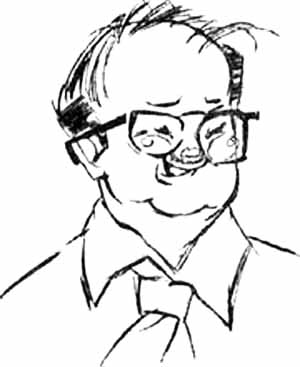
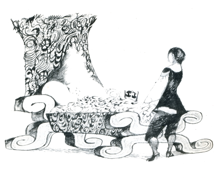
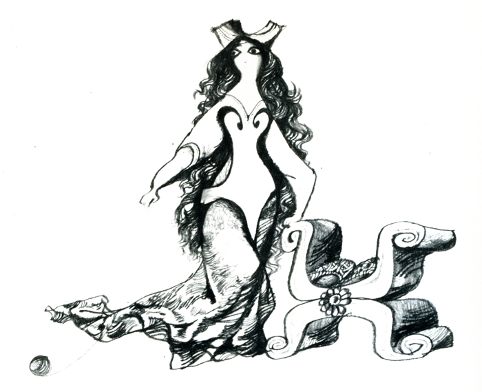
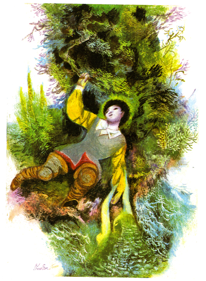
I’ve highlighted the one film because it’s the work of NY animator/artist, Irra Verbitsky (pictured right). Hopefully, a large audience will attend to cheer her film on.

________________

I might take exception with MOMA’s statement that “Most short films are produced by young filmmakers at the start of their careers.” This somehow debases the work of most animation Independents. We can’t afford, for the most part, to do features. Shorts are expensive as well, but making them is obviously more manageable. Perhaps the same isn’t true of live action filmmakers. Perhaps once they’ve put their foot into the short film exercise, they can jump into producing feature films. Or maybe they give up.

Regardless, there are plenty of us out there making short films, animated, doc or live. We don’t need to feel diminished by an organization like MOMA that, I know, is supportive. Just bad copywriting.

________________

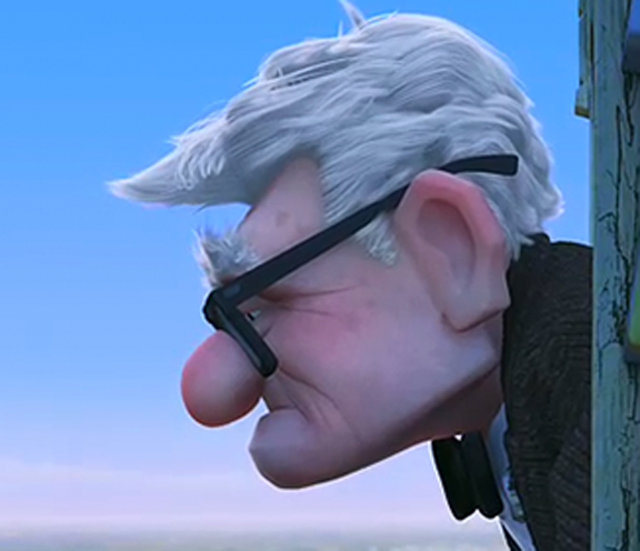
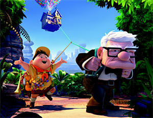
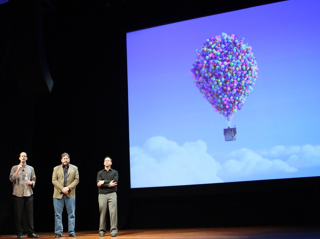
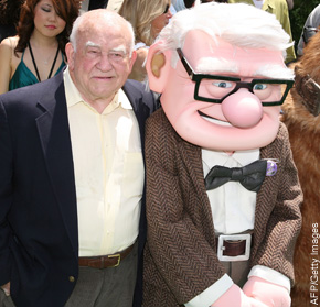
- I must say that I enjoyed Mike Barrier‘s review of Up (in fact, I waited for it.) My only spark of contention is that I’m not a fan of Monsters, Inc. and he is. Regardless, he has a lot to say – even if you were a fan of the film – and is worth the read.

Over the years, as a film maker who has gotten a lot of very positive reviews, I’ve noticed that general film reviewers look at animated films in a different way than they do 
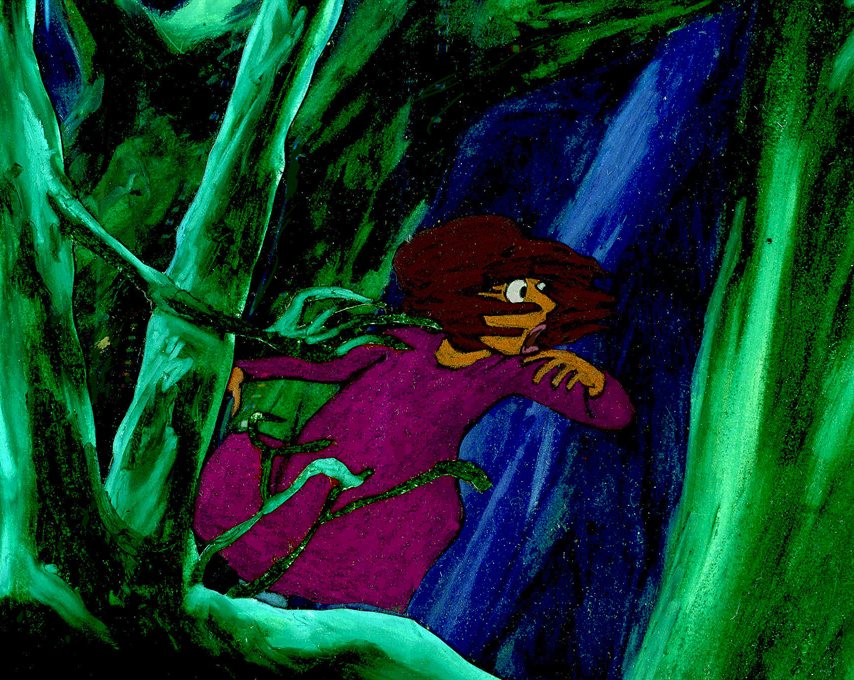
live action films. Animation gets a pass on lots of faults and is not treated as harshly. A film like Up gets praised to the hilt and generally good critics ignore significant problems that stare them in the face.

After I’d finished The Red Shoes, I thought that the story was just not well told. The film seem too compressed, and I felt I needed another 15 minutes to get it out logically and properly. No, the reviewers were all aglow, yet I know that if I had done the exact same film in live action, I would have been castigated for my sins. Or, at least, that’s how I felt.

Now, I think the same can be said for the last two Pixar efforts. They’ve been blessed by critics who miss the trees and the forest for a pretty drawing of the same.

________________

Coraline, the theatrical production, has just opened in NYC ath the Lucille Lortel (a beautiful little gem of a theater in the West Village.)
The review in the NYTimes can be found here.

Commentary 01 Jun 2009 07:31 am

Up

Everyone’s giving a review of Up, so how can I resist after promising as much last week.

- I have to hand it to Pete Docter and Pixar; UP is a very good film. However, there are challenges for this viewer.

The first ten minutes are nicely flawless and set up the story well. Then, after Carl is widowed, the film settles down to earth and gets a bit mundane. Once Carl goes to court, the film shifts, turning into a cartoon and losing its lyricism increasingly as the film moves on. More and more, the imaginiative and unlikely ideas are thrown at us, and the story becomes less and less believable.

There’s a nice, expedient and acceptable way for Docter to cut short the flight and get them to their South American desitination. It’s smart, but it left a big, “Huh?” for me before I moved on. That’s when the dogs enter wearing their jokey voice collars. I wonder if it might have been better for them to keep the dogs without voices. That would probably have offered fewer gags but a bit more logic.

Michael Giacchino‘s score is excellent. The main themes sound a bit like music from a Doris Day film. Light, bubbly and “50s”. It brings the airiness the film tries hard to maintain.

There are several refernces to King Kong (the 1933 version). It occurs when they’re entering a terrain that seems a bit remniscent of the native village in Kong. Lots of repetitive drums right out of Max Steiner’s original score. The most obvious reference, of course, is those dogs in bi-planes trying to shoot down Russell. A couple of the jungle terrains also seem to be pulled from the earlier film.

But then, the film includes dozens of references to other live action films: the opening seems right out of Citizen Kane, the villain is named Charles Muntz (sounds like Mintz) and looks like Kirk Douglas, Carl looks like Spencer Tracey. There are many more, but I’m not sure if they’re there for any purpose other than “fun”.

There’s some animation in the film that’s quite fine , but there’s also some not-so-good animation there. Lots of slipping and sliding in walk cycles; lots of weightless characters (an old cgi bugaboo.) However, it’s miles above most of what I’ve recently seen and does give me a bit of hope.

Up‘s credibililty, for me, roams far from reality with a number of points including: a super humongous zeppelin (where do they get the petrol to run this thing?), talking voiceboxes on the dog collars (not only is the villain a great adventurer, he’s also a brilliant inventor able to read dog-thoughts and build this eccentric machinery in the wild), dogs flying bi-planes with dart-shooting machine guns, and many other bits of business just turn the film into a not-very-believable cartoon.

Of course, all this is a byproduct of the principal idea – a house being lifted by hundreds of balloons. It’s certainly impossible, but we all came into the theater knowing this to be a basic premise, and we agreed to accept it before sitting down. However, I’m not sure we were buying into a lot of other cartoony ideas after sitting through that excellent opening that ultimately seems to be from a different film. It’s as though Bambi had Bugs Bunny as a friend, not Thumper, and the film kept trying to squeeze them together for us.

I’d hoped to accept the entire premise as a conceptual metaphor. Though, I don’t think Docter, in his unspooling of the story, allows us to take this approach to the imaginative but cartoony ideas, so I had to ride with it at face value.

Perhaps this is all irrelevant to most viewers; the film is quite enjoyable while watching it. I did find myself stepping in and out of the story as it progressed, thanks to lapses in credible moments. I also found the film a bit tiresome at about the 2/3 point. Like Wall-E when they’re chasing around in space, inside and outside the spaceship, this film has a dangerous chase inside and outside a zeppelin, on and off the balloon house. They came to the precipice at least four times too many and escaped every time.

I’m glad for what they gave me in this film, but I guess I’m the curmudgeon who hopes the “Action” scenes will be a tad more plausible in screen stories. And I guess I also wish for a little less “Action” in those films. All that running about over and over again get tedious.

But make no mistake, I do think UP is a very good film . . . just not the great one it might have been.

_______

By the way, you have to check out Lou Romano‘s site which is filled with brilliant pre-production art for this film.

Photos 31 May 2009 07:53 am

Steve’s Sundayphotos


- Before getting to the business at hand, today, let me post this link to an article in the NYTimes. Her Prince Has Come. Critics, Too. It gives a good indication of what to expect when The Princess and the Frog is released. Many of the reviewers will discuss the racism inherent and miss the cartoon on the screen.

___________________

- The on-again / off-again rains had me depressed enough that I didn’t pull my camera out, nor did I take one shot. However, my friend, Steve Fisher sent me a stash of photos this week, and they’re so good I don’t want to pass them up. So regardless of the fact that the pictures have little in common, let me post them.


Memorial Day (Click any image to enlarge.)


With just nine days before Fortunoff’s closes its doors forever,
the civility of its customers was thrown to the wind.


The steel frame structure in the foreground is under construction
virtually against the residential building partially seen beyond it.
As soon as the new cladding is erected, one will not be able to see that
side of the house at all. But more unfortunate is that the folks in the
house will no longer be able to see anything outside from their windows.


Thought these pipes found in a utility tunnel under a
building at Stony Brook made for an interesting image.


The innards of a GULF sign, like looking into
the inner workings of the gasoline company.

Illustration &Trnka 30 May 2009 08:24 am

Trnka’s Grimm

- Jiri Trnka is one of my heroes. His sense of design is as gorgeous as his puppets. There’s a feminine delicacy wrapped around a very masculine strength. The same is true of his puppet films. Look at any frame of The Archangel Gabriel or Midsummer Night’s Dream.

We don’t often see Trnka’s illustrations, so I’ve decided, for my own entertainment, to post a few of those in the Grimm’s Fairy Tales book. You can still find copies of this republished many times over. (I suspect the manuscript and illustrations are in public domain.)

Here are about half of the book’s illustrations:


Red Riding Hood


Rapunzel


Iron Hans


The Master Thief | The Grave Mound


Godfather Death


Godfather Death


The Six Swans


The Spirit in the Bottle | The Wishing Table, the Gold Ass & the Cudgel


The Bremen town Musicians


The Valiant Tailor


The Youth Who Could Not Shudder


The Nix of the Mill Pond

Daily post 29 May 2009 07:48 am

Hubley answer

For some inspiration let me give another Hubley answer in the Halas book, The Technique of Film Animation:

    Do you think cartoon is capable of handling realistic subjects, especially involving the human figure?

    JOHN HUBLEY : Yes, provided animators master fundamentals of drawing form and volume, and then combine this with fresh, personal expressions of human action. The mechanics of moving the human figure cannot be isolated from the motivational drives and dramatic meaning of any action, without rendering it empty and useless. It is primarily the emotional content of an action that is of interest to an audience, and the goal of animators must be to express this in graphic motion; not merely to move arms, legs, and bodies around in space. At this point it will become possible to deal with “realistic subjects” and make them exciting and believable.

For some reason, the response makes me think immediately of Glen Keane’s Tarzan. Glen was on to something for whole stretches of that film, but the skateboarding through the trees destroyed any illusion of reality for me.
In fact, for me, the best and best observed human animation has always been the work in 101 Dalmatians. All of it.

______________

The reviews are out, and the clearest and most articulate of the ones I’ve seen is by Manohla Dargis in the NYTimes. She’s fast becoming my favorite current reviewer. I urge you to read the whole thing, though I can’t resist quoting one or two phrases:

    In its opening stretch the new Pixar movie “Up” flies high, borne aloft by a sense of creative flight and a flawlessly realized love story.

    Though the initial images of flight are wonderfully rendered — the house shudders and creaks and splinters and groans as it’s ripped from its foundation by the balloons — the movie remains bound by convention, despite even its modest 3-D depth. This has become the Pixar way. Passages of glorious imagination are invariably matched by stock characters and banal story choices, as each new movie becomes another manifestation of the movie-industry divide between art and the bottom line.

    … an adult relationship that the director Pete Docter brilliantly compresses into some four wordless minutes during which the couple dream together, face crushing disappointment and grow happily old side by side. Like the opener of “Wall-E” and the critic’s Proustian reminiscence of childhood in “Ratatouille,” this is filmmaking at its purest.

    But much like Russell, the little boy with father problems, and much like Dug, the dog with master issues, the story starts to feel ingratiating enough to warrant a kick. O.K., O.K., not a kick, just some gently expressed regret.

I’m looking forward to seeing it tomorrow.

Commentary 28 May 2009 07:58 am

Up and Up

- I’ve read three different reviews for Up, all very positive.
. Tom McCarthy in Variety reviews the film we all expect to see: another feel-good, light and airy cartoon done by those wizards at Pixar. All positive.
. Michael Rechtshaffen in The Hollywood Reporter writes a less specific but much more buoyant review. “Despite the innate sentimentality, director Pete Docter (“Monsters, Inc.”) and co- director-writer Bob Peterson keep the laughs coming at an agreeably ticklish pace.”
. Robert Wilonsky in the Village Voice reviews a film that slyly works more as a film for adults than for children. “Pixar movies have been moving in this direction for years—adult animation sprinkled with just enough shenanigans to entertain the kids while we get our weep on.” All positive.

The best written review was the Village Voice, and it’s also the one that makes me most curious to see it. Two of the reviews suggest that 3D is probably a hindrance more than a help:

Variety: In fact, the film’s overall loveliness presents a conceivable argument in favor of seeing it in 2-D: Even with the strongest possible projector bulbs, the 3-D glasses reduce the image’s brightness by 20%. At the very least, the incentive for seeing “Up” in 3-D would seem less powerful than it is for other films.

Voice: Do not see Up in 3-D. It’s inessential to the tale and altogether distracting.

The Hollywood Reporter spends much of its review promoting the 3D experience: “… those attending theaters equipped with the Disney Digital 3-D technology will have the added bonus of experiencing a three-dimensional process that is less concerned with the usual “comin’ at ya” razzle-dazzle than it is with creating exquisitely detailed textures and appropriately expansive depths of field.”

The film opens tomorrow, and I’ll look forward to some of the other more mainstream reviews. I’ll see the film at an Academy screening on Saturday. It’ll be shown in 2D at the screening, so I won’t have the option of seeing it in 3D. (Perhaps the Academy should update?) Regardless, I’d like not to see it wearing polarized glasses that dim the design’s colors to offer an unnecessary effect. You pay $5 more for 20% less, in my estimation.

I’m not sold on the character design in the trailers and stills I’ve seen, and the character animation I’ve seen has not won me over. But that all becomes moot if the story is solidly engaging as both of these reviews suggest. I can hope as well as anyone.

__________________

Meanwhile in another story about Up, The NY Post offers a Q&A with Ed Asner, as well as a-not-very-positive article about Pixar’s attempt to do more daring kinds of movies: a “… rodent-driven “Ratatouille” and continuing with last year’s “WALL-E” — an amazing, mostly wordless film about a robot tidying up after an environmental apocalypse.”

And now a film about a 78 year old man.:

“The movie’s premise is so unusual that Thinkway Toys, Pixar’s partner since 1995, has decided to sit this one out.

‘That really tells you something,’ says David A. Price, author of ‘The Pixar Touch.’ ‘Everybody likes their grandpa, but the consumer product folks don’t think that grandpa is gonna sell as a doll.’

Docter says he and the other creative staff at Pixar don’t think in terms of marketing and merchandising.”

I wonder if Bob Iger would say the same.

But then this has been the story on many of the entertanment blogs (eg: this one) over the past few months. Personally, I don’t think it’s fair to judge a film on its marketablity quotient, but then I’m not sure that a film that costs upward of $150 million shouldn’t concern itself with that factor.

Originally, Toy Story premiered without any dolls on the market. Disney seemed to have been showing their lack of support for that first big Pixar effort. The success of the film caught them unaware, and they weren’t able to truly capitalize on the dolls until after the success. (Making Toy Story 2 all the more important.)

Perhaps children will be craving for rubberized Carls and they’ll have to make Up 2 to encourage them. Of course, that’d have to wait until Toy Story 3 and Cars 2 hit theaters.

Daily post 27 May 2009 07:35 am

Peters/Scher/Ford/Barrier & NewYorker

– I’m sad to report that ASIFA East board member, Tony Peters, has died.

I’d known Tony only in conjunction with ASIFA for the many years I sat on that board. He was a member before I, and that dates at least back to 1973. He was a voicferous member who helped forge that little organization back in its earliest days.

His work goes back as far as 1961 when he was one of the producers on the Tales of the Wizard of Oz for Rankin Bass. He also did continuity for Rudolph the Red-Nosed Reindeer and wrote and did production design for the Rankin Bass feature, Willie McBean & His Magic Machine.

His presence at ASIFA East meetings will be missed.

_______________

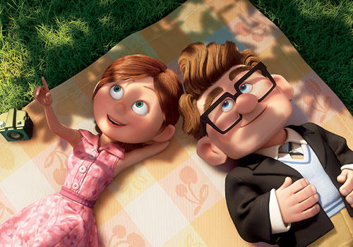
- Jeff Scher shares an older film of his with the NY Times.
NYC was shot in 1975. After the lab went out of business and the negative was lost, Jeff hand colored his print and used that as his negative. The images and colors were more vivid than expected and
his work was completed. Shay Lynch added an appropriate syntho-pop score which adds light to the film.

The words of Hans Richter “who spoke of rhythm as being the essence of cinema and ‘the conscious articulation of time’” and Goethe “who called architecture frozen music” drove the film.

It’s a stirring and expressionist view of the city with a hand-touched vivacity. Check it out (and support animation on the NY Times – so they know people are watching.) NYC

_______________


- An extensive article written by historian Greg Ford about animation director Tex Avery appears on the Bright Lights Film Journal‘s website. The article was originally written for the 1978 Zagreb Animation Festival’s retrospective of Avery’s work. It was reprinted in the Bright Lights magazine/journal but until now hasn’t appeared on-line.

Like all of Greg Ford’s work, it’s thorough and extensive and includes unnecessary apologies by the author. If you have any interest in Mr. Avery’s work, read Tex Avery/Arch-Radicalizer of the Hollywood Cartoon.

By the way, Greg Ford’s commentaries on those WB DVD collections is among the finest. His offerings, as well as those by Mike Barrier and Mark Langer are principal.

_______________

- And speaking of Mike Barrier, he recently posted on his site, MichaelBarrier.com, a picture of Disney wearing cap and gown as he received his honorary degree from Harvard back in 1938. This page and picture gave Mike an excuse to note that he had a relatively recent feature on his site called: Day in a Life. These photo essays are invaluable, and if you haven’t checked them out, I urge you to do so. They’re light enough to make you smile, but they offer real historical information.
Disney 1927
Walt Kelly, 1955
Disney, 1930
Kansas City, 1922
Disney, June 20, 1938
Disney, 1931

_______________

- Finally, in case you haven’t heard or seen it, the current New Yorker cover is one that was drawn and painted by Jorge Columbo while standing and waiting an hour on line at Madame Tussaud’s Wax Museum on 42nd Street. It was drawn on his tiny iphone. You can watch a short video of the cover painting and read more about it here.

Commentary 26 May 2009 07:47 am

Q&A

- I recently spent a few minutes rereading the questions printed at the back of John Halas’ seminal text, The Technique of Film Animation. There’s something formidable to me in a few solid questions posed to a number of smart people. Playing off and comparing them against each other almost gives another answer. I think I first found this book back in 1966, yet in all those years the questions and answers never seem to date. At least not for me.

Anyway, one specific answer struck me this time, and had me thinking about a subject that’s been prominently on my mind lately. Naturally enough, it’s John Hubley’s answer that impresses me. Here’s the question with John’s answer:

    Do you think animation is in a general state of stagnation as regards its style and presentation? How would you like to see it develop artistically?

    JOHN HUBLEY: There is a tendency toward cliches of design in a traditional sense, and even the so-called modern style. (The large profile nose, hair line, arms and legs, black dot eyes, etc.) But more disturbing are the cliches of action (stylized flutter-lip action—sandpiper-like leg motion for walks and runs, multiple image jitters for fright, and many others). The trend toward more rapid timing of actions and reactions is reducing the human characteristics portrayed in the animated image. I would like to see the development of animation which is capable of deeper emotional expression; the portrayal of characters that are more profound and human. This will require stories dealing with ideas and relationships beyond the usual cat and mouse chase or “cute” children’s tale.

If anything his answer is more appropriate today. Cliches in design are not the only sins evident, but cliches in animation and movement even more so. There’s the Flash thing – angled characters with thick external lines are the way forward for most animation done today. It’s the most severe design that the mediocre to poor popping animation hides behind. Solid flat colored backgrounds and a total lack of depth in drawing is the signature of most of the Flash pieces I’ve seen. Too few try to overcome the simple problems in Flash – like popping a head from profile to straight on with no inbetween drawings, or popping from any pose to another. They’re not all in homage to Tex Avery. More likely it’s an homage to laziness. After all, it’s just a cartoon.

Occasionally, you’ll come upon a Sita Sings the Blues and realize that Flash isn’t the problem, but it’s the handicap for many another limited animator. How smartly the design is conceived in Nina Paley‘s film, it gives a very fluid action and a busy texture in the very stylized and appropriate backgrounds. But this is defiinitely the exception to the Flash films out there. Nina uses the medium for all it’s got.

It isn’t just Flash. So many other shorts; so many cg or 2D features are so limited in their choices. The upcoming Disney feature, The Princess and the Frog, cannot fully be critiqued based solely on its trailers, but honestly, it’s doubtful the rest of the film will be designed differently. As it is, the film reminds me a bit of the animated sequences done by James Baxter for Disney’s Enchanted. That was supposed to be a parody of all those Disney fairy tales done recently. I somehow doubt that The Princess and the Frog is parody, but I could be wrong. It just looks retread; well-done retread but just the same.

After seeing those credit pieces for Kung Fu Panda (also done by James Baxter Animation & Shine Studio) wouldn’t we expect more of Disney? Maybe not. Actually, the entire Kung Fu Panda was well designed.

Those 2D title sequences were exceptional though, and if I were trying to revitalize the 2D division of Disney, I’d be going for something strong not reworked. However, as I’ve said, I haven’t seen the final version of The Princess and the Frog and will hold any final criticism until I do.

Design shouldn’t exist outside of the film it’s working within. Two fine examples of excellent and daring design that strengthened their films would be Mulan and Lilo and Stitch. The strong, simplicity of Mulan gave that film the backbone it so needed. I wasn’t completely satisfied with the character design; several of the characters (grandmother and dog) seemed to step out of another film. But overall, it was a brilliant effort, and watching it was almost hypnotic. Lilo and Stitch almost seemed retro with the decision to use the water color backgrounds and beautifully rounded characters. There was a softness there that absolutely made that film. Both were examples of daring design that supported the stories and the animation. It didn’t call attention to itself but brought you into the film.

My sole purpose here isn’t to criticize anyone. I’m just calling for some solid and strong design in animation for both settings and characters. Designers and animators have been sleep walking far too long.

Illustration &T.Hachtman 25 May 2009 07:53 am

Trompe Monday

- From time to time, I’ve been pleased to showcase some mural paintings by my friends, cartoonists Tom Hachtman and his wife Joey. She has a company out of New Jersey which paints murals and commissioned Trompe l’oeil paintings.

Last year they went to a Parkland, Florida home and painted Venice by moonlight in a dining room.

This year they returned and painted the Coney Island boardwalk by daylight in an upstairs hallway.


(Click any image you’d like to enlarge.)


Here’s the group working on the painting.


These are some detail shots.


Joey did the people on the beach.


The finished wall.


How it sits on the second floor.


The crew, from left to right: Joey, Christine, Katie Mae and Tom.

Photos 24 May 2009 08:38 am

Sundayphoto mailboxes

Memorial Day seems to be about the right time for me to remember mailboxes. Both brown and and blue, they exist in droves holding onto the snailmail still out there. One might wonder how many more postage rate increases it can withstand before we depend allmost exclusively on internet communication.

These days many of the boxes have been decorated with graffiti of different sorts. All of it seems to be some kinda message to the world.
Nice and clean with dozens of coats of paint

Given that it’s probably a federal offense, one would expect such graffiti to be limited. But I’d say that that’s not the case.

I can remember walking down the street with John Leguizamo and his director David Bar Katz as he was about to open in Freak on Broadway. Al around town his face was stenciled on sidewalks and walls promoting the show.

We passed a mailbox and John saw his image/ad. He got upset. He knew that it was a federal offense to mark up the mailbox and he asked his director to see if he could look into stopping such practices. The show opened and I suspect there was no such inquisition from the feds.


(Click any image you want to enlarge.)


One graffiti writer wanted the world to know that “Papa Loves Baby”

. . . so scrawled it up and down Houston St. in the Village – both sides of the street – on all of the mailboxes.

It certainly got the point across to “Baby”.


.

“Faro” is someone who’s been out there for quite awhile.
(S)he doesn’t just cover mailboxes. Subway walls and posters
are also fair game for this scribbler.


They can get pretty gritty.


or some get newly painted with just a touch of pink.


Sometimes they come in pairs – brown or blue.


or threes. (newly painted)


Unfortunately, clean up painting things don’t get much better. Splotchy coats
of paint that don’t match the undercoat don’t always improve things.
It’s exhausting when you think about it.


These last two photos are by Steve Fisher,
a better eye for the humorous than I.

« Previous PageNext Page »

eXTReMe Tracker
click for free hit counter

hit counter