Photos 20 Sep 2009 08:25 am

Tops o’ Buildings / Sunday Photos

- Time to turn the Sunday photo section over to friend, Steve Fisher. He took me at my word when I said I was looking for images of things at the tops of buildings.

He sent the following stunning pictures, and what can I say. Here they are:


(Click any image to enlarge.)


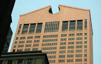
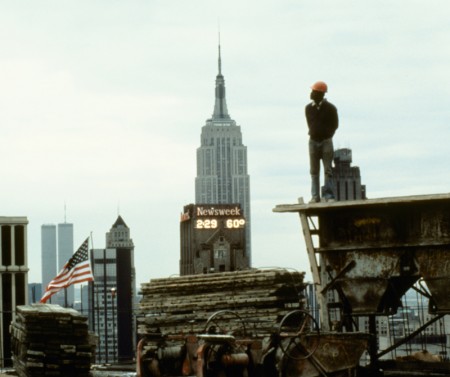
Here’s a shot of the SONY building, which was once the AT&T building.
This is when it was under construction – dead center.


For reference, here’s what it looks like now.
(Pic pulled from AT&T site.)
It was designed by Phillip Johnson.


This and the following images were taken from
SOHO around Green Street.


A pretty mess.


This next group of photos was taken from above
Cooper Union (above), the historically famous Arts school
in Greenwich Village where Third meets Fourth.


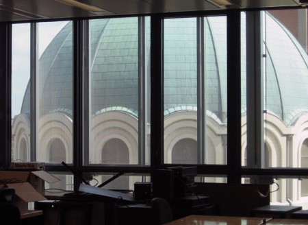
Steve was able to get some clear shots of other rooftops
and even another view of the Cooper clock.


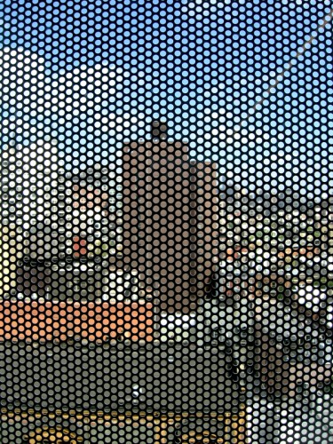
Steve writes: The new building at Cooper Union is largely sheathed
with perforated metal panels that act as a sun screen.


The views out to the rooftops of the surrounding buildings thus have
a texture to them that make for some interesting photos, but I would
find annoying as a workplace.


Imagine having a class at Cooper Union, looking out at this.


From a terrace on the building, Steve was able to get
these shots. Here’s looking uptown.


An overburdened rooftop.


On the terrace, there is a ‘green roof’, part of the environmentally
sound design, and a stone eagle that once adorned old Penn Station.


This one, in Queens, shows what many are doing to their modest,
attached brick homes – adding another story, with little regard to the
scale of the neighborhood or how it looks to their adjoining neighbors..


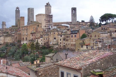
That’s not unlike what happened in San Gimignano,
and we all herald that as great stuff.


And we end in Queens with a something iscious.

Books 19 Sep 2009 07:44 am

The MGM Chapter

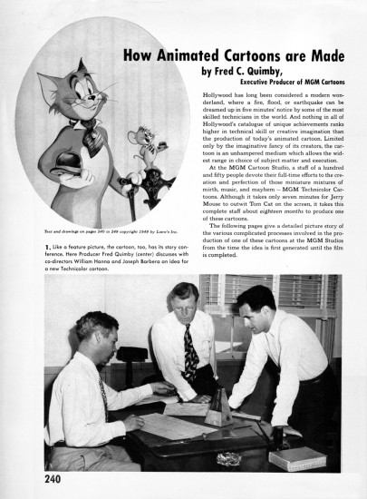
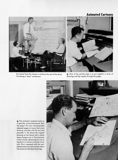
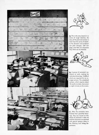
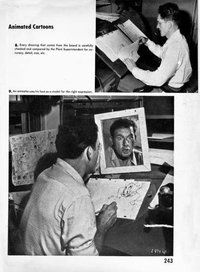
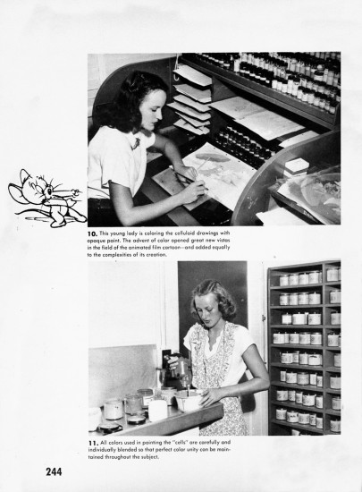
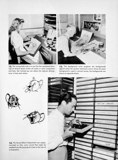
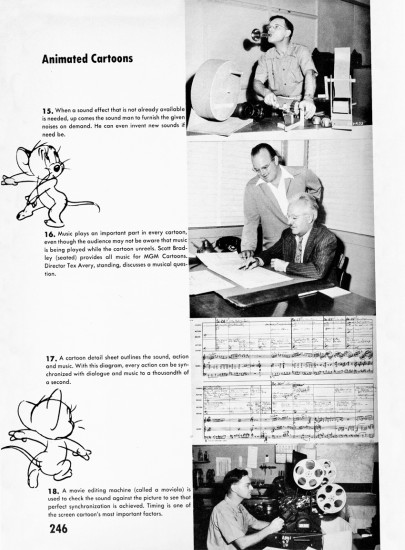
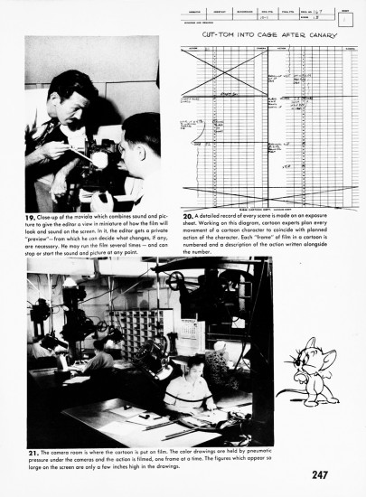
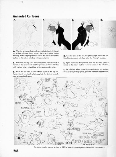
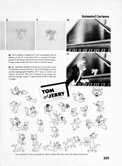
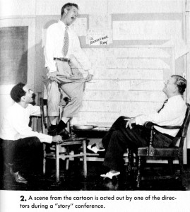
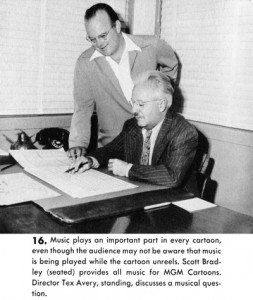
- Last Saturday, I posted a couple of pages of a Terrytoon walk cycle from the book by Gene Byrnes, The Complete Guide to Cartooning. This book has a full chapter on MGM cartoons which is credited to Fred Quimby as writer. The book was a strong inspiration for me when I was a kid, and it still sends a chill up my back and gets me wanting to animate when I look at a couple of those images.

I mentioned this chapter last week and have debated whether to post it. I’ve seen it on line at the blog Sweaterthieves (they posted many of the pages), and the ASIFA Hollywood Animation Archive has posted seven of the chapters that deal with specific cartoonists. However, this chapter seems to warrant some higher resolution images, and I’ve decided to place it here in case you haven’t seen it or don’t know it.

By the way, if you can identify any of the animators or people in the photos, please leave a comment.

1
(Click any image to enlarge.)

2
Upper right: Preston Blair / Bottom: Asst Animator Tom McDonald

3

4
Upper: Max Maxwell head of checking / Bottom: Irv Spence

5

6

7
Middle: (standing) Tex Avery (seated> composer Scott Bradley

8
Upper left: (standing) Animator, Mike Lah

9

10

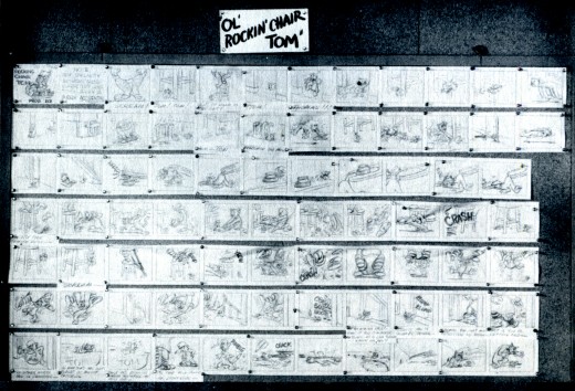
And like Sweaterthieves, I’m enlarging the photo of the storyboard. Without the benday pattern and at a higher res, it’s a little easier to read blown up.

This book also includes some pretty great (non-animation) cartoonists. I’ll pick out a handful and post them next week. I still remember every page from my childdhood when I borrowed this book countless times from my local public library.

Daily post 18 Sep 2009 08:23 am

Cloudy/Holland/POE/

- Cloudy With A Chance of Meatballs came with a lot of advance on-line promotion. However, it opened today, and I didn’t have a clue. The film seems to have snuck into town on tip toe. Not even bus and subway ads in NY. I’ve seen one ad – two weeks ago – on TV. Even Ponyo had 2 commercials on broadcast TV (that I saw). There were NO newspaper ads.

So the film opens in NY officially unannounced, and the newspapers gave back in kind. All of the reviewers who reviewed the film were not the lead critics; as a matter of fact most weren’t even the seconds. The Village Voice hasn’t even reviewed the film yet!

Don’t these marketing experts, hired by the big studios, realize they could make a buck with these films! Two of the last year’s biggest money making movies were animated. Ice Age III and UP. Half a billion dollar potential is worth a few ads!

Surprise! surprise! It so happens that the majority of them actually liked the film. That has something to do with the good will Judy and Ron Barrett‘s book brings with it, but the film has to stand on its own. Actually, it doesn’t even resemble the book anymore – except for the book’s main story. (As a matter of fact, it looks very ho hum – like 90% of the other cg features dumped on us.

Hopefully, the film will do well and more attention will be paid in the future. Here are some links to the NY papers:

- The third tier writer at The NY Times, Daniel M. Gold, said: In a year in which Hollywood’s 3-D animated films have seemed to set the genius of Pixar’s “Up” against the dubious best of everything else, the impulse to take a break from computer-generated family fare is understandable. (Any urge to see “Ice Age: Dawn of the Dinosaurs” again? I thought not.)
What! No slide show on the Times for this one?
- The second string reviewer for The NY Daily News, Elizabeth Weitzman, gave it Four Stars and said: “Unless you’re on your way to Disney World by way of Hersheypark, ‘Cloudy With a Chance of Meatballs’ is very likely the most fun your family will have this month.
- Even The NY Post doesn’t put up their lead critic. Kyle Smith wrote the only negative review – Two Stars:”The animated movie greatly expands on the kids’ book on which it’s based in a clever and engaging first half. But the second half leaves a foul aftertaste. Slapdash action scenes play against dreary warnings to fear wealth and beauty. “

____________________

Congratulations to those who made it into the Holland Animation Festival scheduled to take place in Utrecht from the 4th to 8th of November. Americans in competition include:

    Non-Sponsored Films:
    Chris Ware – Quimby the Mouse

    Alex Budovsky – Royal Nightmare

    Elliot Cowan – The Stressful Adventures of Boxhead

    Sponsored Films:
    Michael Jantze – Hilton Hotels: Mr. Lux in ‘At your Service’
    George Griffin – Lorraine Feather: You’re Outa HereBoxhead and Roundhead in a stressful situation

.
For the complete lists of films in competition go here.

____________________

- For those who were not aware of it, I have a site designed to showcase the feature we’re putting together, Poe.
This site is called PoeStory.net and it contains clips, artwork and production updates about a long-in-process film. I hope to see it moving sooner rather than later, and this site allows me to keep in touch with it.

You can also find the some of the same material on my studio website at MichaelSpornAnimation.com. Once on the home page click the black cat which links to POE.

By the way, that site – on the Home Page – gives the scheduled times many of my films run on HBO (they repeat monthly.)

Bill Peckmann &Books &Illustration 17 Sep 2009 07:39 am

Good Housekeeping 3

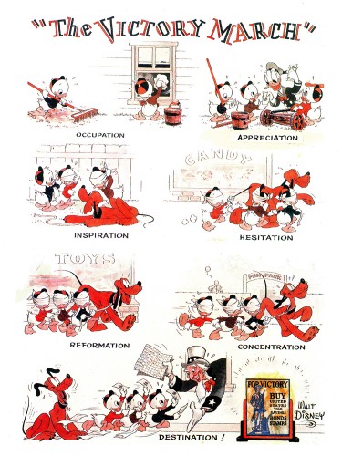
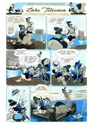
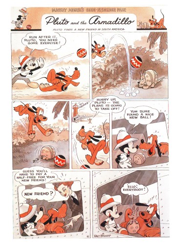
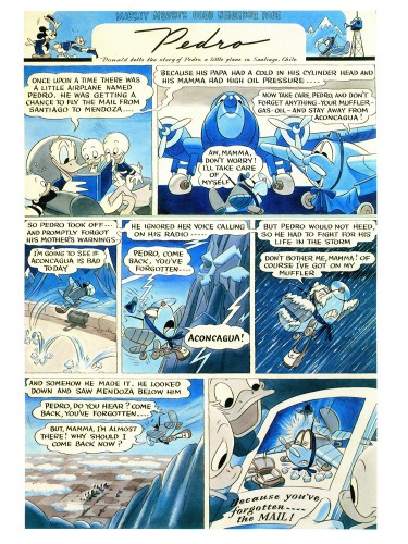
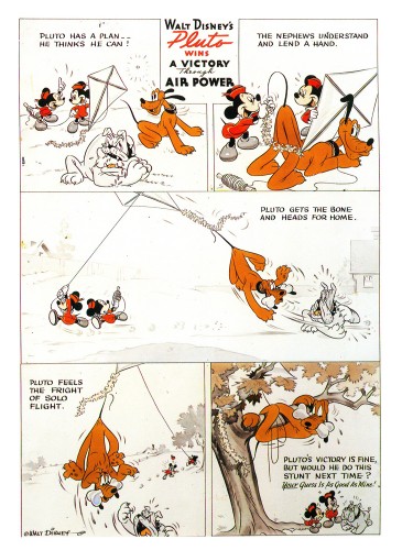
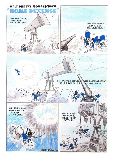
- Bill Peckmann loaned the book of collected Good Housekeeping illustrations that were publishrf bryeen 1938 through 1944. (The illustrations actually began in 1934 and were printed complete in an interesting recent book called Mickey and the Gang which was edited by David Gerstein. That book includes so much more than these illustrations – including the text that went with the illustrations. However, I like the printing, on non-glossy paper, of the 1987 book.)

I’ve done two other posts of these illustrations (part 1, part 2) and finish them up with this piece.

1
The Victory March, August 1942

2
Lake Titicaca, December 1942

3
Pluto and the Armadillo, February 1943

4
Pedro, March 1943

5
Pluto wins A Victory Through Air Power, April. 1943

6
Donald Duck Home Defense, August 1943

7
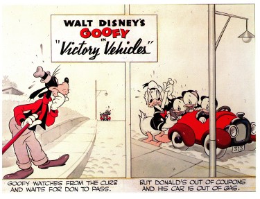
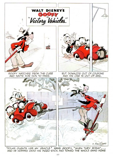
Victory Vehicles, September 1943

This edition, published in trhe Alexander Gallery catalogue
is really just the upper half of the strip.


Here’s the whole strip as printed in
Mickey and the Gang.
More white no colored grays.

8
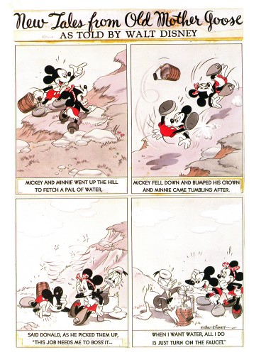
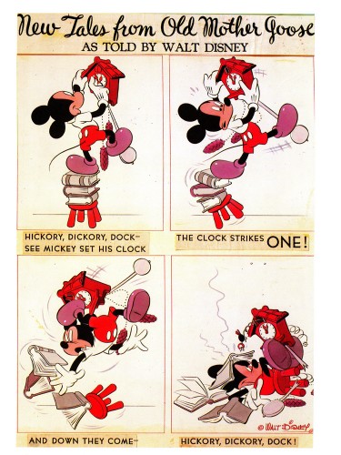
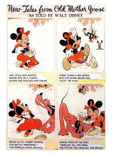
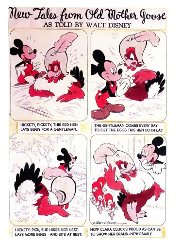
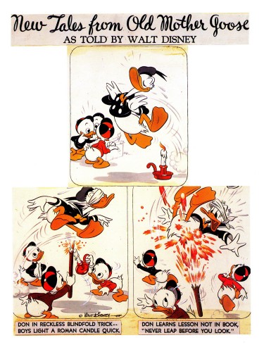
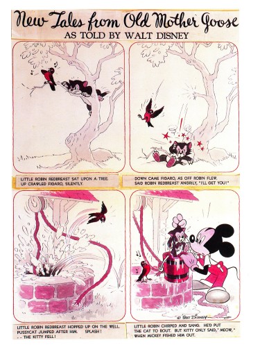
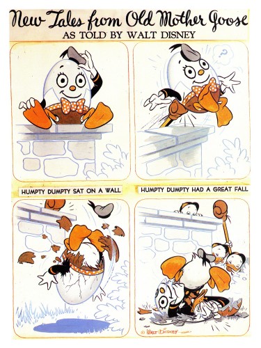
From 1943 on, the illustrations became “New Tales from Old Mother Goose.”
This was a revision from “Donald Duck’s Mother Goose” that had
appeared in Mickey Mouse Magazine, published in the 1930′s.
Hank Porter and his writers dealt with a more limited subject in a
more comic-strip sense and used the two color process during the war.

Mickey an Minnie Went Up the Hill, October 1943

9
Hickory Dickory Dock, February 1944

10
Little Miss Muffet, May 1944

11
Hickety, Pickety, June 1944

12
Don be Nimble, Don be Quick, July 1944

13
Little Robin Redbreast, August 1944

14
Humpty Dumpty, September 1944

Animation Artifacts &Bill Peckmann &Disney &Story & Storyboards 16 Sep 2009 07:31 am

Pinocchio Bd

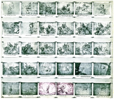
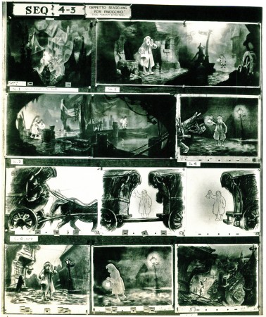
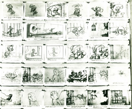
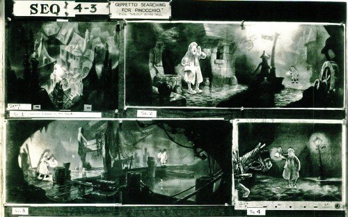
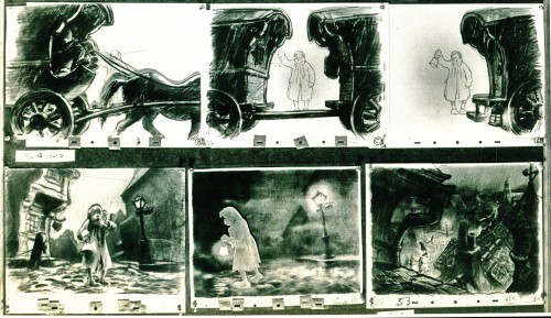
- Here are a couple of Pinocchio storyboard sequences from the collection of Bill Peckmann. The boards are stated in a relatively small format. I’ve scanned them in at a high res and am placing them here in smaller sections so that they’re legible – at least in the blown-up versions.

Pinocchio is duped by some cads. These are the three full sized boards which take us through the nose-grows sequence (minus Stromboli).


(Click any image to enlarge.)

Now here are those same three boards broken into sections.

11a

11b

12a

12b

13a

13b

14a

14b

15a

15b

21a

22a

31a

31b

32a

32b

33a

33b

34a

34b

35a

35b

Of course, if we’re talking about studying Pinoochio, I have to direct you back
to the drafts on Hans Perk‘s great site and
the mosaics on Mark Mayerson‘s equally excellent blog.

Animation Artifacts &Books &Illustration 15 Sep 2009 07:29 am

Piccoli

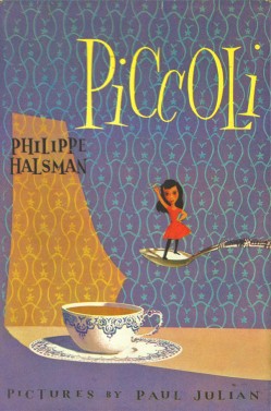
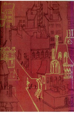
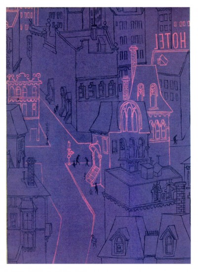
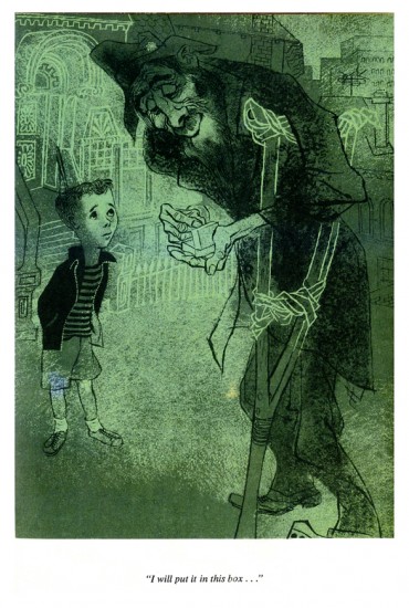
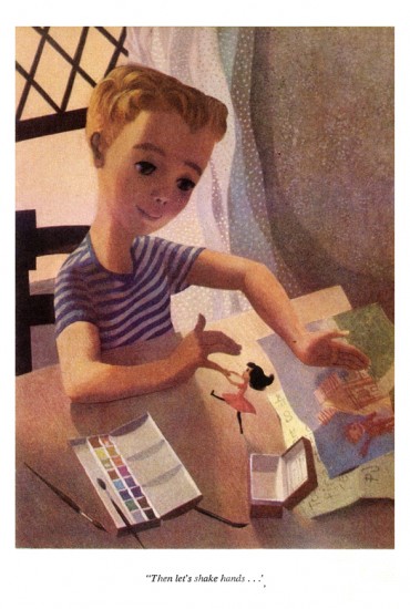
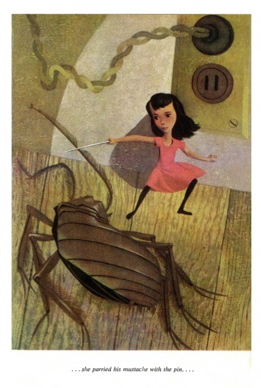
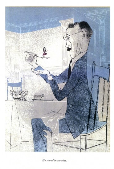
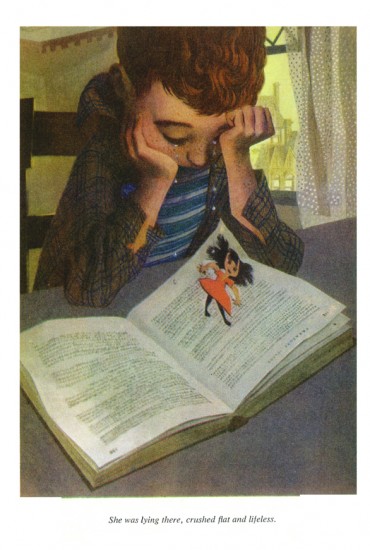
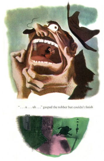
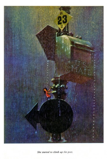
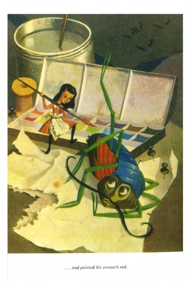
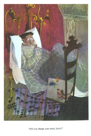
- The brilliant artist/designer/background artist, Paul Julian, illustrated a stunner of a children’s book in 1953. Piccoli is the story of Piccoli Sogni (little dreams) a tiny girl who lives in a matchbox. A stranger gives her as a gift to a sad young boy. She helps to inspire him creatively.

The story is by Phillippe Halsman which he had written for his daughters. He was a celebrated photographer who worked with Salvador Dali on the book Dali’s Moustache. In 1958 he was chosen as one of the 10 greatest photographers in an Internation poll. His 1959 book, Philippe Halsman’s Jump Book, collected more than 200 recognized photographs.

Paul Julian, of course, is well known by animation enthusiasts as one of the principal background artists for many of the most famous Warner Bros cartoons. He also gained some fame for his art direction of the UPA masterpiece, The Tell-Tale Heart.

His work has always seemed just slightly this side of the surreal, to me. His color choices were masterful and the many backgrounds he did reflect his own style. See this excellent post by Hans Bacher on his important blog, Animation Treasures.

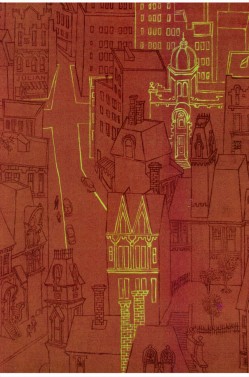
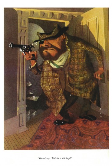
John Canemaker loaned me a number of color copies of the book, and I tried to get an accurate read on the colors from the copies, but I suspect they’re still a bit off. Here are Julian’s illustrations for Piccoli:


The inner cover of the book.

1

2
At times the art looks influenced by Gregorio Prestopino.

3

4

5

6

7

8
This is actually a composite of two different illustrations
on two separate pages in the book.

9

10

11

12

13

14

15

Animation Artifacts &Bill Peckmann &Disney &Models 14 Sep 2009 07:27 am

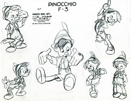
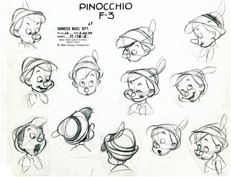
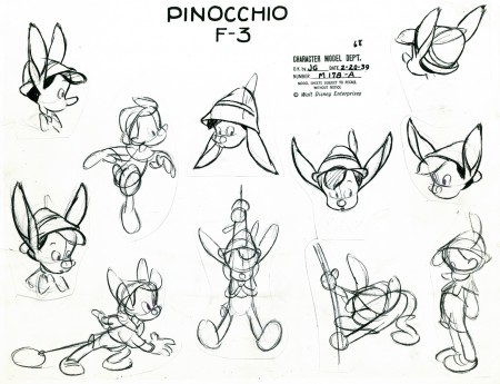
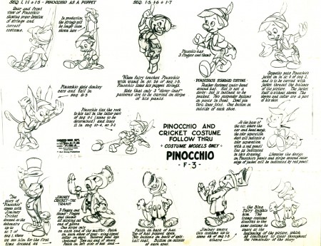
Pinocchio Model Monday

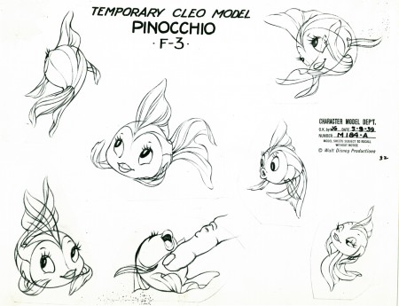
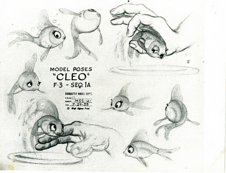
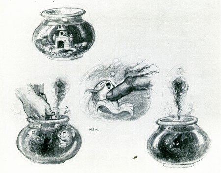
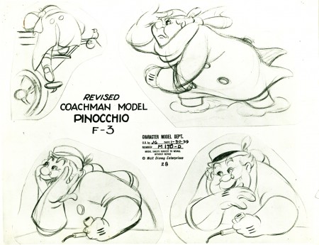
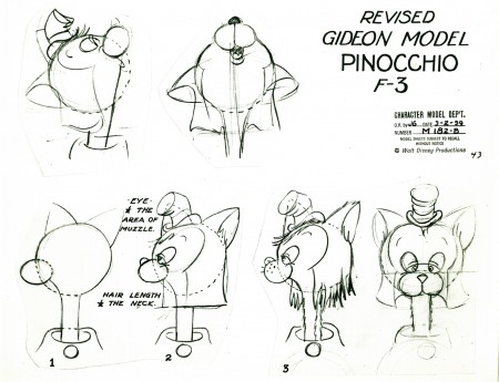
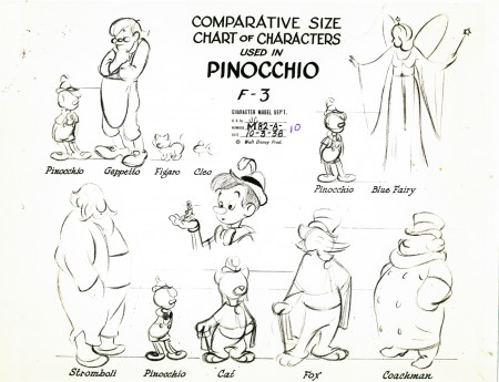
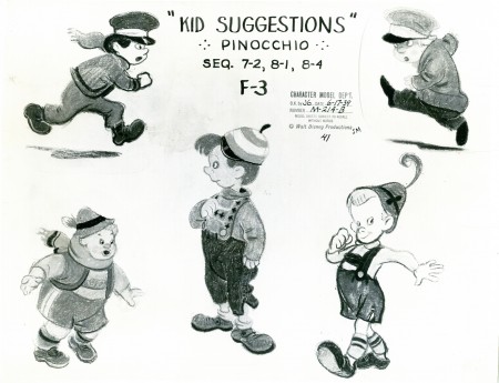
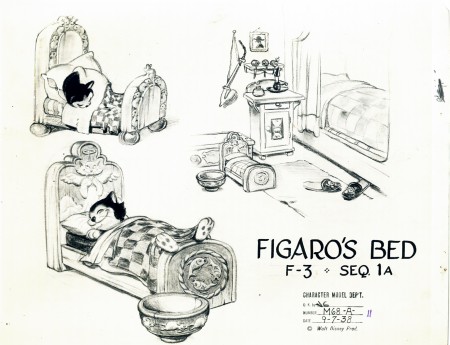
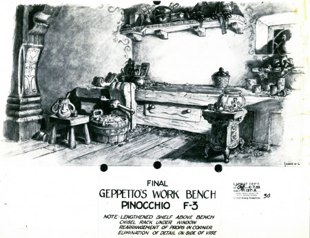
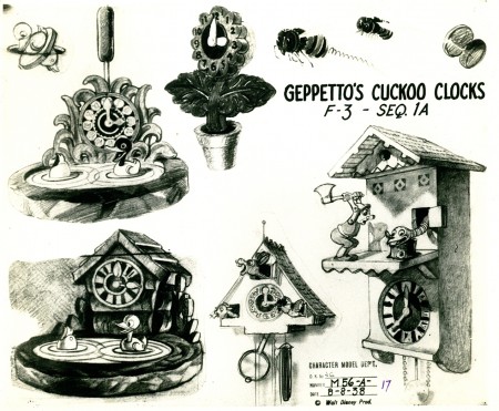
- As I did with the past few Mondays, I’m posting some Disney model sheets on loan to me from the generous Bill Peckmann. Here we have Pinocchio. I’ve seen about half of these models before – usually in much worse states – though some of them are very new to me. (Check out #5, #11 & #20.) All are photostats and in fine shape. This film is an inspiration to any animator, so they’re fun to post.

1
(Click any image to enlarge.)

2

3

4

5

6

7

8

9

10

11

12

13

14

15

6

17

18

19

20

21

22

23

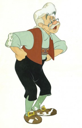
What! No Gepetto?

I do have this badly damaged 16fld cel. After all, he has to be represented. And when would I get a chance to show it off?

Photos 13 Sep 2009 07:55 am

Larry Gelbart & SundayPhoto Grabbag

- Back in 1995 a film of mine, Whitewash, won the Humanitas prize. This is a Hollywood award for writing a film that celebrates humanity. (The official website says this: “Stories that affirm the human person, probe the meaning of life, and enlighten the use of human freedom.”) the award is presented to the writer. Ntozake Shange would receive the prize. I did the treatment, she wrote the first draft and I did the last two. I gave and give her full credit.

She didn’t want to go to the ceremony. It sounded like a treat to me, so I went out to pick it up for her. (There was also one for me.)

I flew to LA for the day and got there in time for the ceremony. When it came time, they called out her name (with a little difficulty), and I went up. My short thankful speech opened with, “It may surprise you but I’m not Ntozake Shange.” There was a big laugh from the group and just at that point, my day was made. There at the center front table laughing very hard was Larry Gelbart. Whatever else happened that day I don’t remember. I had made one of my writing heroes laugh. That was my real Humanitas prize. I also got to meet him later.

I was saddened to my core yesterday when I’d read that he had died. So many people this year, the grief is almost overwhelming.

______________

- When you take a lot of photos looking for themes to present, you end up with a pictures that don’t quite belong, but they’re interesting enough to hold on to them. Today I’m going to stick my hand into that grabbag of picture leftovers and put them up as a bunch of photos that didn’t quite belong. About half of these were sent by my friend Steve Fisher. Since they’re the more interesting pics, I’ll group them all in the latter half.


As you know by now, I can’t get enough of Psychic shop photos.
I took this one of the only Psychic I’ve seen with an ATM shop
installed just outside the front door. Handy.


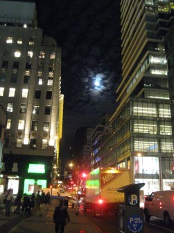
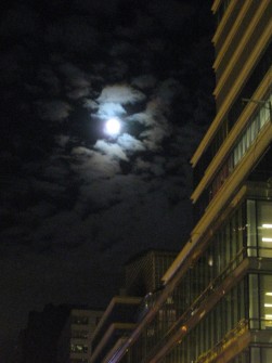
The other night, we had a full moon with lots of passing clouds.
This was the view from 59th Street and Lexington Ave for about
two full minutes. Clouds rolled in and covered it immediately.


The full moon might have explained this protected street lamp.


“Step away from the Saint.”
A gem from Steve Fisher.


I’ve always been a sucker for shots of grass with lots of deep focus.
Trite and clichéd, but it gets me going.


The same goes for telephoto shots capturing color temperatures.
I’m not good at taking these photos, but that won’t stop me.


Steve Fisher has a different kind of eye. He turns two overlapping
trees into a Jackson Pollack.


Just take a step or three back and
you get a different kind of Art.


Likewise his shot of this sky is more evocative.
Isn’t this a scene from Dumbo?


These shots of signs by Steve were more than evocative.
Our society inside out.


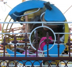
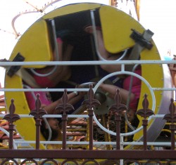
Steve shot these pictures at a local street fair in Queens.


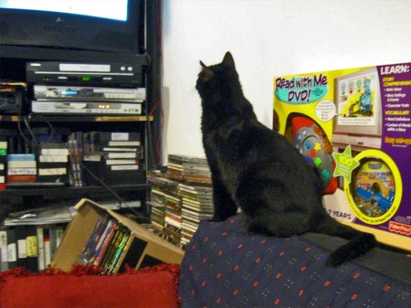
Finally, how could I not end with a shot of the studio cat,
Robbie, watching PONYO dance across the waves.

Books &Commentary &walk cycle 12 Sep 2009 07:40 am

Cartooning

- When I was a kid, there were few resources one could turn to for information about animation and the process of making these films. Before computers, information was somewhat more difficult to acquire.

I couldn’t afford many books on the subject. Of course, I owned the Preston Blair book and that other Walter T. Foster book about Making Animated Cartoons (the one that wasn’t drawn very well and included animation examples that just didn’t work.) My treasure was the 1958 Bob Thomas book, The Art of Animation, with its technicolor focus on Sleeping Beauty.

I also clipped every magazine/newspaper article or image I could find about cartoons and saved it in a homemade scrapbook. It would be years before I came upon Mike Barrier‘s Funnyworld Magazine or any other mag, for that matter, that focused exclusively on animation or cartooning.

There were other books, and I went to the library to check them out monthly. I treasured that library copy of Robert Field‘s The Art of Walt Disney that I read over and over again. I appreciated Nat Falk‘s How to Make Animated Cartoons.

There was one book The Complete Guide to Cartooning by Gene Byrnes that had a chapter on MGM cartoons. This book had some of the greatest photos in it. Animators, inkers, directors, cels and sound effects. The pictures were great in that forties kinda way that just had me drooling animation when I looked at it. (It was published in Jan, 1950.)

This came to me years ago when I found the animation section of this book on line. I haven’t been able to locate the site again; if I do, I’ll post the link or scan the section myself to post.
It came again recently when friend, Tom Hachtman, visited and brought a copy he owned to see if I knew about it. Of course, opening the whole book was like going home again after dozens of years. I knew every page intimately.

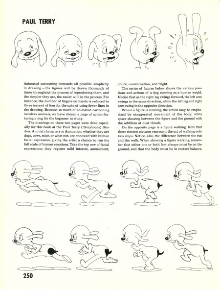
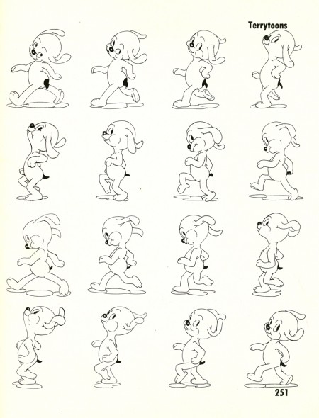
Two pages that stood out followed the MGM section and had the same effect within the book of seeing a Terrytoons cartoon after seeing one from MGM. Low rent. The pages look like left overs from Nat Falk’s book (and may, in fact, have been part of one of his books.)

However it amused me to look them over and actually run the peculiar walk cycle through AfterEffects to watch the motion. There are no registration marks, so I had to guess. (I didn’t take a lot of time with this, believe me.)


(Click any image to enlarge.)
.

Here’s the QT of the odd pupwalk:

[ Javascript required to view QuickTime movie, please turn it on and refresh this page ]

Pupwalk on two’s
I’m not sure who animated this – my guess Connie Rasinski
Click left side of the black bar to play.
Right side to watch single frame.

Commentary &Daily post 11 Sep 2009 07:18 am

9-11 / 9 / 2Art4TV4 / Starting Point / El Grupo

- Today, of course, is September 11th and certainly no New Yorker can get through the date without reminiscing about that horrible day back in 2001.

Tom Hachtman visited the studio yesterday and he and I went on a bit. He’d regularly submits pieces to the New Yorker magazine. He was on his way into the city to submit a cover that had the strange bit (the week before 9/11) where a parachuter landed on the torch of the Statue of Liberty. The twin towers were in the background. When he learned, coming into town, that the buildings had been struck, he didn’t even show his cover idea (a good and funny one, normally) but went home.

Everyone was affected from great to slight, and a very sad calm comes over when we give our minds to it.

________________
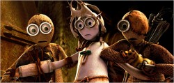
- Shane Acker‘s 9 opened in New York this past Wednesday and might have snuck in without notice if we weren’t looking for it. I have seen the ad for it several times on tv -all during Yankee games – (which is more than I can say for Ponyo.) All of the ads were action-adventure blow up kinda ads. None of them would get me near a theater.

I do have the memory of the short that was nominated for the Oscar. I wasn’t crazy about it, but I certainly remembered it. Mad Max meets Henry Selick meets student film. I couldn’t tell if it was puppet or cgi, though I suspected cgi. I now know it was. At least Shane Acker makes no bones about that being the look he was going for.

The film didn’t get a review in the NYDaily News until today – a short 2 star review; it earned 3 stars from the NYPost, and received a generally non-commital of a review from A.O.Scott in the NYTimes. (Since he’s now half of that new “Siskel/Ebert” clone of a show, it’ll be interesting to see what he says live on the upcoming program.)

The NYTimes does have a slide show of stills from the film.

________________
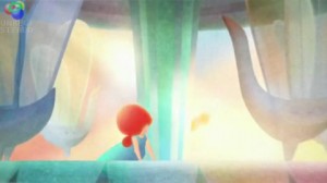
- Speaking of cgi looking like puppet films, here’s a cgi film that DOESN’T look like a Viewmaster clone. Un tour de manège They sought to imitate painting.
What do you know! Gobelins strikes again.

The film’s a bit romantic in tone, but the graphics are superbly done. It’s technically very sophisticated but quite simple in its look and execution. I appreciated the work that went into it and the final product.

Thanks to Ian Lumsden‘s great blog for pointing me in the right direction.

________________
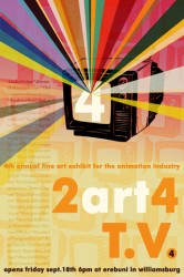
- Too Art for TV4 is the title of the latest art exhibit of work by animation artists. The wrok will be displayed in Williamsburg at the art gallery, Erebuni. The opening reception is next Friday, September 18th, 6pm-9:30pm

The show, itself, will run from September 18th, through October 17th, 2009
at Erebuni, 158 Roebling St. Williamsburg, NY 11211.

I urge you to support your fellow artists and take a look.

Some of the artists exhibiting may be unfamiliar names; others may be friends. I suggest you check out the website and scroll down. Take the time to read some of the bios.

CONTRIBUTING ARTISTS include:

    Liz Artinian ____ Amanda Baehr-Fuller____
    Christopher Beaumont ____Andrew Bell
    Robert Bohn ____Connie Li Chan
    Devin Clark____ Eliot Cowan
    Jared Deal____ Kelly Denato
    Eric Dyer ____Maya Edelman
    Jon Ehrenberg____ Christopher Fisher
    Chris George ____Kenneth B Gore
    Edmond Hawkins ____Jen Hill
    Stephen Irwin____ Marta Maria Jonsdottir
    kaNO ____Thomas Knowler
    Eileen Kohlhepp ____Peter J. Lazarski
    Eric Leiser____ Adam Levine
    Dave Lipson____ Todd Kidwell Lown
    Richard Mather Cynthea____ Satsuki Mazur
    Margaret Meyer____ Jessica Milazzo
    Nate Milton ____Michael Mucci
    Deodato Pangandoyon____ Alex Smith
    Zartosht Soltani____ Ryan Sovereign

________________

- I enjoyed Mark Mayerson‘s comments on Miyazaki‘s book Starting Point. I’ve been hot to get my hands on this one for some time now. I ordered it from Amazon and have been in limbo ever since.

I’ve just received a second notice (a month later) that the book has just been shipped. I’ll believe it when I have the book in my hands. It’s a bit frustrating. There are times when I wonder why I didn’t just go to the store and buy a copy! (Of course, laziness is the answer.)

________________
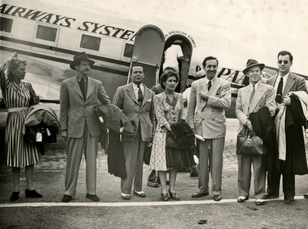
- As I wrote a couple of weeks ago, Walt and El Grupo opens today at the Quad Cinema on 13th Street. The reviews for the film have been good (only the NYPost offered their top reviewer), as expected. All of those I saw (about 6 of them) said the film was too reverential, a studio promoting its own history.

I thought it a good documentary with lots of sterling footage of the groups travels through Latin America. Jerry Beck’s one negative comment is the same for me – I wish the film had offered more of the animation from the films that came out of this trip. Of course, I’m one of those the movie was made for – an animation fan who went into it knowing who all the people on screen were.

I did appreciate a lot of the commentary about the strike, that all of these employees were part of – on Walt’s side of the fence. We learn in the doc that many of them were worried for those they’d left behind. We can easily imagine what a concern that would be. It’s a good film that you should see if you have any interest in Disney.
« Previous PageNext Page »

eXTReMe Tracker
click for free hit counter

hit counter