Bill Peckmann &Books &Commentary 30 Sep 2009 07:47 am

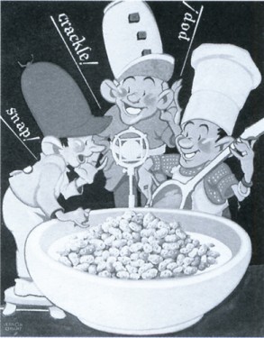
Snap Crackle Pop


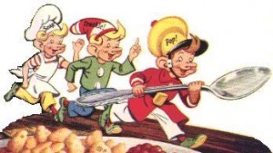
The original Snap, Crackle and Pop

- Vernon Grant was the designer of the three elves who’ve appeared on the Rice Krispies package since 1928.

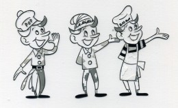
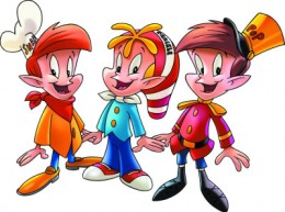
Snap, Crackle and Pop have gone through many incarnations since their debut. Their ears and noses have been reduced and softened, and their costumes have changed significantly.


Two other variations found on liine. The left animated at Playhouse Pictures in the Fifties.

A couple of commercials can be found on YouTube. Naturally enough, the quality degenerates chronologically.
#1, #2, #3, #4, #5

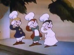
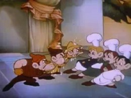
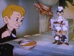
In 1939, Snap, Crackle and Pop starred in a short called Breakfast Pals. In the 1½ minute film, the three elves have to fight another three elves: Soggy, Mushy and Toughy. Ultimately, our heroes roll the bizzaro elves into a syrupy pancake and prepare Rice Krispie cereal for two boys sharing a sleep-over.

The film was made by Cartoon Films Ltd. This was the last incarnation of Ub Iweerks’ own studio. He was, at the time, making some short films for Columbia.


Soggy, Mushy and Toughy fight Snap Crackle & Pop

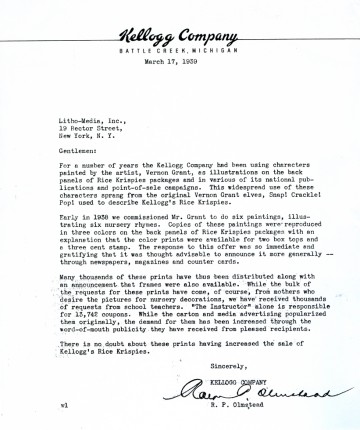
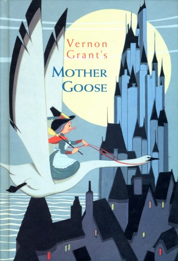
In 1939, the Kelloggs Corporation sent this letter which talks of other illustrations by Vernon Grant. Mother Goose rhymes were added to the package backs and became very popular. Kellogs sought to publish them.


(Click any image to enlarge.)


This is the subsequent book, which became
quite successful and is still available.

I’ll post the illustrations for the book tomorrow.
The letter and book are courtesy of Bill Peckmann to whom many thanks are offered.

Frame Grabs &Title sequences 29 Sep 2009 08:28 am

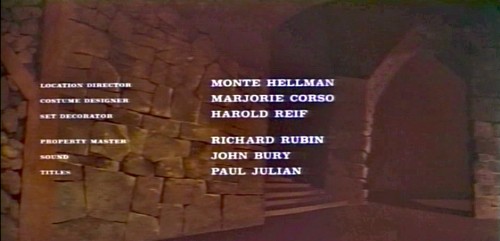
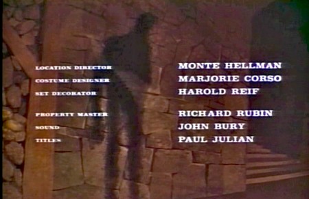
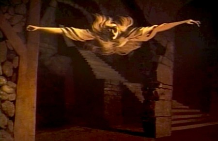
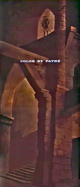
Paul Julian’s The Terror titles

After posting the book, Piccoli, a week or so ago, I’ve grown more interest in Paul Julian‘s work. He’s known predominantly for the Bgs he did at Warner Bros and the art direction he did on The Tell Tale Heart. However, there’s more film work he did independently.

The Hangman was a short film he did with co-director Les Goldman. Maurice Ogden’s poem is read by Herschel Bernardi in a very earnest tone. The artwork by Julian absolutely saves this film which was nomainted for the Oscar.

Roger Corman also used Paul Julian for a number of opening title sequences for the low budget films he did in the 60s. I’m going to try pulling some frame grabs from a number of these title sequences so that I can place some focus on Julian’s work in these forgotten films.

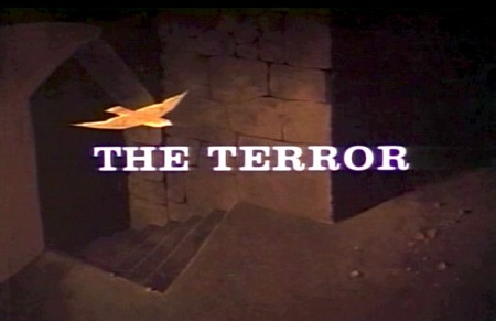
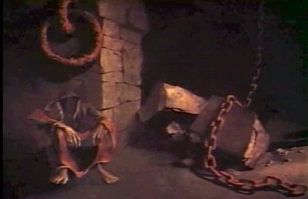
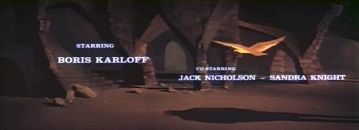
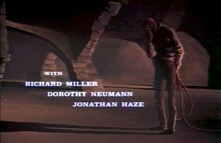
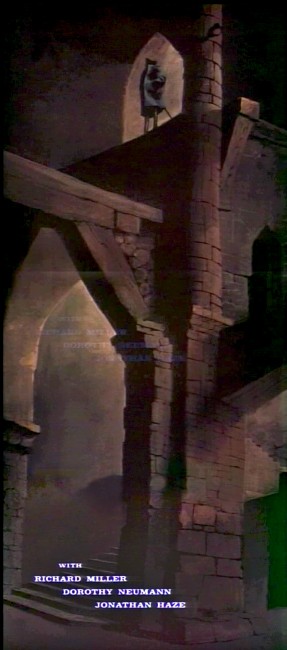
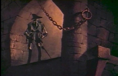
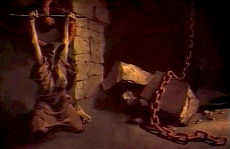
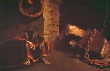
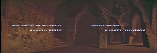
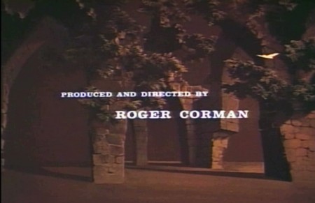
I start here with The Terror a film Starring Boris Karloff and Jack Nicholson. Julian uses a couple of pieces of artwork that he works over the course of the sequence with lots of lateral camera moves. Quite expressive work, though certainly not on a par with Tell Tale Heart.

1
(Click any image to enlarge.)

2

3

4

5

6
Starts at the bottom and pans up.

7

8

9
Monte Hellman directed Two Lane Blacktop.

10

11

12

13

14

15

You can watch a grayed-out version of this video on YouTube. The credits come on about a minute into it.

Swamp Women’s title sequence will follow soon.

Animation &Bill Peckmann &Disney &Models &Story & Storyboards 28 Sep 2009 07:36 am

Bambi Board 2

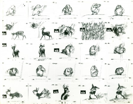
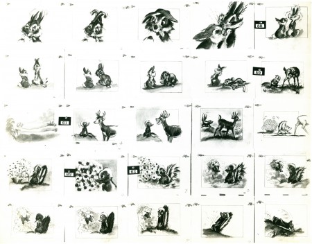
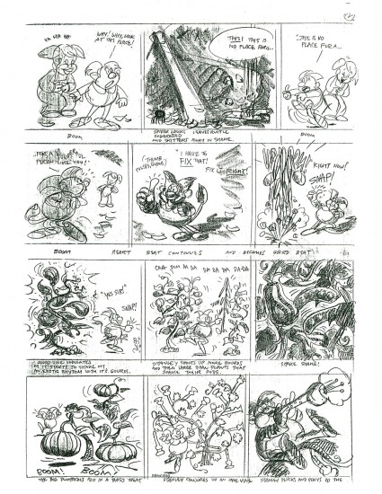
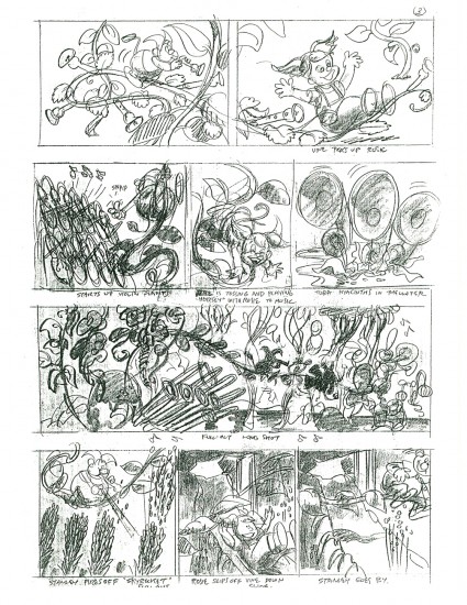
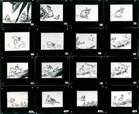
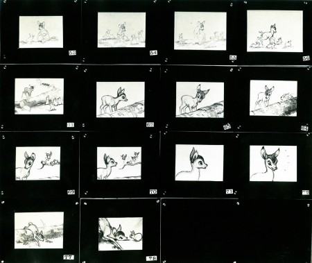
- The cache of stats that Bill Peckmann recently sent me on loan includes several photo pages of storyboard from the Bambi Twitterpated sequence. I’m not much of a fan of this sequence, but looking at these beautiful storyboard drawings makes me realize how charming it is in its original state. The cute/cartoony movements came from the animators and directors. Perhaps the film needed this funny, broad approach, but I have a feeling there are other ways it could have been tackled that might have let it feel more connected to the whole.

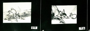
As with past board postings, I’ve cut them up into rows so that I can post them at a higher res for better viewing. First here are the three pages as they stand:

1
(Click any image to enlarge.)

2

3

Now here they are again broken into individual rows:

1a

1b

1c

1d

1e

2a

2b

2c

2d

2e

3a

3b

3c

3d

3e

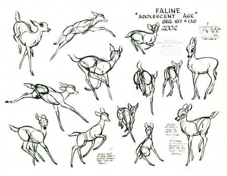
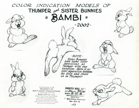
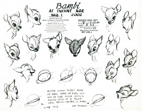
Here are some model sheets which relate to this sequence:

1

2

3

4

5

Once again, many thanks to Bill Peckmann for the loan of this marvelous material. It’s truly appreciated, and it’s fun to share.

It’s amazing to think how Walt Disney pushed all this great art forward. This film actually moved the “Art” side of animation forward with the majestic backgrounds, realistically designed animation and bold storytelling approach. There’s no possibility that something as rich as this film could be done today.

Photos 27 Sep 2009 08:25 am

The Feast

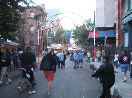
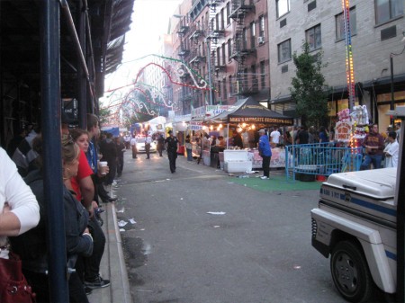
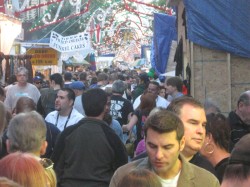
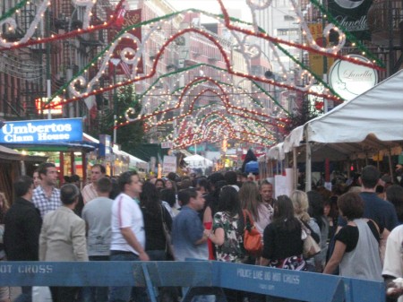
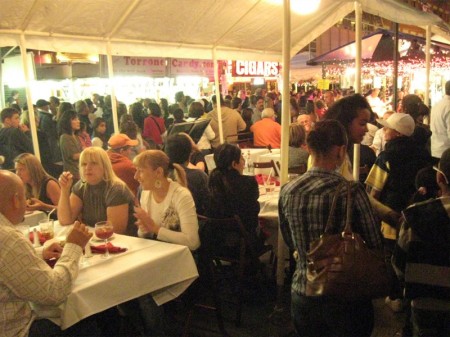
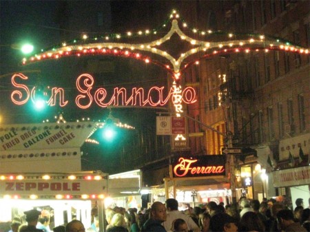
- Every year, Little Italy bursts aflame as the San Gennaro Feast sets up and sits over a 10 day period. (In New York we just call them – there are about three or four of these annually in Manhattan and others in the outer boroughs – the “Feast” and everyone knows what you’re talking about.) This is a “feast” built around the Old St. Patrick’s church, downtown. It goes for about 15 city blocks and is crammed with an estimated million people annually. (I think most of them come from New Jersey.)

I enjoy taking in these “Feasts” and have gone to many over my lifetime. It’s usually best to go at night when it’s dark and the lights are brightest. This year, Heidi and I took in San Gennaro going earlier, at twilight.


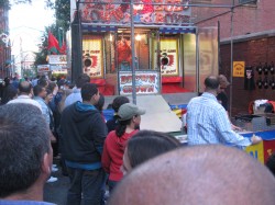
We came at the “Feast” from the North end crossing Prince St.
at Mott. From there you could see the endless decoration.


As you move into the throngs of people the area gets closer and
closer, tighter and tighter. Not for those with claustrophobia.


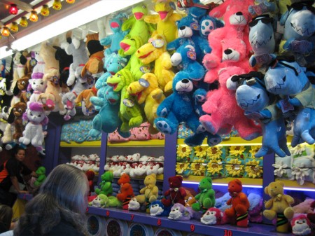
Almost immediately you come upon the games.
Lots of colorful dolls to win for a small price.
As we went on the prizees grew more Hi-tech –
Ipods, cell phones etc.


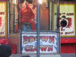
There was the obnoxious clown you could dunk in a tank of water.
He spends his nights hurling insults at the people trying to dunk him.


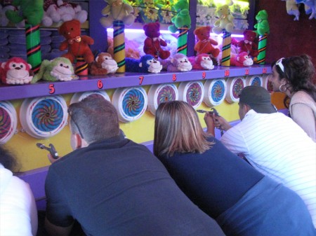
Of course, there’s the water pistol game where you try to
blow up a balloon faster than other competitors.
There’s always a winner.


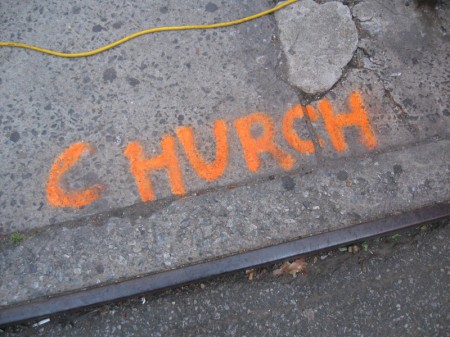
The sign on the ground showed us the back door to the church.


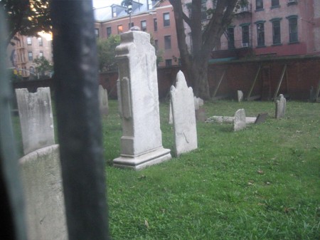
It led us through a corridor with gated windows which
led out to the ancient cemetary.


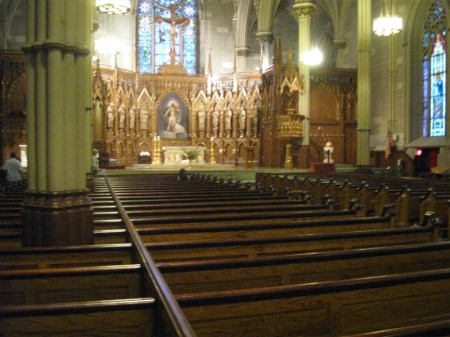
The end of this corridor opens to reveal the church.


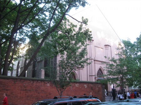
St. Patrick’s Old Cathedral from the exterior, front of the church.
A high wall was built around the church to protect those inside from
riots that seem to have taken place regularly in the mid 19th Century.
Irish vs Italian.


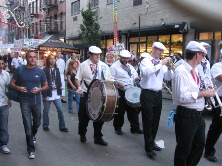
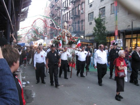
When we got back to Mott St. the street had been cleared, and
a slow moving parade was walking, led by the police and a band.


The marching band is a regular mainstay of Little Italy.
Often they’ll burst into your restaurant, while you’re eating,
and parade around the place playing their music.


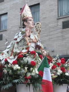
Slowly the procession moves onward. The center is the
statue of St. Gennaro being carried down the street.


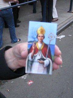
The statue has dollar bills pinned to its costume. An advance crew
comes up seeking donations. When you give them a dollar they
give you a prayer card with St. Gennaro’s likeness.


Once the Saint passed, the crowds opened up. Some were
following, some were heading in the direction of the booths.


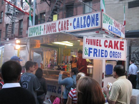
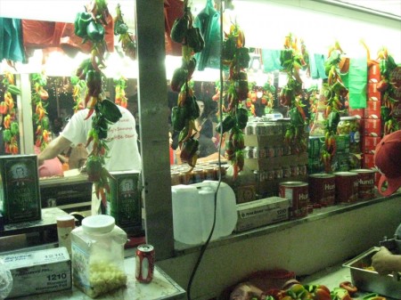
The food was everywhere now. Years ago I would’ve
eaten this stuff, but I’m too old for it now.


Even the colorful refrigerator magnets were shaped like food.
12 for $5 – a bargain.


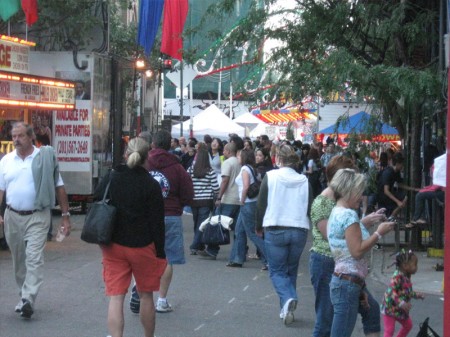
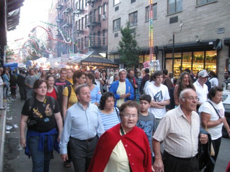
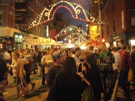
The crowds were beginning to get large and close.
It was Twilight on Mott Street.


Throngs of people all milling about on a very slow crawl
up or down Mott Street searching.


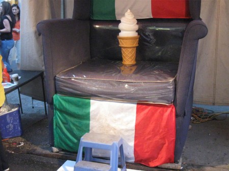
The plastic dairy queen cone sat on the lounge chair throne.
I noticed the Italian chair had plastic covering.
Not for human consumption.


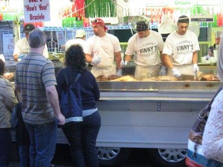
I liked the image of five big guys all working the grill at the same time.
They had more room to move than the crowds around them.


Evening was fast approaching.


Once we reach the heart, Umberto’s on the left, Ferrara’s on the right
we decided to take a break and went down the short side-street.


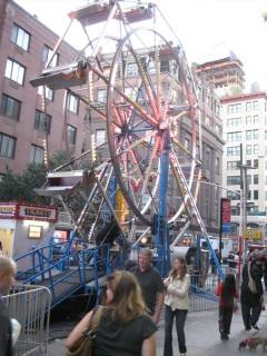
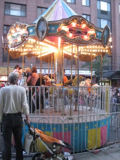
There we saw a lot of kiddee rides.
A dangerous Ferris Wheel and tiny Carousel.

We stopped for something to drink in a quiet wine bar.


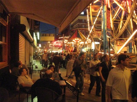
When we came out it was night, and the lights were on bright.
We headed back to Mott Street to take in the even-bigger crowds.


The restaurants on these blocks had set up seating pavilions.
These were often larger than the restaurants, themselves.
All were packed with waiting lines to get in.


One or two actually seemed attractive.


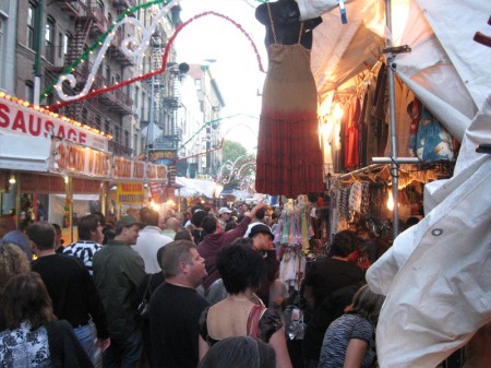
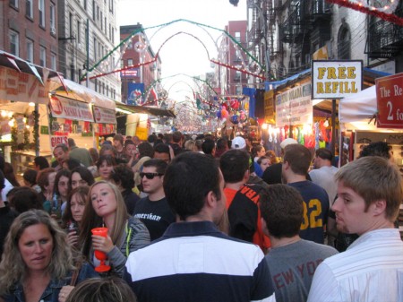
The crowds here were at their height.


It took almost an hour to walk this next block.
That’s when we decided to surrender.


We said goodbye to the “Feast” this year and headed to a
parallel street which was dark, empty and completely walkable.

Books &Hubley 26 Sep 2009 08:00 am

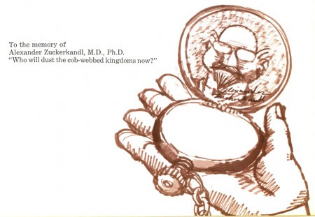
Zuckerkandl! book 2

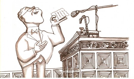
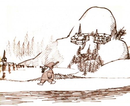
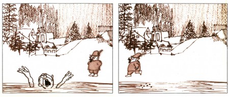
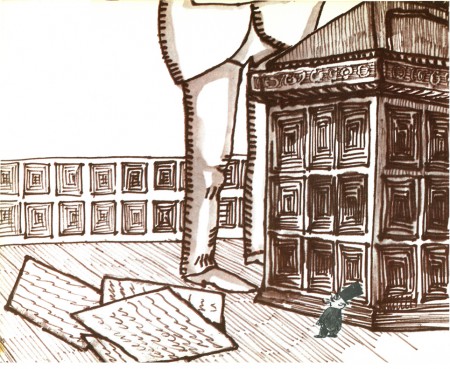
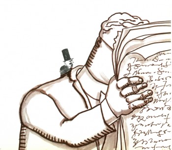
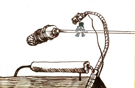
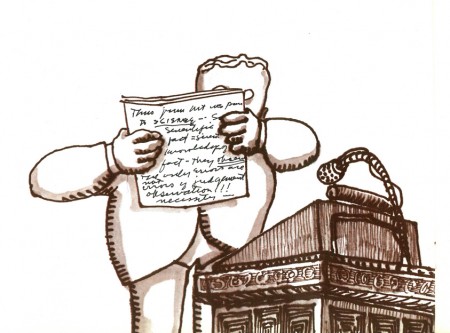
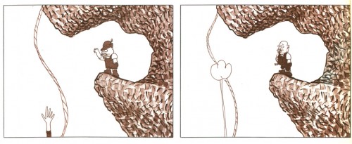
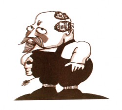
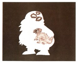
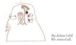
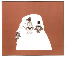
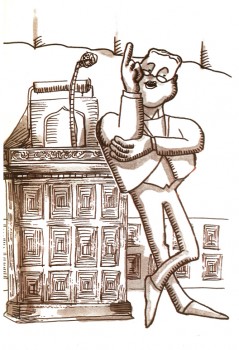
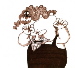
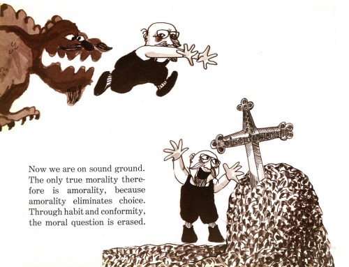
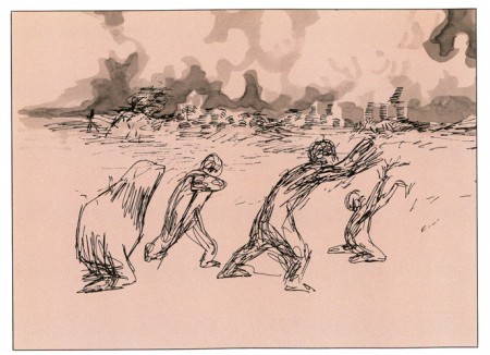
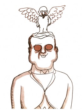
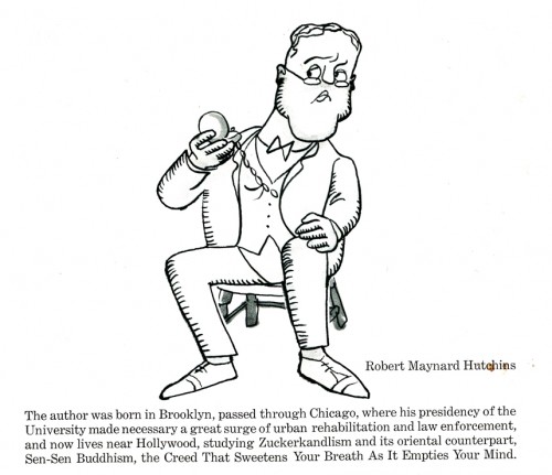
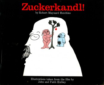
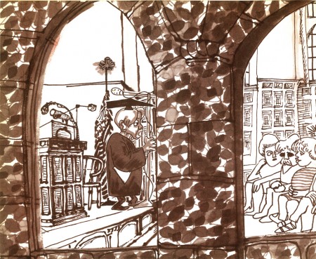
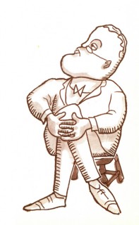
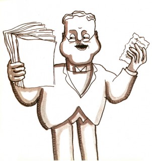
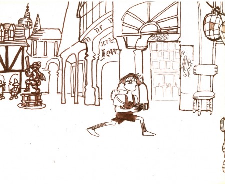
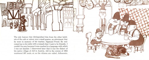
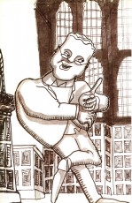
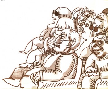
- I continue, today, with my posting of the book published from the setups of the John & Faith Hubley film Zuckerkandl!. This book was released by Grove Press in1968. It’s an adaptation of the comic lecture by Robert Maynard Hutchins espousing the philosophies of one, Alexander Zuckerkandl, M.D., Ph. D.

The artwork for the film was done wholly with Sharpie markers and Design markers. All of them bled through the Bristol paper for the backgrounds and the animation paper (cut out and glued to cels). All backgrounds were done by John Hubley. The animation was done by Vinnie Bell, Shamus Culhane, Tissa David, and Bill Littlejohn. The inking was by Faith Hubley, and coloring was by Nina Di Gangi & Sara Calogero.

23
(Click any image to enlarge.)

24

25

26

27

28

29
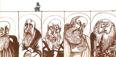
Saints

30
Sinners

31
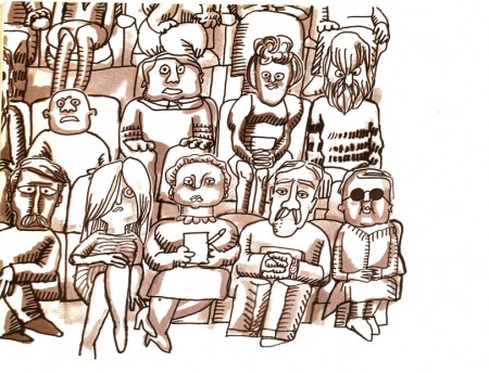
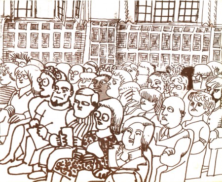
Audience

32

33

34

3536

3738

39 40

41

42

43

44

45

46

4748


Back Cover

I have some more artwork for this film which I hope to put up soon.

Daily post 25 Sep 2009 08:06 am

Leaf men/Priebe/Herzog/Luzzati & Barrier

- An article in Variety announced Chris Wedge‘s upcoming film at Blue Sky. There’s a history of studio politics behind this film.

Apparently, when Wedge and the author of the book, “The Leaf Men and the Brave Good Bugs,” William Joyce (Robots) weren’t able to get Fox to give the project a “go” they went to Pixar and Disney, with Fox’s blessing. Many meetings and discussions and planning later, just as Disney was about to make the deal, Wedge learned that Fox hadn’t and wouldn’t give up the rights.
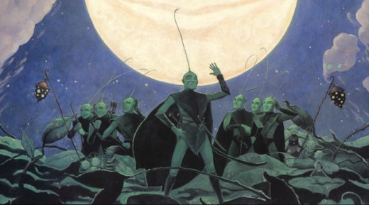
Fox wouldn’t respond to Variety except to say that it was proud to have greenlit the film at Blue Sky. Of course,they started the project now that Disney and Pixar wanted it and Chris Wedge.

It would have been enormously interesting to see Wedge move to work at Pixar. We would’ve seen the real difference between the two studios comparing the pre and post films of the director. However, we’ve been spared the excitement as he takes control of this “major animated title” at his home, Blue Sky Studio in Connecticut.

_________________
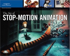
- Ken Priebe wrote to say that he is at work on a second volume of his book, The Art of Stop-Motion Animation. The release is scheduled for sometime next summer.

Of the book, Ken says: “I’m covering history of stop-motion again, but this time specifically focusing on the evolution of feature-length puppet films, from Starewitch’s ‘Tale of the Fox’ and onwards (to Wes Anderson’s ‘Fox’…funny how we’ve come full circle this year with foxes.) Also included will be rarely-talked about gems like Hansel & Gretel, Nutcracker Fantasy, Pogo for President, and others.”

Considering that the last year has seen at least four animated features done in stop-motion, the books are timely.

_________________
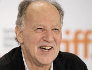
I really got excited this article. Werner Herzog will start to teach a class in Rogue filmmaking. “The director of Aguirre and Rescue Dawn is offering students a chance to experience ‘the exhilaration of being shot at unsuccessfully’ and learn skills such as ‘the neutralisation of bureaucracy’”

The Werner Herzog school of guerrilla film-making is open for business!

“‘The Rogue Film School is not for the faint-hearted,’ said the film-maker. “It is for those who have travelled on foot, who have worked as bouncers in sex clubs or as wardens in a lunatic asylum, for those who are willing to learn about lock-picking or forging shooting permits in countries not favouring their projects.”

Not very faint-hearted and one who has travelled on foot, I’m trying to raise the $1,450 to be able to attend the weekend course.

_________________
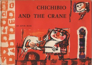
- Ward Jenkins posted pages from Emanuele Luzzati‘s first children’s book, Chichibio and the Crane .

This is an adaptation of a story by Boccacio which was adapted and illustrated by the artist. Luzzati was already a designer of costumes and sets for the opera, including La Scala, and he had been a cermacist. The book is designed for two color printing, as were many books in the day, and it’s amazing to see the excellent results the artist pulled out of the limitations he was given.

This book is hard to find, and I’m pleased to see it on Ward’s site.

_________________

- I doubt I need to direct any of you devoted to animation to Mike Barrier ‘s site. Recent posts are coming at us with a vengence. Animation history is active on that site, and you get a good idea of what it takes for someone serious about the business.
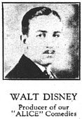
There’s the long and excellent post on the information gleaned from an ad in the Film Daily Year Book for 1927 which goes into depth about Disney’s break from Charles Mintz and the interviews with Hugh Harman and film director, Andrew Stone.

There’s the trip Disney made to NY and Carnegie Hall in 1940 where he got to hear the use of the sound device that would become Fantasound.

There’s the discussion of Walt’s connection to Norman Rockwell or Dr. Seuss‘s first cartoons.

This is probably the most important site for anyone interested in the history. Go there.
Books &Hubley &Illustration 24 Sep 2009 07:57 am

Zuckerkandl! book 1

- Weeks back I posted a piece on the John & Faith Hubley film, Zuckerkandl!. There I posted some animation drawings, models and a several pages from the picture-book version of this film, which is a favorite of mine.

The story is an animated version of an annual lecture given by author, Robert Maynard Hutchins. The lecture is a parody of philosophical theories created by the author in the name of the fictitious Alexander Zuckerkandl, M.D., Ph.d.

A comment from Tom Shea at that post asked for a specific couple of setups (that I didn’t even approach), and I thought that I should, indeed, post all of the illustrations from the book (which were culled from the original art of the film.) Thus this post; here art those illustrations:


(Click any image to enlarge.)

1

2__3

4

5

6

7 8

9

10 11

12

13 14

15

16

17

1819

20

21

22

23

The remainder of this book will be posted Saturday.

Animation Artifacts &Bill Peckmann &Rowland B. Wilson &Story & Storyboards 23 Sep 2009 07:37 am

Troll Bd 1

- The animated feature is a funny business. So much work goes into them and so few give back the intended spark that the many creators think they’re investing in the labor. Such a film goes through many incarnations and struggles on its way to the public that it’s a wonder that it even makes it. And when it hits the theaters some jerk like me will dismiss it with a few bad words.

Don Bluth produced and directed as many as 11 feature films between 1982 and 2000. That’s a lot of work, and a lot of talented artists worked with him to get those flms to screens. Not all of them, obviously, were successful. I’ve read about The Pebble and the Penguin, but I don’t remember seeing it though I probably did; and if I don’t remember I may as well not have. Yet how much intensive labor by how many people went into making that film? How many years of work?

A Troll in Central Park is another one of those 11. I’ve seen parts of this film many times over. This is one of those films that I always seem to turn on at exactly the same moment and see the mid-section again and again. I admit that I haven’t seen it to the end. It has a very distinctive look, yet it wasn’t compelling enough for me to stay with it.

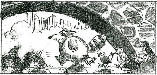
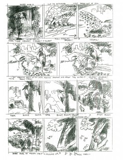
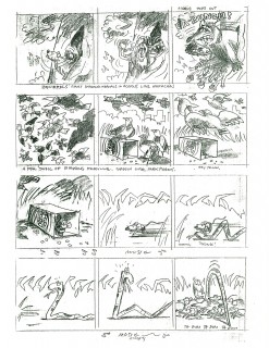
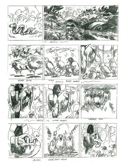
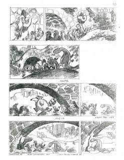
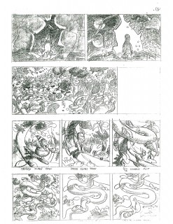
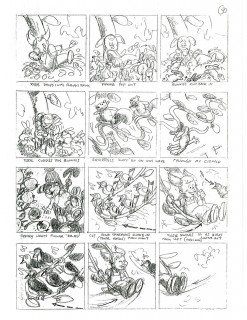
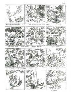
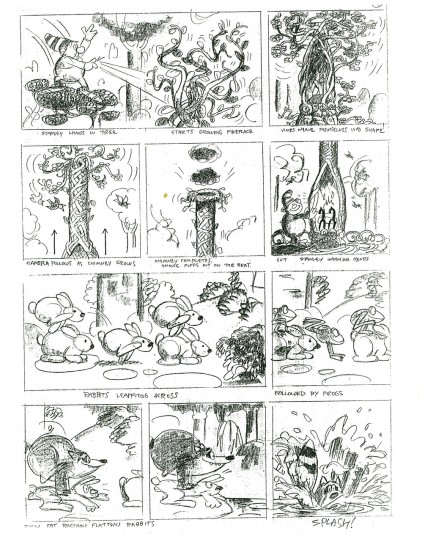
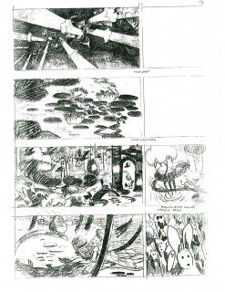
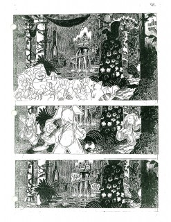
I have some of the storyboard sections done by Rowland Wilson, and I want to post them. There’s something to learn from every film fragment and this board offers much. Rowland was such a brilliant artist that it’s worth rummaging through any of his work, and he put a lot into all of it. This board is no exception.

Without further explanation or fanfare, here are 14 pages of board – actually I think they’re thumbnails – which were done by Rowland for A Troll in Central Park. These were given on loan to me by Bill Peckmann. His collection has been a real education for me.

1
(Click any image to enlarge to a legible size.)

2

3 4

5

6 7

8 9

10

11 12

13 14

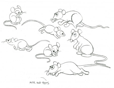
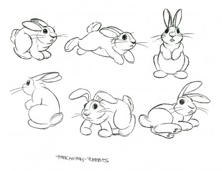
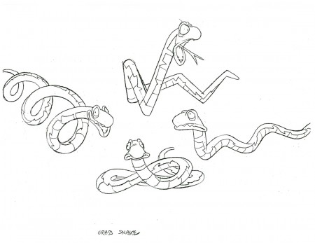
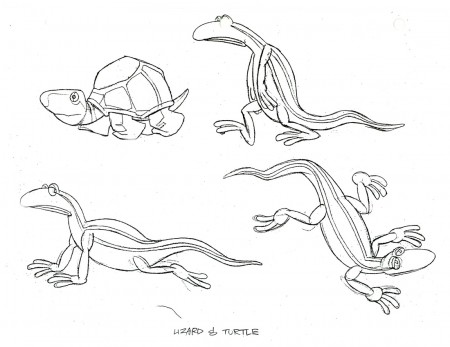
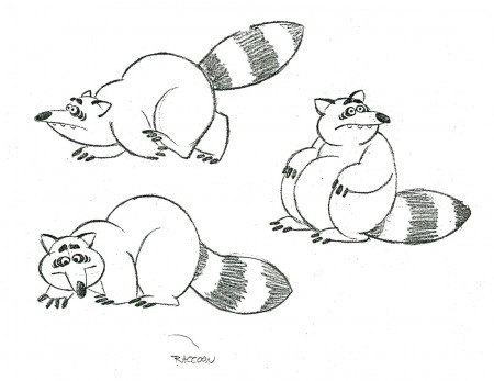
Here are a few character models for this sequence:


Can an animator have a better design for a racoon?
There’s enormous personality in this character.


Mice and Rats


Bunnies


A snake


Other reptiles

And here are some BG Layouts for this sequence:

1

2

3

I’ll put up more of these next week. Many thanks, again, to Bill Peckmann for the loan of this art.

Animation Artifacts &Articles on Animation &Puppet Animation 22 Sep 2009 07:31 am

Coronet George Pal

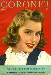
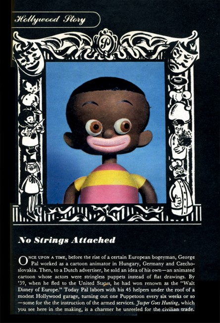
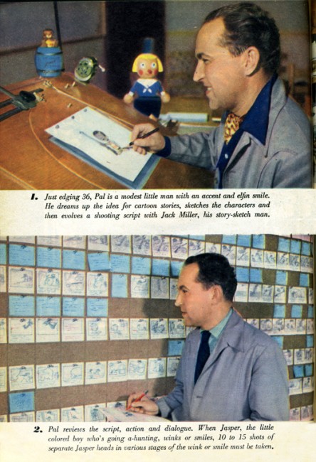
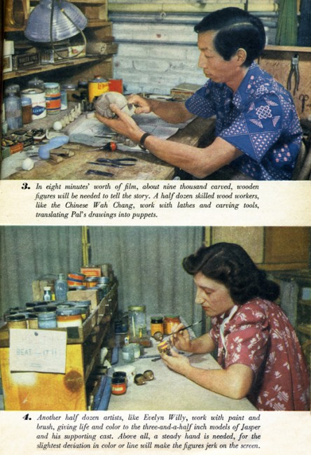
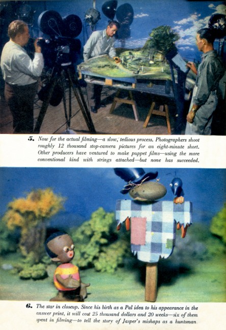
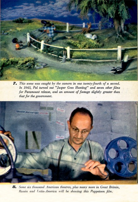
- In April 1944, Coronet Magazine printed an article about George Pal and the making of one of his very successful shorts done for Paramount. He had been nominated for seven Oscars for the shorts which included When Tulips Bloom, John Henry and the Inky Poo, and Dr. Seuss’ The 500 Hats of Bartholemew Cubbins, and he was given a special Oscar in 1943 for his puppet work.

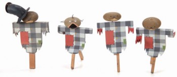
The short featured is Jasper Goes Hunting. This is one of the last of the films featuring this character, a holdover from the racist days of yore. Sort of a puppet version of Harman-Ising’s Bosco.

Pal’s style animated puppetry involved lots of replacement parts. If you wanted to move an arm, you had to create a dozen arms which would be replaced from frame to frame. It’s a very time consuming process and offers lots of opportunity of messing up a shot and having to start over.


(Click any image to enlarge.)

2

3

4

5

Note that Jerry Beck on Cartoon Brew just recently directed us to an auction
of many of George Pal’s puppets. Some of the puppets for the film featured
in Coronet are among those up for sale. This is the link to the auction.
Animation Artifacts &Bill Peckmann &Disney &Models &Story & Storyboards 21 Sep 2009 07:34 am

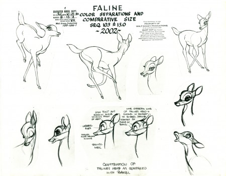
Bambi Board 1

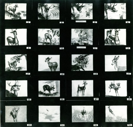
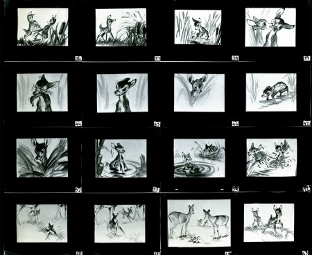
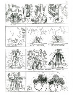
- Straight from the collection and the kindness of Bill Peckmann comes these three photo captures of a presentation board from Bambi.

One of the photos is missing, consequently on the first picture every other group of four panels is gone. If you look at photos #3 & #4, you’ll see that they should be read across. The top 4 images from #3 should be followed by the top 4 images from #4; then onto the second row.
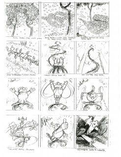
The same should be true of photos #1 & #2, but #2 is missing. What’s here is so good, though, that I’m posting it just the same.
As with past boards, I post the boards/photos as they came to me. Then I break them up (putting them into proper order) a row at a time. This is to be able to offer you the highest res copy of all.

1
(Click any image to enlarge.)

3

4

And now the breakdown of these three boards:

Photo 1

1a
missing four panels

1b

missing four panels

1c

missing four panels

1d

Photo 3 & 4 combined

3a

4a

3b

4b

3c

4c

3d

4d

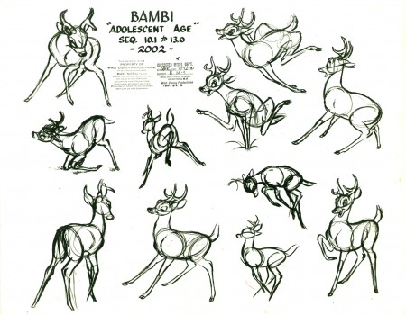
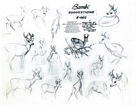
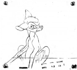
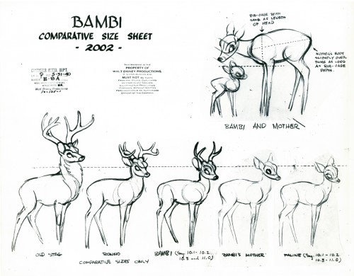
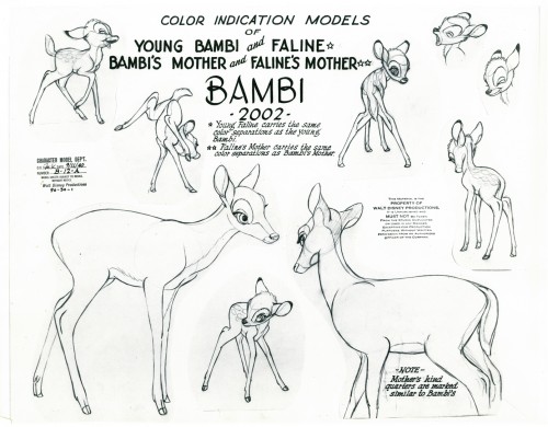
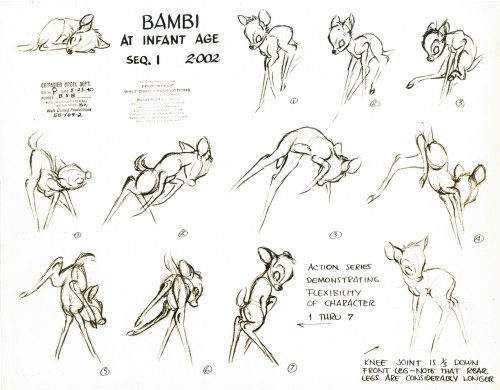
Here are some model sheets that relate to this material:

1

2

3

4

If you’re interested you should check out past posts on Rico LeBrun’s animal anatomy lessons: Part 1, Part 2, Part 3

There are another three pages of storyboard that I’ll post soon. Again, many thanks to Bill Peckmann.

« Previous PageNext Page »

eXTReMe Tracker
click for free hit counter

hit counter