- I’m an Independent Director/Animator/Producer of animated films. As such I watch closely what else is going on independently in the world of animation. I try to keep up with most of the short films made and being made; I try to keep up with all the people involved in that world.
 In the old days, one had to go to the Festivals around the world to see these films. ASIFA East often brought some of these films and filmmakers to our local meetings, but generally you had to travel to see the average film. The big, famous award winners would always show up somewhere. Nowadays, the Internet has brought more films and artists into my life, and I get to see more of the less than sterling flms from around the world. Ian Lumsden’s Animation Blog has introduced me to many films I wouldn’t have even known to look for including many gems. Niffiwan‘s Animatsiya in English brings Russian films that would otherwise escape my notice. There’s a lot out there, and I keep looking.
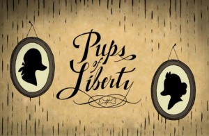
The fortune of having a modestly successful blog is that some filmmakers actually approach me. Such was the case with Jennifer & Bert Klein‘s Pups of Liberty. They sent me a link to their site which offered a trailer for their short film, and they offered to send me a DVD of the entire film.
When I looked at their site and trailer, it was obvious this wasn’t your average short. I saw the very full animation, beautiful backgrounds, and I looked deeper.
I saw the credit list and the names of James Lopez (Animator on Hercules, Emperor’s New Groove, Flushed Away and Princess and the Frog), Eric Goldberg (Animator on Aladdin, Fantasia 2000, and Princess and the Frog), Barry Atkinson (BG artist on Prince of Egypt, American Tail and The Lion King), and Mark Henn (Animator Ariel, Belle, Jasmine, Mulan and Tiana) among others. I had to see this film.
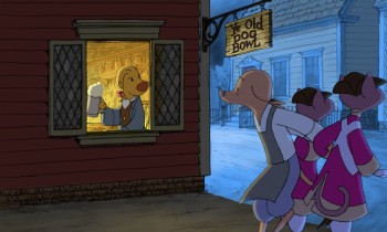
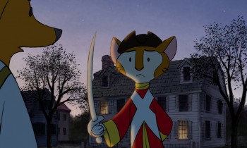
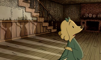
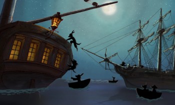
I wasn’t disappointed. The animation is sterling in the richest of full animation; the Bg’s are beautifully styled to feel like the period (the Revolutionary War) they’re meant to suggest, and the Direction couldn’t be cleaner or clearer or more focused. The film doesn’t waste a shot, but drives itself through the story in a very economical approach. Yet not a dollar seems to have been spared in making this the extraordinarily lush film it is.
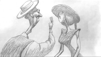
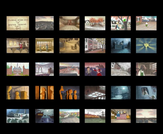
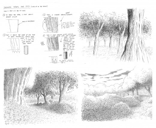
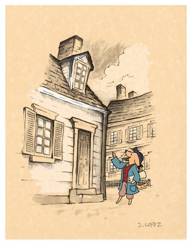
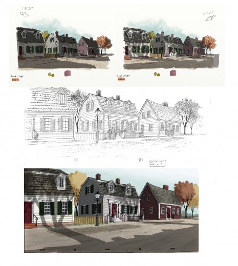
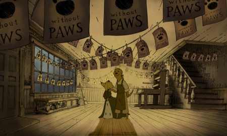
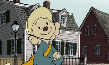
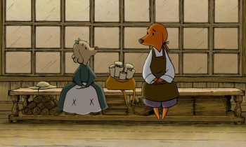
I had to respond to Jennifer and Bert Klein to ask for a short interview and they responded with answers to any question I posed and plenty of supportive material. Hence, I’ll post that Q&A today with some stills from the film, and tomorrow some amazingly attractive pre-production artwork. This film deserves a book of its own.

All images copyright © 2009 Picnic Productions
The Interview
.
Michael –
What prompted you to develop this story? It reminds me a bit of Disney’s Johnny Tremaine in the way that it focuses on a particular craftsman and his daughter, just as the live action film focused on a silversmith and his apprentice. Was there any inspiration from that film/book? Animation wise, it feels a bit like Ben & Me. Perhaps that’s because of the subject.
 Jennifer – I have always loved this era of history (Colonial/Revolutionary America) so when I first began developing an idea for a new short it was the first setting that came to my mind. I wanted to make a story that was quality and that a viewer would feel good about watching; I was also very interested in how to teach people concepts (like taxation and representative government) with a media like animation.
The story of the Boston Tea Party seemed like an iconic event to start with, since most American school kids learn about it pretty early on. The more I researched the more I was drawn to the story of the printer who started the Sons of Liberty. I love the idea of a group of ordinary people getting together to motivate change in their world, and I liked that that is something that translates internationally, to everyone.
 I grew up watching Robin Hood because it was the only Disney movie we had. At some point I saw Ben and Me and I have always liked that one a lot too. I like allegorical story telling, fables… so it seemed natural to tell the story with animals. In a way it lightens up the mood of it having a political bent- because really, they are talking dogs and cats.
Bert – We initially considered making a film about the first Thanksgiving with cats as pilgrims and birds as the native Americans. We moved ahead in time a bit and did the Boston Tea Party instead.
I’m sure you don’t want to discuss your budget, but you must have gotten a lot of incredibly talented people to volunteer to help you make the film. (Eric Goldberg, Mark Henn et al). The expense easily looks quite high.
Michael - Was the budget completely out of pocket?
- How did you create such enthusiasm for the project to do so?
- Now that you’ve finished what is your hope for distribution or future development?
 Jennifer – Our budget was all out of our own pocket. We might be a little crazy I guess, but this is what we do. It’s our hobby. Bert and I are very passionate about making shorts, and when we began the project we were also very interested in keeping ourselves in practice for 2d animation at a time when there weren’t any other 2d features being made at any of the studios. Our friends who worked traditionally started to hear about the film and we would have evenings with everyone over and do pencil tests and see them cut into the storyreel – and we’d always have pie, I would bake every night for the crew. The nights started to take on a family atmosphere, and I think everyone felt very comfortable to come and practice their art that they had been trained to do. Everyone was working at their highest skill level– Mark Henn was doing 20 feet a week, James Lopez stretched himself and all of our layouts, we had cleanup people doing the most beautiful work I had ever seen from them. I can’t say how we “created” enthusiasm because you can’t consciously create something like this. You’re just darned lucky that it happens.
We are submitting the Pups to film festivals, so we will have about 2 years worth of that, and then we’ll see what happens. My biggest hope would be for a series. I would also love to see it in the classroom one day.
Michael – It must have taken quite some time since I doubt you were able to work steadily on the film and had to fit it in between other jobs. (I’ve seen your resume and know you’ve been busy outside of this film.)
- How long did it take to make, given your work schedule?
- How were you able to maintain such a consistent (and consistently high level) look while working on it on a long, piecemeal schedule? (Assuming that was the case?)
 Bert – Most of the production took place during spare time over a two year period. The births of our two kids stretched out the last bits almost another two years.
One way we ensured consistency was having Jennifer do clean up keys over the different animators’ drawings to maintain the style. Mark Henn did a lot of animation on the film and helped raise the bar for everyone else. One person (James Lopez who was a supervising animator at Disney for a decade) did all of the layouts. I animated a lot of it myself and just kept working on it until it was done. Our assistant director Hyun-Min Lee was invaluable to us in getting this done, tackling technical problems, organizing scenes and x-sheets, and trackreading amongst many other jobs.
Jennifer – I took some time off to work on the film, so I was able to dedicate all of my time to it. I did the boards, designed the characters, did reds for the cleanup keys. I think that the simplicity of the characters saved us a lot of line mileage and made it possible for the artists to get through the footage quickly. They also look best against the backgrounds, which are done in a hand drawn pen-and-ink style and required something simple to contrast with them. We looked at the printwork from the time for inspiration- Paul Revere’s engravings especially really had a ‘homemade’ colonial feel, and you can see his personality in them and in the brush strokes of color used that we tried to invoke.
 It is hard to sit down and work after you have worked a full day, but I always remembered something Bert would say- “Even if you just get one drawing done you are one drawing ahead.” So I’d try and get one scene’s worth of layouts done a night, or read a track, or just something, and we’d inch forward until we were done.
Michael – Just as American Tail was compared to MAUS, your film has already received a comment on Cartoon Brew comparing it. There are very obvious differences, but I wonder if you thought about this possibility?
- Or worried about it?
- Did you ever question the idea of doing it with humans?
- Or would that have made you focus even more on historical accuracy?
Bert – I heard of MAUS, but I’ve never read it. Our main reason to make this was purely a labor of love. I watched Jennifer do great work as a story artist on lots of feature projects for studios that never got made or changed radically from the first inception. She was one of the original story artists on Where the Wild Things Are when it was a fully animated feature back in 2001. I wanted to produce a film that was a showcase for her story sensibilities because I felt that it might be the only way to get that pure vision to the screen. We also hope that people and their kids can enjoy it.
 Jennifer – Honestly I never heard of Maus. Whatever subject matter you make a film about though, there will always be something to compare it to — how many films are there about aliens? Or zoo animals? A setting is just a setting- it’s how you hook the audience in, how you make them really feel for and believe in your characters, and the experience that you give them that matters.
Doing a historical film with humans instantly makes it more serious- doing it with animals, you can’t take it as seriously and you can have more fun with it. Why animate humans when you can animate talking dogs? It made us laugh. We did it this way so that we could have some fun, and do what we love to do.
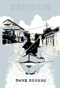 - The New York Times reported that Jonathan Demme is planning to make an animated feature of the book, Zeitoun by Dave Eggars.
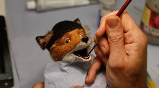
 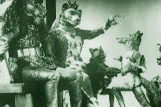 Unfortunately, what I’ve seen of The Fantastic Mr. Fox looks like poor limited animation in puppets – a bit like those old Rankin-Bass episodes of Pinocchio. The difference is that the characters, here, are covered with fur making them look more like an early Starevich film. (Regardless, I like Anderson’s films so I’m still looking forward to seeing this – however it’s animated.)