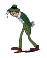
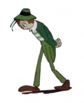
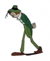
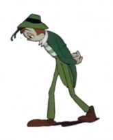
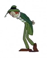
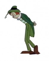
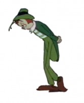
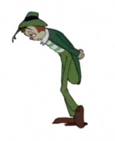
Animation Artifacts &Hubley &Story & Storyboards 09 Nov 2009 08:40 am

Doonesbury Start

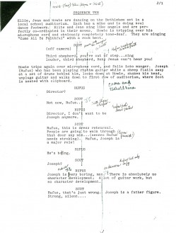
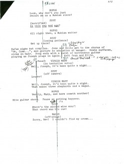
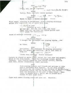
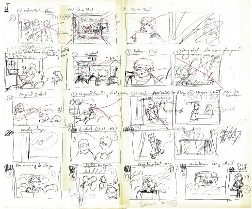
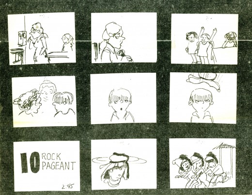
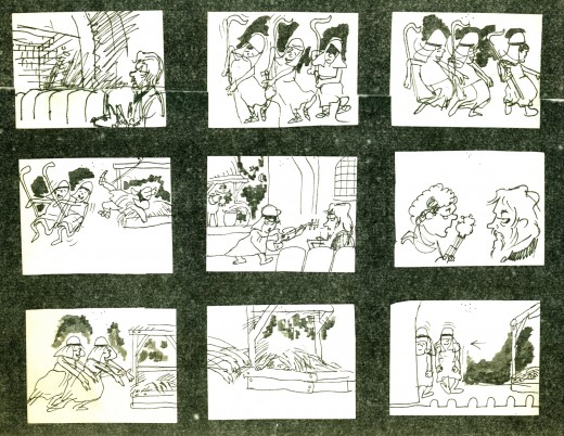
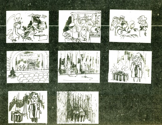
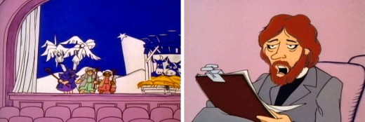
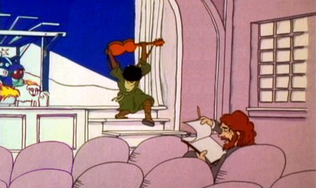
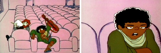
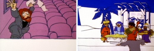
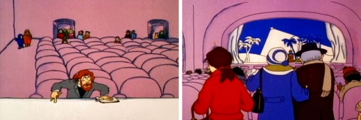
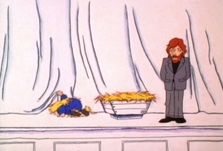
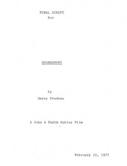
- Today it’s back to the Doonesbury well. Tissa David was brought on to do the sequence where the kids put on the Christmas pageant. Through these materials we can see how the sequence takes shape even before the animator/director gets to do any character posing.

She, of course, was given the script as well as the original voice track for the sequence. These are the pages for the sequence:

CovJ1
(Click any image on this post to enlarge.)
.
J2 J3

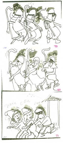
Tissa also had a copy of the storyboard that John Hubley and Garry Trudeau did for the film. (Note that there’s no dialogue indicated. This is the way John and Faith worked. They’d memorized the track by the time they did the board.)

Tissa then took a bunch of specific frames from the board and blew them up. With these she decorated her walls all around her drawing table.


These drawings weren’t so much to act as models but as inspiration.
She plucked them from many different parts of the board even ones
that she did not work on.
.


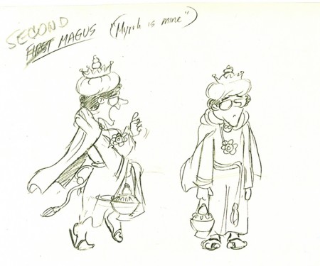
Here’s a drawing by Garry Trudeau that hung with the others.

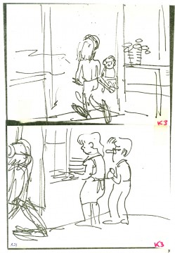
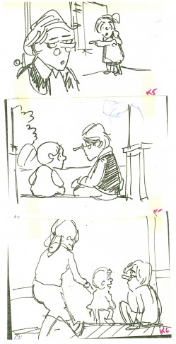
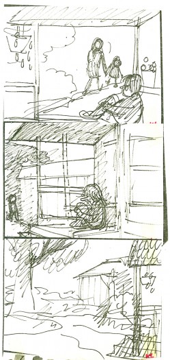
Then, Tissa did her own board. She modified the scene arrangement and cutting. She always did this with John’s boards. He trusted her implicitly and gave her free reign to alter.
I only once saw them disagree about a scene – it was more about how it should be drawn. John won. he was the director.
This rough board Tissa did was only for herself. The drawing was quick and rough, and the images were small.

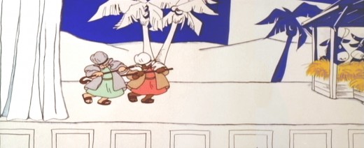
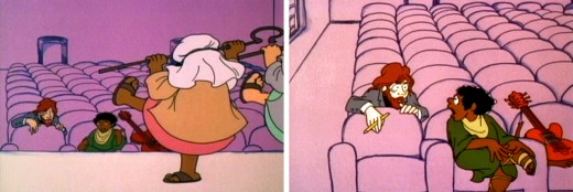
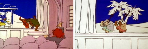
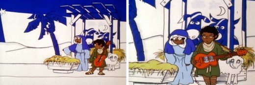
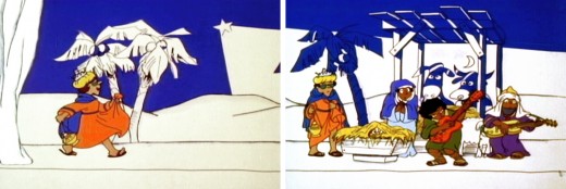
Finally, here are frame grabs from the actual sequence. Sorry, the colors are all over the place. The transfer is soft, and the colors never remain true.

J1


J2-3

J4


J5-6


J7-8


J9-10


J11-12


J13-14


J15-16


J17-18

J19

Photos 08 Nov 2009 08:47 am

YankeeCanyon

- The “Canyon of Heroes” is what they call Broadway in the Wall Street area. It was there that they had the big ticker-tape parades for the returning soldiers of WWI and WWII. Lately, such events honor athletes who have succeeded for the City.

On Friday, there was a ticker-tape Parade for the Yankees who had won the World Series. I’d never gone to one of these things before and thought this would be a good time to see what it was like (though, actually, I knew.)

My brother who always heads downtown for these events said, of course, that he was going, so I went in tow. It was a very bright, very cold, sunny day. The crowds started large and grew much larger as we got closer to our target, City Hall, where the big ceremony was going to take place. We knew we’d never get there, but it was worth seeing how close we could get.

For the record, there is no ticker-tape anymore, but the city had offered a lot of paper to the Wall Street offices for throwing. I don’t remember seeing much of any snowing paper, especially given the swirling wind that day. It just seemed like random litter going past the floats. More a snow shower than a snowfall. Where we ended up, people had brought rolls of toilet paper and were decorating the trees.

1
(Click any image if you want to enlarge it.)
.
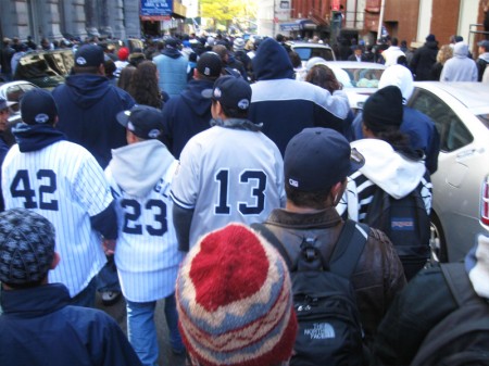
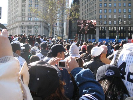
We headed down Broadway from Houston Street walking
as near City Hall as we could get. As you can see from this
picture, the street was crowded at the get go.
.
2
The cops started moving us in different directions off Broadway until
we ended up at a small park about 2 blocks north of City Hall. There
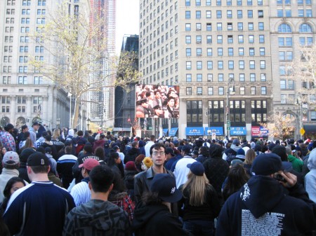
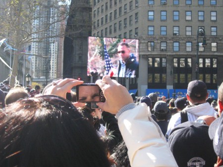
was a large TV monitor to watch the Parade feed but no sound.
.
3
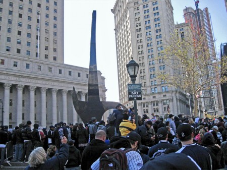
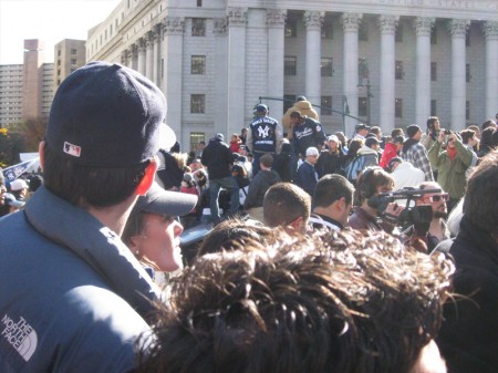
To the left of us was a statue, more a marker than
anything that represented anything to me.
I was surprised no one had climbed it.
.
4
Whenever a Yankee appeared on the big screen there was a wild
applause with shouts and hoots. Yogi Berra was one of the first
to appear on screen. Actually, Matsui was the first we saw, and his
applause was enormous. After all, he had singlehandedly won that last game.
.
5
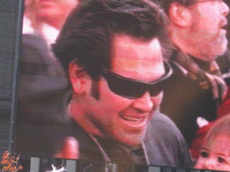
Johnny Damon also got a lot of love from the crowd. We could hear
cheers from a few blocks away before we actually go the feed, so
we always knew someone was going to show up soon.
.
6
To the right of us was an enormous throng of people. By the
time we got situated we were tightly surrounded. They counted
over a million people, and I believe it since we were disconnected
from the principal part of the Parade.
.
7
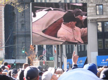
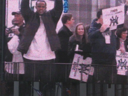
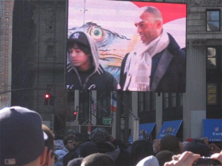
This video screen showed sub Yankee catcher Cervelli (I figured
this out later in the day from his clothes) and Alex Rodriguez in hat.
Kate Hudson was nowhere in sight, though she may have been there.
.
8
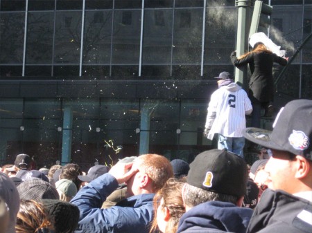
It didn’t take too long for people to start climbing lamp poles.
We expected the cops to show up and pull people down, but
no problems. Everyone was light and happy. Just a bit of jostling
as people kept trying to get to the front (closer to the TV.)\
.
9
There was a group to the left that made a lot of noise.
I think they could see up the road to City Hall. After they
cheered the empty float (truck) drove past.
.
10
C.C.Sabathia, rightfully so, got a huge applause when he appeared.
He pitched his heart out in a couple of those final games.
.
11
Behind us there was a group of kids that were pretty loud laughing it up
and seemed to be unsupervised. (Playing hooky – like me -no doubt.)
.
12
Jeter appeared and the crowd went beserk. Shrieking, screaming,
shouting for an endless time. I kept trying to recognize the older
guy who was behind him – until I realized it was his father.
.
13
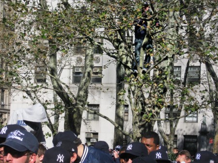
If you look pretty hard, you’ll see a bunch of kids in the tree.
They had climbed there and had good viewing seats, though
I think we all did, actually.
.
14
By now, the kids behind us had joined hands in a circle and
were singing some kind of play animal song. I didn’t recognize it.
.
15
Finally the Yankee Closer, Mariano Rivera. This was the cue to
tell us that it was all over and time to split. We’d watch the
ceremony at City Hall on a tv (computer) back at my studio.
.
16
We came across some Scottish pipers that had marched at
the beginning of the Parade. They had dispersed and looked as
though they were heading for a drink somewhere.
.
17
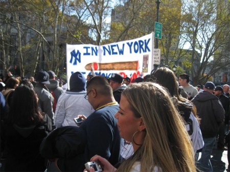
Finally, the last banner I saw.
In New York, we smoke Phillies.
Hilarious. It was fun (and exhausting.)

Comic Art &Illustration &T.Hachtman 07 Nov 2009 08:49 am

Renaissance Masters 2

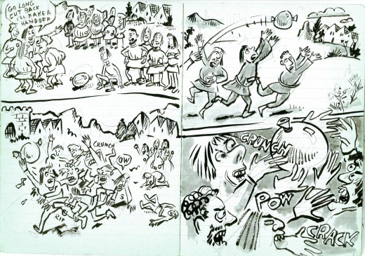
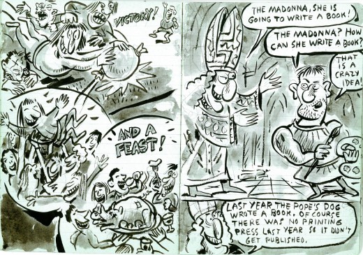
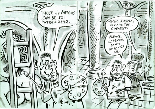
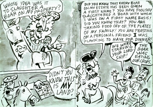
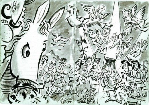
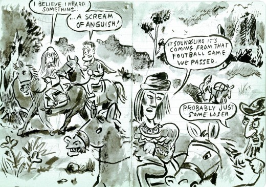
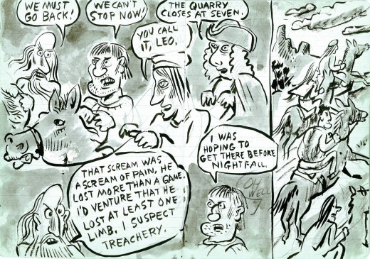
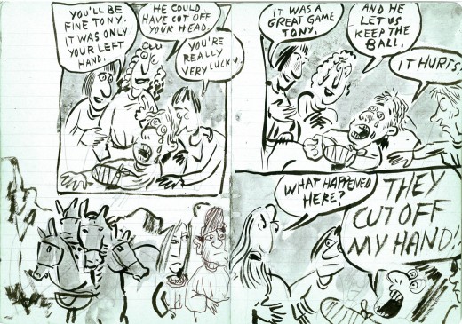
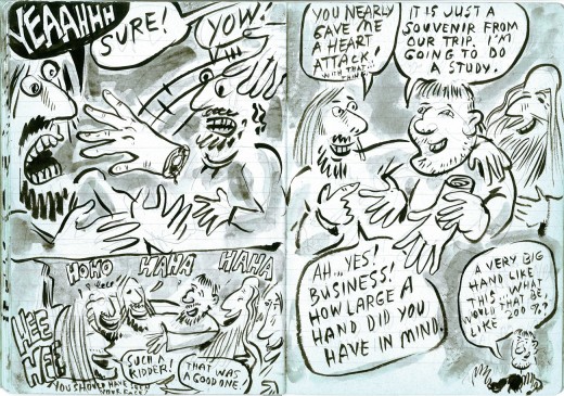
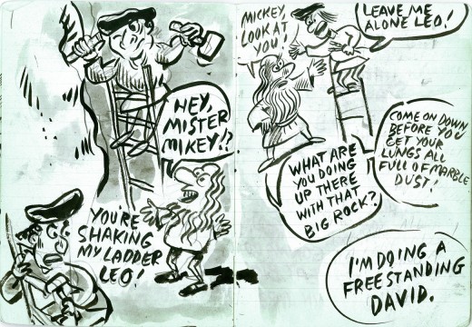
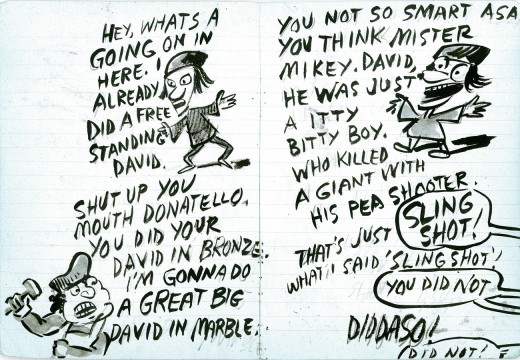
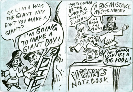
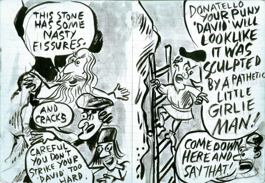
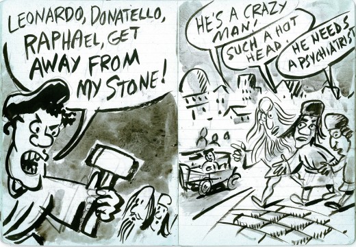
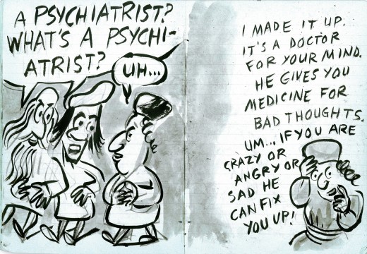
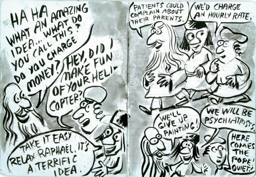
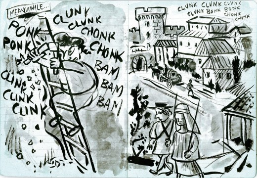
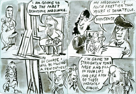
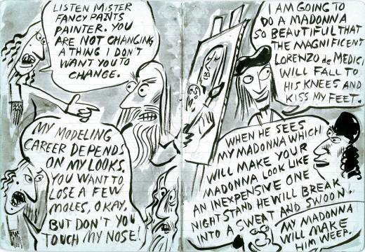
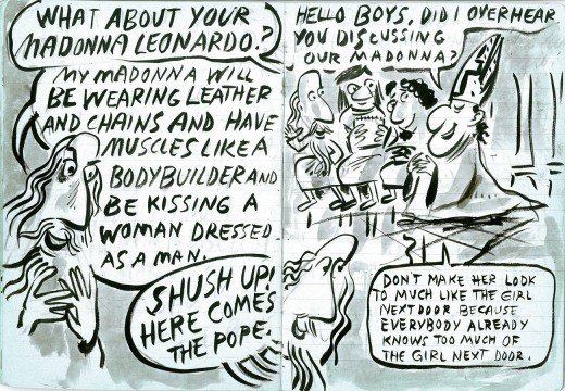
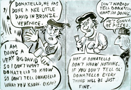
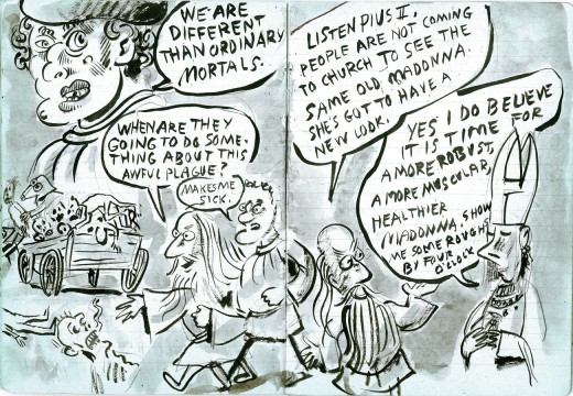
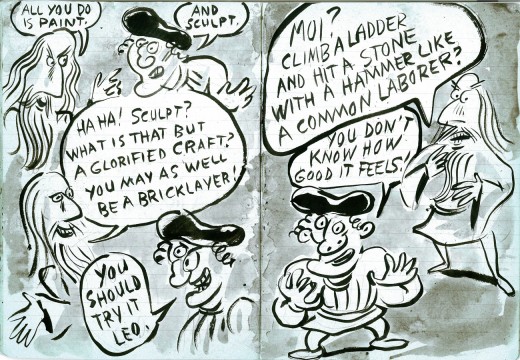
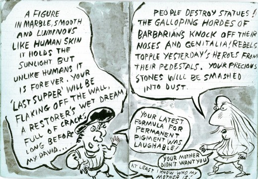
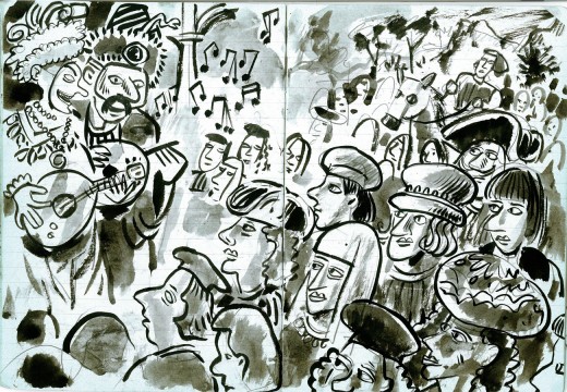
- It’s Saturday, so it’s time to continue with Tom Hachtman’s strip, Renaissance Masters. We started posting this last Saturday; (go here to see Part 1.)

18
(Click any image to enlarge.)

.
19
.
20
.
21
.
22
.
23
.
24
.
25
.
26
.
27
.
28
.
29
.
30
.
31
.
32
.
33
.
34
.
35

.
More next Saturday. Thanks, Tom Hachtman, for sharing.

Articles on Animation 06 Nov 2009 08:41 am

Ed Benedict – Animafilm Intvw

- Amid Amidi in Animation Blast #8 printed a brilliant interview with Ed Benedict. There was another interview in the European magazine Animafilm 6, 1980. It was written by Dana B. Larrabee.

Ed Benedict on Animation

We have often dealt in our journal with the prospects of computer animation. We believe that also the views of an advocate of the traditional methods of animated film deserve popularization.
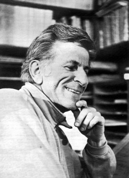
Ed BenedictEd Benedict first spoke to me on the telephone about an animated tv spot I had done for a local car dealer. When 1 learned of his extensive hack-ground in animation, I asked it” we might meet and talk further. Shortly thereafter we met twice at his home in Carmel, California.

We talked mostly of the views Ed has developed during his forty-plus years in the animation business. From those interviews I have assembled the following for those interested in a personal ac-count of the craft and business of animated filmmaking as it has evolved in the United States.

It wasn’t a business. It was a group of guys that had to organize themselves for eight hours of the day basically.

In 1930 Ed went to work for the Walt Disney Studios as an apprentice inbetweener. The Mouse was an established cartoon character then, and Walt trying to launch a new kind of cartoon series that did not feature a regular character. These were the “Silly Symphonies”.

Ed recalled: – When I first worked at Disney’s (show you how thorough that guy was), we were required to make our own little animation tests. This is when we were just assistants. We’re not animators yet. I did a horrifying job when I think of it now, of a guy taking a horn and blowing it. That sounds pretty damn simple . . . and it could look like it too. And you could do it and it would look like, “Oh, brother! Is that keen!” A guy big, full of air: then blowing out, turns thin, you know. No animation. Just going from A to B. But we had to do it our own way. Start with nothing. No instructions. Just a blank piece of paper, and how many drawings we took to do it, that was our own thing.

We had to take all of our test papers in to the test-camera which was a little Tinker Toy baling wire rigged-up thing. This was at the first studio on Hyperion. He wasn’t making cameramen out of us. He was just rubbing our noses in the business.
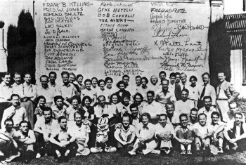
Oswald the Rabbit at LantzSo you got kind of an overview – I interjected.

Yes. An appreciation for every department. Then the cameraman would take it out and develop it – and not print it. We’d just look at the negative on the Moviola. We would get our strip of film and that was it. At the end of the day Walt would come around and look at it with us and just go over it.

There was one of the early “Silly Symphonies ” called “The China Plate” (1931) when I was assistant to Rudy Zamora. One of the scenes was trucking in on one of these plates with Chinese scenes painted on it. Rudy had this scene and he was quite delighted to have thought to do this himself; I remember him leaning over to me, flipping the animated drawings saying: “Hey, how do you like this?”

You know these little Chinese girls with the little Chinese bobs? Straight bobs. Whether they ever had them or not, I don’t know. That’s the way we thought of them at the time. This little girl was to turn from left to right – but when she turned, the hair trailed across her face. That had never been done before. That’s a first beginning to loosen up things. Not only animating the figure from here to herc~but there’s little things on them too, where a thing will trail an action and then come back again and then settle down. It was just sort of lifelike.

He also worked under Wilfred Jackson {who had previously been an assistant to Ub Iwerks) doing breakdown, clean-up and inbetweening.

I’d been there a couple of months and we were working on this picture that had an Indian character ot a fox fighting with another character. I noticed that in this particular scene the fox’ tail was missing. When I remarked on it to Jackson, he said there was so much action that no one would miss it. I guess you could say that was my first experience with the “facts of life”.

He chuckled and continued: – Jackson was to later become a first class triple-plus director . . . and he was the last guy in the place that looked like it. A wonderful guy . . . straight . . . and he didn’t appear to have a sense of humor. He just didn’t look like he belonged in that business. But I guess he was the first genius of the directing end who knew to get the “Disney” out of the Disney Product.

In 1933 Benedict went to work for Walter Lantz at Universal as an assistant animator. Then he worked for Charles Mintz at Columbia for a year-and-one-half before returning to Universal where he became a full fledged animator. It look an average of four years to make animator, Ed recalls.

Then on the side with a co-worker at Lantz’, he set up an independent company. They first tried to interest Richfield Oil in the idea of animated billboards – a project Ed describes as “successfully unsuccessful”. Then he hit on the notion of selling commercial ideas to independent theatres. But without a distribution set-up, the idea “took a long time to develop into a state of nothing”.
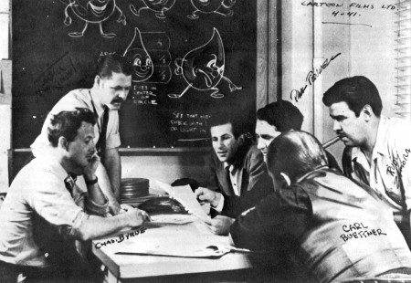
Ed Benedict among his collaborators.
.
From 1938 Ed worked with Paul J. Fennel at Cartoon Films, Limited making commercials for Borden’s, Shell Oil, Rinso, etc. He returned to the Disney organization in 1942.

Did you work on “Willie, the Operatic Whale”? I asked.

Yeah. I worked with Ken O’Connor on that. An excellent artist.

Ed went on to explain about the drawing materials used by the animators.

The paper that everybody used to use was called Management Bond.
What kind of ink did they use on the cells? I asked.

I can tell you back then it was India. And there were Gillot pens and there were other kinds of pens for certain widths. And then they started getting these spread lines and working with brush. The girls had to be pretty sharp with a brush. You couldn’t just take any girl, like with a pen. A girl had to be trained with a pen for tracing before she’d get into brush. Ed was kept busy at Disney’s doing “war stuff”. He worked on an aerology series for the Navy and Victory Through Air Power as well as educational films. This period of employment with the Disney organization lasted three years. After the war, he took a leave of absence to help Paul Fennel found his own cartoon studio.

About this time United Productions of America, better known as U.P.A. was getting under way.

Now U.P.A. was my idol. U.P.A. was the greatest – Ed enthused. Steve Bosustow was living down in Santa Monica on the beach and one time I visited with him. And in one of the rooms on the wall was a bunch of story sketches that he wanted to show me, things they were working on. They were a little weird-ish compared with the typical bulb-headed looking things. They were attractive and intruiguing. And that was the beginning of U.P.A.

It was later taken over by a different outfit – made a garbage can out of it. Like the Dusenberg. gone. Period. End. Fin.

Later Ed called Tex Avery at M.G.M. (whom he knew from his days at Universal) and asked him if he needed a layout man. In animation “layout” refers to the design and relation of the cartoon characters to the backgrounds and to the total visual concept of the film as a whole.

Ed explained: – You see when I left Universal I was an animator. But with Paul I was laying out and doing the models – everything. So I got away from animation – animation bored me. I don’t know. I wasn’t a good animator. But my inclination ran towards more drawing. So laying out and models got to be my thing from then on.

By models, do you mean model sheets? For the characters?

Not model sheets – models. Just a drawing of the one character . . . and overall three-quarter thing showing what it’s all about. Model sheets are based on models.

The model sheets are referred to by the animators as they work on their scenes. They show the characters in multiple views, different poses, expressions, etc., and their proportion to other characters they may be working with. By doing models Ed was designing cartoon characters.

At M.G.M. Tex Avery gave me a model sheet of Droopy to see what I would do to modernize it. He liked what I did and said; – Okay, come to work.

Later M.G.M. started cutting down. And TV started to cut in. So Tex’ unit was cut out. But Bill and Joe (Hanna-Barbera) wanted me to stay there and work for them. I didn’t work on “Tom and Jerry” – but other special pictures they were doing. Then the thing got cut way down. I left the place and was home doing comic books for awhile. And then I got a eall from Quimby (Fred Quimby was in charge of the cartoon units at M.G.M) to come in and talk to him about doing the set-up for this Gene Kelly thing. This was a whole picture -not just a sequence. It could have been really good-looking but they were all too sissy about it.
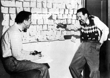
Ed with Mike Lah
.
In the meantime Tex established his own commercial unit, Tex Avery Cartoons, and is sending over model jobs for me to do via one of the animators that worked at M.G.M. who was doing outside work for Tex. Hell, I was making more working a half-hour on a model (for Tex) on M.G.M.’s time than I made a whole day sitting there for M.G.M.!

Things were getting pretty hot over here, beginning to fold up. And Joe and Bill are working on things of their own. I did the Ruff ‘n’ Reddy models for’em. Anyway, we’re doing commercials over at M.G.M. for a while. For Schlitz, S-H stamps, and then the thing folded. Meanwhile I’ve been doing models and commercial layout for Tex. Hell, I’m making a minimum of twice what I was getting at M.G.M. I was doing all the H-B models “Huckleberry Hound”, “Quick Draw Me Graw”, “Flintstones”, etc. as well as the layouts. Now when they get loaded down at H-B, I get a call.

I asked Ed about working with the numbering system I’d heard was used at Hanna-Barbera. He called it a “file and number system”.

It was driving me crazy – he sighed. You would spend more time getting up from the board here and going over checking the files and numbers to see where you’re going . . . or looking up the right background. It would’ve been less work if I’d done the whole thing myself.

What about the u-nions? I asked. What’s the difference between the two, if any?

I can’t say what he is now – he emphasized. I can say of the middle era (The ‘forties and ‘fifties). The screen Cartoonists ‘Guild was considered a “Liberal” u-nion. The Motion Picture Screen Cartoonists was part of the I.A.T.S.E. It was considered the more moderate of the two.

If you’re looking for work in Hollywood, do you have to belong to the u-nion to get in down there?

Yeah. Furthermore, they’re not that long on work. So all the u-nion guys would have to come first.

I moved up here in ‘sixty-one. If the work followed me -fine. If it didn’t, the Hell with it! I’d had it. And I’d never liked it since I’d been in the business anyway. There were very few “talented” guys in the business. But the ones that had it – like Art Babbitt, Tom Oreb, John Hubley, Bob Cannon and Norm Ferguson – they were real geniuses! But many of the guys couldn’t draw their own breath. In the earlier days, the business was made up of cartoonists more than artists. Had there been more artists, there might have been a different picture.

Where did you think the future of animation lies?

I think it’s walking towards its grave. I can’t tell you how far it is between here and the grave. It’s like centuries ago when guys were carving with chisels, these ultra-fine hunks of lettering and sculpting in marble. The exactness. The fantastic things they were doing then. A guy could stand off and say: “Gee, that’s what I’m going to be when I grow up.” And you can go and keep saying it ’cause it was so beautiful, it was so superb-what’s better? But is it? There ain’t none of it. None. It’s just an old dead art.

Is that analogy valid for animation?

Sure it is.’

Why? Look at some of these television commercials…

That’s not animation. That’s using the animation medium … To me, most of it has no advertising value whatsoever… It’s just a lot of talk that somebody is trying to sell somebody and they’re not. The ad agencies are all wrapped up in their own immediately constructed little world. And they turn to each other and all of ‘em think: “This is ours”. Completely losing the total picture of whether it’s ours or yours or the next-door-neighbors’ . . . What’s it doing? What’s it supposed to do?

You don’t see any future in the business?

No.

Do you think it’s stupid to try getting into it?

Well, I can afford to be wrong. But for the most part . . . I would say “yes”. Stupid from the standpoint if you think you ‘re ever going to make something out of those things. But not stupid from the standpoint if you’re fascinated with it. If you’re intrigued to the point that nothing else will do, no, you’re not stupid. You’re smart. Go through and milk it . . . Being in the business was beautiful. Being in the business was keener than Hell. Informal! Friends of mine that had to work in offices – oh, they envied the Hell out of me. And I didn’t blame them!

With regard to the dollars and cents end of animated film making, Ed felt that the producer “might make a couple of bucks.” He cited ever rising labor and material costs as the main reason the profit potential in animation is lessened all the time.

Together we examined some “how to” books on animation by Eli Levitan and Roger Manvell. Later, Ed had this to say about them:

- Much of this stuff in the books was too much analysis. That never was done at all. That attitude just wasn ‘t there. It was more a natural reaction to things that they were seeing, or doing, or thinking.Finally we discussed “contemporary animation”. Ed took a pretty dim view of it all.

I was looking at these things on channel nine. And every one of ‘em are done in Yugoslavia or Arabia or some other place where the guys don’t make ten cents an hour. A gay is sitting down at a drawing board and doing anything that comes through his mind…I don’t even put it in the category of drawing. Animation? No such thing.

Have you seen any computer animation? I asked.

I have no use for it – he answered quickly. I have nothing but utter, unadulterated contempt for it.

Are you sure you’re not a little afraid of it?

Not in the least. It will never in your time touch animation. They are still a mathematically run machine. It hasn’t an iota of looseness. They’re finding out that computers have their limitations . . . It always has the same flavor, same attitude. It’s always there as a graph.

One can take issue with some of Ed’s opinions about animation as apart form and as a business. But what makes his remarks so compelling is his first-hand knowledge of the craft itself and of the many personalities who made the business of animation a “business”. His sentiments concerning the current “state of the art” are disconcerting to the animation enthusiast. But they are the outcome of his having been caught up in the rise and fall of the theatrical cartoon studio operations as well as the growth of a never, and to him, less satisfying sort of production geared to television.

I also suspect that this attitude stems from his own genuine concern for the craft – his frustration ai what animation has come down to as opposed to this notions of what it should be.

To some, Ed’s opinions may seem overly pessimistic. But before Ed would consent to this interview in preparation for this article, he forewarned me that he would not “romanticize the cartoon business”. He explained that this was his pet peeve with most of the articles and books that dealt with the history of his craft. And Ed Benedict was not about to further that sort of misrepresentation.

photos:
1. Ed Benedict
2. The Oswald the Rabbit team at Lantz
3. Ed Benedict among his collaborators
4. Ed Benedict and Mike Lah

_________________

A couple of comments.
- Sorry, I had to write the word “u-nion” that way because WordPress (on several different computers wouldn’t allow me to save that word. (Secret conspiracy?)

It’s unfortunate that Ed wasn’t asked more about his brilliant work at Hanna-Barbera. That’s where he truly came into his own and had such an enormous effect on the world of animation.
Commentary 05 Nov 2009 08:56 am

Yankees / Scrooge

GO YANKEES!

_______________________________

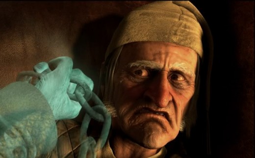
- Zemeckis’ Disney’s Christmas Carol was reviewed in the trades.

Uh, oh!

Here are some pieces of the Variety review by Todd McCarthy:

    Shortchanging traditional animation by literalizing it while robbing actors of their full range of facial expressiveness, the performance-capture technique favored by director Robert Zemeckis looks more than ever like the emperor’s new clothes in “Disney’s A Christmas Carol.” Charles Dickens’ 1843 novella and screen perennial has been retrofitted here as a so-called thrill ride in which Scrooge zooms above the streets of London and rockets halfway to the moon and back, only because now he technologically can. . . .

    But then, as with “Romeo and Juliet” and other imperishables, perhaps every generation gets the “Christmas Carol” it deserves: The postwar British feature, starring Alastair Sim, was no doubt the best; next came a bloated, musicalized post-”Oliver!” version; then, in the ’80s, Bill Murray starred in a hipster “SNL”-era modernization. In this context, it makes a certain sense that the early 21st-century edition is dominated or, more accurately, dictated by technology; there’s no other impulse running through it other than the desire to create shots and pull off effects that would have been impossible, or at least prohibitively expensive, prior to the invention of CGI, the performance-capture technique and the rebirth of 3D. . . .

    To capitalize upon the latter, Zemeckis favors placing objects such as hands or chains in the extreme foreground so as to create a 3D deep-focus effect. He’s also developed many scenes with an eye to moving the camera constantly in relation to the characters and settings, keeping editing to a minimum. But given the overall animated patina, this doesn’t create anywhere near the beauty or excitement that similar moves would in live-action cinematography. Also, the diminishment in image brightness by at least 20% when the 3D glasses are put on is quite noticeable.

And here’s bits of Kirk Honeycutt’s review from The Hollywood Reporter:

    Bottom Line: Exuberant movie technology overwhelms, then buries Dickens’ emotional tale.

    Didn’t Charles Dickens use to be the author of “A Christmas Carol?” Well, now it’s “Disney’s A Christmas Carol” that opens later this week. Even that’s a misnomer. It should be “Robert Zemeckis’ A Christmas Carol.”

    . . . as the spirits escort Scrooge through his sorry life, Zemeckis gradually makes this “Christmas Carol” his own. But as he does, with his intense reliance and belief in movie technology, this auteur shuns the beating heart of Dickens’ story.

    Dickens’ “A Christmas Carol” is about emotions. It’s about how emotions can get stunted and tramped down, how they can be revived and how empathy and affection can bring joy to the human soul. One will find none of that here.

    . . . The worst offense to the spirit of Dickens comes with Tiny Tim. He, more than any other character in this tale, represents its true spirit. In the Zemeckis version, he’s a dress extra who tiresomely exclaims, “God bless us, everyone!”

    So deck the halls with praise for the crew . . . But a rousing humbug to those who confuse the media for the message.

Looking forward to it.

Animation &Fleischer &Frame Grabs &walk cycle 04 Nov 2009 08:27 am

Hoppity walk

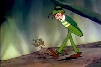
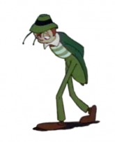
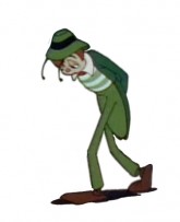
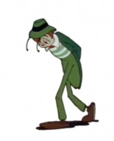
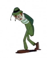
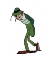
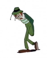
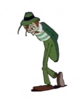
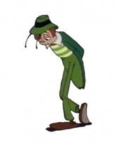
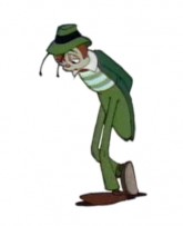
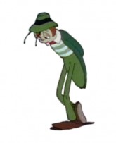
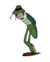
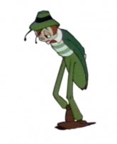
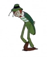
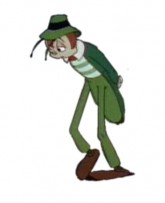
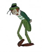
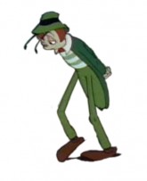
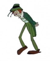
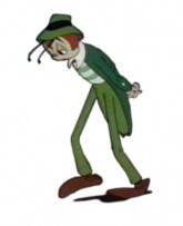
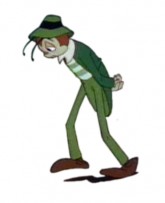
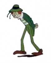
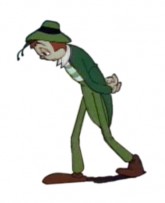
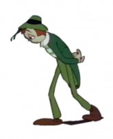
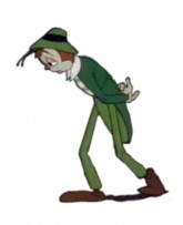
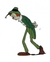
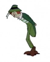
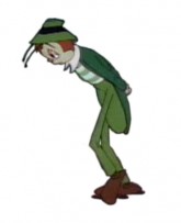
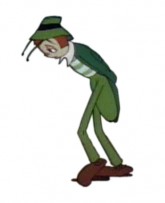
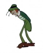
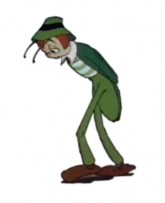
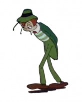
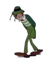
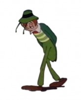
- Hoppity Goes To Town is a feature I’ll always love. The second and last feature from the Fleischer brothers’ studio is a bit limited in its animation, but I like the story and the way it’s told. Admittedly, this film is something of a personal favorite because I first saw the film in my formative years, age around 10. Today, I recognize some of the problems it has, yet I find it a completely charming and entertaining animated film.

The Fleischer studio had figured out how to make a cartoon, and this one was arguably ahead of its time. It’s the first animated feature based on an original story. The character of Hoppity, obviously built on the personality of Gary Cooper, is endearing to me, and I think the movement of this character not bad. There’s some distortion and bad drawing throughout the film, I don’t really mind.

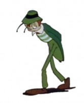
I’ve chosen a walk that was not quite a cycle, and I’ve made it one. It starts with a kick of dirt – Hoppity is disappointed and frustrated – and quickly moves into this section. It’s a slow walk – 52 frames, on ones – and is a complex one. He pulls both legs in a subtle and circular arc as they move forward, lumbering from left to right to left. His legs almost look like matchsticks split at the knees. It makes for an interesting walk (though they do change size a bit as they move.)

Here’s Hoppity:

1 2 3
(Click any image to enlarge.)

4 5 6

7 8 9

101112

141516

171819

202122

232425

262728

293031
323334

353637

383940

414243

444546

474849

505152

Hoppity’s sad walk on ones

[ Javascript required to view QuickTime movie, please turn it on and refresh this page ]


Click left side of the black bar to play.
Right side to watch single frame.

Commentary 03 Nov 2009 08:40 am

Lmtd anim8n

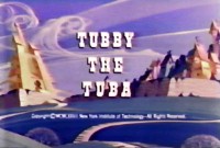
- There was a quiet day at the studio during the production of Tubby the Tuba. Johnny Gentilella and I were left alone for a few minutes during our lunch break. I took the opportunity to ask him a question I’d just about rehearsed asking for months prior.

While working together previously on Letterman for the Hubleys, I was the person who assisted all of the animators and inked all of the drawings. This was for 20 mins. of animation done in 2½ months in 1973. As a relative newcomer to the business, I studied and absorbed every drawing and exposure sheet that came my way. I was working with the work of some brilliant animators.

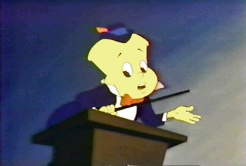
Essentially, in the kindest possible way, I asked Johnny Gent why a scene he did for Tubby at a podium matched a scene he did of Spellbinder, from Letterman, at a podium almost drawing for drawing. The exact same scene with two different characters for two different films.

Johnny explained that in these days of low budgets and tight schedules the animator took the brunt of the responsibility for the movement despite the fact that there were no pencil tests to check on their scenes. If it didn’t work, the animator usually lost the job. So, said Johnny, he had to fall back on what he knew worked, use all the tricks at his disposal and make it acceptable to his client – the film’s director.

There wasn’t the opportunity for him to play around or experiment. He used what he knew. I understood his logic and said so.

I remember, a couple of months later, telling Tissa David this story. She responded that Johnny was so lucky to have such a memory. She wished she could remember what she’d done from day to day so that she could repeat it. But no. She had to come out drawing, experimenting and creating every scene from scratch.

__________

While having coffee with John Dilworth last week we got into a conversation over something I’d posted on my blog. The subject started with the idea that humans do little motion in most of their activities.

Ralph Bakshi . . . said that humans stand still most of the time, but that if an animated character would stay still, it wouldn’t be acceptable. It would look like poor limited animation. It’s a problem good animators enjoy solving.

This led to our discussing what kind of animation is actually out there and how limited or generic or poor the movement. Then John said something that stopped my brain in its tracks. He said that there’s also the animator who doesn’t do the movement that he actually imagines for the character but limits it. The reasons are many: money, speed, laziness, whatever. The acting is bad because the client and/or public will accept the cheaper movement, so why do more.

I had to admit that this is probably true for 99% of all bad animation out there. Assuming the animator can do the movement properly, there’s the need to keep the money flowing, get the job in & out, or, in some cases, do all you need do to get the point across. It’s a cynical thought, but it’s probably also an accurate one for the reality of the world of the animator.

__________

Animation’s come a long way since those days in 1973 when I worked at Tubby the Tuba. Now there are computers to “make our jobs easier.”

Programs like Flash not only encourage limited animation but demand it. As a matter of fact most computer-drawn imagery is more easily designed for limited animation. Though I’m writing and thinking, principally, about 2D – flat art, I expect some of the same problems exit for cg animation. Animated features done “traditionally” aren’t breaking much new ground either.

Now, I gaze at my navel wondering how much work I’m doing is in any way “daring”, and thinking that I have to start getting serious. I think we all do.

Animation &Animation Artifacts &Story & Storyboards 02 Nov 2009 08:25 am

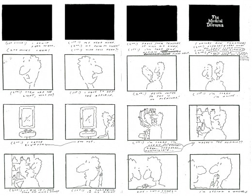
Medical Dilemma

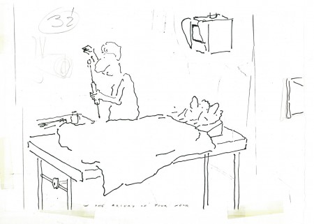
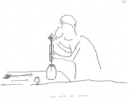
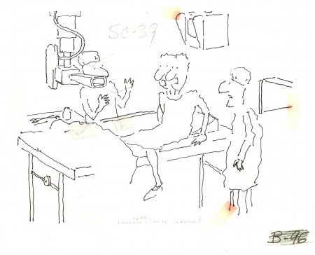
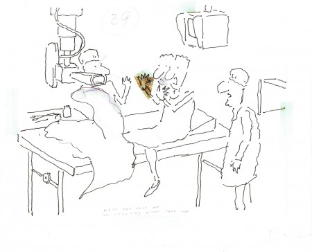
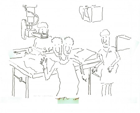
- One of the best, most intelligent films I worked on was a short film R.O.Blechman made for NBC television. The network was doing a three hour evening dedicated to the state of health care and hospitals in America. They wanted Bob to make a film about over-testing to find things to resolve a patient’s complaints.

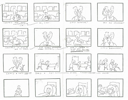
Bob and I made numerous trips to Columbia Presbyterian Hospital to get information about procedures for testing the brain. This was back in 1977. CATscan tests were just then starting to come into their own. It wasn’t as frequently used as it is now. Other tests were demonstrated for us, and we spent several days watching these exams being done. Dyes being injected into the brain, machines that turned the patient upside-down, lots of big-named procedures

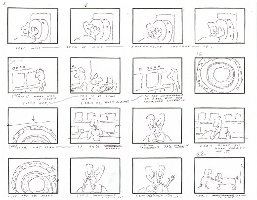
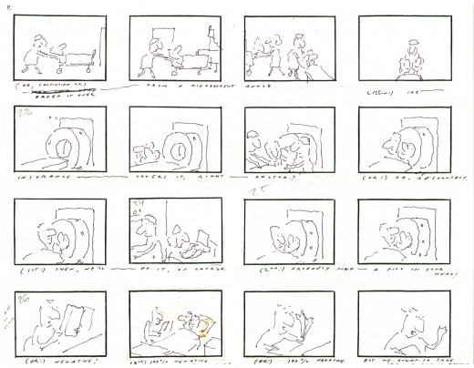
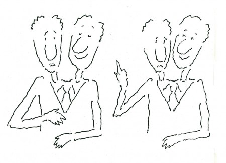
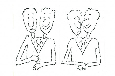
Bob wrote a piece about a set of siamese twins – a man with two heads. The two heads kept a running discussion about a headache one of them had. They went to a doctor who decided to do some basic tests. They discovered nothing. More tests – nothing. Finally, the doctor wants to try one more test. The twins see the needle and get off the table. They refuse this final test. The two heads join into one.
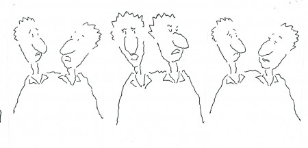
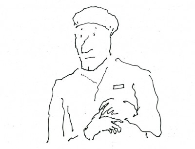
The doctor, in cu, starts to talk to himself, aloud. His head splits into four different opinions discussing the situation, and the film ends.

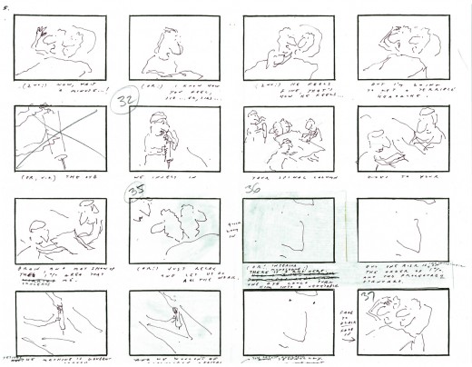
Here’s Bob Blechman’s storyboard for the film.

1
(Click any image to enlarge.)

2

3

4

5

The whole film, about four minutes, had fewer than four months from beginning to end. The board went through lots of changes on the fly as the animators worked. Tissa David and Ed Smith were the primary animators on this film, although Ed did the scene I most think about within the film. The third and last animator on was Cosmo Anzilotti. I assisted all of them in whatever their needs – clean-up, inbetween or inking.

There was at least one scene of genius in this movie.
That final cu at the end of the board where you see the face of the doctor fill the screen – it animates in on him – all lines, just lines, that completely told that doctor’s thoughts and mindset. Lines on the screen that you completely bought as a face. A face with multiple voices and personalities arguing with itself. It was brilliant and remains one of my all time favorite bits of animation.

The voice of the twins was done brilliantly by the late, great Anthony Edwards. He was the perfect voice for the Blechman character, and he did quite a few of them over the years. This was one of his finest performances for Bob.

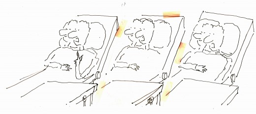
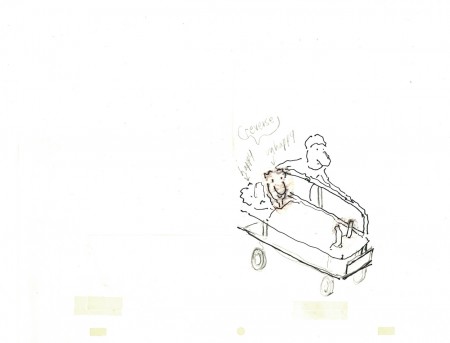
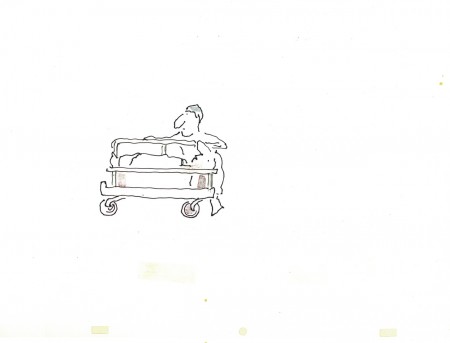
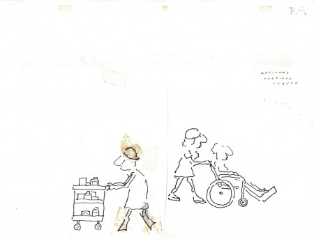
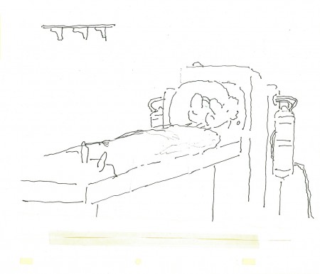
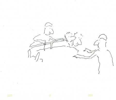
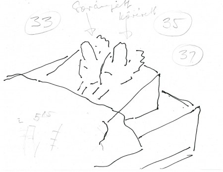
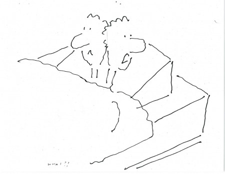
Here are some of Tissa’s drawings and layouts:

1
This collection of drawings stood over Tissa’s desk while she animated.

a
Here, I’ve broken that long piece into three smaller.

b

c

2
This is another drawing from above her desk.
The yellowing is the tape that held the drawings together.

3
The twins being wheeled to their exam.

4
Passing gurneys in the hospital hall.

5
More of them

6
Here the twins are about to face a CATscan.

7

8
The patients questioning the final test.

9

10
The doctor preparing the NEEDLE.

11

12

13

14
The patients leave.

15
The doctor trying to understand the patients’ leaving.

I don’t know how you’d get to see this film, but I hope it shows up sometime. I have a 16mm copy, but I haven’t transferred it. Maybe I’ll ask Bob for a copy of it.

Photos 01 Nov 2009 09:26 am

Sat Halloween Fotos

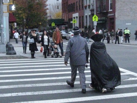
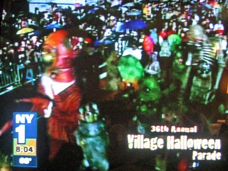
- This neighborhood is a nightmare come Halloween. The Greenwich Village Parade forms just a few blocks away and the march goes right through the area. Many hundreds of tourists wade through the streets during the day waiting for the nightfall.


1
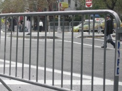
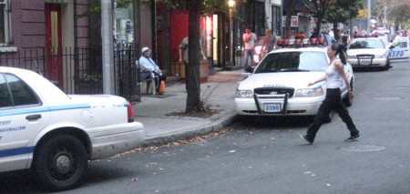
I was greeted in the morning by many police cars
all surrounded by the material to build blockades to
harness the visitors into the smallest possible area.

2 3
The entire area for many many blocks crossing and
intersecting with Sixth Ave. are blocked off to stop
pedestrian AND auto traffic. And this was at noon on Sat.

4 5
(Click any image to enlarge.)

6
One door was nicely decorated.

7
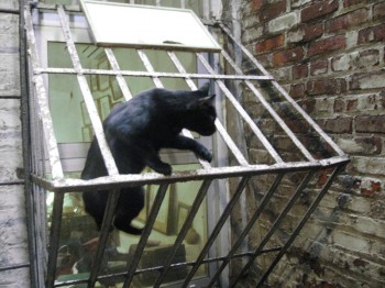
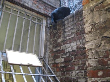
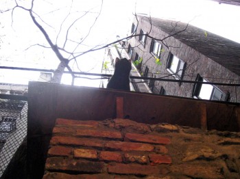
The studio’s black cat wanted nothing to do
with the Halloween brouhaha.

8
So he jumped to the top of the 12 ft. wall to be alone.


Security and danger.


By the time I took off, about 6, there were
cops and people mixing everywhere in sight.


Crowds and more crowds were heading to the
blockaded area. Some in costume, some not.


Even out of sight of Sixth Ave. people were heading there.


I got a front row seat for the parade . . .


. . . watching it on television.


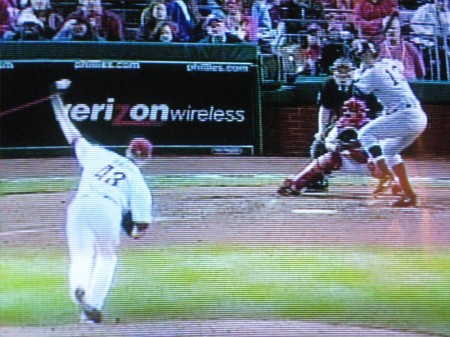
When the rain delay was over I switched to
the World Series to watch my Yankees win.
(Snapped just before A-Rod hit his home run.)

Comic Art &T.Hachtman 31 Oct 2009 07:35 am

Renaissance Masters 1

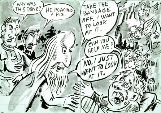
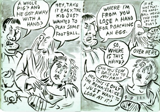
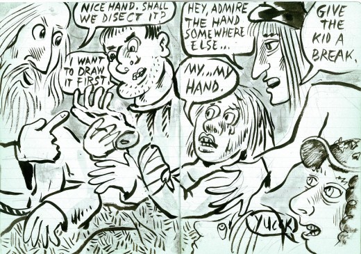
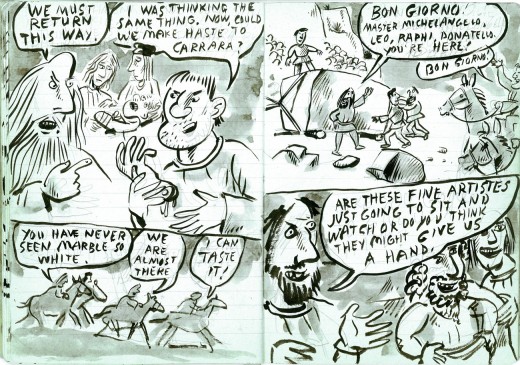
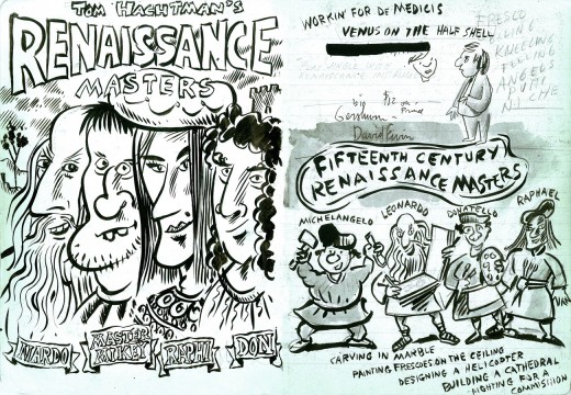
- Tom Hachtman, you’ll remember, is the cartoonist whose comic strip, Gertrude’s Follies, featured characters out the Americans and artists in Paris: Gertrude Stein, Pablo Picasso, Ernest Hemingway and others during the 20s – but set in modern day. The strip was a success, and I made a short or two out of it, trying to get interest in a feature.

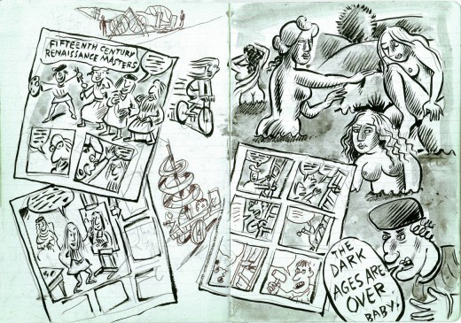
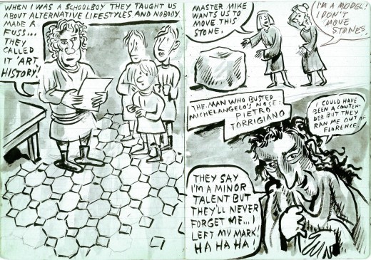
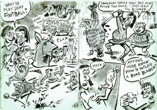
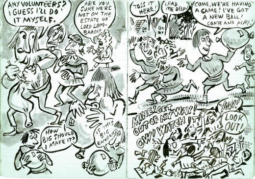
Tom actually started to develop another strip. With this one he mined the Renaissance Masters, and that’s what he called the strip. Michelangelo, Leonardo, Raphael and all the other biggies are in there.

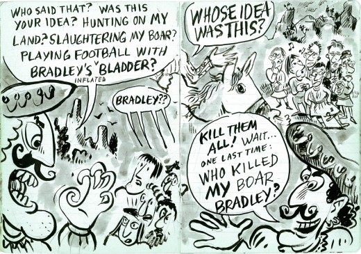
He did this strip in a notebook (with blue lines), and he gave me the book to post on this site – at my request, of course. So for the next few weeks, I’ll post all the double page panels done with India Ink and wash. At a good breaking point we’ll continue it next week.

Here they are, the Renaissance Masters:

1
(Click any image to enlarge.)

2

3

4

5

6

7

8

9

10

11

12

13

14

15

16

17

« Previous PageNext Page »

eXTReMe Tracker
click for free hit counter

hit counter