Books &Norshtein 19 Nov 2009 08:47 am

Norstein Comics

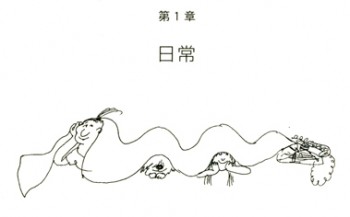
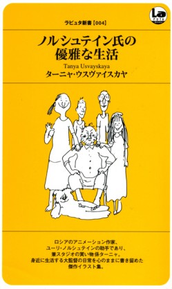
- A week or so ago, there was a gentle knock on my door. It was a messenger coming from Richard O’Connor, one of the proprietors of Asterisk Animation. He had sent me a gift of a little treasure book; one printed in Japan which contained dozens of cartoon caricatures of Yurij Norshtein and his staff. The cartons are done by Tanya Usvayskaya. Let me post her own introduction. I’ll follow that with two of the chapters from the book. The text is a bit hard to follow, so I’ll retype it below each cartoon to make it more legible.

    Honourable friends!

    Hello!

    My name is Tanya Usvayskaya. I’m working and studying at the Studio of Yuri Borisovich Norshtein – one of the most eminent animation directors. In this book you can see my small sketches ‘from nature’ depicting our studio life and different reactions to our events.
    You can meet all members of our small team, as same as our friends, guests and close relatives.

    All these small memos have been drawn with the intention to brighten and cheer up each of us, but in the book they’ll help you to imagine that ‘concentrated solution’ where the cristals of our collective creative work are growing up.

    Wishing a lot of joy to you I recall the words of little Yanochka to her grandfather Yuri Borisovich: ‘Grandad, I want so much everyone to be delighted’

    Sincerely Yours, Tanya Usvayskaya

cov1
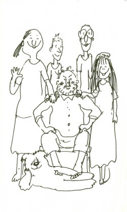
“Gather around, all of you!”
Members of the studio prepare for
photography. Photgrapher id Jukovski.

.

.

.


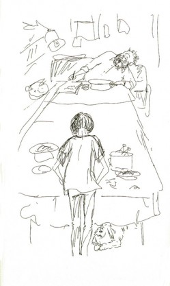
Norshtein is working and rinsing a bad tooth.
Zoia Trofimova, his student, is preparing her specialty, chicken broth. Zoia Trofimova is director of “PIPSQUEAK PRINCE.”

3
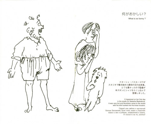
“What is so funny?”
It happened on her first day in the studio for Natasha Baskakova.
It was very hot and Norshtein came to the studio with his shirt
tucked into his knee trousers.

4
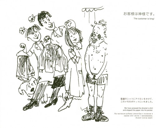
We have pressed the director’s shirt,
and slipped this paper into his pocket.
“The customer is King!”

5a5b
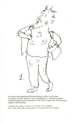
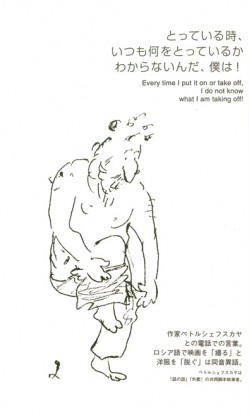
5a – His words while talking with Petrushevskaya, a writer on the phone.
In Russian “snimati” stands for either “shooting film” or “taking off clothes.”
Petrushevskaya wrote the scenario of “The Tale of
Tales” and “The Overcoat” together with Norshtein.

5b – “Every time I put it on or take off.
I do not know what I am taking off.”

6
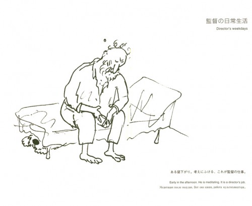
Director’s weekdays.
Early in the afternoon. He is meditating. It is a director’s job.

7
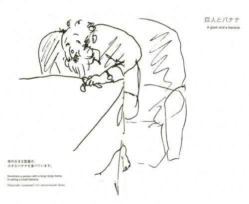
A giant and a banana.
Norstein, a person with a large body frame,
is eating a small banana.

8 9
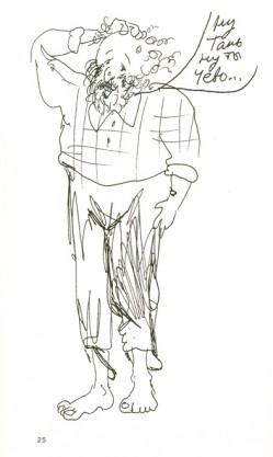
8 – “Er, uhm, you know . . .”
Norstein said to us apologetically, scratching his head.
It is a signal he sends when he wants to have a cup of tea.

9 – “Like a sucking pig.”
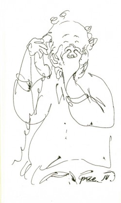
Norshtein is talking on the telepone and scratching his nose.
Then he put his fingers into his nostrils.

10
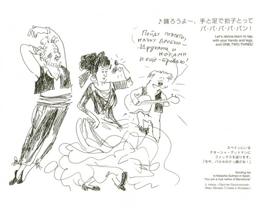
“Let’s dance, learn to tap, with your hands
and legs, and One, Two, Three.”
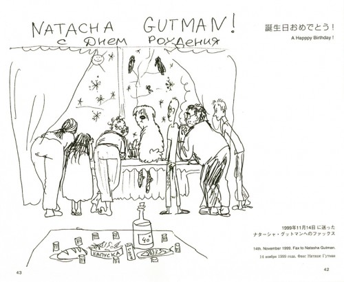
Sending fax to NATASHA GUTMAN in Spain.
“You are a true native of Barcelona!”

11
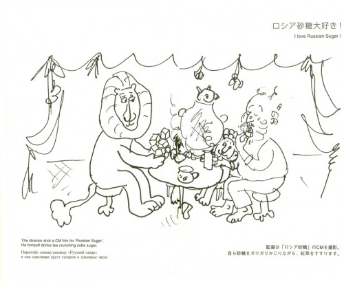
“I love Russian Sugar!”
The director shot a CM for “Russian Sugar”.
He himself drinks crunching cube sugar.

12
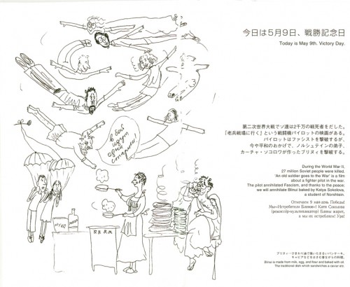
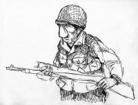
“Today is May 9th, Victory Day.”
During the World War II 27 million Soviet people were killed.
“A old soldier goes to the War” is a film about a fighter pilot in the war.
The pilot annihilated Fascism, and thanks to the Peace;
we will annihilate Blinui baked by Katya Sokolova, a student of Noshtein.

Blinui is made from milk, eggs and flour and baked with oil.
The traditional dish which sandwiches cavier, etc.

13
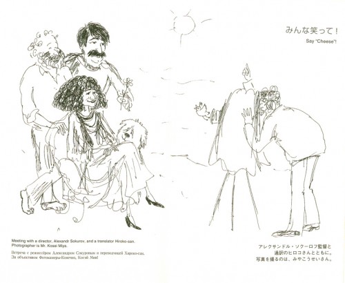
“Say cheese!”
Meeting with a director, Alexander Sokurov, and a translator, Hiroku-san.
The photographer is Mr. Kosei Miya.

14
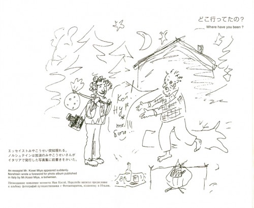
“Where have you been?”
An essayist, Mr Kosei Miya, appeared suddenly.
Norshtein wrote an introduction for a photo album
published in Italy by Mr. Kosei Miya, a bohemian.

15
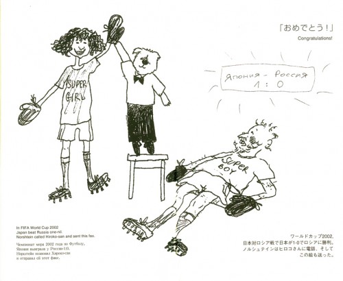
“Congratulations!”
In FIFA World Cup 2002 Japan beat Russia one – nil.
Norshtein called Hiroko-san and sent this fax.

16
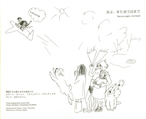
“See you again, my friend.”
Those seeing them off are Pirat (the dog),
Tanya, Norshtein, Francheska and Marfa.

17
“A Happpy Birthday!”
14th November 1999. A fax to Natasha Gutman.

.

.

.

.

.

Ha-ha-ha
Hee-hee.

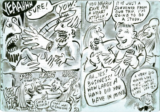
Yurij Borisovich said something offensive to Tanya and smiled with extreme satisfaction while Tanya took vengeance upon him by drawing this picture.
No one remembers what it was about,
and this picture remains.

19
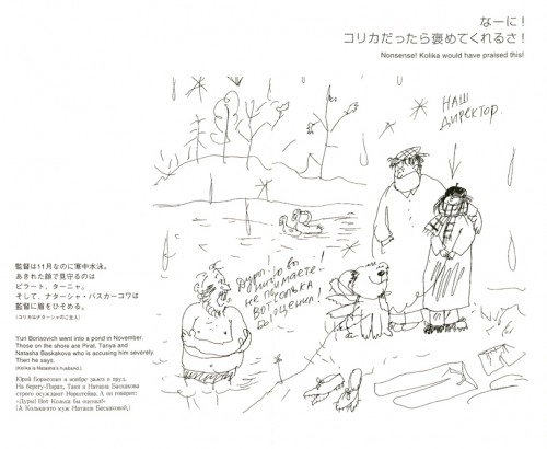
Yuri Borisovich went into a pond in November. those on the shore are
Pirat, Tanya, and Natasha Baskakova who is accusing him severely.
Then he says:
“Nonsense! Kolika would have praised this.”
(Kolika is Natasha’s husband.)

2021
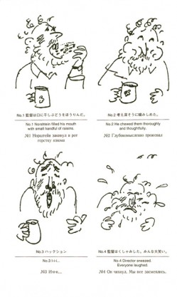
20-1 Norshtein filled his mouth with a handful of raisins.
20-2 He chewed them toroughly and thoughtfully.
20-3 . . . I – i – i
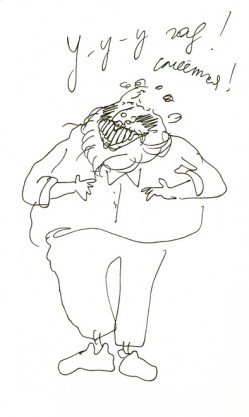
20-4 Director sneezed. Everybody laughed

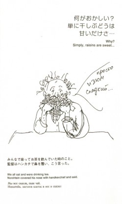
21 We all sat and were drinking tea.
Norshtein covered his nose with a handkerchief and said,
“Why? Simply, raisins are sweet.”

21
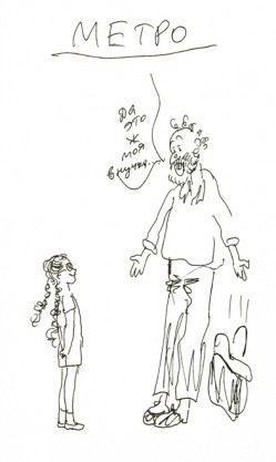
“Yes, it is my grandchild!”
Yuri Borisovich came to the studio in the morning and said,
“Imagine, I have just met my Granddaughter, Yanochika, in the subway!”

What a gem of a present. Thank you, Richard.

Commentary 18 Nov 2009 08:57 am

3 Animated Features

- Three animated features in the past four days. That’s a lot – at least compared to what I see theatrically in the rest of the year. Only one was in the running for the Oscar, this year; all three were brilliant in their own ways. All three were directed by forceful directors with something on their minds.

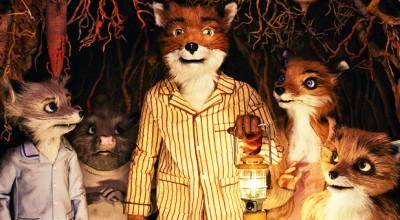
- That one running for the Oscar was The Fantastic Mr. Fox. This is the work of a live-action director, Wes Anderson, who has built a personality for himself on film. All of his feature work has been eccentric, all have featured a cast of regulars; none of his films have been blockbuster success stories. But they’ve all done well and have their built-in-audience.

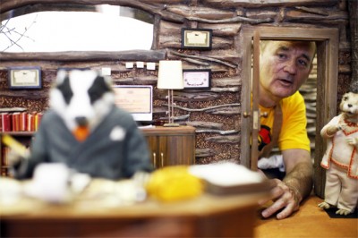
With The Fantastic Mr. Fox, Anderson has built a studio in England staffing it with a supervising director from the staff of the Will Vinton Studio. Mark Gustafson had more than a little control over the making of The P.J.s and animated on Vinton’s Mark Twain feature. The animation for Mr. Fox wasn’t gloriously slick in the way Coraline or Up was; it looked as though someone’s fingerprints were all over the sets and dolls and frames of this film. That was part of the charm.

The rest of the secret of this film comes wholly out of Anderson’s way of working and directing. He was a country away from the set, yet he was able to communicate easily via the Internet and was able to review everything in production. He trusted Gustafson and gave him space to lead the crew – the way any good director would do.

I remember one day at the Hubley studio on a break. Crossing Park Avenue on my way to a store, I thought about how happy I was in this job. I thought about the work I was doing. Then, smack, I’d come to realize that I was drawing Hubley drawings. My artwork wasn’t as good, but it looked like a Hubley drawing – not a Sporn drawing. What I was doing had little to do with me and all to do with John Hubley. I don’t know how he got me to do that; I don’t know how he got all of us to do that – John was so hands off. Yet, there it was: a Hubley film! That was when I realized how a director had to work to get the most from the artists and creators involved in the film. I haven’t forgotten my lesson.

It’s obvious that Wes Anderson knows what he’s doing. Every inch of his film is fun and charming and delightful. Every frame of it is adult, yet kids can enjoy it as well (and they certainly did at the screening I attended.) [Richard O'Connor has a great review of this film. I suggest you read it.]

_____________
.
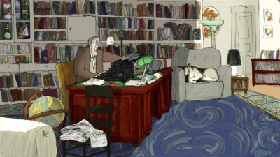
- A second feature I’d seen was another eccentrically odd puppy of a film. My Dog Tulip was completely drawn, animated and colored by Paul and Sandra Fierlinger. Paul wrote the script from a British best seller by J.R. Ackerly.

The film told the story of a relationship between a man and his dog; it was a close bond between the two – a curmudgeon of a man and his overprotective dog. Within a short time, the film grew peculiar because it focussed on Ackerly’s concern for the urine, feces, other bodily effluvia of the dog, including its sexual needs. Having not read the book, actually, I’m not sure if these were so prominent in the original or if this was something Paul attended to in writing the screenplay. I assume the words were all Ackerly’s. They are the heart of the film, so Paul obviously wanted it this way, and it makes it somewhat off-putting to any general audience.

The film has had a hard time finding a distributor. I hope it does find a release. Much of the artwork is extraordinary. Paul animated completely within the computer using the TV Paint program. His wife, Sandra colored it all and painted the backgrounds, also in TV Paint. They used a sort-of watercolor technique with a color palette that felt as if it glowed, yet in reality was limited to soft grays and browns with spots of high color. It was very controlled in the digital copy I saw projected at the Film Forum. This is Karen Cooper‘s gem of a theater that is willing to trust and support artists in film.

The animated movement in the film was quite loose. It felt like a mix of James Stevenson and William Steig animated. I suspect that the completely digital drawing with TV Paint, as opposed to drawing on paper and scanning, has loosened Paul’s lines even more than it once did. There’s certainly been a gradual change in his work over the past few years. Different – not better or worse.

The celebrity actors include Christopher Plummer, Isabella Rosselini and Lynn Redgrave.

The film has received mixed reviews – that bodily fluid thing – and hopefully this will not hold it back in any way other than a small bump. So much work by these two artists went into this film; one wants the struggle to deservedly pay off.

_____________
.
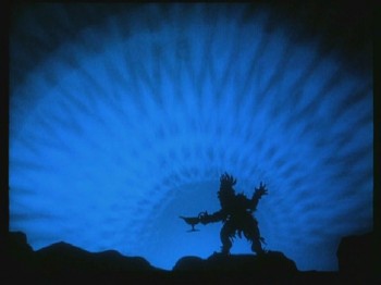
- The third and final feature seen this weekend was screened at the Museum of Modern Art on Sunday evening. Lotte Reiniger‘s The Adventures of Prince Achmed was the first animated feature, done in 1926. Made just steps from the Bauhaus, in the throes of German Expressionism, this film in some way set the way for all features to follow. A very strong director with pure impulses created a long film – the first. Done in her style of back-lit 2D silhouette puppets, the film blazed techniques that were truly innovative.

The film was done, of course, in B&W, yet the print screened was digitally colored, predominantly in pastels. The music was supplied by pianist, Ben Model. He did well by the film, but I suppose my feelings toward this movie were shaped by my initial viewing years ago – back in the 70′s.

It was a screening at the Galerie St. Etienne. They had set up a room that was long and narrow, two sets of folding chairs down each side with a 16mm projector in the rear. The projection was perfect, the film was colored optically (there was no digital anything back then), and the sound was a small orchestral accompaniment. This was a spanking new print.

Lotte Reiniger was in the house, and after the well-received film, she proceeded to give us a demonstration of how it was made. A very large lightbox was constructed on a primary stairwell, and we all gathered around. She cut out and constructed a puppet in front of us. Then she placed it on the light box and showed how she moved it. She told stories (which I’ll save for another post) which kept us smiling.

At one point, she looked up to those around the table and she was overtaken with emotion. She ran around the table and tightly embraced a very short, elderly woman. The demonstration was over. It was Lotte Lenya, standing only a couple of feet away from me. The two hadn’t seen each other in all those years.

Now I was taken with emotion. What an evening; what a delight.
Seeing the film again brings back memories. It’s a wonderful film, but the real life adventure which played out in front of me, back then, colored the film forever – more than even the computer would be able to do.

Articles on Animation 17 Nov 2009 08:43 am

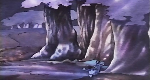
Norshtein 1980

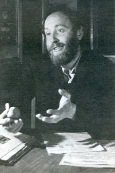
- This article, written by Yurij Norstein, appeared in Animafilm 5, March 1980. How could I not reproduce it, since it appears nowhere else on line or in print, that I know of.

Just Art
L’Art tout court

by Yuri Norstein
WHAT IS ANIMATION FOR ME? Just a field of art, I suppose. T don’t regard it as something separate, I don’t think it has its own laws different from those applying to art in general. Another thing is that being a new field of art, it is looked down upon by feature film, just as film itself was once looked down upon by the theatre. People often treat animated film as if it were something inferior, and underestimate its artistic possibilities and social significance.

In my opinion the essence of art is not confined to the fact that it serves concrete purposes, such as providing emotional experience or entertainment. This does not mean that art does not perform these functions. It does. What Aristotle said still holds: art, above all teaches man to enjoy life.

But Leo Tolstoy, for instance, used to say that if he were commissioned to write a work on a clearly defined theme with a precisely stated social function, the writing would not take him more than two hours. He would add that he wrote mainly about people, about relations between people, in order to force the reader to laugh or cry, that he sought to release ordinary human reactions characteristic of life. His idea was that man should see in an artistic work everything he could perceive in life, out that this should be presented in the form of certain regularities. This means that life and art are different concepts; art always assumes objective significance, it becomes an historical phenomenon, while what we call ordinary life and the events taking place in it, do not have this character.

Of course I do not single out animated film as a field of art guided by its own principles. According to me its principles are exactly the same as those governing other fields of art; they are taken from life, but at the same time the collected material is subjected to some specific processing. This material consists of human emotions, joys, tears, love and everything that is contained in our life and that the artist turns into art.
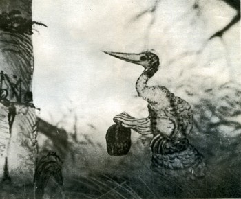
NO, ANIMATION IS NOT THE ONLY FIELD OF MY ACTIVITY. As a matter of fact, I make drawings for animated films. I also practise painting, but I treat this as a purely personal affair. My attitude to animation is rather specific; it is determined by the neccessity of choice. This is not so much a matter of choosing content wirh a clearly defined plot or idea. It is something much more, for in my opinion an animated film does not merely express some idea.
An idea can be formulated in words; the means of expression used in the visual arts are not indispensable here. But there may be something more which I may find difficult to put into words and which perhaps is not necessary for me. I have in mind the ideas composed of concrete pictures, of the artistic context in which these pictures exist, of colours, tones, some kind of flora, words, music, all those devices which can create something that cannot he translated into a language of words, that cannot he formulated as a definite idea of a film.
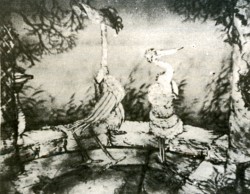
Of course, the artist must have this idea in himself. However, this idea is much more general than the concrete idea existing in a film. This is how I understand art, and this is what animation means to me.

I am not interested in films with a definite plot and do not want to make them. Why? Because a clearly formulated plot constitutes the deductive side of every film, a side followed attentively by every spectator. But if a film is reduced to the unequivocal content of its story, the content ceases to interest the public when they see it for the second or third time. I think that if a film is interesting, the spectator will always want to see it again, in order to follow not the plot itself but those elements that are connected with reality and have been expressed in a definite artistic language.

WHY DO I USE A TECHNIQUE that, in a way, makes my films different? I think this technique allows me to make wide use in animation of my artistic pursuits, for it combines animated puppets with animated cartoons.

Animated cartoons are a more dynamic art; animated puppets arc more static. Dynamism and inattention to the plot are alien to the latter owing to their very nature. Puppet animation is a much more philosophical art, I think. But at the same time it lacks the flexibility characteristic df animated cartoons; it does not give the artist the same freedom of handling figures and objects.

So my technique combines the good and bad sides of animated cartoons and puppets, and this can be reflected in various ways. The point is that in spite of everything, this allows me to subordinate the entire artistic background created for the needs of films to my inner ideas, to my artistic credo.
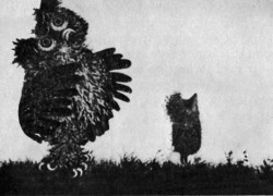
ARE THE POETIC NATURE OF THE PLOTS OF MY FILMS and their poetic form a result of my interest in painting? Yes, to some extent they are. I think that every animated film director is always interested in painting or in the fine arts in general. This is only natural. After all, an animated film has a dual nature. An artist creates a new original artistic background in which I, as a director, must create a definite dramatic action. Hence the dual character of animated films, and the difficulty of creating the proper artistic background. The spectator should adapt himself to this background, penetrate it, and participate in the film on terms dictated by the subject.
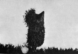
THE STYLE OF MY FILMS, THE WAY THEY COMBINE JOYS AND SORROWS, their light character? I think this is necessary in animation. After all, it is important to awaken something in the spectator, something that will remain in his soul, something he will want to return to. I wouldn’t like to make films that influence the public only by their physiology.

I have in mind overabundance of artistic elements or shocking, unusual scenes. The picture of a killed child will always move the public, but this is not necessarily an artistic experience. An artistic experience occurs when a film contains definite mutual relations perceived by the spectator, relations which make him think. The same scene with a killed child will then make a different impact.

In my work I seek to combine all the elements of an animated film into one absolute whole: the settings the background and figures and assembly.

IS AN ANIMATED FILM LESS determined by technical limitations than other kinds of film? On the whole, animated films arc all the better for technical limitations. To begin with, technical limitations make the artist consider the conditions dictated by the fact that he is making an animated film.

Besides, I think that both objective and deliberate, conscious limitations are necessary in animated films. 1 cannot express opinions about other kinds of films. I take no part in their making and I am only a spectator. But if we arc to compare them, my opinion is that is good for one kind of art is not good for another. And I don’t think one can say that one kind of work in film is less important or less difficult than another.

In an animated film the material itself may create greater possibilities. In a feature film with actors the shifting of a machine to where the director wants it to be may be very difficult. But the entire background is already there; it exists in its basic forms. In an animated film everything must be created from the very foundations; one has to choose, to find all the necessary elements, the best ones. This is just as complicated as the shifting of a machine in a feature film. As in art in general.

WHAT KIND OF SPECTATOR DO I HAVh IN MIND DURING MY WORK? This will sound like a paradox but I think mainly about myself. This may sound cynical. For me, however, this is the most objective evaluation of what I am doing. If I thought, let us say, about crowds of spectators, I wouldn’t be able to take the tastes of each of them into consideration. And if I assumed my film was meant for an artistic elite, sensitive to all artistic innovations, things would be very much the same. Especially as the elite may be wrong too, in fact it is often wrong because it is sensitive to the creative side and may not perceive the rest.
So when making a film I think of myself, of how I will receive it, whether it is simple and understandable. There is a certain danger here, for I move within my film all the time, so it may seem understandable to me without really being so.

Undoubtedly, this is not the most objective way of finding out whether I can reach the spectator or not. Nevertheless, I think that this approach to creative work allows me to come nearer the absolute which exists in my imagination. Another thing is that when I am working on a film I tell my friends what I am doing and watch their reactions. And this is often helpful as it allows me to see whether the effects I achieve arouse interest or bore people. I take these reactions into consideration, change certain things, have yet another look at some fragments. However, when I am absolutely convinced I am right, I do not change anything, even if I notice a lack of interest in my ideas during a conversations, I am inclined to admit that I may have made a mistake. Now and again, very often in fact, T talk with my children, relate various episodes to them, watch their reactions and draw conclusions.

I think that films for children can only be made by an artist who understands children. If he can play with three- or five-year olds, it means he can look at the world through their eyes and can make films for them.

THE FUTURE OF ANIMATION? I see it in rather dark colours. I cannot say whether this is connected with limitation of a technical nature or the crisis of the animated film in general. Each of us goes through some critical moments, especially when we have achieved something and feel that further work will be just a repetition. We then begin to look for something completely new, we find some analogies with literature and feel that this is what we want; but at the same time we feel that we cannot express this, that not everything has been fully grasped. These are very difficult moments, especially when one sets to make photographs and the doubts have not been removed yet. Such a crisis can be overcome all of a sudden, under the influence of something quite unimportant. But before this happens there is a lot logo through.

DRAMATURGY IN ANIMATED FILMS. In my opinion the present principles of dramaturgy in animated films are wrong because they are the same as those in feature films with actors. Disney somehow managed to cope with it but not because he set himself high moral requirements but because at every moment he was in full control over every detail. Literature, which is now a kind of basic art, reaches the reader slowly and a bridge is a piece of metal difficult to be engraved upon but once this has been done, it lasts for a long time. Literature is similar in this respect and film cannot compete with it. A film does not usually remain long in human memory, and it seldom exerts an influence on people’s attitude to life, etc. There have been exceptions, hut they have been few.
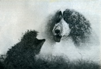
The reason why I say this is that the principles of dramaturgy, especially in feature length animated film, have been transferred unchanged from ordinary films. This is wrong in my opinion. An animated film sould make use of all the means which an artist can create in his studio. In Chaplin’s films everything is contained in his acting. One gesture comprises elements of various genres: from the fantastic to absolute realism and even atavism.

An animated film is by its very nature an art composed of various genres. It contains myth, fantasy, cosmogonic ideas, absolute realism, and even naturalism or mysticism. I think that the combination of all these elements could contribute a lot to the animated film, especially feature-length film. But I have never seen such a film. Not yet. All I see are films with a plot which could just as well be played by an actor.

Painting is developing in various directions while the animated film seems to be at a standstill; it does not show dynamism in development. It lacks something; it seems to be confined to one genre. I think that a study of literature, especially ancient literature, which combines various genres, including the Bible, which contains practically all elements from comic to tragic ones, that is, the entire richness of human life, would be of great benefit for animated films, especially feature-length ones. I think that a feature-length animated film should not just tell a story. It should present the richness of human life and, making use of the specific properties of animation, look for its own ways of development.

Recorded by Mieczyslaw Walasek

YURI NORSTEIN: FILMOGRAPHY
1968: 25th – THE FIRST DAY
1971: THE BATTLE OF KERSHENZ (prizes: Zagreb, Tbilisi)
1973: THE FOX AND THE HARE (prizes: Baku, Zagreb)
1974: THE HERON AND THE CRANE (Kischinjow, Annecy. New York, Teheran, Tampere, Melbourne)
1975: THE HEDGE-HOG IN THE FOG (prizes: Frunse, Karlove Vary, Melbourne, Gijon)
1979: THE TALE OF TALES (prizes: Ashabad, Lille, Obcrhauscn).

Illustrations:
1. Norstein (1980)
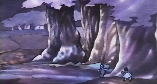
2. The Heron and the Crane (1975)
3. The Heron and the Crane
4. The Hedge-Hog In the Fog (1979)
5. The Hedge-Hog In the Fog
6. The Hedge-Hog In the Fog
SpornFilms &Title sequences 16 Nov 2009 08:39 am

Prince of the City

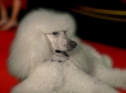
- When you have an animation studio, and you have to keep paying the overhead, you end up taking some pretty unusual jobs. I once had a man who thought his poodle would make a great talk-show host. He wanted us to produce a talking poodle trailer which he would release on YouTube. The Royce Report was an entertaining two week job to push through. We shot the dog in live action against a green screen, We animated the dog’s mouth to the voice of the dog’s owner (who’d also written the piece) and pasted him into the photo backgrounds I shot. It paid a couple of bills for the week and is still on YouTube with over (or only) 17,000 hits.

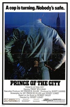
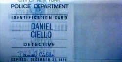
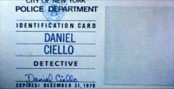
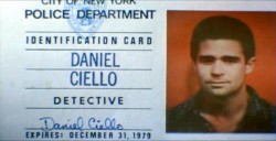
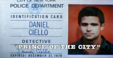
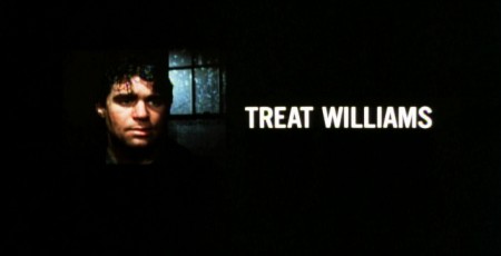
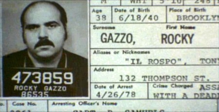
- One of my studio’s very first jobs was to do the titles to a big Sidney Lumet feature film, Prince of the City. The film was a hard-nosed crooked cop drama brilliantly directed by Lumet. The problem it had was that few of the actors in the large cast were known, and the audience was having a recognition problem. Treat Williams was in his break-out role and the only other identifiable actor was Jerry Orbach.

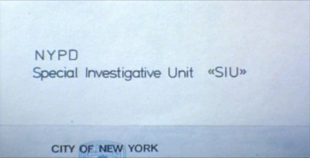
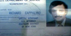
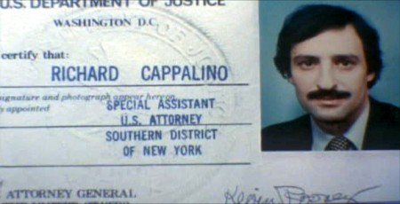
I was hired to ID all of the cops, lawyers, good guys and bad with what-looks-like live action identification cards. I also did title cards throughout the film, breaking it into chapters. Finally there were the end credits (no opening credits.)

I pulled in a friend and film genius, Phillip Schopper. Together we shot the actors with Polaroid film trying to make the photos look a bit cheesy, as the real items would. Phillip took the Polaroids and doctored them to our needs. Treat Williams, for example, had moved onto another film and came back only for these photos. His hair was now jet black for the new movie, so Phillip had to recolor his hair in the doctoring (in those years before computers.) Jerry Orbach had a blemish on his lip that he wanted retouched. There were plenty of little things to deal with on the photos.

I had to locate the real identification cards (NYC police dept, NYState Supreme Court judges and DA’s, etc.)

Then I had to forge them. I worked with a printing shop in NY that didn’t ask questions. We chose to actually print the cards as if they were done via mass production so that they would look authentic. I also had to find appropriate paper and laminating machines to get the actual look of these cards. This was all done before the wide use of computer technology.

We had to film the sequences.

We worked with animation cameraman, Gary Becker for about a week and took over his Oxberry. We built miniature sets to hold the ID cards at odd angles, and we relit the cards with shadows built in. We wanted these cards to have a gritty reality to them that an animation stand didn’t generally offer.

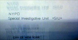
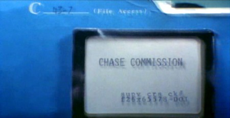
The cards were animated moving as if a machine were printing them or a folder were being opened or papers were being tossed aside. This involved a lot of work getting out-of-focus images in the animation. When a folder opens, it moves in soft focus. The folder will pick up the top sheet and let that drop back again. We had to manipulate this all in stop motion to get it to work properly.


(Click any image to enlarge.)

2 3

4 5

6 7

8 9

10
These cop cards (about five of them – one for each
of the five cops) appear twice. Once for the new enthusiastic cops.
Another for the tired and jaded cops.

There were about 8 insert sequences about a minute each.

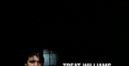
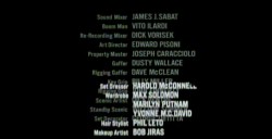
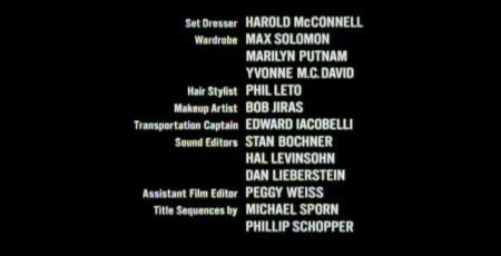
When it came time for the end credits, we chose to include photos of the actors with their names so that people would be able to recognize them from the film, without having to have had to memorize their characters’ names. We pushed these cards up as if a machine were printing the titles, a card at a time. The cards had to move in out-of-focus, as well. It was long and arduous shoot.

2 3

4
All of the credits came up at varying speeds, timed to the music.
This was helpful in that all titles go through changes after they’re done.
Our system gave us a lot of flexibility to addd or change cards as
necessary without having to reshoot them all.

Sidney Lumet didn’t want me to have a company credit. I couldn’t include the studio name, Michael Sporn Animation, Inc. because he felt that people would try to figure out what was animated. He didn’t want them to know there was any animation in the film. Hmmmm.
I put both my name and Phillip’s as doing the titles and insert shots.

1 2

3
There’s actually a four frame fade out of the old credit list
as the new list zips up and in / out-of and into-focus.

I did quite a few other title sequences for Sidney as a result of this job, and I was pretty proud of the film and the job that I had done.

Two other insert shots:

1
Records in a folder. The embossed stamp was a headache.
We shot the back of a card’s actual stamp in shadow, then we
printed it on a document in reverse on the front of our card.

2 3

4 5

6
.
1
The microfilm look for mug shot records.
The slightly bad guys in B&W.

2 3

4

Commentary &Photos 15 Nov 2009 09:17 am

Trees of the City

- One of things I love about New York is the number and excellence of the many parks throughout the City. It’s somewhat similar to London, except here the neighborhood parks are open to all.

1
.

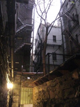
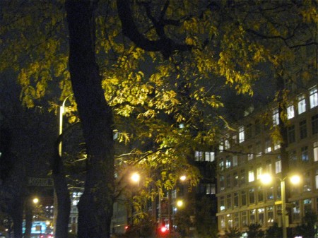
Where there are no parks, there are trees. I’m always fully aware of the many trees around
me on my way to or from work. At the moment, they’re all going through the final stage of Fall just prior to the barren winter upcoming. The reds are dark and the leaves fallen are everywhere. I’m particularly aware of this because of the small walkway in front of my studio’s door. There are trees all around us, and leaves have molted in this passageway for the past six weeks or so. I’ve had to sweep them frequently enough so that they don’t clog the drains and create problems. I have to say that I enjoy this chore. My cat romps about while I attend to the sweep-up.

To the right, you can see the barren trees above the outer wall which greets me when I leave my studio. The door is under the light bottom left of the photo. It’d been raining most of the day, yesterday, when this picture was taken, consequently there’ll be the last of the leaves on the wet, stony corridor.

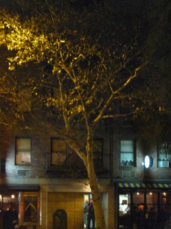
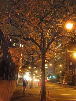
The walk home lately is in the dark, thanks to Daylight Savings time. Fortunately, Houston Street, an eight-lane, major thoroughfare separating Greenwich Village from SoHo, is surrounded with trees, new and old.

2

At night, the trees lurk in the street framing the shops and
street lamps which seem to play in and around those trees.

3 4
The inner mass of the trees’ foliage is lit
by the street lights down below them.

5 6
With pedestrians moving about the trees, there’s an
almost-festive mood about, thanks to the lighting.

7
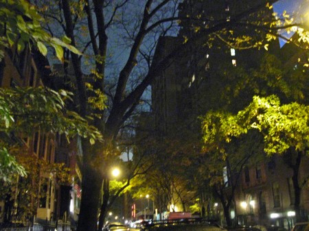
The lesser lit areas take on a moodier effect.
So quickly you travel from one emotion to another.

8

9
Is it any wonder, then, that I enjoy living on 30th Street with
it’s abundant and spectacular foliage always lining the street.
The blue sky to the right, is actually a fogged mist. It’s covering
the Empire State Building which usually sticks out brightly.
Last night, it was like it wasn’t there. An odd sensation.

Comic Art &T.Hachtman 14 Nov 2009 09:02 am

Renaissance Masters 3

- I saw The Fantastic Mr. Fox last night. It is fantastic; I loved it. The actors, of course, were all superb, and the klunky animation works well with the master plan Wes Anderson brought to it. This is a good example of what one strong-minded director can bring to an animated film (feature or short). The feature deserves all the excellently positive reviews it’s getting.

___________

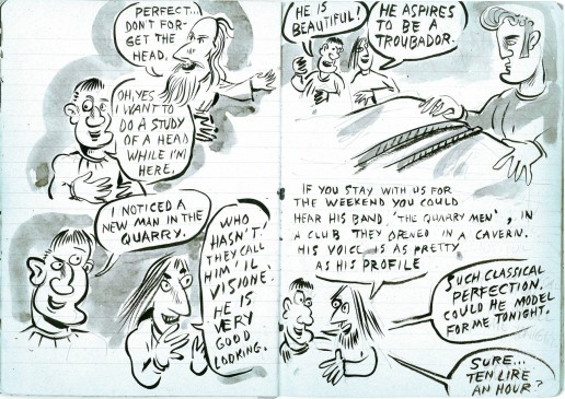
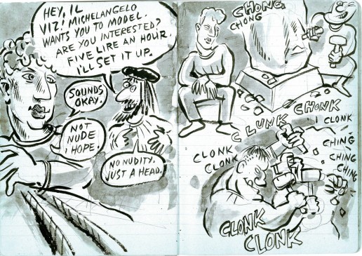
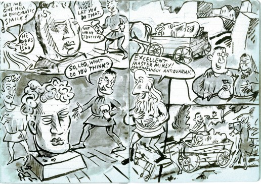
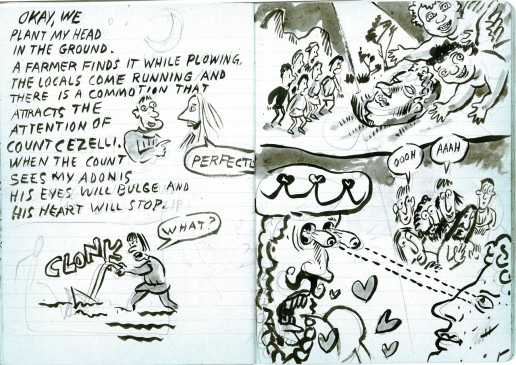
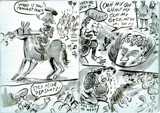
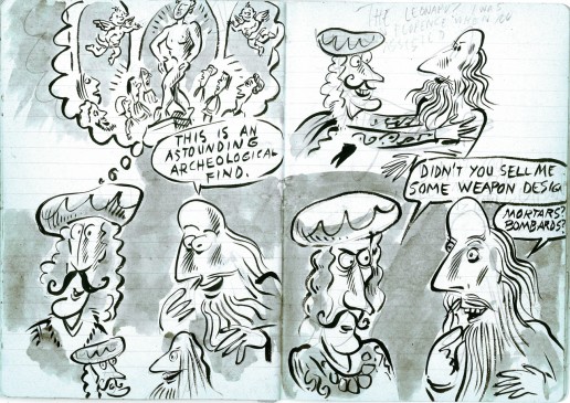
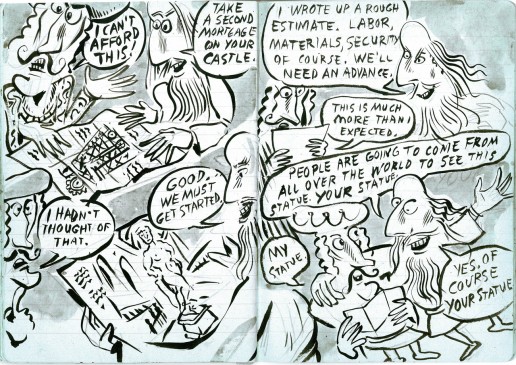
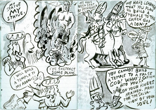
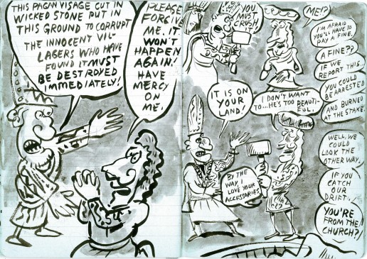
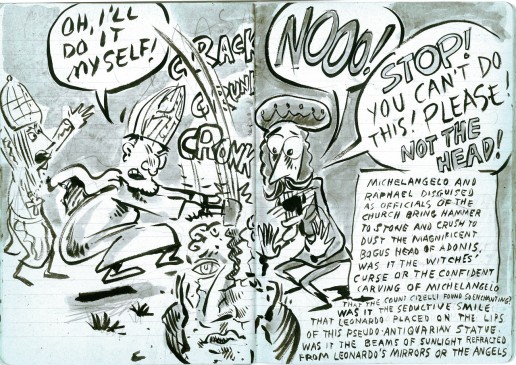
- It’s Saturday, and here’s part 3 of Tom Hachtman ‘s previously unpublished strip, Renaissance Masters. He drew this in a green-covered paper notebook with blue lines on every page. There’s no doubt it should have been published somewhere, and I’m glad to oblige as best I can.

Here’re the links to Part 1 and Part 2 if you want to read previously posted cartoons.

To get you back up to speed, I’ll start with the final pages of last week’s entry. Enjoy.


35
Click any image to enlarge.)
.
36
.
37
.
38
.
39
.
40
.
41
.
42
.
43
.
44
.
45

The final installment will come next Saturday.

Books &Commentary &Richard Williams 13 Nov 2009 08:25 am

Magoo & Christmas

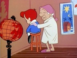
- This is my mid-November reminder that Dec. 1st The Paley Center will will host a screening of Mr. Magoo’s Christmas Carol. After the screening there will be a panel discussion which includes the following guests:
- Darrell Van Citters, Animator and Author of Mister Magoo’s Christmas Carol: The Making ____of the First Animated Christmas Special,
- Judy Levitow, Daughter of Magoo Director Abe Levitow
- Marie Matthews, Voice of “Young Scrooge”
- Moderator: Jack Doulin, of the New York Theatre Workshop.

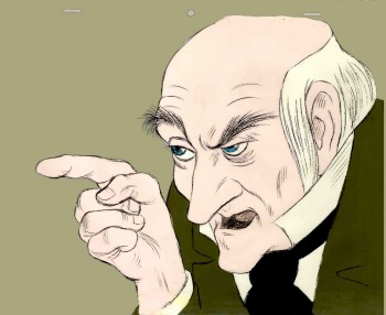
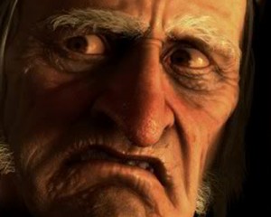
The program starts at 6pm and general admission is $20. All guests will receive a complimentary DVD of Mister Magoo’s Christmas Carol. It’s a good antidote for the Robert Zemeckis version of Dickens’ story.

_______________

May I also recommend, again, Darrel van Citters’ excellent book, Mister Magoo’s Christmas Carol: The Making of the First Animated Christmas Special. I’ve long been a fan of the show (I collected reviews, promos anything prior to its initial airing) it was a treasure found when I got this excellent book. The head-to-head production, also directed by Abe Levitow, of Gay Purr-ee was strong material to read about. It’s a page turner of a book and filled with gorgeous illustrations.

_______________

- As long as we’re promoting Christmas Carols, Richard Williams’ tightly strung version of the story is still available in old vhs copies. You can also find the entire film (in four parts) on The Thief Archives on YouTube.

I remember Dick having a conversation with me about the brilliant animation Abe Levitow did on this film, and, indeed, I agree. In a film filled with stunningly beautiful animated illustrations, the only real character animation I found belonged to Levitow. The sequence wherein the ghost of Christmas Past opens his robe to reveal “ignorance” and “want” is the capper of the show.

I find the show a little too rushed to properly tell the story emotionally, and it’s an emotional story. But what’s there is as brillinat as anything Dick had done. In some ways, the artwork reminds me of the cross-hatched animation his Soho Square studio did for The Charge of the Light Brigade. (In fact, when I first saw the show in 1971, I wondered whether some of the birds in Christmas Carol were reused from Charge. I never learned the answer.)

_______________

The songs from Mr. Magoo’s Christmas Carol are principal in the success of that show.

When you’re alone, alone in the world
When you’re alone in the world
Blown-away leaves get blown in the world
Swirled-away leaves get swirled

And hand in each hand was made for the world
Where is the hand to reach for mine back
Where are the shoes that click to my clack
I’m all alone in the world

Millions of grains of sand in the world
Why such a lonely beach?

A hand for each hand was planned for the world
Why don’t my fingers reach?
Millions of grains of sand in the world
Why’s mine a lonely beach?

Where are the heels to click to my clack?
Where is the voice to answer mine back?
I’m all alone in the WOOOOORLD!!!

Animation &Animation Artifacts &walk cycle 12 Nov 2009 08:31 am

Tissa’s Ann Run

- Here’s a run Tissa David did for Raggedy Ann. The character is tiny in the frame. The entire scene is more than 45 secs long (no cuts); this run comes toward the end of it.

Tissa had the character run across two fields of paper, and animated a slight move of the background underneath her. Consequently, it feels as if she’s slipping in place a bit. However, if you see it in the film, you’ll see that she looks anchored to the BG.

455
If you click any drawing the actual animation sized paper will pop up.

456
You’ll note that Tissa worked on standard animation paper – 10½ x 12½.
When Ann runs off the edge of one field, she pops to the other edge
of the next field. It saved having to work on 2 field paper.

457

459

460

461

462

463

464

465

466

467

468

469

470

471

472

473

474

475

476

477

478

479

Raggedy Ann runs across the screen on twos.

[ Javascript required to view QuickTime movie, please turn it on and refresh this page ]

Click left side of the black bar to play.
Right side to watch single frame.


These are the first and last frames of this walk taken from the actual film.
It’ll give you an idea of how tiny they are in the frame, yet how large they were drawn.


David Nethery, in the comments section, left a link to a QT movie of this scene. You should read David’s excellent comment and check out the scene in motion.

Commentary 11 Nov 2009 08:33 am

Veteran’s Day / What I like about The Christmas Carol

Happy Armistice Day

This is the day originally set aside to celebrate the signing of the Armistice ending World War I. In honor of this day, the Rauch brothers, Tim and Mike have placed their short film, Germans in the Woods, on Youtube. Take a look, if you haven’t seen it. It’s a good film.

_________________

.
- I haven’t seen ZemeckisThe Christmas Carol, but I eventually will. There’s an Academy screening next Tuesday, but I’ll have to miss it. A more interesting event has surfaced which I’ll attend. (Henry Selick is having a meet-and-greet as part of his Coraline promotion.)

I’ll probably see it on DVD since I don’t like the 3D experience. (I don’t much like seeing grayed-down movies, and those glasses certainly do that.) The film looks to me like one of those 1950′s 3D movies. Everything and its brother looks to be hurled at the audience so your headache can come even sooner than it would with the 3D process, alone.

Then there’s the Mo-Cap issue. I honestly don’t think of this “process” as animation. I do liken it to puppetry – electronic puppetry. Jim Carrey is one of the puppeteers of his character and too much of him comes through for an animator to claim “character animation.”

Regardless, I’ll eventually see it for the film, itself. Zemeckis has made a few competent films in the past, and there’s a possibility he might make another one. Castaway was my favorite film of the year 2000. I still find myself absorbed whenever it plays on cable. It’s unlikely, but maybe this will be Zemeckis’ Mo-Cap Castaway.

Aside from all of these obvious reasons why I’ll probably dislike The Christmas Carol, there’s one reason why I already like it – sight unseen.

This is a digital film. It’s only a hop skip and a jump away from all those films Pixar and Dreamworks make. The computer also rules those films. However, I’ve never quite understood why those big studios are intent in designing films that imitate puppet animation. Why, with the tools at their hand, do the films have to inhabit the child’s world of those Viewmaster puppets when they have the whole of the art world at their hand in 2D animation?

Zemeckis has found that he can make films look like Impressionist paintings (even when they aren’t well rendered) rather than puppet films. Monster House and Happy Feet used the same technique Zemeckis employs to create their mundane puppet worlds, but Polar Express used a 2D style in a 3D environment to get its look. The same was true for Beowulf and The Christmas Carol.

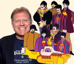
True, the images in those three films are frighteningly ugly, but one wonders what they might look like if some hugely talented artist were designing them. Perhaps that’s what he plans for his next film. Robert Zemeckis presents Walt Disney’s The Yellow Submarine. (Don’t forget that Zemeckis did I Wanna Hold Your Hand as his first major film.) Will anything of Heinz Edelman be left? Will the Beatles be hurled into the audience, or how about the Submarine, itself? We can only wait and hope.

Like those monkeys sitting at typewriters, we’re still waiting to see them write Hamlet. Maybe now that they have computer keyboards, it might be easier for them.

Frame Grabs 10 Nov 2009 08:37 am

Cosmic Rays

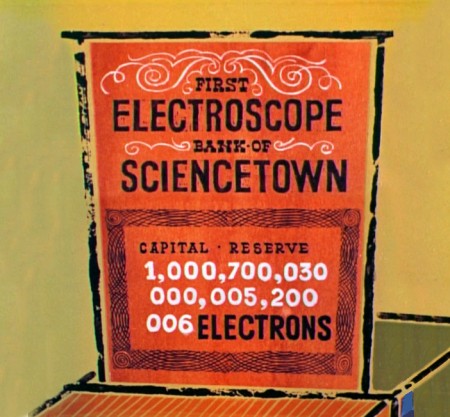
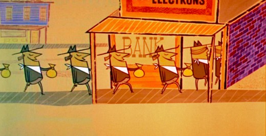
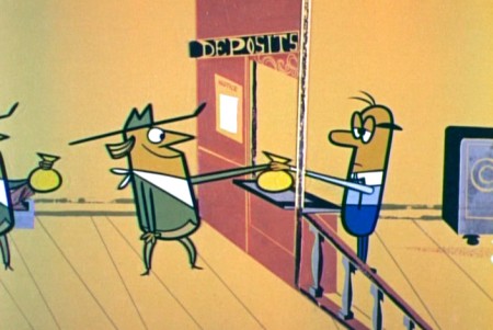
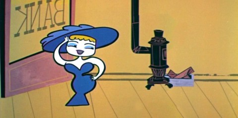
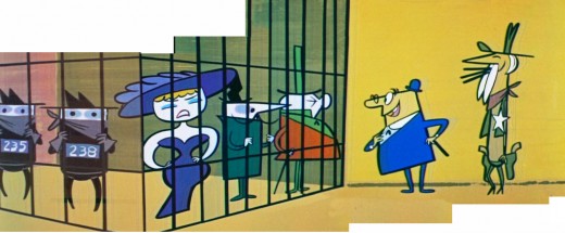
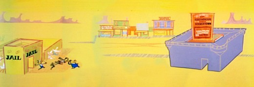
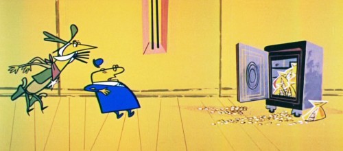
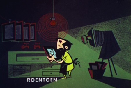
- I posted many frame grabs for Our Mr. Sun, the Bell Science series premium program. That show gave families information about the Sun and the solar system.The show, Hemo the Magnificent, was about the blood system and the body. Both were two of the star episodes of this series.

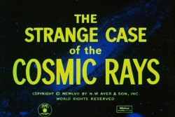
There were also the lesser shows, of which this program is one. The Strange Case of the Cosmic Rays talks about radiation. Of course, the information available in the early Fifties, when this show was produced, was somewhat limited. Consequently, they don’t talk about the negative effects radiation and atomic medicine have on the body.

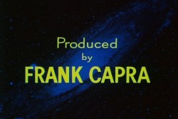
Frank Capra produced this series for the Bell Laboratories. He wrote in his autobiography that he loved making it. He’d graduated from college with a degree in engineering, and he felt he was finally putting some of that knowledge to use.

During the early Thirties, Capra befriended Walt Disney. He was instrumental in getting Columbia to distribute the Disney shorts, which gave Mickey an even wider venue than it had at the time. The deal between Disney and Columbia eventually went sour, and Disney didn’t sign with them again when the contract expired. Capra remained close with Walt. It was a natural for him to ask Disney to get involved in some of the animation, and his studio did – working on Our Mr. Sun.

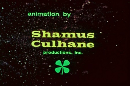
The animation for this show was done by Shamus Culhane productions in New York. It’s markedly inferior. The progressive style falls back on traditional rounded artwork at varied points, and the artwork doesn’t have a unified look. Although the animation is serviceable, it never soars.

A1
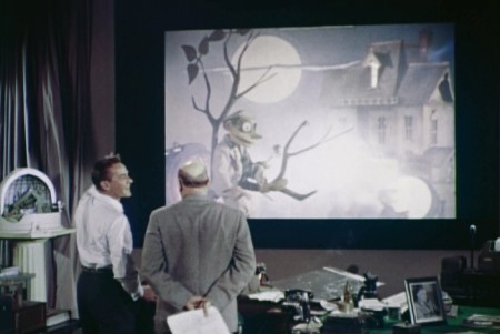
The show starts with series host, Frank Baxter, talking with actor,
Richard Carlson (who appeared in many Sci Fi films of the period.)

A2
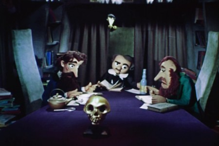
They interact with three early mystery writers –
Edgar Allan Poe, Dostoevsky and Charles Dickens.
These were marionettes from Bil and Cora Baird.

1
Within a few minutes, the animation comes in to tell
the more complex parts of the science.
From the start it’s a tale told as a cowboy film.

2
It’s all told with metaphors and similes.
They dumb down the science as much as possible.

3
It does make sense, though the telling
in this particular show is somewhat convulted.
Perhaps it’s the complicated material involved.

4

5

6

7

8

9

10

11

12

13

14

15

16

17

18

19

20

21
From here on they go back and forth to live action
then animation etc. The live ultimately dominates
with some few blinks of the animation.

22

23

24

25

26

27

28

29

30

31
32

33

34

35

36

37

38

39

40

41
42
A barely serviceable credit these corporate credits.
Today it’d be a swirl of hundreds of names squeezed into the
lower third of the screen with less than ½ a blurred frame per name.

« Previous PageNext Page »

eXTReMe Tracker
click for free hit counter

hit counter