Bill Peckmann &Comic Art 08 Jan 2010 09:18 am

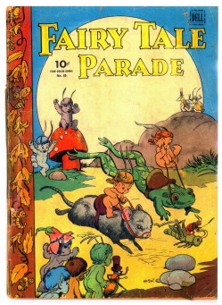
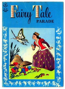
Walt Kelly Comics

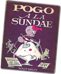
- Like all would-be child animators of the 50/60′s, I was obsessed with cartoons and cartooning. Naturally, enough one of the great heroes for all of us, during this period, was Walt Kelly.

Here was an artist of sublime dimensions. He’d animated for the best of the Disney films and then moved onto his own comic strip, Pogo, for generations of us kid (and adults). Let me tell you, Pogo was the be-all and end-all of comic strips. I clipped a lot of these strips out of the newspaper and saved them, until I realized I could buy the bound volumes of Pogo comics. I got rid of the clipped-strips and started collecting those collections of his strips – organized by him into subject matter. There were lots of them, so I went back to find some of those on the market that I had missed. Then there was the collected hard-cover volume of the books – Ten Ever-Lovin’ Blue-Eyed Years with Pogo. I bought that, too.

Funny, that they did a couple of animated programs adapting Pogo – a couple with the help of Kelly – but all these shows didn’t cut it. Not even the Chuck Jones show, The Pogo Special Birthday Special. It, naturally, was more Chuck Jones than Walt Kelly. It didn’t work.

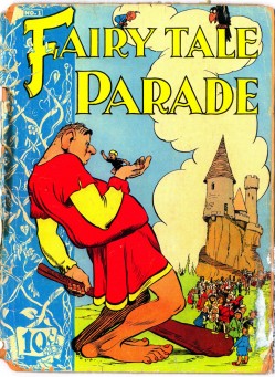
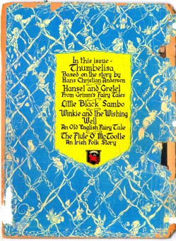
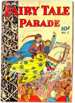
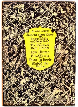
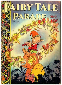
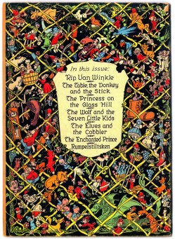
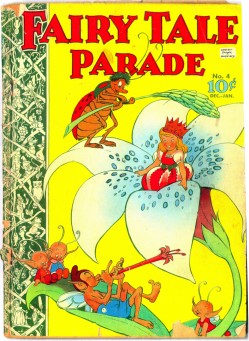
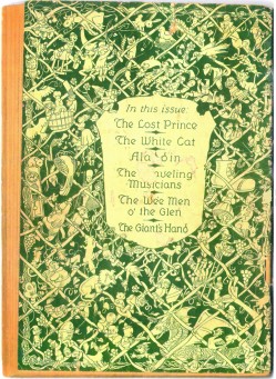
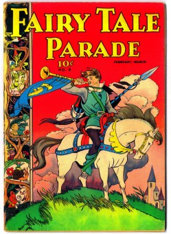
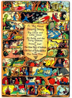
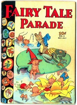
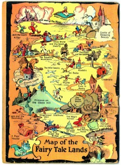
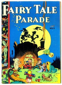
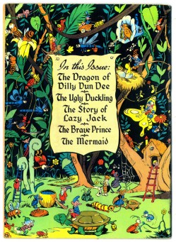
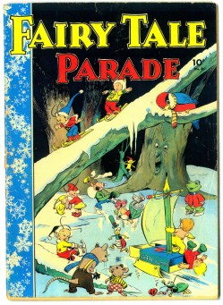
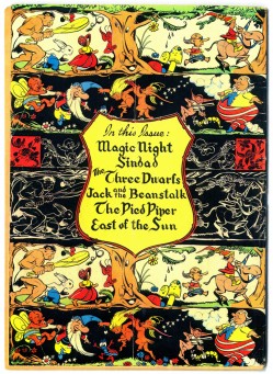
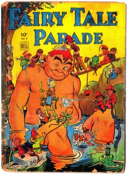
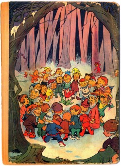
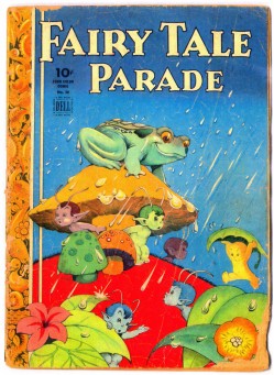
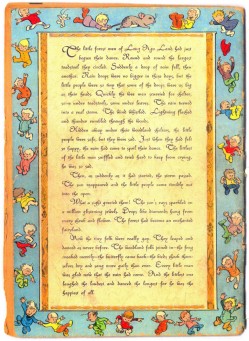
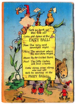
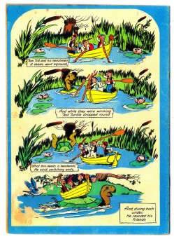
Between animation and strip, Walt Kelly had had a foray drawing comic book art. These comics are rare today and pretty hard to find. One person who seems to have all of these is comic collector, John Benson. Years ago, he’d sent color copies of all the covers – front & backs – to Bill Peckmann. Bill sent me these copies, and I’m sharing them here. (Michael Barrier wrote about and posted one of these stories.) These comic pages date from June, 1942 onward.

If you’re a Walt Kelly fan, this should be a treat. Thanks, of course, to Bill Peckmann and John Benson for the viewing.

Front cover__________Back cover

1
(Click any image to enlarge.)

2

3

4

5

6

7

8

9

10

11

12

I repeat my thanks to John Henson and Bill Peckmann
for the chance to see these gems.

Animation &Animation Artifacts &Bill Peckmann &Disney 07 Jan 2010 10:04 am

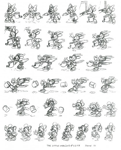
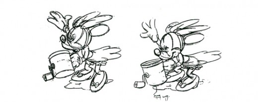
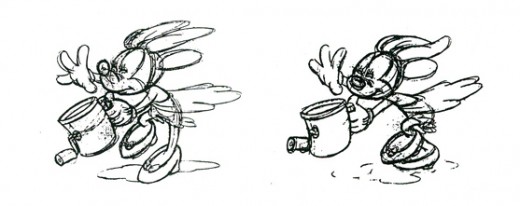
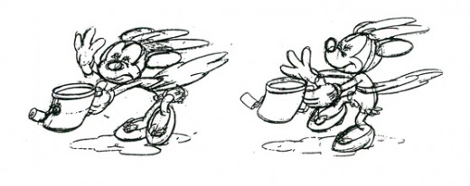
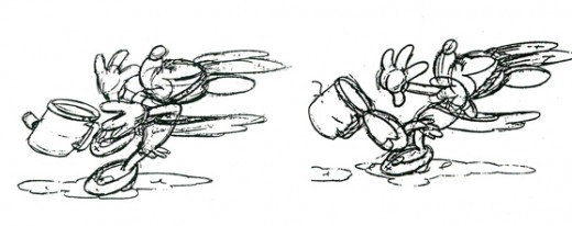
Little Whirlwind Action Chart

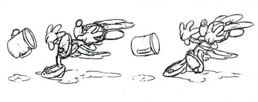
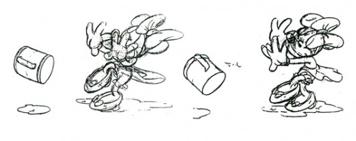
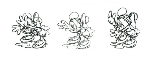
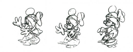
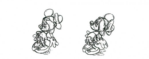
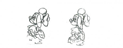
- Thanks to the generous loan from Bill Peckmann, I have this animation model chart of Minnie in Sc. 10 from The Little Whirlwind. The animation is by Ken Muse, Les Clark and George deBeeson (Effx). I suspect that Les Clark had the greatest hand in animating Minnie.

Here’s the model chart as copied:

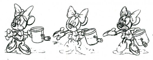
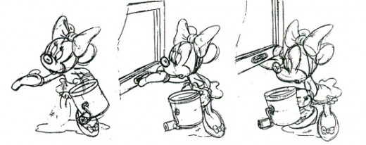
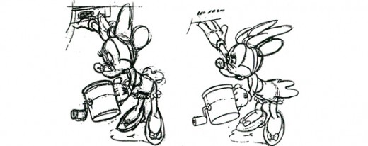
I’ve broken the images down and enlarged them a bit for viewing purposes:

The Following QT movie is exposed on
a mix of ones and twos. All guesswork on my part, and
there are probably some drawings left off the model sheet.

Click left side of the black bar to play.
Right side to watch single frame.

Animation &Commentary &Events 06 Jan 2010 08:54 am

Russian Animation

- Andrey Khrzhanovsky is one of Russia’s premiere animators. The list of his an1mated shorts can be found here.

He has completed a live action/animation feature that has been scoring excellent reviews. A Room and a Half draws on the biography of Joseph Brodsky, the Russian -Jewish -American poet, who won the Nobel Prize for literature in 1987 and was made poet laureate of the U.S. in 1991.

The reviewer in Variety wrote:

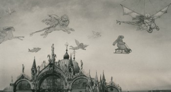
    Veteran animator and documaker Andrey Khrzhanovsky’s feature debut, at the age of 69, is a magical, wildly creative fantasia on the life of Russian poet Joseph Brodsky. . .

    Khrzhanovsky has stated that Brodsky’s life was the “creative impulse” for his film, meaning it shouldn’t be seen as a biopic. Or rather, it’s as much a biopic as one of Fellini’s self-referential reveries. . .

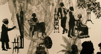
    “A Room and a Half” is unmistakably the work of a mature artist, and it’s the helmer’s absolute mastery of the different formats that makes his work so joyous. Silhouette cutouts reflect pre-Revolutionary elegance, an animated cat appears inside a credenza and musical instruments float across the city skyline, fusing Magritte and Chagall.

The magazine Screen adds:

    Some of the most touching moments in the film cover his childhood, painting an intimate, cheerful, closely knit family, that never lets their cramped living space or the penury of the lean years sap their spirit. The film freely elaborates on young Brodsky’s flights of imagination at the time, including a magical animated sequence in which Soviet soldiers throw culture out of the window, followed by a whole orchestra’s worth of instruments.

The Film Forum will be screening A Room and A Half for two weeks beginning Jan 20th.

________________

.
- Speaking of Russian animation, there’ve been some additions to Niffiwan’s site, Animatsaya In English. Lots of recent animation has been posted (all subtitled in English) as well as a lot of information.

Niffiwan has put together a Wiki site which offers a large number of animated films, both current and historic, which have been subtitled. There’s a list of films subtitled in English and a list of films that are wordless. You owe it to yourself to start catching up on some of the world’s finest animation.

Some of the treasures include:

    Of course, there are Norshtein‘s films: The Heron and the Crane and The Hedgehog in the Fog

    There’s also Fyodor Khitruk‘s masterpiece Film, Film, Film as well as several of his Winnie the Pooh flms.

    There are number of films by Edouard Nazarov including There Once Was A Dog.

    There are classics like Ivan-Vano-Ivanov‘s The Little Hunchbacked Horse or The Stolen Sun.

    Plenty (maybe too many) of the commercially successful Well, Just You Wait! films.

Get a taste of the Russian Roadrunner, then move on.

There are at a couple hundred films on this site. Spend some time.

Additionally, Niffiwan leads us to another site: Digital Cake which offers some other animated films (many are the same as his wiki.)

Articles on Animation &Books &Illustration 05 Jan 2010 09:03 am

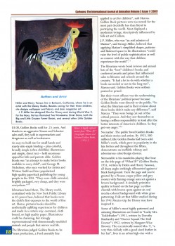
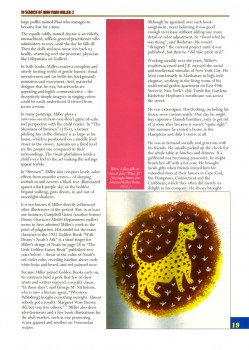
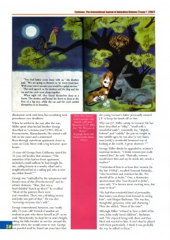
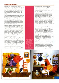
Canemaker’s J.P. Miller – 2

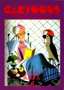
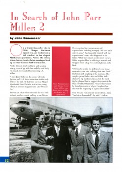
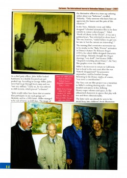
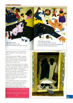
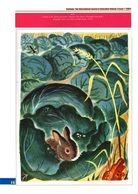
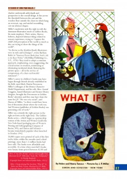
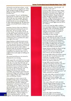
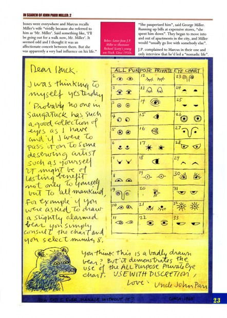
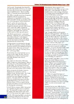
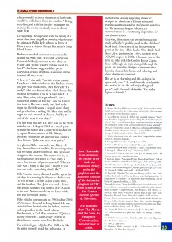
- Last week I posted the first part of a two-part article written by John Canemaker for the magazine, Cartoons, the International Journal of Animation published by ASIFA Int’l. The two part article appeared in the Winter 2006 and Spring 2007 issues. (See Part 1 here.)

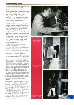
John Parr Miller worked at the Disney studio from 1934 to 1942 as part of the Character Model Department run by Joe Grant. After Miller’s service in WWII, he designed and illustrated many children’s books and he continued in that field for the remainder of his life.

This is an extraordinarily well-researched article by John Canemaker, and I’m pleased to post it here for all those who don’t have access to the magazine, Cartoons. Thanks go to John for his permission to post both parts of the article.

With more of a focus on his children’s books, this is part 2:

1 2
(Click any image to enlarge.)

3 4

5

6 7

8 9

1011

12

1314

Animation &Animation Artifacts &Disney 04 Jan 2010 08:42 am

More Thomas Jungle Book – 2

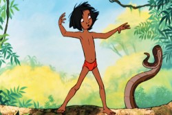
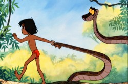
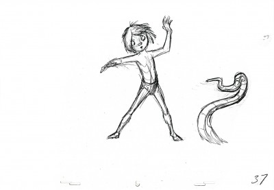
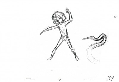
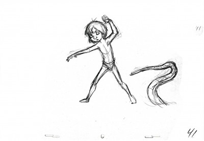
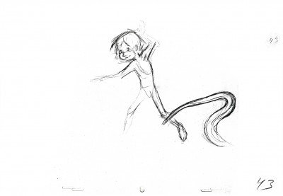
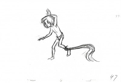
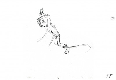
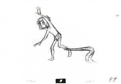
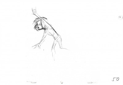
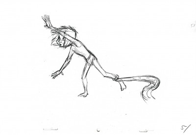
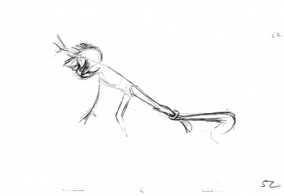
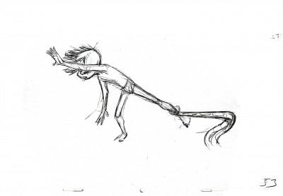
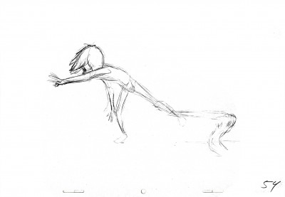
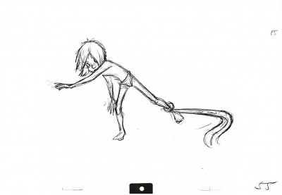
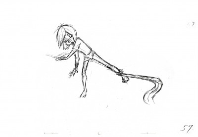
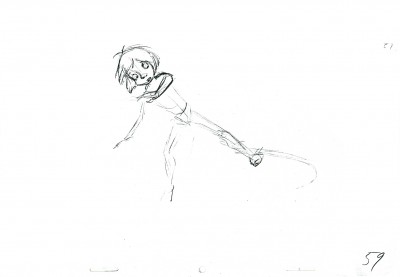
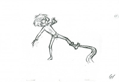
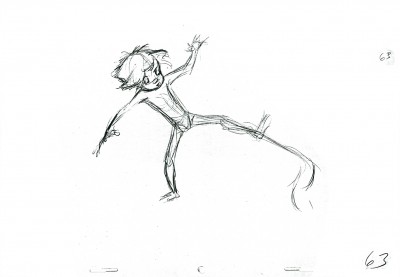
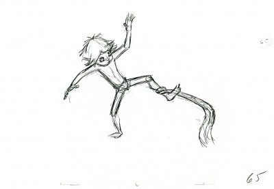
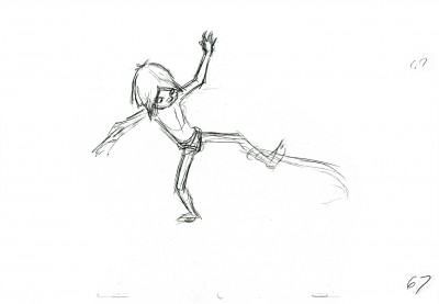
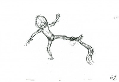
- Last week, I posted the first part of a scene Frank Thomas animated for The Jungle Book. This is the second scene offered that involved the boy, Mowgli, and Kaa, the snake.

This scene follows one I posted several months back. (The two come in the film with only a closeup of Kaa separating them.)

The 103 drawings in the scene will have to be broken into three parts, so you can expect the last third next week.

Once again, many thanks go to John Canemaker for allowing me to share these on line.

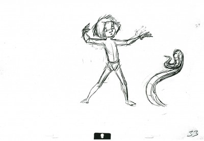
I begin with the last of the drawings up last week, #33:

33
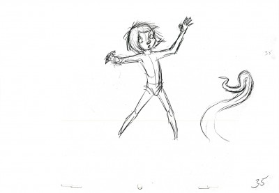
(Click any image to enlarge.)

35

37

39

41

43

47

48

49

50

51

52

53

54

55

57

59

61

63

65

67

69

The Following QT movie is of the complete scene.
I love how he shakes his head and mouths the word “No”
just prior to wrenching his hand from Kaa’s grip.


Click left side of the black bar to play.
Right side to watch single frame.

Art Art &Commentary 03 Jan 2010 09:41 am

Morgan Library

On New Year’s eve/day, we went to the Morgan library. This was the first time I’ve been in the new building since the reconstruction. The new architecture was designed by Renzo Piano and reopened in 2006.

I used to enjoy going through the large iron doors (at least, I think they are iron) which are still there, but are now permanently locked on what has become the side of the museum. There was something grand about it. There’s now a grand new entrance which is wheelchair friendly going through a large faceless glass entrance.

Once inside, you face a high ceilinged room with a great expanse of open space. Dining facilities are all about you, and it’s one of the better features of the building. A nice place to have a cup of tea/coffee and a spot of lunch.

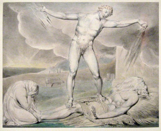
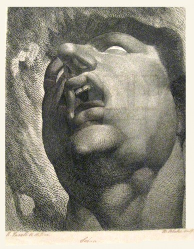
Of course you’d go to the library for the exhibits on display. Closing this Sunday (today) is a show of the art of William Blake. While there, I took out my camera and started photographing some of the etchings and watercolors. No sooner had I shot two of them, than I was caught in my tracks by a guard asking me not to photograph anything. These are the two I did capture:


“Satan Smiting Job with Boils” by William Blake


Satan – “Head of a Damned Soul in Dante’s Inferno” by William Blake

However, I did learn that you can view the entire Blake exhibit by going online to here. There, all of the images are offered (at least through today.) The Book of Job is outstanding as are others from the Book of Europa. However, no photograph or reproduction can satisfy as much as standing in front of the actual article.

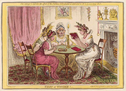
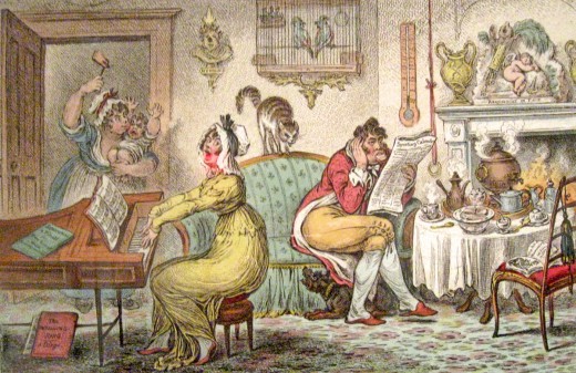
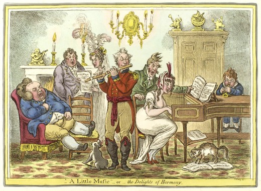
Also on display, through March 14th, is a show of Jane Austen’s manuscripts, letters and other artifacts. Being the visual person I am, of course the cartoons by James Gillray, which offer a glimpse of the society she dealt with, are an absolute riot. It was nice to be reminded of his brilliant work.

I was able to photograph several of them, but in two cases images I found on line were better than my soft photos. Here are three examples:


Tales of Wonder by James Gillray


Marital Harmonics by James Gillray


A Little Music or The Delights of Harmony by James Gillray

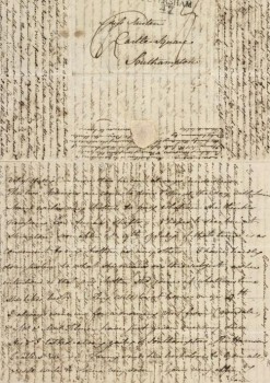
I was also fascinated with Austen’s letters. Having done a lot of research about Edgar Allan Poe, I’ve seen quite a few of his letters, and the two were writing at roughly the same time.

Letters did not come in envelopes. They were large-ish sheets of home-made paper that were folded into very small parcels and were sealed with wax. Since paper was valuable you did not waste any of it. Writing went from left to right, up and down and in the margins. Wherever there was empty space there was room for more writing. Letters were also contained to one sheet of paper since the carriage of the letter was expensive.

I don’t quite know how they managed their postal system, but it must have been somewhat arcane in comparison with today’s system of dropping a letter into the corner mailbox. I do know that Poe sometimes employed friends to carry letters to those he was writing.

The visit to the Morgan Library was entertaining and enjoyable. I’m sorry I don’t do it more often, certainly considering how close it is to my apartment.

Animation &Animation Artifacts &Disney 02 Jan 2010 09:09 am

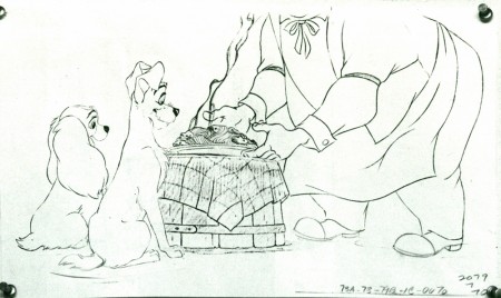
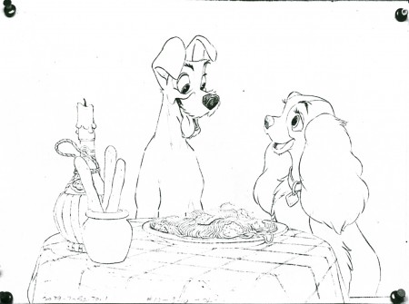
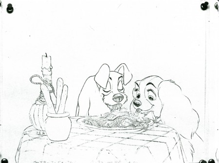
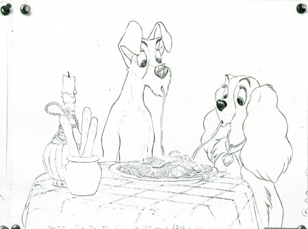
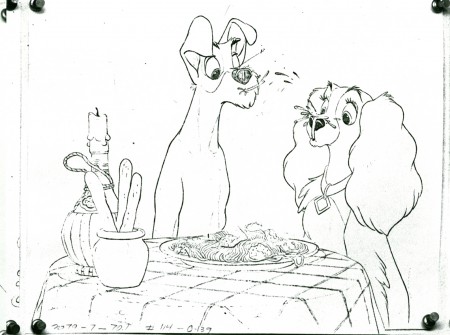
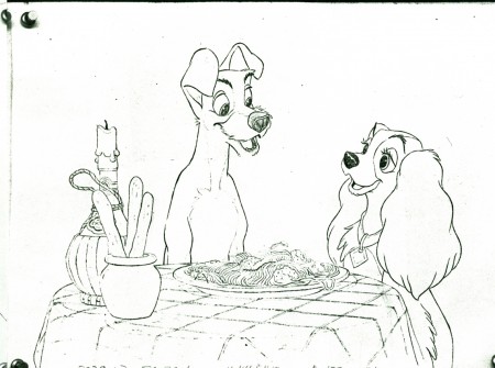
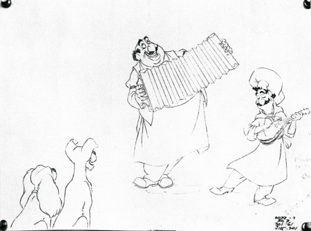
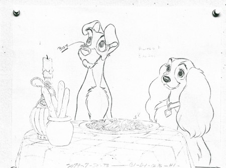
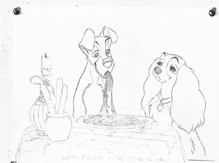
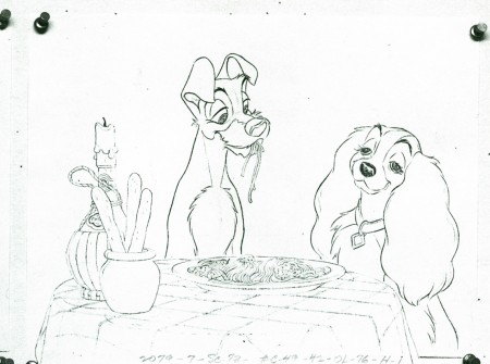
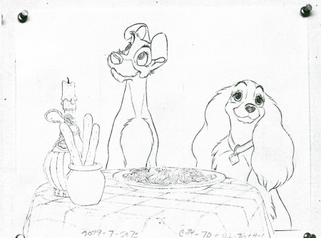
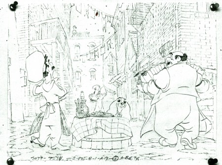
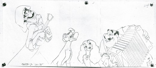
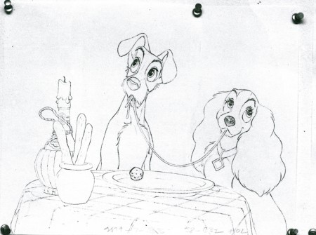
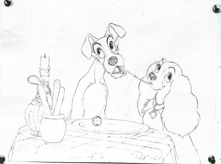
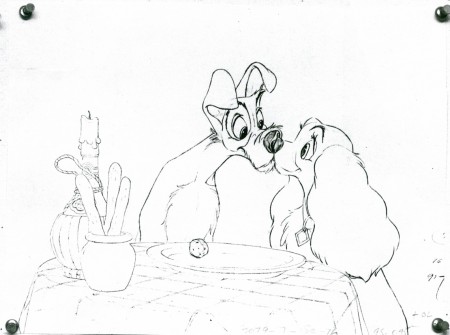
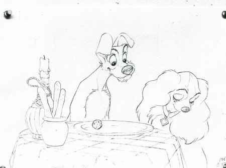
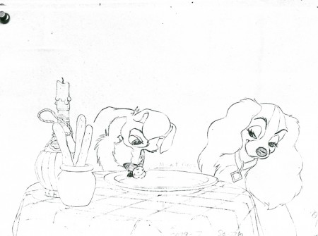
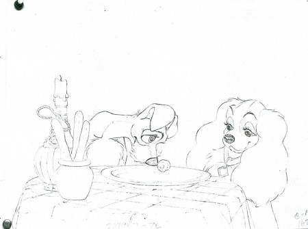
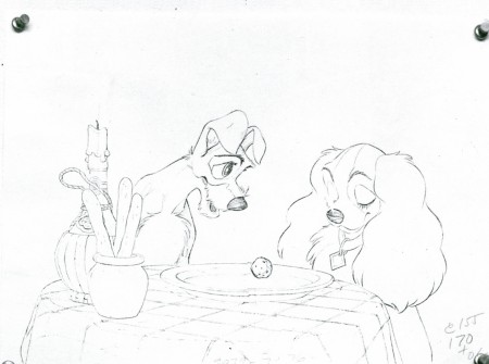
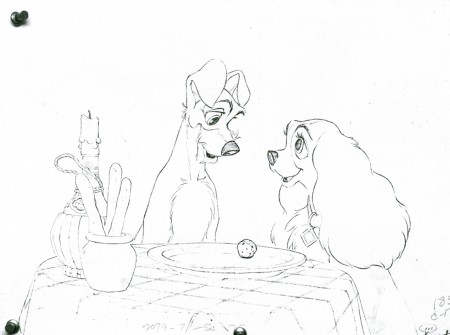
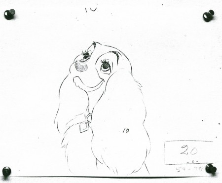
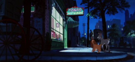
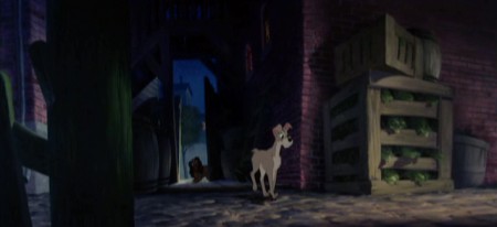
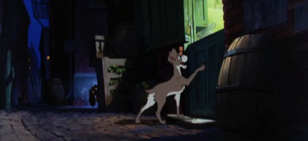
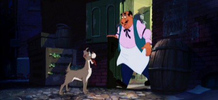
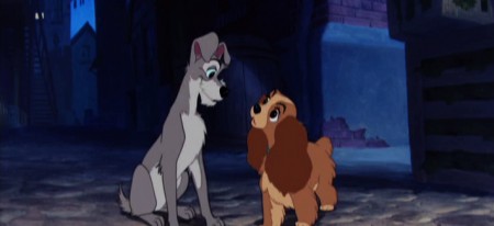
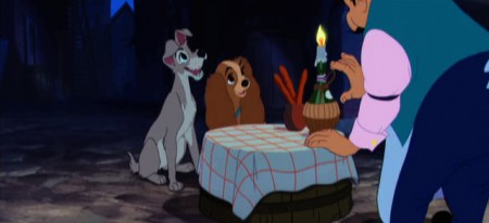
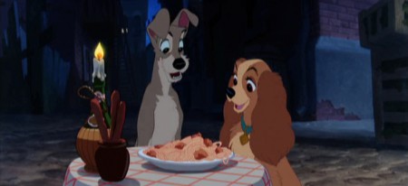
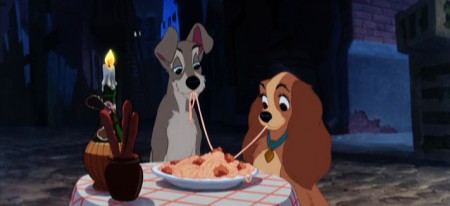
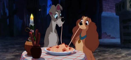
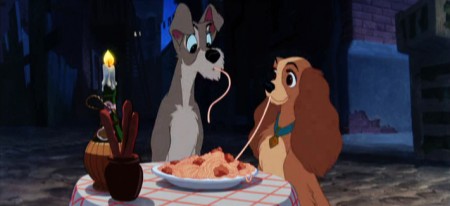
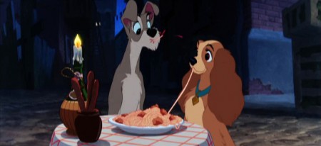
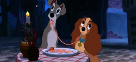
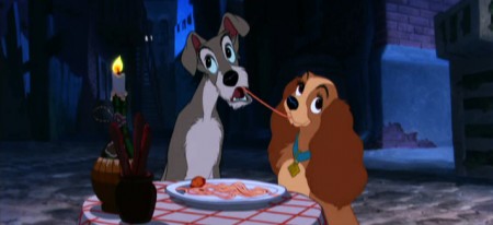
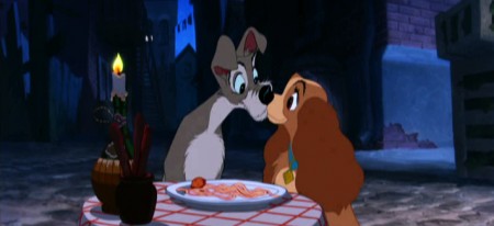
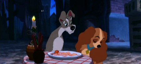
Lady and the Tramp poses

- These are drawings were published in rather small sizes in the Frank Thomas/Ollie Johnston book, The Illusion of Life. I have photos which are somewhat larger and felt that it’s worth calling some attention to them. There’s so much charm in every one of them. Frank Thomas animated the scene.


(Click any image you’d like to see larger.)

1

2

3

4

5

6

7

8

9

10

11

12

13

14

15

16

17

18

19

20

21

22

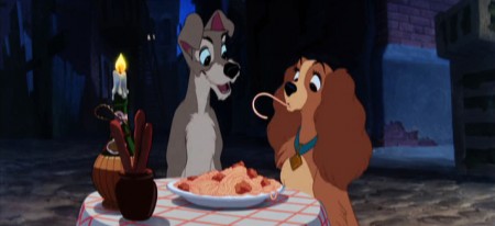
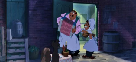
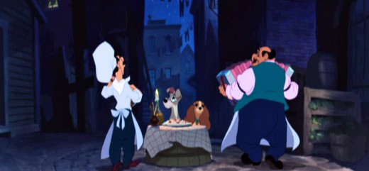
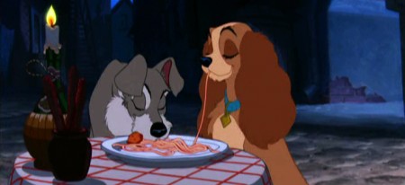
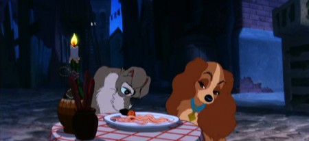
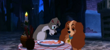
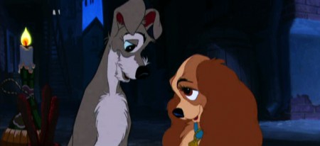
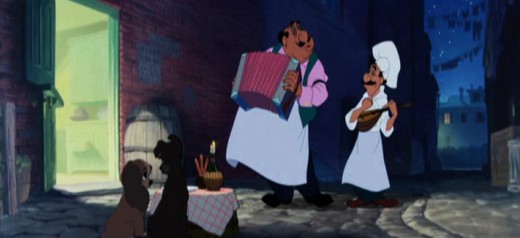
Now lets take a look at frame grabs from the sequence. (I followed the drawings above and eliminated some scenes – mostly of the two restauranteers playing music.

1

2

3

4

5

6

7

8

9

10

11

12

13

14

15

16

17

18

19

20

21

22

23

24

Commentary &Daily post 01 Jan 2010 09:36 am

happy new year

Happy New Year

.
Here’s one of my favorite pieces. We did it for a home video of children’s poems.
It’s a piece by the brilliant Russell Hoban. The animation is by Mark Mayerson, and the design is by Jason McDonald. The music is by Caleb Sampson. I think all of these artists did brilliant work.

Click left side of the black bar to play.
Right side to watch single frame.

_________________

- I’ve grown to know that I am too old for New Year’s Eve’s TV celebrations.
Watching a 40 year old mother, J-Lo, in a skin-tight nude outfit with sparkles, moving around the stage on all fours while lip-synching a generic song and two guys pretend to violate her – this does not have much to do with New Year’s Eve for me. As I said, I’m too old for this coarse crudity. Even reruns of Guy Lombardo in his tuxedo sounds better. Especially when you’ve drunk too much. Call me a prude, I don’t care; I’m all for dignity. We watched the Twilight Zone reruns on SYFY. All those great Bernard Herrman and Jerry Goldsmith scores.

_________________

You can start your New Year off with a bit of Art. The good news is that the IFC Center has extended the run of Nina Paley’s Sita Sings the Blues through next Wednesday, Jan. 5. Get off the couch and go. Perhaps they’ll extend it another week.

See A.O. Scott‘s NYTimes review here. (It’s very positive and well written.) See the readers’ reviews (all positive) here.
Go to Elizabeth Weitzman‘s NYDaily News top ten pick of 2009 here. Anyone know of other 10 Best lists the film made it onto?

_________________

- I congratulate Sally Cruikshank on having her film Quasi at the Quackadero selected into the Library of Congress’ National Film Registry, but I have to admit I find it whacky that Rooty Toot Toot, Moonbird, The Old Mill, Peace On Earth and dozens of other true history-making shorts of U.S. animation haven’t been selected before this film. I can only assume they will get their just deserts next year.

Animation Artifacts &Bill Peckmann &Models 31 Dec 2009 08:49 am

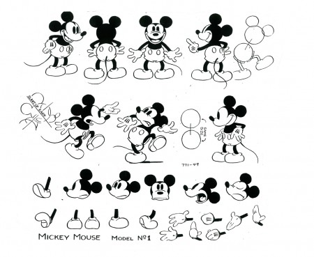
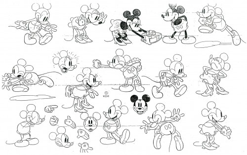
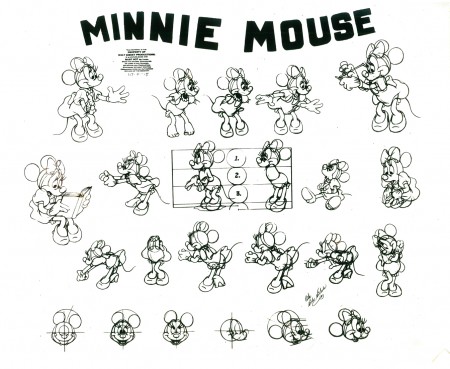
More Mickey Models

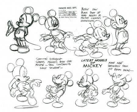
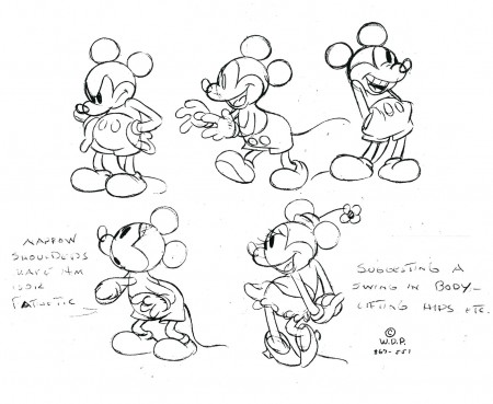
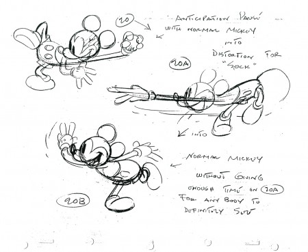
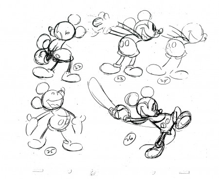
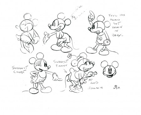
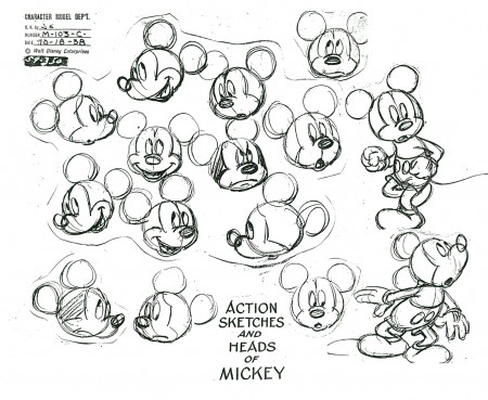
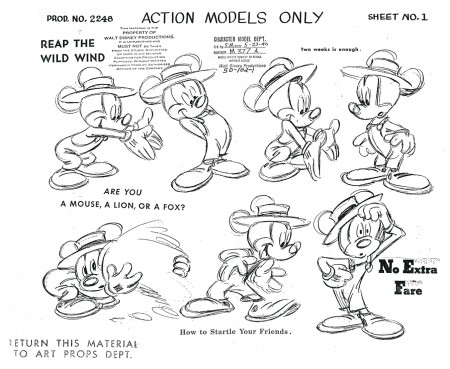
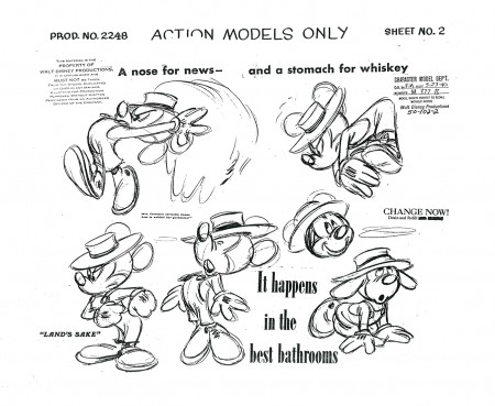
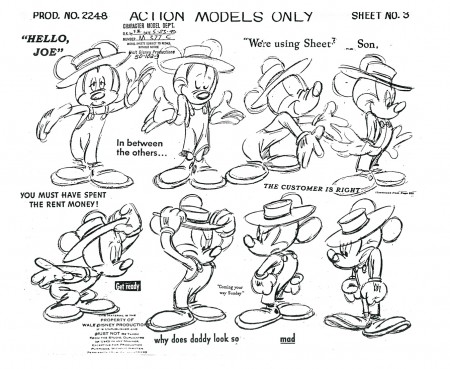
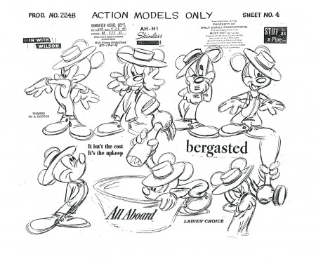
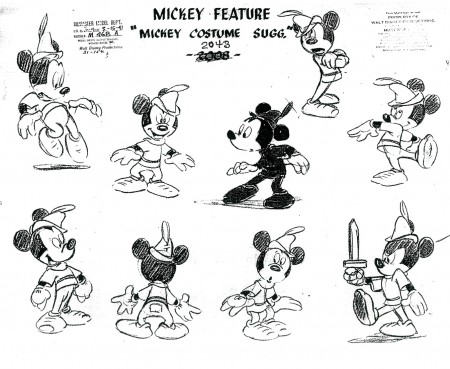
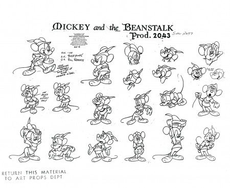
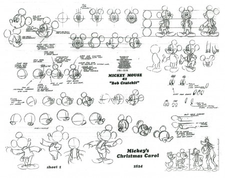
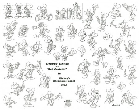
- Bill Peckmann has generously loaned me another very large stash of character model sheets, primarily Disney. There’s a wealth of Mickeys, alone.

I’ve posted some of them before, many in much poorer condition. Consequently, I’m about to spend some time with Mickey and Minnie, and post some new, some old and some out of this world models of the pair.

Here’s a large number of them. I’m holding back some animation charts from L’il Whirlwind and The Symphony Hour which will come at a later date.


Let’s start with a nice early Mickey.


Then a Minnie and Mickey together.


Here’s a beautiful Minnie model.

1
These are the models from the Disney lecture posted here.

2

3

4

5

6

1
These next four are the model sheets drawn by Ward Kimball.

2
The earlier versions of these Kimball models that I published were
in horrible condition. It’s nice to post such clean versions of them.

3

4


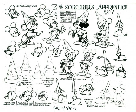
Here’s a fine copy of the Sorcerer’s Apprentice model sheet.

1
These two model sheets from Mickey and the Beanstalk are new to me.

2

1
And, finally, these two charts from Mickey’s last
hand-drawn short, Mickey’s Christmas Carol.

2
Now Mickey’s a cgi character and completely off-model (and unwatchable.)

Thankyou, yet again, to Bill Peckmann for sharing these with us.
.

There are three interesting model sheets at David Lesjak’s excellent site Vintage Disney Collectibles.

Commentary &Disney 30 Dec 2009 08:49 am

Another look at 2 features

- I’ve seen a couple of this year’s features another time this past week and have had some more thoughts about them.
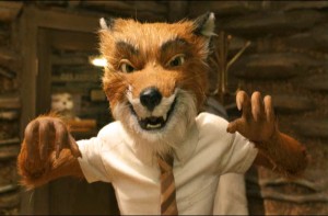
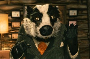
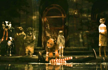
I’ve now seen The Fantastic Mr. Fox a third time. Twice in theaters and once on DVD. All three times it was every bit as entertaining for me as it was on the first viewing. I was more impressed with the levels of depth cleverly written within the film.

There are the same father/son complications of every Wes Anderson film, however more interesting to me was the thought on the nature of the film’s creatures.
The Royal Tenanbaums treat each other as if they are Royal. The Foxes are wild animals; they know it and allow their true nature to emerge. Look at every time they eat, attacking wildly and voraciously.

The animals in costume are little more than their natural selves: a fox is a fox and it’s unable to resist its natural, wild tendencies. A badger is a badger and tempers will rise when mixing with a fox. Though he’s a friend and lawyer to the fox, the two spit and spat whenever they meet.

This is not the same lax world as many past cartoon creations. Bugs Bunny was rarely, if ever, a bunny. He was more a foil for Elmer Fudd (or in some cases Daffy Duck, who started life as a duck but became something other.) Mickey Mouse could mix with Donald Duck, or Goofy, and all could just act as humans do with little regard for their off-sized proportions or animal natures. (Admittedly, Pluto always stayed a dog despite the fact that Goofy was also a dog, and Mickey Mouse was his owner and larger than the dog.)

This is the cartoon world, and there’s nothing wrong with it. It’s just that Mr. Fox takes it into a different direction – thanks to the spirit of Raold Dahl, which Wes Anderson followed closely. And in doing that Anderson asks what is our true nature? What is wild within us when we, as adults, seem to have learned to temper those base instincts.

The animation of some of the Beatrix Potter stories have followed the animal natures of the characters, but adaptations of The Wind in the Willows have not followed the book’s logic. In the book the animals ARE pointedly animals – despite wearing clothes and acting more human-like.

To me, the film is witty, charming and wholly satisfying. Even the stodgy, stiff animation is part of the appeal. There’s a quaint and homespun feeling to the characters in this old-time, hand-made animation. Sitting next to me in the theater, this last time, was a mother (about 30) with her son (about 10). She was quiet during the film, he was certainly enjoying it. When the film ended, the boy asked his mother excitedly, “Didn’t you just love the farmer?” The mother hesitated for a long time, then said, “I guess so.” She seemed not to enjoy the film while her son gushed over it all the way out of the theater. Not all films are for everyone.

The Princess and the Frog I saw for a second time on DVD. Actually, I could only make it through about 2/3 of the film on the second viewing. Its flaws were larger for me on the small screen and at second viewing.

The largest hurdle for me on the first viewing was the story, and it remained the complete shambles it was the second time out. It’s an embarrassment to me that this film came out of the Disney studio with no one noticing how poor the story and the storytelling is.
The only joy was in seeing animation so rich – not always good but always rich and professional. It’s been a while since we’ve had even that.

The movement and character development, in this film, was often more Warner Bros than Disney – wilder, broader and hard-edged. The last few Disney 2D features seemed to be making a split. Half the animation seemed very Don Bluth while the other half was more WB. This, of course, was just my perception. Only a couple of animators seemed distinctly out of the Disney mold – Andreas Deja and Glen Keane, for two.

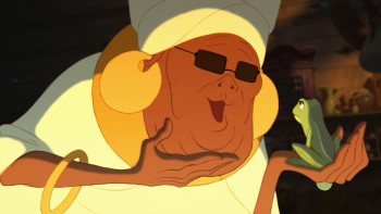
I like Andreas Deja‘s animation of the voodoo queen, Mama Odie, introduced to us in the last third of the film. (Really! Was there no way to introduce this character earlier in the film?! I can think of half a dozen ways to do it, and the film could have used more of her.) Unfortunately, she’s on the screen too short a time to separate her from Mad Madam Mim or The Rescuers’ Madame Medusa.

It’s interesting that the film includes the death of a bug (a bug also introduced in the last third of the film), and that’s supposed to make us feel something. Of course, it becomes a star (there must be lots of stars – meaning dead bugs – that we don’t see up there) as the directors try pointlessly to pull the heartstrings. More disheartening than heartfelt.

In Mr. Fox, when the villainous rat dies, no such poor attempt is made to manipulate our emotions. Anderson didn’t sentimentalize the death. “Just another dead rat in the garbage pail behind the Chinese restaurant.”
« Previous PageNext Page »

eXTReMe Tracker
click for free hit counter

hit counter