Animation &Books 06 Feb 2010 09:15 am

WTFoster’s other book – 2

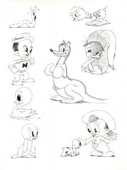
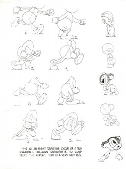
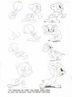
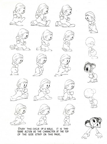
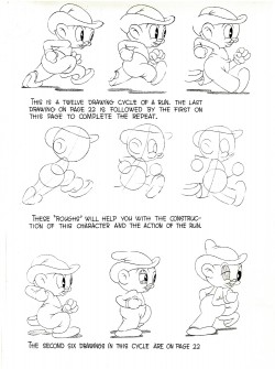
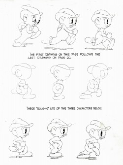
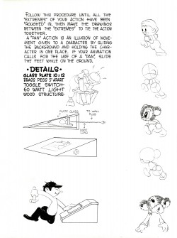
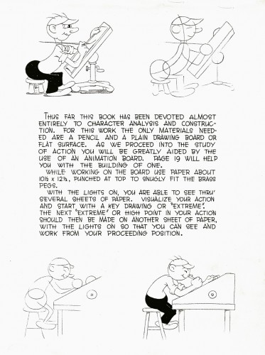
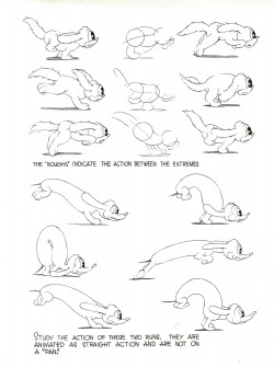
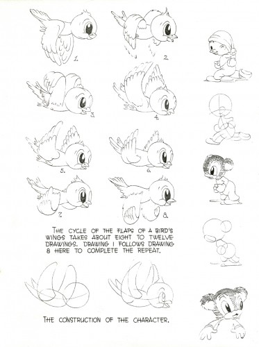
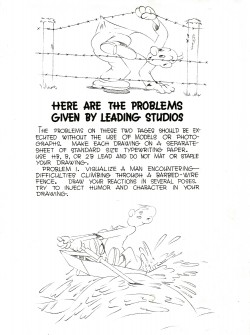
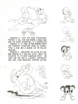
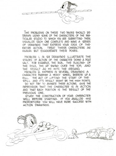
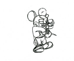
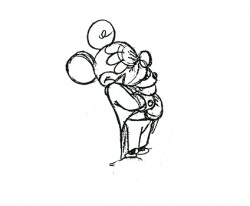
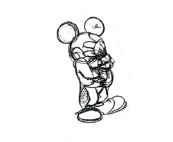
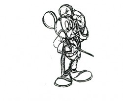
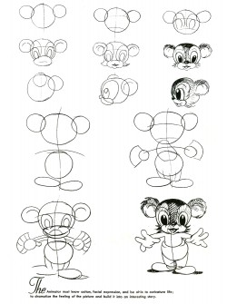
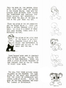
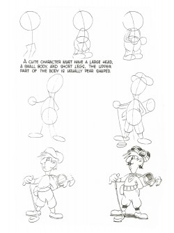
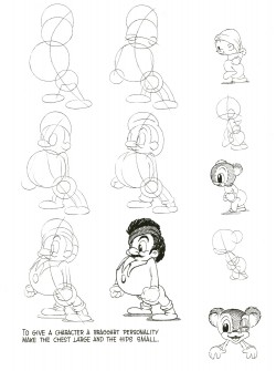
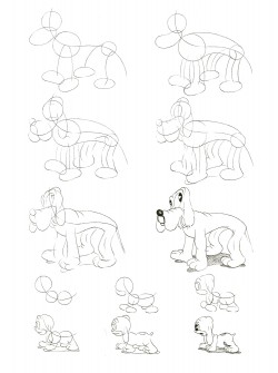
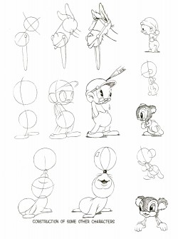
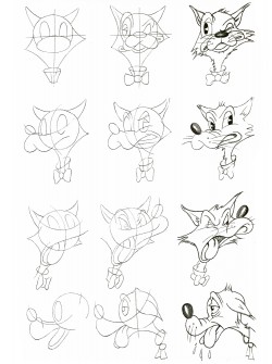
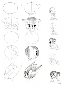
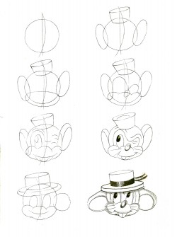
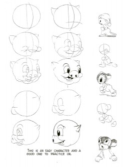
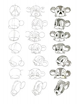
- – Last week I posted the first part of this Walter T. Foster art book: Animated Cartoons for the Beginner. Here’s the second half of the book done in a very retro style. I’m surprised it survived the 1960s, when I first got a copy of it. The artwork looks like it comes from the 1930s and could hardly have survived the War (never mind been drawn after it.) The book was first published in 1946.

The animation in the book is certainly odd, not least because the pages are out of order and the flip book imagery doesn’t properly flip. I’ve placed the images in the correct order and have made a small QT movie of the piece for your entertainment if not your edification.

Here are the pages of remaining:


1617

1819

20

2122

2324

25

2627

2829

30

3132

33

Here is the flipbook that rests on the outer edge of every other page.
I’ve maneuvered them a bit to make it work properly. Registration is
impossible given the size shifts and placement of the drawings on the pages.
i’ve done what I could.

Click left side of the black bar to play.
Right side to watch single frame.

Animation Artifacts &Commentary &Frame Grabs &Independent Animation 05 Feb 2010 08:53 am

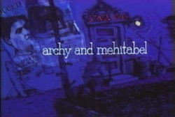
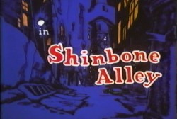
Shinbone Alley

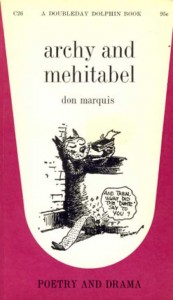
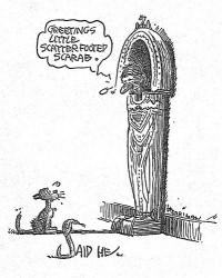
- Don Marquis‘ book, Archy and Mehitabel, garnered fame quickly and not least because of the extraordinary illustrations of George Herriman, the creator of Krazy Kat.

The first book was published in 1927 and others followed in 1933 and 1935. It wasn’t until the third book that Herriman took over the characters created by Marquis in his book of short stories, developed mostly, in poetry. An on-again off-again love affair, the story had two principal characters: a cat, Mehitabel, and Archy, cockroach. (You can read these poems on line here.)

In 1953, writer Joe Darion along with composer George Kleinsinger (the creator of Tubby the Tuba) created a musical theater piece. Tenor Jonathan Anderson played Archy and soprano Mignon Dunn was Mehitabel. At about the same time a recording of the showtunes was recorded with Carol Channing as Mehitabel and Eddie Bracken as Archy. The record was a success.

With the help of the young writer, Mel Brooks, they were able to get their show to Broadway in 1957, but it was now named Shinbone Alley. After 49 performances, the show closed, but the original cast album was recorded that same year. The songs stayed in the permanent repetoire of Carol Channing and Eartha Kitt.

In 1971, John Wilson directed an animated feature starring the voices of Channing and Brackett and using the songs from the musical. The love affair between Archy and Mehitabel was penned by Archy, the cockroach; his poems tell their story.

The film suffers from its music. The songs are simple and sound as if they’re written for children, but the lyrics pull from the poems which are definitely designed for adults. It gets a bit confusing, as a result, and is a bit picaresque; the poems are short and illustrating them in animation would take more adaptation than seen here.

John Wilson had developed his studio, Fine Arts Films, on the back of the weekly, animated, music videos he did for The Sonny and Cher Show, an enormous hit in the early 70s.

These music videos were loose designs animated quickly and lively around the songs Sonny & Cher would schedule each week. There would always be one or two of these pieces, and they were highlights in the weekly one-hour musical/variety program.

The graphics of Shinbone Alley aren’t too far from these Sonny & Cher videos. Loose design and animation with a design style not too far from the Fred Wolf’s made-for-ABC feature, The Point. This was the first feature made for television and featured the songs and story of Harry Nilsson, although Shinbone Alley featured a wilder color pallette.

Jules Engel, Corny Cole and Sam Cornell all worked in design on the film. The long list of animators included Barrie Nelson, John Sparey, Spencer Peel, Eddie Rehberg and Jim Hiltz. Mark Kausler was an assistant on the show.

The film wasn’t an enormous success, but that was probably explained much by the limited distribution and the poor marketing of the film.

The Jacob Burns Film Center will host Shinbone Alley on Tuesday Feb. 16th. The screening will be at 5:30 & 7:25 pm.

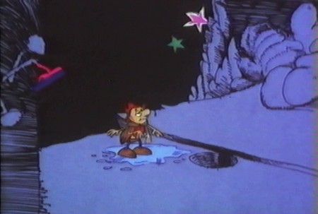
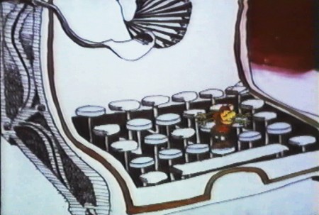
Here are some frame grabs from the first 1/4 of the film:


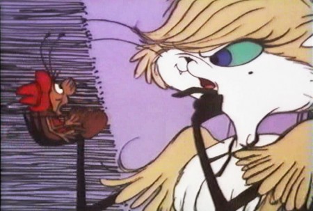
We’re introduced to Archy right off the bat as he
flies out of the river onto the dock. He realizes that he,
the poet, tried to kill himself and was sent back as a cockroach.


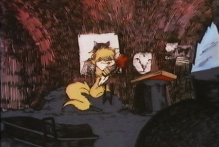
He soon finds a typewriter and goes straight back to work.


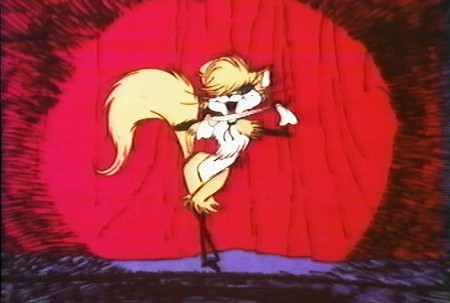
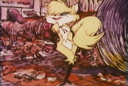
Mehitabel is a performer – with Carol Channing’s voice.


The two meet cute.


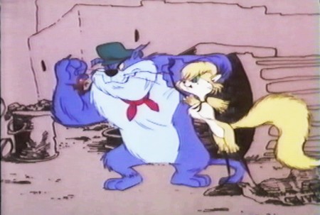
She has another boyfriend, voiced by Alan Reed,
who is also the voice of Fred Flintstone.


A song video takes us outside.


pan down.


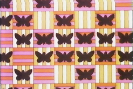
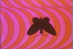
Another music video brings us into Peter Max’s style.


Life in Shinbone Alley.


Animation &SpornFilms 04 Feb 2010 08:47 am

Moving feet – using it

- The other day I’d written about a pet peeve of mine. This is when animators take the poor layouts they’re given and simply inbetween them. As a result, the feet on two related layouts slide from one position to another. This is not something real people could or would do, yet animators do it out of laziness. It’s a sure sign that the animator isn’t thinking of the character as a living/breathing organism. It’s just a bunch of drawings to that guy.

How to fix the problem; it’s easy.

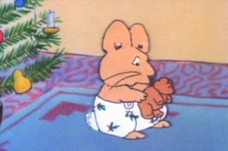
On an early short film of mine, I worked with an illustrator, Rosemary Wells. It was her first time seeing her characters animated. Consequently, she had a lot of involvement in the process. I ended up having to take drawing lessons from her – how to draw her characters. I travelled upstate at least half a dozen times to watch her at work.

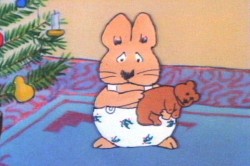
In the end, she gave me a bunch of drawings that she hoped I would follow. In one key scene, she drew her character, Max, with feet facing one direction. Then in the next layout, his feet are facing another direction.

1 2

I could have just inbetweened his feet, or even let them pop from one position to another (as Elmer does in that GEICO spot). It would have looked horrible. Instead, I chose to treat the positions as animation moving from one foot to the other. I added a stop position in the middle for a reaction – pause.

Then I let the scene play out.

Click left side of the black bar to play.
Right side to watch single frame.

The end result gave a bit of character to Morris, and worked within the needs of the scene. A few extra drawings paid off. (This, of course, is not something you’d see in Flash – it’d just pop.) The way I handled the move made Rosemary Wells happy, and it made me happy. It took the monkeywrench she’d thrown at me to make something more alive, and I was happy for it.

Note that I’m not patting myself on the back. I’m just saying that this is something that should be second nature to anyone out there that considers themself an animator. If a layout you have to follow indicates feet moving, either change them or make them work.

Daily post &Norshtein 03 Feb 2010 09:02 am

Dumbing down Oscar/Norshtein visit

- I thought I’d comment on the Oscar nominations.

The list of 10 Best Picture nominees creates some pathetic choices. The Blindside and District Nine should not be nominated for the Best Picture. It diminishes the category and demeans the other nominees. I’m sure Up got in there because of the increase to 10 nominees, but I’d gladly sacrifice that to give a little dignity to the award. The Messenger was better than either of those two films (and better than Avatar as well) yet it was left out in the cold.

They did this once before, in 1939, when every one of those 10 nominees deserved to be there. This year it was tough just picking 5 films to be nominated.

I’m glad Tomm Moore’s The Secret of the Kells got nominated, though I don’t think it was particularly good. However, it would have been a total sham if Cloudy With A Chance of Meatballs had been honored. My preference would have been for Ponyo, which may have been the best animated feature of last year’s crop.
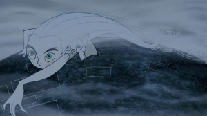
(By the way, there’s another chance to see the Secret of the Kells in NY. Tomm Moore will be in attendance for a Q&A. It’s playing Sat Feb 27 at the CANTOR FILM CENTER – 36 East 8th Street – at 1pm. Go here for tickets in advance. )

It’s also sad that Runaway wasn’t nominated for Best Animated Short. It’s better than most of those nominated, even though I’m not a fan of any of the shorts in the running. There were a bad crop of films shown this year, and I would have had a hard time if I had to select any of them.

I have to say, watching Logorama, which ended with a devastating earthquake, so soon after the Haitian disaster was difficult. This wasn’t the fault of the filmmakers, just the circumstances that were happening in the real world. It took something away from the film, for me.

___________________
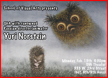
Yurij Norshtein is visiting the two coasts.

He’ll be in San Franciso this Sunday, Feb. 7h, showing his films and talking at the Balboa Theater (3630 Balboa Street, San Francisco, CA). Tickets are $25. The event will be a fundraiser to support Yuri Norshtein’s animation studio in Moscow.

He’ll be in Olympia, Washington on Wednesday, February 10th at the Evergreen State College (Communications Building, Recital Hall in Olympia Washington.) Ticket prices are $10 regular admission, $8 seniors, $5 students.

He’ll be in LA this Friday at the USC School of Cinematic Arts (the Norris Cinema Theatre/Frank Sinatra Hall.) The admission is free and begins at 7:00pm. Friday, February 5th, 2010. Igor Kovalyev (Milch, The Rugrats, Duckman) will lead the conversation with him.

And, finally, he’ll be in New York on Monday, February 15 at the School of Visual Arts Theater (333 W. 23rd Street, between 8th/9th Ave.) This event is free to ASIFA East members (and anyone else, too.) Interesting enough, none of those who put together the NY edition of this show have any idea whether Norshtein will be screening films or just doing a Q&A. It’s up to him (and I’m pretty confident his films WILL be screened – since he doesn’t speak English, making a lengthy talk impossible.)
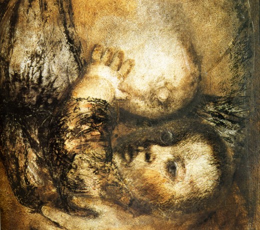

This is one of the great world leaders of animation, people. ATTEND ATTEND ATTEND and Stop being so lazy.
Animation &Commentary 02 Feb 2010 09:10 am

Moving Feet

- One of my pet peeves in animation – 2D animation (it’s something you rarely see in cgi) – is, what I call, the moving feet syndrome.

In this, layout artists create dynamic poses/drawings for animators to animate. Their drawings don’t always offer the best path to good animation, yet doggedly faithful animators obligingly follow the images at hand without questioning the logical sense of the drawings handed them. The feet positions end up moving without reason, yet the animator chugs ahead giving without noticing the needs of the character being drawn.

I plan to start showcasing a bunch of examples of this in both current and historic animation scenes. I’ve noticed this bad animation in two recent slick spots on television. Both look like decent animation, but both fail the moving feet test.

Here’s a recent GEICO spot which cleverly uses Elmer Fudd in what almost looks like a classic scene. It’s not animation that Ken Harris or Bobe Cannon would have done, because they’re not layouts that would have come from Chuck Jones or Fritz Freleng, and Bobe and Ken would have questioned the layouts.

Here’s the spot, as seen on YouTube.


A 30 sec spot including live action intro.

Let’s look at some frame grabs:

fr 410
Every time Elmer comes to a stop his feet move.
As he goes into action, they either pop or
quickly inbtween to the next pos.

fr 418
You’ll notice in the spot during the first 1/2 of the
animated segment he keeps repositioning in every hold position.


Here’s a closeup of the feet blown up.
They move imperceptibly, but they move.

fr 600
In the last half of the spot he gets into a good postion.

fr 655
Two seconds later he moves to another postion.

fr 668
1/2 second later they’re in a new postion.

fr 707
One second later back to the previous position
before Elmer walks out of the scene.

Here’s a CU of those feet moving like crazy:


From this –


- to this –


- to this before he turns and walks out.

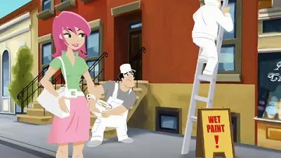
Let’s turn to look at a Flash animated spot, the “Switch and Save” spot for Esurance.


Look at the guy painting the wall on the right, 8 secs into the spot.

Unlike Elmer, in the GEICO spot, this painter is more active so there is a bit more justification for some of the moves. But there are too many for too short a bit of screen time.

fr 261
He starts here and . . .

fr 267
. . . throws paint on the wall.
The foot movement is certainly justified.

fr 287
But then he goes to this hold position
only 1/2 second later.

fr 292
. . . then to this hold postion 5 frames later.
The animator’s trying to make two very different
foot positions work within such a short time.

fr 374
Two seconds later we’re into a new position.
More action might justify it, but why did you
go into pos fr 292 in the first place?

fr 381
And might as well end his bit with another move.

Here’s a closer look in case you missed it (sorry for the bad copy of the blowups.)

fr 261
Go from here . . .

fr 267
. . . to here . . .

fr 292
. . . to here . . .

fr 374

fr 381

And it’s not even a dance move.

Remember animators, if you’re moving those feet have a reason.

Animation &Animation Artifacts &Bill Peckmann &Disney 01 Feb 2010 08:59 am

Symphony Hour – sc 48

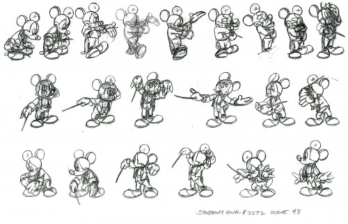
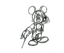
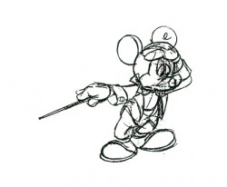
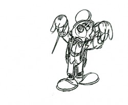
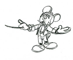
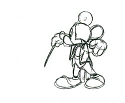
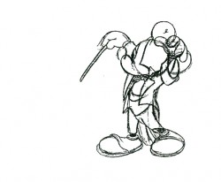
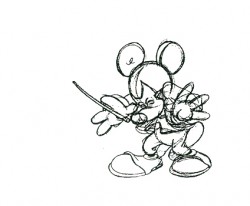
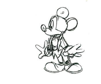
- Last week I posted the model sheet for scene 22 of The Symphony Hour. This week I have scene 48. I’ve also broken down the drawings and made a QT comparison between the final film and these extremes from scene animated by Marvin Woodward. I hope it’s useful to some of you.

The model sheets come from the gracious courtesy of Bill Peckmann. Many thanks to him.

As with last week’s post, first the full model sheet then a breakdown.


(Click any image to enlarge.)

1 2

3 4

5 6

7 8

910

1112

1314

1516

1718

1920

21

The following QT movie was timed to match the extremes in the
animation. Until any pose appeared in color, I held the image just
prior for the number of frames to cover the missing inbtws.
It’s a large QT so may take time to load.

Click left side of the black bar to play.
Right side to watch single frame.

For further study take a look at Mark Mayerson‘s Mosaic and comments on this film.

Photos 31 Jan 2010 09:11 am

Photoshow

It’s been a few weeks since I’ve featured any photographs. Steve Fisher sent me a couple that I thought pretty extraordinary, so I’m posting them. It’s a late afternoon in Maspeth, Queens.


The sky seems to be saying everything.


The houses beneath the sky.


That “twilight” hour.


Late night Friday, the moon was full and big.

Independent Animation 30 Jan 2010 09:32 am

It’s Still Me

-Candy Kugel‘s made a short film to honor the memory of her late mother who developed severe Aphasia after having a stroke. The film was done in conjunction with the National Aphasia Association.
Allison Janney narrated the film.

Recently, having to self-promote her own film, support for the film came her way from a couple of celebrities, Michael Douglas and Lee Woodruff, the wife of journalist Bob Woodruff. I thought it worth showcasing these comments given Candy.

Here’s the tribute given by the actor, Michael Douglas.

    After my father, Kirk Douglas, had a stroke, I learned how truly frustrating it is to try to communicate with a loved one without words. My dad was still my dad, he just could not express himself, initially after the stroke, the way he had communicated so eloquently
    his whole life. And we, his family, were frustrated by the struggle to understand him.
    The DVD, “It’s Still Me”, would have been a welcome tool to help us incorporate novel and effective strategies to improve communication with each other. Luckily, my father can speak again, but many people with aphasia are not so lucky.

    This was true of my neighbor, Adelaide (Chig) Kugel, who was the inspiration for “It’s Still Me”. Chig was a wonderful and sophisticated lady who developed severe aphasia after a stroke. Never able to speak fluently again, this former professional dancer learned to express herself beautifully without words while maintaining relationships with her family and friends.

    Chig’s daughter Candy created “It’s Still Me” in partnership with the National Aphasia Association in memory of her mother in order to share with others the lessons they earned to communicate with each other and to maintain their loving bond. I highly recommend “It’s Still Me” for families facing communication challenges brought on by stroke, aphasia and related conditions.

And this is the tribute by Lee Woodruff, wife of television journalist Bob Woodruff

    Candy Kugel and the National Aphasia Association have done a masterful job on their DVD “It’s Still Me”, which gives people with aphasia and their families effective ways to communicate when words are not available. It is very well done, simple and has lots of useful information. I wish I had a resource like this when Bob was recovering from his traumatic brain injury and dealing with aphasia.

    While I was reviewing the DVD, Bob passed by and became transfixed by the images and messages of “It’s Still Me.” The DVD’s information and style is powerful on many levels, especially when emphasizing the fact that the intellect, personality and heart of your loved one is still there, even without words. My family and I know this firsthand.

More information about the dvd can be found here.
The dvd can be purchased here.

________________

- Tomorrow, Sunday, at Lincoln Center there will be a program of Dance in Animation (particularly Disney). Mindy Aloff will talk about the cartoons and will sign copies of her new book, Hippos in Tutus.

Along with about 40 mins. of Disney animation there will be some newer Independent films that also focus on dance:

En Tus Brazos by Edouard Jouret, Matthieu Landour, and Fx Goby, France, 2006; 4m
Trash Dance by Oliver Fergusson-Taylor, UK, 2008; 1M
Entanglement Theory by Richard James Allen, Australia, 2009; 9m
She by Kathy Rose, USA, 2009; 4m
Romeo & Juliet Before Parting by Jay Field, Canada, 2009; 5m
Gabrielle by Stephanie Weber Biron, Canada, 2009; 4m.
Introduced by the director.

Today’s NYTimes has a feature article on this program.

Bill Peckmann &Comic Art &Illustration &Rowland B. Wilson 29 Jan 2010 09:20 am

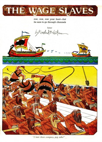
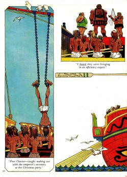
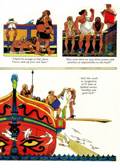
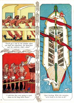
More Rowland B. Wilson

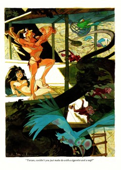
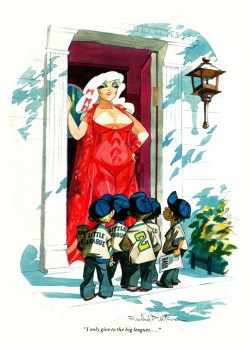
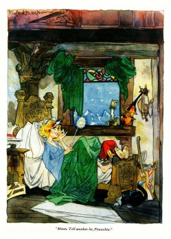
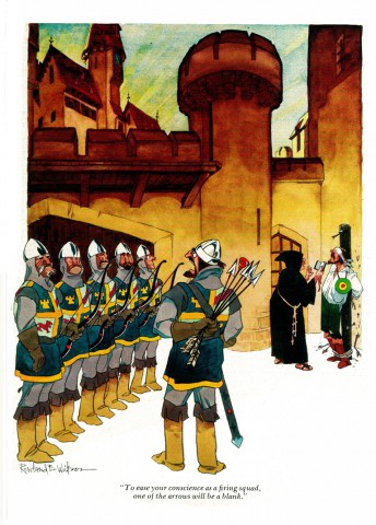
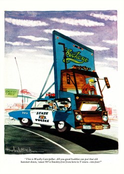
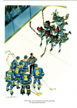
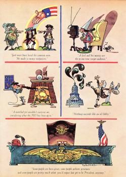
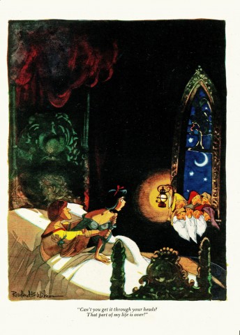
- Here, courtesy of Bill Peckmann, and his great collection of work, are more of Rowland B. Wilson‘s great cartoons for various sources.
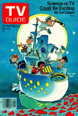
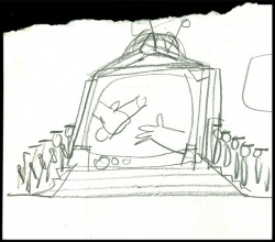
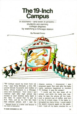
for TV Guide:


A cover and a spot ad.


A rough sketch for this spot ad.

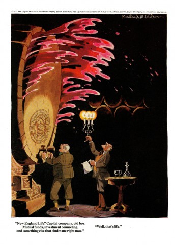
A couple of ads he illustrated:


(Click any image to enlarge.)


Rowland did many ads for Equitable Life.

And of course more playboy cartoons:

1
This is a multipage piece he did.

2 3

4 5

6 7

8 9

1011

12

13 14

15 16

17

Bill Peckmann sent these additional comments
after seeing these images on the site:

Here are some personal notes/sidebars if you’re interested:

TV Guide –
I believe the cover was the only one RBW ever did for TV Guide. He did do tons of editorial art for them.

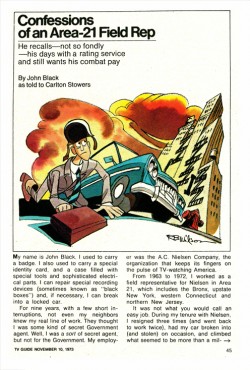
Editorial art for “Confessions” was done at same time he was working on “Lucky Seven Sampson.

The rough sketch is mine, that was one of the great perks of sharing studio space with Row.
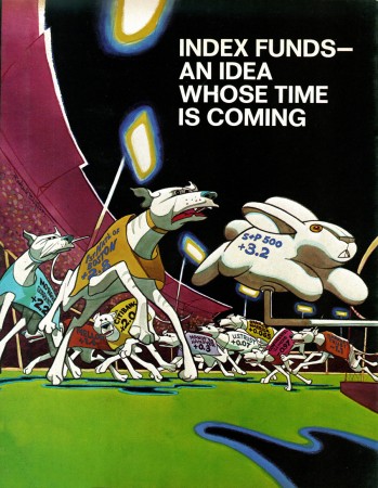
Greyhound editorial art was done for one of the business mags in the ’70′s, at the same time he was working on “Poor Rowland’s Almanac”.

New England Life art was done when Rowland was working at R. Williams’ Studio, visiting him on vacation, I was lucky enough to hand carry it back to the States for delivery, man, it was not easy to let it go and give it to the ad agency.

Playboy – #6. That’s Suzanne (Rowland’s wife) as the lady and RBW is the bearded gent on the right in the audience. Also done in London.

#10, The lady was inspired by Mae West.

#14, At the time, the NY Islanders wanted the original art as a gift, gratis, to hang in their offices, Rowland told them where to go with that.

#17, Rowland & Suzanne gave us the original as a wedding gift 10 years ago, of course it’s one of our prized possessions and I have tell to you that the printed version just does not do the original justice, too bad it’s so hard to get out of the frame otherwise I’d let you post it.

Books 28 Jan 2010 09:34 am

WTFoster’s other book – 1

- We all know that Walter T. Foster art books published the grandaddy of modern How-To-Animate books, Preston Blair‘s Animation. But there was another book from the same publisher, and I don’t know, to this day, who put it together. I think it might have been Walter T. Foster, himself.
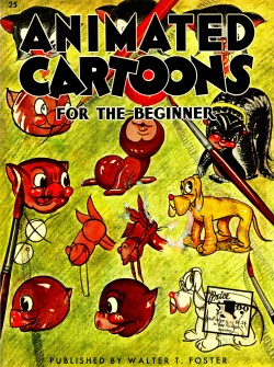
Animated Cartoons for the Beginner.

When I was young – 10 or 11, somewhere in there – a guy who lived in my building, Norman (I don’t remember his last name), worked for NY’s largest art store at the time, Art Brown. My father broached him and told him of my obsession for animation and asked if the guy, who was an “artist,” could help me. Norman came down to my apartment and spent a lot of time talking with me and encouraging me. He gave me a copy of both Walter T. Foster books on animation, and he won a fan forever. He soon moved out of the building but was replaced by a woman, who I guess took over his apartment, Norma
(I don’t know her last name either.)

She brought some colored pencils, watercolors and a 5×7″ drawing pad with rough surface. She wanted me to draw/paint a story. I filled that book with illustrations of a Russian fairy tale called “The Prince and the Dragon.” I liked the dragon part. As I did it, she spent time guiding me in using the materials.

There’s nothing good or notworthy in that pad (which I still have), but it put me on a path after spending so much time whining about wanting to be an animator. The kindness of strangers.

Anyway, that other book, Walter T. Foster’s Animated Cartoons for the Beginner, was always a poor and distant cousin to the Blair book. Even when I was 12, I looked down on it. I mean who draws like that? Except Nat Falk and Walter T. Foster. When I pulled the book out to show my guys in the studio, Matt Clinton‘s first comment was, “Who draws like that anymore?”

I guess they used to draw like this. Connie Rasinski and the folks up at Terrytoons perfected it, and copyists like Walter T. Foster turned it into something else.

But looking at the book today, it sure is something. It always irked me that the drawings on the right hand side (the even numbers, below) included walk cycles and movement that could be flipped. But the pages of the book weren’t correctly assembled, so the animation doesn’t flip without some big problems. It’s crazy.

1 2
(Click any image to enlarge.)

3 4

5 6

7 8

9 10

1112

1314

15

Next week, I’ll post the other half of the book and try to make some QT movie flipbooks of the pages – those I’ll have to put into proper flipping order.

« Previous PageNext Page »

eXTReMe Tracker
click for free hit counter

hit counter