Animation Artifacts &Bill Peckmann &Disney &Models 16 Feb 2010 09:40 am

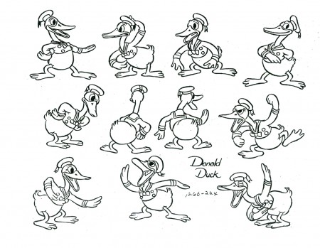
Donald Models – 2

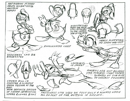
- Last week we had the Donald Models. Actually that was the second edition of Donald models, I’ve posted. The other was a while back – back in July 2009, there was the lecture notes written of the after-hours class held in the ’30s.

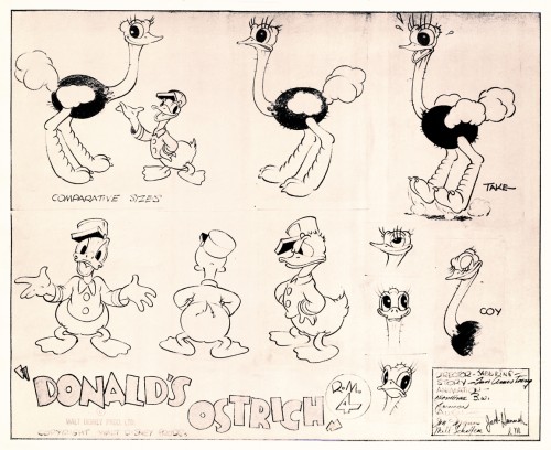
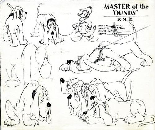
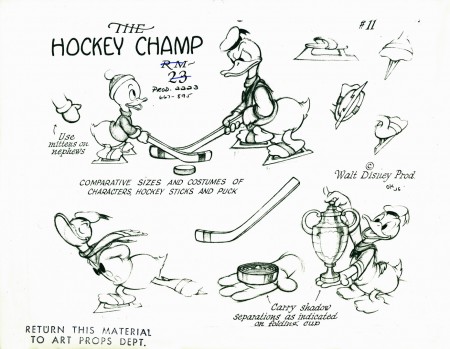
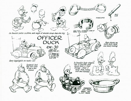
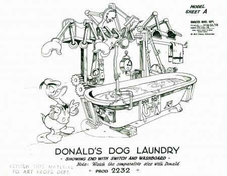
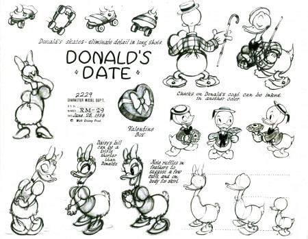
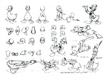
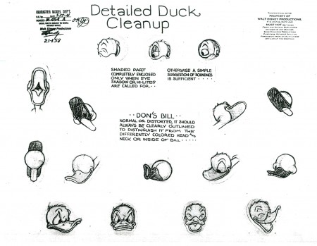
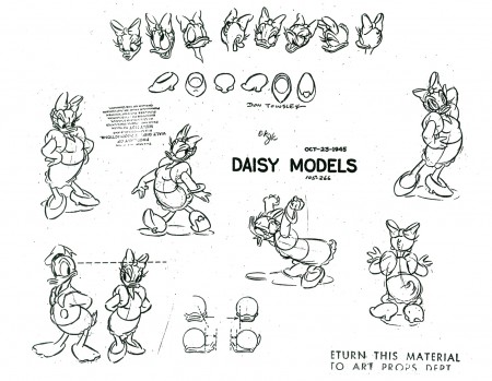
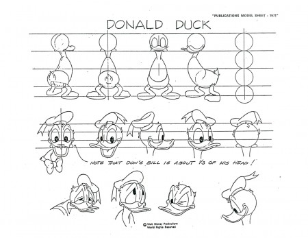
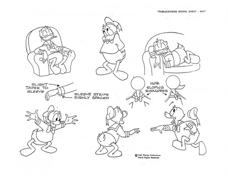
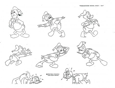
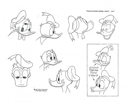
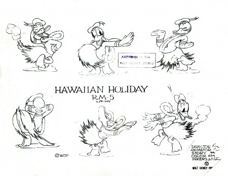
As I stated, last week, this post is dedicated to model sheets of Donald that are tied to specific films he was in. I love them all. They come from several periods of Disney shorts and Donalds. The first is from my favorite period for Donald, and I’m sorry he had to change from this guy; I love him. But I also love the Mickey of that period – 1931-32.

In the end we get into the TV Donald – but not too much.

Anyway, enough gab.


Love this character.


Hawaiian Holiday – Sept 24, 1937


Donald’s Ostrich – Dec 10, 1937


Master of the Hounds
retitled The Fox Hunt – July 29 1938


The Hockey Champ – Apr 28, 1939


Officer Duck – October 10, 1939


Donald’s Dog Laundry – April 5 1940


Donald’s Date
retitled Mr. Duck Steps Out – June 7 1940


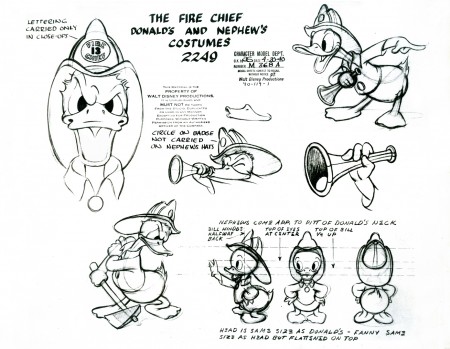
The Fire Chief – Dec 13 1940


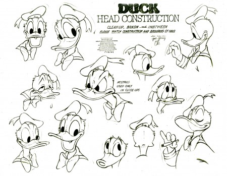
Just heads. This is getting to be late-period Donald.


Here we have one from Steel and America (1964)
an Industrial done for the U.S.Steel Corporation.


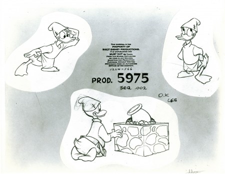
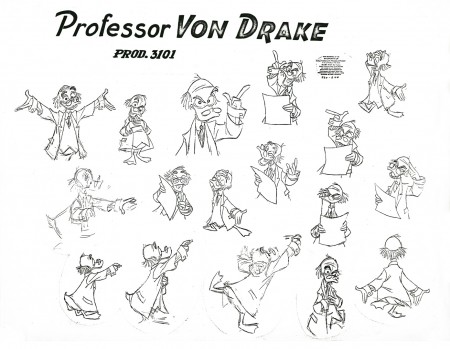
Finally, I had to have a Von Drake in the bunch.

Many thanks to the gracious Bill Peckmann for the loan of this material to post. His collection of model sheets is amazing.

Commentary &Events 15 Feb 2010 08:49 am

Norshtein/Multiplane/Gervais

- Yurij Norshtein will appear tonight at The School of Visual Arts Theater (333 W. 23rd Street, between 8th/9th Ave). 6:30pm.

They will screen The Hedgehog in the Fog and The Overcoat, his long-in-progress film. Norshtein will also have an extended Q&A with the audience.

The man is one of the great animation masters, and I hope that there will be a good turnout for him. I wonder if the copy of The Overcoat that will be shown will be a more current version than the one that’s been screened a couple of years back. I’d read that he was planning to break the film in two and release the first part at the end of 2009. Perhaps that is the case, and we will be seeing this version.

In any event, for me, this is a big event and I’m looking forward to it.
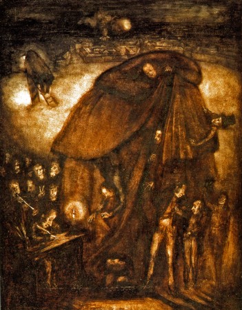

A sketch for The Overcoat.

___________________

.
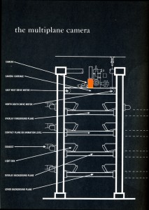
– I think I was hit with a fascination of the Multiplane Camera when I first read Bob Thomas’ book, The Art of Animation, back in 1959. (See graphic to the right.) After that book I just searched out all the scenes described within it – the flying scene from Peter Pan, the town awakening in Pinocchio, and the entire Old Mill short. I was entranced and paid attention to every use of the device in Disney films. Of course, I saw what Ub Iwerks did with his machine, even before Disney, in all his very odd animated shorts. I even watched Don Bluth develop his own smallish multiplane camera for his films.

My father and brother-in-law teamed to build a multiplane stand for me when I was a kid animating and shooting my own 8mm films. The thing handled 12 levels of glass panels 18″x36″ and had some 5000 watts of lighting spread throughout. It got hot but enabled me to make some interesting films. Not
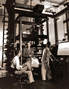
necessarily good – just interesting. It enabled so much invention in those short film fragments.

Hans Bacher this week has posted a collection of photos of the camera setup from the Disney studio. The collection is thrilling for those of us who have been entranced with this invention.

However, if you really want to get into the nitty-gritty of the machine, you have to visit a number of posts on Hans Perk‘s website A Film LA. There he has posted several extraordinary documents which detail William Garity’s plans for the invention of the Multiplane Camera. You can see these documents here: 1, 2, 3

Then there are another three with many photos of the multiplane, some taken by Hans Perk, himself: 1, 2, 3.

___________________
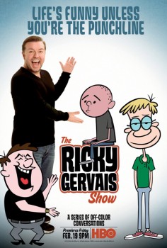
- Starting Friday on HBO The Ricky Gervais show premieres. This is an animated program built around podcasts that Gervais has been distributing on-line. The voice tracks are animated in LA predictably utilizing Flash for the lowest budget. The style is out of the predictable cookie-cutter mold we’ve been seeing lately. You can catch a couple of segments here.

The NYTimes has an article in their Sunday paper about the show, but, as might be expected, nothing about the animation is actually discussed. Star driven vehicles aren’t about the animation. Though the Times does offer an excellent interactive feature that showcases a lot of the artwork.

It’s difficult to find out much about the actual production. Media Rights Capital is co-producing the animated HBO show along with Wildbrain. The credited animation director is Craig Kellman.

The review in Variety wasn’t glowing:
. . . employing a stiff “The Flintstones”-type look and visual template.
Animation would seem to be an ideal vehicle for this, but there’s only so much it can do — in part because there’s no adhesive to the episodes. The three guys sit and bullshit for 20-some-odd minutes — at times entertainingly — until the program simply ends. Perhaps that’s why the effect diminishes as the episodes wear on, though Glyn Hughes’ jaunty score does play them out on a high note.

If you’re a Ricky Gervais fan, I suggest you check out his blog. It’s actually entertaining without being too “me me me”.
Art Art &Photos 14 Feb 2010 09:46 am

Mo’ Snow

- For some reason, whenever I step out into a newly snowed-upon setting, I feel obligated to take a picture. Consequently, I fill up the nearby Sunday Photo blog with snowy settings. Sorry about that.

It snowed this week. Not as heavily as they threatened on the newscasts, but it was heavy enough. (Right up to an hour before it ended, Al Roker was still forecasting 15 inches. We only had about 6.)
Regardless, it was white.

Memories of my first photography assignment in college – shoot white-on-white pictures – came rushing back. I didn’t aim for the white-on-white, but white was enough.


My first sight of 30th St. after entering the outdoor snowfest.


Park Avenue looking downtown from 30th St 6:30am.


Park Avenue bicycle rack.

My pictures were boring enough that I won’t get too tedious on you. But my friend, Steve Fisher, knows what to do with a camera, and he sent me some great stills, shot in Queens, that I have to share.

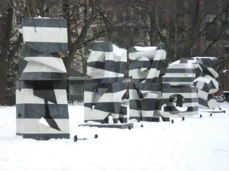
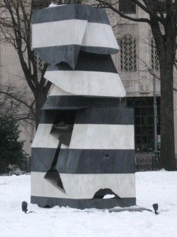
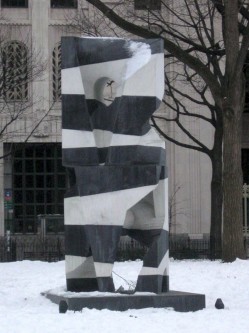
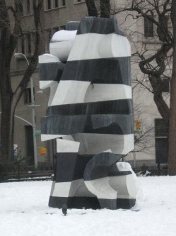
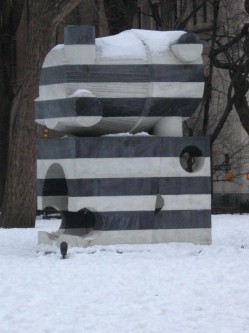
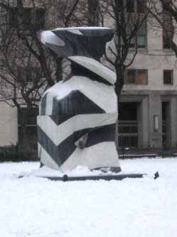
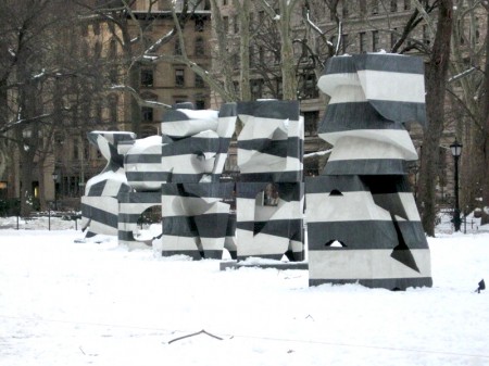
OK, let’s bring it back to Manhattan. Madison Square Park has had an art installation displayed for some time now. By sculptor, Mel Kendrick, Markers went up in September last year, but I wasn’t inspired enough to take pictures though it’s obviously monumental enough. It was supposed to have been removed at the end of December.

Now standing in snow, it looks different. The blacks look about 70% gray against the snow. Here it is. The writing comes from the official commentary by the Park.


Mel Kendrick – “Markers”


Kendrick’s Markers are cast in alternating layers of black and white concrete, resulting in bold striation that alludes to the layered stone found in Italian Gothic Cathedrals.


Standing over ten feet tall, the commanding scale of these sculptures echoes the grandeur of their home on the Oval lawn at the center of historic Madison Square Park.


By the way, HAPPY VALENTINE’S DAY

Animation &Commentary &Events &Independent Animation 13 Feb 2010 09:16 am

Anti-Valentine

- On Sunday night, Valentine’s Day, Debra Solomon‘s show, Getting Over Him In 8 Songs or Less, premieres on HBO 2 at 7:30pm. The film offers a musical trip through the last couple of years of Debbie’s life as she regroups from a divorce with her husband. (Animation as therapy.)

On her site, she writes this synopsis:

    In my new film, I animated myself out of heartbreak. The animated journey was also my emotional journey. In GETTING OVER HIM IN 8 SONGS OR LESS the main character is caught in a
    woman’s worst nightmare, wandering around the neighborhood undressed and exposed after being left by her husband. Through the use of brightly colored patterns that wash away section after section of the film, mimicking the ebb and flow of feelings, the viewer passes through the crisis with the main character.

I know firsthand how intensely Debbie worked to pull this show together. She singlehandedly animated the entire show in Flash in a sort of stream-of-conscious linear style that pulsates with a nervous energy (not unlike her own). The entire story is told through a pastiche of funny songs that she wrote, performed and produced. In short she bares her soul via a quick moving, funny animated film. It’s an animated diary of Debbie’s life in the year after her marriage. She lived through it as she animated it.

It’s brilliant that HBO helped finance this animated and personal film. This is a bittersweet bon bon of a tv show. Tune in.

Here are a couple of other images from the show:


(Click any picture to enlarge.)

There’s a short interview with Debra in MovieMaker Magazine.

This is the complete show schedule for the rest of this month:

7:30pm Sunday Feb 14th HBO2
9:30am Tuesday Feb 16th HBO Signature
6:00am Friday Feb 19th HBO2
10:00am Sunday Feb 21st HBO Signature

Animation &Commentary 12 Feb 2010 08:54 am

VISA Grand Central

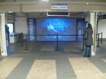
- VISA has taken over Grand Central Station with an enormous display focussing on the Winter Olympics, the centerpiece of which is a number of 3D ads, one of which is animated. You can get a good idea of how all-encompassing this display is with the following video:

Initially they handed out 3D glasses, but many of the people took the glasses and didn’t stay for the films. When I went through there were no glasses, but it didn’t seem to hurt the appearance of the movies (although they weren’t noticeably 3D anymore.)


Heading from the street to the subway
you’re hit with Visa’s name everywhere.


You can’t avoid the stairway signs.


If you head off to the Shuttle train
you run into the film in the connecting tunnel.


This is what the exhibit looked like. Stuck within a tunnel between
the IRT subway and the Grand Central Shuttle it’s not quite conducive
to good film watching. A lot of buildup for a couple of commercials.
Most people passed it by at 11pm on Friday night.


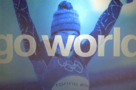
Here’s a still from one of one of the live action spots.
The guys handing out the 3D glasses didn’t have any;
they just stood about talking to each other.

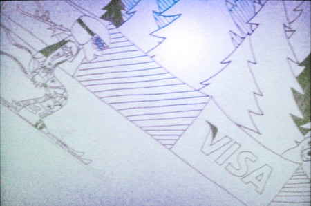
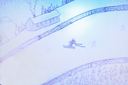
The animated piece was done in the style of children’s drawings.
I haven’t been able to locate who produced the animation, so if you
know please leave a comment. Here are a couple of stills taken with
my small camera – bad lighting=bad pictures. Sorry.


Here are a couple of frames from the animated piece.


I’m curious to know how THIS worked in 3D.
It seems a bit flat. Not quite AVATAR.


The animated graphics, above, appears designed for maximum 3D effect.
This was produced by a company called Superfad.

Articles on Animation 11 Feb 2010 09:43 am

George Dunning Remembered

- George Dunning died February 15, 1979 – thirty years ago, next Monday. The January 1980 issue of ANIMAFILM featured a couple of pieces about him. I recently posted (here) the interview conducted by John Canemaker. Just preceding that piece, there was a short remembrance of Dunning, who had just passed. Comments by Bob Godfrey, John Coates and Norman McLaren were offered.

To complete the post, I wanted to give those pieces here. (Obviously the title should read: “They Remember George Dunning.” So much for translations from English into Russian and back again.

They Remind George Dunning

BOB GODFREY

George Dunning’s T.V. Cartoons was one of the dozens of small animation companies to spring up in and around Soho in the early 50′s to satisfy the demands of Advertising Agencies eager to experiment with the new medium, Television Advertising.

Two factors contributed to JVC’s success, in a notoriously difficult medium, George’s continual striving for excellence and his long and happy association with his business partner John Coates.

Most animation houses were making their own entertainment shorts about that time, and George’s house was no exception. First came “The apple” an excellent short, and then George changed the whole shape and feel of animation with “The flying man”, painting straight onto glass. He was to change the look of animation again in the late 60′s when he directed the “Yellow submarine”, adapting Heinz Edelmann’s brilliant graphics to animation. Fortunately George lived to see “The Sub” become a landmark in animation history. George’s patience and kindness with young students was legendary and they always recognised in him a fellow “Freak”.
At the time of his death, George was animating Shakespeare’s “The tempest”. I can not think of a more unlikely subject for animation than that, but that, of course, was why George was making it.

JOHN COATES

I first met George in a Mayfair pub 22 years ago, and as a result T.V. Cartoons was formed in June of 1957.

Like all animation studios, we had many ups-and-downs, during which time pur partnership thrived. A large part of this was due to George’s steadfastness. He had an amazing way of keeping his cool under all circumstances, whether he was forcing through his creative ideas or arguing with the “money-men”.

To people in the business, he was quiet innovator of marvellous new techniques and experiences, and many are the studios around the world today whose creative owners learnt their art at TVC, under George’s patient direction.

Animation has lost one of its great talents, and many of us a very good friend.


A still from Dunning’s short, “The Flying Man.”

NORMAN McLAREN

I had the good fortune to work with George Dunning when he first arrived at the National Film Board. He had just come from Art College, and already his style as a graphic artist was quite distinctively his own.

From his very first film he showed a ready and natural bent for animation, and, what was even more important, he had the ability to make the sensitive and mystic marriage between his talents as a graphic artist and as an animator. His peculiarly personal vision and whimsy soon shone out in such early films as “Cadet Rouselle” and “Upright and Wrong”. I found George a graceful, articulate and gentle person: a philosopher much given to strangely fanciful invention and drollery, and all in great taste.

His later personal films such as “The Flying Man” and “Damon the Mower” emphasize these asnects of the man even more. He was a true noet.

Animation Artifacts &Comic Art &Hubley 10 Feb 2010 09:20 am

Roll-A-Book Letterman

- The recent comments on Michael Barrier‘s post about the Dumbo Roll-a-book prompted Milt Gray to tell of his creating a homemade version of the device, which is well described in Barrier’s article.

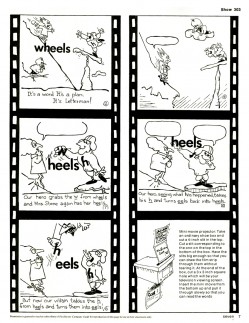
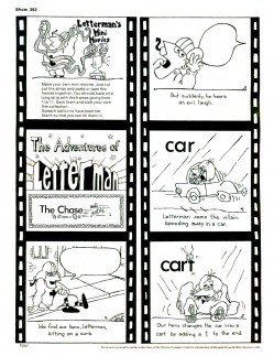
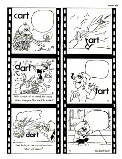
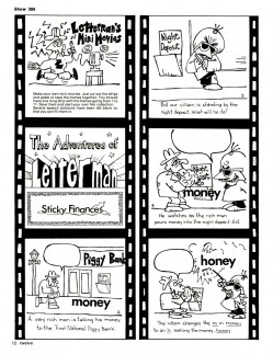
Of course, any kid of the ’50s knows this device well. I’d made them hundreds of times, and, in fact, found that by drawing the pictures I could make my own “films” for the homemade Roll-A-Book. Getting an opaque projector meant that these rolls of picture stories could be projected, and that’s just what we, my brothers and sisters, did daily. Every night one or more of us always had some kind of funny home-drawn cartoon story to project – one image at a time. And they went on for hours – large rolls of pictures.

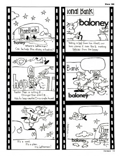
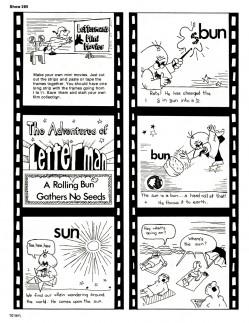
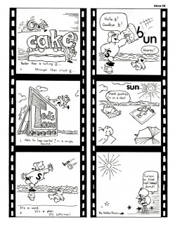
When I went to work for the Hubleys, I became the Letterman guy. After working on a couple of seasons of Letterman animated cartoons, John got a gig to draw comic strips for The Electric Company Magazine. That meant I was doing the strips which were adapted from the shorts as they aired in the series.

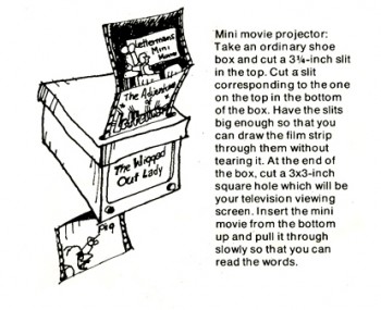
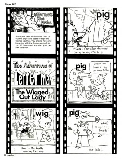
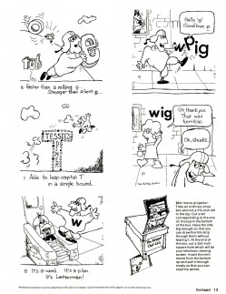
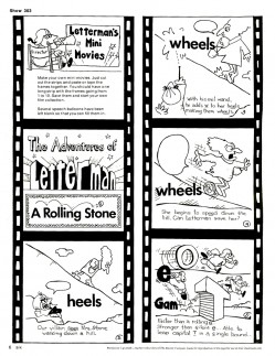
I designed these strips as mini-movies advising kids to create home-theaters essentially Roll-A-Book devices. (See sample illustration above.)

1 2
(Click any image to enlarge.)

3 4

5 6

7 8

9 10

Commentary 09 Feb 2010 09:20 am

Annie Competition


Happy Heidi Birthday

___________________

- The NYTimes now covers the Annies, at least in its blog roll if not in print. Brooks Barnes, in writing Intrigue at the Annies talks about the deadly serious competition between the animators at Pixar and those working for Jeff Katzenberg at Dreamworks. Animators get “really cranky when it comes to the public lauding – or not – of their work. ”

The tally of wins gives the overall plus to Dreamworks (5 to Dreamworks, 2 to Pixar.)

It’s good to hear that animators (described as “generally dorky and polite, guys [and overwhelmingly so] who offer an aw-shucks counterbalance to the preening of the rest of Hollywood”) can be as bitchy as actors when collecting the gold – despite our being “dorky.”

Apparently, William Shatner hosted the awards presentation and kept things moving at a good clip. It sounds like the program, itself, was worth attending.

Maybe if the ASIFAEast awards went bigger, we’d become more high strung on the East Coast. At least we don’t have to wear tuxedoes to collect our slip of paper, but then the NYTimes doesn’t cover us.

By the way, I appreciate that Jerry Beck had the list of winners posted by midnight (NY time) on Saturday night. There’s someone who’s dedicated to his blog and his readers at Cartoon Brew. Thanks Jerry.

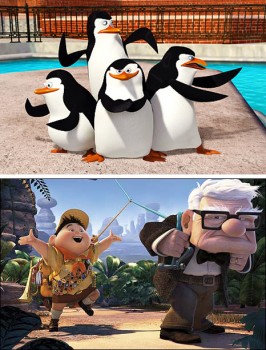
It’s doubtful that any of this will have an effect on Oscar picks. To start with, the nominees are different. (For one, there are no TV shows running in the Best Animated Short category – unless you count the most recent Wallace & Gromit film.)

_______________

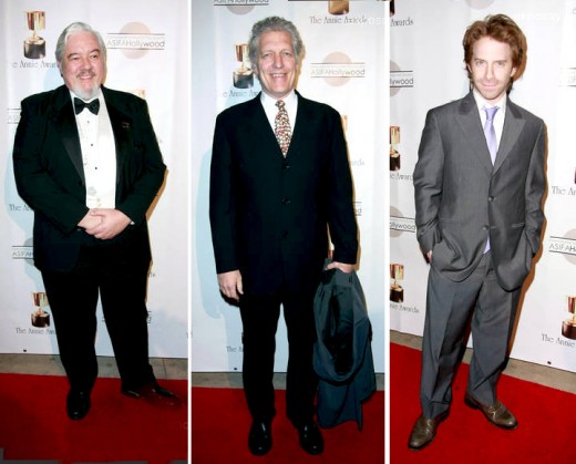
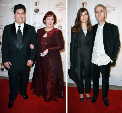
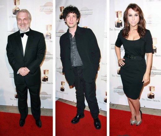
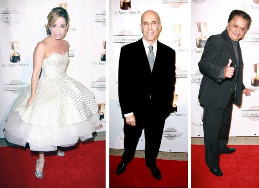
Here are a few photos from the Annie’s “red carpet” found on the web:

Tom Sito - Thomas Wilson - Seth Green 1 Antran & Katy Manoogian - Bruno Coulais & Raya Veleva 2
1. Tom Sito – Thomas Wilson – Seth Green
2. Antran & Katy Manoogian – Bruno Coulais & Raya Veleva

Ron Clements - Neil Gaiman - Lacey Chabert 3 Jen Cody - Jeff Katzenberg - Deep Roy 4
3. Ron Clements – Neil Gaiman – Lacey Chabert
4. Jen Cody – Jeff Katzenberg – Deep Roy

Animation Artifacts &Bill Peckmann &Disney &Models 08 Feb 2010 09:02 am

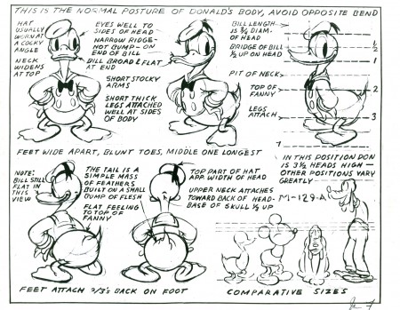
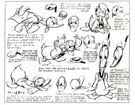
Donald Models

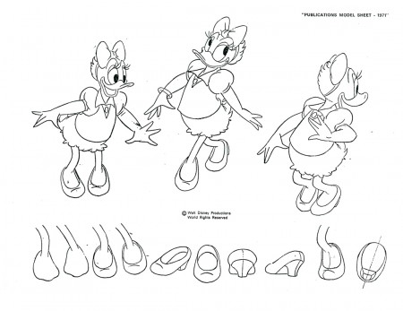
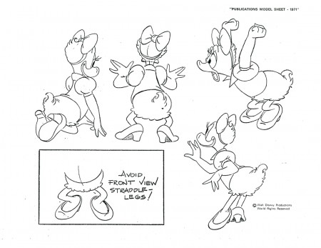
- I’ve spent a lot of time the past few Mondays posting models of Mickey Mouse. It’s only fair to move onto Donald Duck. Here are a lot of good models, mostly from the ’30s.

I follow this first group with some really clean models designed for publishing. I think you’ll see how heartfelt the first batch are compared to the second group done in the ’50s.

You can also see an earlier post I did of the Disney lecture on Donald and how to draw him.

1

2

3

4

5

6

The following are designed for publishing, not animation:

1

2

3

4

5

6

Next week I’ll follow with a number of models from specific films, all of which are gems.

I have to thank the inestimable courtesy of Bill Peckmann for the loan of these sheets. I am deeply grateful.

T.Hachtman 07 Feb 2010 09:12 am

Yankee Time

- I know! Today’s Superbowl Sunday. All I’ve heard for the past week is football, football, football. Sorry, I’m not a fan. In fact, I’ve been
following the MLB Network on tv regularly to hear of any baseball trades, changes or news.

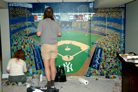
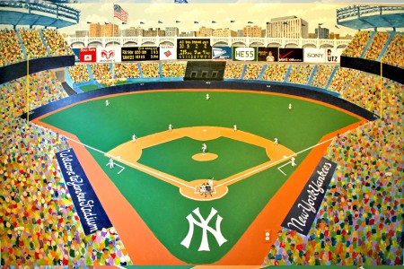
This week, I received some photos from Tom Hachtman showing the progress of a new mural he assisted in painting in a home in southern New Jersey. You’ll remember that I posted some info about Tom’s wife, Joey, who has a business painting murals locally (go here: 1, 2, 3).

Her business is called Three Designing Women Studios, and you can read about them in this article published, this week, at APP.com. There’s also another recent article here.

The group of artists is composed of: Joey Hachtman, Christine Myshka, Katie Mae Mott and Tom Hachtman.

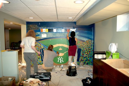
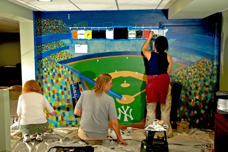
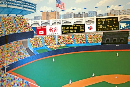
So they’ve sent their latest creation, completed this past week, a wall full of Yankee Stadium as seen from the far outfield. It helped get me in the mood for Spring Training, about to start in another week.


The overall room with the painting in progress.


Pictured are Christine Myshka, Tom Hachtman and Katie Mae Mott.


One assumes it’s Joey Hachtman behind the camera.


The final painted mural.


A detail of the left side of the painting . . .


. . . and the right side.


Artists Christine Myshka of Plainfield, Katie Mae Mott of Jackson and
Tom Hachtman of Point Pleasant Beach (left, center front and center
back, respectively) are shown with Three Designing Women Studios
owner Joey Hachtman, who is married to Tom.

« Previous PageNext Page »

eXTReMe Tracker
click for free hit counter

hit counter