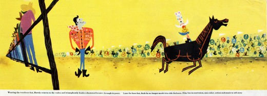
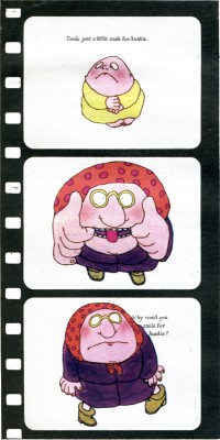
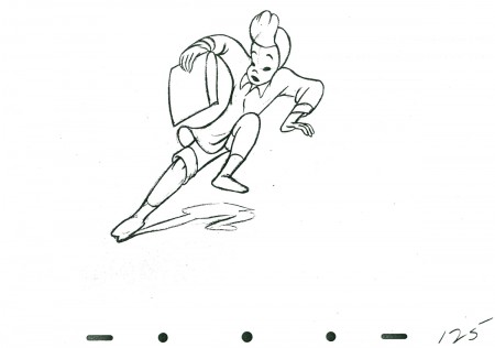
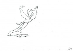
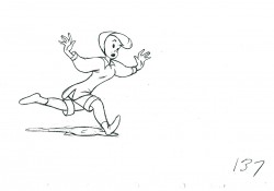
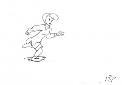
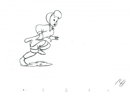
I just caught up with Cartoon Brew‘s posting of the Gene Deitch directed UPA short, Howdy Doody and His Magic Hat. I’ll have a lot to write about this film soon, however I wanted to add this piece by Mr. Deitch.
Gene Deitch wrote the following article which initially appeared in The HORN BOOK, in 1978; then was reprinted in Animafilm #5, 1980. I post it again for your benefit.
_____________
The Picture Book Animated
by Gene Deitch
 Living in Prague, an ancient town so full of its own stories, I am surrounded by an instructive ambience for my kind of work: making films from books. Building Prague took a long time; every period of European architecture is represented in the city. Each era adopted the building style which conformed to the artistic expression of that particular time – Romanesque, Gothic, Renaissance, baroque, rococco, art nouveau, cubist, prefab. Just seeing all this every day helps me to take the long view and to take my time. Right outside my window, a Gothic tower stands in the courtyard. In the sixteenth century an alchemist worked there trying to change lead into gold. Now I’m here trying to avoid doing the opposite, for I start with gold. Morton Schindel of Weston Woods always sends me the very best books he can get his hands on. My job is to shine them onto a movie screen, trying to keep the image bright and the focus sharp.
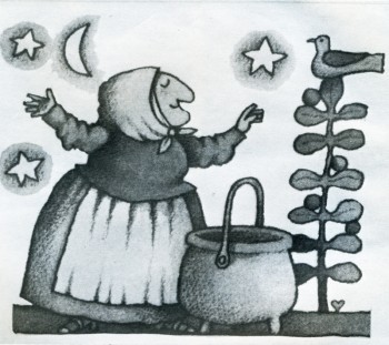
My films exist only in their relationship to the books from which they have been adapted. The goal of these films is to reinforce the child’s interest in the original book. I share Mort Schindel ‘s belief that books are still the best medium for storytelling and for the preservation of literature — a medium which is always at hand. Our aim is to illuminate each book so that a child will find his way back to it. Among my attempts to transmute gold into more gold, or at least into quicksilver, are film adaptations of “The Happy Owls” (Atheneum), “Rossie’s Walk” (Macmillan), “The Three Robbers” (Atheneum), “The Swineherd”, and “Strega Nona” (Prentice).
 Like the successive architects of Prague, I resort to a medium of expression of my own time – the motion picture. Ed and Barbara Emberley’s “Drummer Hoff” (Prentice) is an example of what I mean. Hidden among the bright colours of the outwardly lighthearted book are some interesting clues to its real depth. As the grandly uniformed soldiers strut along, intent on assembling their technological triumph – an elaborate cannon – they don’t seem to notice the flowers underfoot or their tiny observers, the birds, and the soldiers actually stepping on the flowers and shooing away the birds and thus to emphasize the meaning of the last page of the book – and of the final shot in the film – nature winning out over man and his destructive machines. Now, I don’t expect that children will absorb all of these ideas and details as such, but I do expect that when they pick up the book again (maybe because the film has now made it special for them), they will notice some things they might not have been aware of before. My hope is that they will love the book more for having seen the film.
Tomi Ungerer’s almost-over-the-edge book, “The Best of Monsieur Racine” (Farrar), is also loaded with lurking symbols, which might unnerve a children’s librarian. Tomi believes in there is much more to the book, and I tried to bring out something loving and charming that I found amidst the crazy tangle of startling images. What caught me was Monsieur Racine’s perfect serenity in his world of chaos. I felt he had just the kind of insulation which children have – carrying on and doing his own thing, immune to all of the crudity going on all around him. He has retained a childlike purity of concentration. His relationship with the beast, even when it was revealed to have been based on a gross deception, survives and continues, merely revised and adjusted to the new circumstances. This is marvellous, and I hope that the film will enrich the child’s comprehension of the book.
The greater the book, the greater our responsibility – and hazard. It may impress or dismay you that we worked on Maurice Sendak’s “Where the Wild Things Are” (Harper) “on and off and in and out” for five years before we had a film. “Wild Things” is the Mount Everest of picture books, and we had to film it simply because it was there. Once undertaken, there was no hedging. A film version would have to make specific what might be imagined in many different ways. This, incidentally, is the major risk a film-maker faces in adapting a work from another medium. There is never any one right way, but it is still necessary to have a conception and to follow it through. Maurice himself knew there was no point in making a film adaptation at all unless we could use the motion picture medium to extend some of the subtle implications of the book. He came to see me in Prague in 1969, and we had some long walks through old and dark corners of the town. We both wanted a magical film, and he left me some fascinating hints to work with: “In this story everything is Max… As for the music, think of “Deep Purple”.
Well, the old song “Deep Purple” stirred memories for me, too. Like Maurice, I was a child of the thirties. I began to see the roots of musical and sound devices which might suggest the distance between Max and his parents, who ware probably also children of the thirties. After all, why is Max “making mischief of his parents”. But where are they? Unseen in the book, I imagined they were probably in the next room having a party or (in today’s terms) watching TV. Anyway, they were not with Max. So I came to the notion of using that muffled, bland music of the 1930s, the sound of applause, the snatch of a TV comic’s joke (which just happens to be cogent), and so on. The music itself expressed the distance between Max and his parents, and with progressive distortion it could also express Max’s growing rage and journey into fantasy.
I wanted all of the sounds to be within Max’s home experience. So to create the “Wild Things” dance rhythm, I restricted myself to domestic sounds, specifically those which might express Max’s feeling of isolation: a gas oven lighting (Mother too busy for Max); a door slam (he was shut in or out); a car starting (Father going off to work); a baby crying (competition). All of these sounds repeated over and over on a tape loop, were used to heat up the music, which I made weird simply by spinning the record with my finger and letting the sound reverberate in my tape recorders.
Viewing any of our films should also indicate that we strive always fot the result of “the picture book projected”. We go to such great lengths to capture the graphic look of each book that viewers might assume they are seeing the actual book on the screen. In fact, though, we have never used any of the book illustrations. The technical processes of our medium require that we re-create every drawing and painting in terms of motion and film-frame composition, and a film’s wider scope often calls for scenes or additional artwork not found in the book at all. We must actually absorb the artists’ own styles in redeveloping the drawings and paintings specifically for film. In an effort to achieve absolute fidelity, we even asked Quentin Blake to send us the actual colored crayons he used for his illustrations for “Patrick” (Walck), and we used what was left of the same crayons to do our film backgrounds.
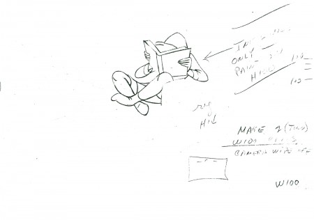
 Some books are almost scenarios for films and need virtually no adaptation; Crockett Johnson’s “Harold” series (Harper) is the perfect example. The books are so masterfully constructed that one might easily dismiss their perfection as mere simplicity. As I undertook “A Picture for Harold’s Room” and “Harold’s Fairy Tale”, Johnson warned me, “Don’t be fool by the seemingly simple!” He was right. These films were devilishly difficult to make. “Harold’s Room”, for instance, is a fascinating lesson in size relationships and perspective. To make it work on the screen, Harold had to be exactly the same size in relation to the film frame as he was to the pages of the book. Consequently, we could allow ourselves no close-up cuts nor camera moves in or out. In effect, the entire film must appear to be one continuous scene – all from the same camera position and all on a plain, smooth background tone, where no mistakes could be hidden. Any mistake at all meant that we had to start shooting all over again “from the top”.
If you would take apart a copy of “A Picture for Harold’s Room” and paste the pages together, you would see that it is based on one large drawing, which Crockett Johnson obviously worked out in advance. Of course, we had to do exactly the same thing. We made a huge drawing of Harold’s landscape and manoeuvered it under our animation camera. For the pencil layout of this we had already prepared seventy-five hundred inked and painted drawings of Harold himself following the lines of the overall landscape. As we placed these drawings over the landscape one by in reverse order, we wiped away our background painting to match each position in his room and working our way relentlessly back to the little town. Thus, beneath our camera Harold undrew his scenery. When we finished shooting, the big drawing had been completely wiped out; and only when the film was projected forward did it reappear.
Most people realize that it takes hundreds, even thousands, of drawings, representing carefully calculated phases of each action, to give the effect of animation in even the shortest film. A glance at the illustrations of “Where the Wild Things Are” indicates the formidable task. As a matter of fact, “Wild Things” required a totally new of rendering characters onto our animation cels* and a totally new way of making them move. When Maurice Sendak said of the story, “Everything is Max”, he has hoping I could find a way to show that the Wild Things were actually a fantasy expression of Max’s own mind, a projection if his anger. Maurice further envisioned them as having “slow, heavy, dream-like movements” and as being “clumsy, dumb, sluggish, heacingcreatures… not horrible”.
To produce this effect on film, and to do it in a way that would make clear the “Wild Things” status as evanescent fragments of Max’s imagination, I devised a way of photographing the phased drawings in an interweaving series of dissolves. This device, in combination with the slowed-down, wavering music and special effects, was part of our attempt to fulfill Maurice’s extravagant wish for us to “go beyond the book”. (I was later thrilled with his equally extravagant praise of the sound track.) Going “beyond the book” refers simply to the nature of the film medium and not to extending the book’s content or meaning. We endeavour only to bring out what is there or what we feel is there. “The Horn Book” review of the film concisely stated what we attempt: “recasting of one aesthetic form into another.”
This is the problematic task with every book we film. Each book has set me off in a new direction, prodding me to find a new way, a specific solution to the problem of adapting that particular book to the motion picture medium. I have no formulas. My private conceit is that without my name on them, no one could tell that all these films came from the same director. For me, my Oscar-winning cartoon “Munro” was a success when people asked if it was made by Jules Feiffer himself.
I used the word problematic. Is our work valid? The question haunts me. Why should we try to make films of picture books? Why shouldn’t the books be left to communicate in their own way? Why don’t we concentrate on developing original film stories? we do this, too, of course. I made “The Giants”, my own films, a child sees that books do have life, that they have movement and sound. We try always to leave room for the child to participate with his own imagination.
For instance, the ending of “Leopold the See-Through Crumbpicker” leads directly to the idea that the children can draw and paint their own variations for decorating the invisible cookie-eater. In “Changes, Changes” I added a box of building blocks, not actually shown in the book, thus inciting children to carry one the story, stacking up their own changes. The film “Patrick” ends just as the colourful procession heads back toward the drab village seen at the start of the film. By this time the children know what will happen there when Patrick and his full-colour fiddle arrive; but they don’t see it, so they are allowed to imagine the ensuing scene for themselves.
Patrick’s fiddle, incidentally, plays virtuoso variations on Dvorak. In “A Picture for Harold’s Room” the purple crayon draws to the music of a classical string quartet. Unadulterated Janecek, in all its Slavic richness, precedes the musical frame for “Zlateh the Goat”. Our version of Andersen’s “The Ugly Duckling” introduces children to Carl Maria von Weber. For our original scores we have gone to many lengths to provide just the right music. We needed authentic Central African music for “A Story”. My Czech wife Zdenka, who is also the production manager for our films, found antique instruments in a half-hidden ethnographic museum here as well as a curator-musician who could instruct us. A curious interplay of cultures resulted in our recording ses-ion: genuine African instruments played by Czechs, along with a recording by an African story-teller reading from a book by an American woman – for a movie for Western children being made in an eastern European studio.
The existence of our film versions, I am told, have often helped a book stay in print and increase in sales. Films are powerful but transitory, seen and suddenly gone. The book can always be read and will be even more after a child has seen it on the screen. The permanence of the printed word, however, is now being challenged. Movies, audiovisual media, and especially TV are very powerful forces. But must they destroy book reading, or can they complement it? The flood cannot be dammed, but it might be directed. We are trying to provide a channel which flows toward books rather than away from them.
*In animation production, moving figures are usually rendered onto transparent “cels”, sheets of acetate film, so that the stationary background painting can be photographed simultaneously on each film frame.
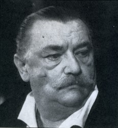
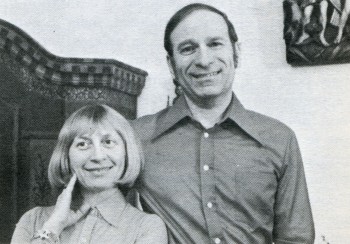
GENE DEITCH – American director living and making films (in his own studio) in Prague. During thirty four years he has directed more than thousand films and commercials and received numerous awards including the Oscar for “MUNRO” in 1959. Specializing in the adaptation of children books.
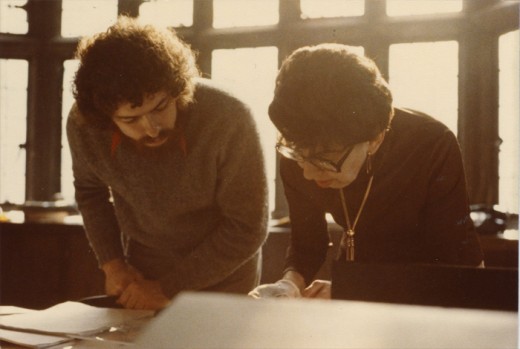
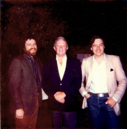
1. Gene Deitch with his Wife
2. Strega Nona
3. Smile for Auntie


