Bill Peckmann &Disney &Layout & Design &Models &Rowland B. Wilson 15 May 2010 08:53 am

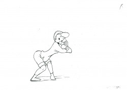
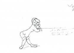
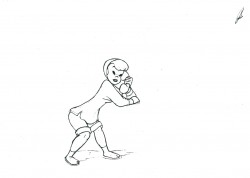
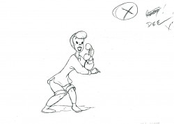
Hunchback Art

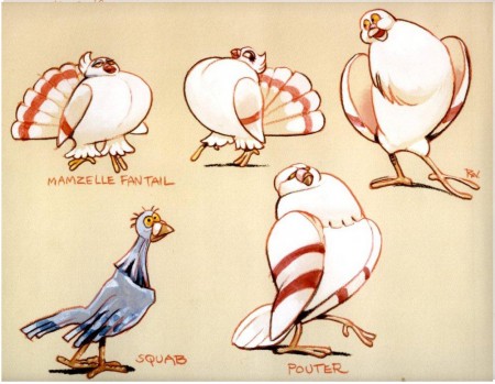
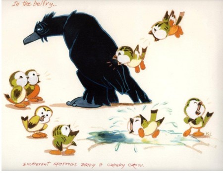
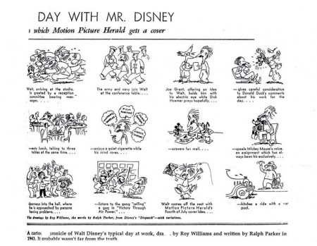
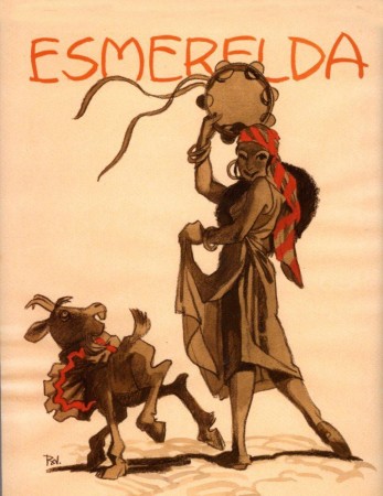
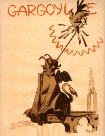
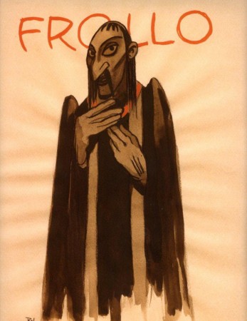
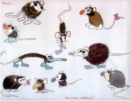
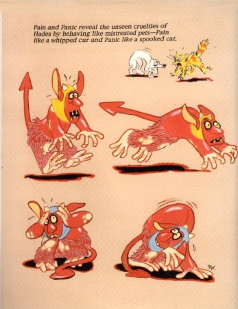
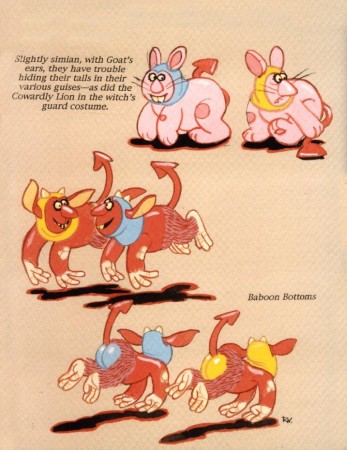
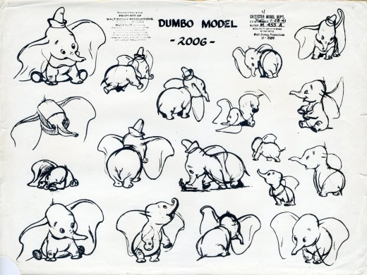
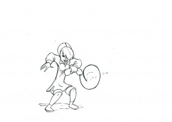
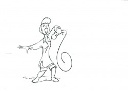
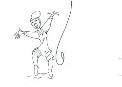
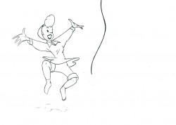
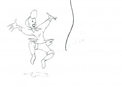
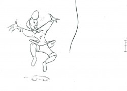
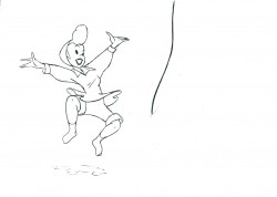
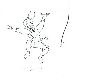
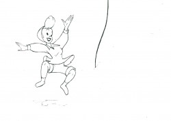
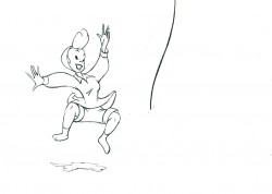
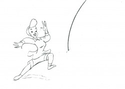
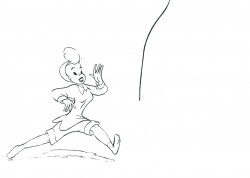
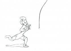
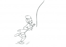
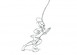
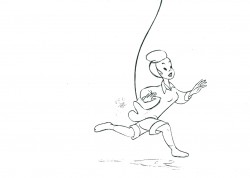
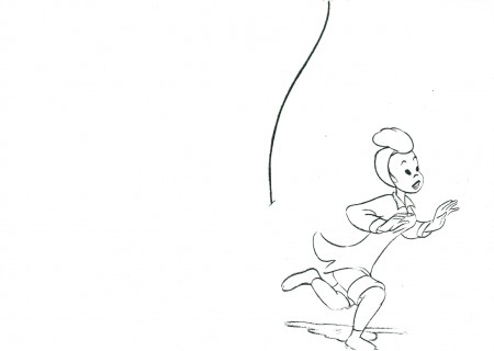
- Thanks to Bill Peckmann, I’ve posted some of Rowland B. Wilson‘s art from his Disney years (mostly The Little Mermaid artwork). Now. Bill has sent me some work from The Hunchback of Notre Dame.

A second posting of this art will be forthcoming; it’s a larger size and will take more comlications in scaning.

1
(Click any image to enlarge.)

2

3

4

5

6

7
Does it get any better than this?
She could have stepped out of Gulliver’s Travels.

8
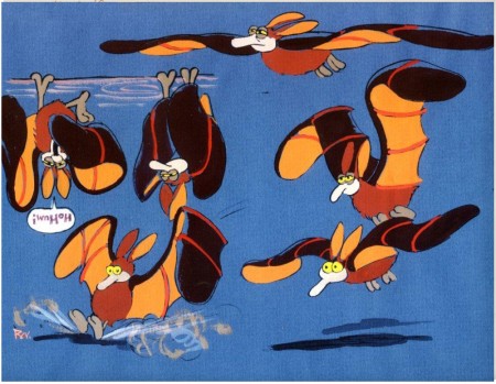
The charm in these birds is also ineffably beautiful.

9
These two (above and below) seem to belong to Hercules.

10

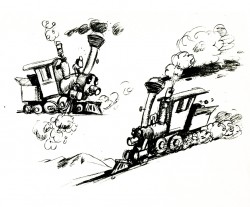
This final piece didn’t come from The Hunchback’s artwork, but was slipped into Bill’s Package from Rowland. I’ve seen it before, but it’s always fun to see it again.

Many thanks to Bill Peckmann for sharing.

Animation &Independent Animation 14 May 2010 07:57 am

Witold Giersz Interview

Here’s an interview with another International Independent master of animation. Again, many of you may not have heard of him, but let me assure you that his work bordered on genius. His film, Pojar, kept me inspired for years after I saw it in Annecy in 1976. Just check out the body of work done prior to 1980; by 2007 he’d done about 60 short films. He was prolific and smart. If you can find his films, watch them.
This interview comes from Animafilm #5, March 1980.

To Start from Material
Marcin Gizycki talks with
Witold Giersz

MARCIN GIZYCKI: How many films have you made?

WITOLD GIERSZ: I have never compiled statistic, but they said once at the Studio of Film Miniatures that there were about forty.

M.G.: The fruit of the twenty odd years of your activity.

W.G.: I started to work with the film illustry as early as 1950, at the Cooperative of Animated Cartoons in Bielsko.

M.G.: You were among the pioneers of the animated film in Poland.

W.G.: That was long ago.

M.G.: You made your debut in 1956 when you did “The Mystery of the Old Castle”. But the turning point in your career was “The Neon Trifle” and “The Little Western”.

W.G.: Indeed. “The Neon Trifle” was my first, very timid, attempt to abandon conventional drawing, i.e. contours filled with colour. I did my drawings with a brush, which created the impression that the characters were made of neon tubes. In “The Little Western” I made use only of patches of colour which 1 put with a brush straight onto the celluloid.
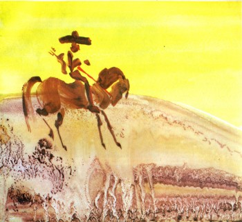
M.G.: You were the first film-maker in Poland and, if I am not mistaken, in the world, to use this technique, namely, painting on the celluloid without a whole staff of assistants.

W.G.: I tought so, too, but, to my surprise, when I showed “The Little Western” at the Festival in Annecy, George Dunning presented his “Flying Man”, made in a very similar way. We arrived at similar results independently and it does not really matter who was the first. Let’s be quite clear about it: both films used the traditional celluloid technique; the only innovatory thing was the form of drawings: contours were by patches of colour.

M.G.: It seems that you have tried all possible forms of animation, you gave even made a puppet film, “Expectation”. However, your name evokes associations primarily with “dynamic painting”, i.e. the gradual transformation, through the addition and erasure of painted elements, of a single picture done in a thick layer of wet paint. Do you agree that this is the most characteristic undercurrent in your art?

W.G.: People call it the most characteristic because, apart from Piotr Szpakowicz, no one uses this technique in Poland. Naturally, our methods are somewhat different. Szpakowicz deals, on the main, with static painted surfaces that evolve as a result of interpenetration. When he introduces animation, it is less complex than with me. But to be quite frank, I have used this method in three films only: “The Horse”, “The intellectualist” and “The Fire”. Nevertheless the story goes that this is my technique. Generally, I have worked quite traditionally. I am especially fond of animation on the celluloid if it is in “The Little Western”.

M.G.: What I particularly appreciate in your films such as “The Little Western” or “The Red and the Black” is the wit based on purely visual efffects. For instance, a clash of two figures, yellow and blue, which leads to the emergence of single huge green figure. This gag could only be born as a result of thinking in terms of pictures, and only in an animated film.

W.G.: This sort of ideas came to me when I was already working on the film and that is why they could not be the starting point for the script. I regret that they did not occur to me earlier, then I could have subordinated the entire plot to them. I think that the starting point should lie in the material. I tried to follow this path in “Expectation”. There, from the very beginning I kept thinking about a plot in which to involve the figures made of tissue paper made by Ludwik Perski. What drama, what tragedy can be designed for a tissue ballerina? Crumpling, tearing or, in the worst case, burning? What can her sensations be? Light, banal, for she is only a paper dancer. This gave rise to the whole plot.

M.G.: You have once said: “I made myself all my films that I find fairly satisfactory (…) all those made in collaboration have turned out mediocre. How do you explain it?

W.G.: Group work hinders one’s approach in the visual sphere. If Lenica had had to work with a group, he would have never made “New Janko the Musician” or the “Labyrinth”. If we work with a dozen, however talented designers, and we do not want to come up with a conglomerate of a dozen, however good, diverse works, we must restrain ourselves and fall into line. One’s own individuality must be given up in favour of a homogeneous final effect. One’s individual mark may be imprinted only in the way we develop the plot, on the dramatic quality, but visually, there is no room for shining out.

M.G.: And yet, you have made films in collaboration with others.
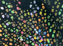
W.G.: Let me explain. In Bielsko. I went through a good traditional school of classical animated cartoons, cultivated there until today. I thought that I had become quite skilful at this technique and originally I planned no other methods. However, as time went by, I ceased to be satisfied, I came to the conclusion that all I knew about workmanship did not mean much, that what really counted in animation and was pleasing to the eye was novelty. After a good deal of research, I finally arrived at something that gave me some satisfaction. I mean the series of films from “The Little Western” to “The Fire”. But from time to time I go back to traditional cartoons, which I regard as my duty towards the company. Certain films are commissioned and I have to carry them into effect. However, I have not made a film with a group of animators for a very long time now. “Please, Elephant” is no exception, as this full-length film uses the material shot for a serial eleven years ago, with only junctions and some other little things done now. I did all the alternationas practically myself, assisted by one animator.

M.G.: Animated film lies on the borderline of two disciplines: the visual art and feature film. Do you agree that an animated film d’auteur has more of the former, whereas an animated film produced by a team is more like the latter?

W.G.: There are films that can obviously pass as works of the visual arts, like for instance, all Szpakowicz has done. Nevertheless, I think that animation has worked out means of expression original enough to be distinguished as an autonomous discipline. Anyway, it is so unique among the multifarious film genres that a maker of animated films finds it easier to communicate with a representative of the fine arts who does not make films than with someone who makes feature films or documentaries. For that reason it may be better to opt for the term “animated visual art”, i.e. produced not solely by means of a brush and canvas but also a cine-camera, a projector, and a screen.

M.G.: You have designed settings for all your films. Does it make you feel an artist?

W.G.: Quite a blunt question. All my artistic experience is subordinated to the film. I do not practice art in any other form. Hence I feel at once an artist and a film maker, one inseparable from the other. I would have no time for painting, graphic art or drawing. Film making is very timeconsuming. Maybe I am not very well organized, but it takes all my time.

Illustrations:
1. The Old Cowboy
2. Footprints

WITOLD GIERSZ: FILMOGRAPHY
1956: TAJEMNICA STAREGO ZAMKU (The Mystery of the Old Castle),
1957: W DZUNGLI (In the Jungle),
1958: PRZYGODY MARYNARZA (A Sailor’s Adventures),
1959: WIOSENNE PRZYGODY KRASNALA (A Dwarf’s Spring Adventures), NEONOWA FRASZKA (The Neon Trifle),
1960: MALY WESTERN (The Little Western-prizes: Turin, Leipzig, Cracow; honorary mentions: Cork, Necochea; diplomas: San Francisco, Melbourne, Oberhausen),
1961: SKARB CZARNEGO JACKA (Black Jack’s Treasure,
1962: OCZEKIWANIE (Expectation — prizes: Cannes, Moscow; diploma: Edinburgh), PODARTA KSIA.ZKA (A Torn Book), DI-NOZA UR Y (Dinosaurs – prizes: Cracow, Alexandria),
1963: W PIASKACH PUSTYN1 (In the Sands of the Desert), CZERWONE I CZARNE (The Red and the Black – prizes: Oberhausen, Cracow, Cannes, Bratislava, Santa Barbara; honorary mention: Montevideo; diplomas: London, Turin, Edinburgh, Cork, Melbourne, Oberhausen; the prize of the “Film” weekly), MADAME SOPRANI,
1964: KLOPOTY Z CIEPLEM (Troubles with Heat – prizes: Lodz, Cracow), LADIES AND GENTLEMEN (an honorary mention La Felguera),
1965: KORZEN (The Root),
1966: KARTOTEKA (The Card-Index),
1967: KON (The Horse -prizes: Cracow, Mamaia, Adelaide, Honolulu; diplomas: Melbourne, Edinburgh),
1968: ADMIRAL (The Admiral), WYCIECZKA ZA MIASTO (The Journey out of the City – prize: Poznah), PRZE-PROWADZKA DOMINIKA (The Removal of Dominik),
1969: INTELEKTUALISTA (The Intcllc-ctualist – prize: Paris, diploma: Venice), ROZBIT-KOWIE (The Castaways), OTO ZYCIE (That is Life -both films done in Yugoslavia with Milan Ljubic),
1970: WSPANIAtY MARS7 (The Maenificent March – prize: foznanj, iy/i: (The Perfect Driver), 1972: KASKADER (The Stunt-man – diploma: Cracow),
1973: RODZINA IN-DONEZYJSKA (An Indonesian Family – commissioned in Norway), STARY KOWBOJ (The Old Cowboy – prizes: Poznan, Cork),
1974: SLADY (Footprints),
1975: POZAR (The Fire – prizes: Cork, Poznan, Teheran; honorary mention: Jelenia Gora; diploma: Oberhausen; the special prize of the President of the Board of Culture),
1976: WIELKIE KOTY (The Big Cats – commissioned in the USA),
1978: SKANSEN (Ethnographical Museum), PROSZE SLONIA (Please, Elephant; full-length – prizes: Poznan, Varna; the Zenon Wasilewski prize).
Animation Artifacts &Disney &Models 13 May 2010 07:50 am

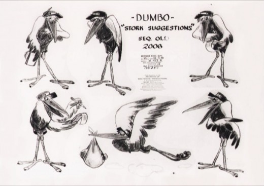
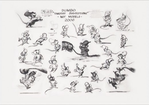
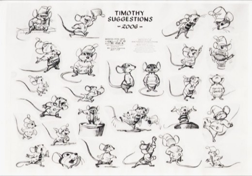
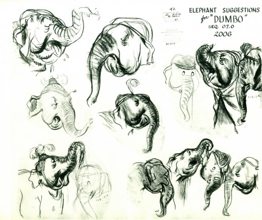
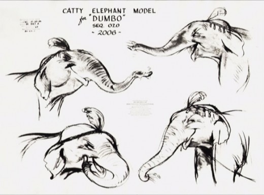
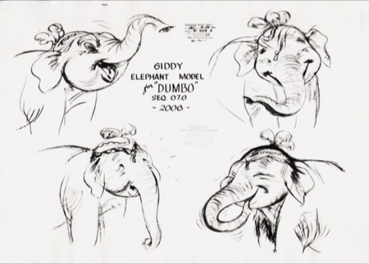
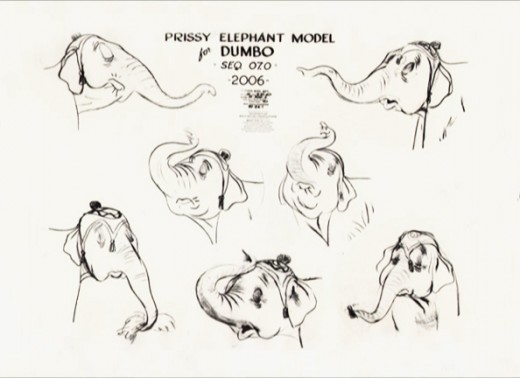
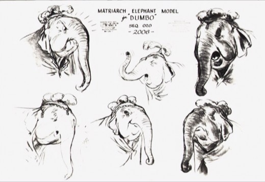
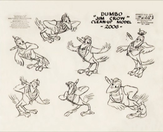
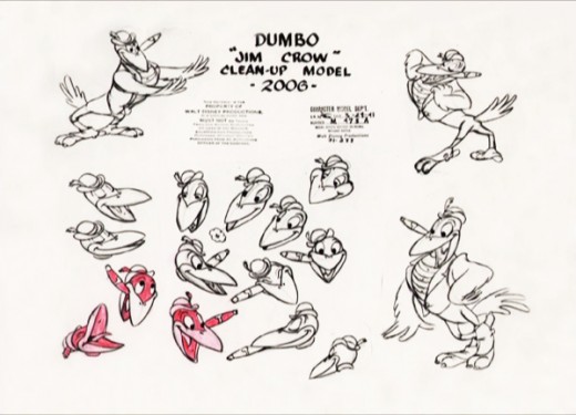
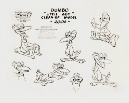
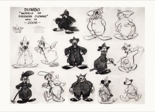
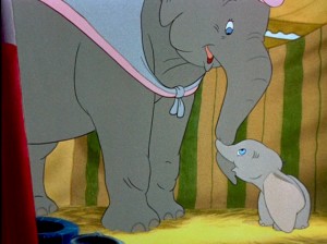
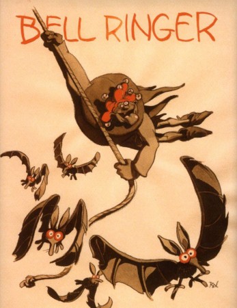
Dumbo Model Sheets

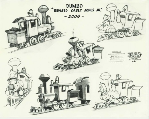
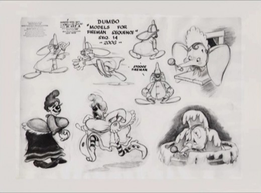
- I’ve made a concerted effort to locate as many of the Dumbo model sheets as I could. Some of these are scanned from the originals; others were lifted from an early version of the DVD for the film (and are consequently small images).

There are still more model sheets at Bob Cowan‘s wonderful site. Don’t hesitate to take a look.


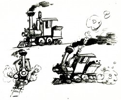
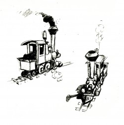
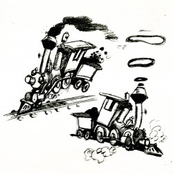
These are the first rough sketches done for Casey Jr. for both Dumbo and The Reluctant Dragon. Eventually, a headlight cap was added and the eye lamps were eliminated.
The eyes were drawn on the boiler’s front.


Robert Cowan sent me this model of Casey Jr. which was used in the final film.

1

2

1

2

3

4

5

1

2

3

1

2

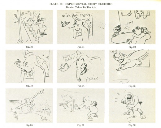
This final piece comes from the Robert Field book, The Art of Walt Disney, published in 1941. It’s a beautiful early storyboard for the climax to the flying sequence.

I’ve put this all together as part of an effort to join in the fun started by Hans Perk who has been posting the drafts for Dumbo, and this has led Mark Mayerson to start posting the brilliant Mosaics he creates for the film. Check out both of their sites.

Animation &Animation Artifacts &Bill Peckmann &Illustration 12 May 2010 08:38 am

PK&A Studio Gags

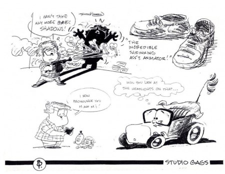
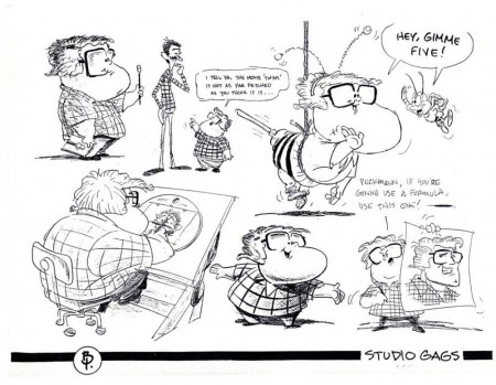
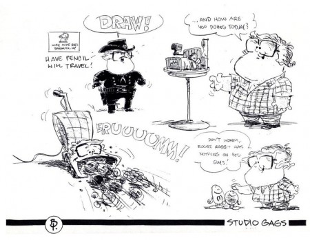
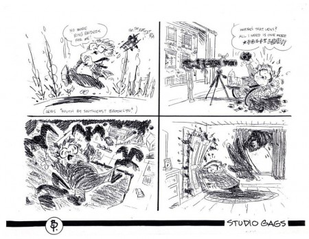
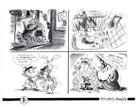
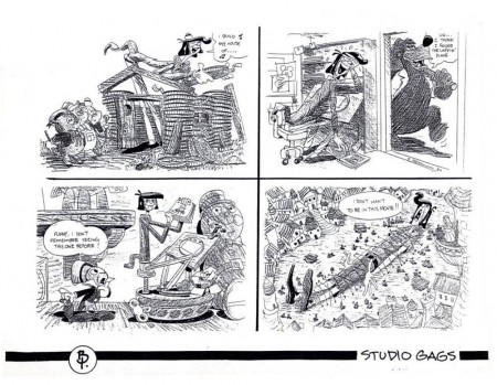
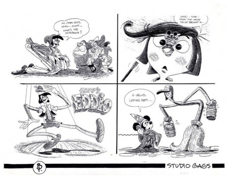
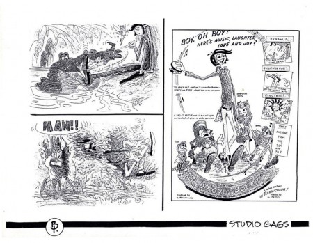
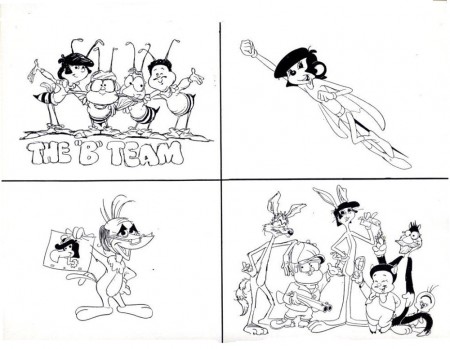
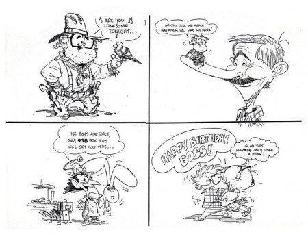
- Bill Peckmann sent me this group of Gag Drawings from his days of working with Phil Kimmelman and Ass. I thought the drawings had so much life and interest, that I wanted to share them. The unfortunate part of studio gags is that the life behind the gag is usually something that we can’t even understand – outside of that studio’s atmosphere. However, at times the drawing is so much fun, it makes up for it. That’s true here, I think.

1
(Click any image to enlarge.)

2

3

4

5

6

7

8
9

10

11

Animation &Animation Artifacts &Disney 11 May 2010 08:09 am

Dumbo’s Bath

Hans Perk has been posting the drafts for Dumbo, and this has led Mark Mayerson to start posting the brilliant Mosaics he creates for the film.

I want to join in celebrating this feature, which is one of my very favorite animated films , and I’ve decided – since I’ve already done a lot of behind the scenes posts – I’ll recap a number of those posts in the next week or so.

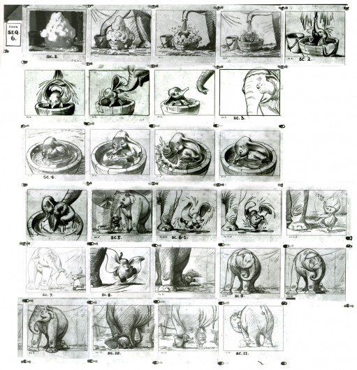
I start with this one of Dumbo’s bath animated by Bill Tytla and boarded by Bill Peet.
.
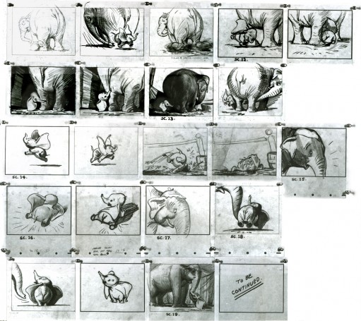
- Thanks to a loan from John Canemaker, I can continue posting some of the brilliant storyboard work of Bill Peet. The guy was a masterful artist. Every panel gives so much inspiration and information to the animators, directors and artists who’ll follow up on his work.

This is the sequence from Dumbo wherein baby Dumbo plays around the feet of his mother. Brilliantly animated by Bill Tytla, this sequence is one of the greatest ever animated. No rotoscoping, no MoCap. Just brilliant artists collaborating with perfect timing, perfect structure, perfect everything. Tytla said he watched his young son at home to learn how to animate Dumbo. Bill Peet told Mike Barrier that he was a big fan of circuses, so he was delighted to be working on this piece. Both used their excitement and enthusiasm to bring something brilliant to the screen, and it stands as a masterpiece of the medium.

Of this sequence and Tytla’s animation, Mike Barrier says in Hollywood Cartoons, “What might otherwise be mere cuteness acquires poignance because it is always shaded by a parent’s knowledge of pain and risk. If Dumbo “acted” more, he would almost certainly be a less successful character—’cuter,’ probably, in the cookie-cutter manner of so many other animated characters, but far more superficial.”

I had to take the one very long photstat and reconfigure it in photoshop so that you could enlarge these frames to see them well. I tried to keep the feel of these drawings pinned to that board in tact.


(Click any image to enlarge.)


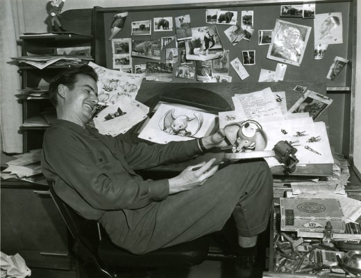
Bill Peet at his desk on Dumbo.

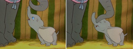
Here are frame grabs from the very same sequence of the film showing how closely the cuts were followed. Even in stills the sequence is stunning.


(Click any image to enlarge.)
.

This film is a gem.
The dvd also has one of my favorite commentary tracks throughout.
John Canemaker, by himself, talking about the film. It’s great!

From Hans Perk’s A Film LA:

Seq. 06.0 “Menagerie – Mrs. Jumbo Goes Berserk”
Directed by Wilfred Jackson, assistant director Jacques [Roberts?], layout Terrell Stapp.

Dumbo being washed by Mrs. Jumbo, animated by Bill Tytla, with effects by Art Palmer, Cornett Wood and Sandy Strother.

Animation &Animation Artifacts &Disney 10 May 2010 07:56 am

All the Cats – part 4

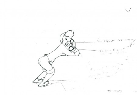
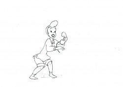
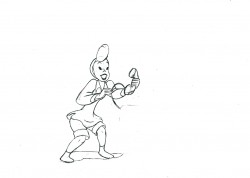
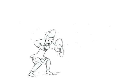
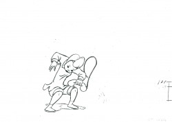
- This scene is a continuation of animation from All the Cats Join In from Make Mine Music. It’s another scene by Fred Moore and is, to me, one of the highlights of the film. The girl keeps jitterbugging even though she’s rapt in conversation on the phone.

The problem I had with this artwork was that the xerox copies offered no registration marks, and there were no visible numbers on most of the drawings. Consequently, I did the best I could to register them.
As in the past we start with the last drawing from the last post.

41

4243

4445

4647

4849

50

5152

5354

5556

5758
59

6061

6263

6465

6667

68

6970

The following QT movie represents all the drawings in the scene.
Since I had no numbers to go by, I exposed all drawings on twos.

Click left side of the black bar to play.
Right side to watch single frame.

Articles on Animation &Puppet Animation 09 May 2010 08:10 am

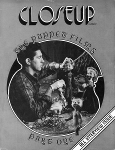
Close Up Magazine

David Prestone published a magazine in the late 70′s called Closeup Magazine. This was a professionally produced magazine that featured articles on stop motion puppet animation and special effects. Sadly the magazine stopped production after the third issue.

I’d posted a number of pieces from the second issue of the magazine, which featured interviews from many of the animators who worked on the 50′s puppet film, Hansel and Gretel. see here and here.

David now tells me that he has a number of collector’s issues still in great condition and would like to sell them. To that end, I’m posting all the information he’s sent me about all three issues, and I strongly encourage you to buy them. They’re truly gems from the past about an often neglected subject – stop-motion animation.

CLOSEUP ONE: Our premier issue, leads off with an exhaustive thirty five page filmbook treatment of “The Golden Voyage of Sinbad” including detailed examinations of the special effects, musical score,origins of the mythological creatures used, etc. A five page article on the making of “Flesh Gordon” follows (with complete plot synopsis), and a discussion of the first seventeen episodes of the “Land of the Lost” television series rounds out the magazine. In extremely short supply.

CLOSEUP TWO: All interview issue. Six stop-motion animators discuss the making of such filmlas “The Time Machine,” “The
Wonderful World of the Brothers Grimm,” “Dinosaurus,” “Tom Thumb,” “Alice in Wonderland” and many seldom seen animated
television commercials. Over 100 rare, behind-the-scenes photographs. Plus: Kathryn Grant, Kerwin Mathews, and scenes from Ray Harryhausen’s latest film, “Sinbad and the Eye of the Tiger.”

Here’s a flyer that David did for issue #3:

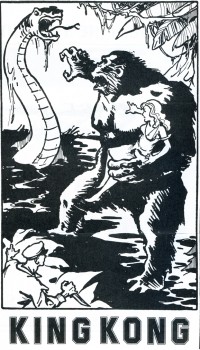
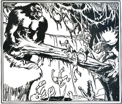
THE KING KONG LETTERS — The genesis of “The Making of King Kong” by Orville Goldner and George Turner-traced through quotes from correspondence with author Turner. Including interviews and comments from: Marcel Delgado, Ernest Schoedsack and Ruth Rose, Orville Goldner, Merian C. Cooper and other members of the cast and crew of this film classic. Illustrated with rare advertisements and campaign material from the super-scarce Kong 1933 and ’38 pressbooks.

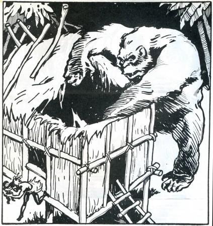
KING KONG UNCENSORED – A look at Kong’s darker side . . . Kong the killer, storming through the native village indiscriminantly killing and maiming to regain his bride. Kong in Manhattan, chewing New Yorkers, dropping women out of windows, creating havoc and wanton destruction. All of the effects scenes that were shot and later deleted (and censored) from the film, fully described, with quotes from the original Kong shooting script and hard cover novelization. Illustrated with two never before published pre-production sketches by artist Mario Larrinaga, and some of the best fan art around.

KING KONG UNCHAINED – A retrospective look at the “Fight Heard ‘Round the World” . . . Kong’s stupendous battle in the grotto with the King of Dinosaurs: Tyrannosaurus Rex!

THE KING KONG YOU’LL NEVER SEE – The full story behind “The Legend of King Kong”: Universal Pictures’ stillborn Kong remake, which would have utilized the talents of stop-motion animator, JIM DANFORTH.


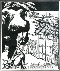
All King Kong artworkis by Glen Cravath
and was done in 1933 fpr inclusion in
the King Kong/RKO pressbook.

KING KONG DETHRONED – A talk with Rick Baker, Paramount Pictures’ Monkey Man. Things were not all mangoes and bananas for Rick on the set of the latest Dino de Laurentiis production. In an exclusive interview, this talented young man discusses his current feud with the makers of the new King Kong film. Illustrated with exclusive behind-the-scenes photographs from the movie!

THE KING KONG CRITICS ROUNDTABLE – Several top animation fans’ opinions of the Paramount Pictures remake.

KING KONG IN PRINT and KING KONG ON ACETATE -Our regular review section, spotlighting this issue, books and records of recent vintage pertaining to the amazing anthropoid.

Features on Ray Harryhausen’s latest Dynarama effort SINBAD AND THE EYE OF THE TIGER, and the puppet filma of Rankin/Bass Productions.

CLOSEUP THREE: *Professionally printed and designed. *More pages, photos, and features than ever before. *A perfect addition to any special effects fan’s collection. *Printed on sturdy 80 Ib. gloss-coated paper in a strictly limited edition.

ALSO AVAILABLE: The Editors of CLOSEUP have obtained a limited amount of copies of a reprint booklet of a “new” King Kong novelization. This slim pamphlet, a reproduction of the English Boy’s Magazine for October 28th, 1933 has 8 fine illustrations, “How They Made King Kong,” and a full page advertisement for a Kong sequel “The Menace of the Monsters” (in which the prehistoric denizens of Skull Island are transported to England where they break loose and wreak havoc on an unsuspecting populace). Imported from England. Supply is extremely limited.

.

DAVID PRESTONE
46 -16 MARATHON PARKWAY
LITTLE NECK, NEW YORK 11362
(Checks and money orders must be made out to: DAVID PRESTONE.)
All orders have to be done through the mail.

These are all the original issues of the magazine – not reprints.
issue #1 – $50 postpaid
issue #2 – $25 postpaid
issue #3 – $25 postpaid

Bill Peckmann &Comic Art &Illustration 08 May 2010 09:16 am
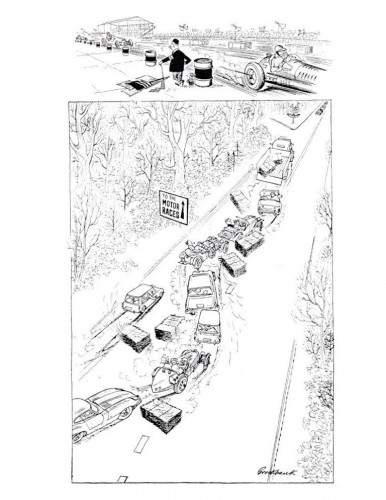
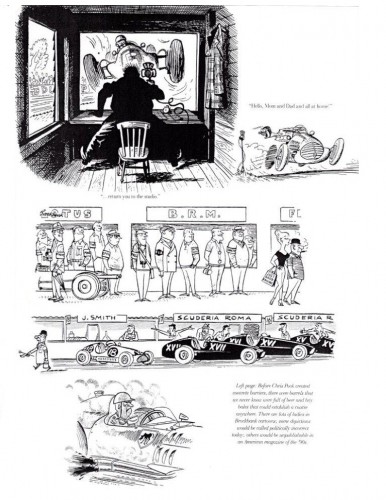
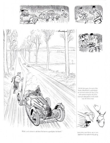
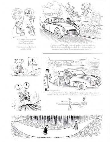
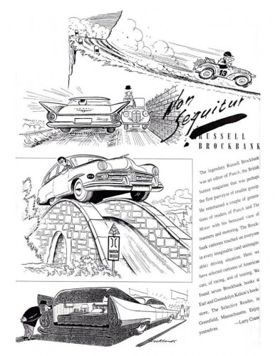
Russell Brockbank

- I’m not familiar with the work of Russell Brockbank, a British cartoonist, but Bill Peckmann sent me this note, along with six pages of his cartoons. I thought I’d share:

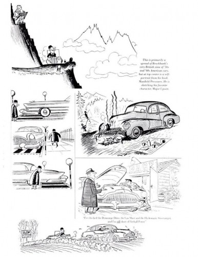
Here are 6 pages of “Punch” cartoonist Russell Brockbank. Fortunately he also showed up in our “Road & Track” magazine from which these pages are taken.

1
(Clicka any page to enlarge.)

2

3

4

5

6

Bill Peckmann &Illustration 07 May 2010 08:50 am

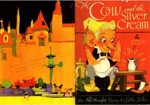
The Cow and the Silver Cream

- I’ve posted a number of items by and about artist Vernon Grant and I’m glad to be able to showcase this rarity as well.

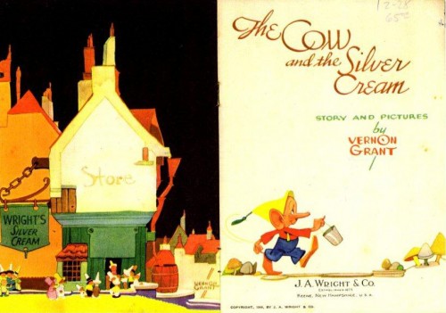
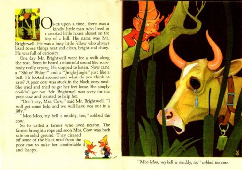
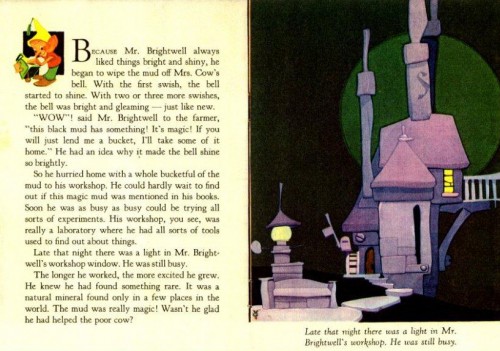
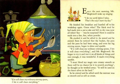
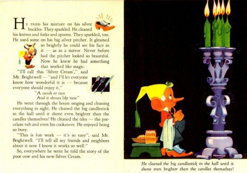
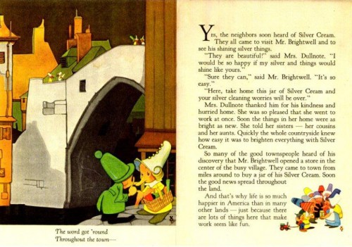
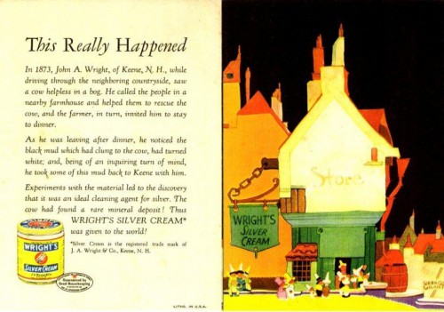
The Cow and the Silver Cream is a booklet that Vernon Grant wrote and illustrated in 1943 for the Wright Silver Cream Company. It was used as a giveaway item for those who sent in for it.

This item comes from the collection of Bill Peckmann and it’s an enormous rarity. I’m thrilled to be able to share it with you.

1

2

3

4

5

6

7

8


This is the inner cover liner.

Many thanks, once again, to the inimitable Bill Peckmann for this booklet. It’s a gem and it’s a real rarity.

For other posts about Vernon Grant, go here.

Animation &Articles on Animation &Commentary 06 May 2010 07:21 am

Dragons & Fanny

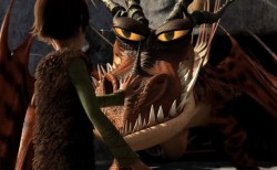
- For the past few weeks, Michael Barrier’s review of How to Train Your Dragon has been on my mind. Actually, not most of the review, just the last two paragraphs. Most of the review talks about the Dreamworks film, and, I must say, it doesn’t encourage me to see it (which I eventually will most certainly do – once they screen it in 2D in New York).

I haven’t yet seen it , but the film, from the ads I’ve seen, looks like the generic Dreamworks product. All of the characters are supposed to be Vikings living in the First Century, but they act and sound like generic animated characters in the 21st Century. It’s just about a given for such current product. The stock facial expressions, the overarching eyebrows, the attitude. In all of the ads and clips I’ve seen, America Ferrara screams every one of her lines. That’s what poses for acting today in most animated films – a direct influence of TV.

Perhaps I’m wrong, but I somehow doubt it. I’ll find out for myself when I do see it. (After all I put down Kung Fu Panda, and I now think pretty highly of that film.) Regardless, this isn’t the part of the commentary that Mike’s written that has my thoughts rambling about.

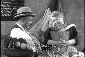
He jumps in his review to Marcel Pagnol’s Fanny Trilogy. Seeing these three films is perhaps one of my all time favorite movie experiences. They played in NY in the 70’s on three consecutive Mondays. I got so hooked into it, I looked forward enormously to those Monday showings. Mike describes them beautifully. All character development and a simple straightforward story that just about breaks your heart. It’s a wonderful film experience despite the fact that it’s a crusty old 1930’s film with lots of soft grays and soft focus. They’re obviously sets built around the Marseilles they’re pretending to create, but you buy it all. At least I did; it’s so wonderfully Romantic.

(Perhaps, that’s a generational thing. I talked an intern in my studio into watching Citizen Kane, and she couldn’t get through it. The B&W was too distracting for her, and she found the film boring. What can you say?)

Mike Barrier rightfully makes the leap to Snow White and the Seven Dwarfs, a natural link – animation wise – to Pagnol’s trilogy. The approach is very similar. Somehow I’d never have seen the link to these films, but it works. Despite the enormous difference in story, the dependence on character development and motivation are alike. A sweet, simple, direct story with very strong character personality holds you tightly throughout.

A lot of this approach stayed with the Disney features right through Sleeping Beauty. I love the first 10 or 15 minutes of all those films; nothing but character setup, and they’re all wonderful. Things started to change with 101 Dalmatians and had been just about abandoned by the time they got to The Aristocats. Character suddenly became reliant on celebrity voices. Thanks to the star turns such as Phil Harris’ Baloo the Bear in Jungle Book, it became easier for animators to pull their characters together. Let the voices do the heavywork, and in The Aristocrats, they ran with it to the film’s detriment.

Now we get unidentifiable celebrities, like America Ferrara, shouting their lines but adding nothing to the character’s personality. I’m not even sure if her name will help sell a DVD. Given these flat voices, the animators turn to their stock poses and facial expressions, and the end result is a sad lot.

I’d like to think that Chris Sanders and Dean DeBlois have surpassed the Dreamworks formula and taken their film to another level. I have been a big fan of Lilo and Stitch, although I think much of the story is hackneyed nonsense. (Whenever we have to see aliens fighting from their spaceship, it’s hard to reconcile that with the wonderful character traits between Lilo and Stitch, themselves.) The beautiful artwork choices help carry you through that film. Mike suggests that the end of Dragon may have as big a problem, and he offers to blame that on the executives above Sanders and DeBlois. Perhaps, but Lilo and Stitch had similar problems.

Mike Barrier suggests that that isn’t the entire case with How to Train Your Dragon, and I do hope he’s right. But nothing I’ve seen to date lets me expect it. I do want to be pleasantly surprised, and I’ll let you know if I am.

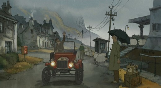
The film I’m really waiting to see is Sylvan Chomet’s The Illusionist. The story in Triplettes of Belleville fell apart, but the execution and development of the principal personalities was so fine, that the film offered me plenty – and plenty of hope. I do hope and almost expect to see that he has taken this approach to another level. What little I’ve seen leads me to believe I may not be disappointed.

« Previous PageNext Page »

eXTReMe Tracker
click for free hit counter

hit counter