Books &Illustration 24 Jun 2010 08:41 am
Animation &Animation Artifacts &Disney 23 Jun 2010 07:04 am
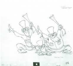
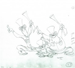
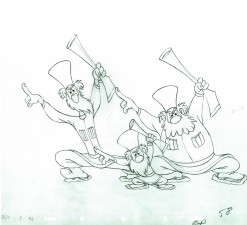
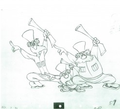
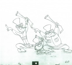
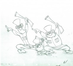
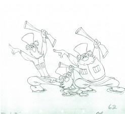
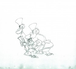
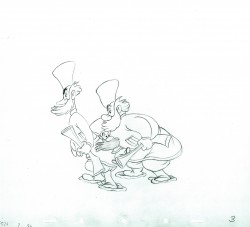
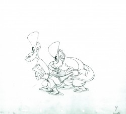
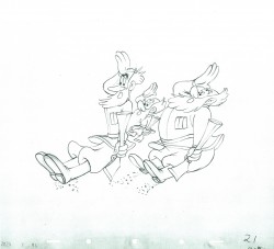
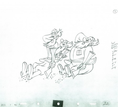
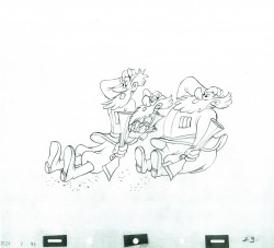
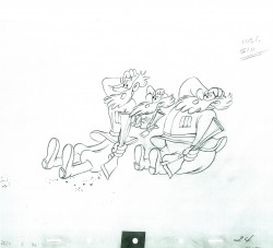
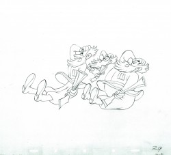
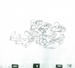
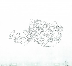
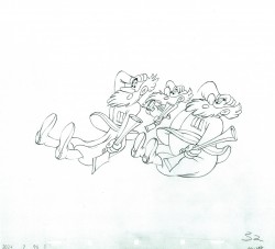
P&W-Kimball Scene – 2
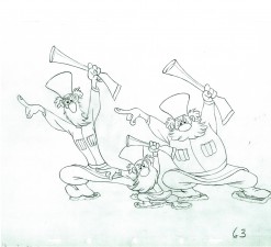
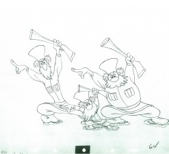
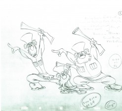
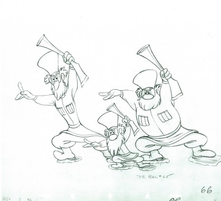
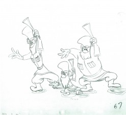
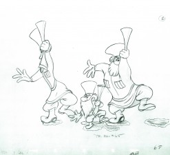
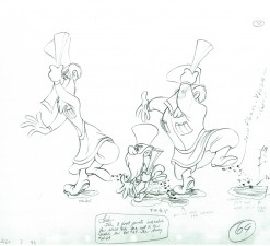
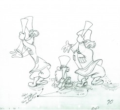
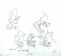
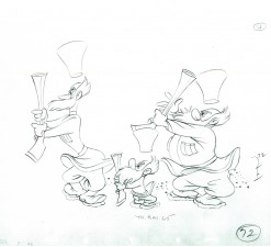
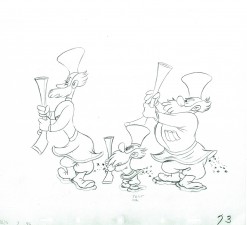
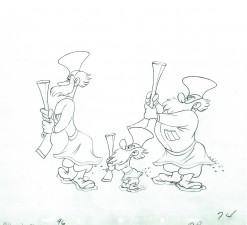
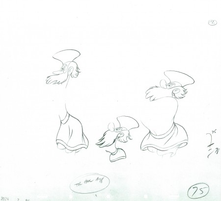
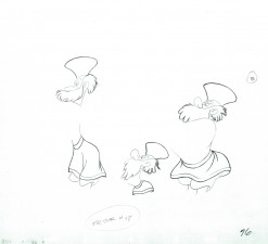
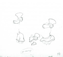
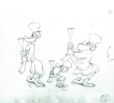
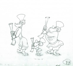
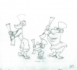
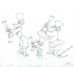
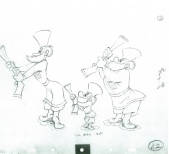
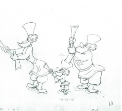
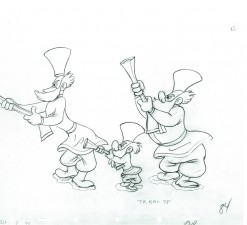
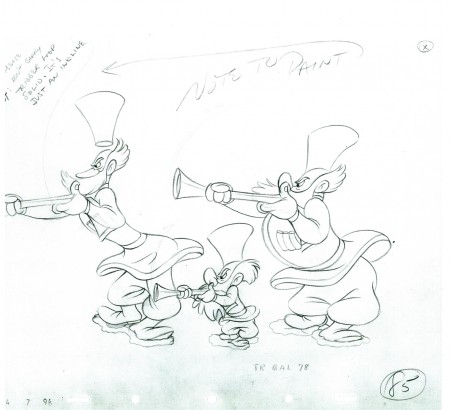
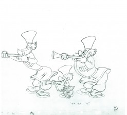
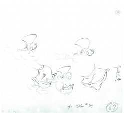
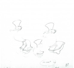
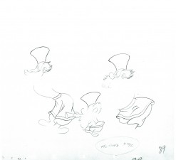
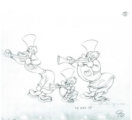
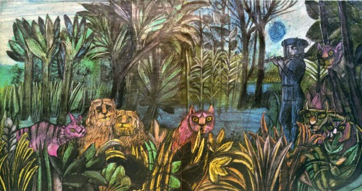
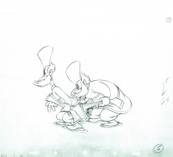
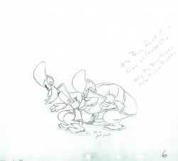
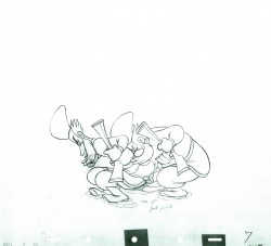
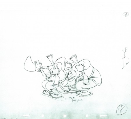
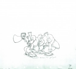
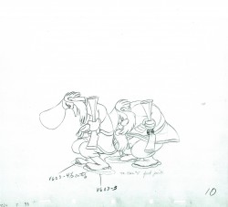
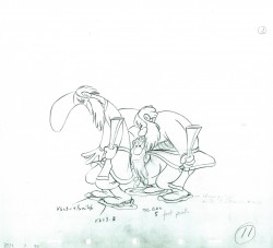
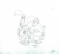
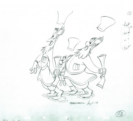
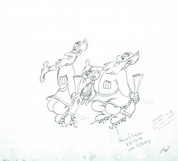
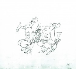
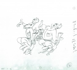
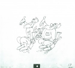
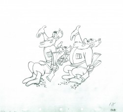
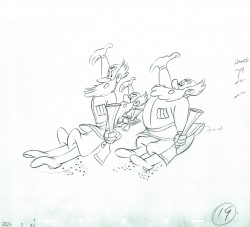
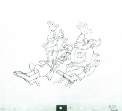
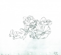
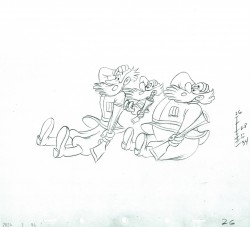
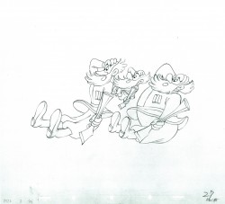
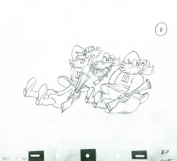
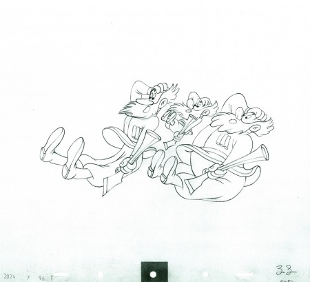
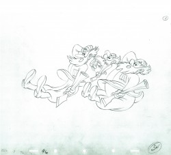
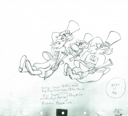
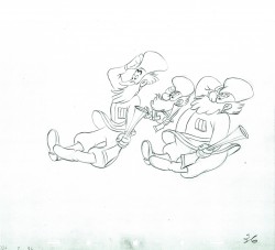
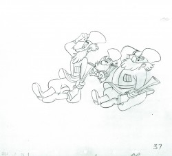
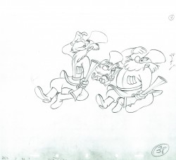
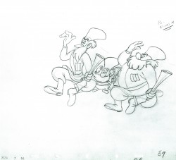
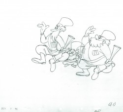
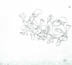
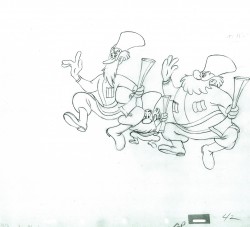
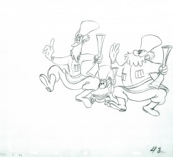
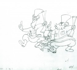
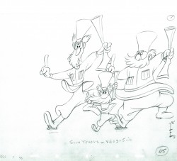
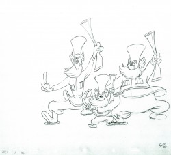
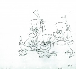
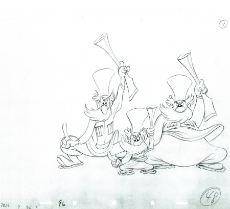
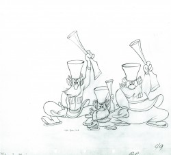
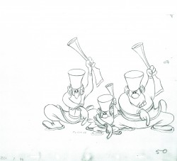
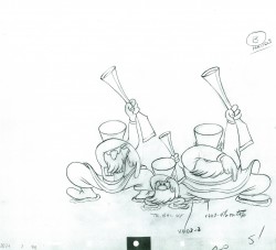
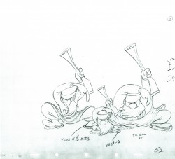
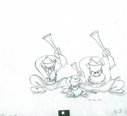
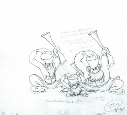
- Here we have the second installment of the Peter and the Wolf scene animated by Ward Kimball. The animation is loose and wild. There are many more parts to this post before all these drawings will be put up, so keep tuned.
By the way, the animator drafts for this feature, Melody Time, are currently being posted by Hans Perk on his endlessly informative resource of a blog, A Film LA.
Many thanks to John Canemaker for the loan of the scene so that I could share it with you.
As with all other such posts, I start with the last drawing from the last post.
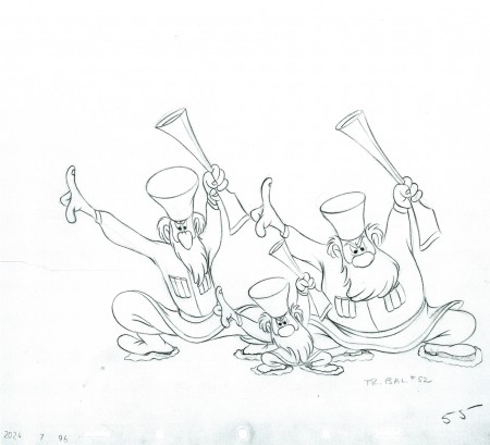 55
55
The following QT movie represents all the drawings posted to date.
I exposed all drawings on ones.
Right side to watch single frame.
Articles on Animation &Luzzati & Gianini &Puppet Animation 22 Jun 2010 07:08 am
Magic Flute
Issue #7 of ANIMAFILM included an article about the Gianini/Luzzati feature, The Magic Flute. To keep the names of these greats in the present, I’m posting the article here. Enjoy.
by Massimo Maisetti
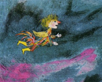 The “Magic Flute” was Mozart’s last opera, written not for the court theatre in the centre of Vienna, but for a theatre situated at the outskirts, whose manager was Schikaneder, author of the libretto. Giorgio Strehler said that it was one of the most complex and most universal works, which could be approached both from the position of the performer and the spectator. The libretto, inspired by oriental short stories, published in 1786, and by abbot Terrason’s novel, stirs up imagination, intelligence, feelings and the sense of ethics. Goethe wrote that one needed more culture to admit the values of the libretto than to deny their existence. This opinion should be thought over, as it deals with the performance staged at the outskirts in the period when to acknowledge values of a “folk” work was to oppose the accepted norms.
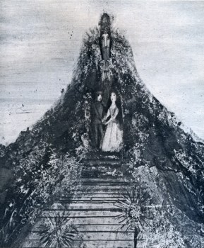 The opera, performed for the first time on September 30th, 1791, has many elements aimed at entertaining less sophisticated audience. Next to the drama of Tamino and Pamina, which is the embodiment of the eternal conflict between Right and Wrong, the Sun and Darkness, next to esoteric elements, connected with the doctrine of freemasons, which both Mozart and Schikaneder professed, there is a counterpoint – Papageno, a purely folk character from commedia dell’arte. The opera has many aspects, but the most visible ones are its fabulous and folk aspects, and next to them – metaphysical, symbolic and cosmic aspects with their Egyptian and Hellenistic associations, making one “gravitate towards one’s conscience”, according to Kirkegaard’s words. Thus to screen the “Magic Flute” was a very difficult task, as the authors of the film rejected the possibility of screening the theatre performance. It was also difficult because they had to use a chromatic and graphic language, animating drawings, where culture and experience should be combined with great sensitiveness and invention.
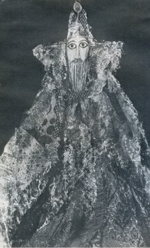 Giulio Gianini and Emanuele Luzzati are among the few film-makers in the world, who can perform such a task successfully. Gianini is an animator. He is an organizer, who is able to subordinate the technique to creative requirements. His characters move like puppets against the scenography. Its colour scheme is joy, music and charm. Those colours are the invention of the scenographer Luzzati, and Gianini, the master of photography (Nastro d’Argento for best colour photography in 1952), can reproduce them using his miraculous alchemic recipes. It was not a mere chance that many years ago at the Festival in Gildenbourgh he worked on Mo/art’s operas: “Don Juan”, “Abduction from Serai”, “Cos! fan Tutte” and “Magic Flute”. “I have always wanted to make such a film since the day I worked on that scenography”, says Luzzati. Twelve years of preparations, two years of work financed by the German and Austrian television, work done with patience, skill and imagination. At least three of Gianini’s and Luzzati’s films, first films of that kind, are characterized by a perfect relation between the music and the image: “La Gazza ladra”, “L’ltaliana in Algeri” and “Pulcinella”, where the charming music happily underlines the fancy, lyrical approach and ironical reserve.
All this was expressed with the help of images in an apologue, in a stylistically sophisticated way. The above mentioned films are among the most interesting effects of using the technique of “decoup-age” in the history of animated cartoons, especially animated fairy tales. Both Gianini and Luzzati turned out to be great artists in synchronizing movements with the music of the three operas and creating three symphonies of lines and colours. Kings, soldiers, Moors, dragons and birds from those beautiful stories, created by Luzzati’s imagination come alive thanks to Gianini’s technique and move in the rhythm, forced upon them by the music and often interpret the music with the help of ballet. In this sense Rossini’s operas helped in the realization of the “Magic Flute”.
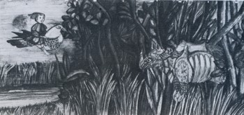 Mickey Rose, an English musicologist, made a fifty minute-long abbreviation of the opera, performed by Berlin Philharmonic, conducted by Karl Boehm, preserving its most vital elements. At the same time the graphics enriches fantastic and folk aspects with expression. It was done with charm, amazing clearness and respect for the music. When the artists use the technique of decoupage paper becomes gold, glass becomes diamond and colours become rich and luminous, like Mozart’s music. It reminds us of such great modern painters as Rouault, Chagall, Picasso, Kandinsky, as well as of oriental wall paintings, Byzantine mosaics, story, creating a naturally composed style, rich in different shades, -where a brilliant visual side interprets and completes Mozart’s wonderful music. Finally the fairy tale aspect predominates over the symbolic aspect, also due to the character of Papageno, who plays a double role: of a paper character and a live narrator (actor Marcello Bartoli). This character in multicoloured feathers reminds its famous classic ancestors. The grandson of Harlequin and Pulcinella becomes the hero of the story, determining its character. Thus the romantic story of Tamino and Pamina concentrates the philosophic sense, which is shown in the form of a fairy tale, and is meant for a demanding audience. But the simple first layer of the film pleases children, like the films “Turandot” and “L’Augellin Belverde”, screened by Gianini and Luzzati in a similar style and technique. About seventy thousand photograms with their immobile and mobile parts, three hundred drawings of the background, creative power and enthusiasm of the authors make a work of art, which is a credit to the Italian cartoon film and deserves emotions, enthusiasm and approval.
Bill Peckmann &Disney &Illustration &Layout & Design &Models 21 Jun 2010 07:30 am
Rowland Wilson at Disney – 3
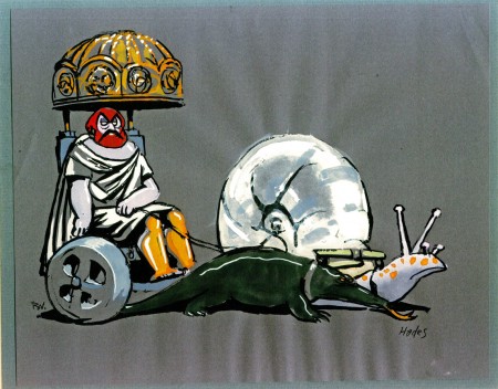
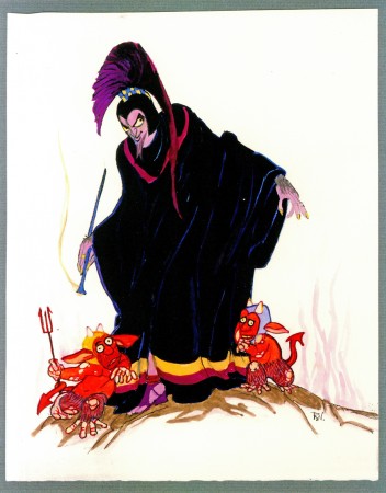
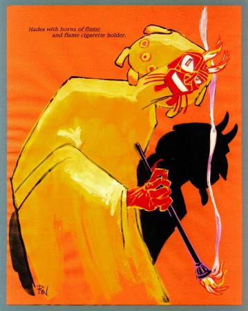
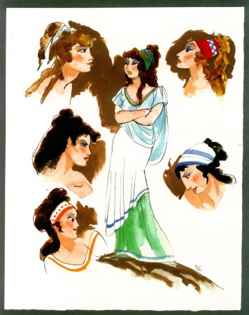
- Here’s Hercules. The last two weeks I posted some wonderful watercolor sketches, preliminary art for The Hunchback of Notre Dame from the great cartoonist, Rowland B. Wilson. (see: Part 1, Part 2)
Here for the first of two parts are some drawings by Rowland for Hercules. This entry includes character sketches for characters that developed into something completely different, or didn’t end up in the film at all.
Once again, I must express my debt of gratitude to the generosity of Bill Peckmann for lending me the art to post here. Thank you, Bill.
 1
1Megara
Next week, the last of these beautiful watercolor sketches.
Photos 20 Jun 2010 07:47 am
Moving Photos
- My friend, Steve Fisher sent me a note about the photo exhibit in which he’s exhibited. It’s moved from the gallery in which it was showing and is now travelling.
The New New York exhibition will travel this summer to Governors Island, where it will be on view from July 2 through August 15. The show will be open the same hours that the island is open to the public: Fridays, 10-5, and Saturdays and Sundays, 10-7.
It will be on view in the ground floor of Building 110, which is the first public building to your right as you exit the ferry. I will be out of the country throughout that period, but I hope you will be able to see it if you missed the Manhattan show (which ends 26 June).
Check out Governors Island website for more information, including ferry schedules: here
Meanwhile, here are some new pics from Steve:
 1
1
Articles on Animation &Books &Commentary 19 Jun 2010 09:05 am
Happy belated Birthday, Mike
 - This past Tuesday, Amid Amidi celebrated the birthday of Mike Barrier with a very respectful commentary on Cartoon Brew. This was followed quickly by more kind words and an acutely written article on Mark Mayerson’s excellent blog. Both were met with positive comments from the people following the two sites.
I was pleased to see both posts and thought of leaving my own comment on each of them. However, I have my own blog and have probably too much to say.
Mike and Phyllis Barrier are very dear friends to me. When they lived in Washington D.C. I took many weekend trips to see some art exhibit or special film event or just a visit to meet with them. We grew close, and even though now we’re half a continent away, I still feel there’s something dear and special about our friendship.
However, long before we became friends, I was a fan of Mike’s writing, criticism and commentaries about the world of animation. Those early issues of Funnyworld Magazine became seminal to my knowledge about the history of the medium. I also knew inherently that this was a widespread thing. Anyone who was anyone, student or professional, knew the magazine. I remember going to my first animation festival – Ottawa ’76. I witnessed no fewer than three conversations about Chuck Jones vs Bob Clampett, all precipitated by a couple of pieces in Funnyworld. No matter how ludicrous it all seems now, Mike had inadvertently reignited something of a feud in Hollywood between the two directors even though he wrote that Jones and Clampett were both brilliant.
The magazine made a large foothold among all animation-lovers. Eventually, it, like most small and independently published magazines, suffered financially until it had to be stopped. Back issues are still being sold for enormous amounts of money.
 Mike kept pushing ahead for years and years and years on his book, a history of Hollywood animation and it was always a treat for me to discuss it with him. Like many other people, I panted for the day when the book would finally make it to the stores. Once Hollywood Cartoons: American Animation in Its Golden Age was published, I immediately plowed through it, then started over and read it again. I’ve re-read the book every year since. It’s the pinnacle of animation history, in my opinion. There’s nothing as exacting or precise or historically accurate on the market.
I also remember a point when Mike was hired to write a history of Warner Brothers cartoons. During one visit to his home in Alexandria, he surprised me by handing me the manuscript and asking me to read it. That was one of the fastest reads I’ve gone through. Excellent, of course; I was properly overwhelmed. On another day, he opened a draw of large-sized chromes of WB artwork. BG’s and animation drawings photographed beautifully and sitting there for me to drool over. It was a treasure-filled weekend for me. The book was cancelled by Warners when they suddenly had a power shift, and a piece of brilliant historical writing was lost. I’ve always hoped Mike would somehow rework that manuscript so that the ultimate history of WB would be made public.
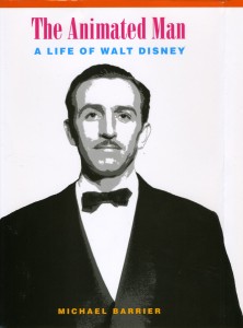 The Animated Man: A Life of Walt Disney, is equally brilliant, even though it seemed to disappoint some animation people. The book follows the story of Walt Disney, the man – just as the title states. It took its subject seriously, and when Walt lost interest in animation, so did the book. We learned more about Fess Parker, Treasure Island and the theme parks than we ever expected from a book about Disney. And, realistically, that’s the way it should have been. Mike painted a portrait of a unique man, and it made him human. Something that hadn’t been attempted before – except by some detractors who tried to make their names by slandering Walt and finding the most negative stories they could concoct.
 Aside from these two books, Mike wrote Carl Barks and the Art of the Comic Book, a history of Barks and the amazing comic books he wrote and illustrated for Disney. Mike has also coauthored, with Martin Williams, The Smithsonian Book of Comic Book Comics, a complete history of the comic page characters that developed into long-running comic books. It’s a big book with lots of well-produced color comic pages. The comic pages are printed on the same newsprint that the originals were printed on.
Oh, yes, he also has a great website.
Now, Mike has turned 70 and seems to be in high form. I know he’s working on a couple of other books and I anxiously await getting them in my hands. Mike’s a friend, a good friend. Aside from that he’s a great and knowledgeable writer of animation. Even when I don’t agree with what he has to say, his writing makes me think about my medium and pushes me to think deeper. (A good example of this is his review of Get To Know Your Dragon which pointed out that we’ve lost something since the glorious Fanny trilogmade in the early thirties. It got me to think seriously about how to bring back that slower paced aura from the past, the one that allowed characters to develop – really develop. Not in the clichéd way of today’s animation but in the full and deep way of the films of the golden era.)
Many like to put down Mike’s writing for being too negative. I know it isn’t. I know that most other writing is too accepting, too forgiving. Has there been a serious review of Toy Story 3? I only see glowing reviews for an amazingly clever film that whisks us through a hurly-burly of confusion until the sappy moments at the end. No characters properly developed, or enlarged. Just whirlwind story – very cleverly done. We need better film critics, not just animation critics. Ironman II isn’t ok, nor is The A Team, nor is Shrek 4. They’re franchises not movies. MacDonald’s III. Yes, aspects of them all are fun, but that’s not enough. We need good movies that are better than clever, and we need more reviewers like Mike Barrier. Those whose historical accuracy is above and beyond most others and whose taste is shaped by a history of watching many many films as well as by a strong understanding of the medium. He knows what he’s writing about, is not afraid to say it, and I’ll follow him anywhere.
Happy Birthday, Mike Barrier, may you have many more.
Articles on Animation &Independent Animation 18 Jun 2010 07:42 am
Norman McLaren – WHO ?
- I was recently in a conversation with a young animation student. In the course of our chat, the student commented on a DVD on my desk; he didn’t recognize the filmmaker’s name. Norman McClaren. I gave him a small lecture about the master’s work and suggested the student start doing some research (even if only on YouTube.)
I came across this article by Gerald Buddner in “The Art of the Animated Image”, and anthology edited by Charles Solormon and published by AFI in 1987. I have to post it.
at Work
First Impressions of Norman McLaren
BY GERALD BUDNER
ver 40 years ago—the summer of 1946—while visiting a school friend who had a summer job at The National Film Board of Canada, I was invited to Miss Evelyn Lambart’s dinner party for Norman McLaren. Conversation was marvelous, dinner was delicious and helpings very ample. I remember it included the perfect fruit dessert—this was followed by another, a “shape.” This Victorian Triumph about 14″ high of molded Creme de Menthe was, sad to say, more than any of the guests could manage, which caused but a moment of disappointment. Suddenly Norman lifted Miss Lambart’s beautiful Georgian dessert trowel, and in about a minute flat, with a few deft strokes, was able to convert the quivering delight into a sculpted Jade Chinoiserie in a Brighton pavilion style—complete with grottoes and waterfall, bridge with fisherman catching giant carp, a pagoda above a lily pool complete with wading storks. The whole exercise was super speedy and enchanted the assembled company. From that moment, I knew I was privileged to be in the presence of a Genius.
The following morning at the Animation Department in the abandoned sawmill, I was invited to see the artists – at work.
Thinking I would witness leaping figures, etc. I was instead spellbound to hear a few absolutely clear and fresh phrases of Bach, drawn—that’s rightdrawn on the sound track. This was the beginning of a 40-year-long enchantment. The magic of the shy McLaren was at work.
From the beginning, the professional life of Norman McLaren was characterized by a creative spirit toward art and music, a finely honed perception for the importance of technical brilliance, a unique sense of humor and a deeply developed sympathy for the whole of mankind. Frugal by nature, he was accustomed to working with the scantiest of means. Inspired by movement, he was able to use characters and even props as puppets. He scratched sprightly images with needles and razors onto raw film stock with delightful and unexpected effects. One of the first animators to experiment with drawing, scratching and engraving both the picture and sound directly onto film, he is also acknowledged as being one of the pioneers of 3-D animation. The effects of his innovation grow more impressive with each successive viewing of the films. Meanwhile he drew and painted continually, offering his works to his admiring friends.
Born in Stirling, Scotland in 1914 to an artistic and cultivated family, he was encouraged to pursue music and art from a very early age. He began a five year course at the Glasgow School of Art, headed by John Rennie Macintosh, specializing in interior design which related to the family business. He was already intrigued with film, and at twenty years of age, he entered two films in a Scottish amateur film festival, where they won awards and attracted the attention of the adjudicator, John Grierson.
Impressed by the obvious talent of the young artist, he offered McLaren a position in London with the prestigious General Post Office film unit where he was taught the craft of film-making. After leaving the G.P.O., he worked as a cameraman during the civil war in Spain. Haunted by his nightmarish experiences, he came to New York in 1939 where he was encouraged by the founders of The Guggenheim Museum and other New York film people.
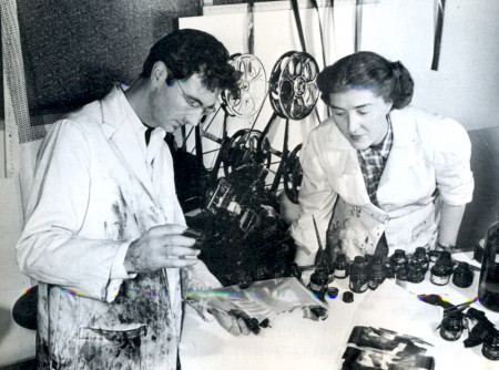
Begone Dull Care, 1949, McLaren at work with Evelyn Lambert.
At that time, the Canadian government created The National Film Board with John Grierson as the first Government Film Commissioner. The “Board” had a very significant mandate to fulfill, not the least part of which was to help, through the film medium, to unify a diverse, thinly populated and vast country. Grierson was quite up to this task, but was soon aware of the danger posed by the very serious and worthy, but nonetheless somewhat heavy-handed zeal of the young filmmakers. This heaviness, although well intentioned, could have been disastrous for a new and untried governmental film organization. By 1941, Grierson was able to convince McLaren to bring his inventive genius, his wacky humor and his artistic conscience to Ottawa, to add some leaven to the earnest mass of vital information being produced for a country at war.
The wisdom of this action was soon evident: the meteoric power of the amazing McLaren was launched. The National Film Board would never be the same! Canada would never be the same! The results would bring delight to Canadian filmgoers and to people around the world, fame to McLaren, and honor and prestige to his chosen country.
In the first years at the “Board,” McLaren was encouraged to establish an animation studio, which attracted other young talents who would contribute richly to the art of animated film in Canada. Evelyn Lambart, George Dunning, Jim McKay, Rene Jodoin, Colin Low, Grant Munro and many others soon joined him. The technical excellence and the level of artistic accomplishment achieved by McLaren’s studio soon attracted the attention of film people across Canada and in other countries. They scorned cheap commercial effects, which were a dangerous trap in this very exploitable medium. Their films were recognized as having something very special to say in a very special way. In Britain, France and The United States this plateau of achievement and artistic integrity was a cause for wonder; the choice of subjects, the graphic styles and the technical skills combined to lift animation to the plane of ART. McLaren produced many wonderful films in this early period.
In 1949, UNESCO invited McLaren to visit China and teach Chinese artists and educators audio-visual techniques. He found the experience was very rewarding on the humanitarian side, as the impoverished Chinese were at war and desperately anxious to use the simplest resources to educate their gigantic population.
This profound experience of war and revolution left an indelible mark on his sensitive and impressionable nature, as well as on his physical health.
On his return to Canada in 1950, he was invited to create films in 3 dimensions for the Festival of Britain. Around is Around and Now is the Time are the result, considered by many to be classics of this technique both for the impact of their fabulous imagery and their unprecedented and powerful sound tracks. Although rarely seen today, the films are regarded as precursors of most 3-D animated films.
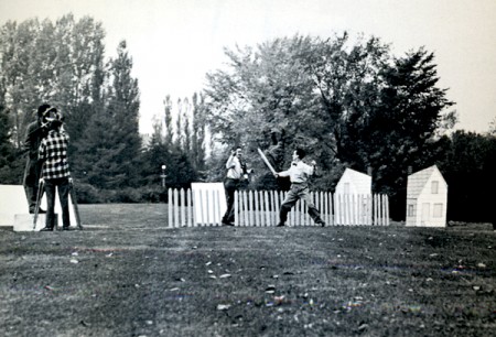
Neighbors, 1952.
It was not surprising that an anti-war film soon occupied him, and in 1952 Neighbors captured the imagination of the film world. The next year it won the Academy Award for best documentary short, as well as numerous other prestigious awards in Canada, the United States and Italy. The technique he employed animated both figures and props, which he christened PIXILLATION. The picture of escalating violent battles for possession of a single flower still sings out his sentiments on the subject of war.
Rhythmetic is a very engaging game-like film made with Evelyn Lambart. Quite surprisingly it enjoys an unexpected revival today, since young people equate it with the computer a surprising example of deja vu in a film made in 1956. Lines Vertical was also made with Evelyn Lambart, in I960. The lines were engraved on black film stock with a stylus. McLaren later told me that he was inspired to make his next film Lines Horizontal having observed the telegraph wires “animate” through the train window while travelling between Ottawa and Montreal. He used his earlier Lines Vertical to create a new film by turning the images 90 degrees! Very frugal indeed.
Mosaic (1965) combined the two Lines films by printing them together and featured a sound track he engraved himself. Pas de Deux. (1967) uses ballet dancers. The stroboscopic effect of slowed movement and controlled back lighting offers sculptral dimensions of magical proportions and depth. The sensual visual effect celebrate his passion for movement in a most elegant way—to me reminiscent of classical bas reliefs brought to life with amazing refinement. These themes were expanded in 1972 where the movement was further slowed down and the emotional impact expanded in Ballet Adagio.
All McLaren’s experiments in animated sound came together in Synchromy made in 1971. The visuals are actually identical with the sound, which was accomplished by photographing the sound cards he had made years earlier. These patterns comprise both the optically colored visuals and the sound track.
To celebrate the accomplishments of his two Parisian animator friends, American Claire Parker and Russian-born Alexandre Alexieff, McLaren made an erudite film Pin Screen in 1973. The velvety light and dark effects made with their sophisticated invention offer the effect of metamorphosing chiaroscuro, resembling stipple engravings of incredible softness and tenderness.
Following this, McLaren and his long-time associate Grant Munro created a series of films for educational use, which elucidate the basic principles of movement in a clear and easily comprehensible way. Animated Motion numbers one, two, three, four and five are very useful for students of animation, and should serve as a springboard for young artists.
Narcissus represents the peak of films that exploit optical effects. In his own words “During the first part of the film Narcissus no special effects were employed, but from the moment Narcissus sees his own image in the pool until the end of the film a whole variety of optical effects were used. Narcissus’ image when flipped left to right and upside down, was made to go in and out of step with itself by freeze-framing, double framing and skip framing. At times in the original shooting Narcissus had to perform two opposing roles which were later optically combined in the same frame. In one such sequence, various flicker effects were introduced, in another more extended sequence the movements (motives or actions) of each ‘Narcissus’ by a very complex optical technique are turned into flowing blurs.” Norman ’81.
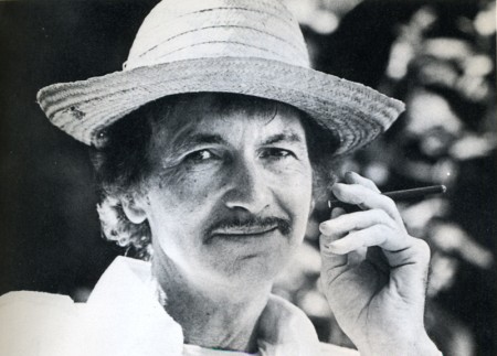
McLaren in retirement.
In the last film made with and about him in 1983 for a festival of animation films in Holland, he underlined how grateful he was for forty-two years of artistic freedom enjoyed at The National Film Board of Canada. All share gratitude for freedom, for we enjoy it too. I am confident that millions will continue to be grateful for a very long time to come. The number of his films long and short totals sixty. From the words of his life-long campanion Guy Glover, written as a foreword for a monograph published by The National Film Board “McLaren – 1980,” let me long and short totals sixty. From the words of his life-long campanion Guy Glover, written as a foreword for a monograph published by The National Film Board “McLaren – 1980,” let me quote:
“Far from the Talking Picture -That vast province of the Cinema that borders,
indeed overlaps, on the Realm of language -
There exists yet another province of the Cinema
where talk is limited and which touches on the frontiers
of Music and Dance. In a corner of that province is to be found
the little garden of Norman McLaren whose films talk only through image and movement.
A birds-eye view of McLaren his life and film work has been attempted,
without forgetting, of course,
that it is in the films themselves
that his creative character is most clearly expressed.”
Bill Peckmann &Illustration &Models 17 Jun 2010 08:06 am
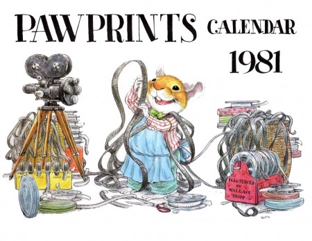
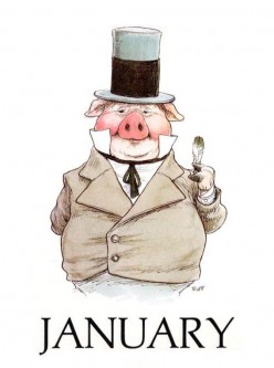
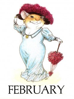
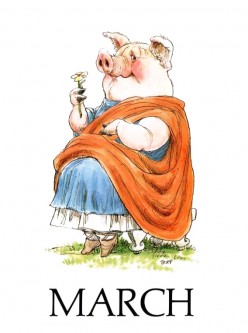
Wallace Tripp designs
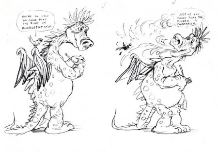
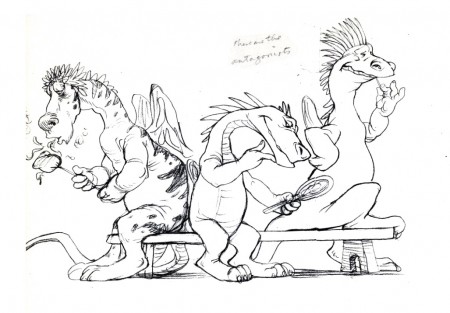
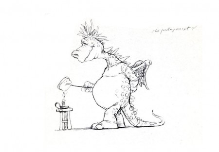
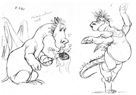
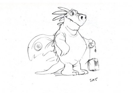
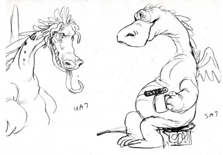
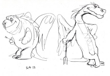
- I’ve recently featured a number of illustration pieces by Wallace Tripp and have frequently expressed my feeling that he should have been desigining for animation. His style seems so ideal for the medium. Well, thank heavens, I’m apparently not the only one who thought so.
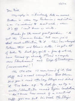
Bill Peckmann sends me a copy of a letter he received from Mr. Tripp which states that the accompanying artwork was designed for Richard Purdum’s British studio. The dragons are a delight.
 1
1 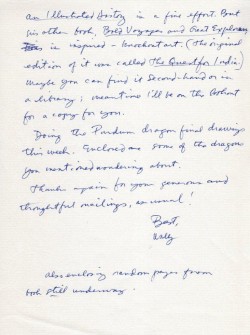 2
2(Click any image to enlarge.)
The following sketch and the character closeups are obviously
for something completely different:
Animation &Disney 16 Jun 2010 08:19 am
P&W-Kimball Scene -1
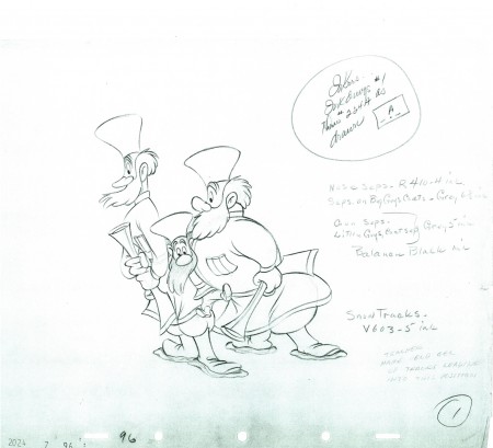
- Here is the first of many parts of a very long scene from Peter and the Wolf as animated by Ward Kimball. There are some 500 drawings to the scene, so it’ll take a while for me to post them all. However, I’ll do it about 50 at a time where I can find natural breaks in the motion.
Kimball was flying high and loose at this time, and his animation is a lot of fun to look at. The scene is all on one’s, and the inbetweener had a lot to do. This scene is very clean, so I’m not sure how much of the actual artwork is actually Kimball’s.
Many thanks to John Canemaker for the loan of this artwork.
 1
1(Click any image to view at full scale)
The following QT movie represents the drawings in this post.
I exposed all drawings on ones.
Right side to watch single frame.
Come back next week for Part 2.
Animation &Disney &Peet 15 Jun 2010 08:10 am
Bill Peet & Dumbo animation
- There’ve been a lot of comments on my blog about how Bill Peet just about re-animated the bathing scene for Bill Tytla. I thought it worth looking into what I could find in print. To start with anything BUT Peet’s autobiography would be foolish, so let’s see what he wrote about his time on Dumbo within that book.
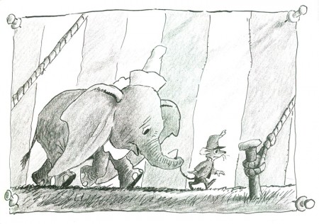
- The intimidating big business atmosphere of the new building became much less difficult for me when I was assigned to work on Dumbo, the story of the little circus elephant with the enormous floppy ears. Otto Englander, the supervisor of Dumbo, was familiar with my work on Pinocchio and gave me a large part of the story to develop on my own.
The year and a half I spent on Dumbo was a happy time especially since our first son, Bill, was born just the year before I went to work on the picture, and my infant son was a definite influence on the way I drew the baby elephant.
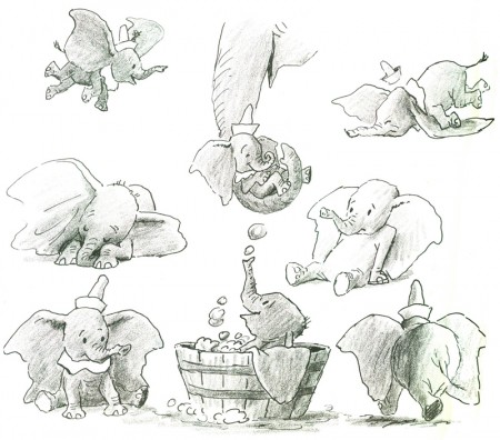
With all my years of sketching and painting the circus I was well prepared for Dumbo, and I contributed so much to the production that Otto allowed me to present my story boards to Walt one day.
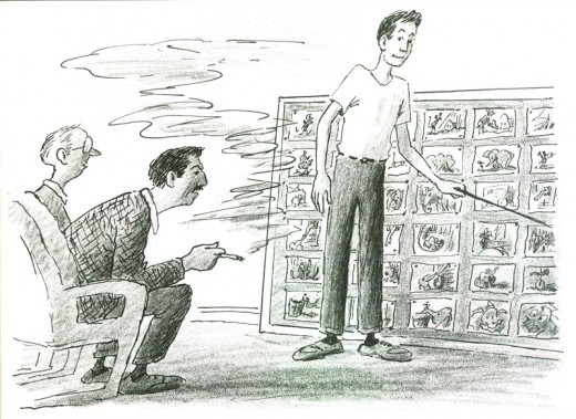
In facing Walt for the first time I understood why so many story men became so nervous and shaky they often lost their voices. It was an unnerving experience to concentrate on the boards while Walt leaned forward in his chair as if he were ready to pounce.
Hi fierce scowl was also disconcerting even though it was usually a sign of deep concentration.
I was greatly relieved to make it through the boards without faltering and find Walt relaxed and smiling.
But then Walt was enthusiastic about all my boards on Dumbo, and I thought sure I was established as a full-fledged story man on films to come. No such luck!
Here’s what Peet had to say in an interview done on Hogan’s Alley.
- Bill Peet: Walt got a little stingy with us on Dumbo because they had a showpiece with Bambi. They could play around with little things like the raindrops. Beautiful, but slow and expensive. We weren’t allowed any trimmings. Bambi was a wedding cake. Dumbo was one layer with a little bit of icing. Ours was more successful because it had common appeal, even though the animation was crude in some places. Dumbo didn’t make big money. It had only cost $800,000, so all it had to do to make its cost back was go a little over $1 million. The other features had cost $3 million, plus the cost of the prints, and with no foreign market because of the war.
John Province: Two of the best, Bill Tytla and Fred Moore, worked on Dumbo.
Peet: People were always amazed at Bill Tytla, that he could draw the giant devil for “Night On Bald Mountain,†and the giant in “Brave Little Tailor;†these ponderous, muscled characters, and then do this little elephant. After he got his first scene on Dumbo, he passed me in the hall and said, “Y’know, Bill, I can’t draw these goddamned little elephants. If I send Nick [his assistant] up with the scene, would you see if you could work it out?†Nick brought up this stack of drawings, Bill’s scene where the elephants first appear was just a mess. So I went over every one of them, probably a couple of hundred drawings, every damned frame in the picture, and redrew the whole scene. They shot the pencil test and showed it to Walt. He was ecstatic! Nick came up and told me, “Walt loved that thing, and I want to shake your hand!†Well, Bill never bothered to thank me, Walt either.
Reworking drawings is not animation, and Bill Peet knew that as well. Animation is all in the timing. I also doubt that a sequence that long would have only had “a couple hundred drawings” (even if that isn’t an exaggeration.) I don’t think Peet is giving Tytla his due. Certainly he deserves some attention for pulling the character on model and showing the assistant how to handle it, but there’s a lot more to it.
Mike Barrier, in his inestimably valuable book, Hollywood Cartoons, reports:
- Jackson, who directed all the sequences with significant amounts of animation by Bill Tytla, handed out scenes to Tytla, “but there would be others who would work with him who would do certain scenes…. Quite often Bill would knock out a few poses to get them started and would supervise what they did, very carefully,” to the point that he accompanied those junior animators when Jackson looked at their pencil tests in sweatbox sessions.
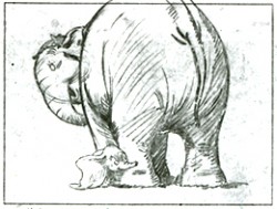 If Tytla had trouble drawing Dumbo, he wouldn’t have had so much authority over the junior animators. I have no doubt Peet got him up and going with the initial scenes, but Tytla is evident in every drawing credited to him in that film. He did that animation.
Personally, I think this sequence is brilliant enough that both men deserved the credit of genius. It’s one of the high-water marks of animation in its entire history. I also think it’s doubtful that we’ll see its like again.
