Books &Commentary &Disney &Story & Storyboards 02 Aug 2010 10:08 pm

Joe and Joe

- Today is the day that John Canemaker‘s book, Two Guys Named Joe: Master Animation Storytellers Joe Grant and Joe Ranft officially hits the stores. I urge you to take a look and go for it. The book is great.
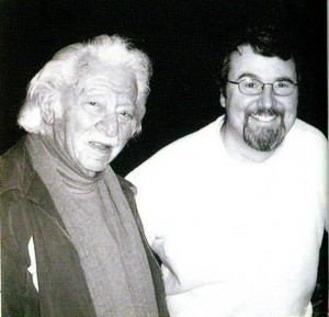
- It was about nine months ago that John Canemaker let me read the galleys of his new book, Two Guys Named Joe: Master Animation Storytellers Joe Grant and Joe Ranft. I’d been aware of the book for a couple of years now, and whenever I’d heard John talk about it I wondered how the two guys fit in together to make a book. When I was handed the galleys, I moved slowly ahead with some trepidition.

I basically knew who the two Joes were from my reading and my NY attempts to keep up with the Hollywood system. Joe Grant was an old timer who’d dominated the Disney modelling department (the only time there was a department exclusively for model sheets), and he’d come back to act as one of the wizened artists helping to shape the new “Renaissance” in the animation community. Joe Ranft was one of the key CalArts guys who’d gone through the Disney system on his way to Pixar where he helped to shape that studio. There’s no doubt he was key to Toy Story, A Bugs Life and Monsters Inc.

What connection would John Canemaker have for tying these two together? Would that connection be enough to fill a book?

Of course, all such conjecture was stupid on my part. The book, as it turned out, is one of John Canemaker‘s finest, and that’s saying a lot. John, after all, is one of the best of our animation historians. His material is well researched, his facts are accurate, and his information is always pertinent and absorbing. He is also a good writer. He tells a story and reveals his information as any good writer would. There’s a solid construction to all of his books, and he lets you into the book in a comfortably relaxed way so that you’re absorbing the story and facts all together, and you are pulled into the book. This is the greatness of Two Guys Named Joe.

As for the connection, John explains that well. Not only, of course, within the book, but he had this succinct statement to make in an interview with Amid Amidi: “I saw the possibility of an overview of the history of storytelling at Disney and Pixar through a very human story of two artists straddling the 20th and 21st centuries.” And that’s exactly what John uses the book to do. He wants to really upchuck the earth of the story departments of both Pixar and Disney, and he does a good job of it.

I’ve now read the book twice. Once in galley form, once in final book form. The book is a rich-looking item full of the finest artwork from storyboards, printed material and developmental art. It’s a gorgeous book.

However, the real gold is in some of the writing and treasured bits that John has dug up to support his material. Here, for example is a small piece about Alice In Wonderland’s story development:
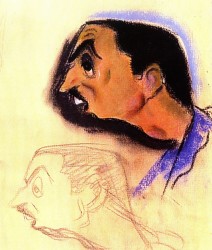
    A March 15, 1939, story conference transcript reveals Walt’s frustration with the project:
    WALT: (To Joe) Have you been through A//ce in Wonderland lately?
    JOE: No. I’ve been through the script though. I think there are some pretty good situations in this.
    WALT: Yes, and some, too, that are not so good.
    JOE: I like the stuff on the disappearing cat—swell possibilities in that.
    WALT: Yes. Let’s see. What are the good situations?
    JOE: The tea party stuff is good.
    WALT: Yes, the tea party is to me the best. . . You
    know, I think we’re missing a hell of a lot in the stuff that is our medium. . . everything isn’t dialogue. Talk, dialogue business that depends on dialogue, hinges on dialogue.

    Disney then tore into an unfortunate writer named Dana Coty.

    WALT: I’m saying that to you because I think maybe
    you’re the one that’s responsible for a lot of silly business that has no basis on anything funny.
    DANA: Well, in the duchess’s house, I wrote that very loosely to begin with, Walt.
    WALT: I don’t give a damn how you wrote it. It’s what we’re driving at. If it hasn’t got a basis for something funny, don’t write it! There’s no use writing the thing and then alibi-ing for it afterwards. It just throws us off the, track. Don’t just write anything to fill up some pages. We had the same criticism, the last time we were together.

John uses this anecdote to not only say something about Disney, himself, but the way he communicated with Grant and the hostility he might display for others. He did not mince words or waste time where he thought it was wasted. They were trying to solve the problms they saw in Alice In Wonderland, but we learn that Grant, Huemer and others felt that Disney was the problem. They felt he didn’t quite understand the Victorian humor of the original and tried to gag it all up. It’s just one wonderful excerpt dug deep in the book.

Another gem of a sequence involves Joe Ranft. It’s the point just when the Pixar artists are trying to sell Toy Story to the Execs at Disney. They’re doing everything in their power to make the film story good while placating the Disney people, and they’re having a hard time of it.

    Disney insisted the production move to Los Angeles so the studio could oversee things. “And give us more notes,” Ranft lamented.

    Lasseter, whose “heart was broken,” begged for a two-week reprieve to turn things around. After obtaining Disney’s skeptical permission, Lasseter, Ranft, Docter, and Stanton resolved to “make the movie we want to make!”

    . . .

    The process included writing, gathering more material, constant meetings, weeding out, refocusing, and . . . more meetings. “Two or five heads are better than one,” Ranft believed. “If you can work together without killing each other, you an accomplish a lot.”

    Going forward, Pixar gladly accepted notes from Disney and welcomed participating in brainstorming sessions with their artists. “But,” Ranft said, “we’d go away and really think about [the notes]. A lot of times we’d go, ‘No. Here’s the real problem!’ And it was even deeper than the notes. ‘And here’s how we’re going to fix it.’”

    Regarding the creative process, Ranft once said, “It’s a challenge. The final product is the goal you’re searching for. [Your little sequence is] gonna get smashed, trashed. It’s gonna come apart for the good of the final film . . . it’s a paradox. You’ve got to put yourself into it, and then you’ve got to take yourself out of it. Be objective and not be hurt.”

And that’s the point of the two guys. They understood the value of the story and the center of the films they worked on and over. Nothing mattered, including personal insult, as long as the story came out right. They were film artists and knew how to get what they needed to complete their goals.

My personal preference is to want to know more about the old timer and to learn more about the golden age. However, it’s totally my bias, and the proof of this book’s success is that I was completely absorbed by all that was written about both men.

This is more than a good book. Anyone in love with animation should own a copy and read it carefully. There’s a lot there, and it’s all good. It’s stunningly designed with beautiful animation art treasures well displayed.
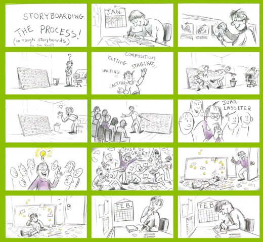

A telling board by Ranft.

________________

Amid Amidi offers an excellent interview with John Canemaker on the subjects of the book at his Cartoon Brew site. I recommend you all read it.

There’s also a video promo you can catch on YouTube if you’re more visually oriented.
Books &Disney &Illustration &Layout & Design &Mary Blair &Models 02 Aug 2010 07:22 am

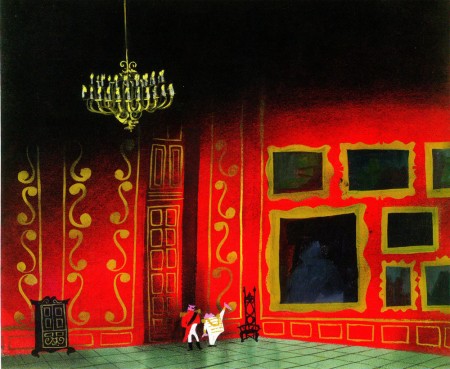
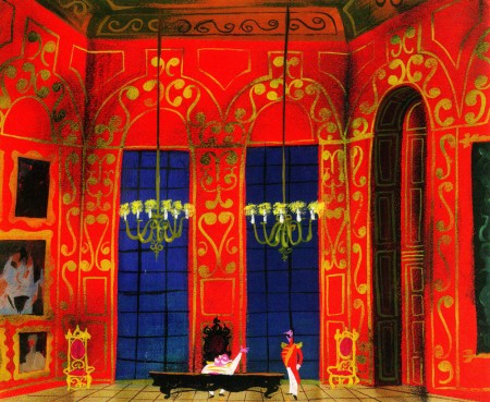
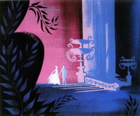
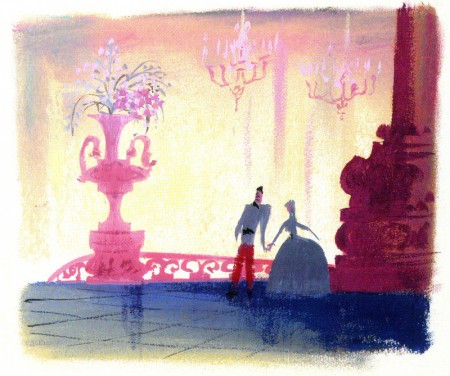
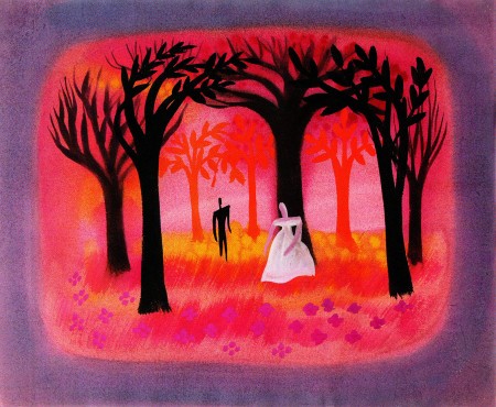
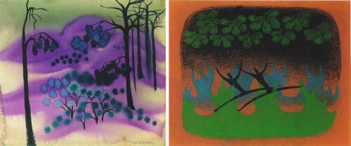
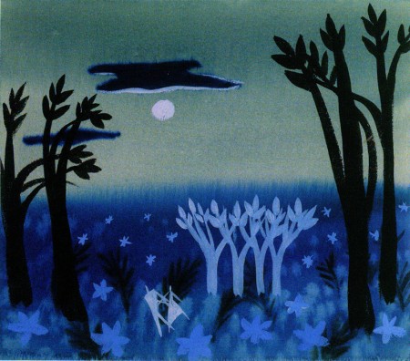
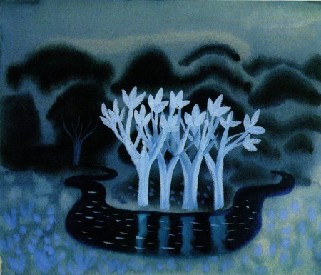
Mary Blair – 4.

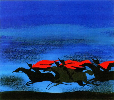
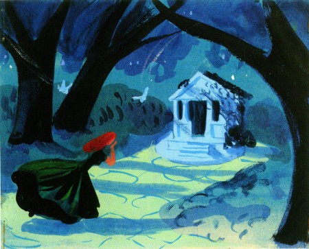
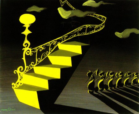
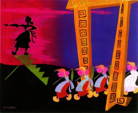
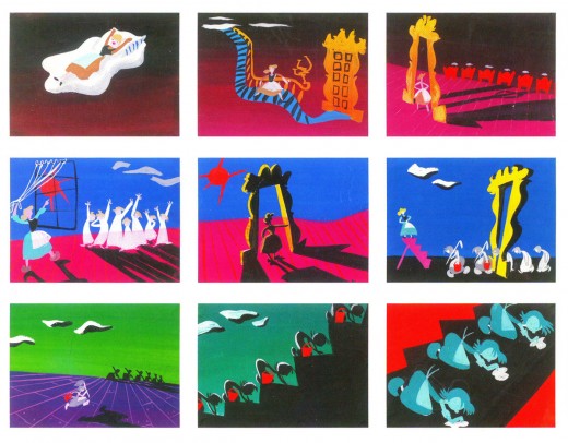
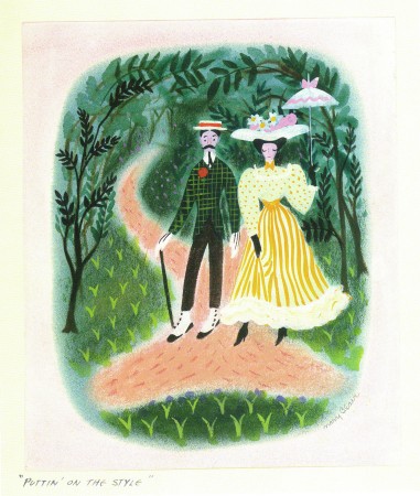
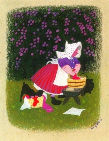
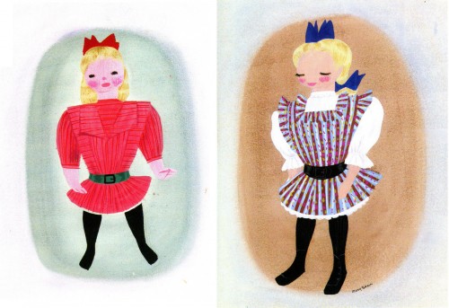
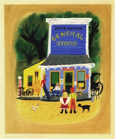
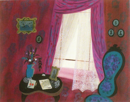
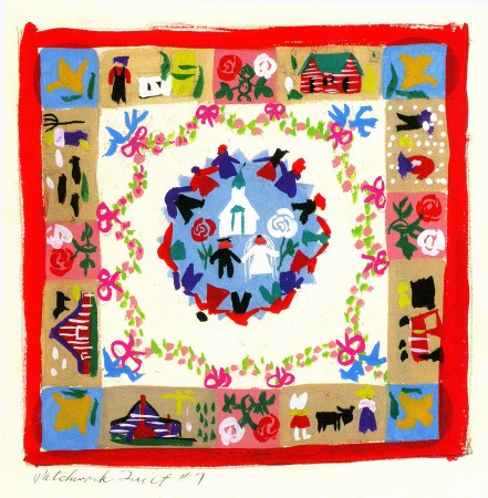
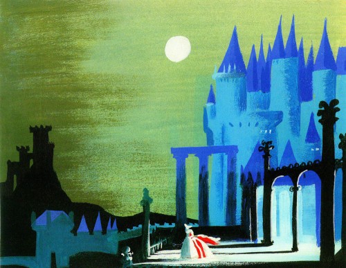
This continues my series of color stills from some of the beautiful work in the exquisite Japanese book on Mary Blair, The Colors of Mary Blair. If you have the resources to buy this book, you should.

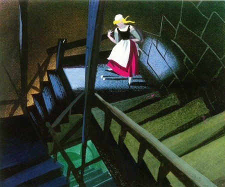
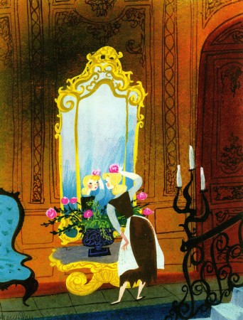
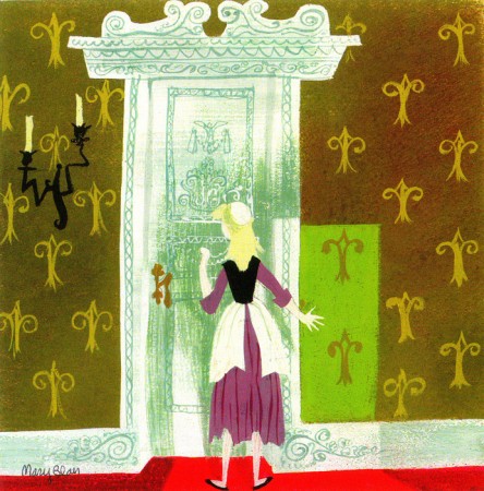
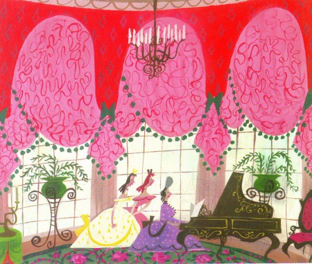
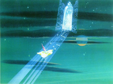
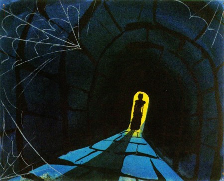
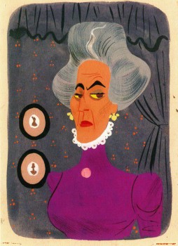
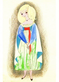
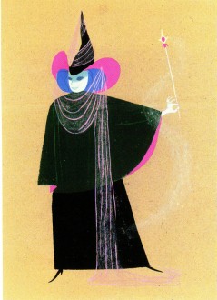
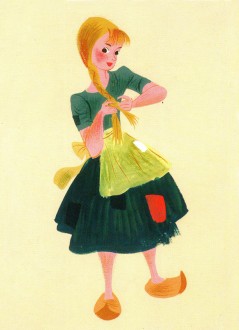
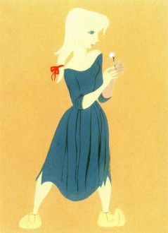
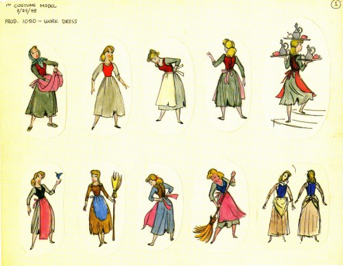
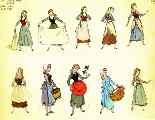
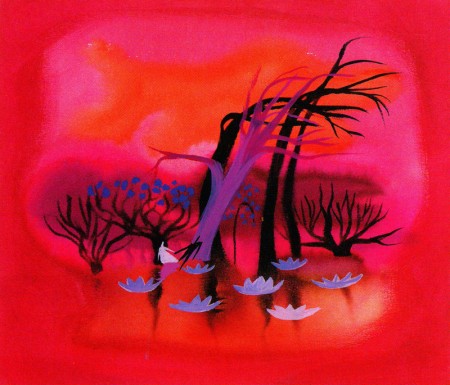
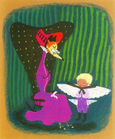
- The big three for Mary Blair, as a designer of Disney animation, were Cinderella, Alice in Wonderland and Peter Pan. We’ll spend all of this post on Cinderella. Many of these illustrations made it into John Canemaker‘s invaluable book, The Art and Flair of Mary Blair. Others have made it into a Cinderella storybook with text by Cynthia Ryant. Still others appear only in this Japanese edition.

1

2

3

4

5

6

7

8

9

10

11

12

13

14

15

16 17

18 19

20
A couple of Marc Davis models.

21

22

23

24

25

Photos 01 Aug 2010 08:07 am

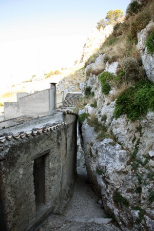
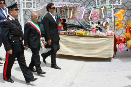
More of Caltabellotta

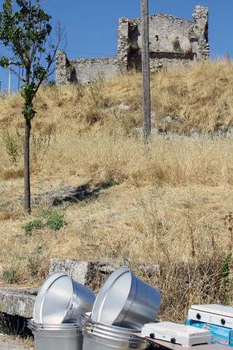
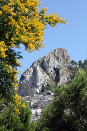
- From Sicilia comes more photos courtesy of my correspondent there, Steve Fisher. Just pictures of Summertime somewhere else.

1

2

3

4

5

6

7

8

Photos 31 Jul 2010 08:19 am

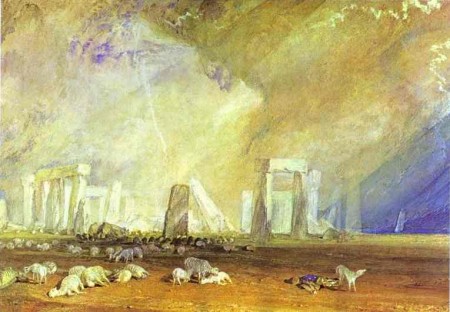
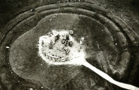
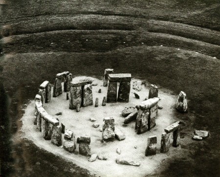
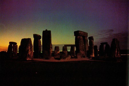
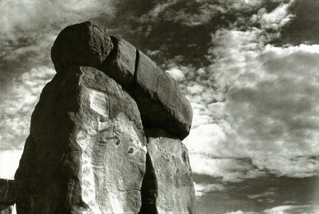
Stonehenge


“Stonehenge” by J. M. W. Turner

- John Fowles is certainly one of my favorite, if not THE favorite author. Aside from the several novels he authored, there were a number of books he wrote to act as companions to photographic essays. Last year, I posted some work from his book on Shipwreck. This book spoke about the many ships that had crashed near Lyme Regis, Fowles home, and included many photos of these wrecks.

Another book of his, The Enigma of Stonehenge, accompanies the glorious photos by Barry Brukoff.

Fowles claims not to have any archeological knowledge, but he does fairly well in reporting the history and the legends behind Stonehenge, and it’s an enlightening book, beautifully written and illustrated.
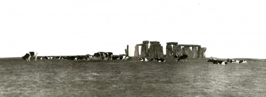
I’ve decided to post the first two paragraphs of Fowles’ introduction to the material with a number of the photos – and there must be a couple hundred of them.

Thanks for tolerating my side trip from animation, at least for today.

_______________

MY EARLIEST MEMORY of Stonehenge is, like so many childhood memories, as much fiction as fact. I see a little boy standing at a country roadside. Larks sing, lapwings wheel. There across the cropped greensward the great stones rise and I run towards them, ahead of my parents – not at all, I’m afraid, as a budding scholar or an embryo Romantic. But at least I recognize a good natural exploring place when I see one. Climbing, scrambling, squeezing through stone pillars: it is not quite so jolly as Cheddar Gorge or the Valley of the Rocks, but above all it is not suburban, the world I know best. Already I know suburbia is sameness, sameness, sameness; that freedom, or my freedom, lies in the unsame; and that nothing can be unsamer than this.

One part of my memory must be very wrong, because people have not been allowed to walk up to the monument as they like since well before my birth; and even in the 19305 I am pretty sure, though one was then free to wander in the central circle, that eight-year-old mountaineers were not encouraged. But our present protectiveness and seriousness over the place is something new. Even possessing it, as late as 1915, had a remarkable casualness. A gentleman bought it at auction for £6,600 in that year. He was asked why. It emerged that his wife had happened to mention at breakfast that ‘she would like to own it’. The good man promptly sallied out and bought her her stone necklace. (She did not wear it long, however; three years later the Chubbs generously gave ownership to the nation.)

Of one thing I am certain: my own first meeting was happy. It may have been because I could not quite take that enticing clutter of boulders, so like a Dartmoor hilltop, as man-made, whatever I had been told beforehand. Almost all public buildings have always carried strong connotations in my mind of duty, work, imprisonment of one form or another – of the cell in all its senses. Where the wiser judge architecture by the way it plays with light and space, I tend to judge it by what it shuts out of those things. Stonehenge’s marvellous openness to them was what first pleased me. It came to me on that occasion, and has remained since, as the most natural building, the most woven with light, sky and space, in the world.
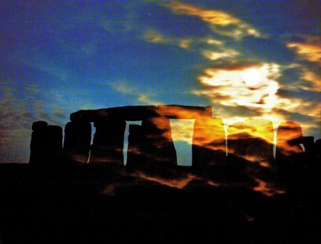
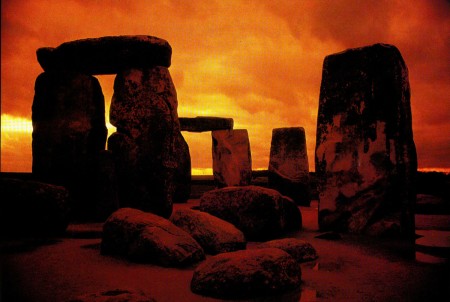
My latest remembrance, on a recent clear but arctic November day, is sadly different. Stone-henge stands in the fork of two busy roads, and the dominant sound in its present landscape is not the larksong of my memory, but the rather less poetic territorial whine of the longdistance truck. Visitors get to it now from a car-park, past a sunken ‘sales complex’, then down a subway under the nearest road: all this designed not to spoil the view, but the effect is unhappily reminiscent of an underground bunker. When they finally rise inside the wired-off enclosure, they are promptly faced with another barrier. The public is now forbidden the central area.

Conservation is a fine thing; yet one feels in some way cheated of a birthright, while the stone-grove itself seems deprived of an essential scale – indeed rather like a group of frightened aboriginals huddled together in self-defence against this sudden decision on our part to ostracize them so mercilessly. Everyone I had spoken to before coming had warned me that the new preserved-for-posterity Stonehenge – this was my first experience of it – makes a depressing visit. My wife, more fastidious than I am, took one look and turned back to the car.

I went up to an attendant in a little wind-shelter and explained I was preparing a text to accompany Barry Brukoff s photographs and would like to walk inside the barrier.

‘Are you an archaeologist?’

‘No. Just a writer.’

‘Department of the Environment, London. By letter.’ Then he added, ‘And I can tell you now you’ll be wasting your time.’

He looked bleakly over my shoulder at the mute clump of stones, as a prison warder might who has successfully foiled yet another clumsy escape attempt. I didn’t really blame him, for it was bitterly cold; and after all, who cares for mere curiosity and affection any more?

Bill Peckmann &Books &Illustration 30 Jul 2010 07:46 am

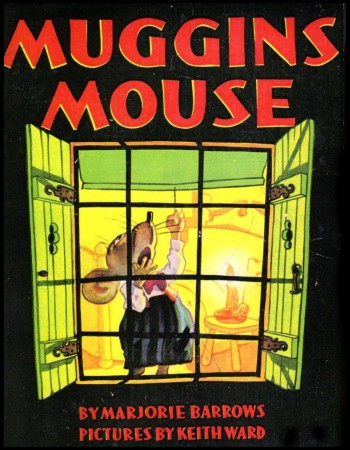
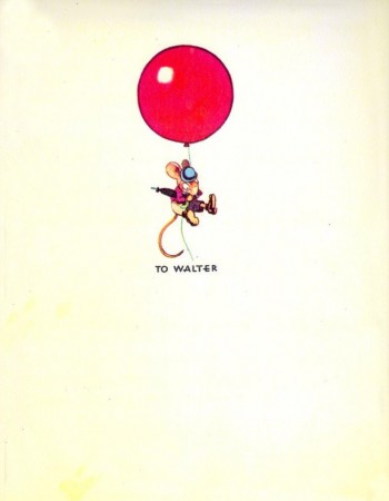
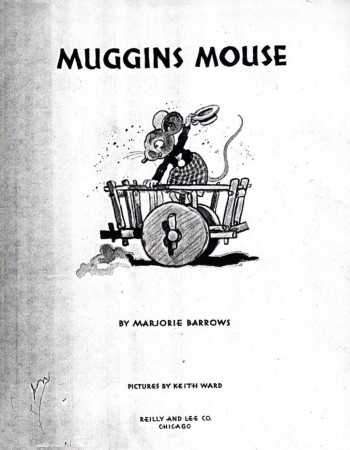
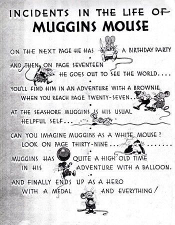
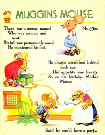
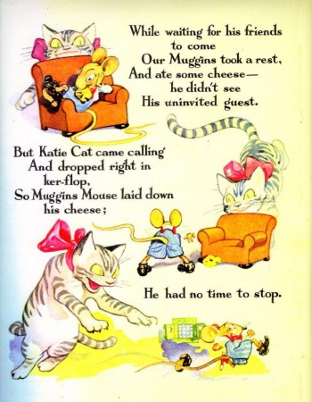
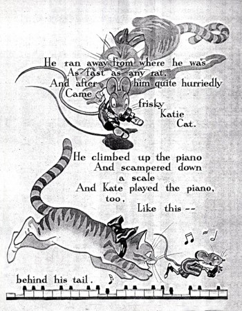
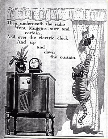
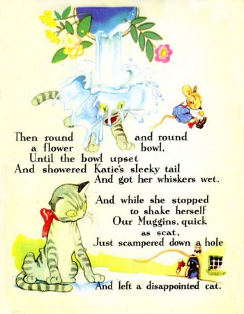
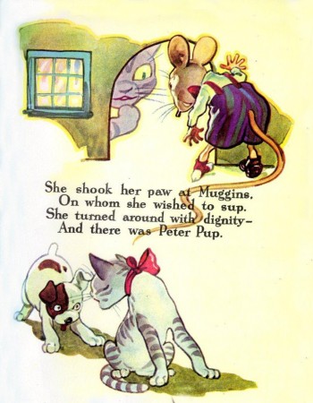
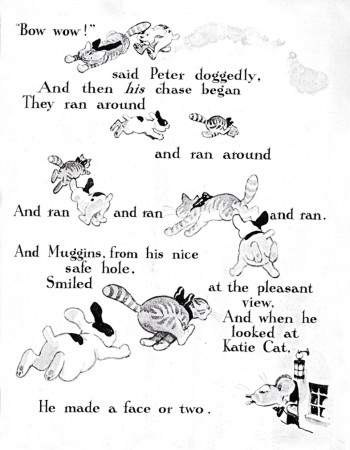
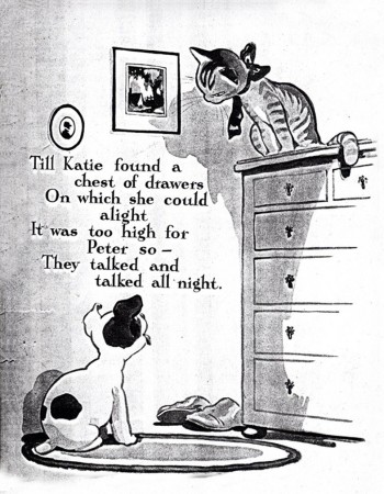
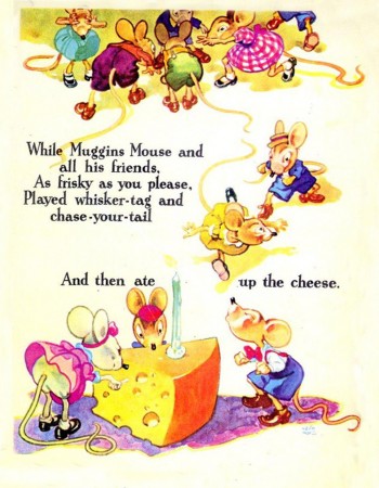
Keith Ward’s MUGGINS MOUSE – 1

- Yesterday, I received this note from Bill Peckmann about some old copies Rowland B. Wilson had sent him.:

    “I finally found Rowland’s copies of another Keith Ward book that he had sent me. It’s a 60 page book, half the copies are in color, half are B & W (not the best Xeroxes), why this is so, is unfortunately lost in the mists of time. The book is oversized, 9 1/2 by 12 1/2. . . . I haven’t looked at these pages in ages and the art is a lot better than I remember it.”

Such beautiful line work, fantastic cartooning. Very original.

So without further ado, I’m posting these great illustrations. This takes us up to the first chapter break. More pics to follow as soon as I get them.

1

2

3

4

5

6

7

8

9

10

11

12

13

Bill Peckmann &Illustration &Story & Storyboards 29 Jul 2010 05:40 am

Schoolhouse Rock

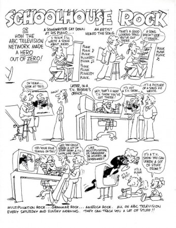
- Schoolhouse Rock became a reality when advertising exec, David McCall, realized his son, who was doing poorly in school, had memorized the lyrics to many a rock song. He produced a record with a couple of quickly written songs.

Tom Yohe illustrated some of the songs and presented it to McCall. They decided to put together an animated version, and the rest became history.


How it came about by Tom Yohe.

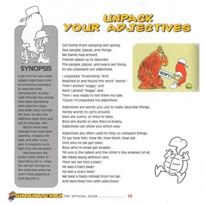
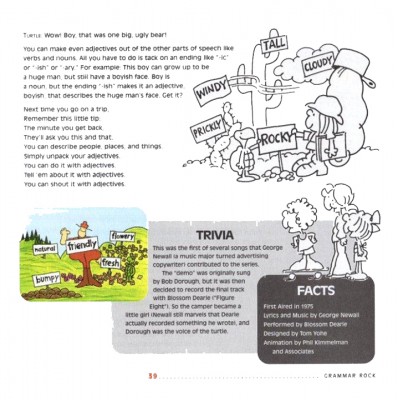
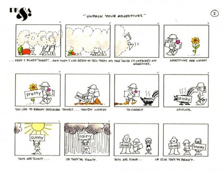
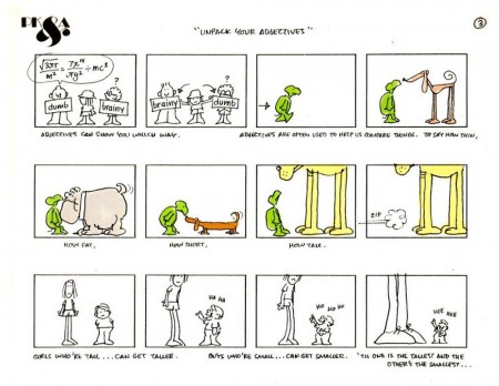
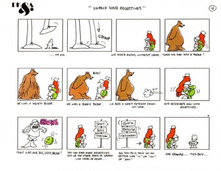
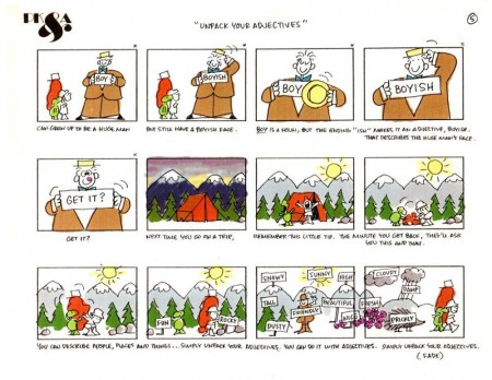
Here’s the storyboard and information, right out of the guide, on one particular episode of the show, Unpack Your Adjhectives.

1
(Click any image to enlarge.)

2

3

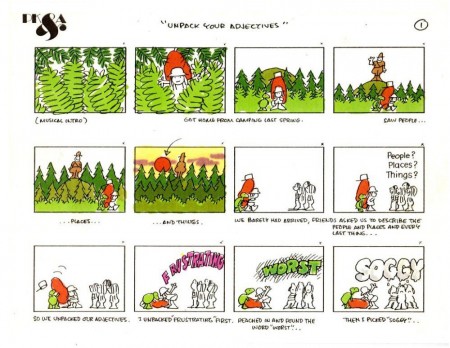
Here’s the storyboard from Phil Kimmelman & Associates.

1

2

3

4

5

Here’s the YouTube version:

All this material came to me from the collection of Bill Peckmann, and I couldn’t be more thankful.

Animation &Animation Artifacts &Disney 28 Jul 2010 05:56 am

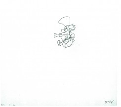
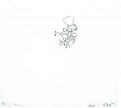
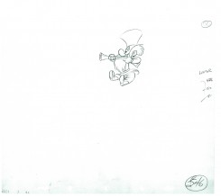
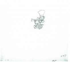
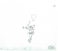
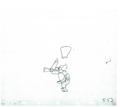
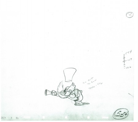
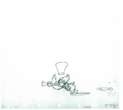
P&W-Kimball Scene – 7

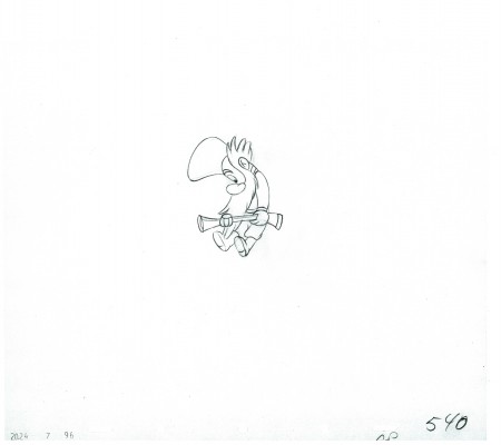
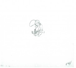
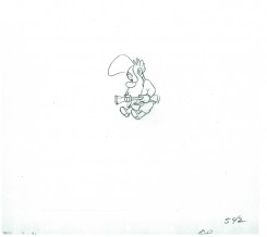
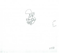
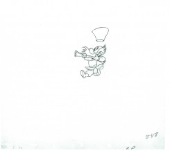
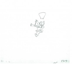
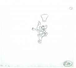
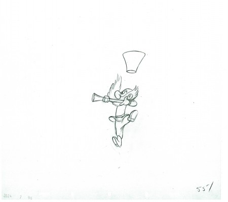
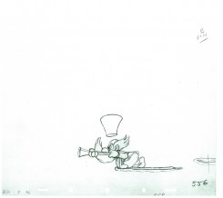
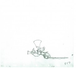
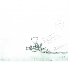
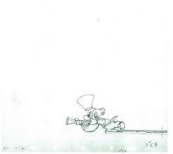
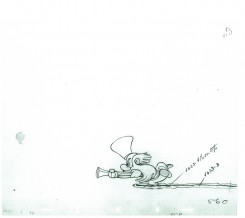
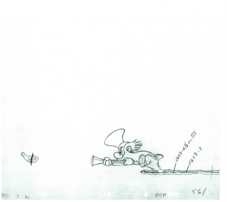
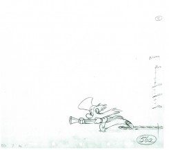
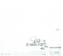
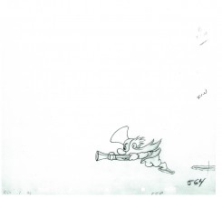
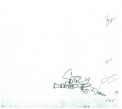
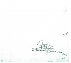
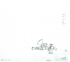
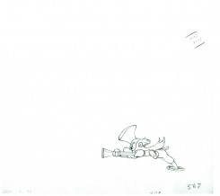
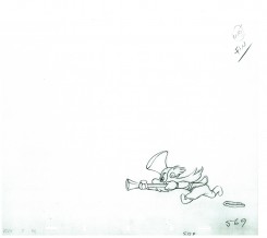
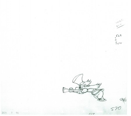
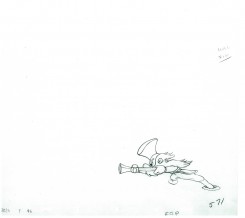
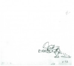
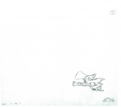
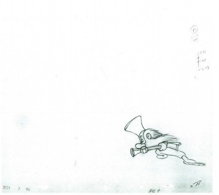
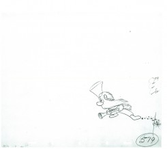
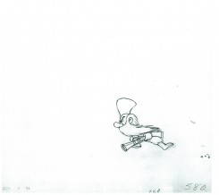
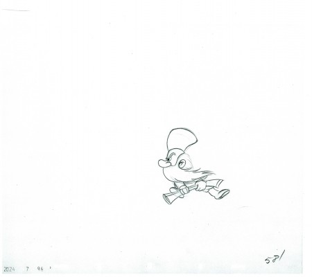
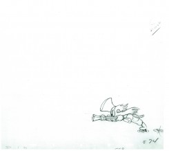
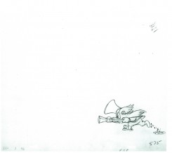
- Production #2024, MAKE MINE MUSIC, “Peter and the Wolf”. Sequence 7, Scene 96. Animator: Ward Kimball.

Continuing the post of the little guy on the separate level, here are the next 40 drawings. This scene should be done next week when I post the last of these drawings.

As usual, we start with the last drawing from last week’s post.
Enjoy.

540

54142

54344

54546

54748

54950

551

55253

554

55556

55758

55960

561

56263

56465

56667

56869

570

57172

57374

57576

578
(Note there is no number 577.)

57980

581

The following QT movie represents all the drawings of the bottom level
as well as the first 40 drawings of the Little Guy who comes in where he should.
I exposed all drawings on ones.

Click left side of the black bar to play.
Right side to watch single frame.

To see the past five parts of the scene go to:
Part 1, Part 2, Part 3, Part 4, Part 5, Part 6

Commentary &Independent Animation 27 Jul 2010 08:27 am

Prayers and Tulips

- Dustin Grella is a young film maker whose independent short, Prayers for Peace is now available on Vimeo, here. It’s a beautiful animated short that should be seen by any visitors to my blog. It’s currently on the Festival circuit, having been screened at Annecy, Stuttgart, Anima Mundi, and Mostra Lisboa, among others.

Mr. Grella takes his inspiration from William Kentridge rather than Walt Disney, and he makes a solidly strong debut with this film which was his Masters thesis at SVA. If you go to his site you can see other film samples he’s created.
The message of this film is in the title, Prayers for Peace. And we’re still praying. After seeing the docfeature, Restrepo, I could only come out of it depressed, wondering what the hell we’re doing there.

This guy has to be ecouraged and pushed to go on. I look forward to Mr. Grella’s next film. The man uses his brain and tries to animate from life not other cartoons. A rarity in today’s community.

___________________

- Speaking of drawing from life, Paul and Sandra Fierllinger‘s feature, MY DOG TULIP, is the first acquisition of the newly reopened New Yorker Films and will open at New York’s Film Forum on Wed, September 1st through Tues, September 14th.

MY DOG TULIP was written, directed and animated by award-winning Philadelphia filmmakers Paul and Sandra Fierlinger. As we all know, they did all of the artwork themselves. The film has been seeking a distributor for the past year, and they’ve found a good one that’ll give it special concern. Getting the New York reviews in early September will be helpful. Hopefully, this one will be eligible for Oscar consideration.

I’ll give the film more attention and review it when it opens.

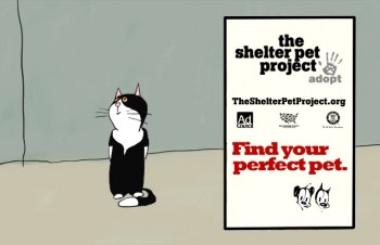
If you’d like to see some other recent work by the Fierlingers, go here to see some 6 short pieces, called “Shelter Stories”. These pieces were done in collaboration with MUTTS‘ cartoonist Patrick McDonnell. Here’s what Paul wrote about these pieces:

    “This is something new for us because it is the first time I had to draw someone else’s cartoons. In this case it is the art of Patrick McDonnell, of the “Mutts” cartoon strip and books. These are six Shelter Stories, PSA’s (Public Service Announcements) urging people to adopt their pets rather than buy them from breeders. Our specific assignment was to communicate that shelter animals are normal, healthy pets that have ended up in shelters due to unhappy circumstances of their owners, rather than coming from cruel treatment, and that they often make the best pets.

    All the stories are lifted off of Patrick’s strips, which heavily relied on written word, sometimes comprising of three panels of the same talking head. It was up to us to give the theme a background story. Patrick was a very generous collaborator, not insisting that we stay 100% on model, which would have been often difficult anyway because his cartoons often don’t even have legs. He also wanted me to employ close to real animal locomotion so we agreed that in some instances my drawings might drop out of model completely, only to return to model whenever the action would stop.
    The music and sfx is by Shay Lynch, the stories are written by Patrick and Sandra and me (mostly Patrick & Sandra, actually). Sandra also did the kitten’s voices and the other two voices are read by two people in our neighborhood. The Agency is the Advertising Council and the client the Humane Society of the United States (HSUS). The spots haven’t been aired yet; actually I haven’t even quite delivered them because I’m waiting for the address where to send them.

    By the way, these spots hold a record for me; this is the very first time in my long career that a client has accepted delivery of my work without requesting a single change!”ul>

Books &Disney &Layout & Design &Mary Blair 26 Jul 2010 06:31 am

Mary Blair – 3.

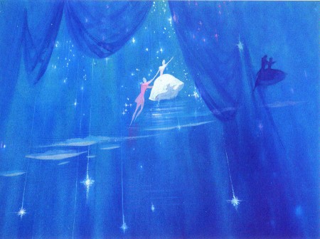
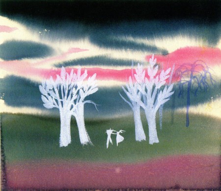
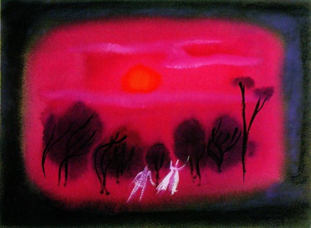
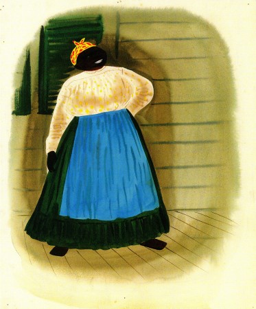
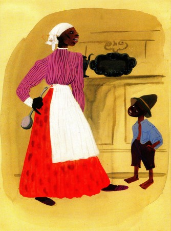
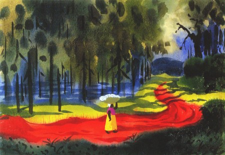
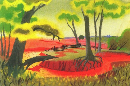
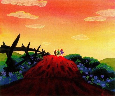
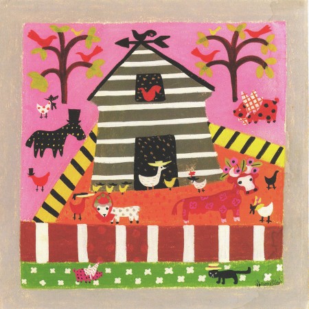
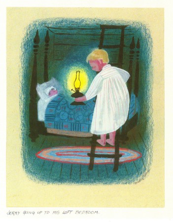
- Continuing gwith some selected stills from the Japanese book, The Colors of Mary Blair, I’ve chosen concept art for three films; one animated: Two Silhouettes, two live action: Song of the South and So Dear To My Heart.


Concept art for MAKE MINE MUSIC’s Two Silhouettes

1

2

3

4

5

6

7

Concept art for SONG OF THE SOUTH

1

2

3

4

5

6

7

8

Concept art for SO DEAR TO MY HEART.

1

2

3

4

5

6

7

8

Photos 25 Jul 2010 07:07 am

Caltabellotta

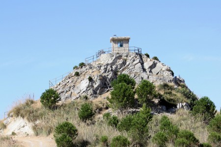
- Many a Sunday, I’ve featured some of the great photos of my friend, Steven Fisher. During July & August, Steve spends a lot of time in Sicily, and this Summer’s no exception. However, he just sent a couple of pictures from his arrival and stay in Caltabellotta, and I’d like to share.


day 1 – sunrise above the clouds somewhere over the Atlantic


day 2 – landing in Palermo next to the mountain


day 3 – feast lights


day 4 – pretty flower


thorns


day 5 – steep streets


day 6 – satellite dish city


day 7 – pots ‘n lands


day 8 – yellow castello

« Previous PageNext Page »

eXTReMe Tracker
click for free hit counter

hit counter