Animation &Animation Artifacts &Hubley &Independent Animation 02 Sep 2010 07:32 am

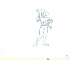
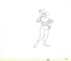
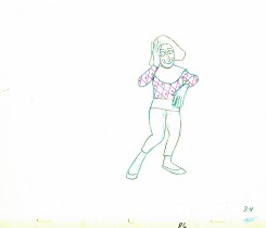
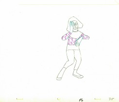
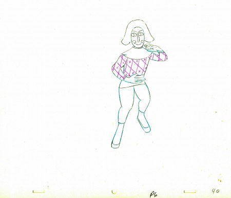
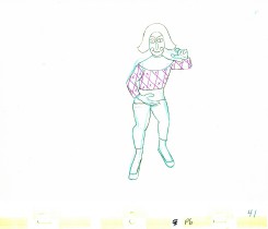
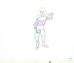
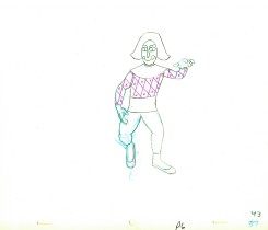
Babbitt’s Carousel Mime – 3

- John Hubley‘s feature film, Everybody Rides the Carousel, was adapted from Erik Erikson’s Eight Stages of Man, a Psychosocial Theory of Human Development.

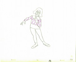
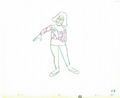
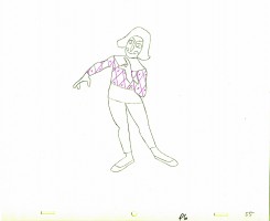
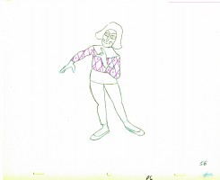
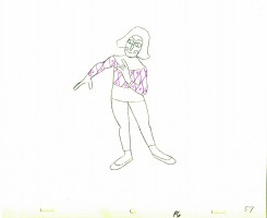
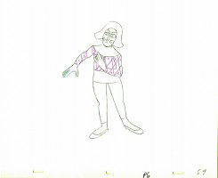
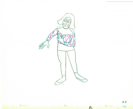
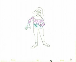
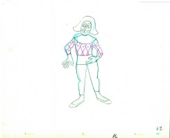
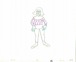
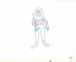
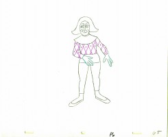
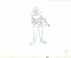
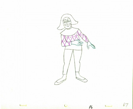
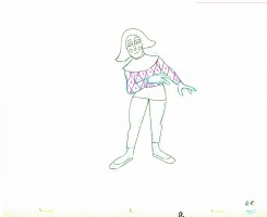
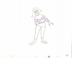
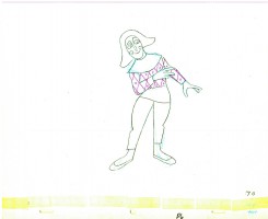
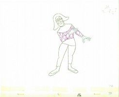
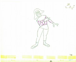
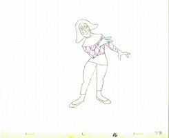
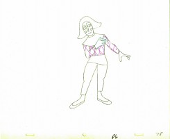
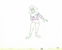
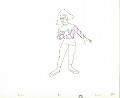
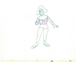
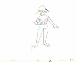
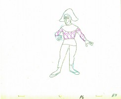
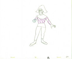
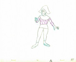
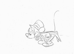
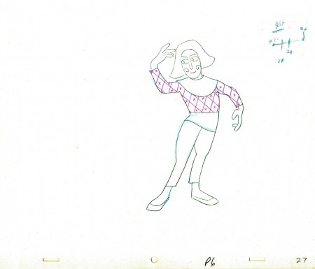
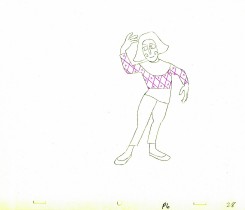
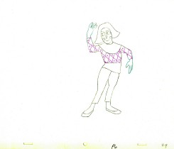
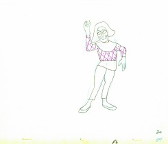
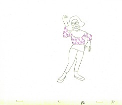
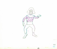
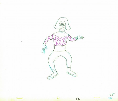
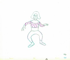
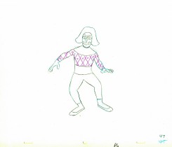
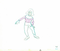
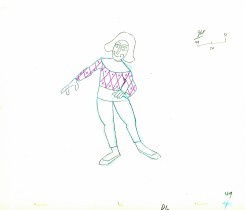
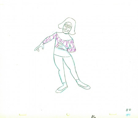
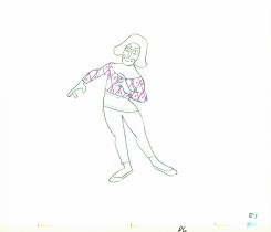
The feature was built around a carousel. 8 horses represented different stages of life. The narrator, a mime, was animated by Art Babbitt, with Dave Palmer as his personal assistant. He left after animating a couple of early scenes. Barrie Nelson completed the character in the show.

For the full story behind the rift between Hubley and Babbitt go to this past post.

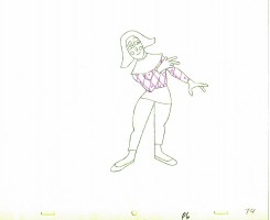
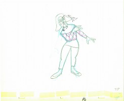
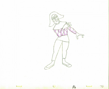
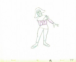
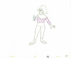
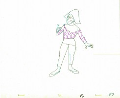
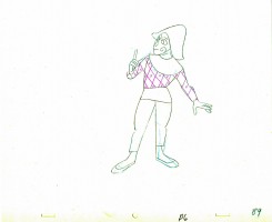
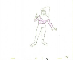
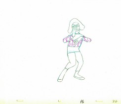
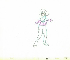
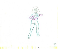
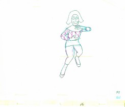
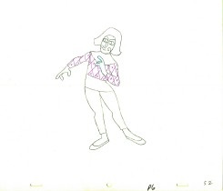
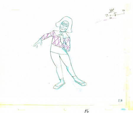
The scene is about 200 drawings long. Here’s the third part. It’s a very slow moving character with short quick spurts of movement.
We begin with the last drawing from last week.

53
(Click any image to enlarge.)

5455

5657

5859

60

6162

6364

6566

67

6869

7071

7273

7475

76

7778

7980

8182

8384

8586

8788

8990

91

______________________

The following QT movie represents the drawings above
exposed as Babbitt wanted them, on twos.

Click left side of the black bar to play.
Right side to watch single frame.

Animation &Bill Peckmann &Books &Disney &Illustration &Layout & Design &Models 01 Sep 2010 07:38 am

Horvath – 1

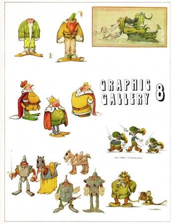
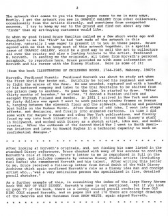
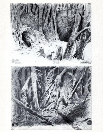
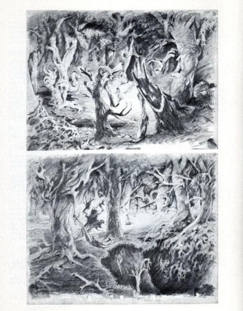
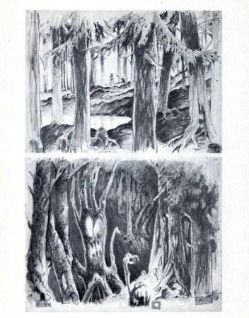
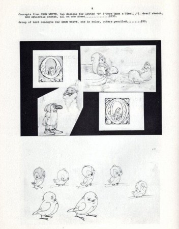
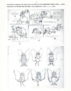
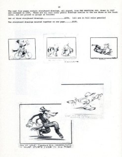
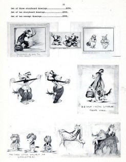
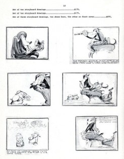
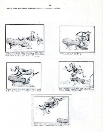
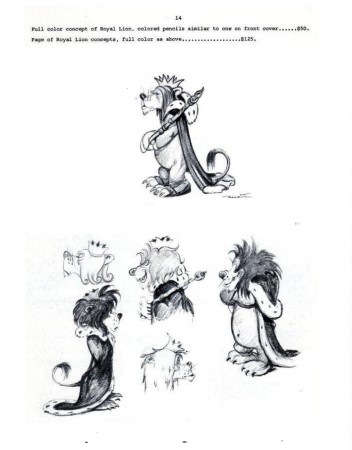
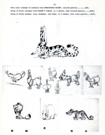
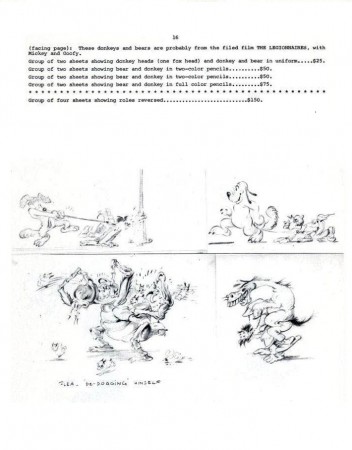
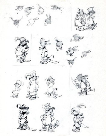
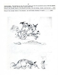
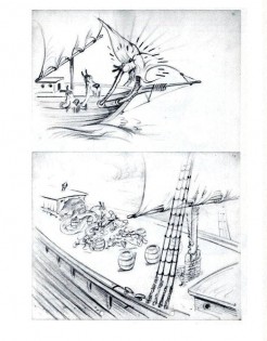
Ferdinand Horvath was a Hungarian book illustrator, who was born in 1891 and died of a stroke in 1973. From 1934-1937, he worked at the Disney Studios in multifarious positions doing everything from painting backgrounds and doing layouts to constructing three dimensional models to designing characters and gags for over fifty Silly Symphonies and Mickey Mouse shorts.

Prior to working at Disney, he labored at Paul Terry’s studio on the “Aesop’s Fables” series. Once he left Disney, he designed models and layouts for “Scrappy,” “Krazy Kat” on shorts for Columbia/Screen Gems. In 1940, he sculpted puppets for George Pal’s Puppetoons.

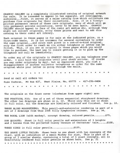
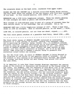
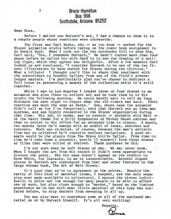
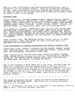
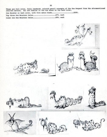
He was a versatile artist whose work was an inspiration for many Disney artists. The following booklet was published by Graphis Gallery and put together by Bruce Hamilton. The opening material explains itself.

Bill Peckmann sent me scans of these pages, and I thank him for keeping Horvath alive.


Front cover of the catalogue.


The back cover.

1 2
This gives information on what appears on the two covers.

3 4

5

6

7

8

9

10 11

12 13

14

15

16

17

18

19 20

21


.
John Canemaker writes in depth about Horvath in his book, Before the Animation Begins: The Art and Lives of Disney’s Inspirational Sketch Artists.

Commentary &Independent Animation 31 Aug 2010 07:43 am

My Dog Tulip – 3 Reviews

- Rather than have a single review of Paul and Sandra Fierlinger‘s feature film MY DOG TULIP – which opens at the Film Forum on September 1st – I decided to get the two animators in my studio, Matt Clinton and Katrina Gregorius, to see the film and give their reviews as well. Hoping this would give a non-biased view of the film and a chance for you to see it through the eyes of pencil animators who happen to be working digitally. I hope this exercise is illuminating. I think it is.

Matt Clinton

My Dog Tulip is a wonderful new animated film from Paul and Sandra Fierlinger. I’ve enjoyed their particular style of animation ever since I saw Still Life With Animated Dogs on TV years ago. The drawings were so sincerely animated that it surprised me, and the film stayed in my memory. The locomotion and behavior of dogs is something that seems to flow effortlessly from Paul Fierlinger’s pen. I love seeing that sort of thing in animation – where it feels natural, and nothing is worked over too much.

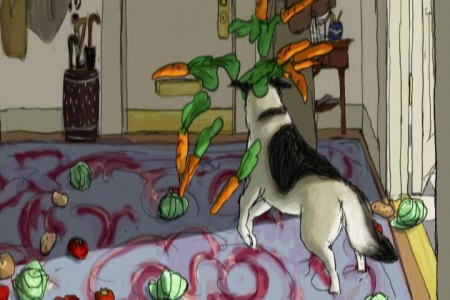
It’s all there in My Dog Tulip. I was very impressed with the animation, which is loose and full of life. It was animated paperlessly using TVPaint. (This film is quite a showcase for that software, and I hope it becomes more widely known.) There are a few different visual styles that pop up in the film. Much of it is drawn in a realistic style. It takes a lot of skill to be able to animate so much footage of a realistic dog who is moving around spatially. Fierlinger excels at this, keeping the animation spontaneous and giving a lot of character to the dog. Tulip doesn’t just show up and bark, like some other ruddy dog actors. She’s a pro. Fierlinger also animates some parts in a simpler style, made to look like doodles in a journal. These scenes were often very funny, and fun to watch. I laughed at Tulip prancing around in a skirt urinating on everything in sight. She is like a young child.
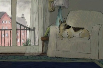
Fierlinger allows time in the film for things to happen, which is rare in animated features. I really get annoyed at the spastic actions and pacing in some animated films; I don’t like leaving the theater with a headache and feeling exhausted. My Dog Tulip is not like that. For example, in one sequence, Ackerley and Tulip are being driven in a sidecar motorcycle to the country home of Captain Pugh. Instead of just showing them departing and arriving, we get to see their silent journey for quite a long time. This lets the audience get a feel for the world that Tulip lives in. Moments like that combine to give you a thorough understanding of the place.

The background paintings are stunning. They were painted by Sandra Fierlinger directly in TVPaint. That software comes with many natural media brushes that you can customize. She used her expertise in painting and color styling to create, in this software, backgrounds that are very classy and sophisticated. I noticed that she created well-placed shadows throughout the film. In his study, Ackerley walks in and out of shadows cast on his rows of books. In another scene the shadows from unseen clouds move across a field where Ackerley is standing. These details add some depth and atmosphere. It’s nice to see such a focus on this. The paintings themselves are not overly detailed but they give you all you need. The film looked great up on the big screen.

It’s clear that these two artists compliment each other very well. It’s a huge achievement that just two people can make a feature film in their home studio, one animating, the other painting. In the press notes, it says that the producers had contacted the Fierlingers and asked them to choose a classic book to adapt as a feature film. I like the thought of that; picking a book and going for it. It would be fun to try. I believe that the Fierlingers are now at work on a film about Joshua Slocum’s book Sailing Around the World Alone. I’m looking forward to seeing how he handles animating all that water. Rough seas are probably haunting his dreams by now.

Christopher Plummer’s narration of My Dog Tulip is notable. There is a large amount of narration and he gives it a bold flourish! J.R. Ackerley’s sense of humor comes bursting out of Plummer’s performance. The rest of the cast is top notch as well.

I think that most dog owners will see a lot that they can relate to in My Dog Tulip. I’ve had a lot of American Eskimo experience. Great dogs! Our first one loved to be wild in public. She loved to make a scene. At home she behaved pretty well and we didn’t mind her nipping at all. You really do learn to love all the unique things about your own dog – their personality and certain tendencies. My Dog Tulip is all about this. Tulip comes into J.R. Ackerley’s life and changes it in unexpected ways. There’s a big impact that Tulip makes. Near the start of the film, Ackerley is racing, racing, racing home to be with his dog, who is waiting. She knows what time it is. The door swings open and the day can finally begin in earnest! The film is an account of their friendship. That’s something anyone can relate too.
Katrina Gregorius

Humorous and full of tender moments Paul and Sandra Fierlinger’s new feature, My Dog Tulip, is an honest account of the relationship between J.R. Ackerley and his dog, Tulip. The film pulls you in as you share the experiences Ackerely goes through in trying to understand his new dog and eventual companion.
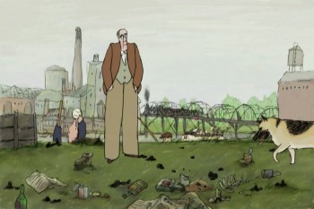
My Dog Tulip begins by showing us the loving relationship between Ackerely and Tulip. Ackerely is rushing to get home and Tulip is excitedly waiting by the door for him. The story then takes us on a journey through the “couple’s” life. Mr. Fierlinger has captured the essence of owning a dog and he isn’t afraid to show it like it is. The feature is filled with scenes of Tulip defecating and urinating all over the place. While some scenes may have been too much for me, I can’t say that they were entirely unnecessary. I’m sure anyone who’s ever owned a dog, cat or any pet can relate.

The film takes on a few different styles throughout, but I especially enjoyed the “yellow pad scribbles”-style. These sequences were meant to be from Ackerley’s perspective and in them Tulip was depicted walking on two legs and wearing a dress, almost human. For me this emphasized the closeness that these two had. Tulip wasn’t only Ackerley’s dog but she was also his friend and companion.

Overall My Dog Tulip is a very touching and heart-warming story of finding love and friendship from the most unexpected places.
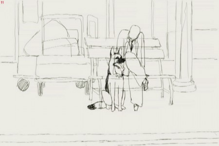

From the pencil test of the film

Michael Sporn

Paul Fierlinger has been making animated films independently for more than 50 years. Recently, his work has turned to the long form. He’s done a number of half-hour shows for ITV which have been aired on PBS local stations. Drawn from Memory, Still Life With Animated Dogs and A Room Nearby were strong programs that brought some decided interest to Fierlinger’s work.

My Dog Tulip, a theatrical feature, came via a couple of producers willing to invest a million dollars in a well-known book adaptation. The book by J.R. Ackerley was more famous in England, but Paul and Sandra Fierlinger sought out the title. The film started with fists and stops, then finally got going after the animators produced a short piece of beautiful animation. The producers were sold, and the film went forward.
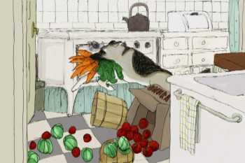
With a strong cast of voice actors, including Christopher Plummer, Isabella Rosselini and, the late, Lynn Redgrave the film sparkles. The backgrounds are a treat, particularly at the start of the film looking at some of the beautiful shots of London.

The film moves into its story about the tight relationship between a man and his German Shepard. At first, there’s a lot of anxiety between the two, but soon they warm up to each other and become almost too close. Plummer’s narration is just excellently delivered and totally conveys the conflict in the relationship.

The film seems to take a strange turn in that it becomes almost too concerned with the scatalogical elements of dog-ownership. We’re treated to the dog’s constant urination, pooping and many attempts at mating. This gets a bit off-putting for some, but the film uses it to detail the tight marriage of man with dog.

Ultimately, the film is a peculiar one. It’s beautiful in its graphics; the animation is often stellar – as expected from Paul, and Sandra shows that she can paint glorious backgrounds with the best. The artwork just glistens. However, the story is unlike anything that’s been seen on screen before; it’s adult. This is surely no 101 Dalmatians – purposefully.
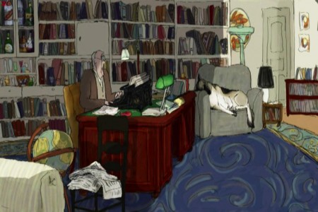
Anytime an individual takes on the task of producing, directing, animating, and coloring an animated feature, it’s a big deal. We’re getting to see this more and more now that digital technology has made it a tad easier for those folk. Something that has to be said is that they are determined to get a film finished. That kind of energy has always produced inspiration in me. I’ve gone to see any such film, just because I feel obligated. Obligated to the art of animation.

There is definitely an obligation, in my mind, for everyone reading this blog to get out and see this film. Support your own.

There was an excellent article in the NYTimes about the methods of TVPaint used for producing the artwork of this film.

The NYTimes critic Stephen Holden reviews the film and makes it a “critics pick” as one of the best movies in the market.
Disney &Illustration &Layout & Design &Mary Blair &Models 30 Aug 2010 07:44 am

Mary Blair – 8

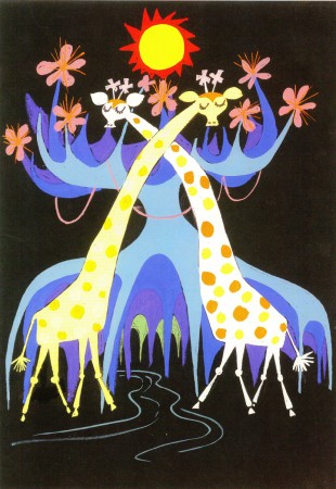
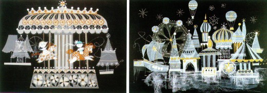
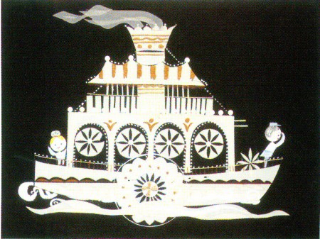
- For It’s A Small World for the Pepsi pavilion at the 1964 NY World’s Fair, Mary Blair produced a lot of preliminary designs. All of them glisten like little gems. Last week I posted art for the larger part of the pavilion; this week we go into the smaller interior parts. All of it is beautiful

These scans were all taken from the featured book, The Colors of Mary Blair.
Of course, there’s also John Canemaker‘s excellent book, The Art and Flair of Mary Blair.

1
(Click any image to enlarge.)

2

3

4

5

6

7

8

9

10

11

12

13

14

15

16

Photos 29 Aug 2010 08:22 am

Yankee Pix

- Last Sunday Heidi and I went to the new Yankee Stadium for the first time, and we sat in the rain for most of the day. We knew it was scheduled to rain, and the game was ultimately held up. Regardless, we had a blast.

Here are some pictures.

1
When you get out of the train, this is the first thing you see.
You then have to follow the police barricades until you get
across the street.

2
The stadium looked glorious at the front gate.
They used to have a giant bat statue. I think they left it behind.
At least I didn’t see it.

3
It looks good close up, too. At least for a Yankee fan.

4
Once you go through at pointless security check, you get inside
to a rotunda of stores and shops selling a lot of Yankee goods.

5
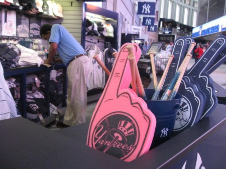
Useless souvenirs for the fanatic.

6
There are plenty of shops and places to eat
as you wander about. A real mini-mall.

7
Once we found our seats, the view was fantastic.

8
C.C. Sabathia just mowed down the traffic in the first inning.

9
The big board kept you informed of everything. In between innings
there were plenty of shots of people in the audience. Once they had
the couple just below us. You could see my legs on tv.
Later they had a shot of the couple above us. I guess I wasn’t wearing
any Yankee logos. No cap, no Tee shirt.

10
Jeter led off for the Yanks and promptly hit
to the shortstop for the first out.

11
The rain came first as a drizzle, then a downpour.
The big sign let us know we were in a rain delay.

12
They pulled a tarpaulin over the field.

13
We travelled underground for a while window shopping.
We went the Yankee museum but the line was too long.

14
Heidi was having a blast. So was I as a matter of fact.
The kept us so entertained – even for the rain delay.

15
We decided to head to the very top. There was an overhang
that would keep us dry, and we could sit down.

16
I sat drenched but happy. We really were having a great day.
The stadium was a hit for us, and that’s all that counted.

17
Eventually the rain stopped and we watched them pull the tarp up.
You could see the drenching water being dumped onto the field.
We went back to our seats.

18
When we returned, I noticed the YES Network booth. You can
see the announce Michael Kay trying to get us back into the game.

19
Cano hit a Grand Slam putting the score out of reach for the Seattle Mariners.
We left after the 7th inning to get ajump on traffic out of the stadium.
The Yankees won 10-1.

Animation &Puppet Animation 28 Aug 2010 07:45 am

Kihachiro Kawamoto

- This last week saw the death of two Japanese animation masters. The very young (46) 2D director, Satoshi Kon, died of pancreatic cancer on Tuesday.
Then we learned that the brilliant puppet animator, Kihachiro Kawamoto had died on Monday. (Cartoon Brew has an excellent obituary for him.)

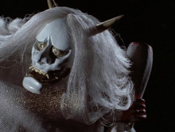
He was an acolyte of Jiri Trnka‘s, having travelled to Czechoslovakia to work with the great puppet filmmaker. Kawamoto’s own short films were gem-like little jewels which often told harrowing Japanese folk tales. Films such as The Demon (1972), Dojoji Temple (1976) and House of Flame (1979) are pure film yet they retain the spirituality of old Japanese mysticism.

Aside from the numerous beautiful short films he animated and directed, he did two features: The Book of the Dead and Rennyo and His Mother. He also supervised the cut out feature, Winter Days, a film inspired by the renka couplets of celebrated haiku poet Matsuo Basho. 35 of the world’s top animators created two-minute segments for the film. The most popular of these was Yuri Norstein

Again I saw him in Ottawa in 2006 at an animation festival. His feature, The Book of the Dead, was being screened. He spoke to an audience at a Q&A for the filmmakers. It wasn’t quite the same feel meeting him this time, but it was more relaxed and a treat, all the same.

He died of complications from pneumonia on Monday, August 23 at the age of 85. He was a brilliant puppet filmmaker – one of the very best.

Art Art &Bill Peckmann &Books &Illustration 27 Aug 2010 07:30 am

David Levine’s Art – 2

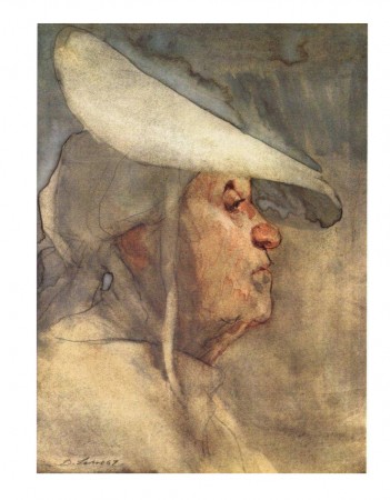
Recently, I posted a number of B&W caricatures by David Levine. They came from the book I featured, The Arts of David Levine. As promised, these are the color plates from the book which feature Levine’s paintings.

Thanks to Bill Peckmann for sending the images.

As I mentioned in the first post, I think these paintings raise Levine’s work to first class art.


1

2

3

4

5

6

7

8

9

10

11

12
This particular painting reminds me
of the work of Joseph Hirsch.

13

Animation &Daily post &Disney 26 Aug 2010 08:04 am

Kon/Mickey/Indep’ts/Day&Night

- I have to take note of the passing of Satoshi Kon. There’s a short piece via Charles Solomon, about him on Cartoon Brew, which I suggest you read. The links there brought me to this piece with more information. He died abruptly of pancreatic cancer. His diagnosis on May 18th was that he would have at most 6 months to live. He died August 24th at the age of 46.
There’s an excelelent obit in today’s NYTimes by A.O. Scott.


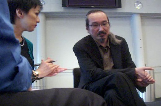
L to R: Me, the interpreter and Mr. Kon

I had the pleasure of interviewing him back in June, 2009. Unfortunately the recording of the interpreter, who spoke so softly, was not good, and I couldn’t get much of a transcript. He was polite, positive and a pleasure to meet, even though a great deal didn’t come of the conversation. His art around the room was stunning. I am decidedly a fan of his work. He died Tuesday, a terribly sad end.

You can see some of this art in the blog post I wrote that day. Go here.
Richard O’Connor also wrote a short, nice pieco on his blog, Asterisk Animation
You should also check out his films Millenium Actress, Tokyo Godfathers, and Paprika.

________________

- Back in February 2007, Hans Perk offered the storyboard and some notes on the shelved Mickey Mouse cartoon, The Plight of the Bumblebee. This was on his site A FIlm LA. It was animated by Fred Moore, Hal King and Cliff Nordberg and was shelved partially because of length. Jack Kinney, the director, calls it the best Mickey film (though it’s definitely not despite the generally fluid yet unispired animation.)

This is important because Thad Komorowski offers the entire pencil test of the film on his site.

Hans suggests that Mr. Lasseter call down to order the film completed since it’s already so close. Nothing happening since that was written in 2007. I’d guess that Lasseter won’t take notice.

Anyway, this is great payoff. Thanks Hans and Thad.

________________

.
- John Canemaker‘s column about Charles Burchfield receives an excellent comment from Richard O’Connor on the Asterisk Animation blog. The connection is made to the new show of Burchfield’s work at the Whitney Museum of Art. Richard’s article is worth a read, and John’s article is, obviously, also worth reading.
________________
.

- I’d like to remind those in New York that there are three features on the horizon (or in one case, already here), about to play in theaters.

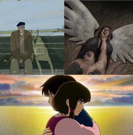
Paul and Sandra Fierlinger‘s film, My Dog Tulip, starts at the Film Forum next week, September 1st. For this film, we’ll feature three separate reviews by the animation staff (that includes me, of course, as well as Matt Clinton and Katrina Gregorius) here at the studio. We’ll probably post it on Tuesday, a day before the opening.

Bill Plympton has his feature, Idiots and Angels, opening at the IFC Center on Oct 6th. I intend to offer an interview with Bill before the film opens, so you can look forward to that. The film has played at many Festivals, so there’s been ample chance for enthusiastic animators to get a preview. If you haven’t seen it the chance will now be there.

Currently playing at the Angelicka is the feature Tales from Earthsea. This was directed by Goro Miyazaki, the son of Hayao Miyazaki. Goro was chosen as a potential way of handing down the father’s directoral mantle when Hayao was planning to retire. When Hayao saw the final of Tales from Earthsea, the father decided not to retire. Instead he made one of his best features with last year’s US release, Ponyo. He’s currently doing another two features. He and his son didn’t speak during the making of the film.

The best review I read of this film is, naturally, on The Ghibli Blog by Daniel Thomas MacInnes.
There’s also a good interview with the book’s author Ursula Le Guin.

________________

- A small footnote. Disney has decided to withdraw its animated product from the Annie Awards. That’s right Toy Story 3 and Day & Night will not be competing for Annie Awards this year.

The people at Disney/Pixar feel that anyone can join ASIFA and vote for the awards. They don’t say that they haven’t won against the Dreamworks product for the last few years. Rotten Tomatoes, indeed.

Here’s the Variety story, if you can’t get it without a subscription.

________________

.

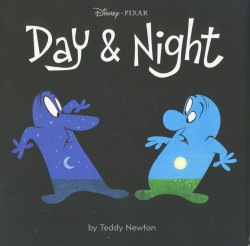
Speaking of Day & Night, I received a copy of the book which sells for only $10 at Amazon.

The book is better than the short film – it takes less time to read. The graphics are better; it’s not a melange of hand drawn work and cgi inner-body motion. The cg is replaced with watercolors. The artwork by author/illustrator Teddy Newton is more constant than the film and decidedly better.

The story – it’s the same sophmoric tale. However, you don’t have to listen to the ending’s narrator telling us what we already know. I doubt I’d ever have bought this book, but thanks the excellent publisher, Chronicle Books, I now own it. This publisher always does a good job with their product.

Animation &Animation Artifacts &Hubley 25 Aug 2010 05:52 am

Babbitt’s Carousel Mime – 2

- John Hubley‘s feature film, Everybody Rides the Carousel, was adapted from Erik Erikson’s book, Eight Stages of Man, a Psychosocial Theory of Human Development.

The feature was built around a carousel. 8 horses represented different stages of life. The narrator, a mime, was animated by Art Babbitt, with Dave Palmer as his personal assistant. He left after animating a couple of early scenes. Barrie Nelson completed the character in the show.

For the full story behind the rift between Hubley and Babbitt go to this past post.

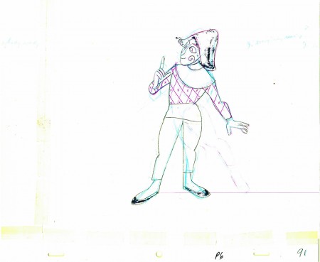
The scene is about 200 drawings long. Here’s the second part. It’s a very slow moving character with short quick spurts of movement.
We begin with the last drawing from last week.

27

2829

3031

3233

3435

3637

3839

40

4142

4344

45

4647

4849

50

5152

53
______________________

The following QT movie represents the drawings above
exposed as Babbitt wanted them, on twos.

Click left side of the black bar to play.
Right side to watch single frame.

/font>

Animation &Frame Grabs &Layout & Design 24 Aug 2010 08:04 am

Conrad

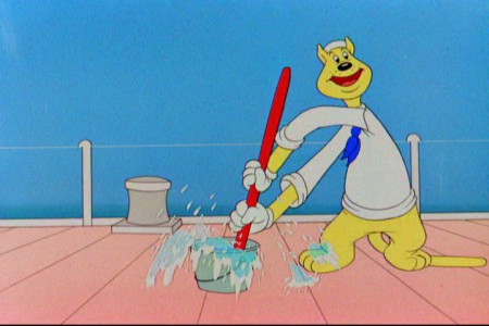
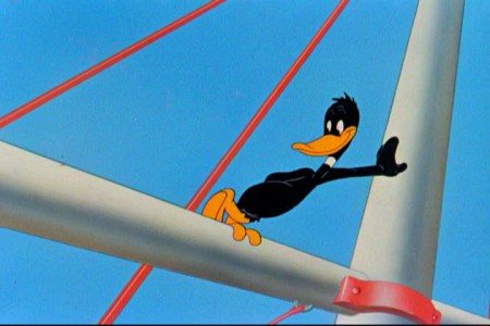
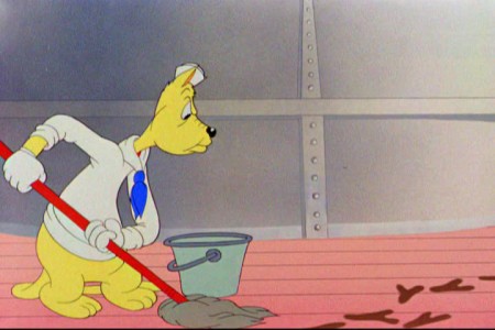
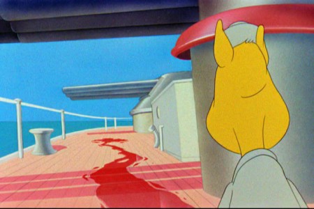
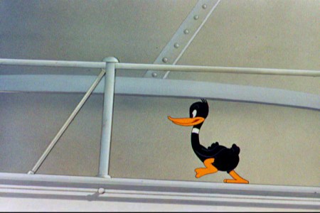
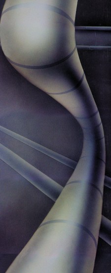
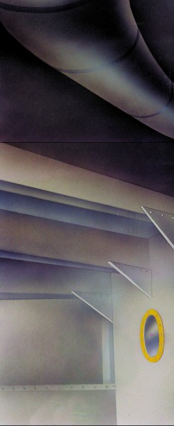
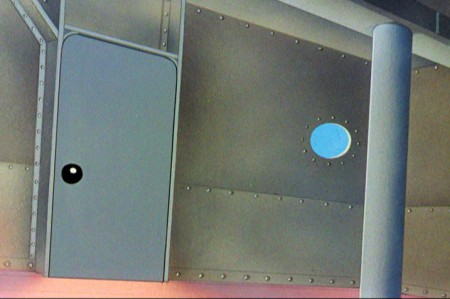
- Regulars to my blog know that I’m a big fan of the work of John McGrew. He was a designer/Layout Artist working in Chuck Jones’ crew at Warner Bros. in the late Thirties/early Forties. His work was daring beyond compare, and, I think, with support from Jones, he changed the look of modern animation backgrounds.

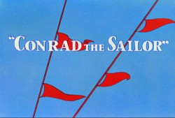
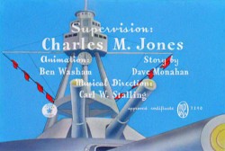
He designed the seminal film The Dover Boys as well as amazing pieces like Aristo-Cat, Inki and the Lion and Conrad the Sailor.

In an interview conducted by Greg Ford and RIchard Thompson, Chuck Jones was asked about McGrew’s style:

    Q: What about John McGrew’s style and approach, as compared with Noble’s?

    A: John McGrew didn’t really have a style; he was experimenting all the time. Maurice does have a style. John McGrew, you might say, was more of an intellectual. You could be intellectual, and get away with it— but if you’re solely intellectual as a director, you weren’t going to get away with it. The result was, however, that he goosed me into thinking that it might be worthwhile to try some different things with backgrounds and so forth. And later on, I would find this kind of thing very useful, in that often it would make your gag work, and sometimes you wouldn’t even know why. Like that little abstract background at the end of Duck Amuck, with the sharply angled lines going off.

Today I’d like to feature some frame grabs from Conrad the Sailor. Where I could, I separated the characters from the backgrounds to just feature the Bgs. My guess is that the Bgs were painted by Paul Julian, but they were planned by McGrew.

The one scene I don’t illustrate is the most original in the film. Daffy is shot into the air with a bullet. (illus #18) The camera does a 360° turn to head back to the ship. The Bgs don’t hold up on their own. Lots of blue sky and wisps of cloud. It works in motion.

Of this short & McGrew, Jones says:

    . . . we used a lot of overlapping graphics on that particular cartoon so that one scene would have the same graphic shape as an earlier scene, even though it would be a different object: first we’d show a gun pointing up in the air, then in the next shot, there’d be a cloud in exactly the same shape. It gave a certain stability which we used in many of the cartoons after that. John McGrew was the artist responsible for that sort of thing. Conrad was also the one where we used the first complete 360° turn, when the characters went up through the air.

For more information read Mike Barrier’s excellent interview with John McGrew.

1
(Click any image to enlarge.)

4

5

6

7

8

9

10

11

12

The following BG pan can be seen in full to the left. I’ve broken it into three parts for a closer look.


12a

.

.

———-(Continue scrolling down.)

.

.

.

.

.

.

.

.

.

.

12b . 12c

13
14

15
A bicycle pan that keeps moving to the left.

16
Continue moving right to left.

17

18

19

20

21

22

« Previous PageNext Page »

eXTReMe Tracker
click for free hit counter

hit counter