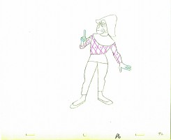
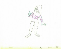
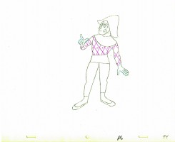
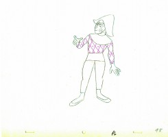
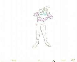
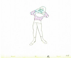
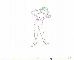
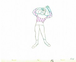
Animation &Frame Grabs &Independent Animation 12 Sep 2010 07:50 am

Bill Plympton talks Idiots & Angels
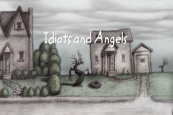
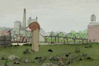
- Opening on October 6th at the IFC Film Center is Bill Plympton‘s most recent animated feature, Idiots and Angels. This like Bill’s other animated features is a labor of love; how could it be anything else when a small group works to produce 90 minutes of animation.

Bill’s style for this film has grown a bit darker and the subject is more cohesive for a full-length story. The look is more dark Eastern European than bright-cheery American. This makes it very grraphic and very much in the heart of Bill’s style.

I had the opportunity of interviewing him and asking 10 questions which illuminate a lot behind the process:

Michael Sporn: The story is probably your most complicated for a feature. The lead character is a bitter and nasty person (the “Idiot” of the title) whose wings (the “Angel”) take over his body to reveal his better nature. Where did this idea come from and what encouraged you to develop it?
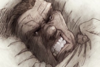
Bill Plympton: The idea for “Idiots and Angels” first came to me when I was in an animation festival in Lille, France and after screening “Hair High”, this French guy asked me what my next film would be—and off the top of my head, (I don’t know where it came from) I said “It’s a story about an asshole guy who wakes up one morning with tiny wings growing out of his back and he doesn’t like it because they make him do good things.”
The kid said he liked the idea, and as I thought about it, so did I. In fact, that night as I lay in my hotel bed, I began to create the character, his environment, and little story sequences.
People say this is my most mature film. It talks about morality, spirituality, and the human soul—they say Bill Plympton is growing up. I hope not, because I will always want to make weird, surreal, offensive comedies.

MS: The draftsmanship in this film is probably your finest. There’s a lot of rendering on the characters using a limited number of colors. It’s perfectly tuned to the film. I wonder how all that line work and rendering is done. You animate the entire film yourself, but surely you must have a lot of help with the rendering? Do you do extremes to set the style and have others follow through?
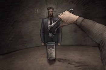
BP: The technique for this film is very new for me. All my other films were shot on a camera stand and now that the cost of digital to film transfer has come down to my pocketbook level, I’m able to scan the drawings and shade/color them digitally.
This is a great breakthrough for me, because all through my life I loved the simple look of pencil on paper. But when I began animation, my copier could never recreate the subtlety and richness of my pencil shaded drawings. So “Idiots and Angels” is the first film to properly recreate the pencil on paper look I love so much.
The process is fairly simple—I do all the animated drawings, erasing the mistakes and redrawing over the original, which gives the art a wonderful layered texure. Then I placed the humongous stack of scenes (30,000 drawings) on my co-producer Biljana Labovic’s desk and she makes sure the artwork is scanned, cleaned, composited, and most importantly colored to the noir-ish style of the concept drawings. We had a staff of about 25 people who off and on would come in to put my drawings together.

MS: – There is a lot of repetitive action in the film. That’s a major part of its style. (The repeated opening of the sunrise, clock and bird singing is obviously done over and over in many different ways.) Yet you don’t seem to use a lot of reuse in doing so. This would have been an easy option given the material. Was it a conscious choice to not do a lot of reuse?
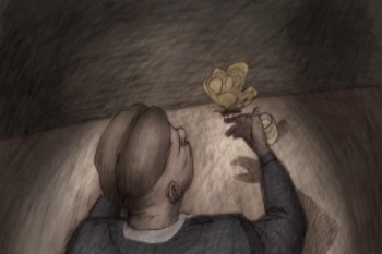
BP: Over the years I’ve had a lot of criticism because my films are not fully animated. In fact, the action is fairly herky-jerky. So in this film, I tried to smooth out the action somewhat. Instead of shooting on 3′s and 4′s I shot on 2′s and 3′s. Also, I wanted to put in the extra effort to try to use different shots for scenes that were repeated, just to give it a more professional look.
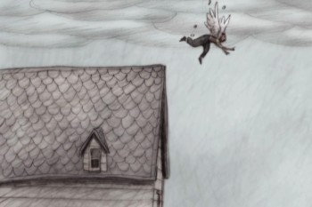
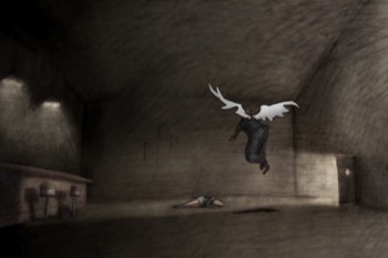
However, there’s one shot where Angel attempts suicide, and I held one drawing for approximately 30 seconds and let Greg Sextro, my sound man, tell the story only through sound effects. I always love it when I can take a shortcut like that and it makes the storytelling that much more unique and interesting.

MS: Having a small independent studio involves doing a lot of jobs that don’t pertain to the actual drawing of the film. How do you travel to film festivals, teach classes within your studio, raise money for your employees’ salaries, figure out how to distribute your film and still have time to animate a feature single handedly?

BP: That’s a very good question. I’ll answer the questions in order—The travel to film festivals is fun but also is a very important part of the job. I use film festivals to make sales and spread the message of indie animation. I’ve stopped teaching the classes, because I want to devote more time to my films and teaching wears me out. The money raising is through sales of my films all over the world on TV, theatrical, DVD, and other media.
My distribution is pretty much by formula now since I have a group of buyers that consistently pay me for the rights to my films. And finally, I have time to single handedly animate my films because I don’t have a family, and I just plain love to draw.

MS: Digital production must have affected your films. Do you work with Photoshop and Aftereffects to get your work to screen? And are the drawings colored prior to scanning?
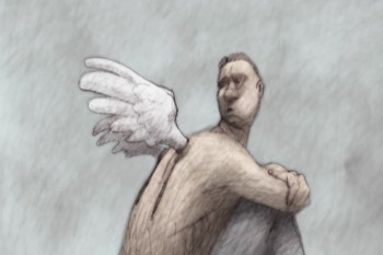
BP: The drawings are colored and shaded after they are scanned. My assistants use Photoshop to color the images, After Effects to composite the frames, and Final Cut Pro for editing and touch-up.

MS: Getting your films distributed has to be the hardest part of the work of feature production. Have you learned how to do it after so many features produced? Or does the business keep changing making it more difficult? Do you have any hope that a major distributor would step in to pick up the film, or do you plan to distribute it yourself?

BP: This is a very important question. There are three parts to filmmaking. 1) Raising the money, and this one is a very large barrier to many filmmakers. 2) Making the film – this is the fun part, and 3) Selling your film and actually making money off of it. This is by far the hardest part—maybe. 0.01% of filmmakers get past this barrier. To answer your question, fortunately, over the years, I’ve been able to create a name for myself and a large fan base.
So if by chance I don’t get a distribution deal I’m usually able to self-distribute, which is what I am doing with I&A. It’s a huge hassle because I have to make the deals with the cinemas, sign the contracts, make posters, make trailers, make multiple prints and do all the press. Then I have to get the money from the cinemas.
But the best part is that I get to retain ownership of the film and often times I make a lot more money than I would with a large distributor.
MS: I know that you’re prone to see everything that’s animated. Does the work of big companies, such as Disney, Pixar or Dreamworks affect the way you do your films in any way?

BP: I’m very happy with the success of Blue Sky, Pixar, and Dreamworks. We’re living in an exciting time when we’re seeing 20 or so animated feature films released every year. In the so-called “golden age” of animation 1930-1950, we’d be lucky to see one animated feature every two years.
I believe that the kids who grew up watching “Lion King” or “A Bug’s Life” now want to see animation with adult ideas done in more creative styles, and hopefully these are the people who will line up outside the IFC on October 6th to see “Idiots and Angels”.

MS: Since you’ve started making feature films, others have followed your suit in making their own long films. Does the competition worry you or are you open to it?

BP: In 1991 when I made “The Tune” independent features were a very rare specialty.
Now it seems, thanks to digital technology, that everyone is making their own animated feature and they’re great films: “Sita Sings the Blues”, “My Dog Tulip”, “Queer Duck”. I believe that we need to cultivate this audience for indie animation and show them that there’s some great amazing films being made by small groups of people without major funding!

MS: Do you have another feature in the works?
BP: Actually, I have two features I’m working on. One has the working title “Cheatin’” that’s done in a very similar style as “Idiots and Angels” but with a much more exaggerated visual style. I’ve put that on hold while I negotiate financing. In the mean time, I’m working on a flash feature called “Tiffany the Whale”. The script and storyboard are all done and we’re already begun animation. This will be a much lower budget film and may be serialized on the internet.

Finally Michael, I want to thank you for giving me an opportunity to talk about my films and hopefully make people aware of the thriving indie animation scene. You’ve been an inspiration for me my whole career so it means a lot to me that you’ve give me your support.

MS: I’m always open and available to you, Bill. You’re the insiration for most Independent animators, believe me. How could I not support that!
Articles on Animation &Guest writer &Independent Animation 11 Sep 2010 07:56 am

Paul & Sandra & Tulip

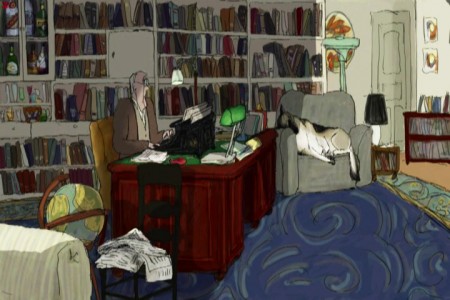
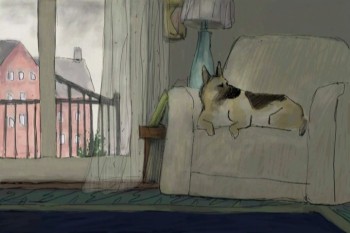
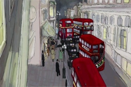
MY DOG TULIP opened at New York’s Film Forum and will be followed by a limited national release. The NY reviews were excellent. The film did so well in its opening week that it’s been extended to Sept. 28th. You have even more of an opportunity to see it.

This interview/article was written by Karl Cohen for ASIFA-SF and he has given me his permission to post it.

One of the impressive animated features coming out this fall is My Dog Tulip based on the book of the same name by J.R. Ackerley (1956). It’s a delightful comedy that I fell in love with at the SF Film Festival. Its directors, Paul and Sandra Fierlinger, have created over a hundred award winning films including Still Life With Animated Dog (2001) that won a Peabody Award and a Special Jury Award from Zagreb. A Room Nearby (2003) also won a Peabody and their Drawn From Life series (2000) has won a grand prize at the Ottawa

International Animation Festival. In 1980 Paul received an Oscar nomination for It’s So Nice To Have A Wolf Around The House.

Although the couple may not be well known by the public, they are highly respected among their peers, so when asked how Tulip came about as a project Paul explained that the film’s producers Norman Twain and Howard Kaminsky, “Just called us out of the blue. One of those calls you think never happens.” They asked right off if the Fierlingers wanted to make a feature film. They didn’t know the couple and their main concern was that the film had to be based on a famous book.

After some discussion about possible books to adapt they decided upon My Dog Tulip. It turned out Howard Kaminsky knew the book and controversy over it when the book was published, as he was president of Random House, the book-publishing firm, for twenty-five years and prior to that was president of Warner Books for seven years. The book and film have scatological references that were quite shocking to polite society in 1956. A contract was eventually agreed upon and it took about three years for Paul and Sandra to complete the project.

Paul says, “It was wonderful work. I could wake up every morning and know exactly what I was going to do and I loved the work. The whole process was very pleasant. There are no horror stories to tell. Nothing bad happened.” The Fierlingers had total artistic control and the budget was $1.3 million, enough for the couple to complete the production with famous voice actors (Christopher Plummer, Lynn Redgrave and Isabella Rossellini) and to be able to provide film festivals with 35mm prints with Dolby sound.

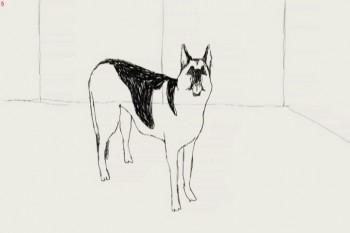
Adapting the book did present problems, as it is basically a series of humorous tales about incidents in the life of J.R. Ackerley as he raises the dog, an Alsatian (German Shepherd) and they become great friends. To flush out the film’s script Fierlinger added true elements not mentioned in the book, including having the author’s sister live with him for about a year. During that period she tried but failed to win over the dog’s affection.

To flush out the story Fierlinger’s producer hired Peter Parker, an excellent British writer who had written a biography of J.R. Ackerley. Paul says, “His prose is equal to Ackerley’s.” If you see the film I think you will assume, as I did, that every word came from the book.

An unusual element in Paul’s long format work (he has also done hundreds of TV commercials, short pieces for Sesame Street, etc.) is his use of different styles and techniques that separate segments of the story. He wasn’t sure what I was referring to when I brought up the subject so I pointed out that in his film And Then I’ll Stop (1989) he had five or six people talking about their lives and each person had a different style of art representing them and their world. Paul then explained that he feels long animated films using the same art styles and rendering techniques throughout the film get boring no matter how well they are done.

He remembers that the first animated feature he saw that he really liked to the very end was Yellow Submarine (1968) because it was done in so many different styles. In his work you know the same artist drew each style, but the variety keeps the work visually interesting.

When working on a story Paul says he gets into a special frame of mind. “In my mind I live the story,” so he draws what he imagines. “If it is a sloppy character then you draw a sloppy line. I did that in And Then I’ll Stop. And if it is the story of a very pristine accountant of a big company I draw him in almost Saul Steinberg type lines.”

Paul has been around long enough to see sound recording technology change drastically. With new microphones and digital recorders he no longer needs to use a big studio with sound booths. Some of Tulip was recorded around a kitchen table, but to record Christopher Plummer the producers rented studio time.

Paul pointed out why it is important to record most soundtracks before animating characters. The character Plummer created in his reading of the script wasn’t the man that Paul had envisioned so he ended up drawing the main character somewhat differently than he had originally planned.

The film’s composer/sound engineer is John Avarese who has worked with Paul for many years. Paul says, “You can tell him the kind of music you want and he can just pull it out of his hat.” Most of John’s work has been for corporate and industrial clients.

The animation was done using TVPaint, one of the oldest 2-D animation systems available. It was started in 1991 and was developed by an independent producer as a work of love. Paul became a beta tester in 1992 or ‘93 and helped develop the system’s capabilities.

His wife Sandra is the film’s co-director. Her background is in painting. She studied at the Boston Museum’s school and graduated from the Philadelphia Academy of Fine Arts. They work together quite well as Paul is a skilled draftsman, but he says, “I never learned to paint or work with color. Most of my films have had very little color in them.” She started working with him in 1989 as a painter when animation was hand painted on cels. She enjoyed the work and together they learned the TVPaint system. She also was involved in beta testing the software. As they learned the system they would ask the software developers to make certain adjustments. Thus the system became tailored to their needs. Eventually other accomplished 2D animators from all over the world joined the beta team to create a unique application specifically meeting the needs of independent artists.

One important part of Paul and Sandra’s good working relationship is her helping him to resolve drawing problems whenever he feels stuck trying to make a decision. He says that often happens, that he can “paint myself into a corner and nothing seems to work, so she looks at it with fresh eyes. We figure it out together. We do that all the time, even when I start writing a script, before I start drawing.” Paul feels all their films should simply say “A film by Paul and Sandra Fierlinger.”

We closed our discussion with Paul’s advice for couples that want to work together on animated films. Based on having lived and worked with Sandra for almost 20 years he says, “The trick is not to have children. If you have children, that gets in the way. You have conflicts. If you don’t have children, you only have your work.” I’m not sure how popular his advice is with parents, but judging from their films that I’ve enjoyed over the years, the advice certainly works for this animating couple.

Before I spoke with Paul I asked Norman Twain, one of the film’s producers, about their distribution plans for the film. He said, “The film will open at the prestigious art house, Film Forum, in New York City on September 1 and concurrently in similar calendar art houses in San Francisco,* Los Angeles, Dallas, Philadelphia, Chicago, Boston, and Toronto, as well as in other New York theaters. Hopefully, as the traction grows we will expand to other major calendar houses in the larger markets in the United States. We will promote the film in the best possible manner, directing promotion toward an Academy Award nomination. Pending the reception of the film in America, we will exploit the foreign market to the best extent we can. Cinemavault, a film sales group based in Toronto will handle foreign sales. After the US distribution has run its course, we will look for a VOD (video on demand) release, concurrently with a DVD release and after that, will try our best to get it on television (hopefully PBS or cable TV network – as it is much too nasty for a broadcast network to show).” *Tulip opens in SF and Berkeley Oct. 15 at Landmark’s Embarcadero and Shattuck cinemas.

I also asked if it was difficult financing the project. He replied, “Fortunately, most of the fund-raising took place prior to the crash, or should I say prior to the sudden scarcity of funds. It’s not an expensive film, under $1.3 million. I think, as all entertainment investments go, it’s risky, but will prove profitable. I am happy to have produced it and will be happy to see it in release.”

I end this discussion with a disclosure. Both Paul and I are extremely fond of dogs. My wonderful yellow Labrador Retriever recently died after being my close friend for 14 years and Paul and Sandra Fierlinger have two rescue dogs at present, a Jack Russell, “probably from a puppy mill,” and a mutt that he says is a cross between a German Shepherd and a Corgi. It had been abandoned. It has a large Shepherd head and a strange body so a friend of Paul’s once remarked, “Oh, a Photoshop dog.” Paul tells me that he sometimes used her as a model when he was drawing Tulip.

Bill Peckmann &Books &Disney &Illustration &Layout & Design &Models 10 Sep 2010 07:49 am

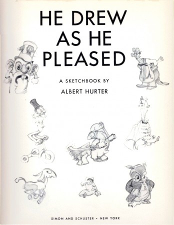
He Drew As He Pleased – 1

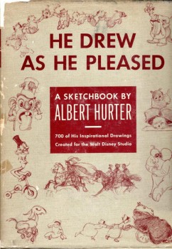
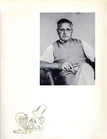
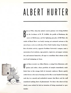
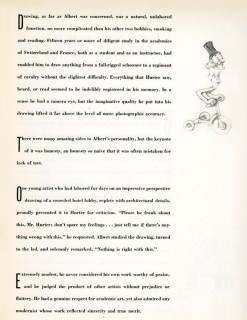
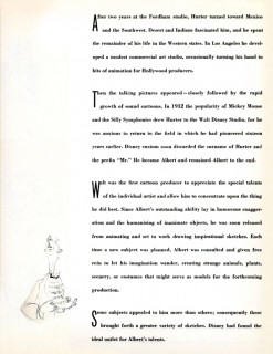
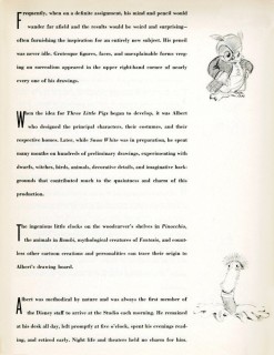
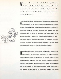
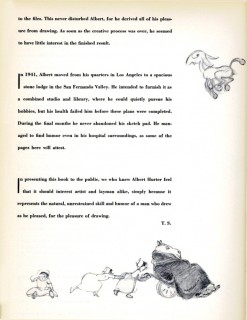
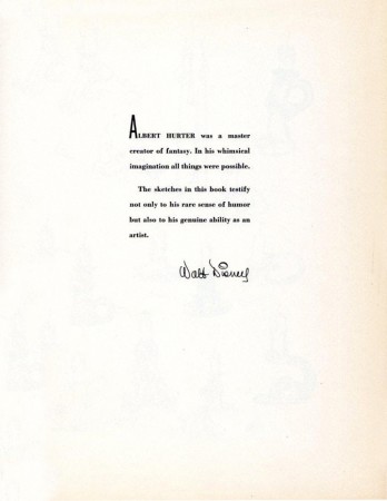
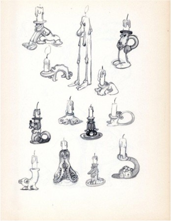
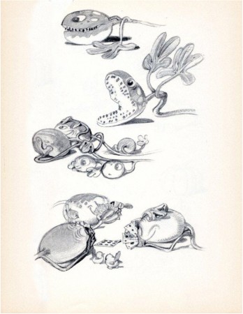
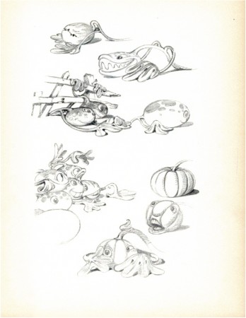
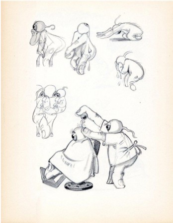
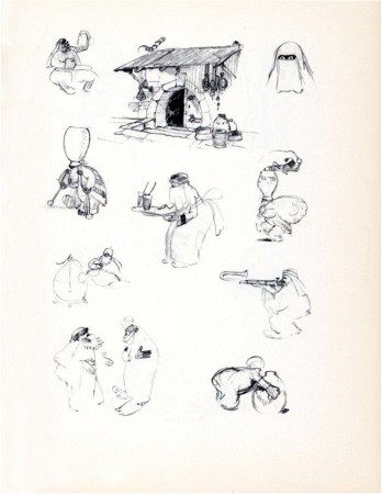
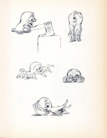
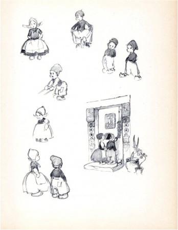
– We all know that Albert Hurter was the brilliant artist behind a lot of Snow White’s gingerbread architecture. Hurter was a Swiss illustrator that Disney brought into the studio and let him go. He could draw whatever he wanted to help inspire the studio to pull Snow White together.

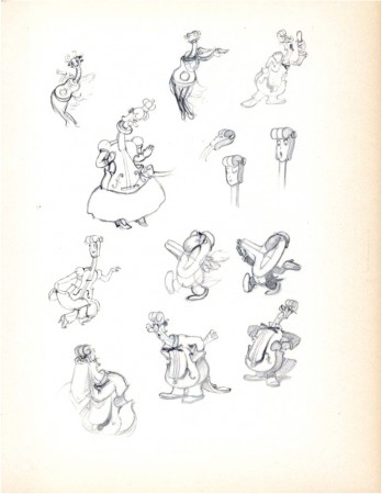
After leaving the studio, Hurter had a book published called, “He Drew As He Pleased.” It’s a beauty of a book and a rare item. Bill Peckmann sent me scans from the book, and I’ll post them here. It’ll take a few installments. The pages are in delicate condition, but photoshop is allowing me to clean them up a bit – but not too much.

Some of the pages are devoted to characters in the Silly Symphonies. I had hoped to pull some frame grabs from the films, but I didn’t have time. It’s a project for the future.

This book will interplay with the post I started last week on Frederick Horvath‘s designs for the studio – at the same time. That booklet will continue soon.

1
(Click any image to enlarge.)

2

3 4

5 6

7 8

9

10
“For Albert There Were No Inanimate Objects”

11
“Even Melons Came To Life”

12
“More Melons”

13
“Eyeball Folk”

14
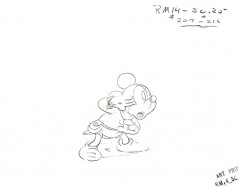
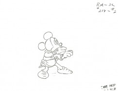
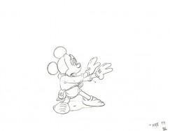
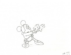
“Atmosphere: Mickey In Arabia”

15
“Men of Parts”

16
“Hansel and Gretel”

17
“Players of a Musical Fantasy”

Guest writer &Illustration &SpornFilms 09 Sep 2010 09:28 am

Patti Stren

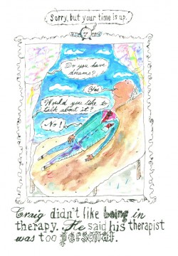
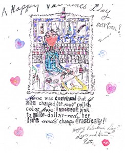
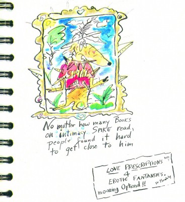
- I got to know Patti Stren well when we worked together making the short film, MONA MON AMOUR. This was something that Patti had developed as a print piece, and we jointly came up with the idea of making a short. We financed it jointly and love the end product. It’s the film that probably got the most laughs when I saw it projected at the Museum of Modern Art. I was quite proud of it then.

I’m going to turn this post over to Patti to showcase some of her past work including a couple of the many books she’s written and illustrated, some of the print ads she’s done, the post Mona artwork she’s done with the characters, and other material.

I hope you enjoy it.

___________________________

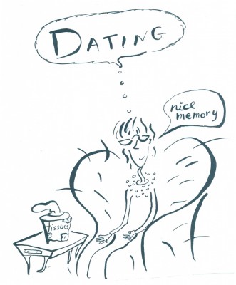
Often my Canadian friends and here, many of my colleagues; but especially my Mama’s mahjong buddies in their 90′s who watch MONA MON AMOUR every day, as if it were a new film -ask me how did this Michael Sporn and I meet? Then collaborate and then become good friends. Well, for sure I immensely respected Michael’s work. And Michael said some lovely things about mine. Coincidentally, my best friend in Paris, Tana Hoban was the sister of one of Michael’s most beloved Children’s Book Writer Russell Hoban. Of which he animated. The Marzipan Pig exquisitely.


Tana Hoban’s photo of Patti for a flyer.

Actually Michael and I were introduced by the Executive Producer of Babar and Father Christmas to work on a project, that sadly fell through. And then one day Michael invited me into his studio after some wonderfully funny phone calls about work and stuff. I remember telling him,” I’ll bring in my portfolio,” and he said, “don’t.” And I did.

I remember the visit exactly. Michael opened the door to his 632 Broadway studio. He was very tall and I was very small. I was very nervous and said: “I am nervous, and I’m probably going to talk and talk and talk a lot.” And he said: “‘That’s okay. Everything you’ll say will be IMPORTANT.” IT wasn’t that a Large Capital Letter bubble came out of Michael’s head. But when Michael spoke I could tell what he meant in Capital letters! Then Michael led me straight back to the long table at the end of the studio. Where I proceeded talking and talking and talking while showing Michael my Portfolio.
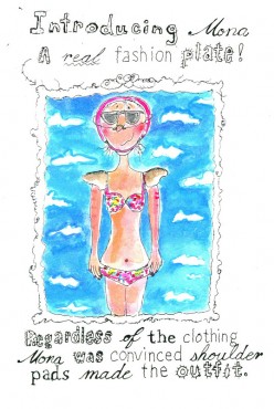

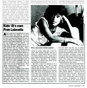
An article from Maclean’s Magazine about Patti.

And, the coincidences in our careers were astounding to me.

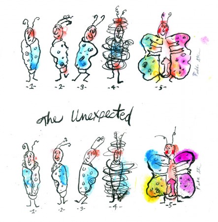
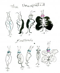
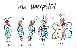
I had abruptly come to New York City on a quest to study with R. O. Blechman in a night class at The School of Visual Arts; taking a leap of faith from my first year at The Toronto College of Art. I don’t remember if I showed Michael or told him about my submission for R.O. Blechman’s class book contest: “DRAW the UNEXPECTED.” But I’m Including the illustration now. I had faxed home roughs to my Mom’s mahjong buddies and they had responded to: “not to forget to draw ‘the dangling participles!’”


(Click any image to enlarge.)

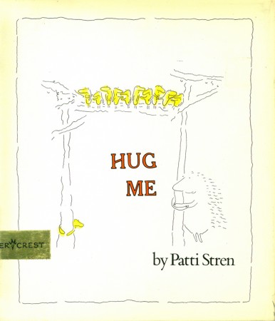
Suddenly Michael was telling me that when I was studying with Bob Blechman at SVA, he was either working with Bob or had just opened up his studio around the same time. I was so elated, since I had shyly, after the class had ended, shown HUG ME (the moment it came off the presses), to R. O. Blechman, one evening when he was lecturing. And, later, Bob had redesigned the cover for my second book since the publishers design was hideous. And . . .

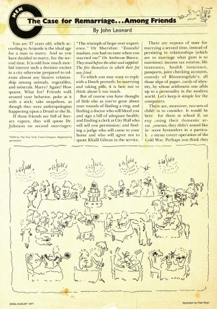
I was so nervous we knew the same person I kept turning pages of my portfolio and forgetting to breathe as I was talking. Michael offered me a glass of water. Since Michael had seen all my children’s books he was very patient with the work I was showing. I turned the pages to my favorite MS Magazine illustration I did for them. The Subject: MEN – The Case for Remarriage. . . Among Friends by John Leonard.


The John Leonard article with illustration.

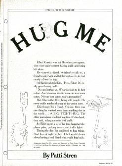
Then In one of the side pockets in my portfolio I pulled out MS MAGAZINE, Sept/1978/, that had the Prestigious Selection for STORIES FOR FREE CHILDREN. And HUG ME was in that section.

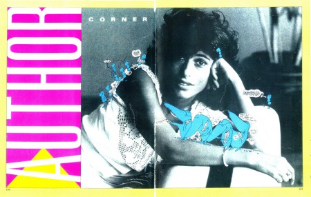
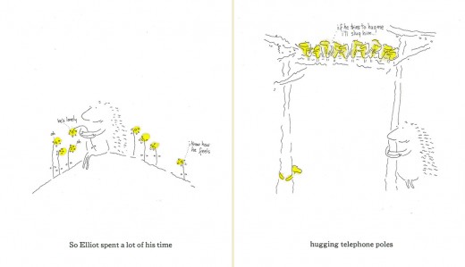
HUG ME book cover and two page spread (below).


Michael and I had already talked about HUG ME, my book published by Harper & Row at the time. And . . .

Producer Nick Bosustow animated HUG ME as part of the CBS LIBRARY SPECIAL called 4 WISHES. Winning 1st Prize at Zagreb Film Festival in Children’s Film Category in 1984.

a b
a. The back cover of the video cassette.
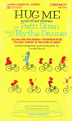
b. The front cover of the audio cassette.

Michael seemed to know everyone I talked about in the business of film. HE had this way of making me feel comfortable, and I kept talking and talking and I confided to Michael that when writing for children I never really try to just write for children but for myself. And I never really planned things out. And Michael described how he created spontaneously in his films. Especially describing the broom closet scene in Lyle Lyle crocodile. . The more he spoke the more Michael reminded me of another gentle genius writer I knew. The wonderful and understanding and exceedingly exciting Writer John Gardner. Who always used to tell me to ignore intellectuals snobs that would act superior and to promise to be myself. Then Michael told me, that not only did he know John Gardner but that he illustrated for John Gardner too. And then we both discovered that John had sent us to the same Random House art director to be published by them. And how we’d both been sent away The coincidences kept adding up.


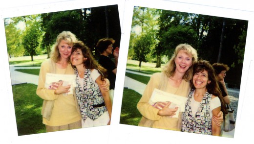
Blythe Danner and Patti Stren

Then Next in my portfolio were the most wonderful photos of Blythe Danner and myself. Always to remind me how happy I am that Blythe Danner Narrated the recordings of HUG ME and Other stories of Patti Stren.

Michael seemed pleased to see Blythe, since he had been really wanting to work with her, but the times had never coincided. Now I have all the rights back for the recording, and I am hoping to get Hug Me animated with the pages turning with Blythe’s narrating. Hopefully with Michael animating. And hopefully with a grant again as with many of my projects.


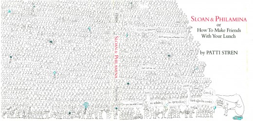
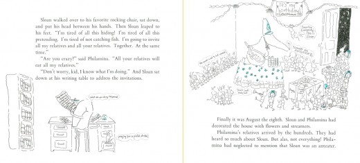
(above) The two page book cover for another of Patti’s books, SLOAN & PHILAMENA
(below) and two sample pages.

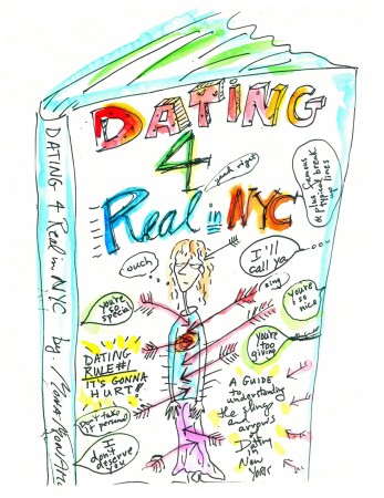
Finally I showed Michael my Secret Book Jacket Cover to my next Book in The Works! Therapy. Sex and Shopping. What Else is There in New York City. ( Except Alternate Side Parking!)

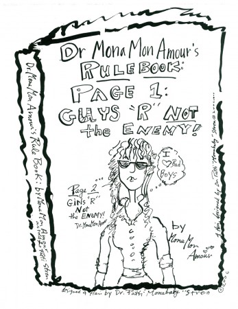
Sample covers.

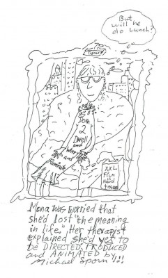
Little did I know showing my main character MONA MON AMOUR with the caption underneath her saying: Mona was convinced that she’d lost the meaning to life. Her therapist told her she’d just misplaced it –Would lead to our collaboration.


Patti’s creativity with Mona is endless.

And when I stopped talking to Michael Sporn about all these ideas I had; I thought I was going to faint. . . . I’d forgotten to breath. And when Rich my husband picked me and my portfolio up in our car; I had no idea Michael would want to make a film with me. But I knew if he did – I’d say yes!


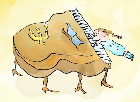
And Now heaps of years in the business, 1′m still having fun designing animated shorts, (the latest animation for Michael again), working on books (both adaptations from the two short animations, MONA MON AMOUR and the little genius Mozart).


A scene from the Mozart film.

And I’m back to my Commercial Art Career. I’m available 24 hours a day, now designing for Eppes Essen Deli, in N.J. in hopes that Eppes will Fed Ex me Heaps of Chopped liver!


The Eppes ads.


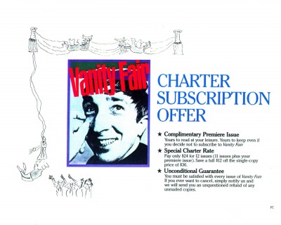
Vanity Fair illustration

Animation &Hubley &Independent Animation 08 Sep 2010 07:43 am

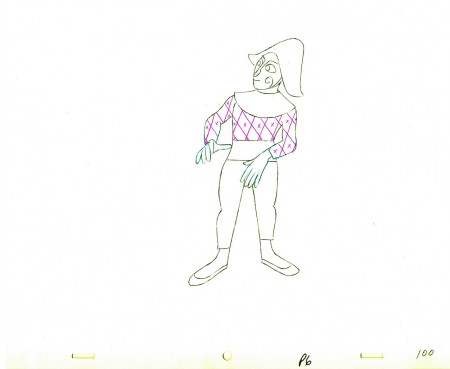
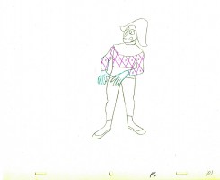
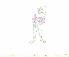
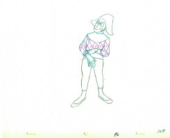
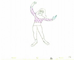
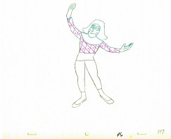
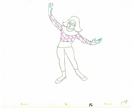
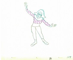
Babbitt’s Carousel Mime – 4

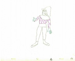
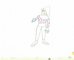
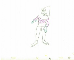
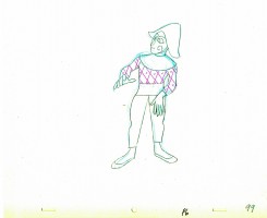
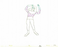
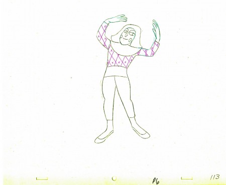
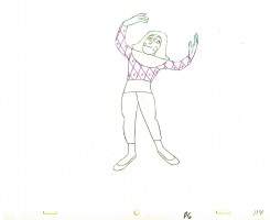
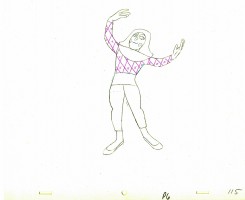
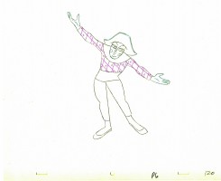
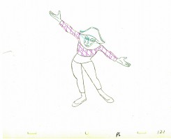
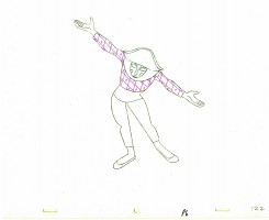
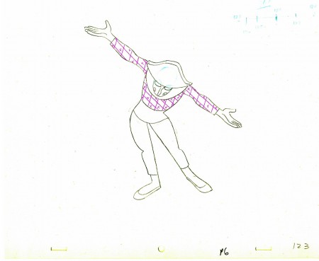
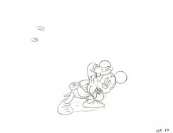
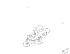
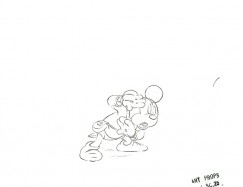
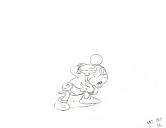
- John Hubley‘s feature film, Everybody Rides the Carousel, was adapted from Erik Erikson‘s Eight Stages of Man, a Psychosocial Theory of Human Development.

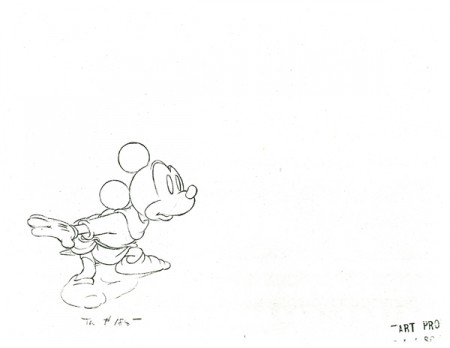
There was a carousel with 8 horses representing different stages of life. The narrator, a mime, was animated by Art Babbitt, with Dave Palmer as his personal assistant. After animating a couple of early scenes, Babbitt left annoyed. Barrie Nelson completed the character in the show.

For the full story behind the rift between Hubley and Babbitt go to this past post.

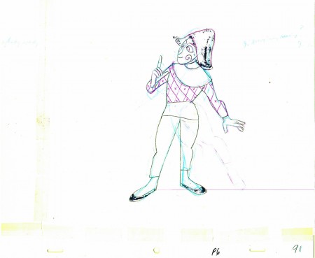
The scene is about 200 drawings long. Here’s the fourth part. It’s a very slow moving character with short quick spurts of movement.
We begin with the last drawing from last week.

91

92 93

94 95

96 97

98 99

100

0102

0304

0506

0708

0910

1112

113

1415

1617

118

1920

2122

123

______________________

The following QT movie represents the drawings above
exposed as Babbitt wanted them, on twos.

Click left side of the black bar to play.
Right side to watch single frame.

Books &Disney &Layout & Design &Mary Blair &Models 07 Sep 2010 05:58 am

Mary Blair – 9

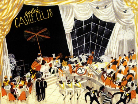
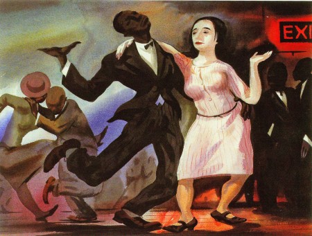
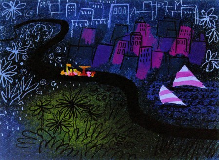
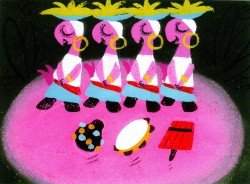
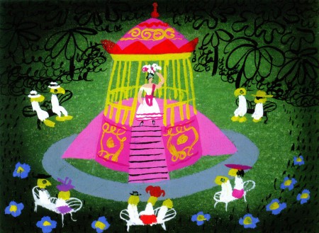
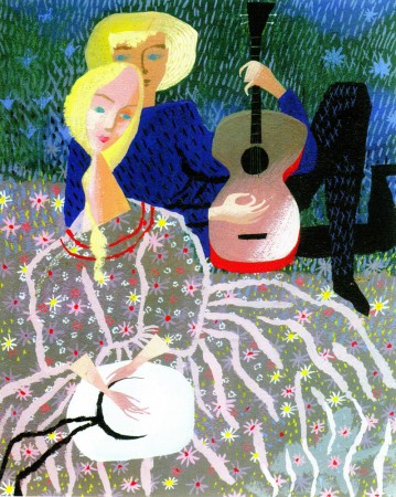
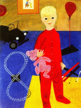
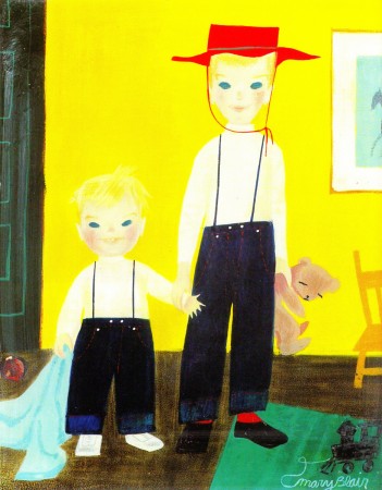
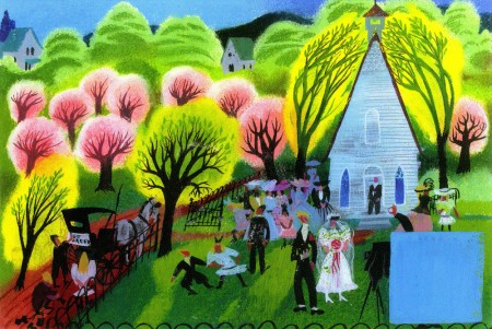
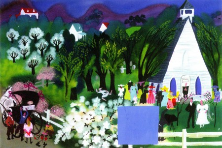
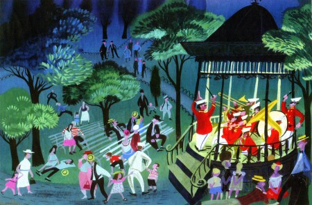
- This will be the last of my Mary Blair posts. Today, I’m going to concentrate on her more personal and private work. Some of these are paintings, some greeting cards, others theatrical designs.

I’ve taken artwork exclusively from the Japanese book, The Colors of Mary Blair. John Canemaker writes an introduction to the Japanese book and that’s also a fine piece of writing.

However, I’ve consistently gone back to Canemaker’s excellent US book, The Art and Flair of Mary Blair.


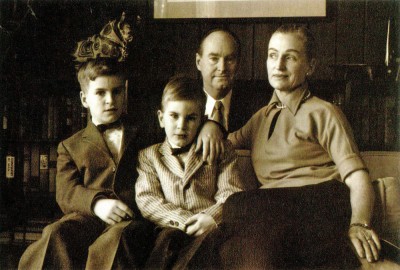
The Blair Family


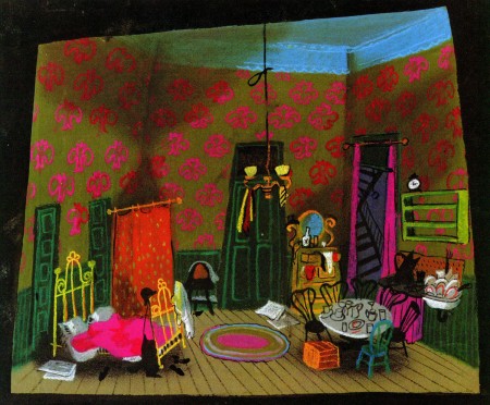
Set design for Cole Black and the Seven Dwarfs


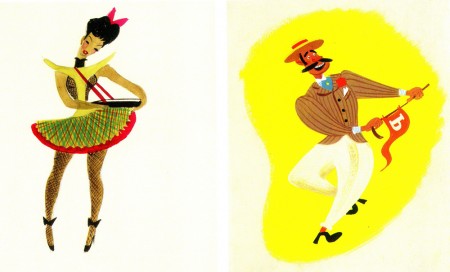
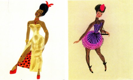
Costume designs for the same show.


This was a musical that featured the music of Duke Ellington.


The show never opened on Broadway, and it’s too bad that
Mary Blair never had a theatrical show that she designed.


An oil painting that’s reminiscent of the work
of the brilliant black artist, Archibald Motley.


Some greeting cards.


Some paintings of her children.

Animation &Animation Artifacts &Disney 06 Sep 2010 08:16 am

Recap – Thomas’ Little Tailor -4

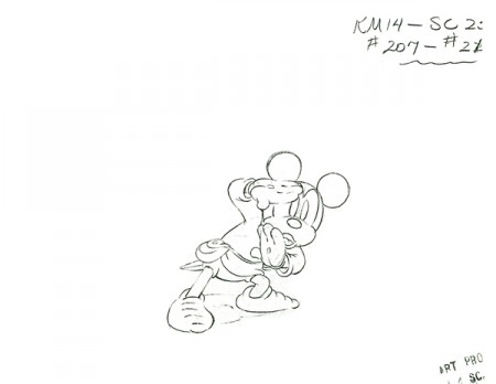
- Hans Perk reminded me that yesterday was the birthday of the late Frank Thomas. To celebrate: Rather than post my usual Mary Blair piece (which I’ll post tomorrow), I thought I’d recap this last part of Thomas’ Brave Little Tailor scene. You can link to earlier parts if you like. The scene is a masterpiece and possibly my favorite Thomas scene of all time.

_________________________

- So, finally, we’ve reached the end of this magnificent Frank Thomas scene from The Brave Little Tailor. The other three parts can be found here: Part 1, Part 2, & Part 3.

Many thanks to friend, Lou Scarborough for the loan of the xerox copies so I could post the scene.

We start with the last drawing from Part 3.

183
(Click any image to enlarge.)

184185

186187

188189

190191

192193

194195

196197

198199

200201

202

203204

205206

207209

210211

212213

214215

216217

218219

220221

222223

224

225226

227228

229230

231

232233

234235

236237

238239

240241

242243

244245

The following QT movie represents all 246 drawings of the scene.

Click left side of the black bar to play.
Right side to watch single frame.

Photos &repeated posts 05 Sep 2010 08:21 am

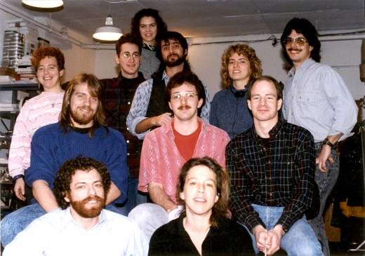
Recap – Photo Sunday / Studio Groups

- Here’s a fun recap from January 2007. Nostalgia for me.

_______________________

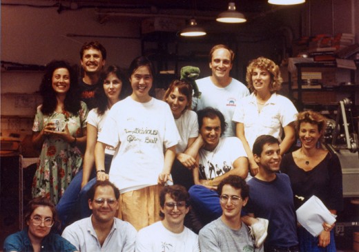
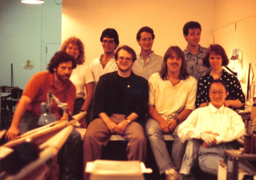
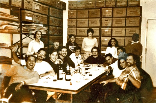
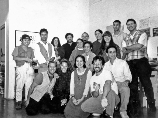
- I thought it’d be great to put together some of the grouped staff shots we used to do a lot. For some reason we haven’t done any recently; maybe it’s because the numbers of people working here are quite a bit fewer. I guess it’s still worth while for posterity’s sake. We’ll do it soon.

All images enlarge by clicking them.

The Lyle crew, back in 1987:


Front row, sitting, L to R: Caroline Zegart - coloring, Steven Dovas - animator, John Schnall - Prod. Coordinator/Animator, Ray Kosarin - Asst. Animator/coloring, Michael Zodorozny - Layout, Bridget Thorne - Art Director/Bgs.

The Abel’s Island group, 1988:


Back row (L to R): Betsy Bauer (colorist), Ray Kosarin (asst animator/colorist), Laura Bryson (behind Ray) (colorist), Robert Marianetti (Prod Mgr), Theresa Smythe (colorist), Mike Wisniewski (asst animator/colorist)
Center row (L to R): Steve MacQuignon (colorist), George McClements (asst animator/ colorist), Greg Perler (editor)
Bot Row (L to R): me, Bridget Thorne (Bg’s)
Not pictured in the photos is Kit Hawkins, my assistant, who took them.

After the move to 632 Broadway a small group working on Baby’s Storytime:


Sitting L to R: me, Jason McDonald, Steve MacQuignon, Mary Thorne, Masako Kanayama

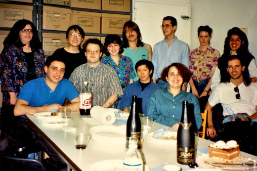
Here’s a birthday party in 1992:


(Back row L to R) colorist - Christine O'Neill, Masako Kanayama, Sue Perrotto, Steve MacQuignon, Ray Kosarin, Liz Seidman, Marilyn Rosado
(Fron row L to R) Ed Askinazi, Jason McDonald, Xiaogang He, Denise Gonzalez, Rodolfo Damaggio. I'm probably off camera still looking at the picture, or else I'm taking the picture.

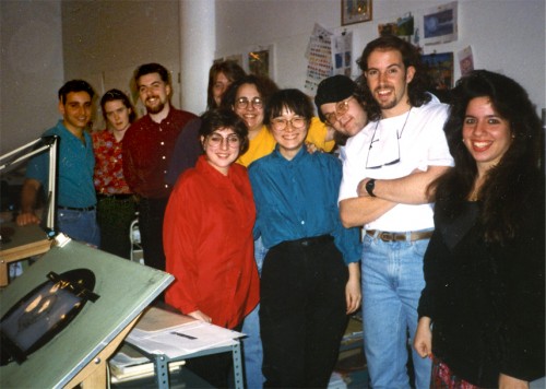
A Christmas party back in 1996:


Back L to R: Ed Askinazi - editor, Liz Seidman - prod coord, Matthew Sheridan - asst, Stephen MacQuignon (hidden) - colorist, Denise Gonzalez (in yellow) - publicity/asst, Sue Perotto (in red) - animator, Jason McDonald's head - colorist, Masako Kanayama - production supervisor, Rodolfo Damaggio - animator, Marilyn Rosado - office manager.

This is the staff during the making of a pilot for Blackside Entertainment, The Land of the Four Winds. It’s another birthday picture. Lots of color deterioration in the photo. The exposure isn’t great – you can barely make out Champagne’s face.


Sitting around the table L to R: Farid Zacariah (runner), Greg Duva (Asst Anim), Adrian Urquidez(I&Pt), David Levy (Asst Anim), John "Quack" Leard (Asst Anim), Jason McDonald (design, I&Pt), Ed Askinazi (Editor), Robert Marianetti (Prod Coord), Heidi Stallings (casting), me.

Here’s one a couple of months later (a better photo by Kit Hawkins – who was also on staff then.) It celebrated Farid’s last day – our all around guy.


Front row kneeling L to R: Farid Zacariah (runner), Laura Bryson (Bg's), Madeline Fan (Asst Coord), Greg Duva (Asst Anim), Ed Askinazi (Editor)

I’m sure this is boring for a lot of you, but I had fun.

Animation &Errol Le Cain &Independent Animation &Richard Williams 04 Sep 2010 07:35 am

The Sailor & the Devil

- There was a documentary about Richard Williams that I saw many years ago on PBS. It made me an ardent enthusiast of Williams’ work, and I followed his trajectory over many years. Eventually, I worked with him.

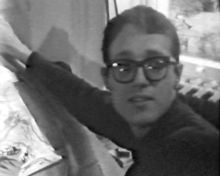
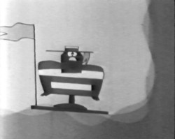
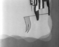
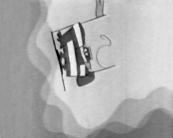
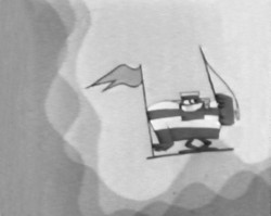
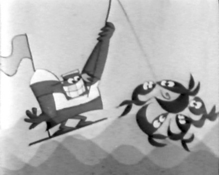
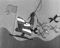
The show was called The Creative Person: Richard Williams and was made in 1966. Within the show was a very small section about one of Williams’ artists, Errol LeCain. He was given the task of making a film by himself. As Williams explains, this would teach him all the aspects of animation filmmaking and the studio would gain a short film in the end.

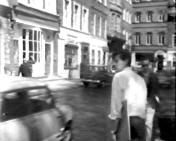
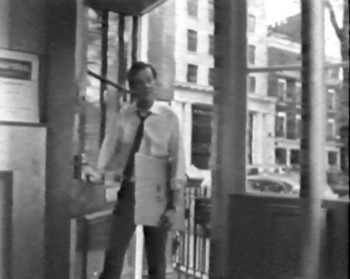
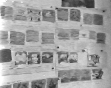
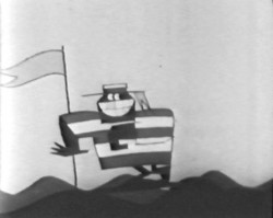
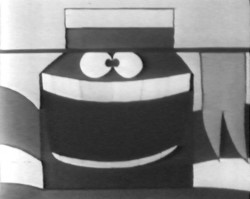
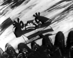
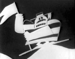
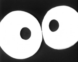
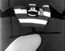
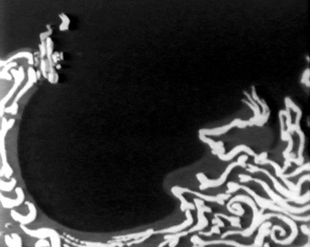
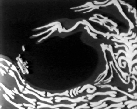
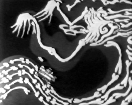
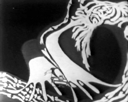
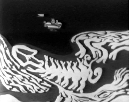
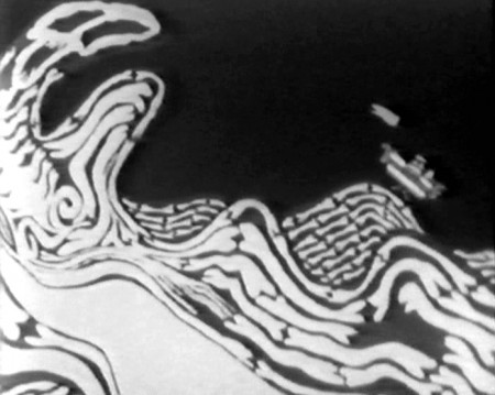
The film was called The Sailor and the Devil. This is probably the only film done by the Williams Studio that I haven’t seen. It’s still not on YouTube. Hans Bacher gave some color images on his site, one1more2time3, a year ago. Wanting more, I went back to the special and made frame grabs of some of the film, and I’m posting them here.

Dick was so young, as was Errol LeCain. He went on, of course, to become a world-class children’s book illustrator and the original designer of the backgrounds for the ill-fated Cobbler and the Thief.


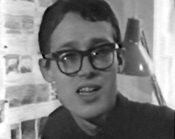
Errol LeCain


A glimpse at the storyboard on the wall.


(Click any image to enlarge.)


Another shot of LeCain.

Books &Commentary 03 Sep 2010 08:19 am

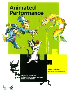
Animated Performance

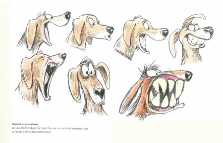
- If I had to select one book, today, that I would reccomend people read to learn about about the art of animation, I’d probably pick Nancy Beiman‘s latest tome. It’s a bona fide gem. It’s not like the Preston Blair/Eric Goldberg model where poses for walk cycles and skips and generic movements are blocked out for you. This book does as its title suggests, it shows you how to get a performance out of your characters. Naturally, it would probably help if you already knew the basics (see the Preston Blair/Eric Goldberg model for that.)

There are numerous conversations with the likes of Art Babbitt, Jamaal Bradley and Ellen Woodbury to give you some info on how they got performances out of their characters. Babbitt, naturally, talks about Goofy and his original animation of that character. Bradley discusses animating the “House” in Monster House. Ellen Woodbury talks about Zazu in The Lion King. There’s quite a lot of material there, and Nancy uses it all to extrapolate her lessons.

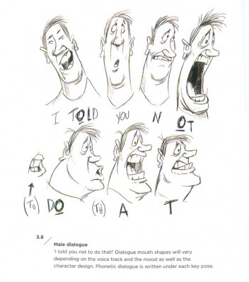
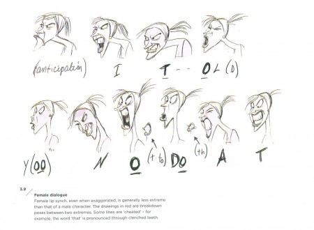
The book is filled with lots of sketches and examples of material being discussed. The drawings are Nancy’s when she has something specific to detail; if she can find an example from an existing film, she uses that. It’s a solid book with strong material that is rarely discussed in How-To animation books.


Here Nancy gives the example of a male and
a female saying the same line.

My complaint might be that some of the thumbnails are printed relatively small so it’s hard to see some of the material. (Of course that also has to do with my aging eyesight.) But there’s so much packed into this book that I can’t imagine them having the room to print it much larger.


Animals are given equal space.

The book concerns itself with the differences between the sexes, four legs vs. two and how to portray animated animal motion, moving inanimate objects, weight and weightlesssness, animating multiple characters and crowd scenes. That’s quite a lot to tackle, and the book seems to get it right in Nancy’s hands.

Nancy Beiman desrves strong kudos for this book, and any animation student – 2D or 3D – should own a copy.

« Previous PageNext Page »

eXTReMe Tracker
click for free hit counter

hit counter