Animation &Animation Artifacts &Independent Animation 12 Oct 2010 07:37 am

Animal Farm cast

I had some communication with Chris Rushworthy, an enormous fan of Halas and Batchelor’s Animal Farm. I had just watched the DVD again and wondered if Chris, who has an large collection of art from the film and has a website to showcase it – AnimalFarmWorld, had ever seen a set of drafts for the film. Which animator animated which scenes?

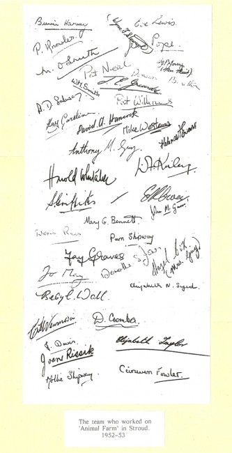
He didn’t have one, but that didn’t stop him from contacting Harold Whitaker, who was a key animator – not only on Animal Farm but for Halas & Batchelor – to ask if he had one. Whitaker responded with a signed card of people who had worked on the film. Interestingly enough, only three people who signed the card actually got screen credit, so I guess that many of the signers were from the Ink & Paint department. Whitaker is the only animator I recognize, to have signed the document.

Here’s the card, and alongside it I tried to identify the names – however, it isn’t easy reading all the signatures. Those that I’m sure I’ve got wrong, I’ve added question marks (????) to the names. If you’re confident of any of the names, please feel free to let me know.


.
Bunnie Harvey
Wynn F. Stewart
Eve Lewis
P. Knowles
Jay Pope
M. O. Smith
Pat Neal
W. M. Smith
J.E.Grundy ???
Ty F. Young (Mrs. Muir)
Kay Coroline
Pat Williams
David A. Hancock
Mike Western
Helena F. Evans
Anthony M. Gray
B.D.Salway ???
Harold Whitaker - animator
D.F.Kniley ???
Sid Griffiths - camera
Mary G. Bennett
John M. Gurr – Camera
Doris Reis
Pam Shipway
Jay Graves
Jo May
Dorothy S. Jones
Hazel Box – (Mrs. Gray)
Beryl Wall
Elizabeth N. Syed
C. L. Newman
D. Coombes
J. Davis
Joan Rissik
Elizabeth Taylor
Mollie Shipway
Ceinwen Fowler

.

The film’s credits don’t offer a hell of a lot more. The names are few and they’re written in script. No first names – just a letter. H. Whittaker – yes, two “t”s even though the card above has just the one “t”. IMDB offers a few additional credits.
One not on IMDB is Gerald Potterton; he told me it was his first position as an inbetweener.

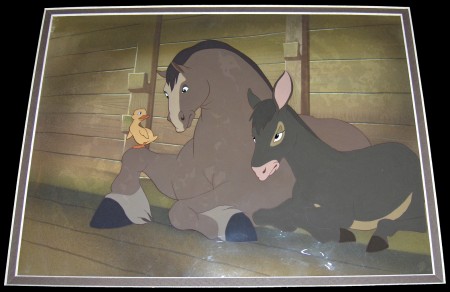
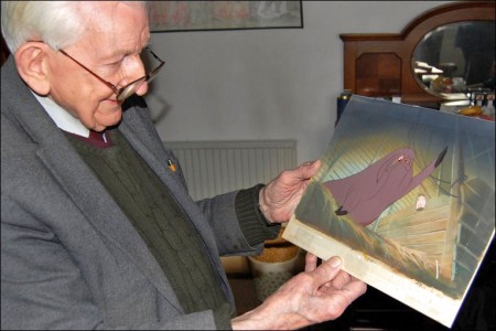
Chris Rushworthy also gave me a preview of a beautiful new setup he recently bought to add to the collection. This is it.


Boxer, Benjamin and duckling

Check out his site to see plenty of other cel setups and drawings.

Art Art &Comic Art &Illustration &Independent Animation &Layout & Design 11 Oct 2010 07:18 am

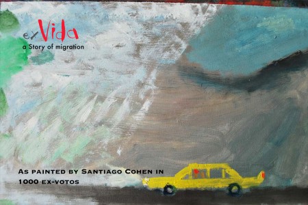
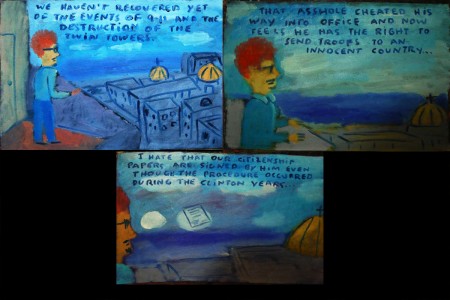
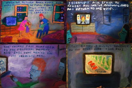
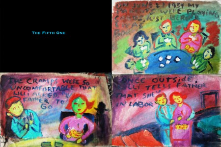
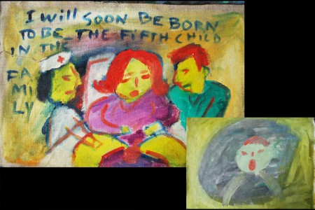
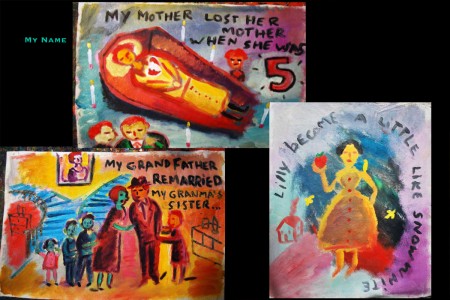
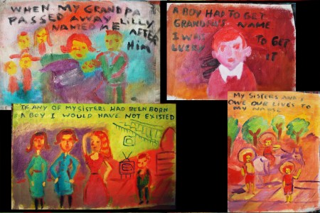
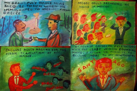
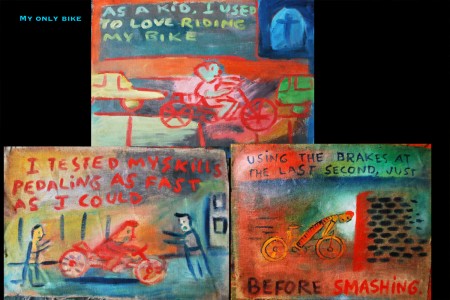
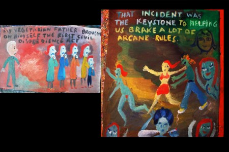
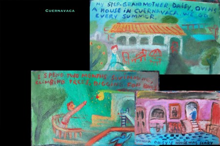
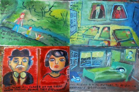
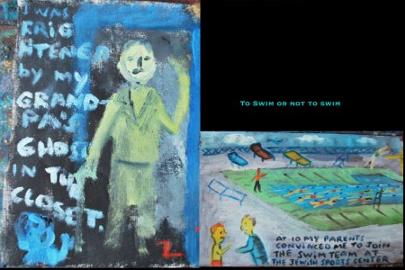
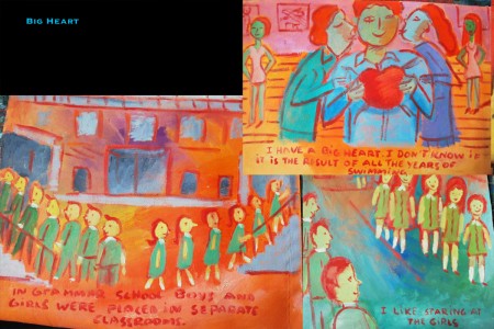
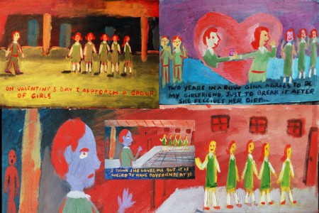
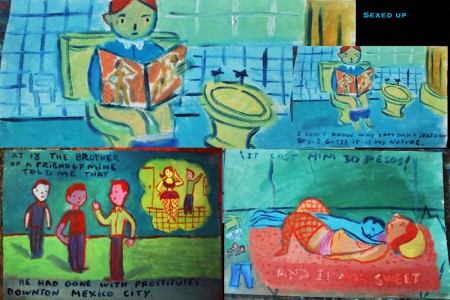
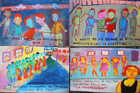
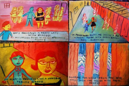
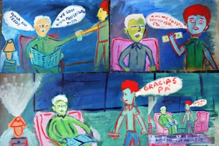
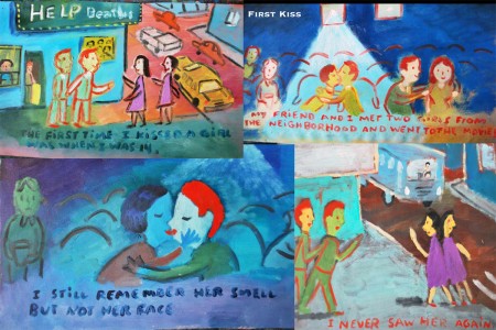
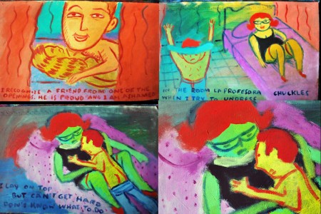
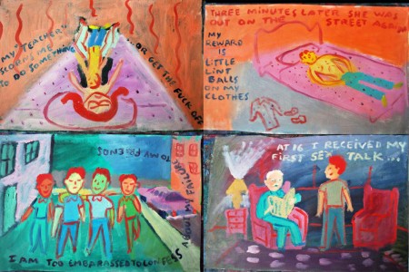
“Ex Vida” from Santiago Cohen – 1

- At a recent event, I was sitting with a couple of other artists and we bagan talking about Santiago Cohen. Here’s one of the greats on the New York scene, and it seems as though he went from super success to silence. We all were hoping something would happen, if only so that we could see more art.

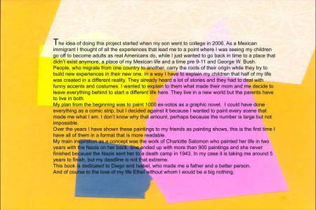
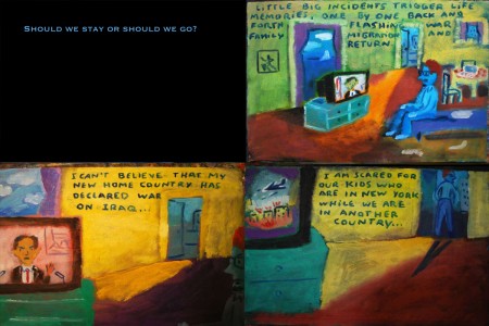
When I returned from my short vacation, I was surprised to find an email from Santiago. He offered to send me part of a piece he was working on to get my thoughts. It’s an illustrated biographical notebook. And, as expected it’s stunning. I received the first couple hundred pages, and I asked Santiago if I could post it. He said yes, so here we go.

It’s appropriate that this piece should start today, Columbus Day. It’ll continue for a while. I’ll break it into parts, all about 40 pages, where it seems unobtrusive. This is “Art” with a capital “A” in the making, from Santiago. It’d make an incredible film.

Let us know what you think.

1
(Click any image to enlarge.)

2

3

4

5

6

7

8

9

10

11

12

13

14

15

16

17

18

19

20

21

22

23

24

25

26

27

28

29

30

31

32

33

34

35

36

37

38

More next Monday.

.

Music &Photos &SpornFilms 10 Oct 2010 07:59 am

Jazzy Bones

The Amazing Bone was one of the earlier films I did with Weston Woods. It was an attempt to do Doctor DeSoto one better by taking a more famous book by Steig and adding some richer animation and a lot more attention. John Lithgow was hired to read the book. I flew to LA and back in the same day to get to the recording. (I could’ve done it by phone, but where’s the fun in that?)

We recorded at the old A&M studio. It was originally Charlie Chaplin’s studio and had ultimately come into the hands of Herb Alpert. I
was early; Lithgow was on time. Our recording engineer was named “Magic.” John read the part brilliantly with few needed retakes. He kept in character for all the voice changes as he read straight ahead. We finished early, and I had a great voice track. I remember exactly the tone of voice when he said goodbye to me, then to “Magic.” He voiced the quotation marks around Magic’s name. I could only smile.

It was a beautiful day, and I had a couple of hours to waste before I had to return my car. So I spent time driving; I love to drive. A lot of touring around Beverly Hills. I remember driving down one quiet street lined with palm trees, and suddenly I realized there was an old clunker of a car tailgating me. I couldn’t imagine what the hell was going on. Then I realized someone was shouting my name. I stopped.

It was Bill Moritz. He came out gave me a big hug; we chatted for a moment, and he went on his way. It was one of those perfect kind of days. I knew Bill because of his association with Elfriede Fishinger. We’d had dinner countless times in NY with John Canemaker and Joe Kennedy.

After a brief chat, Bill went on his way, and I continued my lovely afternoon heading back to the airport. It was one of those wonderful days.

The voice track was brilliant when finally edited together and the animation began. We decided to record the music early on in the process. I’d agreed verbally to use Steig’s son, Jeremy, to do the score. I had been a fan of his flute music and owned several of his albums.

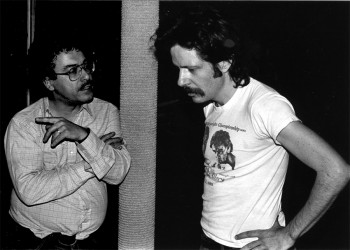
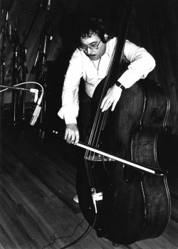
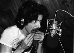
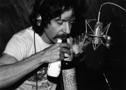
The score was performed completely by Jeremy Steig and the noted bass player Eddie Gomez.

As a fan of jazz, it was glorious for me to be working with Eddie Gomez, who had once been a member of the Bill Evans Trio. I lived and breathed through Bill Evans‘ music for a long time, and to have only one degree of separation was something I cherished for the short span of that Amazing Bone recording.

(click on any image to enlarge.)
Above:Eddie Gomez confers with Jeremy Steig about the score they’re composing & performing.

2 3
1. Eddie Gomez plays his bass.
2. Jeremy Steig plays pan pipes.
3. Jeremy Steig plays assorted bottles.

The score took about 7 hours to record and mix.

There were many breaks for Eddie and Jeremy to confer in the bathroom. It got to the point where the engineer/mixer asked them to please stay in the recording session because the breaks were taking longer than the session. They bristled at his comments, and I had to settle things down. However, the more the two went to the bathroom, the slower things got and the music took longer to record. I let things take their own course; the two knew what they had to do.

Regardless, I didn’t care what it took. I was in heaven experiencing the music. The two performers did a great job, and I loved every moment.


During a break Jeremy and I sat down to discuss the music so far. It was great.

All photos were taken by the producer, Paul Gagne. He’s become a long-time friend. I thought I remembered a photo of him with Jeremy, but I don’t have it.

When I did Abel’s Island, another William Steig book, I asked for Jeremy again. This time it turned into hell with Jeremy’s impossible demands late in the production, his new wife writing me foul-mouthed letters, and my having to fire them (although I did pay them in full) four days before the scheduled mix. I hired the talented Arthur Custer to do a score and he had those four days and half the budget Jeremy was paid. I became a full-fledged producer with that decision, and I’m ecstatic with how it ultimately turned out. Despite threats of legal action from William and Jeremy Steig. That was the last Steig book I was allowed to do.

Commentary 09 Oct 2010 08:00 am

Rambling, Rambling, Rambling

A lot of things seem to have happened in the past few weeks. I thought it time to just ramble about some of them.

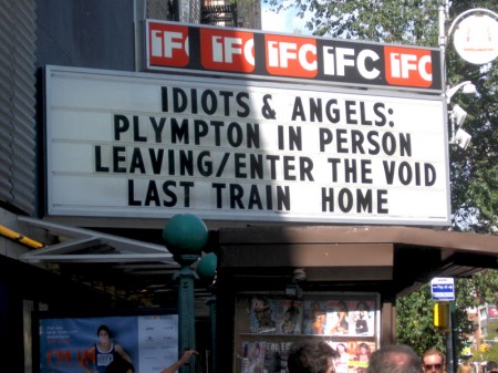
- Bill Plympton‘s feature, Idiots and Angels, has hit NY’s IFC Center like a storm. Bill seems to be attending quite a few of the screenings with Q&A’s added. News about the show is everywhere in NY. The film got glowing reviews from the NYTimes and the NYPost. No word from the NYDaily News (which didn’t review My Dog Tulip, either.)

Bill’s been working overtime promoting the movie. Since he’s self distributing the film, it takes real drive to get the attention he’s created. His is a lesson we can all learn from. It’s a small part of the job making the film; the largest part is selling it. Kudo’s to team Plympton for a job well done.

Bill’s film had an Academy screening this past Thursday in New York and will screen for the Academy in LA on Oct. 31st, Halloween night. It’s quite a coup, I think, to see that he’s gotten the film on their schedule to make sure members can see it. The Oscar push has already started (and Nikki Finke took note in her column.)

________________

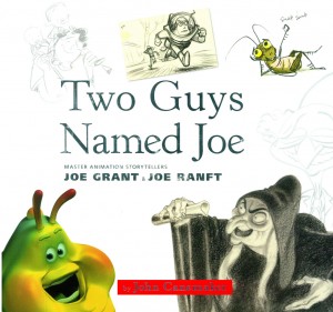
- Last week John Canemaker appeared at the Museum of Modern Art with a talk and book signing for his Two Guys Named Joe. The house was packed and the talk was light and informative. The power-point show was choc-a-block with great photos and artwork. Many of them didn’t appear in the book.

John has a way about these talks that just keep you interested and entertained. To get a good idea, he was on NPR’s Leonard Lopate show that same day as his MOMA talk. You can listen to it here.

Meanwhile, there are two articles by John posted on the Print Magazine website. One about the Disney Family Museum and a second about the Irish Animation scene. Both are enormously informative reads. The Irish article includes several embedded videos.

________________

- Darrell Van Citters has started a new blog dedicated to Mr. Magoo’s Christmas Carol. Take a look. He has pieces on some of the artists. An article about designer Bob Inman is particularly informative as is another about Phil Norman. This is fast becoming a must-view blog.

You’ll remember that Darrell has written one of last year’s best books, called The Making of Mr. Magoo’s Christmas Carol. I’ve read the book three times already and suggest you all buy a copy.

________________

- While away on Vacation, I missed John Dilworth‘s talk at the 92nd Street Y (downtown). The ASIFA East blog covers this event well and I suggest you all turn there to read a report on the event. Sounds like it was fun, as I expected it might have been.

________________

- I’d been entertaining the idea of travelling down to Washington D.C. to attend the rally which John Stewart is gathering. It’s sort of an anti-Glenn Beck rally. Arianna Huffington is supplying free buses from NY to D.C. and back. It makes it just too damn attractive. But I’ll have just returned that week from a trip to Ottawa, and I’ll be feeling my age if I do go down to Washington.

I’ll have to miss it.

By the way, I believe the Festival in Ottawa has given me a hotel room where I’ll have access to the Internet. This means I’ll be able to add updates to my regular blog posts, even during the Festival. I did this the last time I was up there, and it worked out well.

________________

- I’ve gotten a lot of flack in NY recently for comments I’ve posted about the Dash Shaw trailer posted on Cartoon Brew. Too bad. I didn’t like what I saw and I commented. We’re accepting too much crap these days, and animation as a medium is taking a bad hit for it. Some of us have to start saying that the Emperor isn’t wearing any clothes; oh, and he’s also not an Emperor. It’s just my opinion, and you, certainly, can think I’m wrong. He does have one of NY’s greats working for him – Biljana Labovic. If anyone will make the film worth seeing, it will be she. Her work on Bill Plympton’s films went unsung for too long, and she finally got a co-producer credit on Idiots and Angels. I think highly of her opinion, and she must like the work or she wouldn’t be there. So maybe it’s my age or my ego somehow out of whack, but I’ll stick with my opinion until I see something that changes my mind.

However, for those who do like his work, Dash Shaw will lecture at SVA on Nov. 4th. Here’s a press release for this event:

    Thursday, November 4, 7pm
    SVA Theatre
    333 West 23 Street

    The New York Times has called artist and SVA alumnus Dash Shaw (BFA 2005 Illustration) “a hard-core experimentalist” and “a hell of an artist, constructing vivid, uncanny compositions with a spectacular sense of color and space.” With the publication of Bottomless Belly Button (Fantagraphics, 2008) and BodyWorld (Pantheon, 2010), Shaw has quickly established himself as a leader among today’s graphic novelists. The animator and director of IFC’s The Unclothed Man in the 35th Century A.D., Shaw is currently working on the animated feature The Ruined Cast. The event is free and open to the public and presented by the The Alumni Society of School of Visual Arts.

________________

- I still roil over the young death of Japanese director, Satoshi Kon. He was a brilliant animation artist who deserved greater attention. International success seemed to be just starting to touch his films, when he died. I’m glad I had the opportunity of interviewing him several months before his death. (I wrote about it here.)

His film Paprika will play at the Gotham Screen International Film Festival, on Oct. 13th at the Tribeca Film Theater, 54 Varick Street (just off 6th Ave, south of Houston). Tickets are $8 – $10.

________________

- Today’s NYTimes reviews the new DVD release from WB: Essential Bugs Bunny Collection. It’s a 2 disc set with one disc containing not very essential material or shorts. The reviewer for the Times ends with this paragraph:

    Better that you explore the several volumes in the “Looney Tunes Golden Collection,” also from Warner Home Video. Here you will find all these and more, including “What’s Up, Doc?,” a semi-autobiographical cartoon from 1950 that is not in this “essential” collection, yet is essential to any understanding of the artist. Among other insights, it includes an epiphany by Mr. Bunny that rings so true I just can’t get it out of my head: “I was a rabbit in a human woild.”

Animation Artifacts &Bill Peckmann &Books &Disney &Illustration &Models 08 Oct 2010 08:26 am

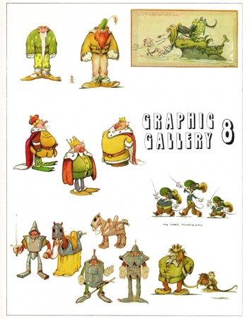
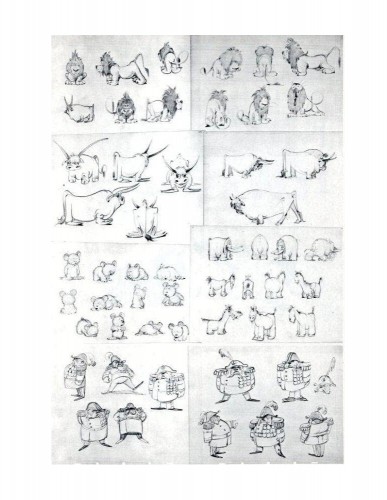
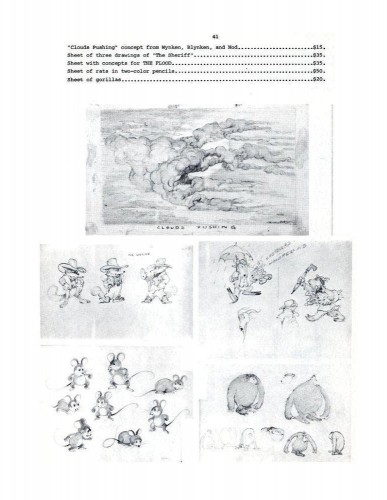
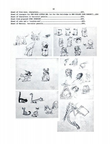
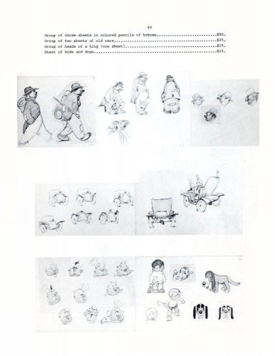
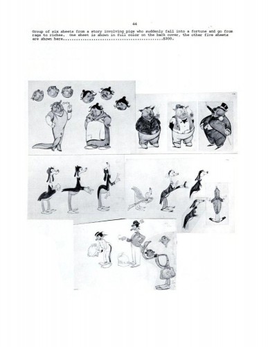
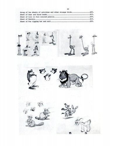
Hovarth – 3

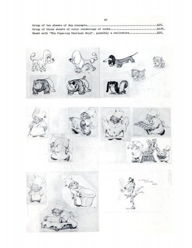
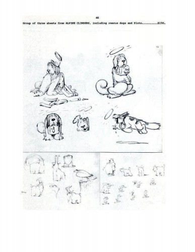
Ferdinand Hovarth was a versatile artist whose work was an inspiration for many Disney artists. He was a mainstay at the Disney studio from 1934-37. He was one of those artists brought in from Europe to draw inspirational art for the other designers and animators. Gustaf Tenggren and Albert Hurter also fell into this category. All three contributed mightily to the product the studio produced – particularly Snow White and Pinocchio. I can only think of Joe Grant as being the modern equivalent, for a short period.

This is the final installment of a catalogue published by Graphis Gallery and put together by Bruce Hamilton. The opening material explains itself.

The following booklet was
Bill Peckmann sent me scans of these pages, and I thank him for keeping Hovarth alive.

40

41

42

43

44

45

46

47

Books &Models &Story & Storyboards 07 Oct 2010 07:41 am

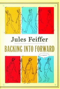
Backing Forward

- I’m currently reading an excellent book; it’s Jules Feiffer‘s autobiography, Backing Into Forward. The book not only serves as Feiffer’s life story, it’s also a treatise on art, cartooning and illustration. The man’s led an extraordinary, artistic life from drawing his weekly strip in the Village Voice to writing plays and movies with the likes of Mike Nichols, Stephen Sondheim and other notables and actors.

I’ve had the pleasure of working with Mr. Feiffer on several occasions, and I can attest that he’s as distinguished and constant an artist as I’ve met. I’ve also had the chance to interview him publicly about the Oscar for Munro (which he didn’t receive – William Snyder did) as well as his long working relationship with Gene Deitch. Mr. Feiffer is an erudite man, and it comes across in this autobiography.

The post that appeared yesterday on the ASIFA Hollywood Archive blog made me think about this short section of the Feiffer book, three pages which call to mind his short history at Terrytoons. The story is interesting, one which I closely relate to. Here is that story in Feiffer’s own words:


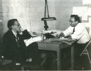
Eli Bauer (R) and Jules Feiffer (L) at Terrytoons.

    (R.O.) Blechman drew like no one else, in captivating minimalist squiggles that Deitch presented stunningly on a panoramic movie screen. A couple of days a week, Blechman and I found ourselves sitting next to each other on a wrong-way rush hour commute to New Rochelle. We would sound each other out on the business, whom we liked, whom we didn’t like, what we were going to be when we grew up. A modest man of considerable sweetness, it was surprising to find that Blechman was as dismissive as I was of the outdated but amiable hacks we had been shipped in to replace, a company of aging boys, midfifty to seventy, who were unembarrassed by and even took pleasure in their mediocrity. They could pushpin seventy-five to a hundred layouts on wall-length corkboard that showed cats and mice and ducks and pigs and elephants wreaking cartoon havoc on one another. Then, following the age-old tradition of storyboard conferences, they would mortifyingly act out in funny voices before sponsors, network honchos, and account executives what was plainly visible to anyone who could read.

    A man of fifty had to bark like a dog, a man of sixty had to flap his hands and quack like a duck, a man on the verge of retirement had to jump up and down in mock excitement. All this to convey to clients what was assumed they couldn’t understand without the assistance of stand-up interpreters.

    And as it must to all men with an attitude, one day it came to be my turn to humiliate myself. Gene Deitch had brought me into Terrytoons in part to design a three-minute animated story to run several mornings a week on Captain Kangaroo, CBS’s star morning children’s program. Deitch’s own creation for Captain Kangaroo, a popular series called Tom Terrific, was about to run its course. On the basis of my early Voice strips and Clifford, which Deitch remembered from the back page of the Spirit section, he thought I could design a sophisticated cartoon for lads in a UFA mode.

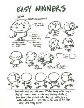
    I went back to my Clifford roots and created a cartoon about a gang of street kids that I called Easy Winners. The title was derived from a Scott Joplin rag I happened to hear late one night on the radio. I put together a model sheet of characters and wrote and laid out a couple of episodes, one of which I pushpinned to the wall. The reaction was more than I could have hoped for. Everyone at Terrytoons loved it. The new guard loved it; the old guard claimed to love it, but it was hard to tell what they really thought, other than that they wished we would all go away.

    Deitch was more enthusiastic than anyone, which was not a surprise. He was happiest working at fever pitch, his energy hyped into overdrive to convince the client, through sheer exuberance, that whatever doubts he might have about the work on the wall, it was potentially a classic. Gene loved my storyboard and he anticipated the excitement of the CBS executive (on his way at this very moment) who would shortly look at and decide the fate of Easy Winners. My role was to do no more than thousands of hacks before me: stand and perform the storyboard before Gene and a claque of animators and layout men, along with Bill Weiss, the president of Terrytoons.

    The man from CBS arrived and my heart sank. He was a tall, silver-haired, mustachioed gentleman dressed in a three-piece pinstripe who, in dress and manner, made the rest of us in the room look inconsequential His name was Williamson, as English-sounding as his look. He outclassed us all, but Gene failed to notice. “You’re going to love this!” he squealed in his high-pitched salesman’s voice. One look at our distinguished visitor told me he was unlikely to love anything pushpinned to a wall in New Rochelle.

    I had been through many of these storyboard sessions. I was upon the routine, but that didn’t mean I was up for the job. I was years away from public speaking, deep into shyness and self-effacement. Still, I did my best to sound like the quacking, barking, oinking animators I’d seen do this many times, pumping myself up to imitate a gang of five-year-olds from the Bronx. A minute and a half in, my humiliation was intense, and what was worse, it wasn’t getting me anywhere.

    Behind me, Deitch and my claque had been laughing hystericalh until it became clear that the unsmiling Mr. Williamson was perhaps having himself a snooze. My approach shifted from manic to wistful. The claque’s laughter dwindled and died, leaving only my own strangled half laugh, half gasp.

    Each time I turned from my storyboard, I noticed the room was a little emptier. My claque had decided that Mr. Williamson’s side was a better one to be on than mine. They had made the only sensible choice: I didn’t want to know me either.

    By the time I limped to the end, only Bill Weiss, the president, and Gene, the head of the studio, remained, plus a goofily grinning threesome of loyal friends.

    It was time for me to shut up and wait for Mr. Williamson’s decision on Easy Winners. His way of presenting it stays fresh in my mind fifty years later. After an uncomfortably long pause, he said, “Well, it’s a little New Yorker-ish.” Dead!

    He had one final comment: “I mean, it’s closer to Dostoyevsky than it is to Peter Pan.”

    As I headed home from New Rochelle that night, rage alternated with my sense of reawakened abandonment. Where had Deitch been when the time came to fight for me? I knew I had no call to be angry. Easy Winners was a loser. I gave them exactly what they wanted, but the they I gave it to was the wrong they.

    I knew I was finished at Terrytoons, this studio where I had actually enjoyed a nine-to-five job for my one and only time since leaving the army. But it was no longer a place where my pride would allow me to work, a place where I could do quality work that also had commercial value. Seemingly, such a place did not exist.

In all the years I’ve presented storyboards, I’ve never done the song and dance required in animation studios. I’ve always trusted the material to out itself. This, perhaps, is a lesson I got while watching John Hubley pitch a storyboard, early on in my career. No quacking ducks, barking dogs or anything resembling the pitch meeting described here.

Thank you, Jules Feiffer, for leading the way and allowing me to feel less embarrassed about it.

Animation &Animation Artifacts &Hubley &Independent Animation 06 Oct 2010 07:45 am

Littlejohn’s Snake – 2

- As I wrote last week, I feel that Bill Littlejohn, was one of THE GREAT animators. I worked on many of the scenes that he animated for John Hubley. At first, I was inking his work (and I always did it with the exposure sheets right in front of me so I could see how he was animating.) Then I had to assist some small bits of his animation.

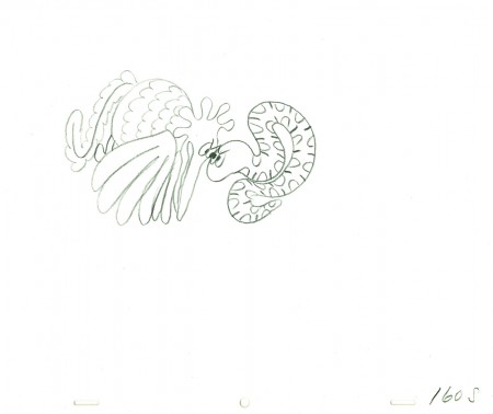
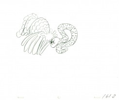
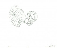
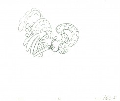
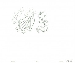
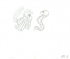
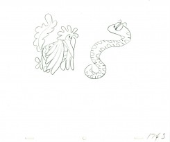
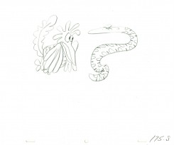
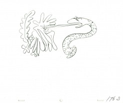
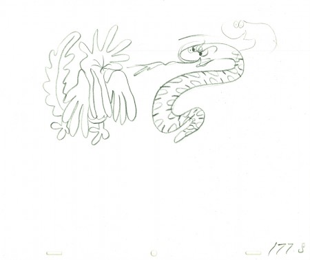
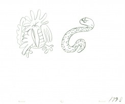
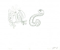
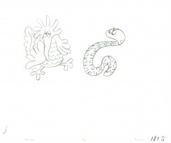
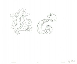
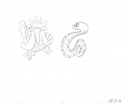
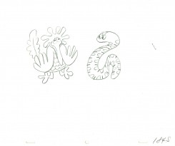
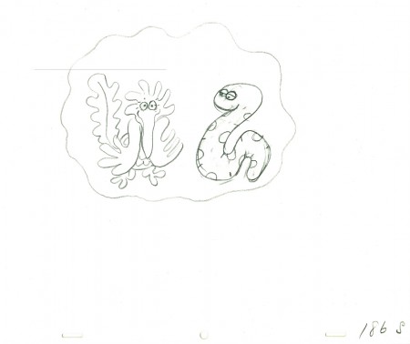
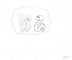
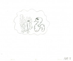
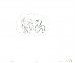
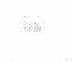
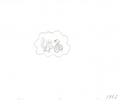
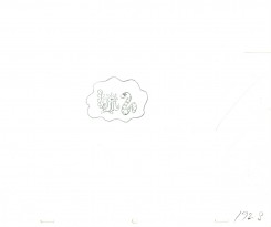
After learning of Bill’s death, last week, I immediately went searching for a scene I could post. This one, from Hubley’s Everybody Rides the Carousel, is not a great scene, but it’s typical of Bill’s work. A beautiful free-flowing style, the scene showcases the almost calligraphic style Bill used for Hubley. The animation drawings just flowed out of his pencil.

The scene represents the animal figures that constantly fight in the heads of the characters. For this stage there was a snake and a phoenix; one representing positive, the other representing negative.

We start with the last drawing from last week’s blog post.

160

6162

6372

7374

7576

177

7879

8081

8283

8485

186

8788

8990

9192

9394

9596

______________________

The following QT movie represents the drawings above
from Bill Littlejohn.
I don’t have the X-Sheets, so I exposed on two’s
except where there were gaps in the numbers.
There I treated part of it as a cycle – which is what it was.

I suspect the scene actually was exposed to last longer
using three’s and a couple of very short holds.

Click left side of the black bar to play.
Right side to watch single frame.

Animation &Commentary &Independent Animation 05 Oct 2010 07:28 am

Idiots & Angels – 3 reviews

- Tomorrow, Oct. 6th, Bill Plympton’s most recent feature, Idiots and Angels opens officially in New York. The IFC Center will screen the film for a limited run. However, if people turn out that could be extended. Bill needs your support; take the family and see the film.

As we did with Paul & Sandra Fierlinger‘s film, My Dog Tulip, we’re posting three short reviews of Idiots and Angels. These are by the three animators in my studio, Matthew Clinton, Katrina Gregorius, and me. In doing that, the hope is that we’d have a wider scope in the review and one that would focus on the craft of the animation. We all agreed that we had problems with the film, yet I’m not sure whether we got that point across in the reviews. You’ll have to decide.

Review by
Katrina Gregorius
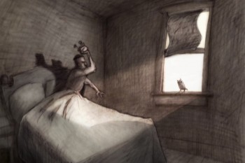
Bill Plympton’s latest feature Idiots & Angels has taken me through a journey within myself in the same way the main character is transformed within the film.

Idiots & Angels is about a guy who is inherently angry and is a jerk to everyone around him. One day, he mysteriously starts to grow wings that eventually try to prevent him from doing any harmful deeds. The rest of the film explore his reaction as well as other character’s reaction to these wings.

Initially I am left without a lot of positive feelings about the film regarding character and story development, but a closer look reveals a film that is an in-depth study of human nature. What I originally thought of as a lack in character development is actually a disturbingly accurate and genuine portrayal of human nature.

Bill Plympton uses color to create the perfect mood for the film. He also creates some playful transitions that are really fun to watch.

____________________

Review by
Matthew Clinton

Idiots & Angels is mysterious right from the start. It’s almost like you’ve landed on one of the dark planets in “A Wrinkle in Time“, where you don’t know who is controlling things or what the truth is. You can feel that things are off, and it’s unsettling. Angel, a devious man who kind of just blends in, wakes up and heads off to his favorite bar. The city is busy with cars and Angel’s awful ways become clear when he blows up a similar suit-wearer who has taken his parking space. He lights the car’s gas tank on fire. Strangely, the city seems totally empty of people – nobody is there to notice the horrific crime, and it is daylight. Maybe nobody is allowed to see? Angel walks into the bar and doesn’t give the murder a second thought.
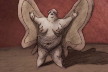
The bar is the center of this decrepit planet. It gives power to the few poor souls who haunt the place: a suit-wearing barkeeper, his barmaid wife, a large card-playing lady, and Angel himself. It’s a motley group. The barmaid shines among the rest of the creepy cast and even manages to penetrate all the septic cigarette smoke and noir shadows. The animation of this character is very nice too. She loves to dance with her broom, and those light scenes are quite necessary to relieve the stifling atmosphere. Of course Angel has to attack her.

The next morning Angel wakes up to discover that small, feathery wings have grown out of his back. He cuts them off with a razor blade, spraying blood everywhere. However, with boney remnants still lodged in his back, I wonder why he didn’t see a doctor at this point – the very first time it happens. (Eventually he does see a doctor…) But he heads back to the bar. Soon he is consumed by hallucinations of birds and wings, a motif that is used cleverly throughout the film.
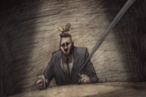
The wings grow back, and will not be stopped. Soon the film becomes a battle to control the wings. The wings want to be an angel, and Angel want to be an idiot. This idea is very full of possibilities, and it’s a good one. There are some stylish scenes that explore that. It becomes increasingly outlandish, though, as the barkeeper and the insane doctor lust after the power of the wings. It gets very crazy now – is it really happening or is it a metaphor? The drastic motives are hard to understand. I guess anything goes in their world, where being a monster is normal. It all makes you want to turn the light on.

____________________

Review by
Michael Sporn
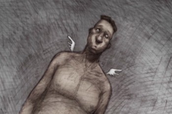
Idiots and Angels is Bill Plympton‘s sixth animated feature. Fifth if you don’t count the one that’s made up of a shorts collection. Still, it’s amazing that an individual can so doggedly, and singlehandedly turn out so much work with with so little. Of course, he doesn’t do it alone – ask all the interns -, but still the animation is his. And we’re talking about films longer than 90 minutes apiece!

At first these features were done by hand on cel with an animation camera, yet none of the features cost more than $500,000. Today computer assistance makes it a mite easier, but not much. There are some secrets here that would be valuable to learn. There’s also a lot of respect that we have to give someone who pulls this feat off.

I’ve seen all of the films, and Idiots and Angels is, by far, my favorite. The story attempts something intelligent, and the graphics are far-and-away my favorite of all the films. It’s still not 100% for me, but it’s getting closer.
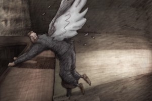
The film, for the first 2/3 of the way, follows a character who is unlikable. (This seems to be something Bill likes to do, have an insufferable protagonist.) Somehow he is gifted with a pair of wings. Every time the character does something nasty, the wings force him to correct the situation and be courteous to his neighbor. Needless to say, there’s an inner-struggle going on. Our hero does everything he can to remove the wings – cutting them off, going to a doctor to have them removed, having others pluck them from his back. The wings don’t go away very easily. Our hero dies at the 2/3 point in the film, and a bartender and dermatologist take center screen – each trying to exploit the wings for themselves.

This is the part of the film where I faded out. The story went off course, and I had a hard time following things. I would have preferred a more developed story about the hero – with a possible character development for him. But instead, he was killed-off and two other greedy folks took center stage.

The graphics, as I said, are, to my mind, the best we’ve seen from the Plymptoon factory. There’s an Eastern European feel to the limited colors and the use of dark grays and umbers employed in most of the coloring. The graphite feel is part and parcel of the Plympton style, and it’s used strongly in Idiots and Angels. In this film. there’s strong control of the textures, and I was pleased to see that. It took some hard work and loving care to pull off.
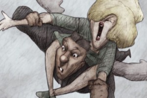
Anyone who makes a feature film with such a small crew and with his own finances, deserves my attention. I think he also deserves your attention. Bill is what I consider a natural animator. He hasn’t studiously studied the work of the masters, yet he seems to have absorbed all of the rules just by watching. Right from his first film, he had it down. I wish that he’d use a few more inbetweens at times, but I can’t argue with the extremes. I also wish so much of it weren’t on Fours – but then this is what passes for full animation these days. Budgets are the excuse, but sometimes I wonder if it doesn’t go deeper.

Saying all that, Bill’s a self-made master of the medium. I doubt he had to study Preston Blair or Frank Thomas; he just got it. See the film at the IFC Center (starting tomorrow, Oct. 6th in New York) and support it.

Idiots and Angels opens at the Laemmle Sunset 5 Theater in LA on October 29. Bill will make appearances at the opening night screenings.

While in LA ASIFA-Hollywood will present “Tom Sito’s Evening with Bill Plympton” on Oct. 27 at Woodbury College. He will also do a signings at Amoeba in Hollywood on Oct. 28, 8 pm, and at Dark Delicacies Bookstore in Burbank on October 31, 2-4 pm.
Books &Disney &Illustration &Layout & Design 04 Oct 2010 07:11 am

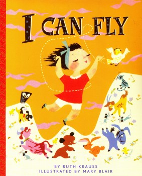
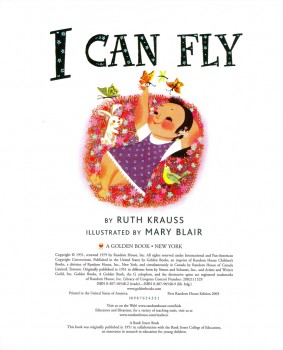
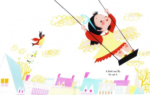
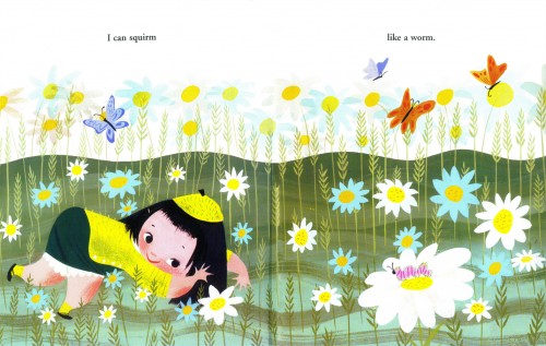
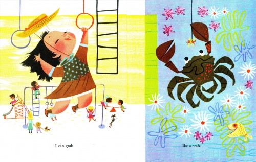
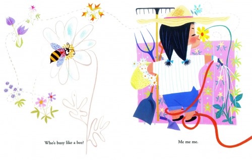
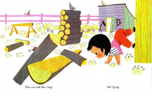
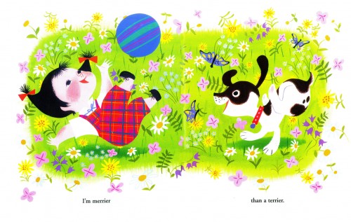
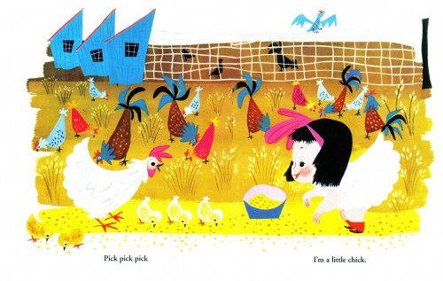
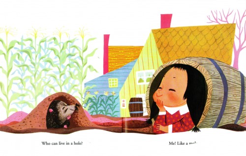
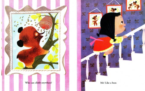
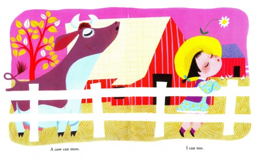
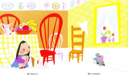
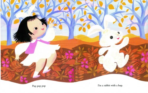
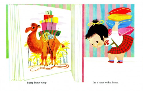
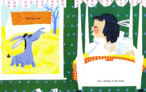
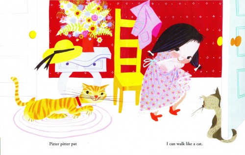
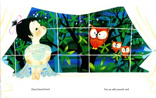
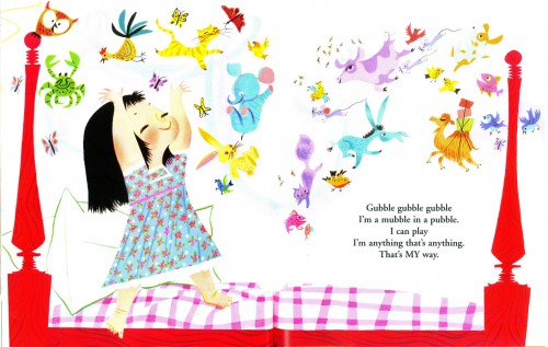
I Can Fly

- I had intended to give a rest to Mary Blair‘s incredible work after having posted so many recent pieces by her. However, I just bought a copy of her first children’s book, after separating from the Disney studio.

I Can Fly is extraordinary. After getting a copy in my hands, I realized I had to share it – even though it’s out there in numerous ways. So that’s what today’s post is about. This is Mary Blair’s book, I Can Fly. Words are by Ruth Kraus.


(Click any image to enlarge.)


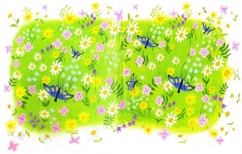
The inner covers.

1
The title page.

2
All of these are double page spreads.

3

4

5

6

7

8
Note that this is identical to the inner covers (above)
with the addition of the child and puppy overlay.

9

10

11

12

13

14

15

16

17

18

19

20

21


The back cover

Animation &Independent Animation &SpornFilms 03 Oct 2010 08:00 am

PhotoSunday Recap – Woman of the Year

- Back in Jan 2007, I posted these photos from the animation production of Woman of the Year. I think these are interesting enough that they’re worth revisiting. So here, again, is that post:

___________________

– To recap:
Woman of the Year was a project that came to me in the very start of my studio’s life – 1981.
Tony Walton, the enormously talented and fine designer, had gone to Richard Williams in search of a potential animator for WOTY (as we got to call the name of the show.) Dick recommended me. But before doing WOTY, there were some title segments needed for Prince of the City, a Sidney Lumet film. (I’ll discuss that film work some other day.)
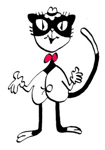
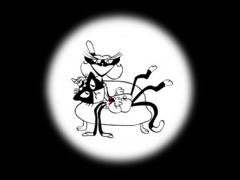
Tony Walton designed the character, Katz, which would be the alter-ego of the show’s cartoonist hero, played by Harry Guardino. Through Katz, we’d learn about the problems of a relationship with a media star, played by Lauren Bacall.
It turned out to be a very intense production. Three minutes of animation turned into twelve as each segment was more successful than the last. ___________(All images enlarge by clicking.)
There was no time for pencil tests. I had to run
to Boston weekly, where the show was in try-outs, to project different segments; these went into the show that night – usually Wednesdays. I’d rush to the lab to get the dailies, speed to the editor, Sy Fried, to synch them up to a click track that was pre-recorded, then race to the airport to fly to the show for my first screening. Any animation blips would have to be corrected on Thursdays.

There was a small crew working out of a tiny east 32nd Street apartment. This was Dick Williams’ apartment in NY. He was rarely here, and when he did stay in NY, he didn’t stay at the apartment. He asked me to use it as my studio and to make sure the rent was paid on time and the mail was collected. Since we had to work crazy hours, it was a surprise one Saturday morning to find that I’d awakened elderly Jazz great, Max Kaminsky, who Dick had also loaned the apartment. Embarrassed, I ultimately moved to a larger studio – my own – shortly thereafter.

Here are a couple of photos of some of us working:


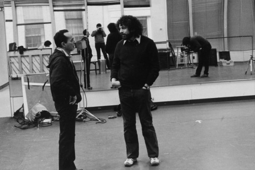
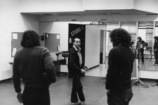
Tony Charmoli was the show’s choreographer. He worked with me in plotting out the big dance number – a duet between Harry Guardino and our cartoon character. I think this is the only time on Broadway that a cartoon character spoke and sang with a live actor on stage. John Canemaker is taking this photograph and Phillip Schopper is setting up the 16mm camera.


Here Tony Charmoli shows us how to do a dance step. Phillip Schopper, who is filming Tony, figures out how to set up his camera. We used Tony’s dancing as reference, but our animation moves were too broad for anyone to have thought they might have been rotoscoped.


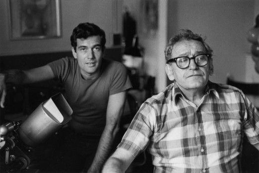
John Canemaker is working with Sy Fried, our editor. John did principal animation with me on the big number. Here they’re working with the click track and the live footage of Tony Charmoli to plot out the moves.


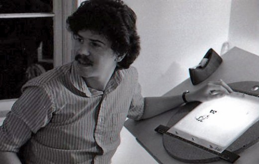
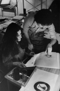
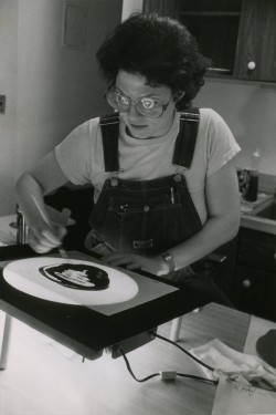
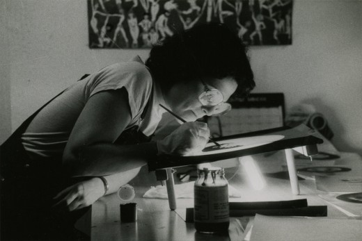
Steve Parton supervised the ink and paint. To get the sharpest lines, we inked on cels and didn’t color the drawings. It was B&W with a bright red bowtie. A spotlight matte over the character, bottom-lit on camera by Gary Becker.

5 6
5. Steve Parton works with painter Barbara Samuels
6. Joey Epstein paints with fire in her eyes.


Joey Epstein paints “Katz.”

8 9
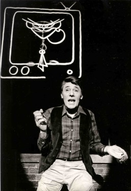
8. Harry Guardino on stage with the creation of “Tessie Kat” developing on screen behind him. This was Harry’s first big solo.
9. John Canemaker gets to see some of his animation with Sy Fried, editor.


One of my quick stops from the lab on the way to Boston? No, I think this is a posed photo.

The success of the animation (including good reviews) posed a small problem for me. The rest of the show was ripped over the coals. When I started using some quotes about me in industrial ads, the producers came down on me for gloating over the others who’d gotten negative reviews.

All the same, it was a real learning experience in a big Broadway kinda way.

« Previous PageNext Page »

eXTReMe Tracker
click for free hit counter

hit counter