Art Art &Illustration 01 Nov 2010 07:02 am

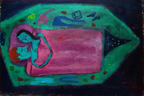
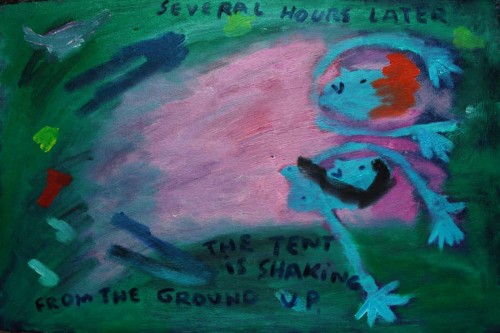
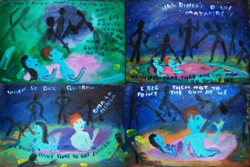
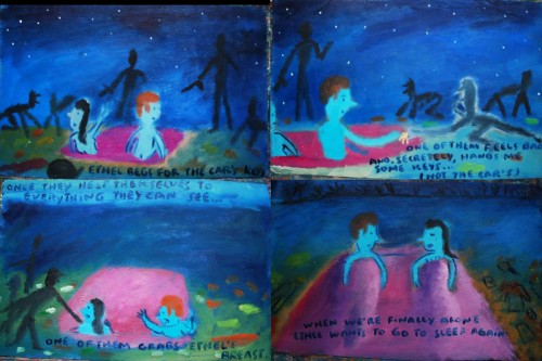
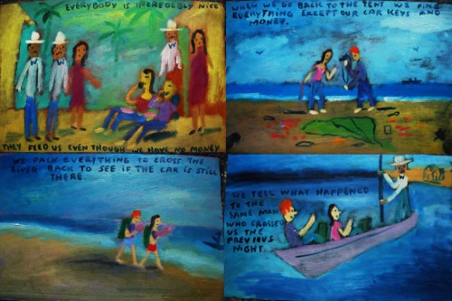
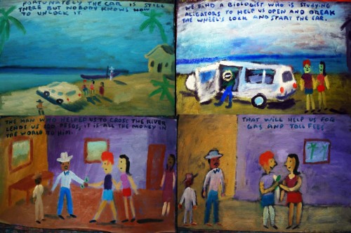
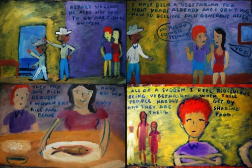
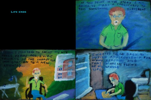
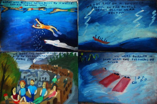
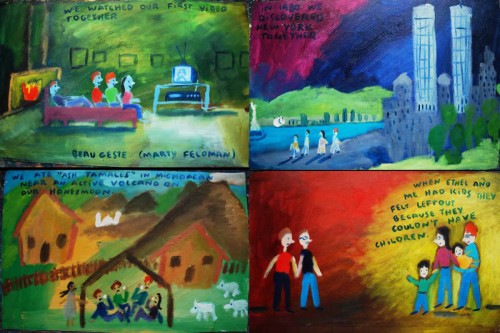
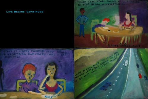
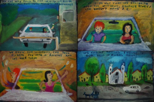
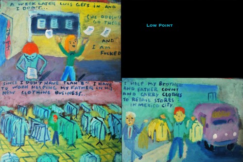
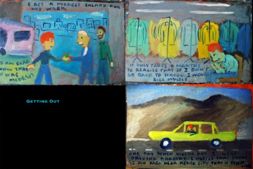
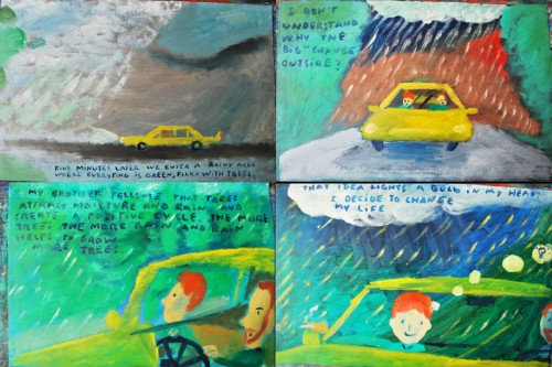
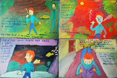
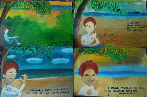
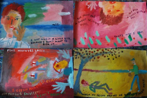
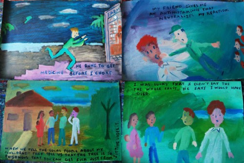
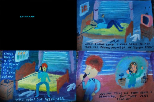
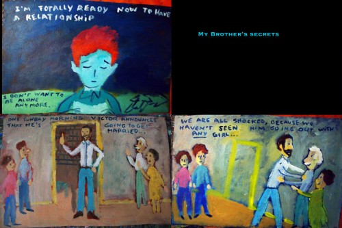
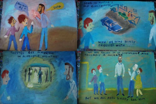
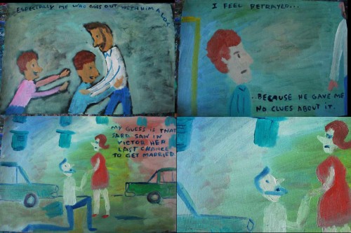
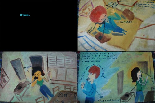
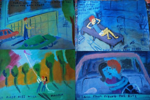
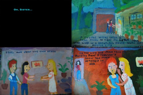
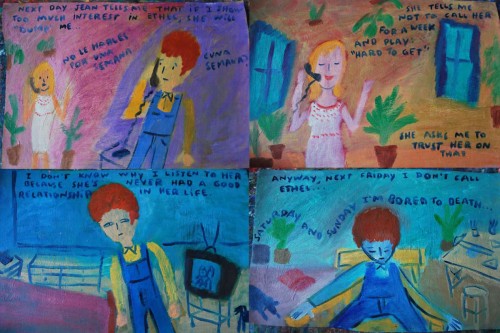
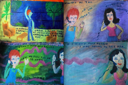
“Ex Vida” from Santiago Cohen – 4

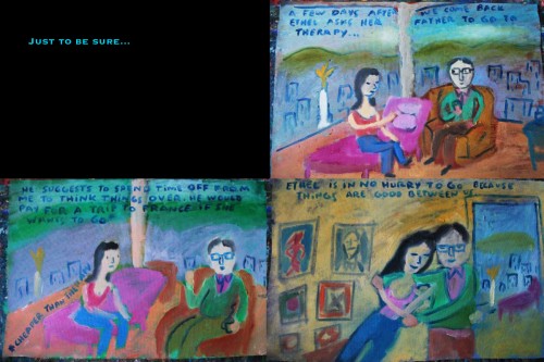
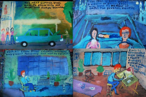
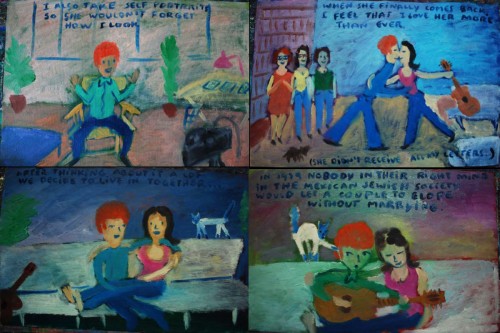
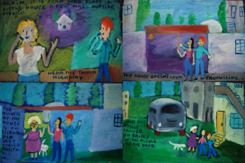
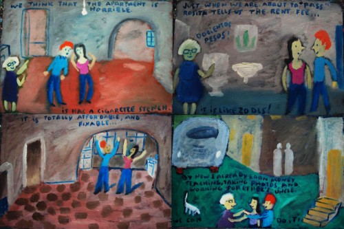
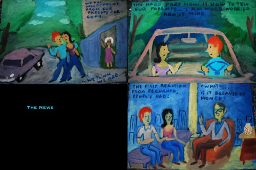
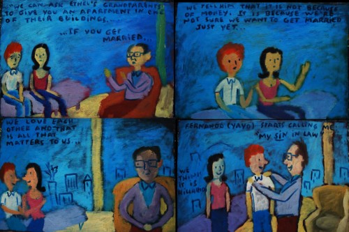
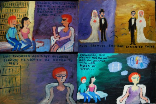
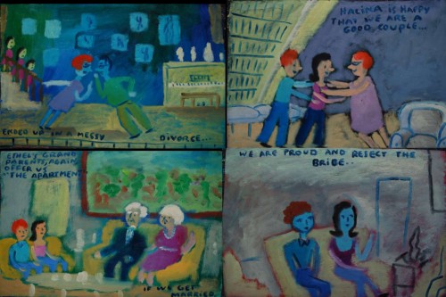
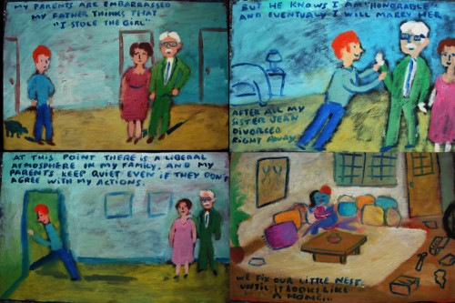
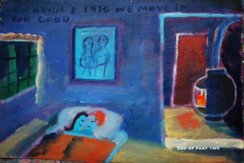
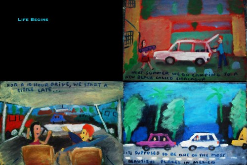
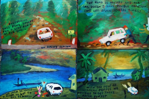
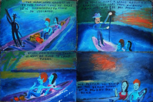
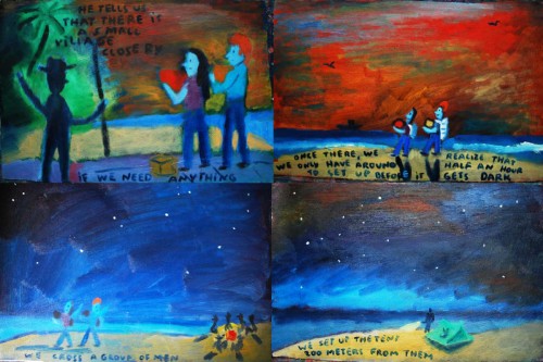
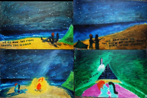
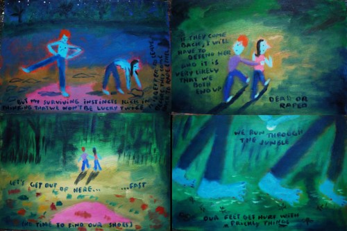
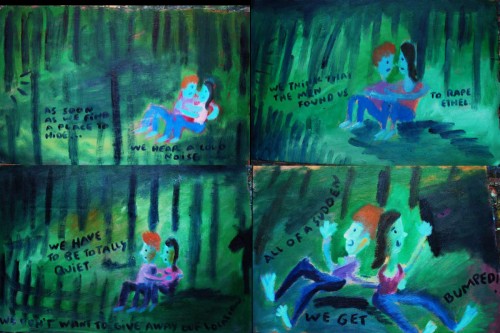
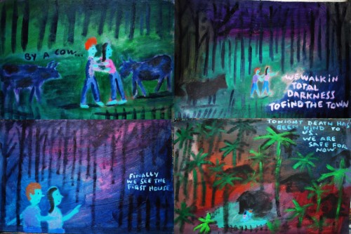
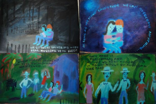
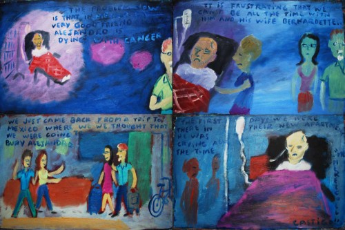
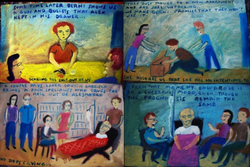
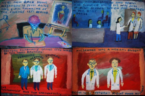
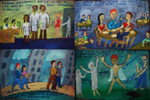
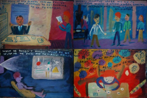
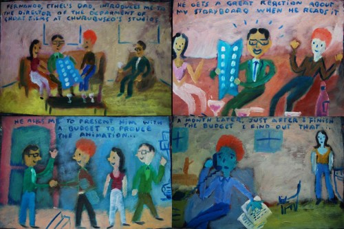
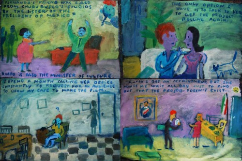
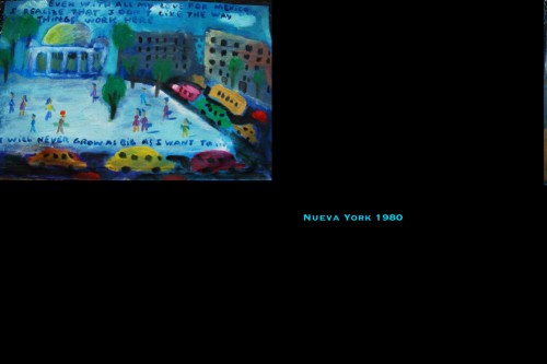
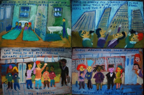
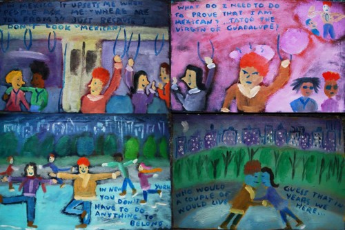
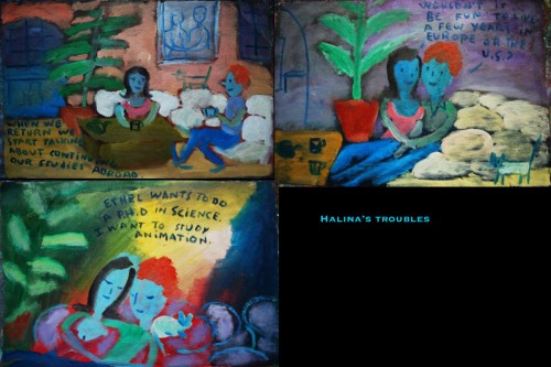
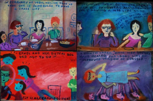
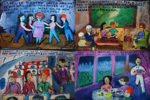
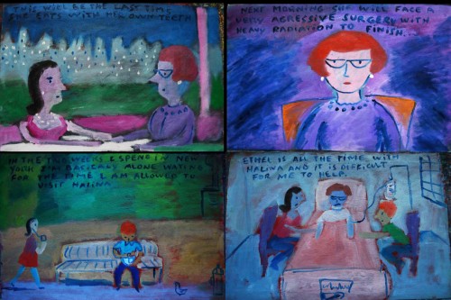
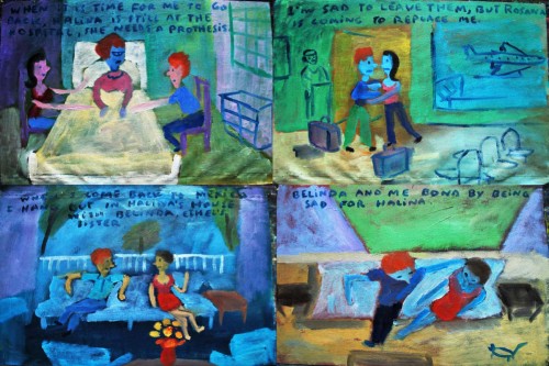
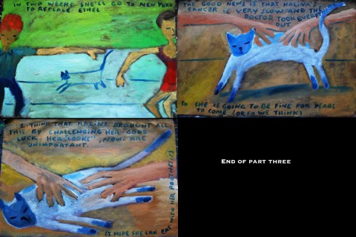
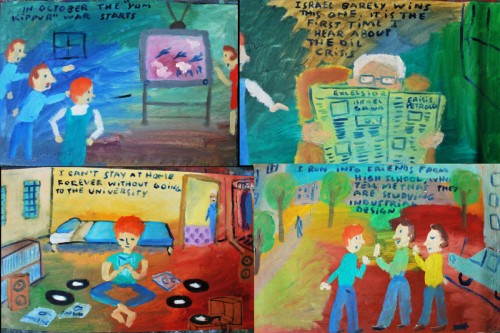
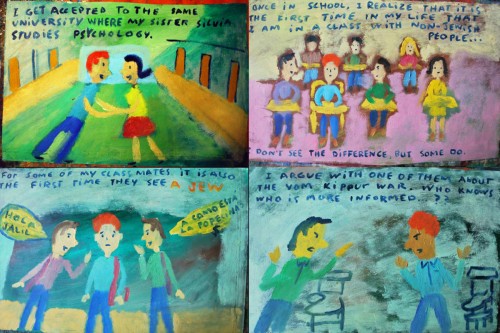
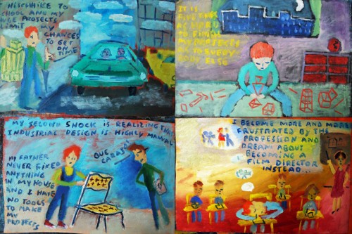
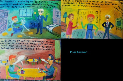
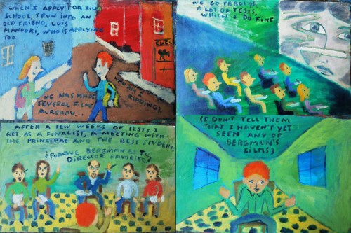
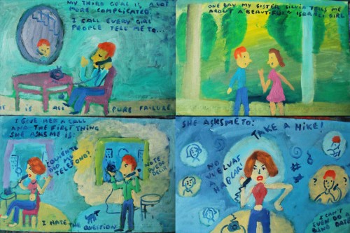
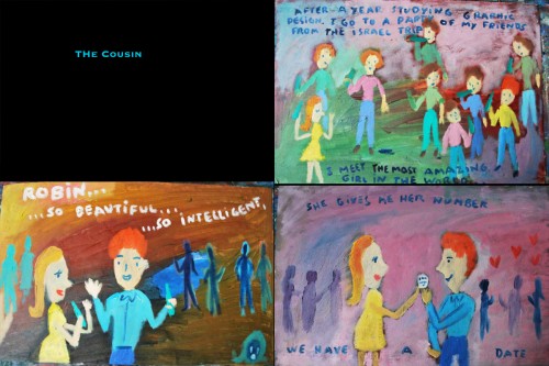
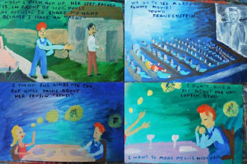
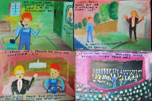
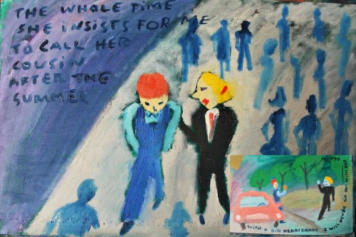
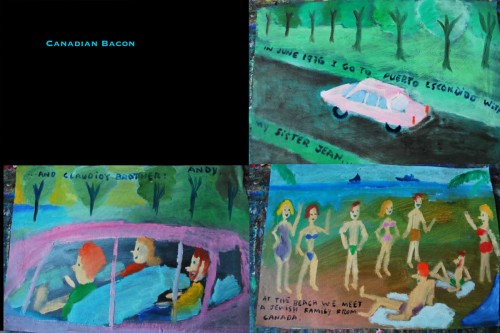
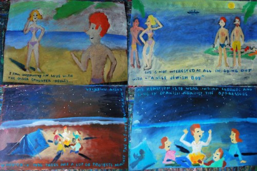
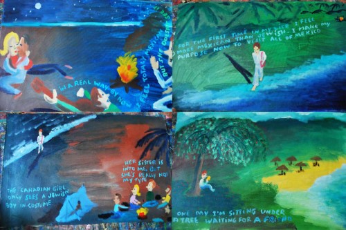
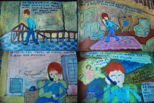
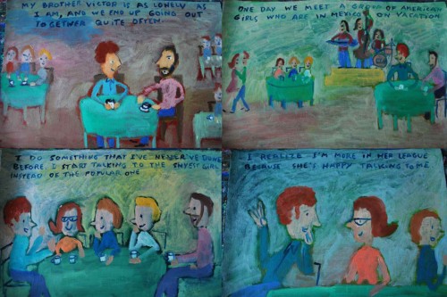
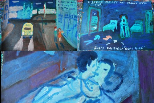
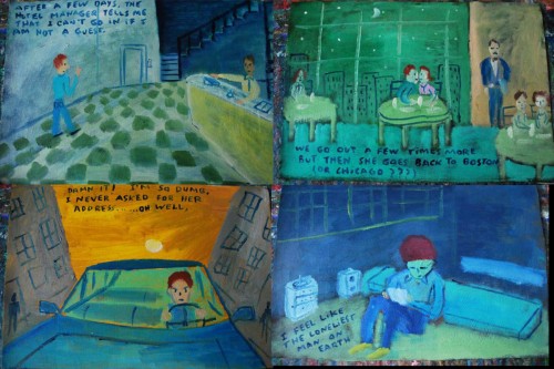
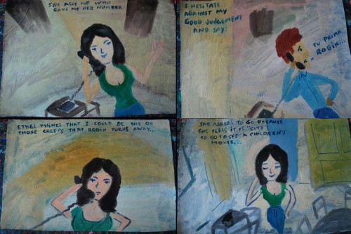
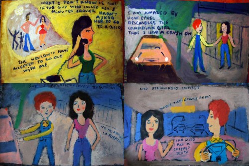
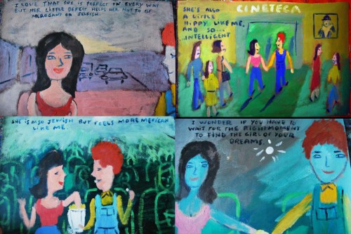
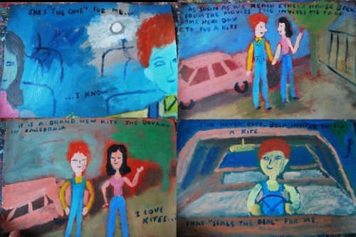
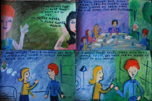
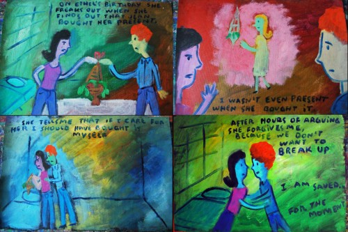
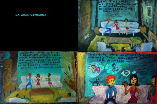
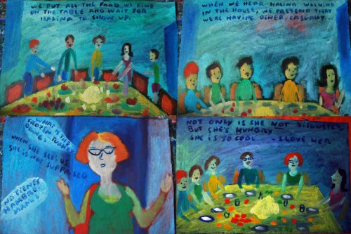
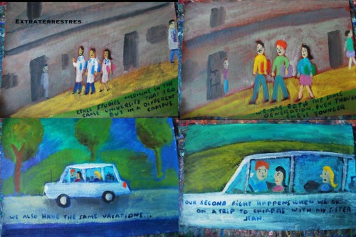
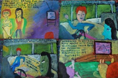
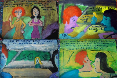
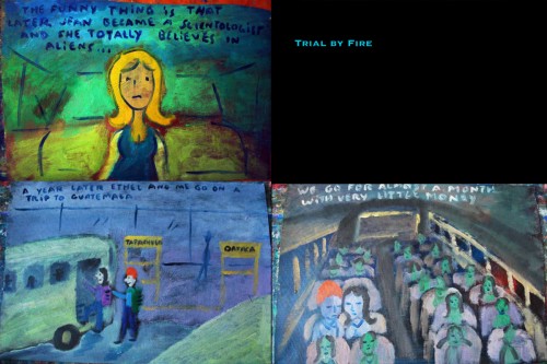
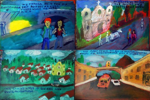
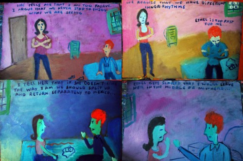
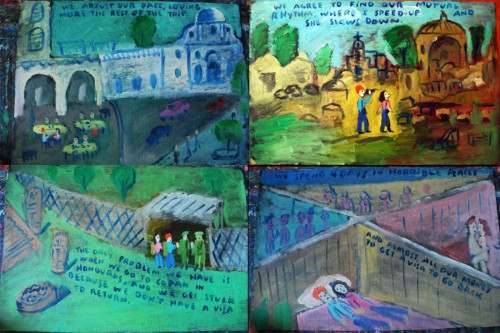
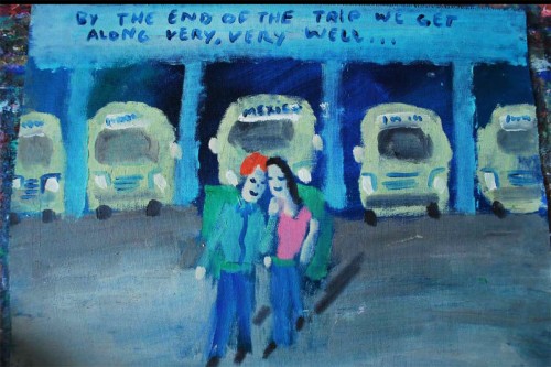
- Santiago Cohen has created a beautiful, autobiographical epic artwork for us all to share. We’ve seen the first three parts and continue onward, today, to Part 4.

To see prior parts of this post:
Part 1, Part 2, Part 3

I encourage you to take your time with it and enlarge the images. They’re all little gems that sparkle with and against the story.

___________________

1
(Click any image to enlarge.)

139

140

141

142

143

144

145

146

147

148

149

150

151

152

153

154

155

156

157

158

159

160

161

162

163

164

165

166

167

168

169

170

171

172

173

174

175

176

177

178

179

180

181

182

183

184

185

186

187

188

189

190

Photos 31 Oct 2010 08:10 am

Halloween Houses – Photos

- As per our annual presentation, Steve Fisher has photographed a number of the decorated houses in his neighborhood, Maspeth and Middle Village, Queens. These people take their decorations seriously, and their houses are a bit over-dressed for the occasion.


The pumpkin patch is ready.


Of course, it all looks different in the dark.


Even the sky takes on an orange glow when you want it to.

Commentary 30 Oct 2010 07:43 am

Bits

- They’ll need 16 animated features entered into the competition for the MP Academy to select five films for Oscar contention. To date, according to Nikki Finke‘s column, there have been only 14 – meaning a choice of three titles for the Award. Producers have until Monday, Nov. 1st to get a film entered.

So far these have been entered:

Pixar’s Toy Story 3
Dreamworks’ How To Train Your Dragon
Disney’s Tangled
Dreamworks’ Megamind
Despicable Me
The Illusionist
Zack Snyder’s Legend Of The Guardians: The Owls Of Ga’Hoole
WB’s live action/ani combo’d Yogi Bear
DreamWorks’ Shreak Forever After
Bill Plympton’s Idiots And Angels
the Japanese anime, Summer Wars
Lions Gate’s Alpha And Omega
Tinker Bell & The Great Fairy Rescue
Paul & Sandra Fierlinger’s My Dog Tulip

The first two films, Toy Story 3 and How To Train Your Dragon are both vying for Best Picture as well. Good Luck, in the field of 10 titles.

______________________

- Darrel Van Citters‘ blog for Mr. Magoo’s Christmas Carol is turning into one of my favorite places to visit. Aside from showcasing the excellent book Mr. Van Citters wrote (trust me this should be in your collection if you have any interest in 2D animation and/or UPA), the site focusses on many of the artists who worked on the UPA TV special.


The intro to Sherman & Peabody by Shirley Silvey.

Recently Shirley Silvey‘s career was highlighted in a great piece. Here’s a brilliant artist whose work has been pretty-much ignored by the animation community, and it’s great to see her get a little of her due attention. The same can be said about other artists who have been featured on this site: Tony Rivera, Phil Norman or Bob Inman.

Van Citters has also been running a four-part series about the takeover of UPA from Stephen Bosustow by Hank Saperstein and his company, Television Personalities. Immediately, The Mr. Magoo Show, The Dick Tracy Show, and other product went into production and on the market.

Take a look at the site.

______________________

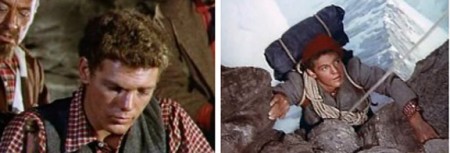
- I’m sad to see the passing of James MacArthur. He was the adopted son of actress, Helen Hayes, and starred in so many of those wonderful Disney live-action films of the late fifties, early sixties.

How clearly do I remember sitting through Third Man on the Mountain many times so that I could get to see Snow White again. Back then, there was no video tape/no DVD. Films ran in theaters on double-bills (two films for the price of one), and you had to get through the dud to see the one you wanted to see. I was there – many times – to see Snow White, but Third Man was always running when I got into the theater. However, I saw Third Man so many times I got to like it as well.

James MacArthur was a big part of that experience. He was also in these Disney films:
The Swiss Family Robinson, Kidnapped, and The Light in the Forest.

______________________

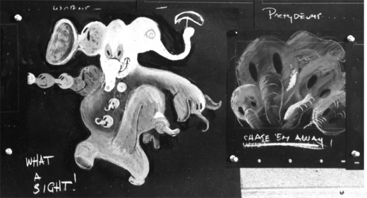
Bill Benzon has another excellent piece on his blog, New Savanna. This is an analysis of the Pink Elephants on Parade sequence from Dumbo.

Called Secrets of Pink Elephants Revealed, it, like all of Bill Benzon’s writing, deserves to be noticed and read.

Take a look.

______________________

Bill Peckmann &Books &Illustration 29 Oct 2010 07:44 am

Will Rogers & Grim

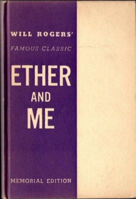
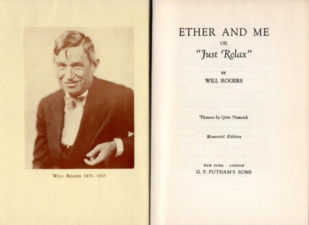
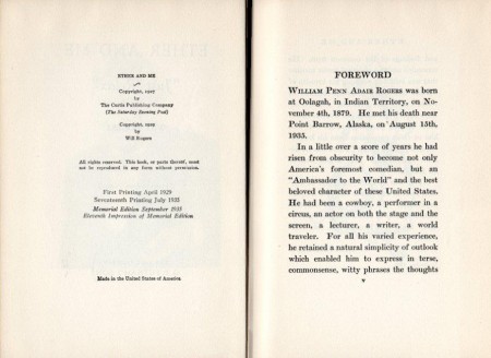
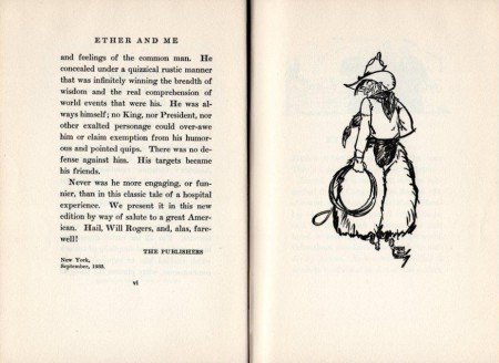
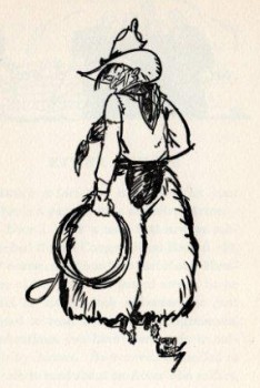
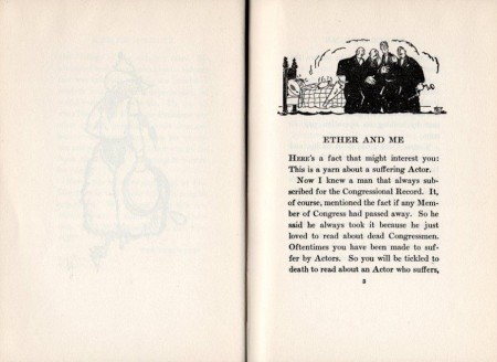
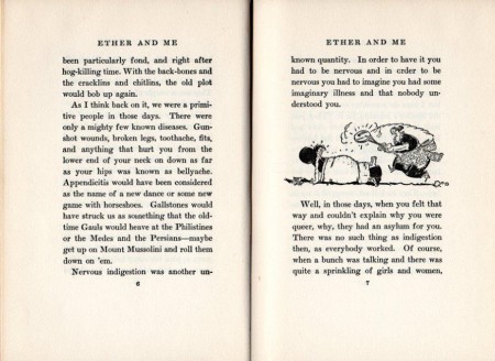
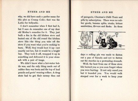
- Here’s a book Bill Peckmann owns. It’s a book by Will Rogers (who was the greatest star of his time) that was illustrated by Grim Natwick and published in 1929.

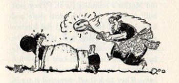
I’ve decided to leave the text on the stills since you might be interested in reading it (as I was) even though it seems to cover every other double-page spread. I’ve also blown up a couple of the stills so you can get a better look. I love this period stuff.


(Click any image to enlarge)

1

2

3

4

5

6

7

8

9

10

11

12

13

14

Books &Disney 28 Oct 2010 07:47 am

Reviews-a-Plenty

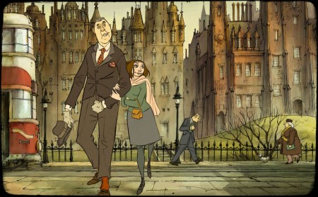
- Mark Mayerson has given an initial review of The Illusionist. I’ve waited a while to see this feature. I’d intended to go to Ottawa, not only to represent my film shown there, but to see this new film from Sylvain Chomet. The first screening I will be able to attend is on Wednesday Nov. 10th.

Richard O’Connor in his short review at his site Asteriskpix.blogspot, left me something to think about, but he didn’t feel it was the best of the features at the Festival. Mark Mayerson certainly did. In the comments section of Mark’s site, Richard extends his review telling me, clearly, that I’ll have to judge for myself.

Mark’s review is answers some of the questions I wondered about. He predominantly focuses in on the story elements and leaves plenty for us to digest. His comparison to not only other animated features but live action, as well, takes this review to a high level, which is where Mark seems to be placing this film and where he always writes from.

______________________

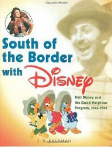
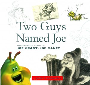
- Michael Barrier has reviewed the two important, relatively-new books: South of the Border with Disney by J.B. Kaufman and Two Guys Named Joe by John Canemaker.

The review is quite long and goes into plenty more about Disney and his employees, covering all the times that Joe Grant would have been working there. Barrier talks more about Grant than about the book’s other half, Joe Ranft. This gives a wider view of the studio. Since Barrier has less interest (admittedly this goes for me as well) in Ranft, he’s give short shrift in this review.

There’s quite a bit about the anti-Semitic remarks Disney and others made and faced at the studio. There’s plenty about the importance (or non-importance) of those travelling with Walt for any length of time. And, most importantly, there’s an analysis of others with equal position to Grant in making the films at the studio – particularly as to how the person was moved by Disney into other branches of work as the studio transitioned into live action and television.

Finally, Mike’s take is that all-things-Disney is starting to get tiresome. He questions whether the two books would have been written differently if they weren’t published by Disney. This was a question I’d asked as well, though I didn’t have the courage to add it to my reviews.

It’s another excellent commentary article by Mike and is a must read for anyone interested in animation. As with some of his other recent reviews, I more taken with some of the side notes – slight tangents Barrier takes – than with that which is directly addressing off the book. The article doesn’t flinch in calling the shots against the authors, although I know that Mike is very sensitive, expecially in this piece, in not wanting to hurt either of the two authors.

______________________

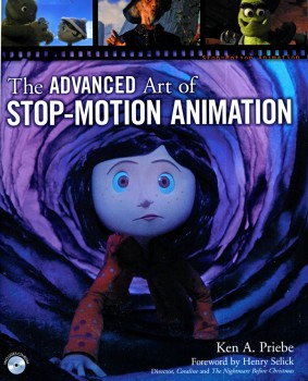
- This pushes me into doing my job of reporting on two books I’ve meant to cover for some time. Ken Priebe‘s excellent The Advanced Art of Stop-Motion Animation is a follow-up to his first book, The Art of Stop-Motion Animation.

The first book was a primer about the art of that medium. Ken covered it thoroughly and gracefully. He not only revealed many of the secrest of the process, but he gave plenty of examples of other stop=motion animation which elucidated on the art.

The second book is much more involved with many of the films out there. There’s a good history of the medium in this book, and I was not disappointed to find some of the rare pieces from the early days. Just look into the films of Starewicz (Americanized as “Starewich”, here), and you’ll read plenty that you might not know. The same goes for A. Ptushko and G. Pal. There’s also plenty said about newer stop-motion. Caroline, The Fantastic Mr. Fox and The Corpse Bride are well covered.

The illustrations are plentiful and large, and the book comes with a DVD so that you can view some of the exercises in the book.

Ken Priebe loves the medium of stop-motion. He often advises me of some rare piece he’s found and put up on YouTube. These are often gems in good quality. He brings that same love of this often-neglected branch of animation to the book at hand. If you, too, have any love of the form, get this book.

It’s a paperback published by Course Technology PTR

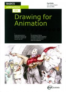
The second book I’d like to present to you is Drawing for Animation by Paul Wells with substantial help from Joanna Quinn and Les Mills.

Need I say more than Joanna Quinn to get you interested in this book? Her films are brilliantly drawn works of art, as if Daumier had come to life. The drawing in this book is outstanding as well, and we’re treated to a plentiful look at her art – from storyboards to animation drawings to final setups. My only complaint is that the images are small. One wishes it were on line so you could click the thumbnails and enlarge. Alas, it’s a book, and we have to settle for the thumbnails (or scan and enlarge them ourselves as I did at the end of this review.)

The use of drawing is detailed and instructed through many many examples and it’s all worth studying. Paul Wells’ writing is clear and concise, and he well uses examples to illustrate his thoughts. This book is a little gem and I recommend it highly for any animation (especially 2D animation) lover.

The book is a paperback published by Ava|Academia.

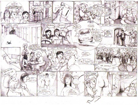
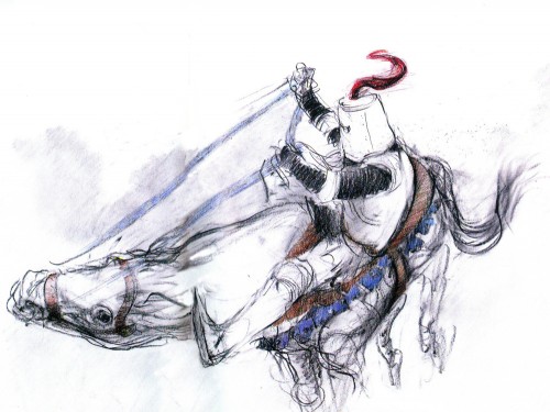
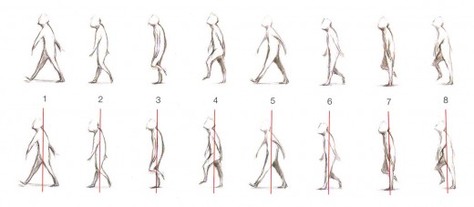
Here are a couple of the other illustrations in the book which you can enlarge by clicking:


A comic book version of a storyboard
for the film A Girl’s Night Out.
An unorthodox method that energized the film.


A study for The Knight Riding Horse 0f Wife Of Bath


A walk cycle which I put through a QT movie (on threes) below.

Animation &Animation Artifacts &Disney 27 Oct 2010 06:22 am

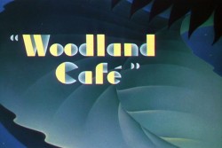
Woodland Cafe – 2

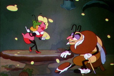
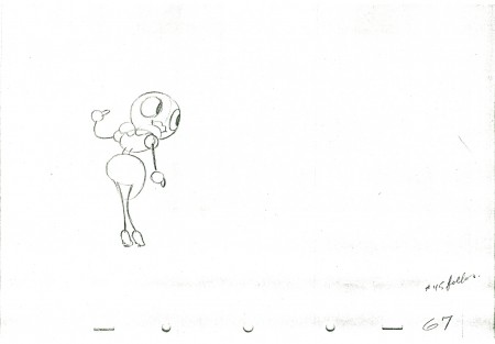
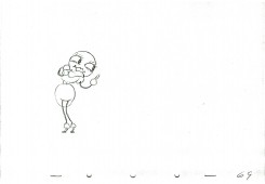
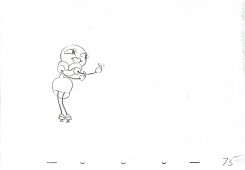
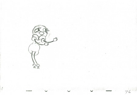
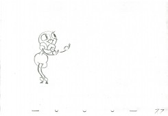
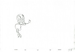
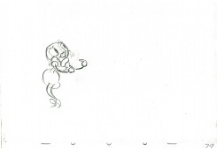
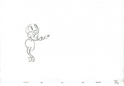
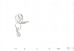
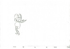
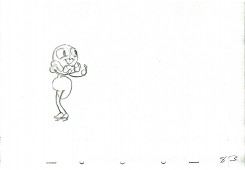
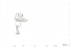
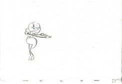
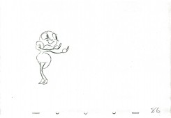
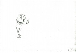
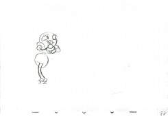
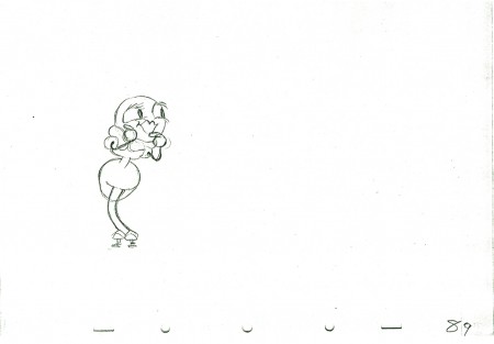
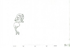
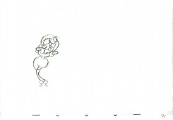
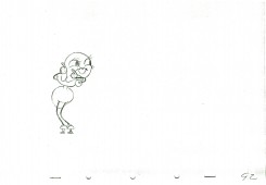
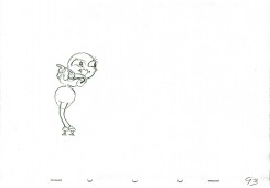
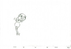
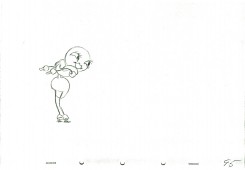
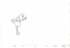
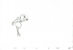
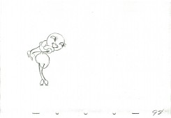
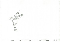
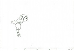
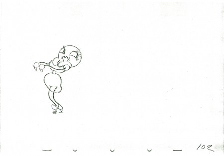
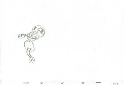
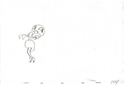
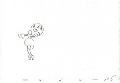
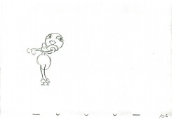
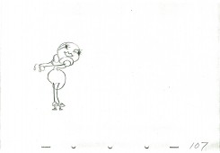
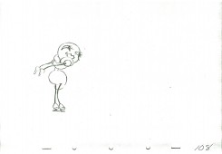
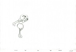
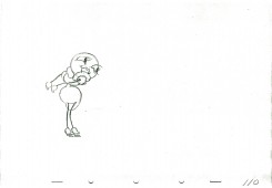
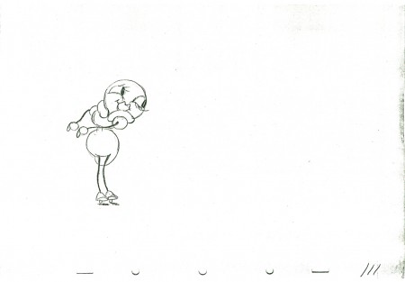
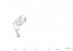
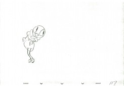
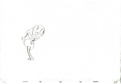
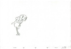
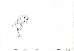
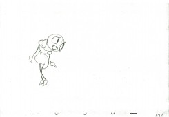
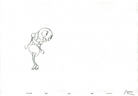
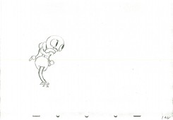
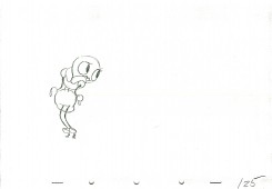
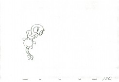
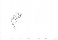
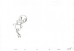
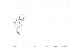
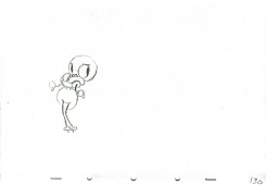
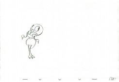
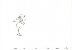
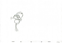
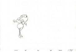
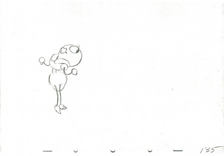
– I continue with Izzy Klein‘s ruffs for a bit of animation eliminated from the Disney Silly Symphony, Woodland Cafe. The animation in the film is more active as she dances around the table.

I had mistakenly said that this was part of The Moth and the Flame but was quickly corrected by Mark Mayerson. I’d called it that because Izzy Klein had said it came from that film, and I never questioned it.

The short is beautiful, but it always reminded me of Hoppity Goes To Town (even though Hoppity came years later.) The animation isn’t the “A” level that was being done by the Snow White team, but it still stands out.

This is the second part of this post which continues after cycling the first bit three times (done last week.)

As with all of these animation drawing posts, I start with the last drawing from last week.


Here’s what the final character looks like in the film.

67

6869

7071

7273

7475

76

7778

7980

8182

8384

8586

8788

89

9091

9293

9495

9697

9899

10001

102

10304

10506

10708

10910

111

11213

11415

11617

11819

12021

122

12324

12526

12728

12930

13132

13334

135

______________________

Here’s a QT movie of the piece.
It’s exposed on two’s as was the final film.

Click left side of the bar to play.
Right side to watch single frame.

Articles on Animation &Richard Williams 26 Oct 2010 07:58 am

Goofy and Babbitt

- The following article was printed in Sight and Sound, Spring 1974 issue. It begins with Art Babbitt‘s 1934 character analysis of Goofy and is followed up with Dick Williams’ 1974 analysis of Art Babbitt. Dick’s comments aren’t always on the money: Babbitt animated a good share of Rooty Toot Toot, but he didn’t animate most of the film. (As a matter of fact, Grim Natwick’s animation of Nellie Bly on the witness stand is, to me, the standout animation of the film.) Babbitt animated the bartender and the trial lawyer.

You can see the film on YouTube, here.

I previously posted the first half of this article with all the Goofy model sheets that it accompanied. You can see that here.

(The original, unfortunately, contains the “N” word instead of “coloured boy” as this edited version offers.)

__________________________
.
Goofy and Babbitt
by Art Babbitt and Richard Williams

.
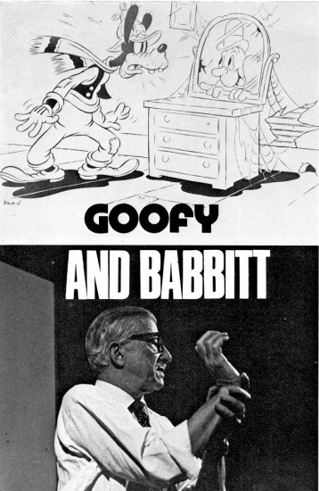
Two of the great artist-animators of the golden years of the Disney Studios, Art Babbitt and Grim Natwick, were working and teaching at the Richard Williams Studios in London last summer. To parallel Babbitt’s 1934 character analysis of Goofy, which has not previously been published, Richard Williams gives an impression of the animator himself.

CHARACTER ANALYSIS OF THE GOOF—JUNE 1934

In my opinion the Goof, hitherto, has been a weak cartoon character because both his physical and mental make-up were indefinite and intangible. His figure was a distortion, not a caricature, and if he was supposed to have a mind or personality, he certainly was never given sufficient opportunity to display it. Just as any actor must thoroughly analyse the character he is interpreting, to know the special way that character would walk, wiggle his fingers, frown or break into a laugh, just so must the animator know the character he is putting through the paces. In the case of the Goof, the only characteristic which formerly identified itself with him was his voice. No effort was made to endow him with appropriate business to do, a set of mannerisms or a mental attitude.

It is difficult to classify the characteristics of the Goof into columns of the physical and mental, because they interweave, reflect and enhance one another. Therefore, it will probably be best to mention everything all at once.

Think of the Goof as a composite of an everlasting optimist, a gullible Good Samaritan, a half-wit, a shiftless, good-natured coloured boy and a hick. He is loose-jointed and gangly, but not rubbery. He can move fast if he has to, but would rather avoid any over-exertion, so he takes what seems the easiest way. He is a philosopher of the barber shop variety. No matter what happens, he accepts it finally as being for the best or at least amusing. He is willing to help anyone and offers his assistance even where he is not needed and just creates confusion. He very seldom, if ever, reaches his objective or completes what he has started. His brain being rather vapoury, it is difficult for him to concentrate on any one subject. Any little distraction can throw him off his train of thought and it is extremely difficult for the Goof to keep to his purpose.

Yet the Goof is not the type of half-wit that is to be pitied. He doesn’t dribble, drool or shriek. He is a good-natured, dumb bell what thinks he is pretty smart. He laughs at his own jokes because he can’t understand any others. If he is a victim of a catastrophe, he makes the best of it immediately and his chagrin or anger melts very quickly into a broad grin. If he does something particularly stupid he is ready to laugh at himself after it all finally dawns on him. He is very courteous and apologetic and his faux pas embarrass him, but he tries to laugh off his errors. He has music in his heart even though it be the same tune forever, and I see him humming to himself while working or thinking. He talks to himself because it is easier for him to know what he is thinking if he hears it first.

His posture is nil. His back arches the wrong way and his little stomach protrudes. His head, stomach and knees lead his body. His neck is quite long and scrawny. His knees sag and his feet are large and flat. He walks on his heels and his toes turn up. His shoulders are narrow and slope rapidly, giving the upper part of his body a thinness and making his arms seem long and heavy, though actually not drawn that way. His hands are very sensitive and expressive and though his gestures are broad, they should still reflect the gentleman. His shoes and feet are not the traditional cartoon dough feet. His arches collapsed long ago and his shoes should have a very definite character.

Never think of the Goof as a sausage with rubber hose attachments. Though he is very flexible and floppy, his body still has a solidity and weight. The looseness in his arms and legs should be achieved through a succession of breaks in the joints rather than through what seems like the waving of so much rope. He is not muscular and yet he has the strength and stamina of a very wiry person. His clothes are misfits, his trousers are baggy at the knees and the pant legs strive vainly to touch his shoe tops, but never do. His pants droop at the seat and stretch tightly across some distance below the crotch. His sweater fits him snugly except for the neck, and his vest is much too small. His hat is of a soft material and animates a little bit.

It is true that there is a vague similarity in the construction of the Goof’s head and Pluto’s. The use of the eyes, mouth and ears are entirely different. One is dog, the other human. The Goof’s head can be thought of in terms of a caricature of a person with a pointed dome—large, dreamy eyes, buck teeth and weak chin, a large mouth, a thick lower lip, a fat tongue and a
bulbous nose that grows larger on its way out and turns up. His eyes should remain partly closed to help give him a stupid, sloppy appearance, as though he were constantly straining to remain awake, but of course they can open wide for expressions or accents. He blinks quite a bit. His ears for the most part are just trailing appendages and are not used in the same way as Pluto’s ears except for rare expressions. His brow is heavy and breaks the circle that outlines his skull.

He is very bashful, yet when something very stupid has befallen him, he mugs the camera like an amateur actor with relatives in the audience, trying to cover up his embarrassment by making faces and signalling to them.

He is in close contact with sprites, goblins, fairies and other such fantasia. Each object or piece of mechanism which to us is lifeless, has a soul and personality in the mind of the Goof. The improbable becomes real where the Goof is concerned.

He has marvelous muscular control of his bottom. He can do numerous little flourishes with it and his bottom should be used whenever there is an opportunity to emphasise a funny position.
This little analysis has covered the Goof from top to toes, and having come to his end, I end.
ART BABBITT
.
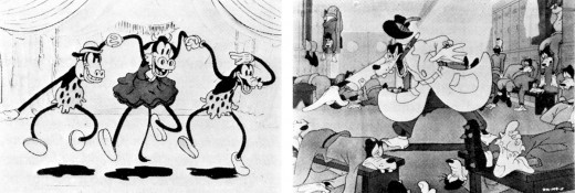
‘Orphans’ Benefit’ (1934). The Goof after Babbitt: ‘How to Play Football’ (1944)
.
CHARACTER ANALYSIS OF THE ANIMATOR—JANUARY 1974
.
He is a funny mixture. He has the bearing of a Marines sergeant (which he was during the war, after leaving Disney following the strike in which he was the principal figure); but he has the mind of a Viennese doctor—which is what he wanted to be. In his youth he always wanted to go to Vienna and study psychiatry; but he couldn’t because he was a poor boy from Iowa with relatives to support. So he went to New York and taught himself to be a commercial artist; and gradually got into animation—starting, I think, through Paul Terry.

Arriving at Disney, he was one of four animators on Three Little Pigs; and of course that was the great breakthrough in personality animation. Then he animated Goofy, and worked on shorts in preparation for Snow White. In the first Disney feature he animated the Queen where she was beautiful, up to the point where she is transformed into the hag. In Pinocchio he did most of the animation of Gepetto, and Gepetto almost looks like him. He had that sort of versatility, to characterise the horrid queen or the sentimental wood-carver. Then in Fantasia he did primarily the mushroom dance; but he was animation director on a lot of other material. On Dumbo he was a supervising animator.

The strike came in 1941. Babbitt had had a personal confrontation with Disney over the low payment of assistants; and Disney ill-advisedly fired him, giving as a reason his u-nion activities. This was directly in contravention of the Wagner Labor Relations Act, and the
U-nion took a strike vote. Babbitt fought Disney through all the courts; and they were obliged to reinstate him, for an uncomfortable period during which Disney would pass him in the corridor without speaking or even looking at him. He stood it for a year; then he quit.

After the war he and Natwick were with Hubley at UPA – Art did most of Rooty Toot Toot. Later he was with Hanna and Barbera. I had heard about him for years before I finally came to meet him. He had seen some of our work, and though he’d not exactly liked it (it was pretty slick) had decided that ‘here are some people trying to do an honest job, and that’s the first time I’ve seen that in ten years.’ He wasn’t all that impressed, but he went to the heart of it.
It turned out he was very interested in teaching people. He was thinking of writing a book to instruct people; and he’d done a course at U.S.C. of which we had copies of students’ notes. As it happened he had a fire at his house and all his own lecture notes were burned. So we were able to send him these student notes. He said they were all wrong; but it was something. Then finally I asked him straight out if he would come over and teach us, because we had gone as far as we could go on our own.

He is a great teacher. He has an astonishing lucidity. Most animators are completely incoherent; they are unable to tell you what they are doing. But Art doesn’t have any difficulty in showing you how a thing works. He just says: ‘Did you notice that that worked because such and such . . . and Hubley did this thing this way?’ And when Art says something is wrong, he’s invariably right—if you want it to work. He’ll say: ‘If you want the wheel to go round, this is the way to make it go round. This is the way to make a cypher for making it go round. And this is another way they used to give the impression of it going round. And your problem is that you are to do it with square wheels.’ He is completely eloquent. I’m sure that at Disney they created a language about what they were doing; and I’m equally certain that it was he who largely gave a verbal form to it, so that the others could understand it. He has a surgeon’s mind; which, I gather, Disney had also.

When he taught in our studio he insisted that people take the course. He started off by saying: ‘Please, in my lectures, do not be British. Be crude, be revolting; ask stupid questions. Please do not be polite; otherwise I’m wasting my time.’ He’s as tough as nails; yet it literally hurt him when someone couldn’t get a thing right, couldn’t understand it. Then when they got it right, he would dissolve in warmth. His patience was beautiful.

He knows so much about everything— about symphony construction, about the visual arts, about everything to do with the medium. He once decided he would teach himself to play the piano. He’s the one in the famous Disney story —when he was learning to play the piano, and Disney said, ‘What are you—some kind of fag or something ?’ He hated Disney for that, because he wanted to understand music to apply it to animation. He knew that Fantasia or something like it was inevitable.

On the course he told us: ‘An animator must possess a curiosity about everything that exists or moves . . . must be a student of everything that might or does exist. From the shiver of a blade of grass—affected by an invisible breeze—to the behaviour of a starving hobo eating the first steak he has had in years. From a baby, tentatively trying to walk for the first time—to an elephant doing the can-can.’

I just saw Fantasia again and the Dance of the Mushrooms; and he was doing things there—treating perspective as a subsidiary action—that no one else was doing at the time. And he does not do it by feel, as I might, but because he’s worked it all out and analysed it. On the course he would say: ‘This is the cliché. This is the formula. And this is how to break it.’ He would set up the rules and then make you bust them.

And as well as the analytical capacity and the intelligence is the ability to start from basics—to deal with the most minute detail. He knows how the labs process the material; the way celluloid is made, the way the pencil is made. People who know that kind of thing don’t usually have artistic ability into the bargain. The ability to discern basics extends to his gift for statements that seem entirely simple and yet reveal vital things one often has not recognized : ‘We must learn to create movements if necessary that are caricatures of reality— but done with such guile they are always convincing.’ ‘We must expand our sense of caricature—to realise that we are not simply exaggerating external appearances— but more important, the inner character, the mood, the situation. A caricature is a satirical essay, not just doubling the size of a bulbous nose.’
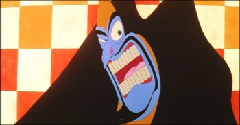

A Babbitt scene from Williams’ Cobbler and the Thief.
.
My portrait is idolatry, maybe; but how do you not idolize someone who after more than forty years work in his and your medium still can find it ‘wonderful, exciting, exacting … A medium that has barely been discovered, let alone explored. A medium that can be an art form that encompasses practically all other art forms. A medium that can gratify aesthetically, that is not earth-bound, that can be an invaluable aid in teaching everything from elementary chemistry to the Theory of Relativity.’
RICHARD WILLIAMS

Books &Comic Art &Illustration 25 Oct 2010 07:14 am

“Ex Vida” from Santiago Cohen – 3

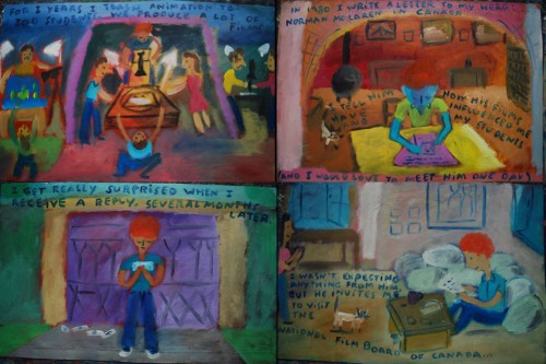
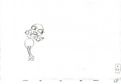
- Continuing with the epic autobiographical story of Santiago Cohen, this is part 3 of a 1000 picture project. The piece is, to me, a pure work of art. A strong, tightly knit story with images which are almost incandescent in their glowing color. I encourage you to look carefully by enlarging the frames and reading what Santiago has written.

To see prior parts of this post:
Part 1
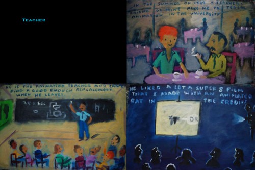
Part 2

1
(Click any image to enlarge.)

86

87

88

89

90

91
92

93

94

95

96

97

98

99

100

101

102

103

104

105

106

107

108

109

110

111

112

113

114

115

116

117

118

119

120

121

122

123

124

125

126

127

128

129

130

131

132

133

134

135

136

137

Photos 24 Oct 2010 08:04 am

Scattered Lights

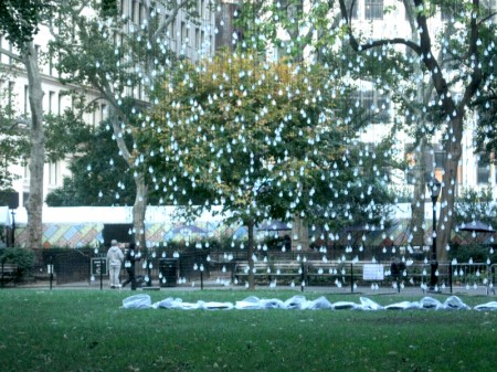
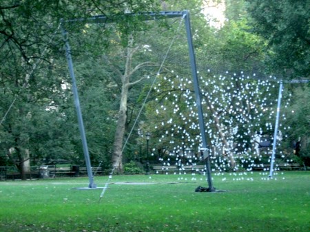
- This past week I walked through Madison Square Park (my subway wasn’t operating so I had to walk) at 6am and found the new, upcoming artpiece under construction. It’s called “Scattered Lights” conceived by artist, Jim Campbell and consists of some 2000 LED lights hung in traditional light housing.


It looks like a box of lites standing in the center of their
large lawn area, set in the middle of the park.

.

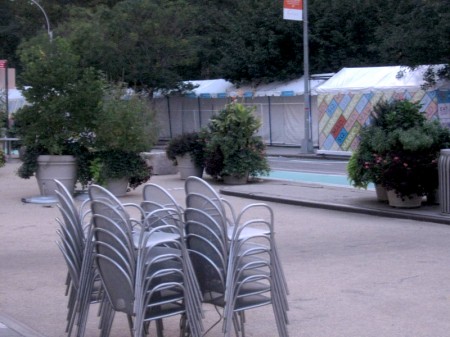
When I arrived, early Saturday morning, the park was crowded
with little tent/stands obviously set to sell food later in the day.

.

The lights were in trial mode of some kind. They were lighting
one row at a time from the bottom up. First one row, then two,
then three until the whole box lit.

.

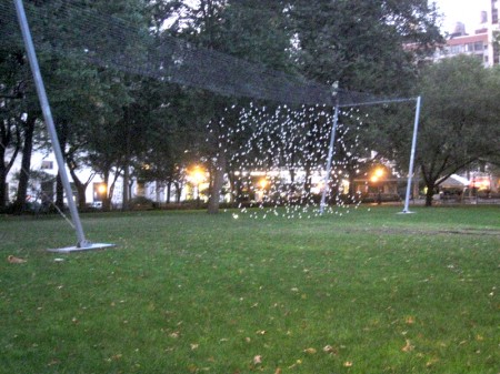
The lights were set between two scaffolding rigs. I couldn’t make out
what these were for or why they stood so close to the lights.

.

I wasn’t sure if the outer rigs were used to project something
onto the light wall. Or did they actually hold it up?

.

I wasn’t even sure if this is all the lights were to do.

.

When I returned the following week (yesterday) things were
a bit more quiet. The lights weren’t lighting one row at a time.
They were on.

.

When I came to them, straight on, I suddenly saw silhouettes
of large people walking across the bed of lights. I couldn’t tell
if this were actual people of some kind of projection. (Actually,
the opposite of a projection since some of the lights would go
off making it look as though animated people crossed the path.)

.

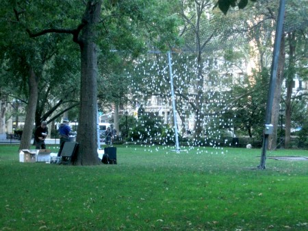
In these stills (and in all the stills I’ve found on line) the projected
silhouettes of people don’t show up well.) It’s hard to see the person
(in the right of the photo, she’s just about invisible) walking across.

.

Consequently, I shot a small movie of the piece which gives a good
idea of what it looks like in motion. Not quite silhouettes, but dark
enough that you get that feel.
It might take a little while to load up initially.

The art piece opened October 21 and will remain until February 21, 2011.

Commentary &Daily post 23 Oct 2010 07:58 am

Tidbits

- Richard O’Connor has been posting excellent wrap ups of the daily events and films at Ottawa. If you haven’t been reading you should. Some of the capsule reviews of these shorts is excellent. Look to Asterisk for these posts.

_____________________

- This week PBS aired a magnificent show about William Kentridge which showed his process for animating pieces for the opera he directed at the Met, The Nose. His combination of animation and live action was just thrilling, and to watch him doing this live with a stop-motion camera (No computers, he. Norshtein would be proud) was mesmerizing. Mistakes and all add to the life of the pieces.

I was sorry to have missed this opera, now I’m even more so.

Jeffrey Brown of The Newshour interviewed Kentridge about the show. You can watch and/or read this interview here.

You can see a short trailer of the show here and if you keep coming back, I suspect they’ll eventually have the entire show up there.

_____________________

- Copngrats to Cartoon Brew editors Jerry Beck and Amid Amidi. Their breaking news about Brenda Chapman‘s being replaced on the Pixar film The Brave made it to the NYTimes on Thursday, and they got a nice mention. A nice scoop for them.

_____________________

- Bill Plympton told me that his film, Angels and Idiots, was doing so well at the IFC Center in NY that it’s been held over, again, for a third week. Here’s hoping the film runs another dozen weeks.

Those in LA shold look out for the LA opening Oct 29th at the Laemmle Sunset 5 theater.

_____________________

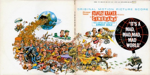
- Another site worth watching is the National Cartoonist’s Society blog. They presently have a display of drawings by Jack Davis. It was nice taking a look at some of the pieces they’re displaying. The double spread record album cover for The Mad Mad Mad Mad World just brought back a nice cozy feeling. Take a look at the site (and keep on looking after you’ve seen Jack Davis’ work.)

_____________________

- Watching Bill Maher, last night, the realization that a good part of the world doesn’t know the story behind Anita Hill and Clarence Thomas drove home. Much of the world is too young to have heard of or remember the big deal that was when Thomas was vying for his seat on the Supreme Court. Obviously, a guy who likes his porn, Thomas was also accused of some other questionable behavior. Believe me, his misdeeds outshone Bill Clinton’s, and Thomas still got to the big bench to help destroy that institution.

As animators, we also have a delicate history, and without careful watch and studious work on the part of the young, that history will also be forgotten. You have to get out there and see films to appreciate the animation history part of it.

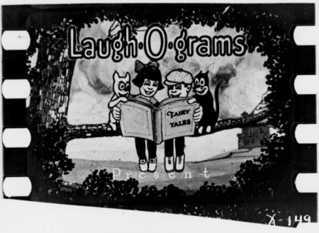
Currently, I’m looking forward to the screening of the recently discovered Laugh-O-Grams at the MOMA. These shorts were restored by MOMA and will be presented for the first time at these two screenings. Serge Bromberg, the director of the Annecy animation Festival and a champion of early animation, will conduct the presentation of these first films by Walt Disney done in Kansas City. The films will have a piano accompaniment. There will be two screenings: Sunday Oct. 31st at 2:30pm and Thursday Nov. 4th at 4:30pm.

« Previous PageNext Page »

eXTReMe Tracker
click for free hit counter

hit counter