- I enjoy rereading some of the articles in older magazines that talk about the “current state” of animation. We get to see, in hindight, what was thought of the industry during a time of change.
This article from Horizon Magazine, was written by John Canemaker in 1980, some 15 years before Toy Story and the serious explosion of cgi would take place in 1995. Many thanks to John for the article.
________________________
Animation. Renaissance ?
From Disney to independents,
animation continues to thrive.
By John Canemaker
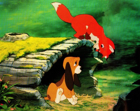
Every few years the press alternately declares animation to be enjoying a “renaissance” or predicts the medium’s gloomy future. In the early 1970s, while Ralph Bakshi was riding a crest of popularity with the success of his cartoon features, Fritz the Cat (1972) and Heavy Traffic (1973), animation was rediscovered and pronounced “born again!” Last September, a dozen animators quit the Walt Disney studio and joined Aurora, a film production company started by three former Disney executives. Aurora is spending $7 million to produce a feature-length cartoon of a Newberry Award-winning children’s book by Robert C. O’Brien, Mrs. Frisby and the Rats of NIHM. Ironically, Mrs. Frisby is a mouse, and, back at the Mouse Factory (as the Disney studio was nicknamed in the 1930s), the premiere of a new cartoon feature, The Fox and the Hound, had to be postponed for six months because of the departure of one-sixth of the animation department. With the recent Disney defections, the pundits (including the New York Times) lamented the “serious gap” in Disney’s creative ranks and noted that the animation industry (and, by implication, the art of animation) had been “long depressed.”

When a dozen animators quit Walt Disney, The Fox
and the Hound, Disney’s twenty-fourth animated feature,
had to be postponed for six months.
Nothing could be further from the truth. Further, the tacit assumption that Disney and the cartoon-film industry represent the
total contemporary animation scene—or even the most important part of it—is a benighted one.
Disney, to be sure, is a great and beloved name, synonymous with animation to the general public; but Disney today is only part of an international art form comprised of a dazzling variety of styles, techniques, and content. Animation continues to thrive and flourish as it has for more than eighty years, not only in industry-run cartoon studios that produce TV series, commercials, specials, and feature-length theatrical films, but in the experimental, personal alternative forms of motion graphics created by the swelling ranks of independent animation-film and -video makers.
Regarding the current Disney situation, it is important to know that it is not an unprecedented event. At least twice before, Disney artists have left the studio en masse — and each time the result was positive for both Disney and the animation industry. In 1928, for example, Walt Disney lost rights to a cartoon character named Oswald the Rabbit; at the same time he suffered the departure of some of his key animators. Oswald was replaced by a new character—Mickey Mouse—and Disney soon enlarged his staff with a corps of artists who, within a decade, advanced character animation to a new plane. Two of the 1928 defectors went on to form the Warner Brothers cartoon studio and, later, the MGM cartoon studio.
 In 1941, a large contingent of employees participated in a strike at the Disney studio that crippled production for several weeks.
One effect of that walkout was Disney’s eventual diversification into areas other than animation, such as live-action features, nature documentaries, television, Disneyland, and Walt Disney World. The financial security derived from such variegation allows Disney to continue making animated features. Some of the 1941 strikers formed a new studio, United Productions of America (UFA), which revolutionized the design of studio cartoons by moving away from the ultranaturalistic Disney style toward bolder graphics rooted in modern art.
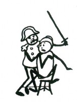
An illustration from_______ Animation production manager Don A. Duckwall revealed that
Le Cuchemar du Fantoche__ despite the recent walkout at Disney, “things are going
a 1908 short by Emile Cohl.__ along beautifully. There is a resurgence of enthusiasm for the
_______________________ product and the future.” Duckwall feels the defection has “cleared the air,” and the studio has promoted peopie who are ‘ ‘taking the responsibility and doing leadership work” on TheFoxandiht Hound feature. So confident is Ron Miller, Disney executive vice-president for creative affairs, that he has scheduled the long-awaited fantasy epic The Black Cauldron as the studio’s next animated-feature project.
“Another benefit of all the publicity about the ones who left,” explains Duck-wall, “is the tremendous number of portfolios being submitted by people wanting to join our animation training program. We now have eight trainees, which is a goodly number for us.” Paula Sigman, assistant archivist at the Walt Disney Archives, confirms the positive effect of the changeover; “Instead of sounding the death knell in the animation department, this has been like a breath of fresh air—to hear the rest of the young guys tell it. There’s a new feeling of unity, of openness and willingness to communicate, of ambition. And although they’re pushed back on Fox and Hound, they’re quite excited.”
Don Bluth, the forty-two-year-old leader and spokesman for the animators who left Disney, said the resignations were “trig- ‘ gered by a dispute over training practices and artistic control.” He plans to make their feature, Mrs. Frisby, in the Disney mode (“It’s the style we love!”), but claims “the content will be different.” Mike Barrier, editor of Funnyworld, a periodical devoted to animation and comic art, has commented that “the real reason the group ! left is not that they want to go beyond what Disney has already done, but because the present studio is not ‘Disney’ enough!”
It is too early to tell if Bluth and company will succeed with their first solo venture and go on to take animated features into areas uncharted by Disney or if the Disney studio itself can succeed with this new creative challenge. The missing factor this time around is, of course, the powerful healing presence of Walt Disney himself; but certainly the competition of the two studios in the area of animated features is a healthy one for animation.

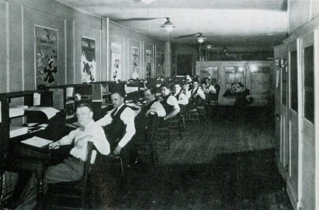
Otto Messmer (second from left) created Felix the Cat
at the Pat Sullivan studio in NY around 1919.

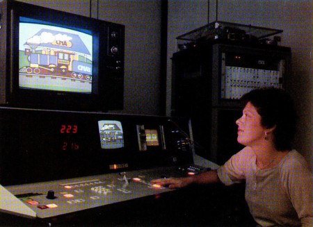
Computers such as Computer Creations “Videocel”
technique are being used today to cut production costs.
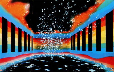
The last decade has seen an astonishing increase in the number of animated features produced by studios other than Disney. This trend can be traced back to The Yellow Submarine (1968) directed by George Dunning in London. A still-fresh, pop-art fairy tale of our times, starring the magical Beatles, it is a milestone film that redefined the stylistic and narrative borders of animated features. It also tapped a lucrative nontraditional cartoon-feature market composed of young singles and teenagers as well as attracting the usual family-kiddie audience.
Ralph Bakshi confirmed the existence of this “other” audience with his two aforementioned X-rated cartoons, which, though sloppy structurally, were compel-lingly earthy and poetic. They explored darker, more sensual themes and emotions than Disney dared to. Of a dozen animated features released in the last three years, several aimed toward a wider audience: Watership Down, Lord of the Rings, Allegro Non Troppo, and Dirty Duck. Internationally, there are about twenty animated features currently in production or in the planning stages.
While it can take two to three years to produce a ninety-minute animated feature, the half-hour Saturday morning children’s series on television devour huge amounts of screen footage each week. Abhorred by parent’s groups, but passively tolerated by children, Saturday morning “kidvid”—or “illustrated radio,” as veteran animator-director Chuck Jones terms it—clones on season after season with formula mediocrities such as Casper and the Space Angels, The New Schmoo, Godzilla, Fangface, Scooby’s All Stars, etc.
But in addition to the series, each year brings a number of animated specials to television. With higher per-show budgets and longer preparation time than for series, the specials’ quality level is higher. Look, for example, at the Peanuts specials, The Doonesbury Special, Everybody Rides the Carousel, The Pumpkin Who Couldn ‘t Smile, and The Hobbit, among others. As if this were not enough to keep animators busy, the PBS educational series (Sesame Street, Electric Company, 3-2-1 Contact) solicit brief, informational, animated spots from many studios and individual film makers. TV commercials often use animation when their selling approach delves into the fantastic, as in the surreal Levi’s spots by Robert Abel & Associates and the virtuoso, action-packed Jovan: The Power by Richard Williams Studio.

Today, animation is not just for kiddie cartoons.
The Oriental Nightfish was a short developed to
be used in the concerts of the rock group, Wings.
The above outlets for animation, theatrical features, and television are dominated by “the industry”—films made by a group of artists and craftspeople in a studio using mostly cartoon designs. It is this work that is most accessible to the general public, both actually and aesthetically. But there is another force working in animation, much less well known but gaining each year in terms of recognition and in avenues of distribution and exhibition. This is a large, vital international network of independent animation-film and -video makers who, freed from profit-motive considerations, explore alternative ways of communicating, interpreting, and expressing themselves and the world through animation. Many work for years on a short film; some subsist on canvas, or a sculptor to clay.
“Because it depends so heavily on technical expertise, we believe the medium of animation enters into the realm of art only when it has a strong personal imprint,” said George Griffin, a leading experimentalist. Griffin, whose inventive films explore the “act of art-making” in a variety of techniques from flip-books to Xeroxed graphics, last year privately published an anthology of new American independent animators.
Titled Frames, the book represents the work of more than seventy animators in this country alone. Their techniques and graphic signatures are lavishly diverse: some artists work in collage (Frank Mouris), others use optical printing (Peter Rose, Anita Thacher), or drawing on film (Steve Segal), direct three-dimensional manipulation (Caroline Leaf, Eli Noyes), rotoscoping (Mary Beams), drawing on paper (Kathy Rose, Dennis Pies), and “cel” animation
(Suzan Pitt, Sally Cruickshank).
To the independents, Griffin notes, “experimental film is not about what a work looks like, but what it does. How it invents its own form, makes its own rules, while stretching the definition of the medium of animation.”
Slowly, the work of these individualistic artists is reaching a larger public. The 1978 New York Film Festival featured a showcase of new animation, as did the USA Dallas Film Festival and the Los Angeles Film Exposition. Independent animators from around the world consistently win top prizes in animation festivals in Zagreb, Yugoslavia, Annecy, France, and Ottawa, Canada. Cable and public television stations book these works, thus introducing them to a wide scope of interested viewers. For two years PBS sponsored the International Animation Film Festival series, which booked many nontraditional animated films. A feature-length compilation, The Fantastic Animation Festival, was distributed theatrically and found particular favor on this country’s college campuses. More and more nontheatrical distributors, who sell and rent films to schools, universities, and library collections, are responding to their patrons’ interest in the new animation and are signing many experimental animators to contracts.

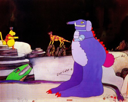
A color model from the pop-art animated feature
The Yellow Submarine (1968) indicated to the
opaquers which colors to use in the final frames.
In the beginning, naturally, all animation was experimental. Although no one knows who first discovered the magic inherent in the camera’s ability to shoot single frames of film, three pioneers defined the animation medium by experimenting and inventing the basic tools still in use today. James Stuart Blackton, a cartoonist-reporter for the New York Evening World, made Humorous Phases of Funny Faces in 1906 and used animation to promote himself and his film company, Vitagraph. The Parisian Emile Cohl made or contributed over 250 animated sequences starting in 1908; his series, The Newly weds, made in America and based on a popular American comic strip, was very influential in identifying the animated-cartoon genre with the weekly comic strip in the public’s mind. Winsor McCay, the most gifted cartoonist-draftsman of his age, tirelessly explored the possibilities of line and motion in his ten films including Little Nemo (1911) and Gertie the Dinosaur (1914)) and promoted animation on his chalk-talk vaudeville tours.
It was in 1914 that American cartoonist John Randolph Bray turned animation into a business. Bray, who might be termed the Henry Ford of animation, organized a staff of specialists doing assembly-line tasks in cartoon studios. He cannily took out patents on certain work- and time-saving inventions (the most important being clear Celluloid acetate sheets called “cels”) which enabled large numbers of films to be produced in series. Thus began the industry of animation, the mass production of cartoon films starring a parade of internationally famous characters. Often the characters came from the newspaper strips, like Mutt and Jeff. But Felix the Cat, created by Otto Messmer at the Pat Sullivan studio in New York circa 1919, was made for the screen —the first creature to express an individuality in drawings that move. Felix’s unique design and, most important, his personality profoundly influenced Walt Disney’s famous animated rodent.
The experimentalists continued to work by themselves creating films that widely diverged from the commercial mainstream. Often the influence of the avant-garde was felt in the studio product, but it was adapted into the “accepted” version —reduced for the conditioned taste of the public who rarely experienced the strong individuality of the original source. (A prime example is the preliminary work the German abstractionist Oskar Fischinger contributed to a sequence in Disney’s Fantasia [1940].) Strong, beautiful, short films of singular vision were made by animators in Europe during the period 1920-1935 and in America in the 1940s and 1950s. Among these animators were Len Lye who painted directly onto film, Lotte Reiniger who used cut-out silhouettes, Alexander Alexeiff who worked in pinscreen, John Whitney with his computer works, and Jordon Belson whose specialty was video projects.
Interest in animated films has been enhanced by a wave of printed supporting material: in the last five years, scores of periodical articles and eighteen books on all aspects of animation have been published. Some of the books deal with cartoon nostalgia (The Fleischer Story), some focus on technology and technique (Visual Scripting), others on a particular genre (Puppet Animation in the Cinema), or historical perspective (Experimental Animation: An Illustrated Anthology). Six new books in the works aim toward publication within two years.

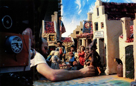
Oscar-winning Will Vinton, one of today’s innovative animators,
adjusts characters from Rip Van Winkle, a half-hour clay animation.
The current issue of the American Film Institute’s Guide to College Courses in Film and Television shows that more than sixty major American colleges feature animation workshops and/or film-tape appreciation courses in their curriculum. Most celebrated is the California Institute of the Arts, which divides its animation work-shops into an experimental group under veteran designer Jules Engel and a character-animation section headed by Disney shorts-director Jack Hanna. Many of En-gel’s students have become some of today’s most exciting independent animators and several of Hanna’s students have found their ways to jobs at Disney or other cartoon studios.
The cross-pollination of ideas gained by the proximity of the two Cal Arts animation courses is a good omen and symbol for the future of animation. The art today is undeniably vigorous and varied; computers are being developed to enhance productivity and cut production costs (such as Computer Creation’s “VideoCel” technique). The growing visual sophistication of audiences and the international exchange of ideas between the avant-garde and the industry, the new technology outlets for films and tapes, such as video-disks and home-tape consoles, make the future of animation exciting and unlimited.
Who’s Watching Cartoons?
Most viewers are children, but there is a healthy contingent of adults, particularly for reruns of old theatrical shorts.
Tim Roberts, head of creative services at New York’s Channel 5, notes that his station receives a “steady number of phone calls from adult viewers” inquiring as to the titles of the shorts shown in the daily series. “Some people want to see a certain favorite, like Bugs Bunny or Woody Woodpecker, but most of the callers have videotape machines and want to tape certain films to add to their cartoon collections.”
Last November Channel 5 presented a half-hour Cartoon Film Festival for one week in prime time (8 P.M.), with interesting viewer results. Diane Sass, vice-president of marketing and research at Channel 5, consulted the Arbitron report, a book of TV viewer demographics and noted that the festival received a ten rating, which she said is “very good. The usual programming in that time slot is a game show, ‘Crosswits,’ which usually pulls a six to seven rating.” More interesting was the breakdown of viewers according to age. The Cartoon Festival, said Sass, “had a total viewing audience of 1,217,000. Of that 438,000 were kids, 225,000 were teenagers—age twelve to seventeen—and the majority of viewers, 554,000, were adults, eighteen-plus.”
A guest fellow at Yale University teaching animation history, John Canemaker is the author of The Animated Raggedy Ann & Andy—An Intimate Look at the Art of Animation: Its History, Techniques and Artists and makes animated films and documentaries about animation.
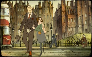
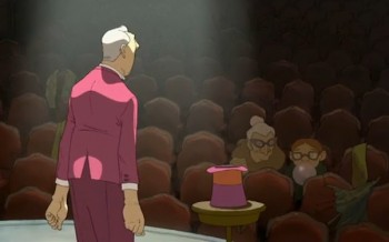 - Last night, I saw Sylvain Chomet‘s film, The Illusionist. I truly thought it was brilliant – acting more as a film than an animated film. At the moment it feels like one of the better films this year. I think I need to see it another time or two for me to write about it properly, but I’ll try here, anyway.
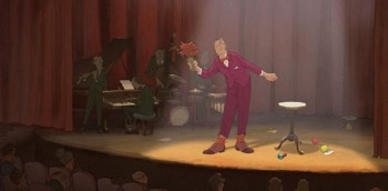 Now Chomet has completed his second feature, and has far eclipsed what he’d done before it. It possibly helps that the film was written by Jacques Tati just prior to his death and sat unmade since 1959. The form, the structure, and indeed the style all came courtesy of Tati. And the results are beautiful and excellent. The animation, the best done in many years, comes courtesy of Chomet, and it is brilliant.
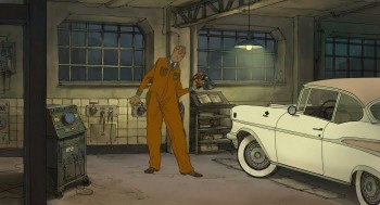 Undeniably, the film moves at a relaxed, comfortable pace. It doesn’t try to be the wham-bam-loud screaming films Pixar and Dreamworks make. It moves slowly and naturally like a Jacques Tati film. The humor isn’t hard-edged and in your face à la How To Train Your Dragon or Toy Story 3. The characters don’t scream their dialogue (the habit of animation films for the past twenty years or so); in fact they don’t have any dialogue.