Photos 21 Nov 2010 08:41 am

Leaves

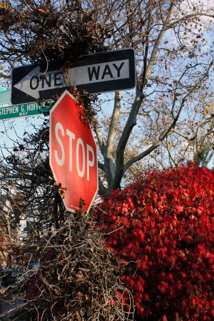
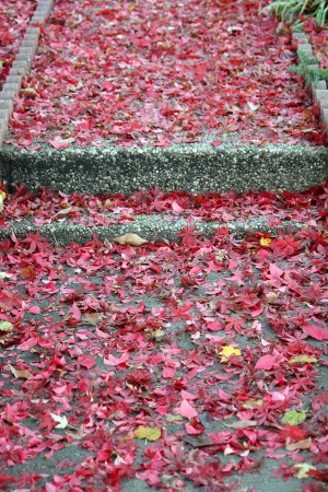
- Every Fall people make a mad dash upstate to view the changing colors of the leaves. Well, it’s taken a little time, but New York is facing a quick changing of the colors. We had a mad rain a week ago, and any leaf that clung to the tree made it to the ground.

Steve Fisher photographed a lot of shots of leaves, and he wrote this:
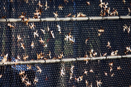
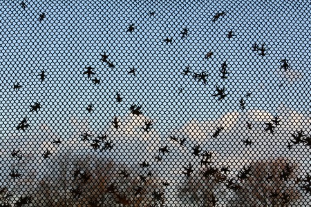
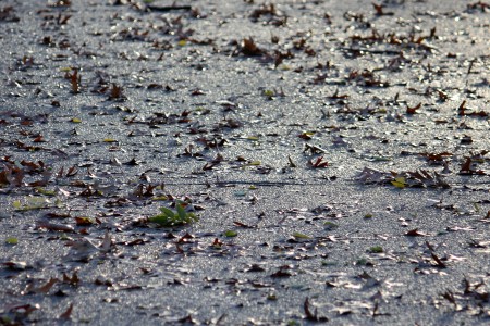
After the punishing rains that pelted prisoner leaves free of their branch shackles had ceased, after the warm air mass that slipped off shore had left a crisp stinging cold, after the winds that wildly swept leaves across streets had piled them into drifts along walls and fences, nothing remains but a shadow of the fall and the hint that next season will soon be upon us. Color is gone. Get your snow shovels ready.

1
(Click any image to enlarge.)

2

3

4

5

6

7

8

9

10

11

12

13

14

15

16

Commentary 20 Nov 2010 09:07 am

Cars 2 / Panda 2 / Signe 1 / Zemeckis 0

- In case you haven’t seen the first trailer for Pixar’s CARS 2, here it is, complete with explosions, Japan, guns, rocket launchers and more explosions. It’s getting to look like Pixar might like doing effects for live-action films. They’re not too far off the mark. The trailer, and no doubt the film, is loud enough to catch somebody’s attention. It should be another winner unless Dreamworks figures out a way to have even louder explosions.
To quote the old SCTV skit: “They blowed him up real good.”

- John Lasseter didn’t have to fire anyone, this time, when he made himself co-director of Cars 2. First time director, Brad Lewis, got himself a partner with Lasseter. I wonder how much time the new co-director will have to spend on the film given all the other chores he’s taken on running both Disney and Pixar. This is old news, but I heven’t talked about this film before.

______________________

And you’ve probably seen the trailer for Kung Fu Panda 2 which actually gets my interest, as opposed to the awful Cars 2 trailer. It’s funny. In case you haven’t seen it, here it is.

______________________
.

.
Lately, one of my favorite blog-spots is Signe Bauman‘s blog. Essentially, this was started to promote a feature she’s trying to get funded, called Rocks In My Pockets. She writes once or twice a week, and each of her pieces is so personal and informative that I can’t help but getting enveloped in what she has to say. She has a good seven part series on fundraising for a film, especially when the film is not very commercial. She writes about the difficulty of accepting rejection when you’ve applied for a grant and don’t get it. She’s even written about Depression. Check out the site and go back a bit to read her commentary. Very interesting stuff.
______________________

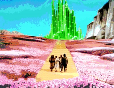
- When the story of Robert Zemeckis having been approached to remake The Wizard of Oz from the original 1939 script hit the blogs, everything went wacko. Lots of rumors flew like monkeys in the sky.

Well the truth is that Zemeckis turned down the job when discussing it with WB. Of course, this doesn’t mean the film won’t get remade; it just means that the #1 Motion Capture guy isn’t planning to do it until he can tear apart The Yellow Submarine. That, of course, will be his next opus – due out in 2012. Maybe entering it in the Oscars, that year, will give us 16 entries.

Speaking of which, I notice that there are only 15 accepted feature documentaries for the Oscar. Somehow, they’ll still have five nominees, while animation – with the same 15 acceptable number – will only be allowed 3 nominees. Something smells rotten in Hollywood.

______________________

- Today I’ll be out all day screening the animated shorts which were deemed eligible for Oscar consideration. That should take about 5½ to 7 hours of watching shorts. It’s grueling, but I love doing it. I see that Cartoon Brew has listed the shorts that’ll be screened. Two years ago I listed the shorts and was chastised by the Academy in a very formal letter. The following year, they started listing the titles. So I like to think that I pushed them into realizing that the shorts could be treated no differently than the features, and they could be announced to the public without hurting their chances. (It gives a little more publicity to the shorts filmmakers, and they’re the ones who could use it.)

Bill Peckmann &Comic Art 19 Nov 2010 08:29 am

Hazel

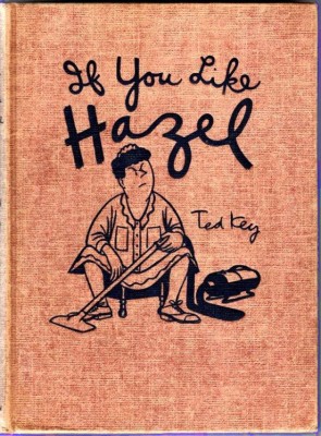
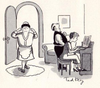
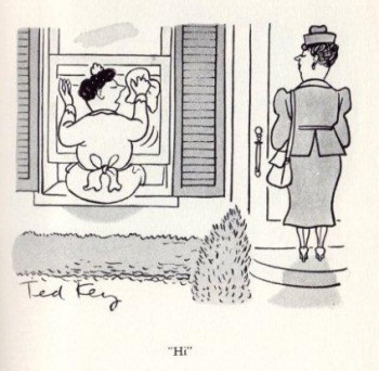
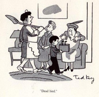
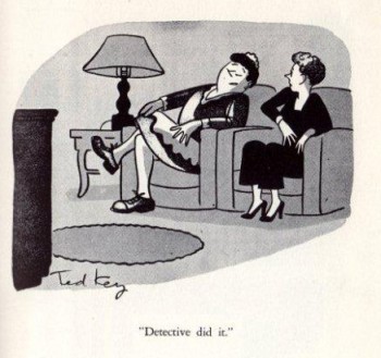
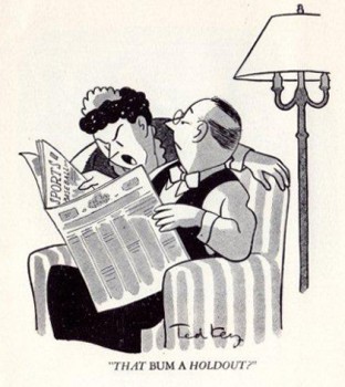
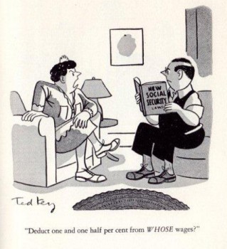
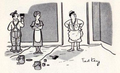
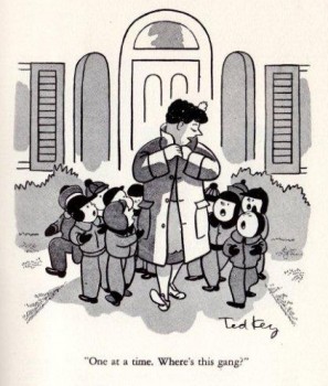
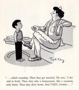
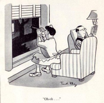
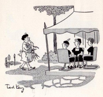
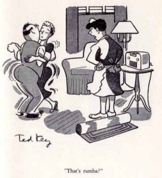
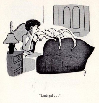
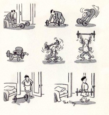
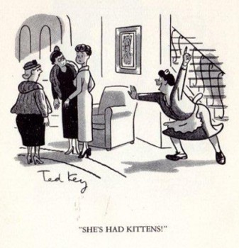
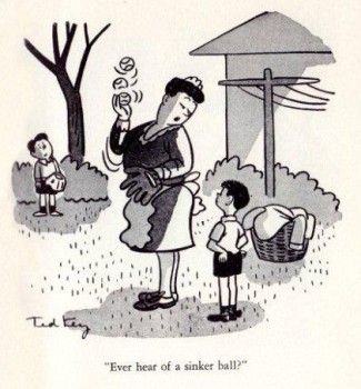
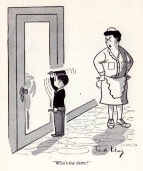
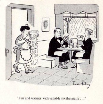
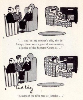
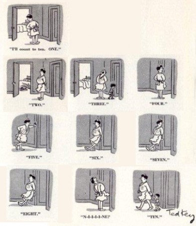
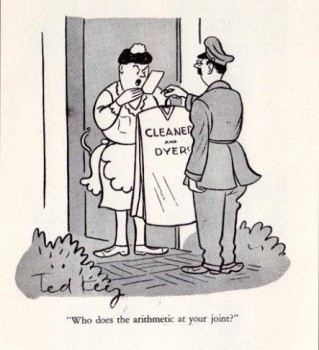
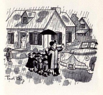
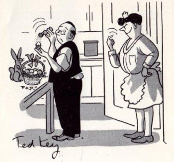
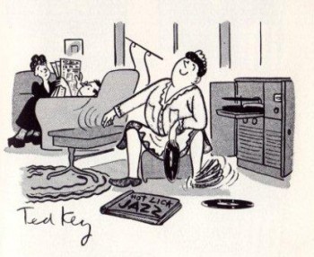
- Ted Key was a prolific cartoonist whose principal cartoon character Hazel lived in the weekly issues of the Saturday Evening Post from 1943-1969 before going wide with syndication at King Features once the Post went out of business.

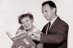
Hazel, in my childhood, was also a weekly TV series starring the inexorable Shirley Booth. I’m not sure this is who, at first, I imagined Hazel to look and sound like, but once you saw the series you bought it.

The strip ran in papers until 1993 when Mr. Key retired. He died in 2008 at the age of 95.

He was also responsible for a couple of cartoons that led to three Disney live-action films: “The Million Dollar Duck” (1971), a pet duck that laid golden eggs, and “Gus” (1976), a mule that kicked field goals and “The Cat from Outer Space” (1978) starring Roddy McDowall. He also created “Peabody and Sherman” for Rocky the Flying Squirrel. Apparently, Jay Ward was a good friend of Leonard Key, Ted’s brother.

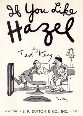
However, I’m interested in Hazel, here. The cartoons Mr. Key did with this character seem so effortless. The line work looks very natural and relaxed, as if the cartoons just flowed from the pen.

Here, thanks to Bill Peckmann and his contribution from his library, are some cartoons from the book of Hazel spots: If You Like Hazel. Enjoy.

1

2

3

4

5

6

7

8

9

10

11

12

13

14

15

16

17

18

19

20

21

22

23

24

Animation Artifacts &Disney &Frame Grabs 18 Nov 2010 08:37 am

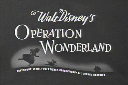
Operation Wonderland

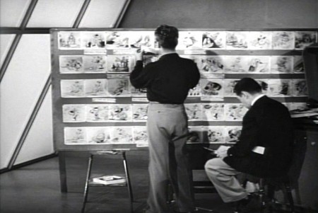
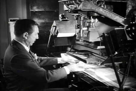
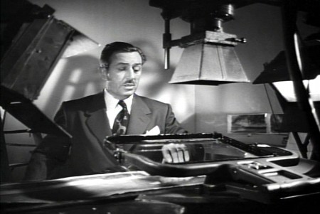
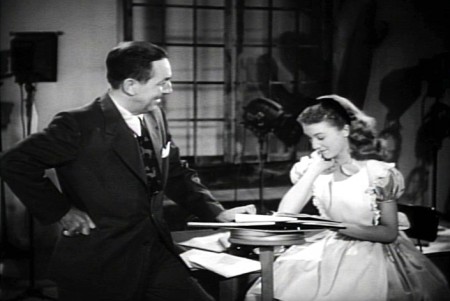
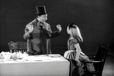
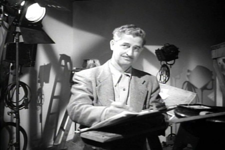
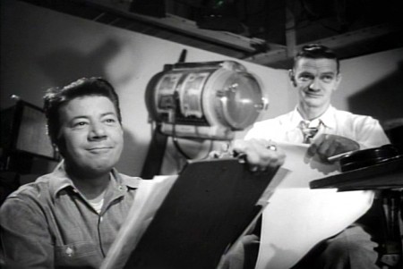
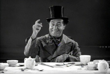
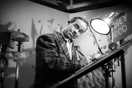
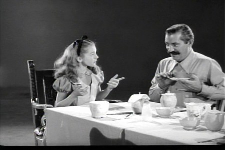
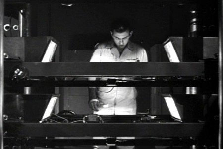
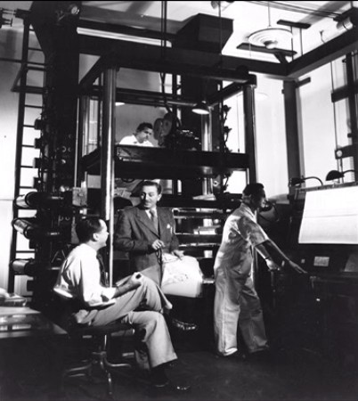
- On the DVD of Alice in Wonderland, there’s an extra little short that supposedly gives you a tour of the studio and a lesson in how animated films are made. (Do you think we’ll ever see one about Dreamworks or Pixar? I’d like to get a video tour of either studio.)

Since I’ve been focussing on Alice’s Milt Kahl scenes, I thought it’d be interesting, as an accompaniment, to post some frame grabs from this theatrical short that was done to promote Alice.

1
(Click any image to enlarge.)

2
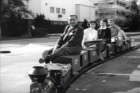
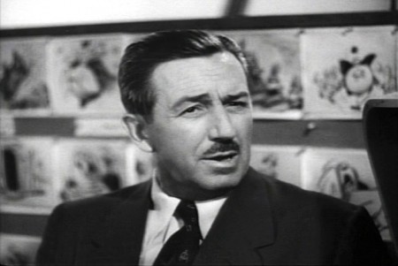
Of course, the film has to start with Walt
riding a toy train around the studio.

3
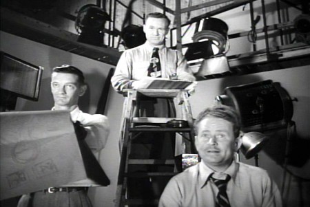
Two storyboard guys sitting in the middle of the studio.

4
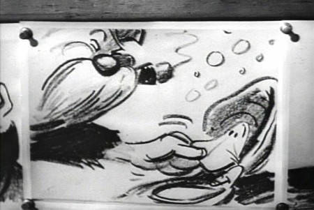
Storyboard: the walrus grabs a clam.

5
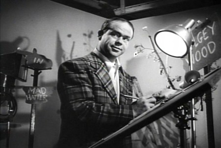
Ward Kimball in a funny jacket.

6-7
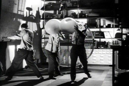
The actor posing as the Walrus for the camera.

8
Walt in a funny pose.

9-10
The Walrus & Carpenter sequence.

12
Walt and Winston Hibler. Hibler eventually narrated
most of the Disneyland shows and True-Life adventures.

14
Flowers from storyboard to final film.

15
Walt gives a demo of the animation camera and
seems to be wrinkling the cels as he does this.

16
Walt operating an animation camera. Ludicrous.

17
Walt and Kathryn Beaumont (who’s
supposed to be doing schoolwork.)

18
Kathryn Beaumont and Ed Wynn.

19
Les Clark.

20
John Lounsbery on the right. The other animator looks to be
Fred Moore. Older and heavier than we’ve seen him in the past.

21
Ed Wynn as the Mad Hatter.

22
More of wacky Ward Kimball pretending to draw.

23
Kathryn Beaumont and Jerry Colonna.

25
Jerry Colonna leads us into pencil test of the scene.

27
This scene was animated by Ward kimball & Cliff Nordberg.

29

31

33

35

37

39

41

43

45

46
John Lounsbery is on the left.
I’m not sure who the other two are.

47
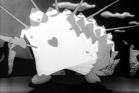
The cards in action in the film.

49
One of the highlights of the film is this dancer doing
march steps for the cards – to be studied.

50
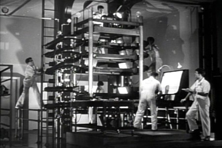
The multiplane camera in operation.

51
The cameraman at the top always looks a bit devilish.

52
No “how animation is made” film would be complete
without the sound effects guys making a racket.

53
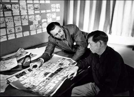
Walt and Wilfred Jackson.

54
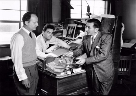
Walt going over some artwork with
John Hench (L) and Claude Coats (center)
Thanks to Hans Bacher and Gunnar Andreassen for identifying them.

55
Before riding his toy train into the sunset, Walt sits
in front of his real toy, the multiplane camera.

If anyone can identify any of those I couldn’t, or if you think I’ve mistakenly identified anyone, please leave a comment.

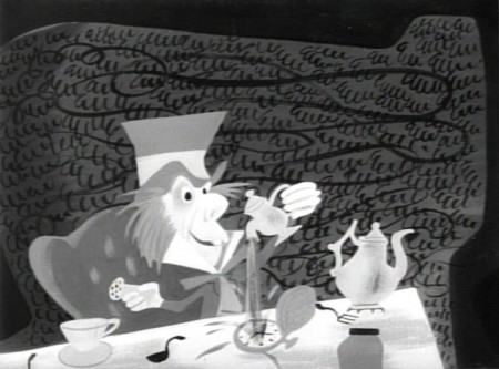
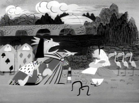
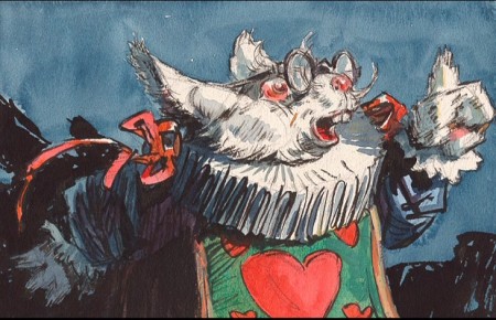
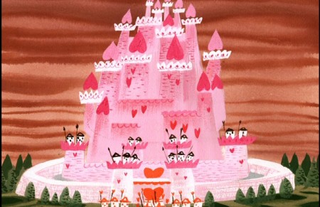
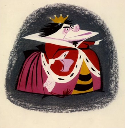
There’s an art gallery of images, many of which are by Mary Blair (and I’ve already posted her pictures a while back.) I’ll finish this post with some more of the images on the dvd.

1
Mary Blair in B&W.

2
More of the same.

3

4
Thiis looks like it comes from HOPPITY GOES TO TOWN.

5
Lots of David Hall designs, here.

6

7

8

9

10

11

12

13
More Mary Blair.

14

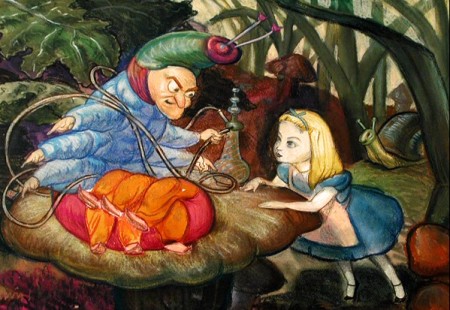
To see more Mary Blair designs for Alice go here.

Animation &Animation Artifacts &Disney 17 Nov 2010 08:13 am

Milt’s Alice – 3

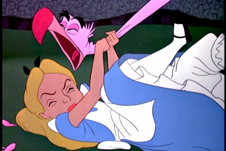
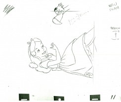
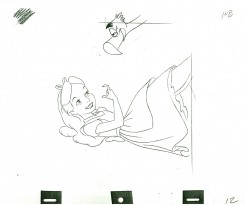
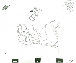
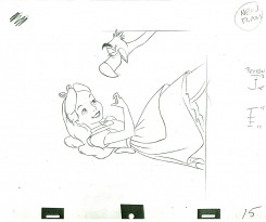
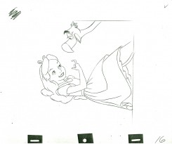
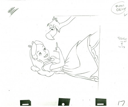
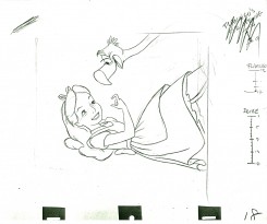
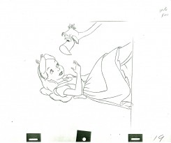
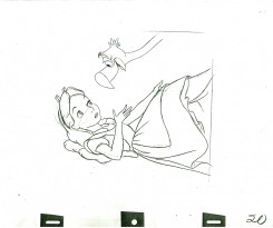
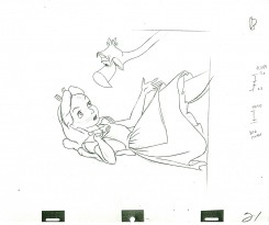
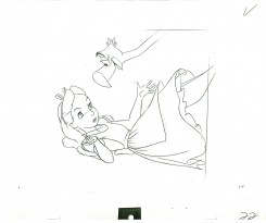
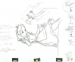
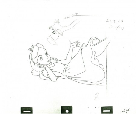
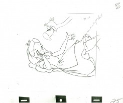
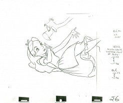
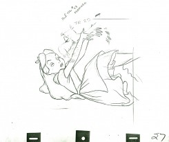
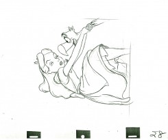
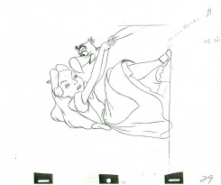
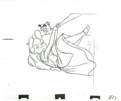
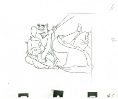
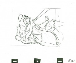
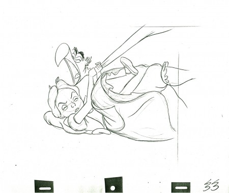
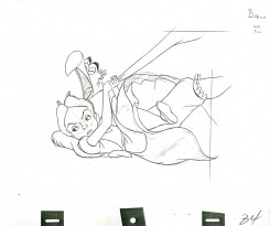
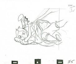
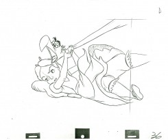
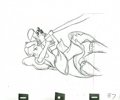
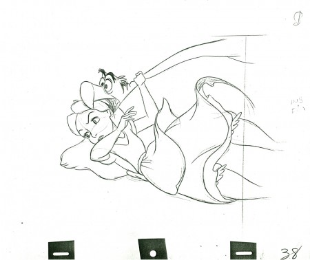
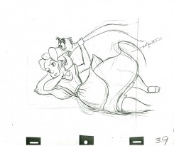
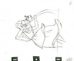
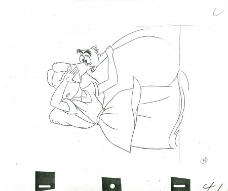
- Here’s another scene animated by Milt Kahl for Alice In Wonderland. Alice’s tangled up with the flamingo trying to play croquet with the Red Queen. Sticky wicket.

The scene was loaned to me by Lou Scarborough. Many thanks are in order.

9
(Click any image to enlarge.)

1011

1214

1516

17

1819

2021

2223

24

2526

2728

2930

3132

33

3435

3637

38

3940

41

________________________

Here’s a QT movie of the action layed out above. Since the scene has been inbetweened, it’s exposed, for the most part, on ones.

Commentary &Disney 16 Nov 2010 08:37 am

Tangled, indeed

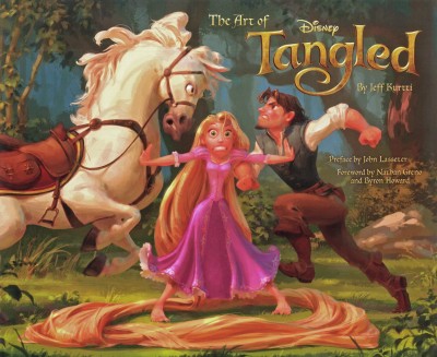
- Like many others, I received a copy of Jeff Kurtti‘s book, The Art of Tangled.
I’m glad I did. It shows me that there was once a soul behind the new Disney feature, Tangled.

I have to admit to something unorthodox here. I haven’t seen this Disney film. I will see it Dec 2nd though it’s going to be a hard pull for me to go there. Yet I still have some commentary – just on all the clips I’ve seen. THere have been about seven minutes of them and none of them pretty.

Because Glen Keane was so intimately involved in the first years of this film, I was more than a little curious to see it. But, to quote Joseph Heller, “something happened”. Keane left the film as director and became an animation advisor – not even animating. The book says he had a “health attack”. The direction, thanks to the sanction of John Lasseter, went to the two responsible for the final version of Bolt, Byron Howard and Nathan Greno.

I’ve seen the clips, let me tell you I’ve seen clips. I’ve read reviews. The Variety review couldn’t be worse. (Quotes: “If the film is hardly one for the pantheon, that’s because it seems more interested in tossing off one-liners than in tapping into its heroine’s deepest desires in the tradition of the best fairy tales.”

“. . . there’s room for visual improvement, particularly a garish, unattractive underwater scene involving Rapunzel’s hair (which often resembles a very long coil of spaghetti, extra al dente). The dimming effect of the 3D eye-wear seemed especially detrimental at the screening attended, draining too much color and light from the image and causing skin tones to appear weirdly pixelated . . .”)

What we’ve seen in the clips is a macho tough guy relationship between the Prince/the thief/whatever he is and his horse. They constantly jab each other and play off each other in that sarcastic and smarmy way Dreamworks characters act. The horse doesn’t talk, but it may as well. He keeps elbowing the hero. (If only a horse had elbows.)

Originally, the story was called Rapunzel. That’s when the Brothers Grimm had something to do with it. Now the bright folk at Disney have taken a great and complex story and have turned it inside-out making the male the lead. You can’t call it Rapunzel anymore, hence the title, Tangled. All the timely gags, all the smart aleck comments make it seem ever more like a Dreamworks production. The film is dated before it’s released.

And it looks so ordinary, it’s annoying. Maybe they should have called it Megamind and changed the horse’s color to blue. He could have come from outer space to harness Rapunzel’s hair. The Variety review does say that the film settles down midway to just concentrate on the fariy tale story. That I’ll have to witness for myself.
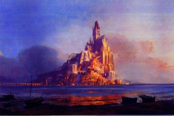
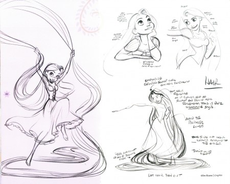
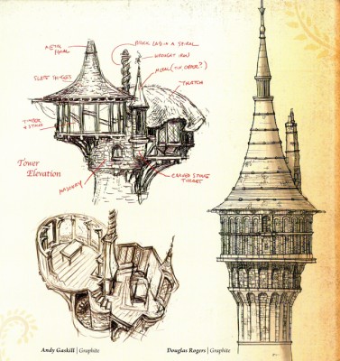
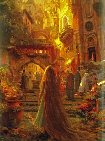
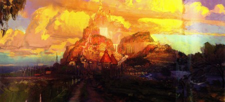
All this would be only so depressing, if we hadn’t seen the artwork in the book, The Art of Tangled. There’s some amazing art in that book, and very little of it seems to be cgi. Plenty of animation drawings and models by Glen Keane give an indication of what the characters could have looked like. Then those background paintings. Yes, some of them look like Eyvind Earle clones, but
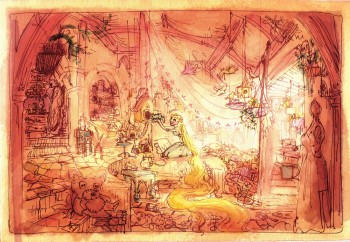
others look like they were watercolors painted by Rembrandt. They’re stunning.

You go through beautiful background after beautiful background, and the end result is the ordinary and dull thing they’ve put on the screen. Who’s responsible? Lasseter? Byron Howard and Nathan Greno? Glen Keane? – no, he seems to have been the guy who got the big shaft.

What a sell out, Mr. Lasseter! How sad I feel about the Disney organization. They can’t do ANYTHING with artistic merit. It’s so obvious they were going down that road, and things were stopped, pulled, and tangled.

They’ll probably get their 12 year old girl audience, and the film will go the way of the Bolts and the Treasure Planets and the Meet the Robinsons.

Here are some of the pretty pictures in the book. These don’t look inspired by other animated films, although the film certainly takes its look from earlier films.
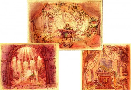
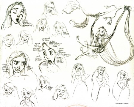
So here’s an Art of book that seems to matter. It shows us what we’ll never see. Glen Keane may have left the directing with a “health attack” (as Jeff Kurtti informs us), but he won’t say a bad word about the company or what followed. He’s a positive guy, well invested in the organization. I just wish some of what was in his mind actually made it to the screen. Perhaps that won’t happen again now that Disney isn’t invested in their 2D division. I can’t imagine Glen Keane has animated anything on the Winnie the Pooh film.

The pictures above were drawn/painted by:
cover: Glean Keane, graphit | Ian Gooding, digital painting
tower: Douglas Rogers, digital painting
island: David Goetz, digital painting
Rembrandt sketch: Claire Keane, digital painting
island: Craig Mullins, digital painting
Rembrandt sketches: Claire Keane, digital painting
2 character models: Glen Keane, graphite
towers: Andy Gaskill, graphite | Douglas Rogers, graphite
girl in town: Craig Mullins, digital painting

Art Art &Comic Art &Illustration 15 Nov 2010 08:40 am

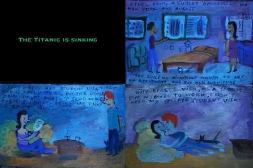
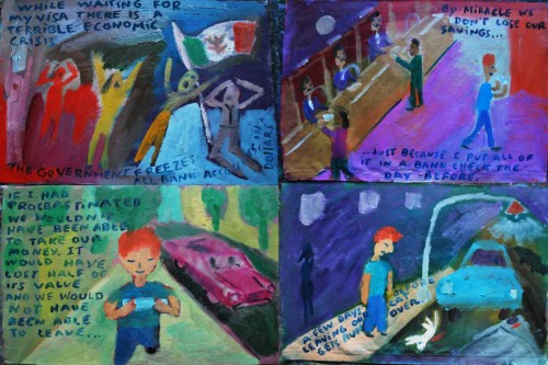
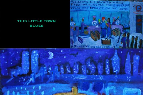
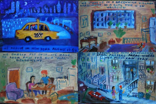
“Ex Vida” from Santiago Cohen – 6

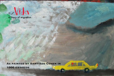
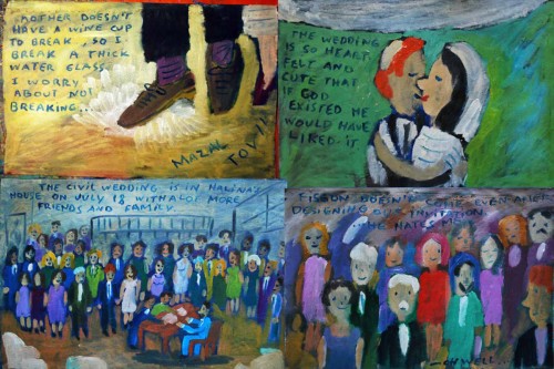
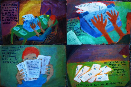
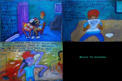
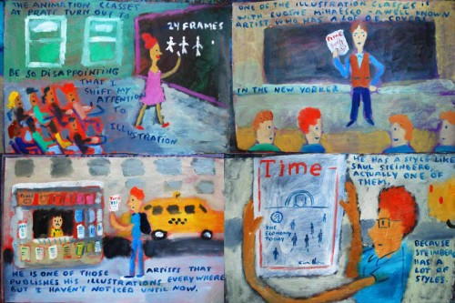
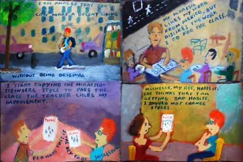
I’d thought the post last week of Santiago Cohen‘s auto-biographical opus had come to a conclusion. After telling Santiago I’d gladly continue it if more came, he actually produced another large continuation of the story. Great for me!

So it will go on for this and, at least, another week. The comments have been quite favorable, and I’m enjoying it. So on with the story.

___________________

1
(Click any image to enlarge.)

205

206

207

208

209

210

211
212

213

214

215

216

217

218

219

220

221

222

223

224

225

226

227

228

229

230

231

232

233

To see prior parts of this post:
Part 1, Part 2, Part 3, Part 4, Part 5

Art Art &Photos 14 Nov 2010 08:50 am

Cloister shots

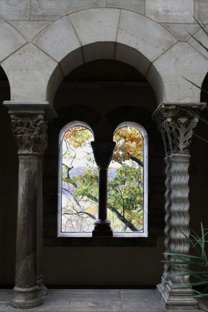
- One of the treasures in New York is the museum called “The Cloisters”. This is a branch of the Metropolitan Museum of Art dedicated to European Medieval Art.

Within this small enclave, there’s a wealth of tapestries, paintings, sculpture and utensils (actually used during the Middle Ages.) The building, itself, was reconstructed near Fort Tryon (a Revolutionary War outpost that is commemorated with a small area of the park) from bricks and stones that were made up the actual building, originally in Europe.

The greatest aspect of the place, to me, is the silence and majesty of the surroundings. It’s beautiful and quiet and goldenl something that stands out and apart from NYC.

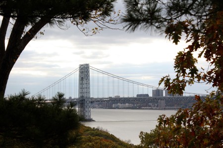
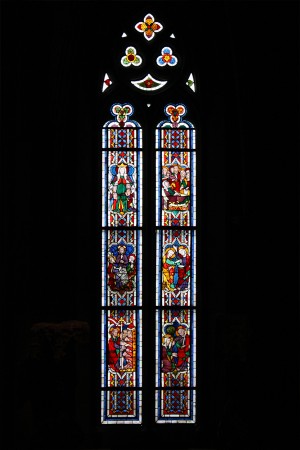
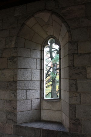
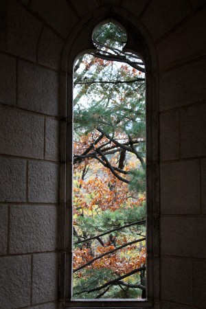
Steve Fisher recently sent me some photos of parts of the building, without showcasing the art, and they seemed perfect to me. Here they are:

1
The Cloisters sits not far from the George Washington Bridge
just this side of New Jersey.

2
Within the building are many stained glass windows.

3

4

5
The windows lead you to the open air.

6
Fianlly you reach the courtyard which is a sanctuary of its own,
any time of the year. It sits in quiet and invites peace.

7
Al aout the courtyard is a the square walkway with water fountains
built into the walls in the shapes of lions and other animals.

8
Some other time, we’ll look at the art.

9

Bill Peckmann &Comic Art &Disney 13 Nov 2010 08:55 am

Alice Comix – pt 1
.

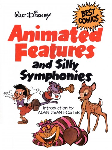
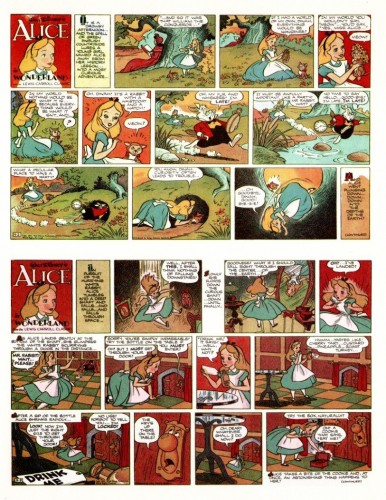
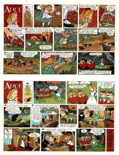
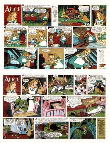
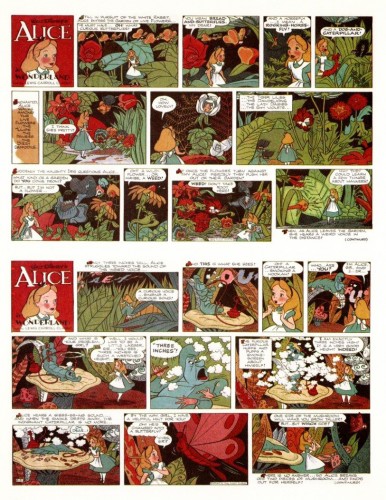
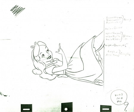
- Following the posts of the Cinderella Sunday strips, and taking a cue from the Milt Kahl Alice scenes I’ve posted, I am offering these Sunday strips of Alice In Wonderland. They were sent by Bill Peckmann from the excellent book he owns: Animated Features and Silly Symphonies.

They’re dated 1951, and each page contains 2 Sunday strips. Cinderella features artwork by Manuel Gonzales, penciler, and Dick Moores, inker. More of the gorgeous line work by Dick Moores.

Two Sunday strips per page:

157
(Click any page to enlarge.)

158

159

160

Once again thanks to Bill Peckmann for scanning these pages.

Bill Peckmann &Books &Comic Art 12 Nov 2010 09:36 am

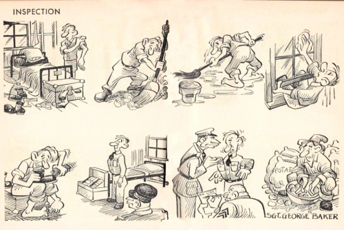
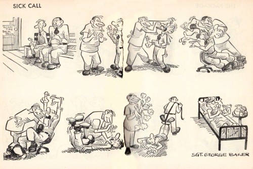
George Baker’s Sad Sack

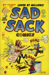
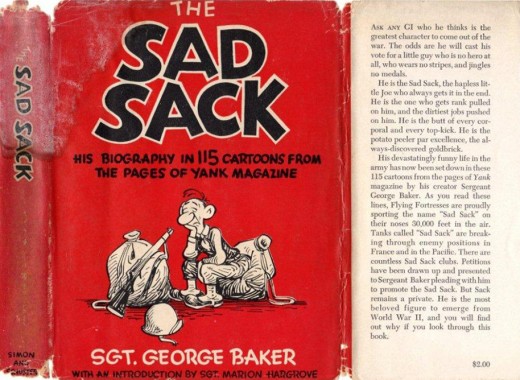
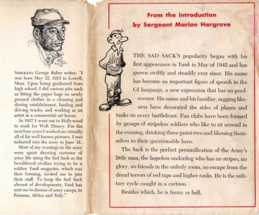
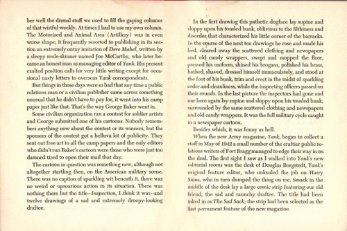
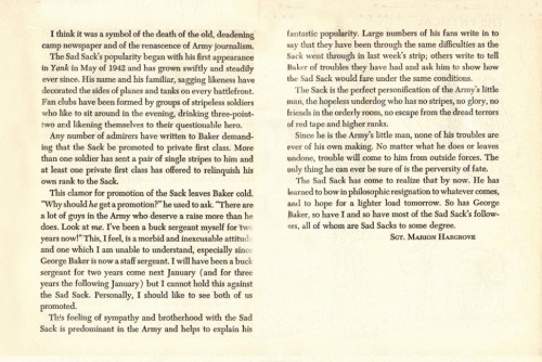
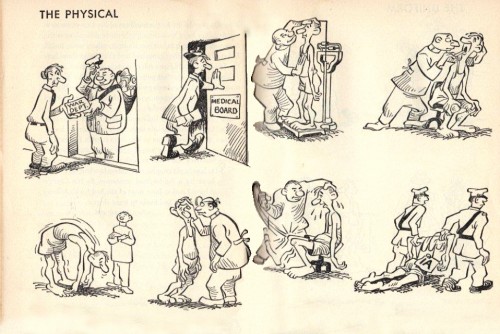
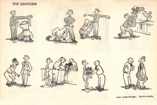
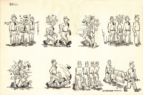
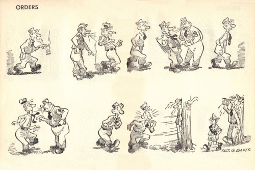
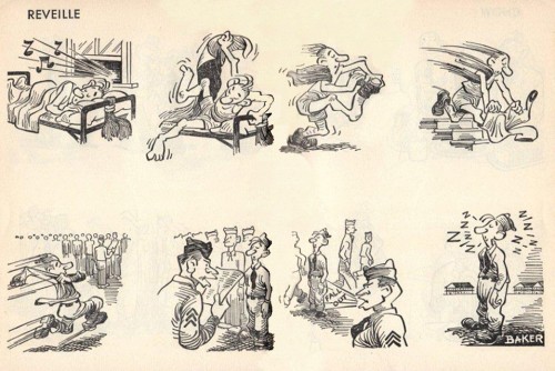
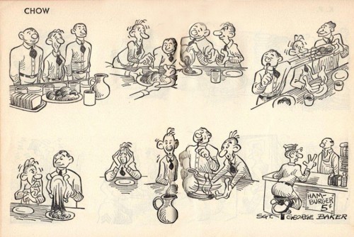
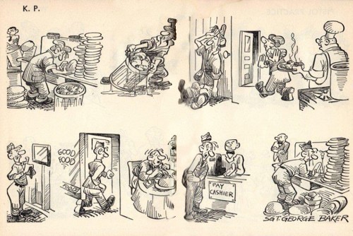
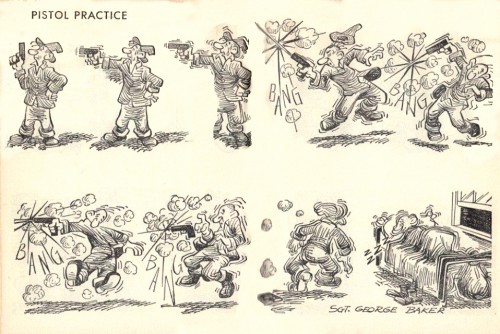
- George Baker‘s comic strip The Sad Sack appeared regularly in the Wartime publication, Yank, The Army Weekly. I grew up reading the comic book version of this strip, many years after WWII, and I had no idea, as a kid, that the comic had such a history. I only knew that I thought it was funny and well drawn.

The strip started in Yank, and, after the war, was syndicated by The Bell Syndicate. The strip was ultimately sold to Harvey Comics in 1957, and they produced the comic books.

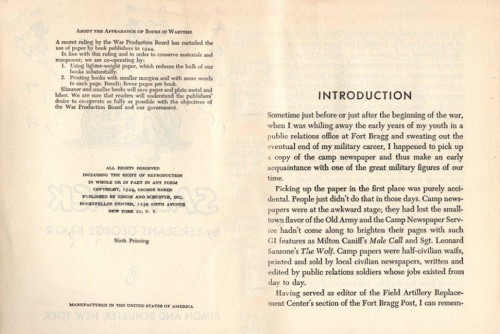
This collection of strips, here, in book form, shows us the evolution of the character and we can see his growth. It’s a collector’s item of a book and another gem contributed here by the inestimable Bill Peckmann from his library. Many thanks to him for the loan and the scans.


The front cover of the book


The back cover.

1
The book’s short introduction.

2

3

4

5

6

7

8

9

10

11

12

13

« Previous PageNext Page »

eXTReMe Tracker
click for free hit counter

hit counter