Daily post 30 Nov 2010 02:28 pm

Oscar Animation Short List

The Academy has announced its short list for animated short films. This list will be narrowed down to five come early January and the nominees will be announced on Jan. 25th.

The 10 films are listed below in alphabetical order by title, with their production company:

    “The Cow Who Wanted to Be a Hamburger,” Bill Plympton, director (Bill Plympton Studio)
    “Coyote Falls,” Matthew O’Callaghan, director and Sam Register, executive producer (Warner Bros. Animation Inc.)
    “Day & Night,” Teddy Newton, director (Pixar Animation Studios)
    “The Gruffalo,” Jakob Schuh and Max Lang, directors (Magic Light Pictures)
    “Let’s Pollute,” Geefwee Boedoe, story-design-animation (Geefwee Boedoe)
    “The Lost Thing,” Shaun Tan and Andrew Ruhemann, directors (Passion Pictures Australia)
    “Madagascar, Carnet de Voyage (Madagascar, a Journey Diary),” Bastien Dubois, director (Sacrebleu Productions)
    “Sensology,” Michel Gagne, director-producer (GAGNE International LLC)
    “The Silence beneath the Bark,” Joanna Lurie, director (Lardux Films)
    “Urs,” Moritz Mayerhofer, director (Filmakademie Baden-Wuerttemberg)

I’m glad to see “Sensology” by Michel Gagne and “The Gruffalo” by Jakob Schuh and Max Lang on the list. Others I’m really sad to see there. And where is the one really funny film, Don Hertzfeldt’s “Wisdom Teeth”?

Congrats, also, to Bill Plympton for making the list for “The Cow Who Wanted to Be a Hamburger,”

You should go to Cartoon Brew‘s announcement of the full list of contenders to see what these films are about.

Animation &Commentary &Disney 30 Nov 2010 08:26 am

Keane Posing

- Before posting this, let me tell you that I have all the respect in the world for Glen Keane. He’s one of the finest animators out there who consistently does original animation.

Last night I saw Tangled at a screening in 2D. I would have liked to have seen it in 3D, though EVERY review I’ve seen has put down the 3D experience saying that the glasses darken the movie to less than 60% of the brilliance on film. I doubt I’ll see it again for the 3D; if I do see it again it’ll be on DVD.

The history of the Disney studio. The film, itself, is basically a reworking of Beauty and the Beast (the magic flower, the bad male who has to be transformed into a good guy), Snow White (the wicked queen and the magic mirrors – two of them have to be broken), Cinderella (she cleans the tower for her wicked stepmother – or is this more of Snow White?), Sleeping Beauty (the horse with his own mind, the Princess awakens the sleeping Prince – or is this Snow White again?), The Little Mermaid (She looks like Ariel, the Little Mermaid with the hair that she just has to keep pushing back), Tarzan (the two lead characters skateboard over water and some paving, yet they don’t have skateboards). I could go on through some other films, but what’s the point?

Several of these female characters showed their spunk and advanced their Independence. In Tangled, Rapunzel goes after what she wants but doesn’t create her own fate, in the end. The male does. One expected it would be the wicked stepmother, but no, it’s the Prince … er Robber/Thief/Scoundrel. Inadequate. This is a film for 14 year old girls, and we see that they’ve seen it this past weekend, but they’re given the wrong version of the story.

The story in Tangled is smooth flowing, but crudely formed. It’s a mass of unbelievable material that rips apart one of the darker and great stories from the Brothers Grimm first published in 1812. The story is a nasty one which begins with a king, personally, stealing a plant from the witch’s garden to help his wife. She catches him on the spot and makes him promise his first born in payment.The king is RESPONSIBLE for his theft. Rapunzel moves to the tower and is protected from sex with her caging in the tower.

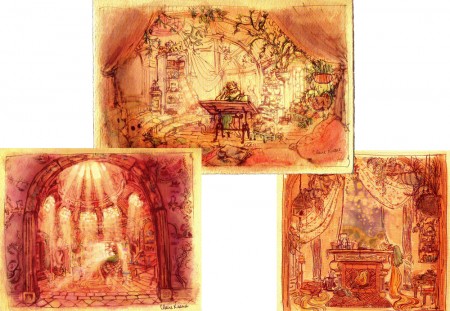
The film doesn’t use the hair very well. It is the sex that isn’t otherwise stated, and some symbolism should have entered the animation; it didn’t have to be obvious – it just had to be there. The incidental characters – all male seem to have bonded well, but we have no idea who they are or what their sexual preferences are. Again, the film seems unwilling to deal with the main subject of this great fairy tale. A stepmother trying to protect her daughter from the evils of the world. (Men!) Instead, this film is about ripping off Disney past. Yet we did see in Jeff Kurti‘s book on The Art of . . . that Rembrant was a major source of inspiration in the earlier days. Too bad too little of Rembrandt made it to the screen.
Just prior to going to this screening, I watched the first half of Tarzan on tv. Below, I’m going to post a number of drawings showing some clichéd poses by Glen Keane, but these poses don’t represent the animation he does on screen. He’s too good and sensitive an animator to show any clichés in the actual animation on screen. In fact, some of what he does is quite inspired. (Not the idea of Tarzan skateboarding through the trees without a skateboard. I expect the soles of his feet would be bloodied and damaged after trying it once, and I don’t think there’s scar tissue for it. It’s a small reality issue for me.) It’s just that these model sheet poses inspire clichés from lesser animators when they’re the poses.

Tangled is totally watchable (despite a couple of children running around the screening room, bored and loud). It’s just not good; story is everything.

Here are a bunch of drawings I culled from Raul Andres‘ blog, The Art of Glen Keane. I have to admit my purpose isn’t to showcase the art of Mr. Keane, but to express my disappointment with what I’ve found. It first became obvious to me with many of the drawings and models of his that were printed in the book, The Art of Tangled. Many of the poses he’s done since Beauty and the Beast have gone to the clichéd pose, and it’s disconcerting to me. Characters look like each other, and their facial postitions repeat the past. It’s a laziness in the drawing.

Look and compare drawings with this small sample. It took only minutes for me to compile them, and I could easily have kept going.
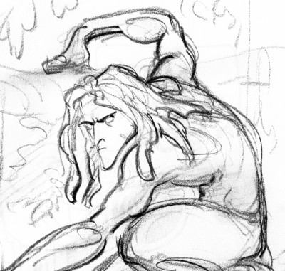

Tarzan 1
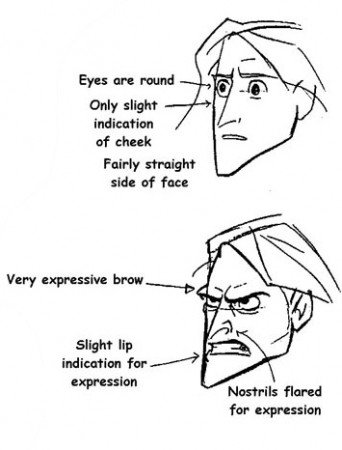

Tarzan 2
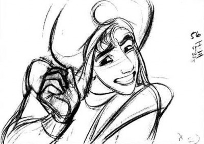

Aladdin
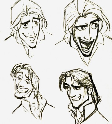

Tangled 1
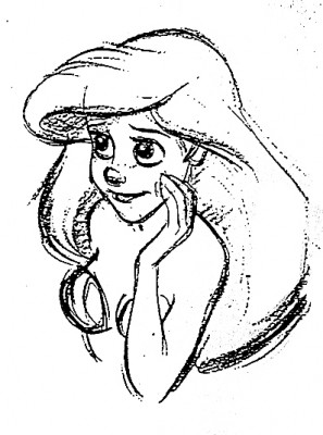

Ariel – The Little Mermaid
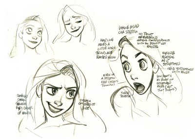

Rapunzel – Tangled
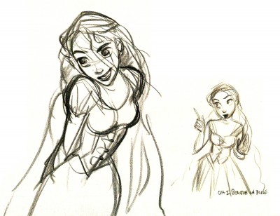

Rapunzel – Tangled
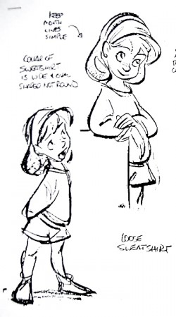

Jenny – Oliver and Co.
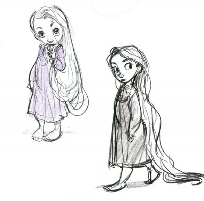

child Rapunzel – Tangled

The problem, to me, is that Glen Keane has grown into this phase of reworking the same godawful poses. He has to come to grips with what he’s doing, and pay more attention it. There’s no excuse. It isn’t so obvious in his animation, just in his model sheets.

You wouldn’t be able to catch two poses from Frank Thomas, Milt Kahl or Ward Kimball that were so alike. There were no obvious clichés in their work.

Glen Keane is a remarkable artist and a brilliant animator. That is exactly why I have to take notice. There are many others aping what he’s doing in animation, and the kingdom is beset with endless clichéd poses. Let’s get it together, folks. Time to bring animation to a higher level.

Attitude has got to be a thing of the past. It’s rampant in Tangled, Toy Story 3 and to a lesser degree in Kung Fu Panda; it’s not obvious in How To Train Your Dragon. The independent films, The Illusionist and My Dog Tulip don’t settle into this type of posing. Strong, clear thinking artists dominate these two films.

Animation &Disney &Frame Grabs 29 Nov 2010 08:23 am

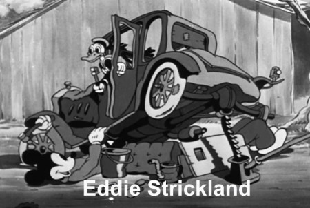
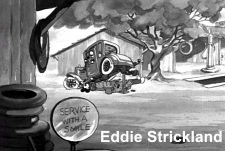
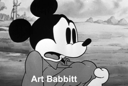
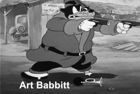
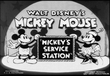
Mickey’s Service Station Grabs

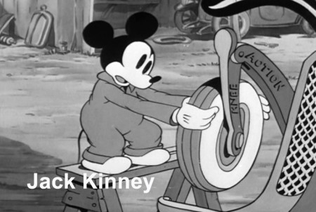
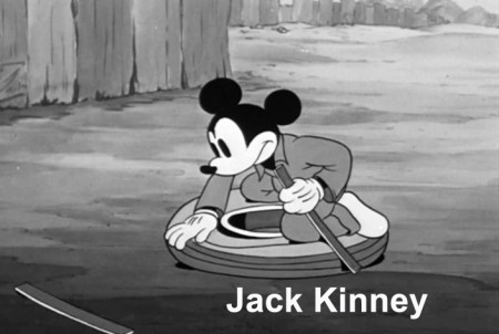
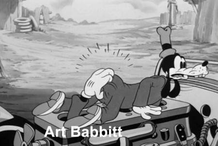
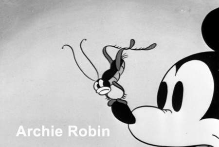
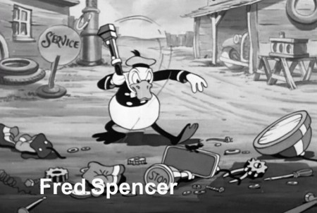
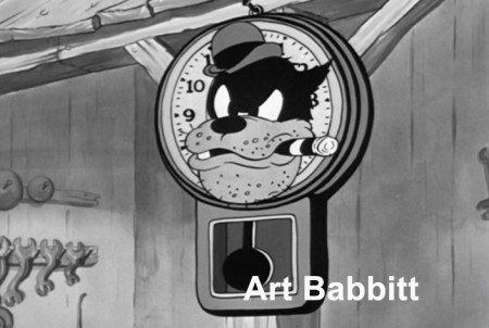
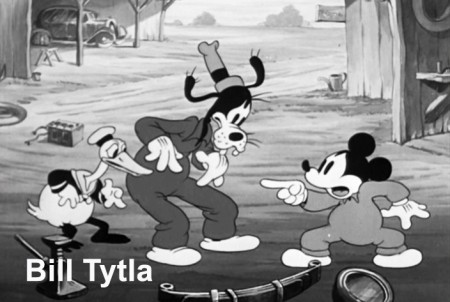
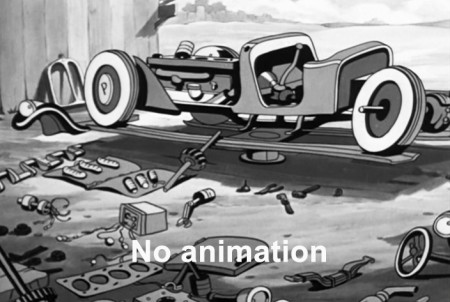
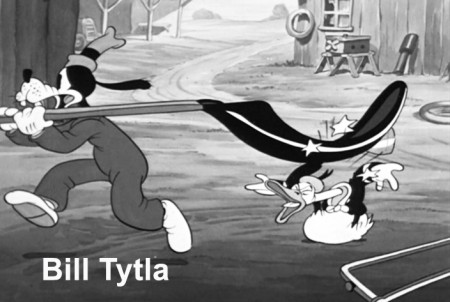
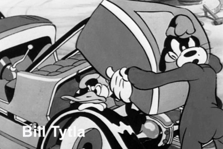
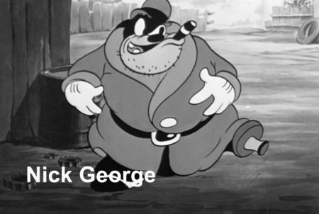
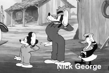
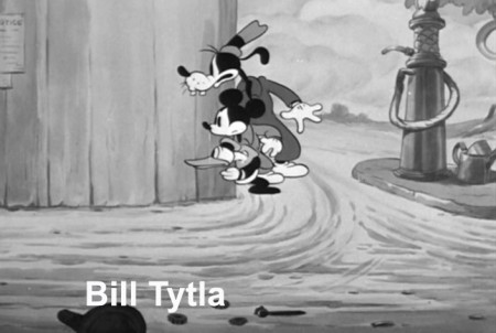
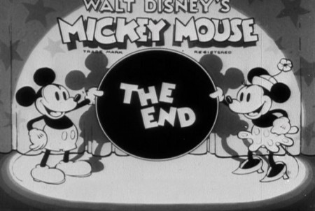
- Having posted sketches from Mickey’s Service Station, the brilliant 1935 short, the last B&W Mickey film, the next thing for me to do, logically, is post frame grabs from the final film – for comparison.

Since Hans Perk has made available the film’s draft on his incredibly resourceful site, AFilmLA, I’ve also added the animators’ names to the frame grabs. What an assortment it is, too. Art Babbitt, Eric Larsen, Bill Tytla, Jack Kinney, Don Towsley, Fred Spencer, Milt Kahl, Ferdinand Hovarth, Archie Robins among others.

Here, then, are the scenes from the film:

1
(Click any image to enlarge.)

2

3

4

5

6

7

8

9

10

11

12

13

14

15

16

17

18

19

20

21

22

23

24

25

26

27

28

29

30

31

32

33

34

35

36

37

38

39

40

41

42

43

44

45

46

47

48

49

50

51

52

53

54

55

56

57

58

59

60

61

62

63

64

65

66

67

68

69

70

Photos &repeated posts 28 Nov 2010 08:51 am

Caricature Birthday – Recap

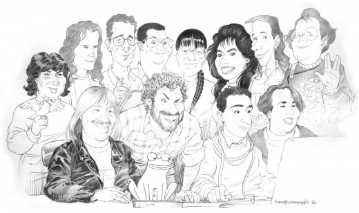
Here’s a piece that appeared on this site in February, 2006. Every day, I see Rodolfo’s caricature of the Studio-past hanging in my studio-present. It’s worth repeating this post.

_______________________________________

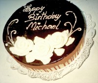
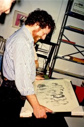
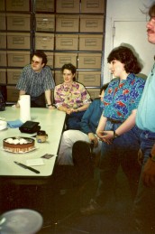
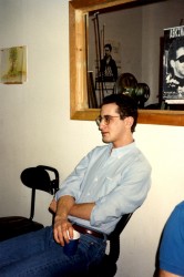
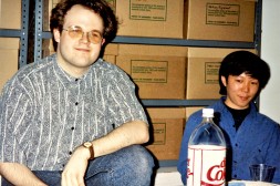
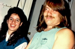
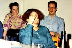
– Lots of birthdays have been celebrated in my studio over the years. Photos are often taken.

Here’s one from the past in which the gang gave me a caricature that was done by Rodolfo Damaggio. Rodolfo was an animator in the studio who drew like gangbusters but wanted to draw comics. He left to become a star in that field and also does boards for live action Effx films.

I posted the image once before and put it up again for reference to compare with the photos.
Pictured:
(back row standing) Sue Perotto (animator), Elizabeth Seidman (production coordinator), Ray Kosarin (animator), Stephen Gambello (colorist/runner), Masako Kanayama (designer/Production Manager), Marilyn Rosado (studio manager), Rodolfo Damaggio (animator), Jason McDonald (colorist/storyboards/designer).

123
1. Here I am in amazement at the fabulous drawing.
2. (L to R) Jason McDonald, Liz Seidman, colorist – Xiaogang (Jack) He, Sue Perrotto, and Stephen MacQuignon (partially cut off)
3. Ray Kosarin

45
4. Jason McDonald, Xiaogang (Jack) He
5. Marilyn Rosado, Stephen MacQuignon

67
6. Liz Seidman, Denise Gonzalez, Ray Kosarin
7. me close up


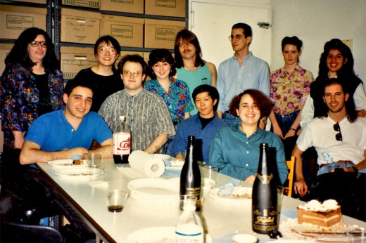
The whole staff and party:
(Back row L to R) colorist – Christine O’Neill, Masako Kanayama, Sue Perrotto, Steve MacQuignon, Ray Kosarin, Liz Seidman, Marilyn Rosado
(Fron row L to R) Ed Askinazi, Jason McDonald, Xiaogang He, Denise Gonzalez, Rodolfo Damaggio. I’m probably off camera still looking at the picture, or else I’m taking the picture.

Two people never made it into the caricature: Christine O’Neill and Xiaogang He. When Rodolfo went to draw he had no photo reference of either, and they weren’t around that day to offer one. Or so I’m told. Christine is the only person from that period still working in the studio.

Commentary 27 Nov 2010 08:52 am

How To Dragon – Movie

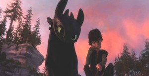
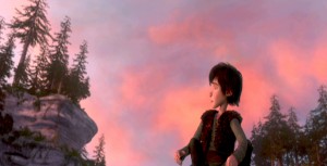
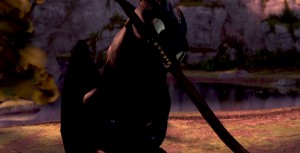
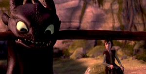
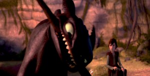
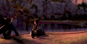
– It’s taken me a while, but I’ve finally seen How To Train Your Dragon, albeit in DVD form. The film’s reputation preceded it when everyone from A.O. Scott to Mike Barrier have praised it. (Sometimes in both reviews it seems faint praise, but praise just the same.) I have to say I have a similar position on the film. It’s a frustrating affair.

It all starts with loud and violent warfare, Vikings vs Dragons. Lots of screaming, fireplay, quick cutting, aggressive movement all set to cacophonous music. John Powell, who did one of his first animation scores for my “Goodnight Moon,” has given a mixed bag of a score for Dragon. Excellent and delicate parts
vs the loud and booming music which is played low in the background so as to create a bed of noise.

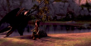
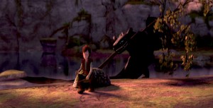
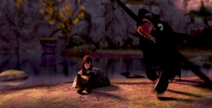
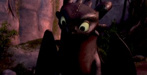
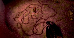
Then there’s the meeting between the hero, Hiccup, and “Toothless,” the dragon. These are fine sensitive scenes with interplay between human and dragon cleverly done without the need of dialogue.

(I suppose I’m supposed to say “Spoiler Alert” here.) However it doesn’t take long for the shouting to return as a trumped up ending resolves the film. (Hiccup having lost his leg took me by surprise and made me think of those in Iraq and Afghanistan, and I wasn’t sure I liked the comparison.)

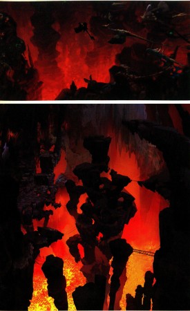
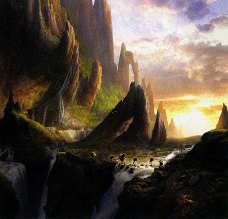
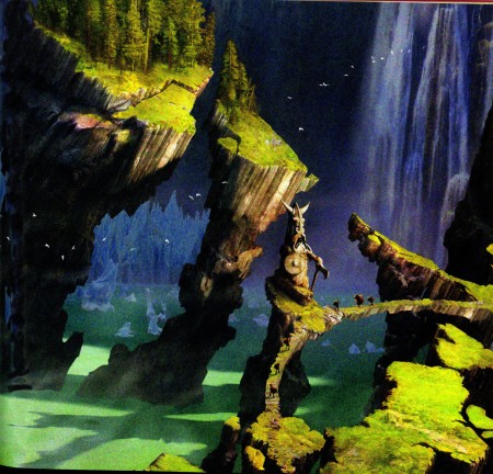
Looking at the film from a distance, there’s a different feel to the big picture. Yes, you can see the “Acts” change in the script with all the clunking machinery dragged in behind it, but the Art Direction, I think, is so original that it makes you feel something else. It’s a real positive for the movie.

Directors Chris Sanders and Dean DeBlois have done a job equal to what they did on the Disney film, Lilo and Stitch. All the outer space nonsense from that film dragged it down to middling, when the scenes on earth between Lilo and Stitch were excellent. A similar problem holds true for Dragon. All the
tiresome fighting between dragons and Vikings is tedious to get through for the friend-making scenes between Hiccup and Toothless.

There’s a touch of Miyazaki’s design in Sanders’ sketchbook. The face of “Toothless” looks not unlike “Stitch” which looks very much like “Totoro.” However, there’s something
comforting in that look, and it’s certainly not a negative.

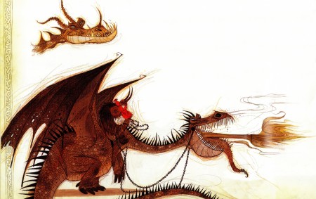
As a matter of fact, the character design is extraordinarily playful. The drawing can be felt through the cgi puppet-like creatures, and there doesn’t seem to be the visual “attitude” given most animated characters these days. (Take a look
at Tangled to catch the “attitude” quotient for the year. Glen Keane should have looked a fourth time at his models; they’re embarrassing when compared to any pre-Keane designer.) Dragon seems to have left the visual clichés on the drawing table, and they produced an original. As I pointed out yesterday, when reviewing the “Art of Dragon” book,
the artwork is all exemplary. It seems there isn’t a wasted sketch or painting that didn’t make it to the film. Of course, that means the book is well constructed and lets it feel naturally connected to the movie.

As a matter of fact, there are only a couple of the typical “Dreamworks” – type 20th century* jokes dragged
into the film, and that is a blessing. However, as each one – dropped by Craig Ferguson’s character – falls, one can’t help but grimace. They’re so clunkily placed into the movie – something about his “underwear” is the only one I can remember. We can deal with a surfer-dude, as one of the trainee kids, as long as his dialogue seems appropriate to the
film as a whole. Without these ties to the modern world, the film would have felt more timeless and have lasted longer on the shelf.

This film far excedes Toy Story 3 in all departments and is very much the better film. However, neither comes close to The Illusionist for originality and filmmaking ability.


* Note: I meant to say “20th Century” not “21st Century.”

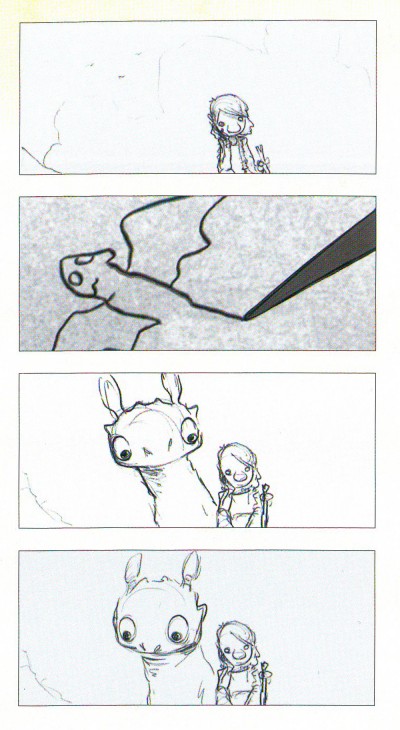
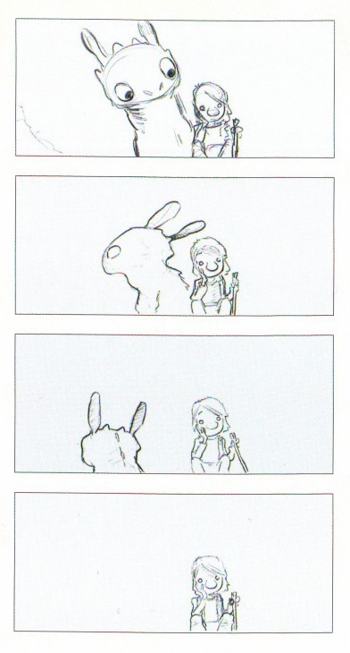
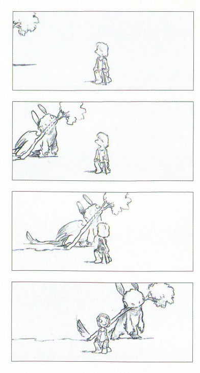
Note that the sequence of frame grabs is the same as the storyboard section I reproduced from the book, yesterday. Compare and contrast.

Books &Illustration 26 Nov 2010 08:41 am

How To Dragon – Book

– A couple of weeks ago, I went to a cocktail party of How To Train Your Dragon. I got to meet the Directors, Chris Sanders and Dean DeBlois, the Producer, Bonnie Arnold, and even Mr. Dreamworks, Jeff Katzenberg. There was a good assortment of the NY anmation community present, and the “wine and hors d’oeurves” was superb. It took place at the 21 Club.

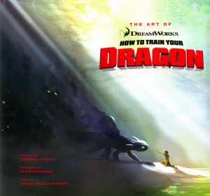
Then, when leaving the event came the best part. There was a goody-bag that contained the DVD, a bunch of picture postcards and a copy of the book, The Art of Dreamworks How To Train Your Dragon, by Tracey Miller-Zarneke.
This book is a beauty and I’ve wanted to review it since receiving it at that party.

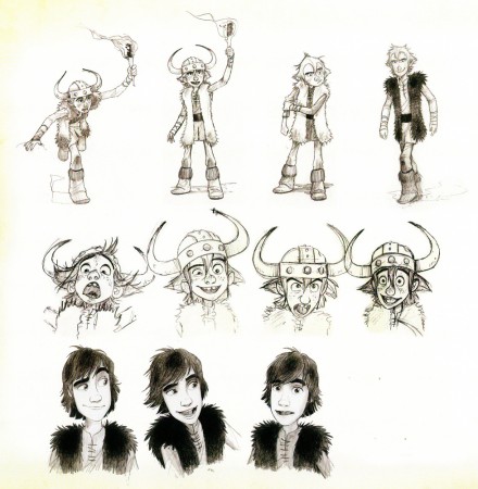
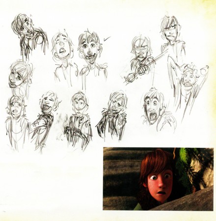
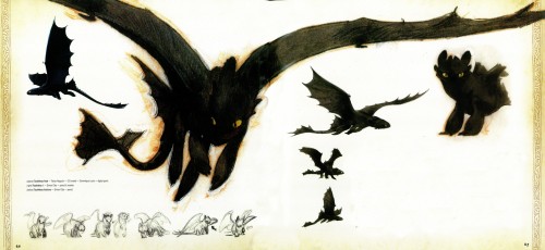
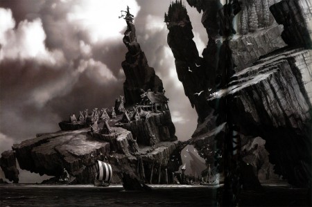
There you’ll find artwork of all stripes leading from the roughest pencil sketch to final images from the film. Here, for example, are a couple of model sheets of the lead character and a sample of what he finally looks like.

1

2


.
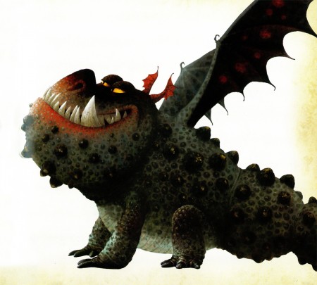
The book is broken into a number of chapters which are a bit peculiar, but it’s meant to lead somewhere in the end, and it does. There are an assortment of dragons displayed, there are the Vikings and the landscapes. The most interesting chapter to me, and probably most animation people, there are the samples of artwork which lead up to the final cgi work. The models, drawings and final digital artwork is all telling and seems a natural development from earlier work.
3
As I said, the artwork goes from the roughest sketch . . .
.
4
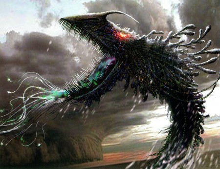
. . . to the finished digital painting.
.
5
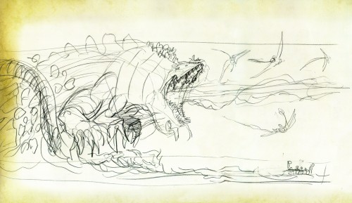
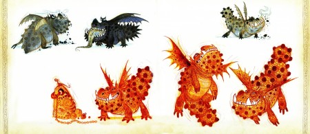
There are many beautiful and original sketches of dragons.
.
6
Dragons of all types.
.
7
.
8
.
9
.
10
The abstraction turns into a reality . . .
.
11
. . . the most realistic of Fantasy Illustration.
.
12
.
13
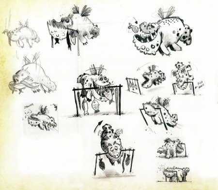
Quite an impressive assortment of sketches.

Here’s a sample of a storyboard done which looks as though it were done by Chris Sanders. However, it’s actually by Alessandro Carloni.

a

b

c
Right out of Winsor McCay

d

e

f

I’ve haven’t, as yet, written about this film, but I intend to do so tomorrow. I’m impressed with this book. You can see how they got to the film on the screen.

Illustrations:
1: Simon Otto, pencil
2: Gabe Hordos, pencil
3: Ricardo Delgado, character design, pencil
4. Nico Marlett, design, pencil / Zhaoping Wei, digital paint
5: Takao Naguchi, cg model / Dominique Louis, digital paint
Simon Otto, pencil & marker
6: Nico Marlet, pencil & marker
7: Morgan Kelly , pencil
8: Nico Marlet, design / Zhaoping Wei, digital paint
9: Nico Marlet, pencil & marker
10a: Zhaoping Wei, digital paint
10b: Pierre Olivier Vincent, digital paint
11: Pierre Olivier Vincent, digital paint
12: Pierre Olivier Vincent, digital paint
13: Pierre Olivier Vincent, digital paint
14: storyboard seq 2475 -Alessandro Carloni, digital paint
Comic Art &Illustration 25 Nov 2010 09:00 am

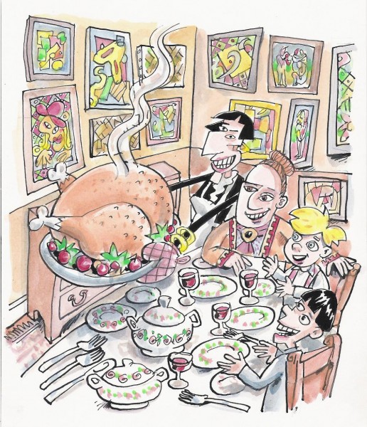
Finally Dinner

Happy Thanksgiving

Here’s Tom Hachtman‘s Thanksgiving drawing of Gertrude and Alice feasting with two children. What more to say? Have a grand day.

Animation &Animation Artifacts &Disney 24 Nov 2010 08:32 am

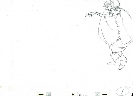
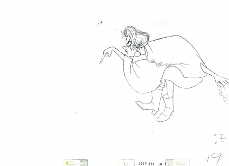
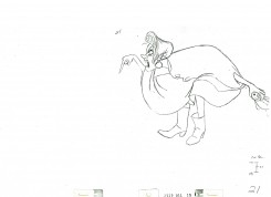
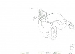
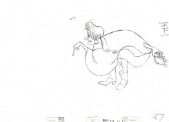
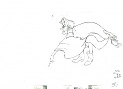
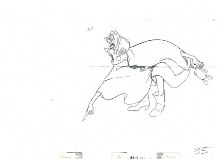
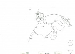
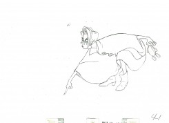
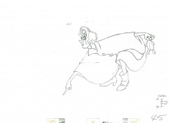
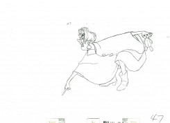
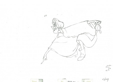
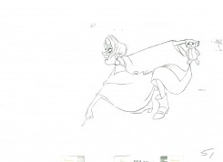
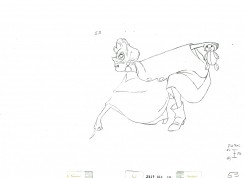
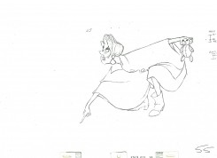
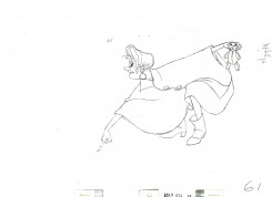
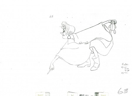
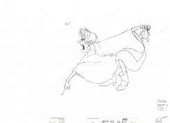
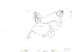
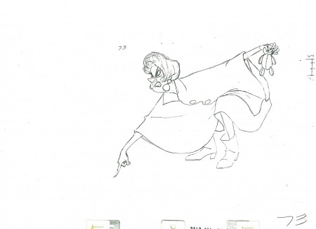
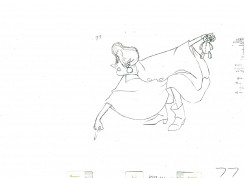
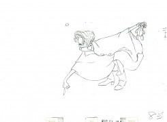
Medusa – 1

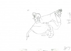
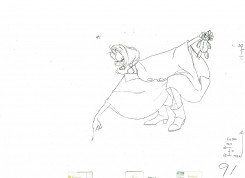
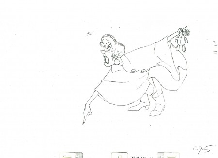
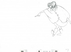
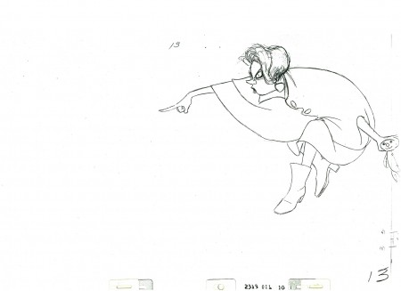
- Here’s Medusa. She’s the bad guy at the center of The Rescuers. Milt Kahl, wanted a shot at creating his own version of Creuella DeVille, and he came pretty close.

The animation has the little girl, Penny, down a hole, and Medusa walks up to the hole and shouts down to Penny to find a gem down there. (Shades of Aladdin in the cave.)

The second half of the scene will follow next week.

The scene comes courtesy of a loan from Louis Scarborough Jr.‘s collection, and I thank him enormously for it.

1

5 7
13

19

2125
2731

35

3941

4547

49

5153

5561

63

6567

73

7783

8791

95

_____________________________

Here’s a QT movie of the action layed out above. Since the scene has been inbetweened, it’s exposed, for the most part, on ones.


Animation &Disney &Frame Grabs 23 Nov 2010 08:41 am

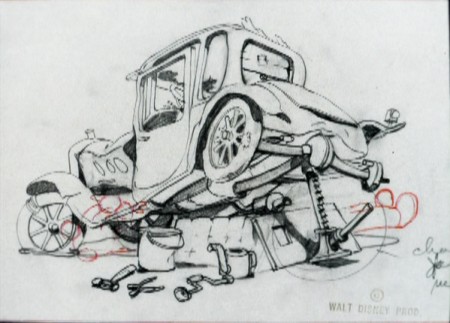
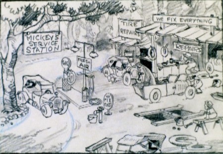
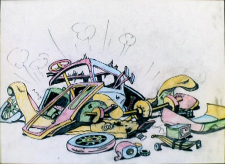
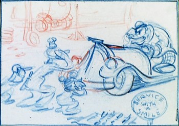
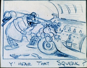
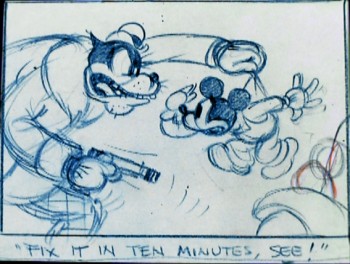
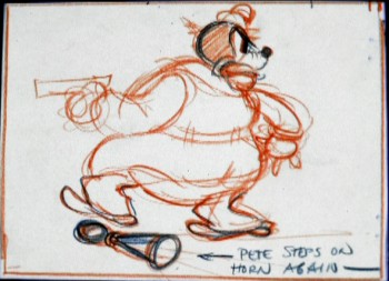
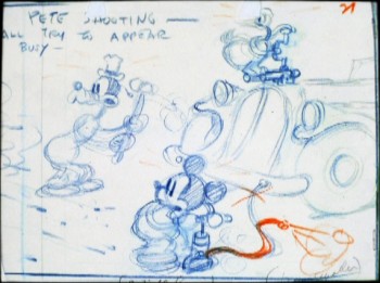
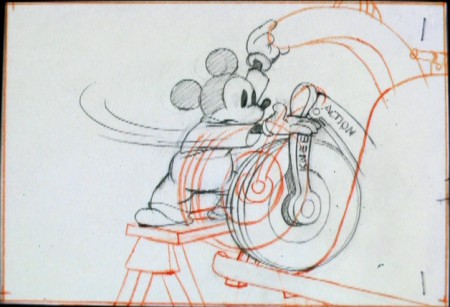
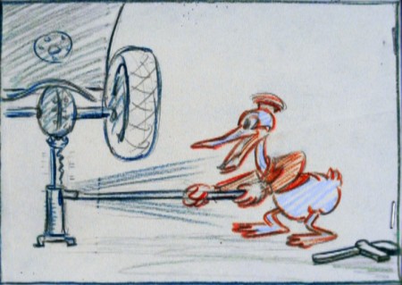
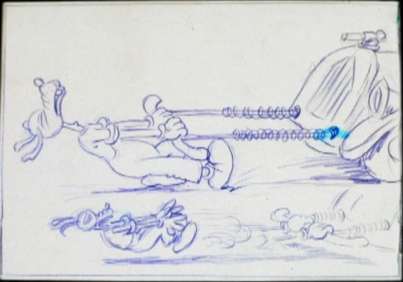
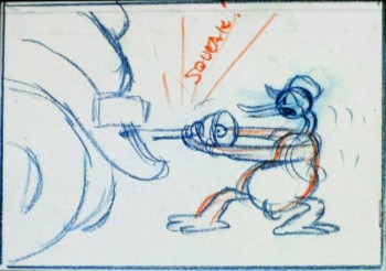
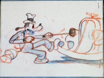
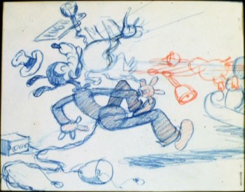
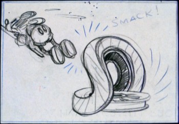
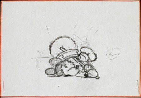
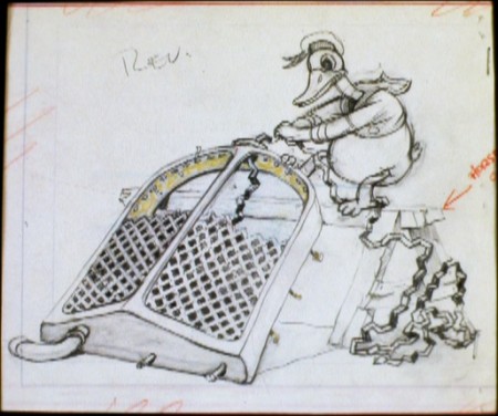
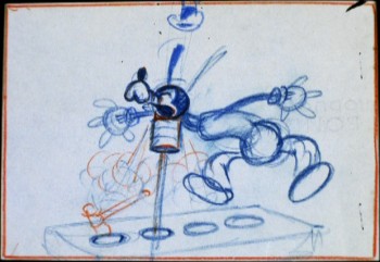
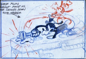
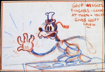
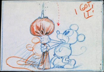
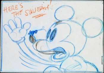
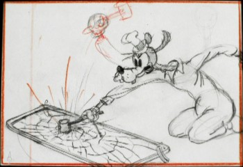
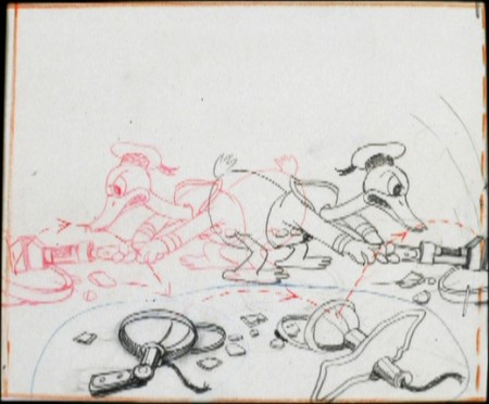
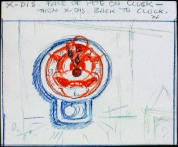
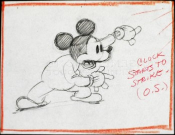
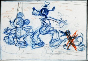
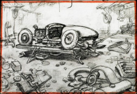
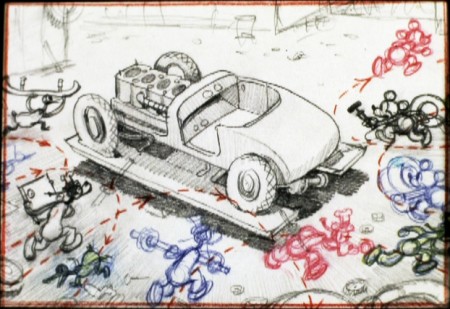
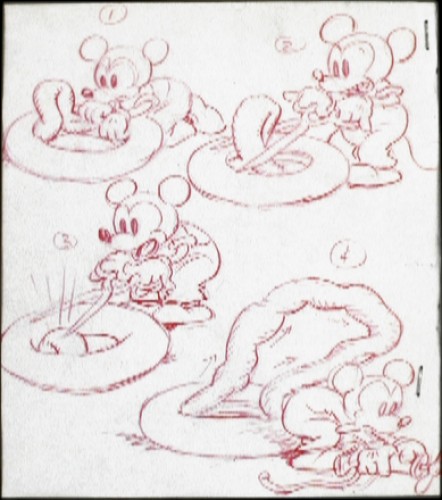
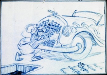
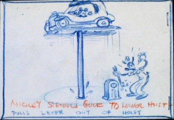
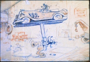
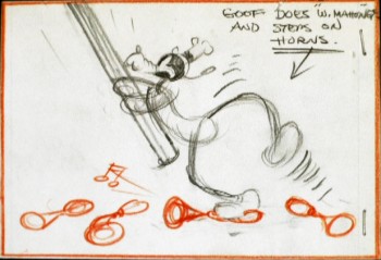
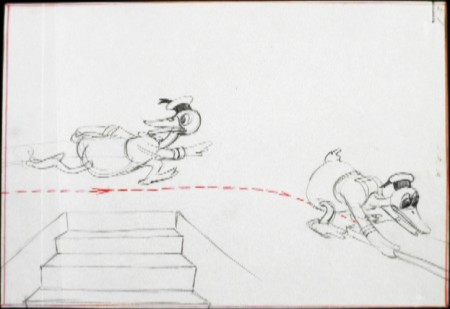
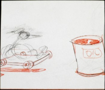
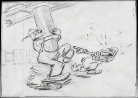
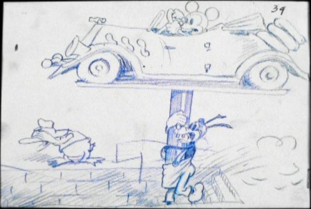
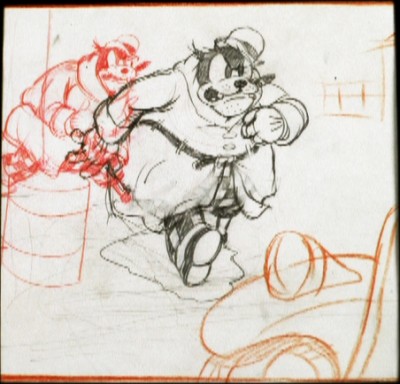
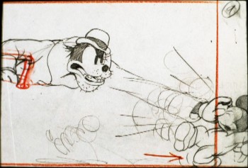
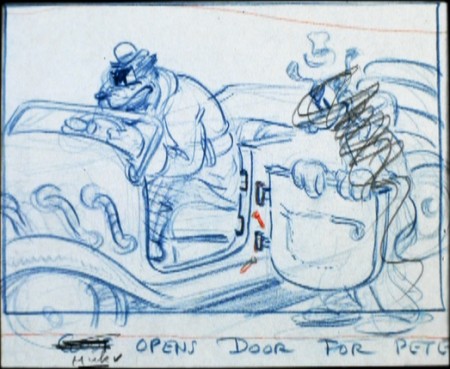
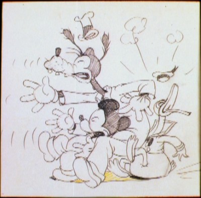
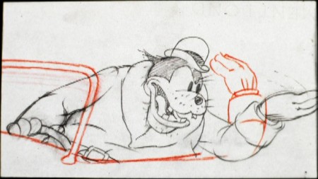
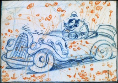
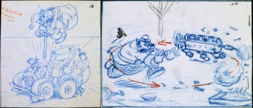
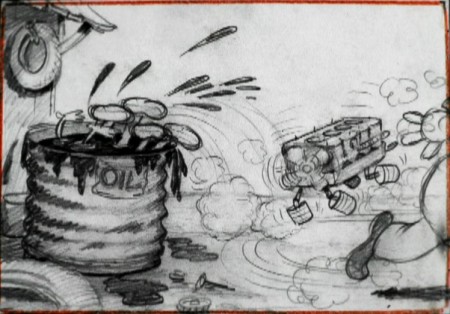
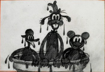
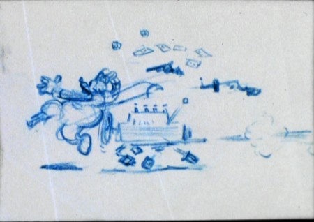
Mickey’s Service Station Sketches

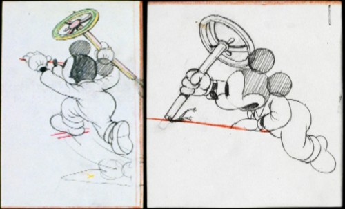
-After watching all the earnest animated shorts entered into the Oscar competition, I decided to treat myself by watching some of my favorite Mickey shorts. I particularly like a lot of the B&W films of the early period.

Mickey’s Service Station is featured on Mark Sonntag ‘s TagToonz blog with some interesting material, so I started with that one.

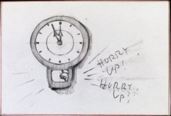
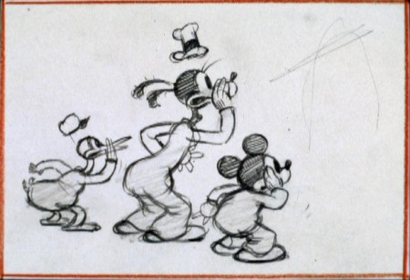
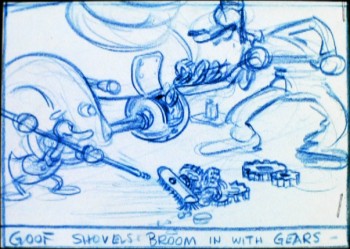
It’s way up there in my Pantheon of great shorts. The DVD features a rough animatic of story sketches from the vault. So I’ve pulled some frame grabs and am posting them here. There are some beautiful drawings here.


(Click any image you’d like to enlarge.)

2

3

4

5

6

7

8

9

10

11

12

13

14

15

16

17

18

19

20

21

22

23

24

25

26

27

28

29

30

31

32

33

34

35

36

37

38

39

40

41

42

43

44

45

46

47

48

49

50

51

52

53

Art Art &Illustration 22 Nov 2010 08:25 am

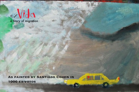
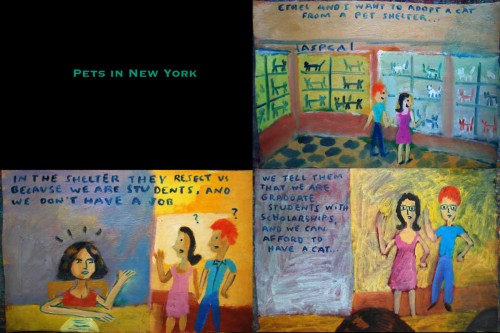
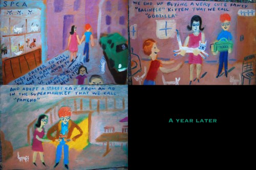
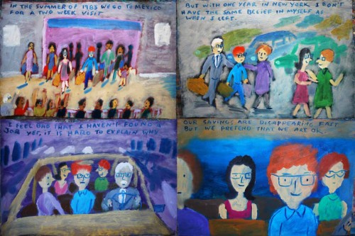
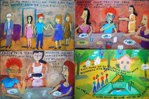
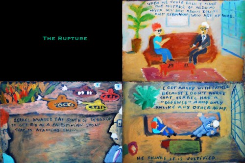
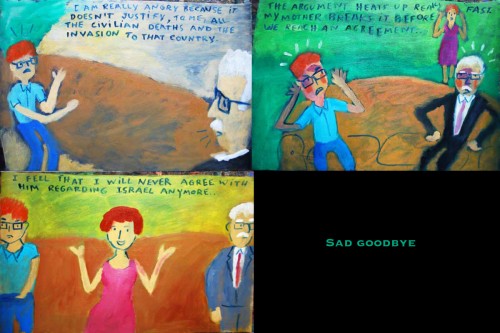
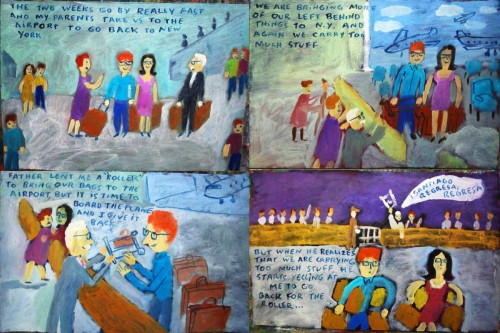
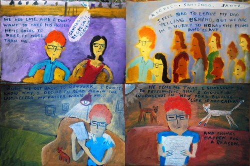
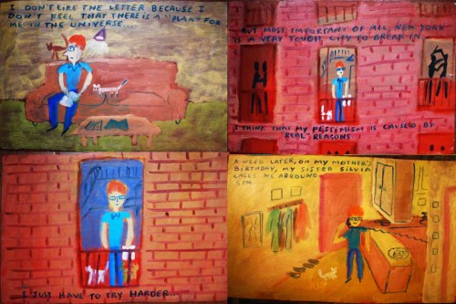
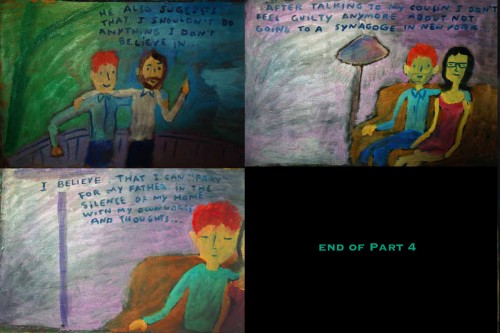
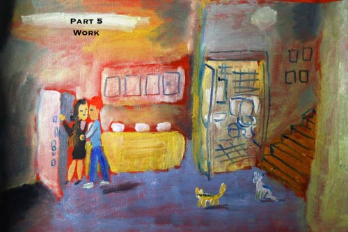
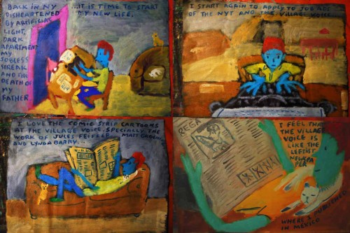
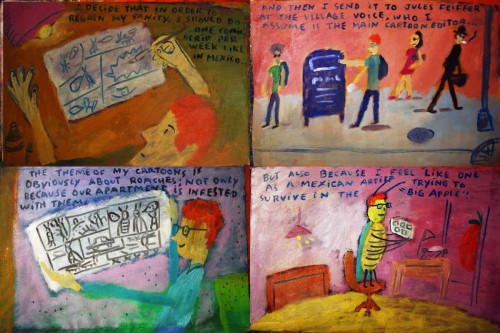
“Ex Vida” from Santiago Cohen – 7

- Continuing the epic artpiece by Santiago Cohen takes us to part #7, and with it another possible ending. Santiago may have produced more, in which case it will continue into next week. I hope so; it’s been a treat to post this brilliant work.

___________________

1
(Click any image to enlarge.)

234

235

236

237

238

239

240

241

242

243

244

245

246

247

248

249

250

251

252

253

254

255

256

257

258

259

260

261

262

263

264

265


To see prior parts of this post:
Part 1, Part 2, Part 3, Part 4, Part 5, Part 6

« Previous PageNext Page »

eXTReMe Tracker
click for free hit counter

hit counter