Animation Artifacts 05 Mar 2007 08:10 am
Fritz, the cat
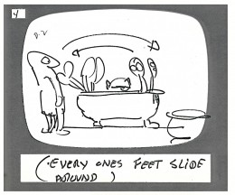
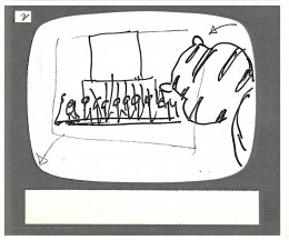
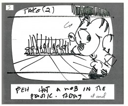
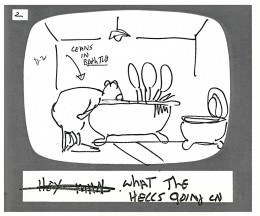
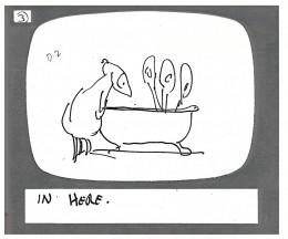
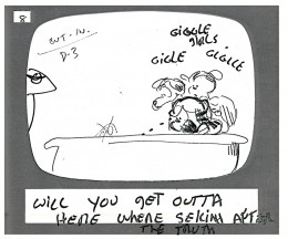
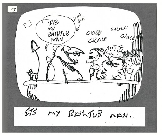
- Here are a few of the storyboard panels to Ralph Bakshi’s feature, Fritz the Cat. I find it interesting that they used those storyboard pads you can buy from art stores. It reminds me of my earliest days, long before I’d entered animation.
 Somehow, I always assumed these pads were most appropriate for ads and advertising agencies and never thought that real studios used them. I couldn’t imagine paying the price for these pads of storyboard panels that were serrated to break apart individually. Why not just use pads of paper? I wonder if anyone who was at the Krantz/ Bakshi studio could explain it to me.
(Click any image to enlarge.)
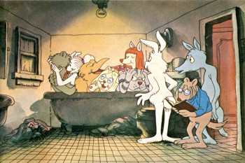
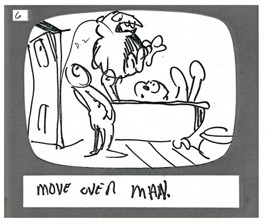
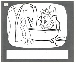
I think the storyboard drawings here might be Cosmo Anzilotti‘s work; I’m not sure. The first four panels come from the opening of the film. The latter group come from the randy bathtub scene a couple of sequences later.
The color illustration above is from Mike Barrier‘s Funnyworld magazine, issue #14.
I encourage you to take the time to go to Mike’s site and read the Funnyworld Revisited section which includes the articles about Fritz in this issue. This was when Funnyworld was at its height, and the articles give a thorough account of the film and a real analysis. Why aren’t we getting the likes of this for any current feature? There are plenty of “The Art of . . .” books but too few critical evaluations. I can understand this for many of the studio features where writers are just bought into a project, but one wonders about the more independent films like The Triplettes of Belleville or Spirited Away. Only the blogs seem to have their spotty critical analyses.
The storyboard panels follow.
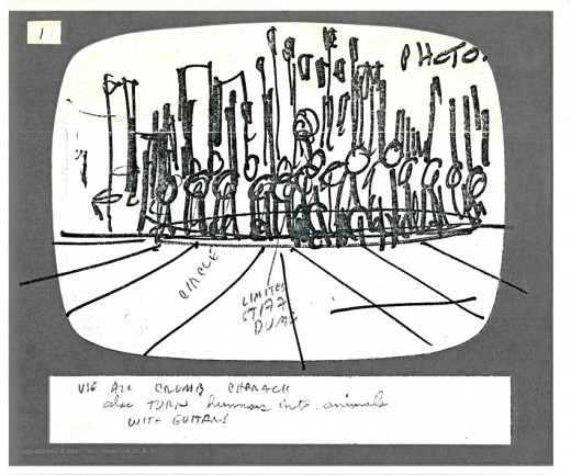
The background is identified as a “Photo.” Many of the backgrounds for the film were photos by Johnny Vita that he traced over in ink on a cel and painted with Luma dyes to match the lines.
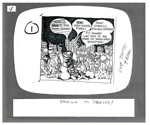
For this scene using one of Robert Crumb’s strip panels was enough.
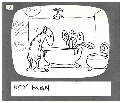
It’s interesting to see how the backgrounds are delineated on this storyboard drawing. From here on they ID the background on every storyboard drawing.
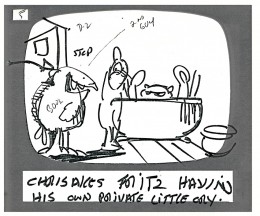
Note how the door has moved to the other side of the bathroom in the final (see color still above).

on 06 Mar 2007 at 3:19 am 1.Stephen Worth said …
Those are definitely Ralph drawings. You can see more of his drawings, but from a later time period, at…
http://www.animationarchive.org/2006/03/media-ralph-bakshis-phone-doodles.html
See ya
Steve
on 08 Jul 2012 at 12:18 am 2.Liim Lsan said …
The mouth on the last drawing is quintessential Ralph. ^^ Was this scene animated by Manny Perez in the final, would you know…I’ve heard it said as such?
(Actually, someone told me that the fabled ’5 days’ Rod Scribner spent on the production was the shot of Fritz shooting the toilet from this sequence. It has his style of timing legs and a few good Scribner arm flails…any way of knowing?)
These are genius! And for all I know, the storyboard panels were cheap. Nobody else bought them save for the agencies, right? If buying for a feature, you’ll buy wholesale and in bulk the style of paper that the major networks ensure will never run out. ^^
on 09 Nov 2017 at 10:31 am 3.roof shingles cost said …
Hey I kmow this is offf topic but I was wondering if you knew
of anny idgets I could add to my blog that automatically tweet myy newest
twitter updates. I’ve been looking for a plug-in like this for quite some time and was holing maybe you woud
havee some experience with something like this. Please let me know if you run into anything.
I truly enjoy reading your blog and I look forward too your new updates.
on 22 Nov 2017 at 5:08 pm 4.remodel said …
I jjst could not leave your website before suggesting
that I acfually enjoyed tthe standard info a person suupply to your visitors?
Is going to bbe back often in order to investigate cross-check new
posts
on 14 Dec 2017 at 10:43 am 5.georgecbernstein.Website said …
It’s nearly impossibe to find knowledgeable people about this
subject, however, yoou sound like you know what you’re talking about!
Thanks