Bill Peckmann &Illustration &Independent Animation &Layout & Design 06 Jul 2013 06:55 am
Provenson Animals
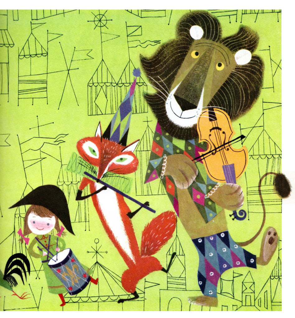
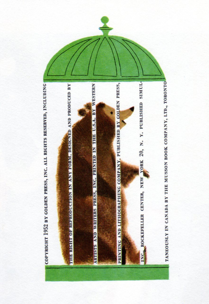
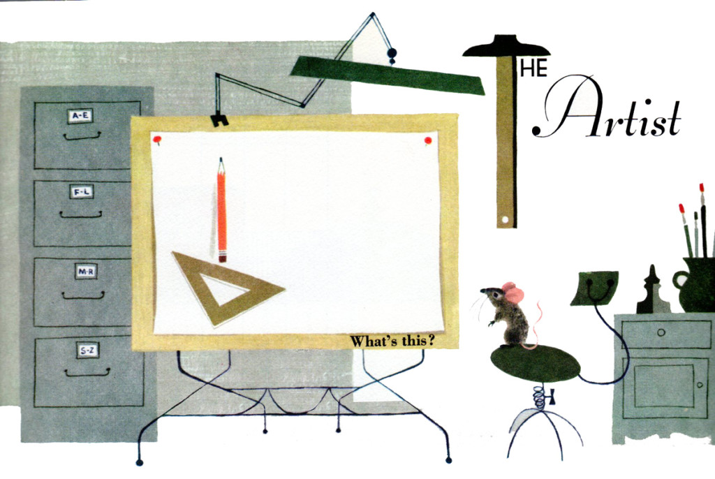
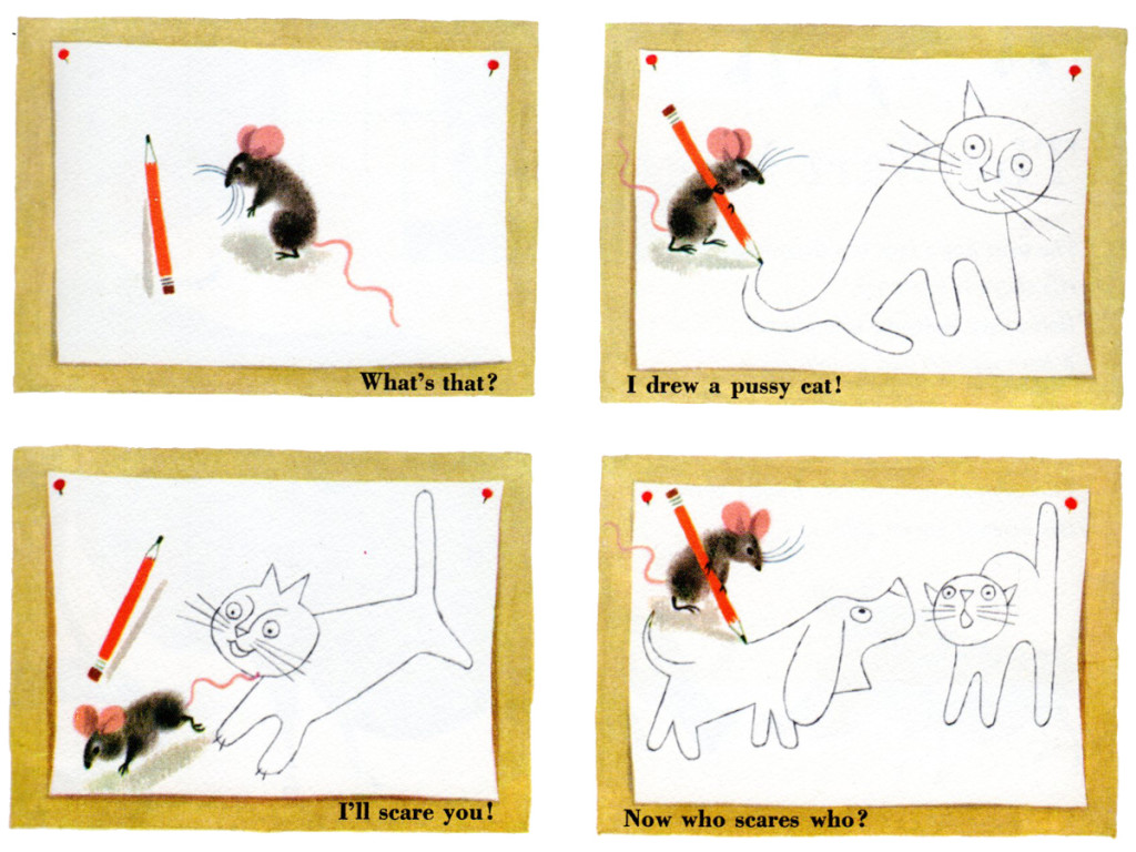
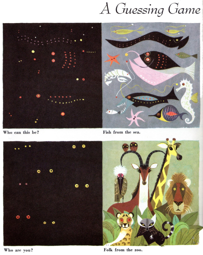
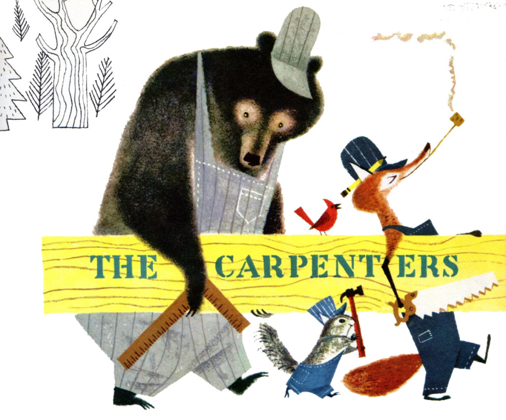
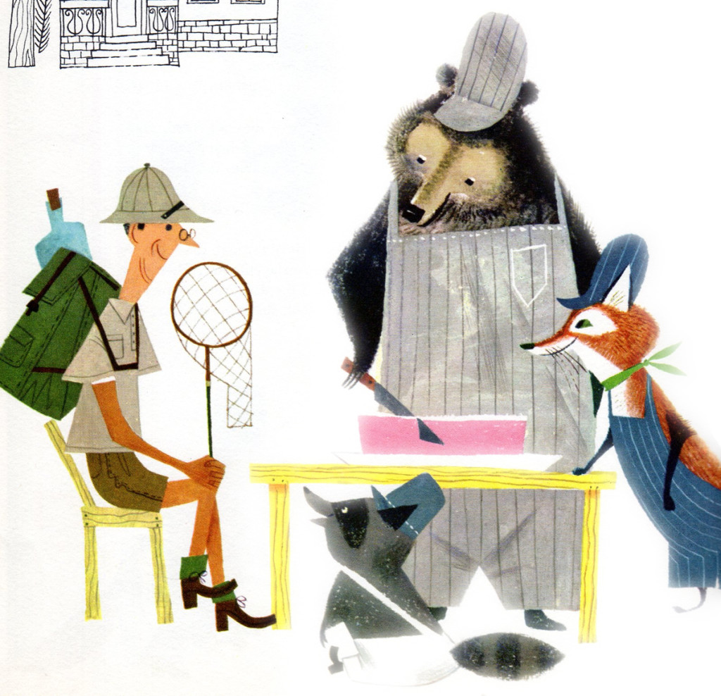
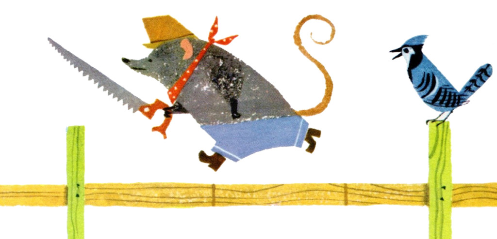
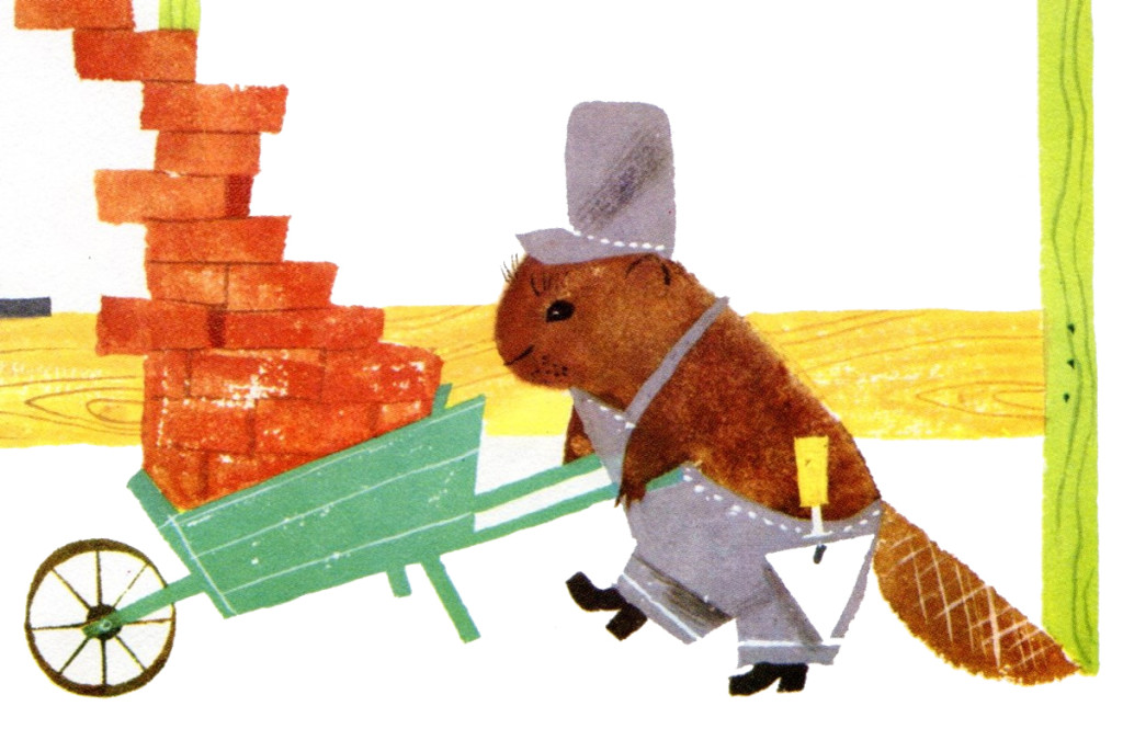
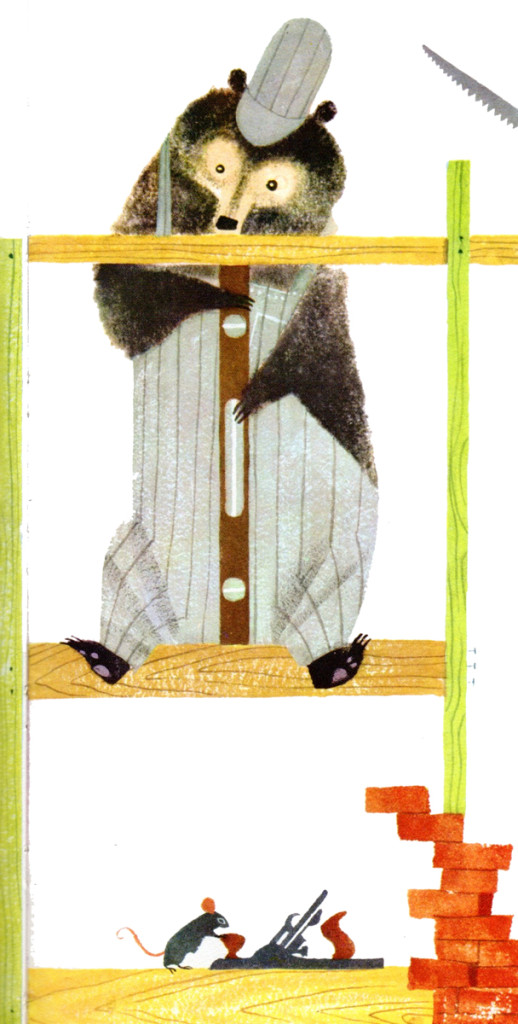
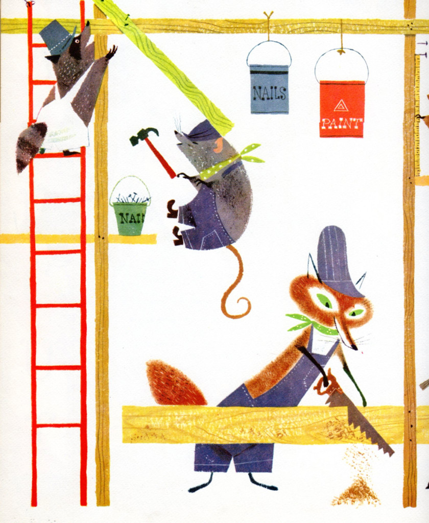
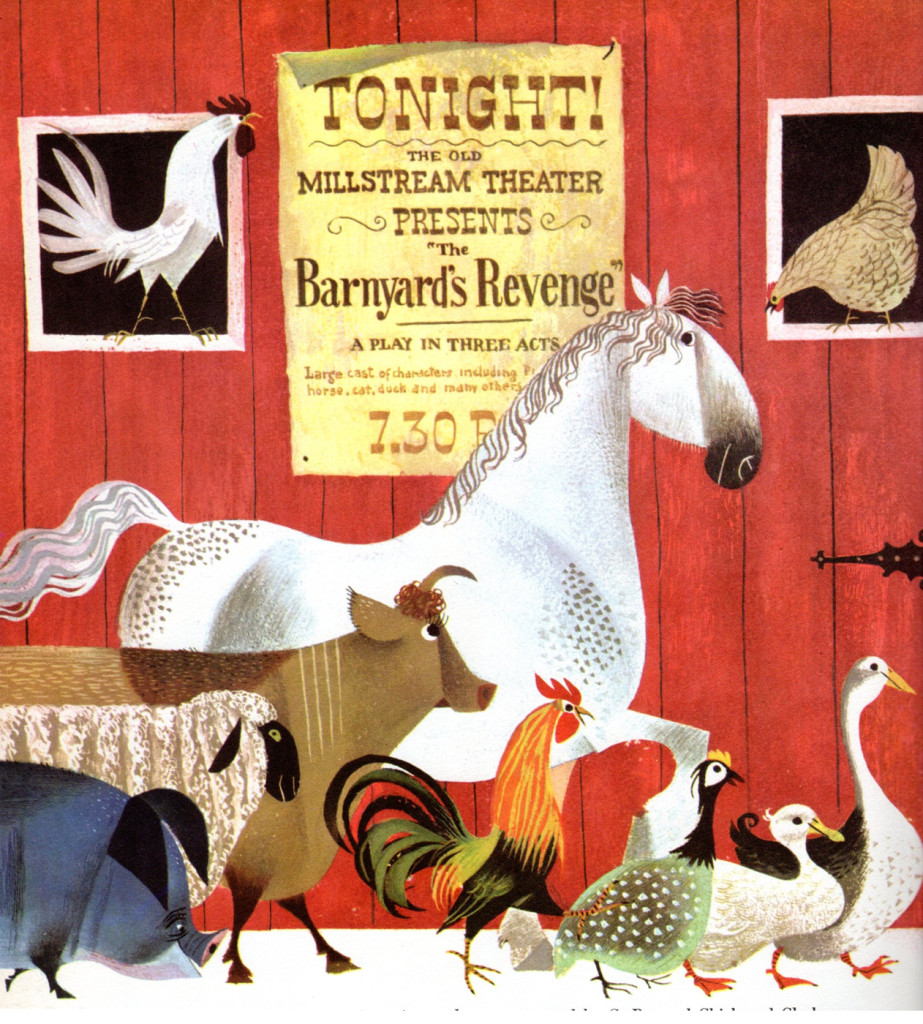
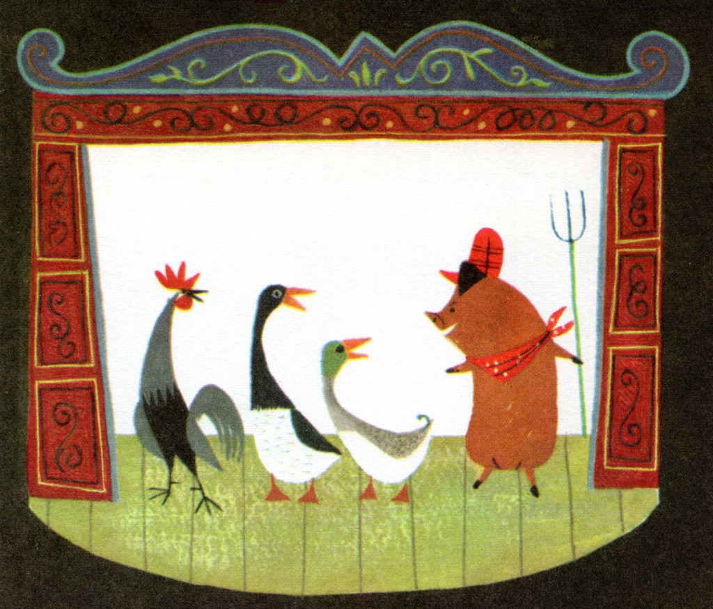
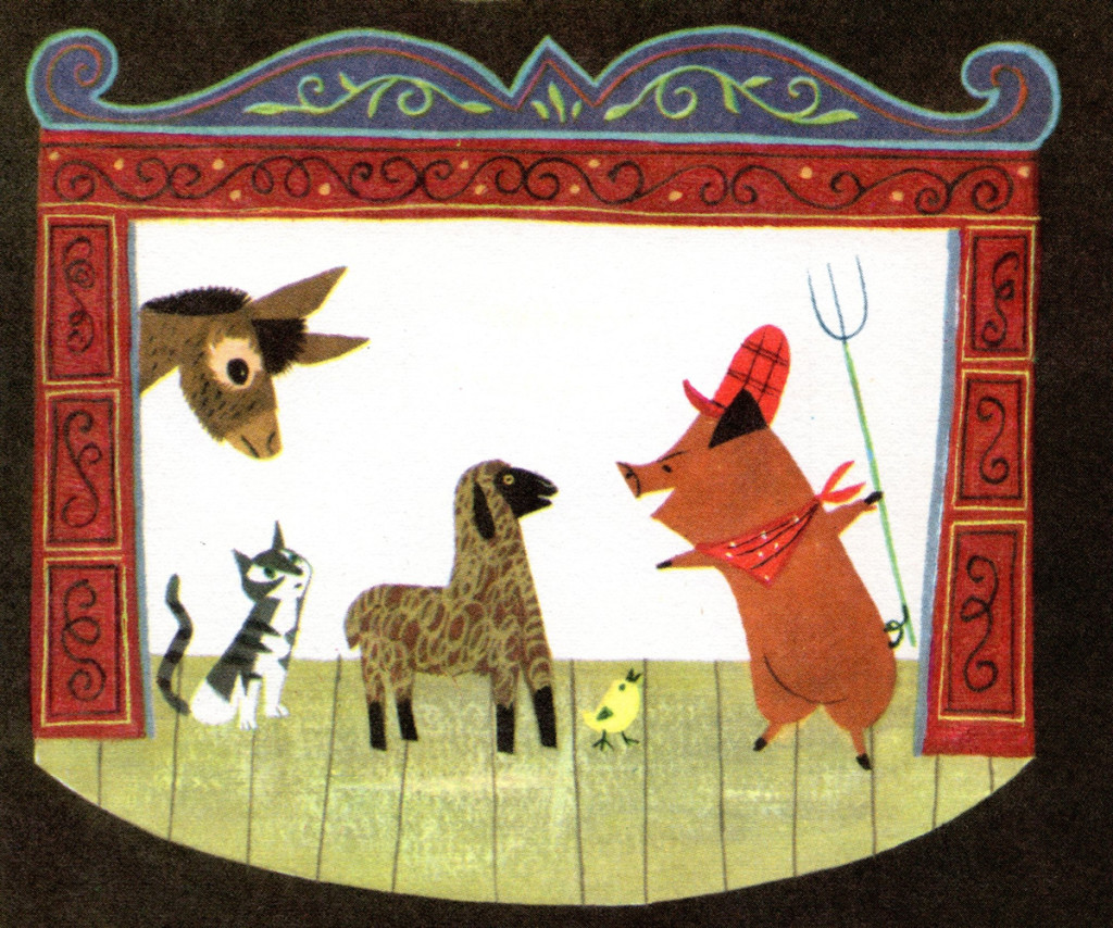
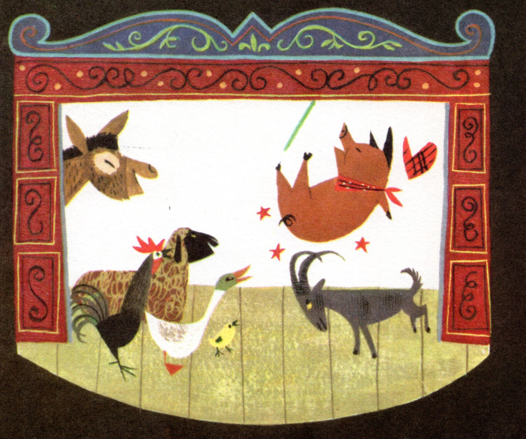
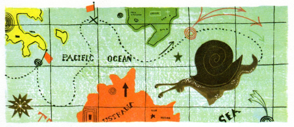
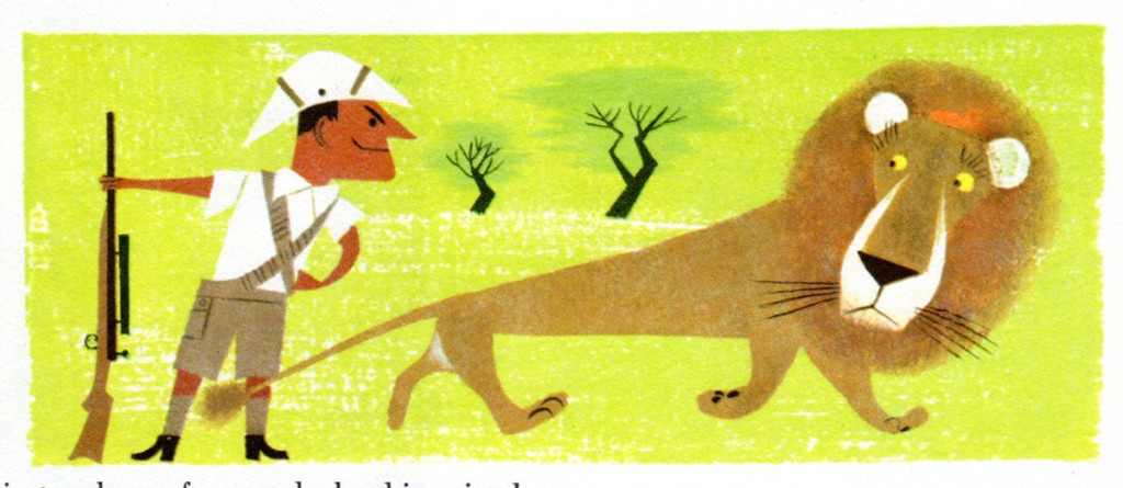
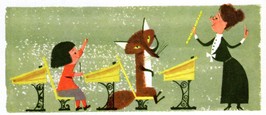
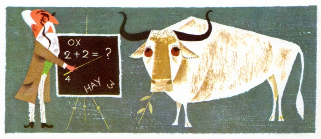
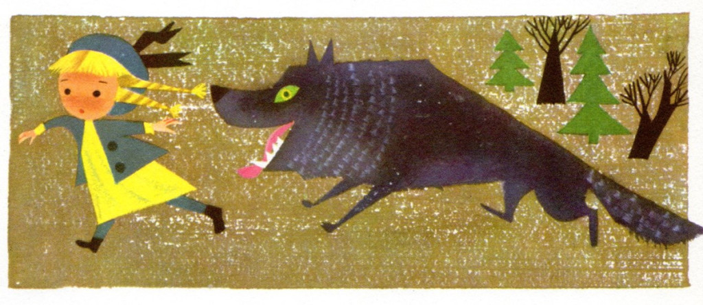
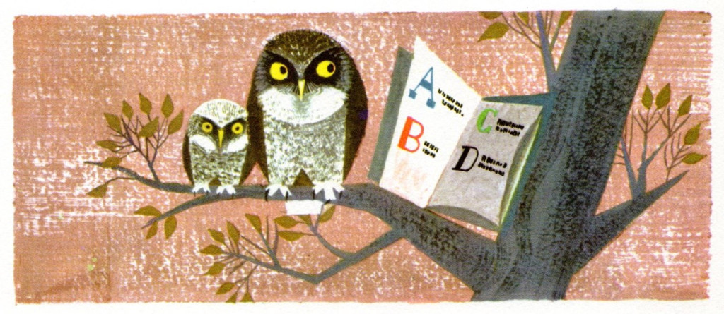
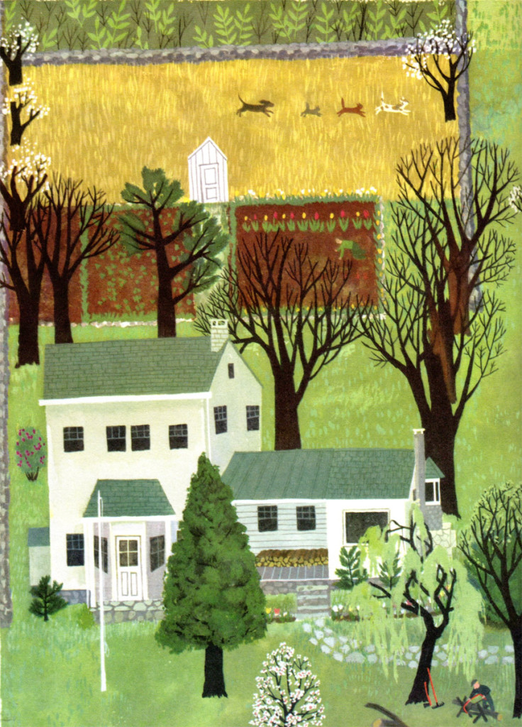
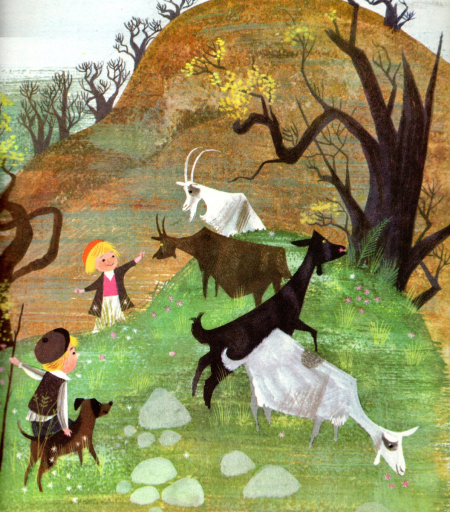
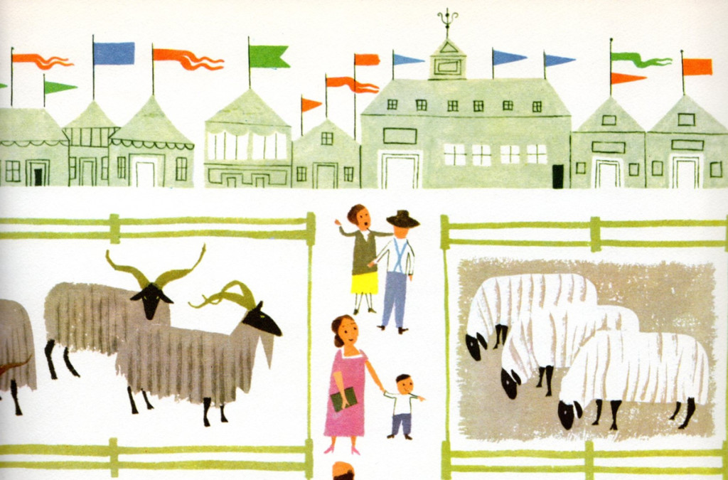
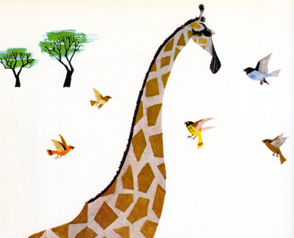
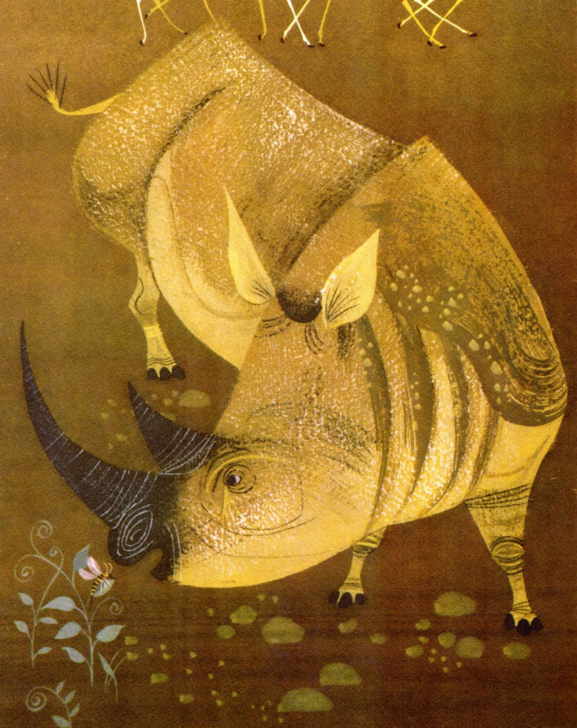
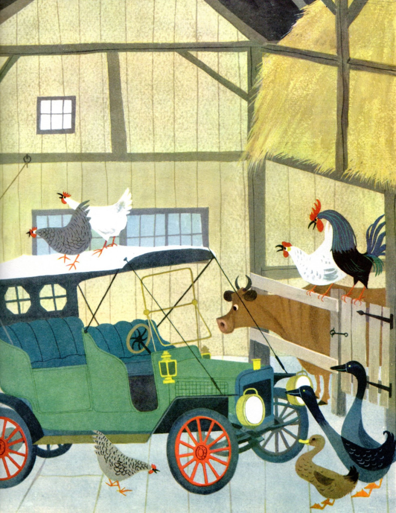
Bill Peckmann sent scans of this glorious and beautiful children’s book by Martin Provenson. There really, as far as I’m concerned, is no reason necessary. The illustrations are just beautiful, and I find myself staring at them for long periods of time. It’s a great book.
Bill writes the accompanying note:
- The reason I have this book is because when George Cannata Jr. was our Animation Design teacher at Visual Arts in 1960, he recommended that his students buy it because it was known as the “animation designers bible” in those days.
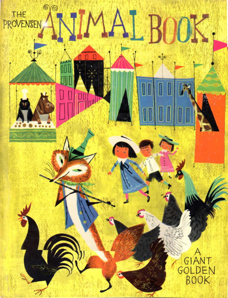
The oversized book cover

on 06 Jul 2013 at 8:33 am 1.Matt said …
These are great! Thanks for sharing.
on 06 Jul 2013 at 8:45 am 2.anik said …
Beautiful!
Are the black and the white goat in love?
on 06 Jul 2013 at 10:39 am 3.Joel Brinkerhoff said …
Oh Alice & Martin Provenson are all time favorites of mine! Inventive and playfully appealing their textual quality and graphic design does keep the eye involved particularity compared with today’s flat digital imagery. Their work is rewarding time after time with each viewing. I love Alice & Martin.
on 06 Jul 2013 at 11:11 am 4.Joel Brinkerhoff said …
I noticed a typo and meant to say ‘textural’ and not textual. I can’t type…
on 06 Jul 2013 at 3:00 pm 5.Star said …
Those are simple, yet beautiful…. Makes me feel like a gargoyle, just staring down at them in full greenness (meaning I feel humbled at them, no offense) I simply admire them. Thank you for uploading such a great post.
on 06 Jul 2013 at 5:24 pm 6.Stephen Macquignon said …
The artist is my favorite clever and just a lot of fun to look at
on 06 Jul 2013 at 5:25 pm 7.Floyd Norman said …
This book was my bible while attending Art Center College of Design back in the fifties. Awesome.
on 06 Jul 2013 at 7:26 pm 8.Andreas Deja said …
One of the best and most influential children’s books.
on 07 Jul 2013 at 2:55 am 9.Paul Penna said …
Reminds me a lot of the work of J.P. Miller (who you’ve covered in past articles) in one of the favorite Little Golden Books from my childhood: “The Little Golden Funny Book,” which I’m glad I still have.
on 09 Jul 2013 at 2:31 pm 10.the Gee said …
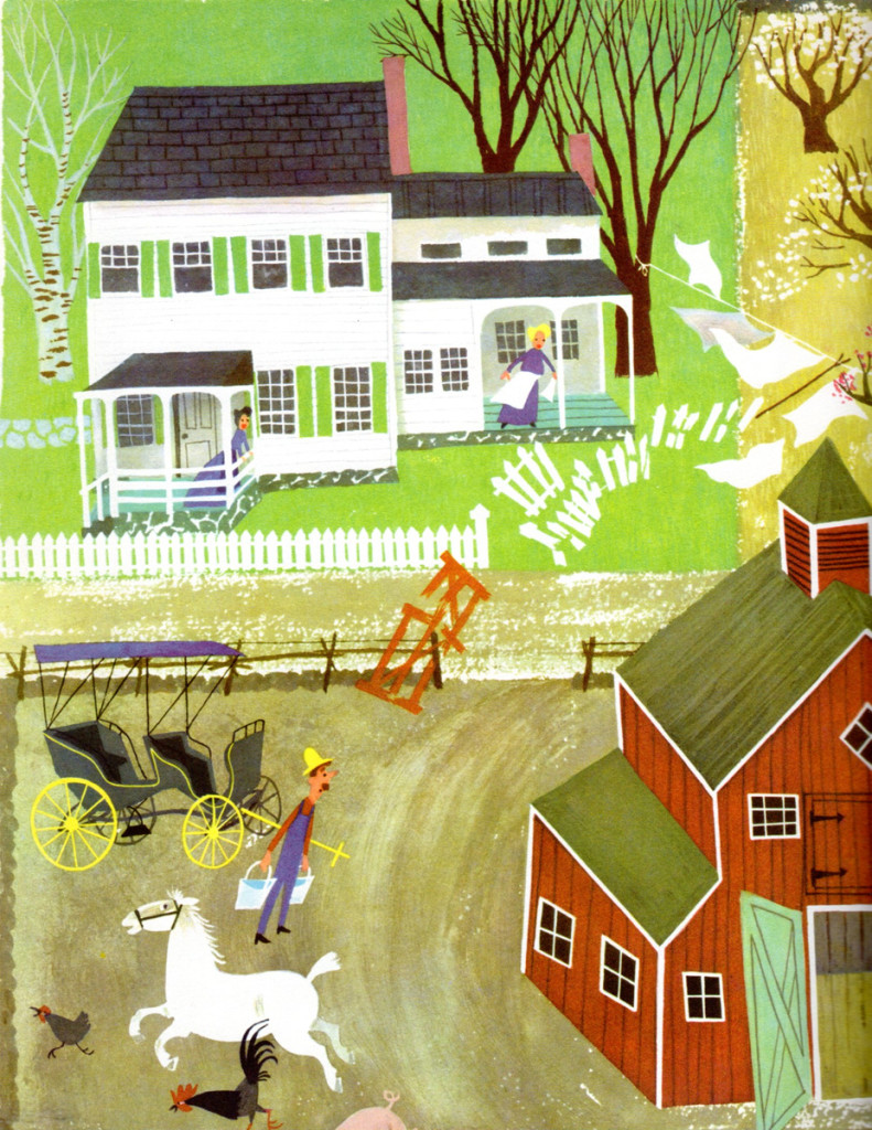
The perspective as used in image 22 of the farm house/property, is the kind of approach I’ve only had a chance to do for my own projects and never had had a call for or chance to play around with for paying work.
The closest I ever get to is is isometric designs. That kind of sucks because Richard Scarry used that perspective for his villages and towns. There’s this vibe I get from it that can only be described as like looking at cut paper collages or even one of the old Colorforms vinyl sets (with full color and a visual cohesion to it, of course).
It gave me a charge when I was in grade school.
As for the style and the techniques used I’ll probably always need to study these works to get a better feel for things. However, I don’t want to outright mimic that look, I would want to apply the best parts of the techniques to what I might make. This is mostly for textures and what not, and, almost always for backgrounds.
Suffice it to state that it is really nice to see this.
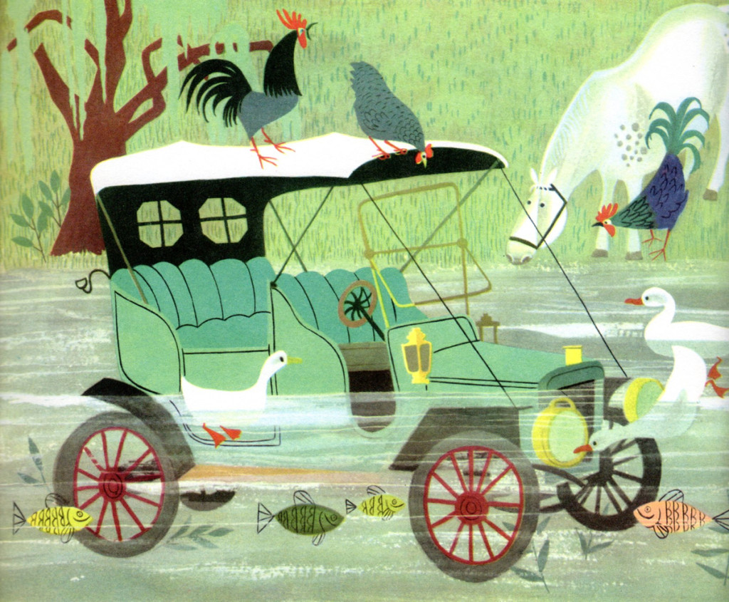
And, to write something which I never, ever thought I would express: those who worked in similar styles to and painted animals produce the most exquisite depictions of roosters I’ve ever seen.