Bill Peckmann &Books &Commentary &Illustration 20 Jun 2013 05:28 am
Peter de Seve
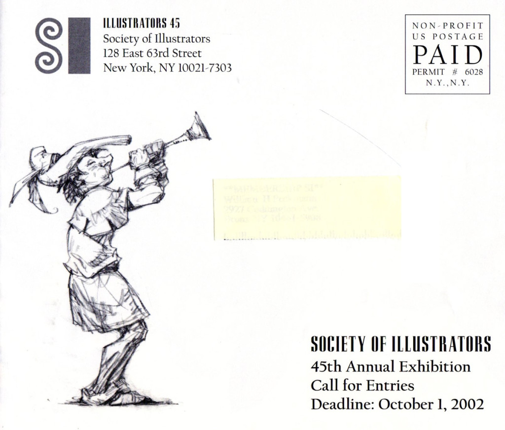
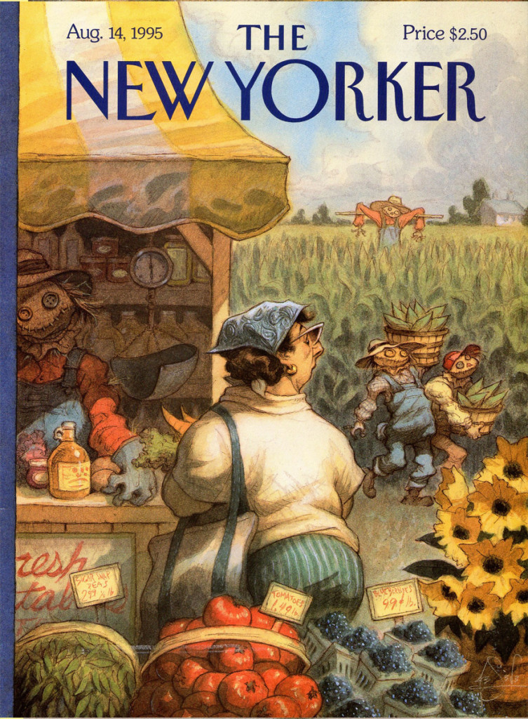
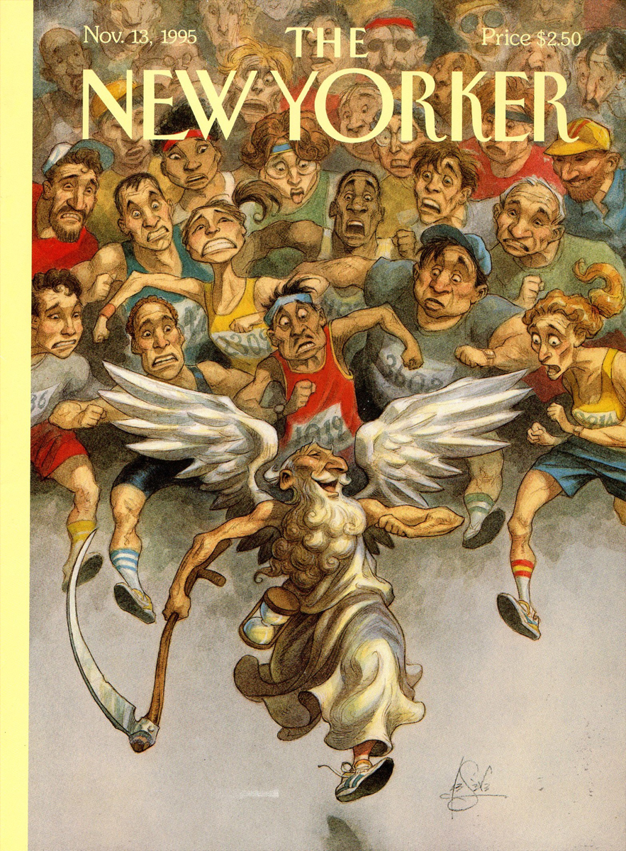
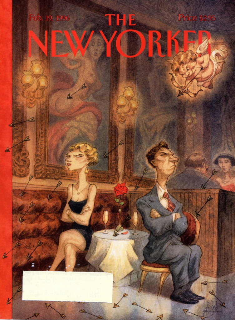
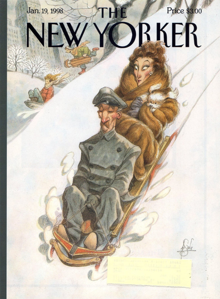
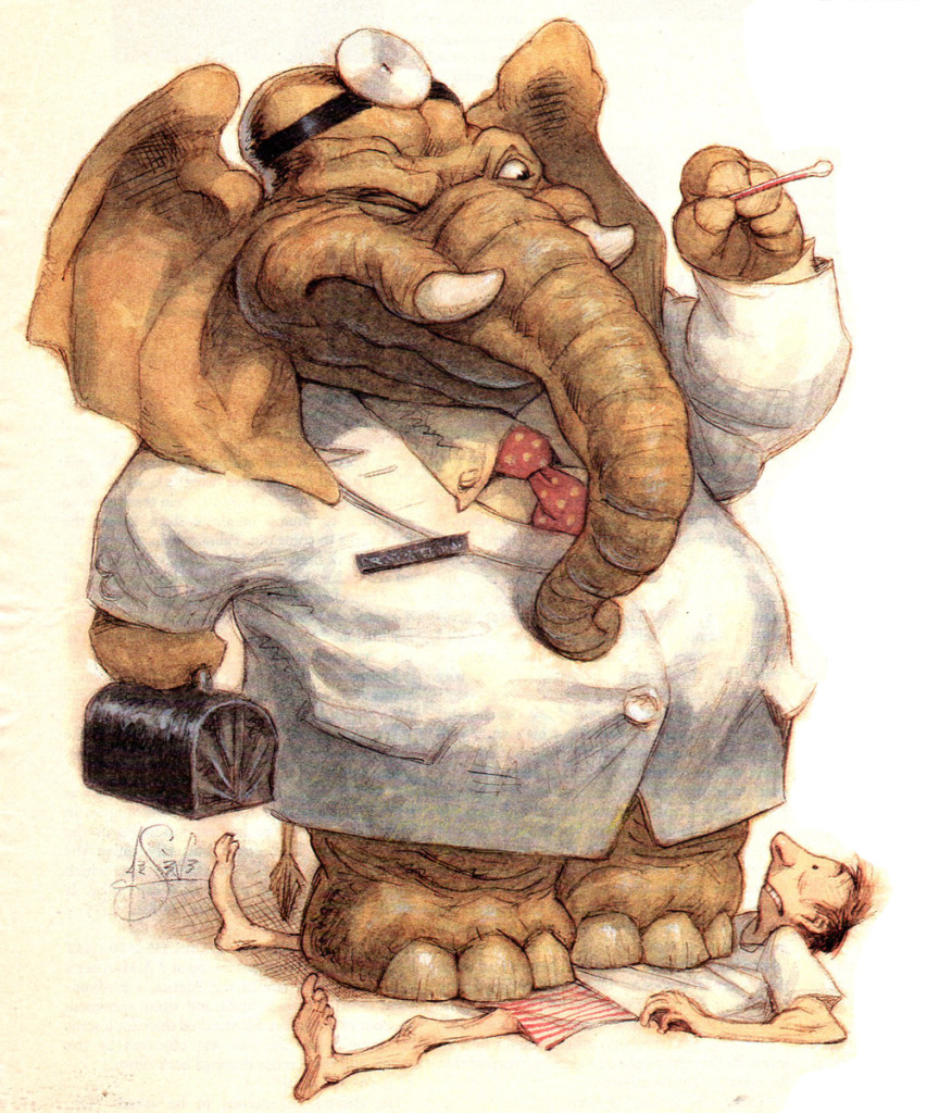
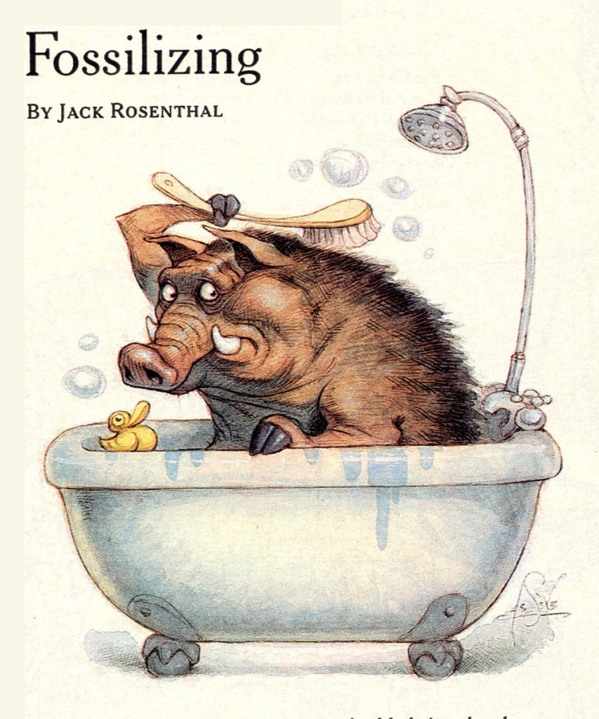
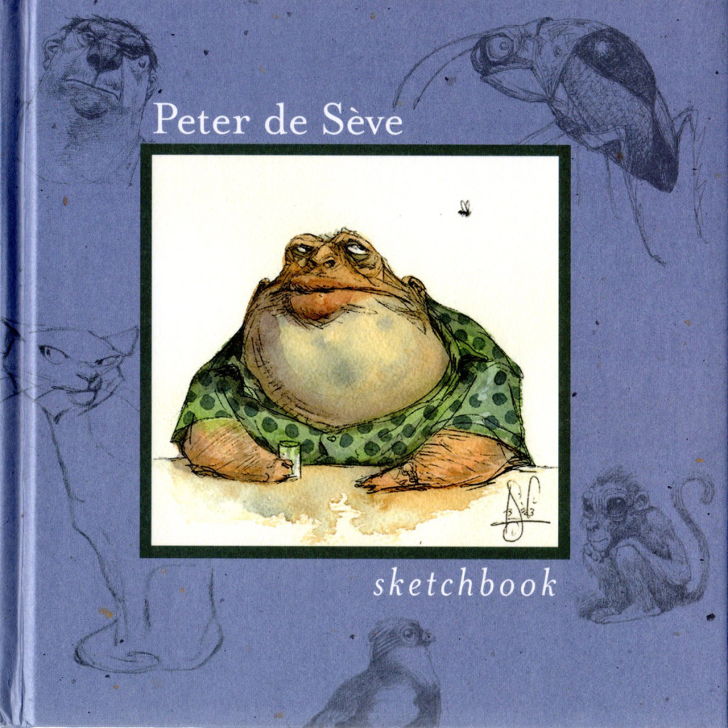
We, in animation, are all familiar with the work of the talented designer, Peter de Seve. Bill Peckmann has sent me a number of clippings of his work: covers from New Yorker magazines, ruff illustrations and articles about him. It makes for a good post on this talented artist.
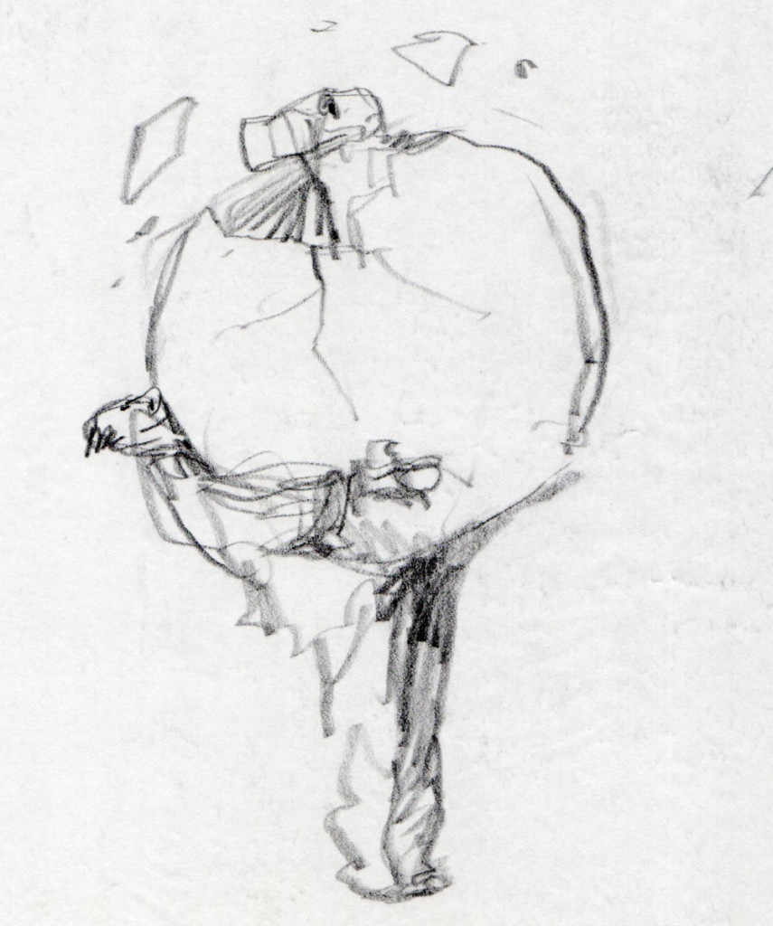
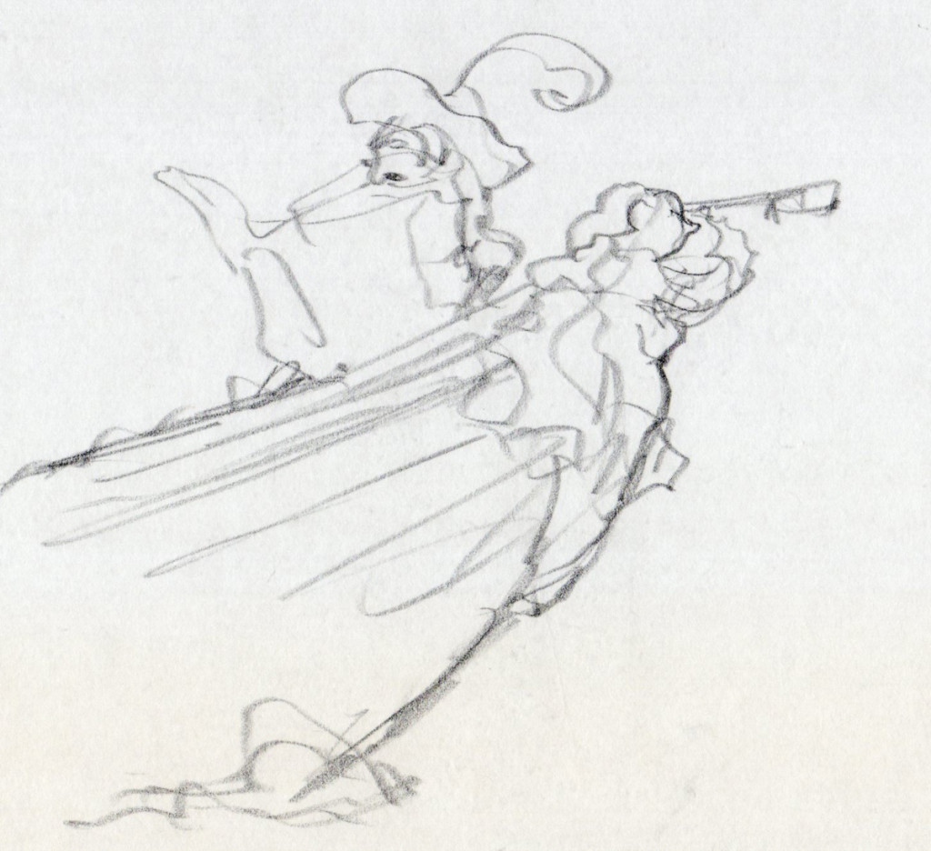
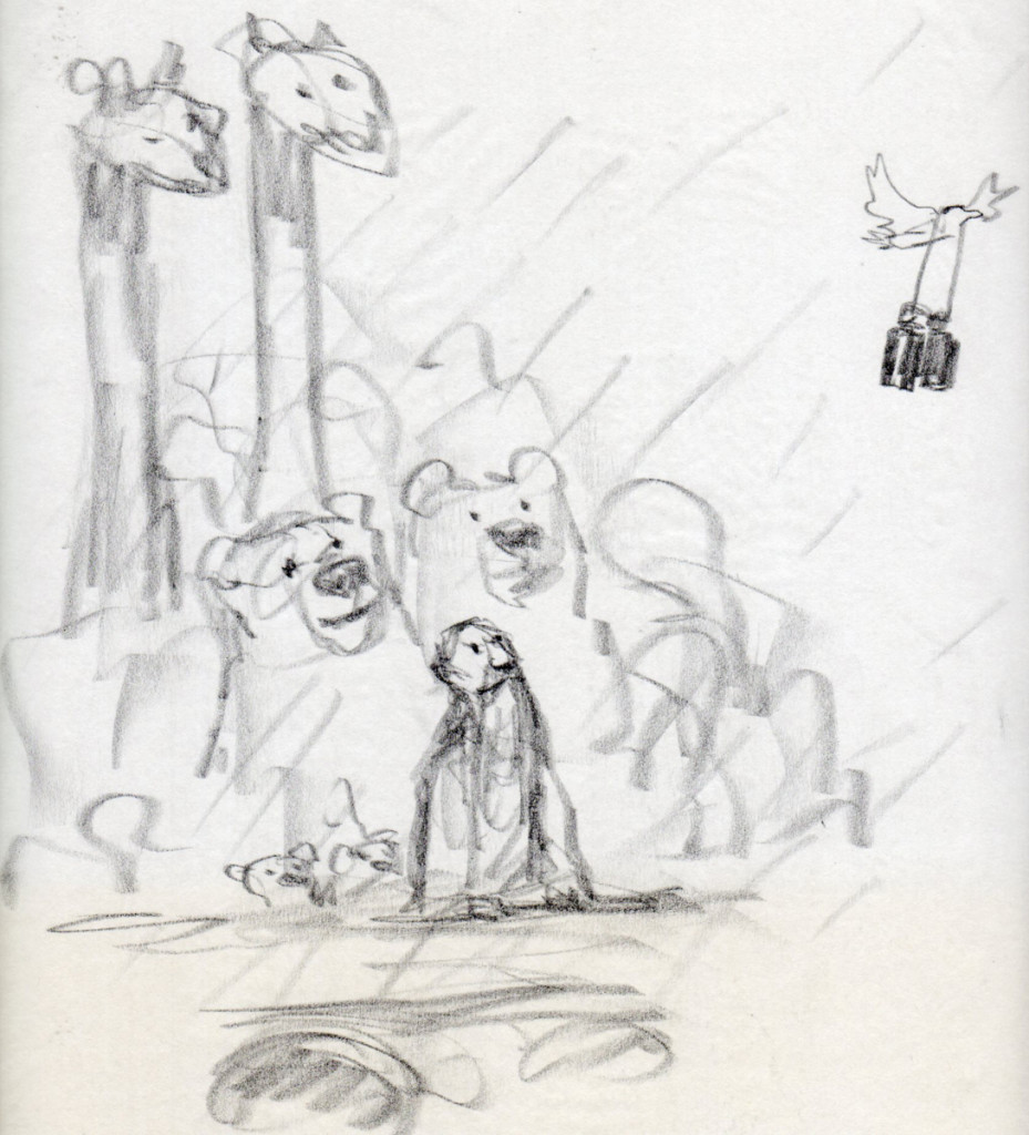
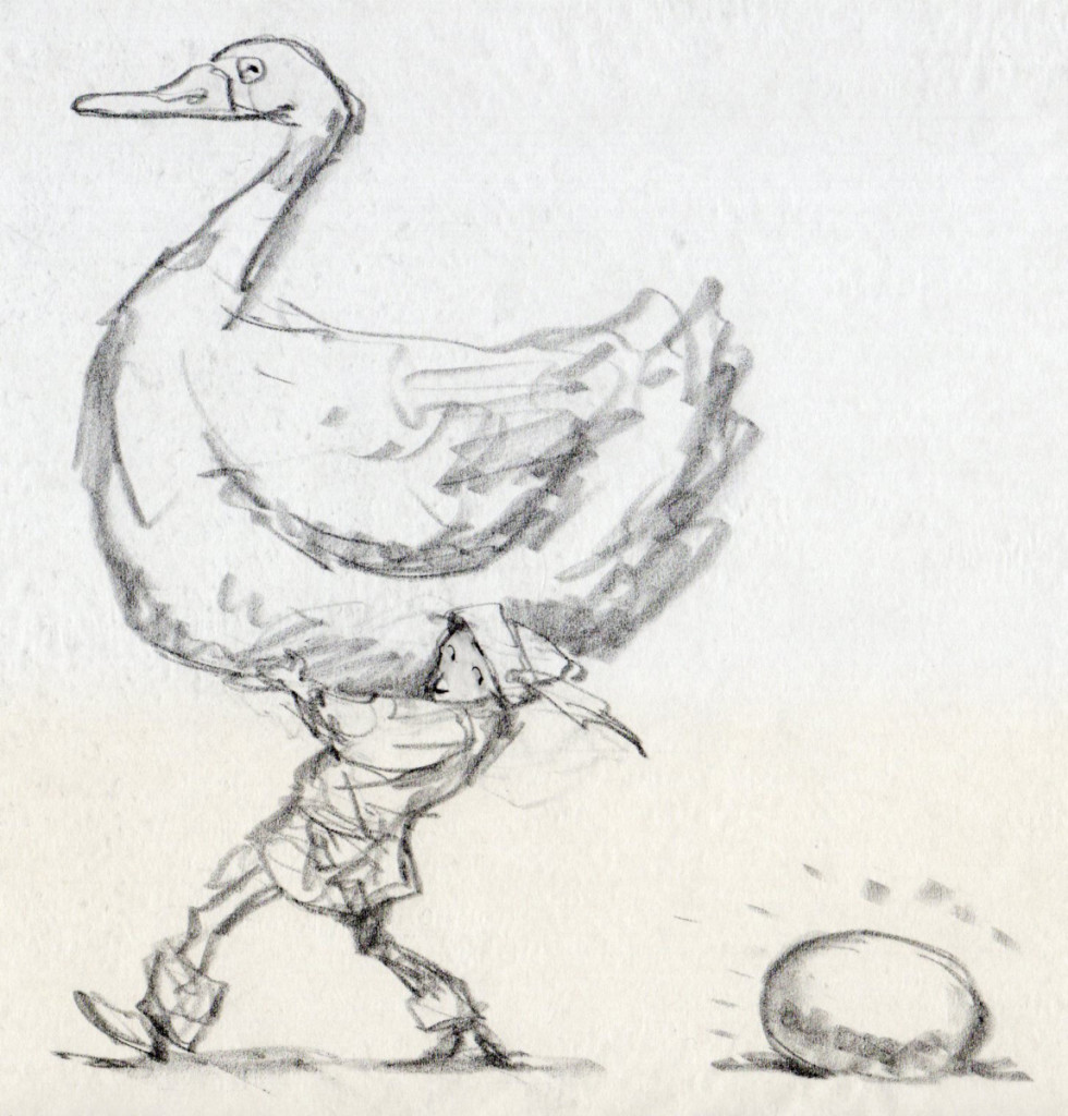
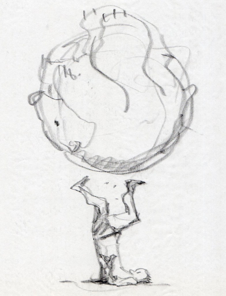
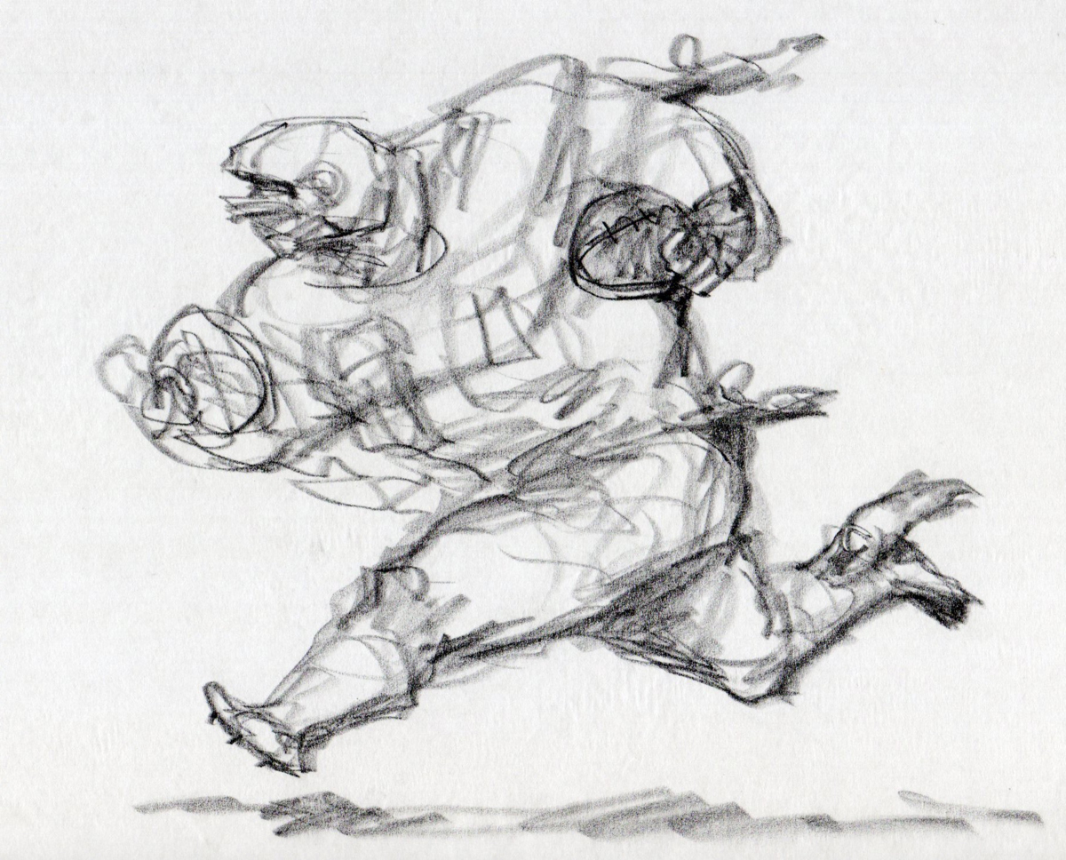
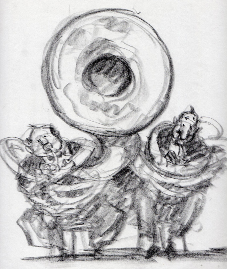
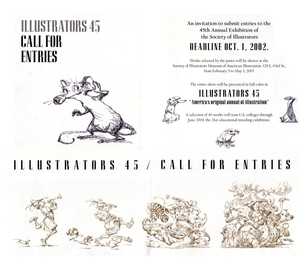
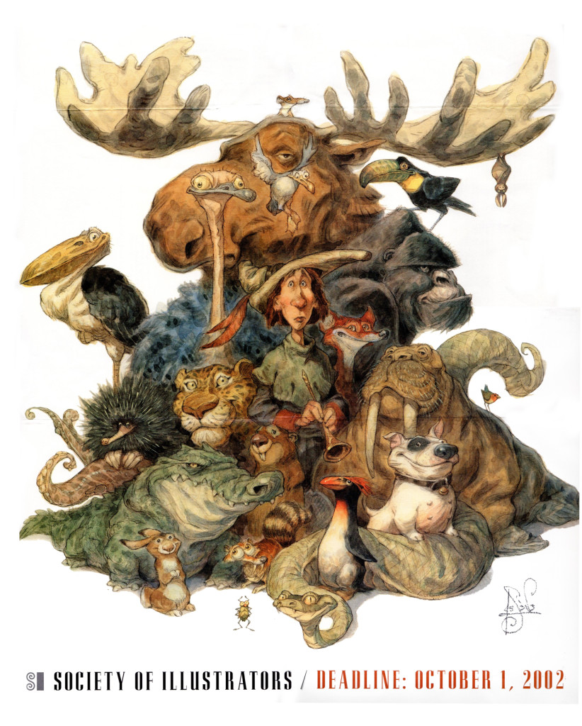
Back in the mid 1990′s, friend Tom Yohe was art directing an ad agency print job and he called in Peter De Seve to do the illustration. Tom knew I was a huge De Seve fan and he was kind enough to give me Peter’s discarded roughs. Here they be…
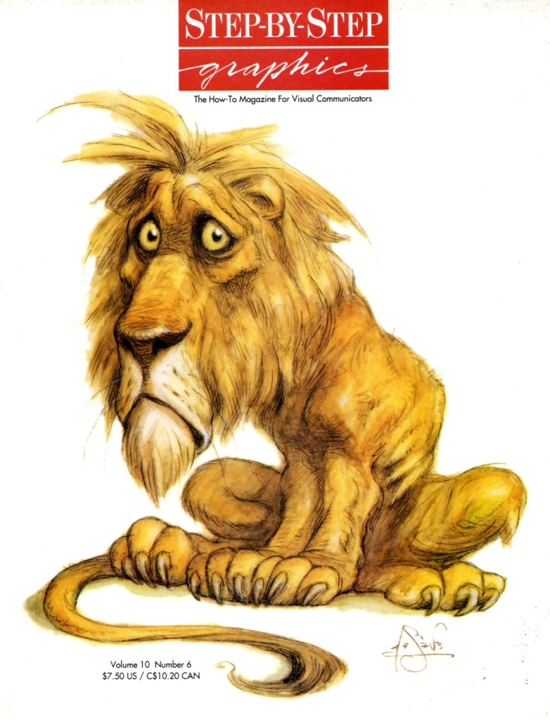
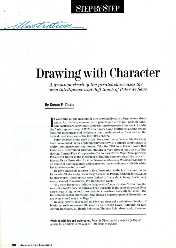
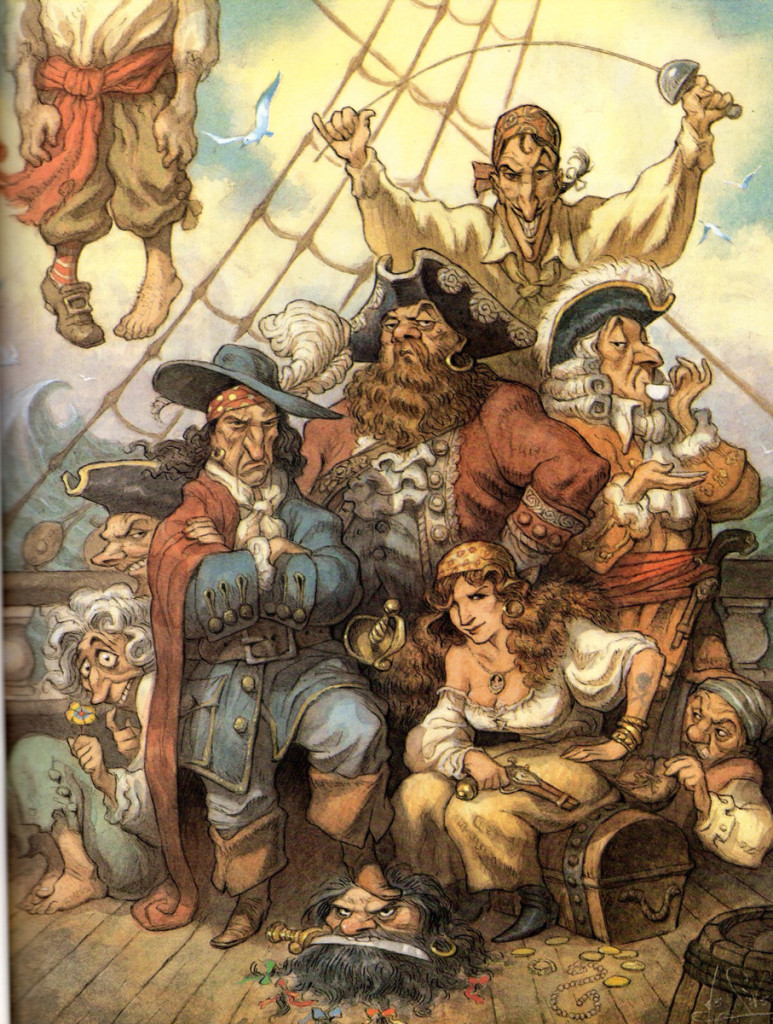
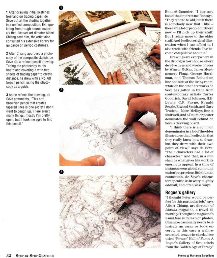
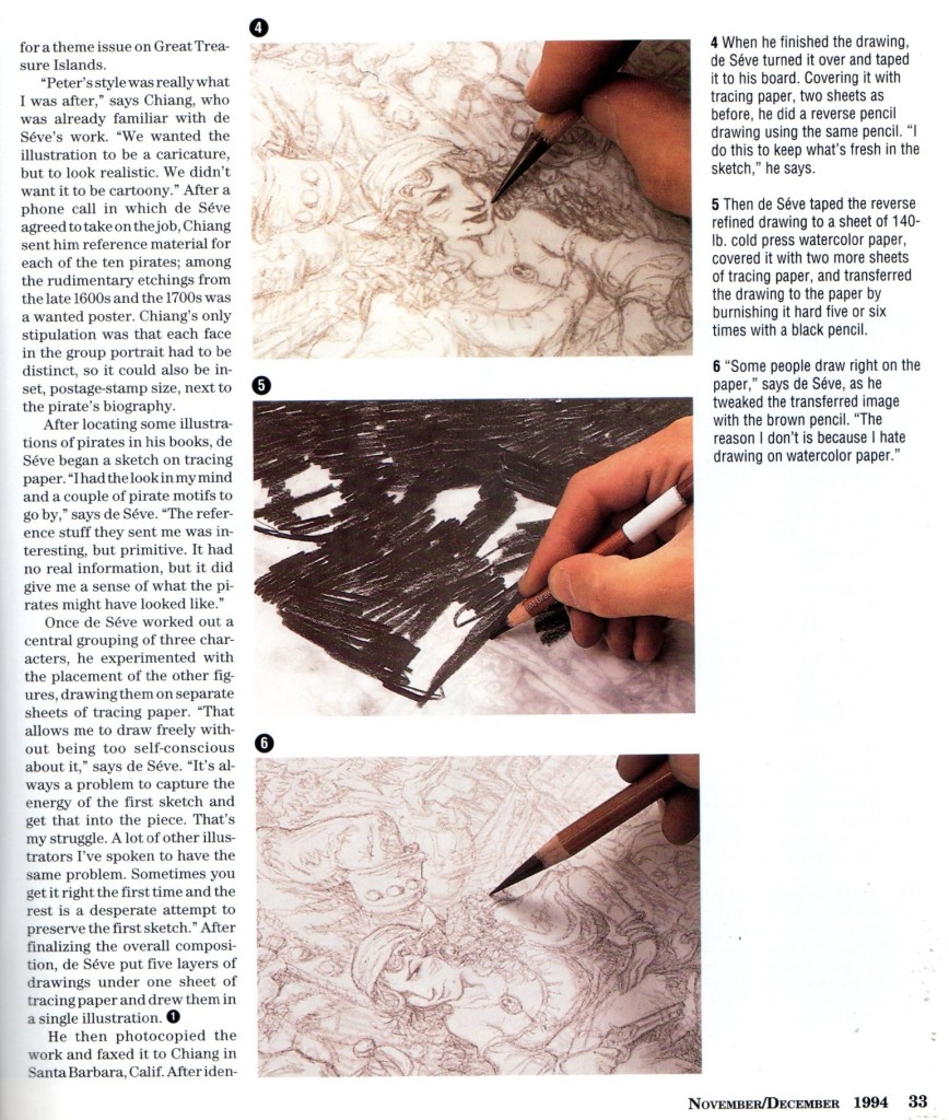
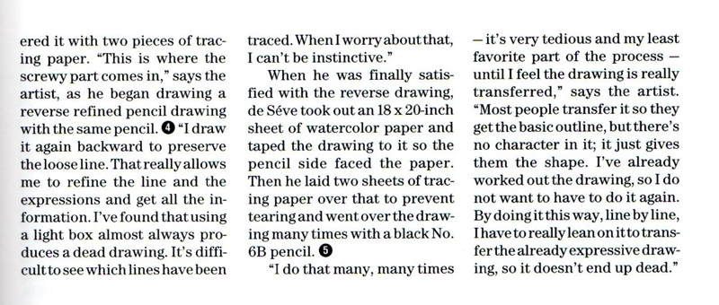
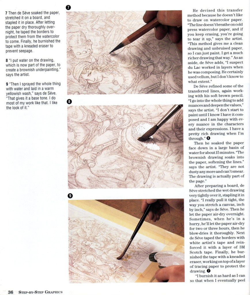
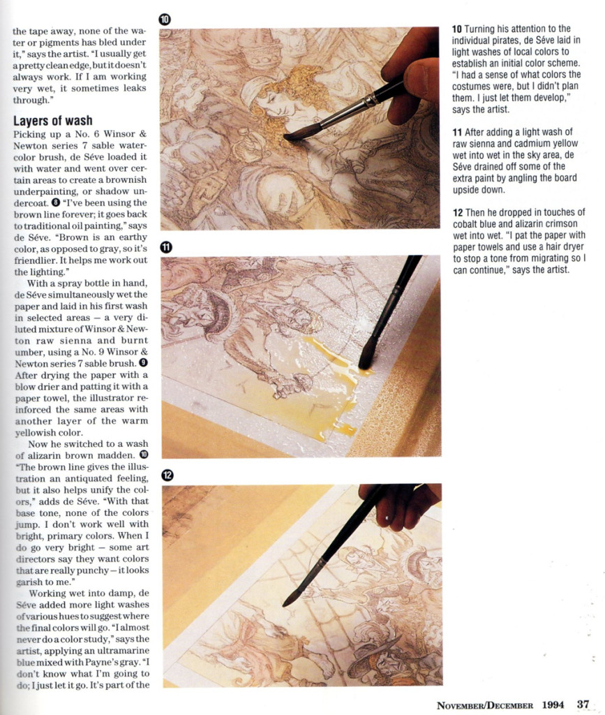
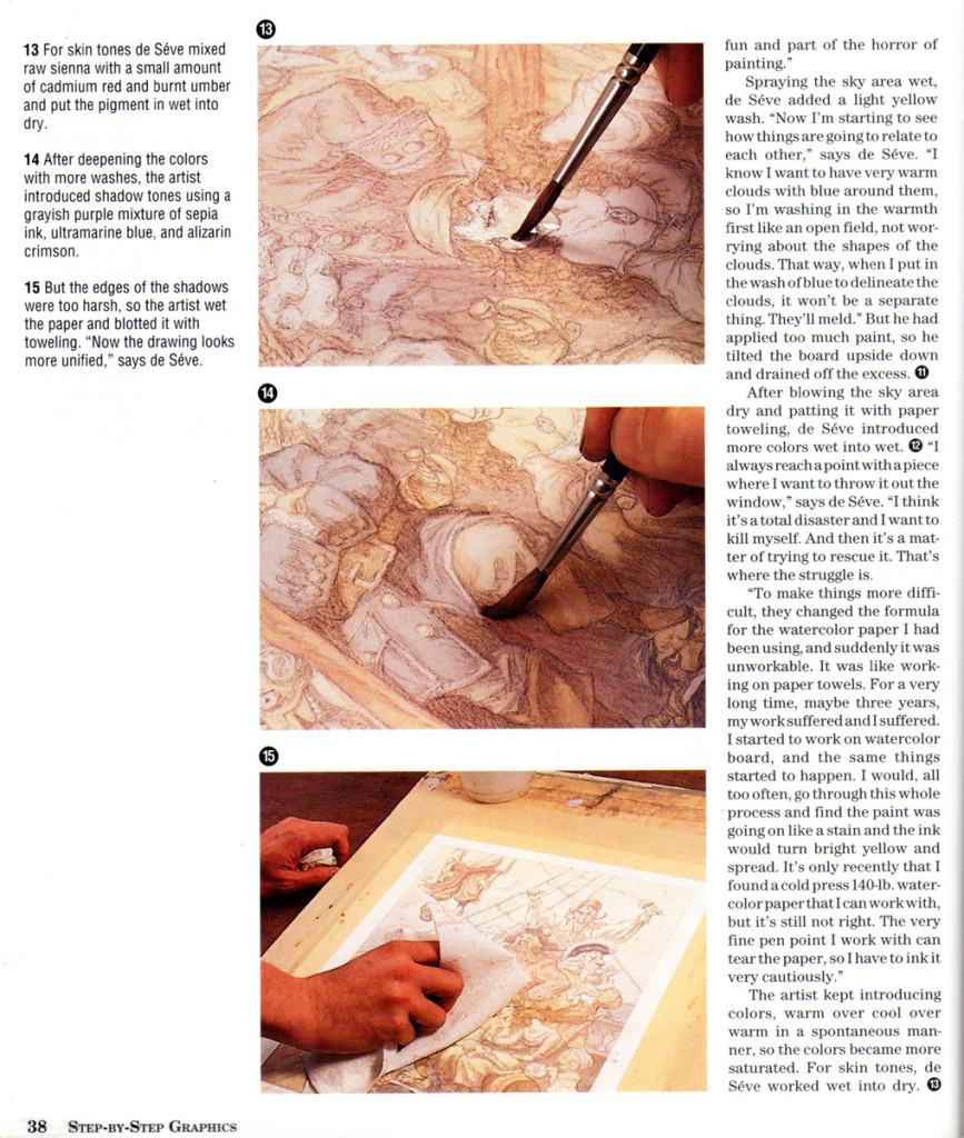
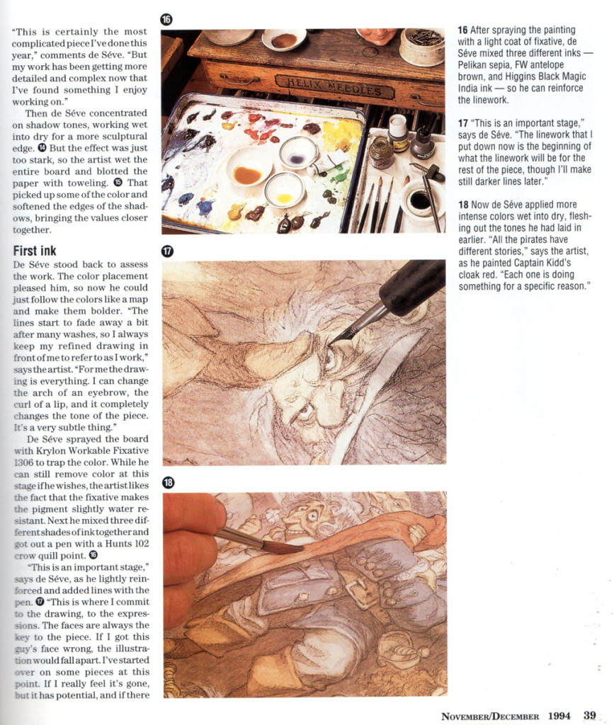
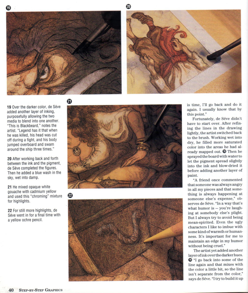
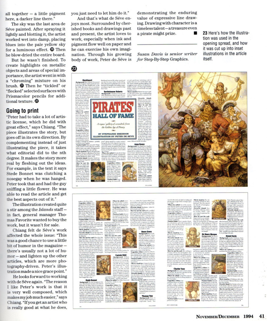
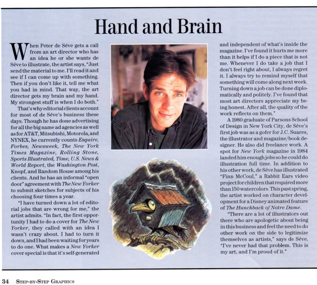
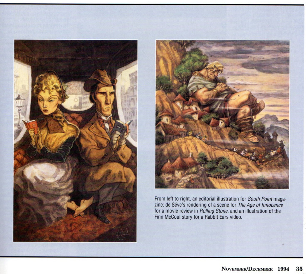
The following is an article from a 1994 issue of STEP-BY-STEP GRAPHICS.
 29
29


on 20 Jun 2013 at 7:06 am 1.Mark Mayerson said …
I love the sculptural quality of de Sève’s work.
on 20 Jun 2013 at 8:17 am 2.Bill said …
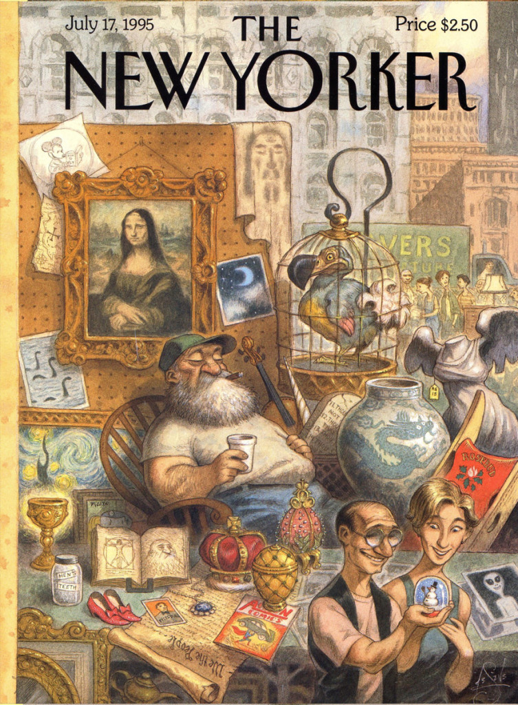
The abundance of visual gags on the first New Yorker cover are a pure delight, but I am embarrassed to say that the “Moon” picture between the Mona Lisa and the dodo bird is going right over my head, help!
on 20 Jun 2013 at 9:15 am 3.Richard O'Connor said …
He’s really, really, really good.
It’s very satisfying, as an admirer of illustration, to know that Peter de Seve has achieved such success.
on 20 Jun 2013 at 3:41 pm 4.the Gee said …
It is really nice to see this. He is a great illustrator, and like Bill mentions, he’s got great gags going on.
As for that “photo” of the moon and the two clouds?
That is kind of vague which is odd because there are hints that one of the Ten Commandment tablets and a unicorn head are in that pile of stuff.
Maybe the “moon†is supposed to go “right over†people’s heads.
( I doubt it but it makes it kind of funny. )
on 20 Jun 2013 at 4:28 pm 5.Suzanne Wilson said …
The Moon could represent myth, magic, superstition, etc. All the items are either iconic, symbolic or linked with belief systems. Is he saying that what people once believed was true is as extinct as the dodo and cast out as junk, while contemporary folks select a new but meaningless trinket to amuse them???
Beats me!
The roughs are to-die-for! What a treat to see those spectacular drawings. They are bursting with life!
on 20 Jun 2013 at 4:49 pm 6.Michael said …
Isn’t it just an antique dealer (the old guy with the beard sleeping) selling everything from the dodo bird to a clipping of the moon, a snow globe to a young couple to the chalice – the holy grail – glowing on the table. The goodies, everything you want, is all there, you just have to look for it. That’s New York, if you ask me. You just have to know what you’re looking for.
on 20 Jun 2013 at 8:00 pm 7.Jack Ruttan said …
That’s a “Blue Moon.” So much work! But very inspiring.
on 20 Jun 2013 at 9:33 pm 8.Bill said …
Thanks Jack, the “Blue Moon” was hiding in plain sight all of the time, perfect! It seems like Peter was doing his best own riff on Norman Rockwell’s Saturday Evening Post April Fool’s gag covers where we all had fun tallying up the many different visual jokes Rockwell squeezed into one illustration. The couple in this cover had many of the world’s rarities at there finger tips and what do they do, they walk away with a mundane snow globe.
on 21 Jun 2013 at 12:12 am 9.kjthe Gee said …
Argh!
You are right.
I swear I was trying see if the clouds were exhaust for UFOs.
The fact that it is a blue moon makes it even funnier, really. If you think about it, someone had the chance to snap a photo of one.
I had a subscription to the NYer once upon a time. Back then, I liked his covers a lot but, all the pluses that have been mentioned here stand out when looking at a bunch of his cover work.
Right now, I’m mainly impressed with his sense of humor. Not all illustrators have that and few would put in “chicken fatâ€.
on 21 Jun 2013 at 12:58 pm 10.the Gee said …
Haha.
The previous one was me commenting. Apparently my fingers got ahead of me.
T. S. Sullivant.
I have blanked his name since I saw this post on de Seve. His style seems very influenced by Sullivant. I just wish I had remembered his name earlier.
on 21 Jun 2013 at 2:40 pm 11.Nat said …
Seve’s illustrations are definitely my favorite part of the New Yorker. Seriously, its easy to idolize this guy.
on 25 Nov 2014 at 11:03 pm 12.Elwood H Smith said …
Lordy, does anyone draw better than Peter DeSeve? If I were just starting out as an illustrator and came upon Peter’s work, I’d simply fold up shop and go back to the milling machine at Besser Manufacturing in my hometown of Alpena, Michigan. Well, maybe I wouldn’t, since I continued on after soaking up and being in awe of the work of Jack Davis back in the late 50s. Still, I am continually humbled by DeSeve’s magnificent artwork. He is at the top of the heap, that’s for sure.