Bill Peckmann &Books &Rowland B. Wilson 31 May 2013 05:28 am
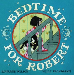
Bedtime for Robert
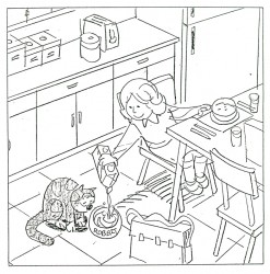
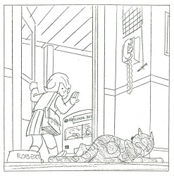
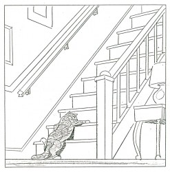
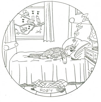
- Bill Peckmann collaborated with Rowland Wilson, back in the early ’80s, on a charming little book for children that never found a publisher and, consequently, never was completed. Bill had a bound copy of the book – in a mockup form – and sent it to me. I, naturally, would like to share it.
First, here’s the note on the inner sleeve of the cover:
- ABOUT BEDTIME FOR ROBERT, A WORDLESS BOOK
Bedtime for Robert is intended to bring to small children an early experience of the special personal relationship one has to a book; the availability and flexibility that a book enjoys over a fixed-time medium such as television.
Being wordless, the book needs no translation. The child has access to it at any time without relying on adults. This early exposure to the physical reality of books will, we believe, enhance the experience of reading later on.
The story combines the pull of a narrative with information that appeals to a child’s curiosity: in this case what goes on at night in the adult world. Although the child must go to bed (reluctantly), Robert the cat’s curiosity leads him into this forbidden adult world. Robert is all cat with cat qualities, not a little person in a cat suit as most cartoon cats are. The child can project his own emotions into the character.
The authors are booklovers with extensive experience in both print and film. We have both won Emrnys and other awards for our animation designs for educational TV.
We believe this is the first book to utilize the principles of film continuity in a printed form. This continuity is vital to the understanding of a narrative without the aid of words.
The use of film pacing supports the unfolding of adventure and humor in a wordless story.
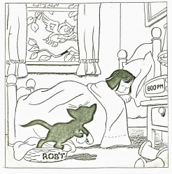
The book is planned to be in color. The pages up to 17 are in finished linework and the rest is in rough layout form.
Robert is conceived as a series. The character and structure would remain constant. The variables would be in the cat’s adventures in various places, seasons, times of the day, and occupations.
Please contact either of us at the addresses below. This is a simultaneous submission.
Yours truly,
Rowland Wilson
Willi Peckmann
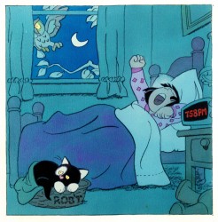
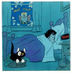
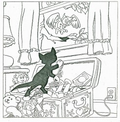
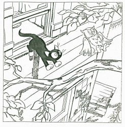
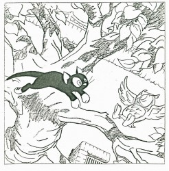
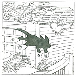
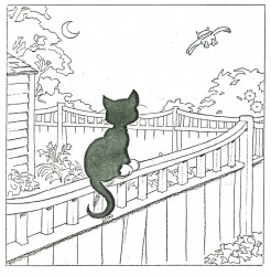
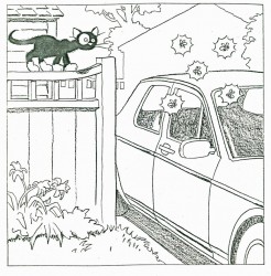
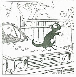
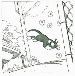
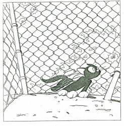
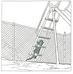
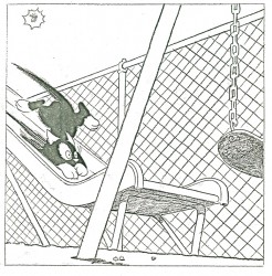
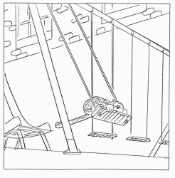
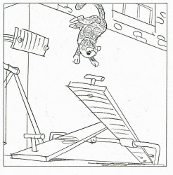
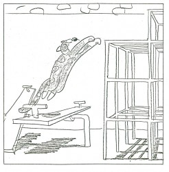
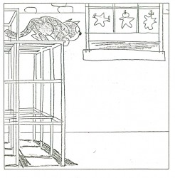
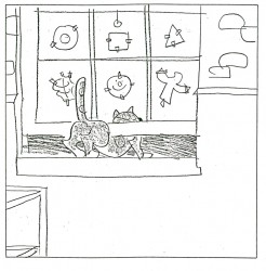
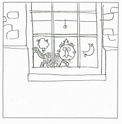
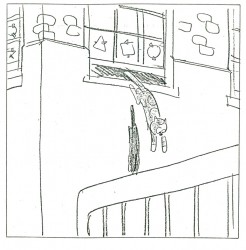
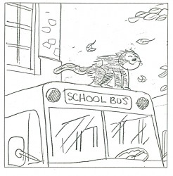
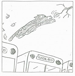
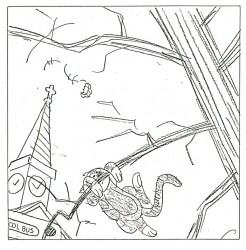
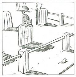
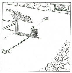
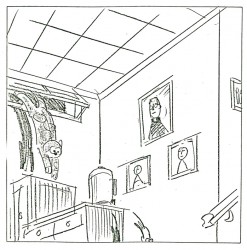
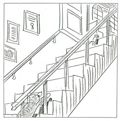
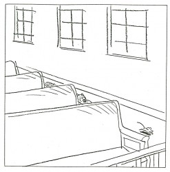
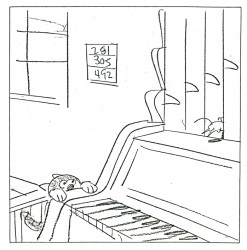
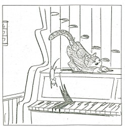
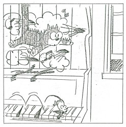
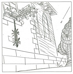
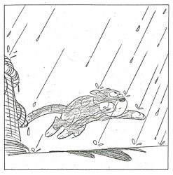
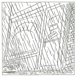
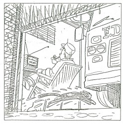
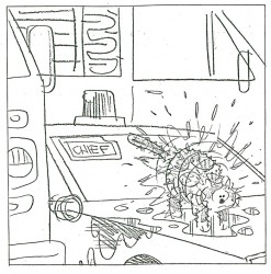
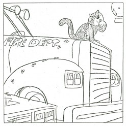
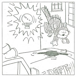
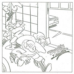
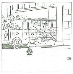
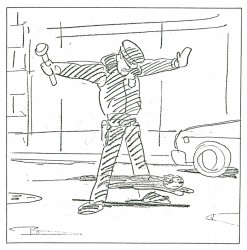
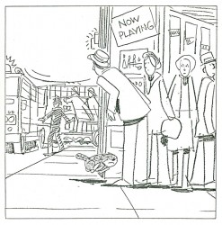
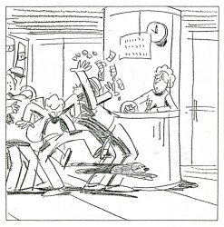
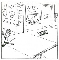
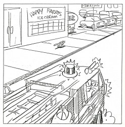
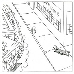
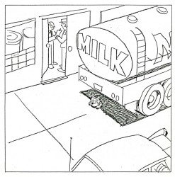
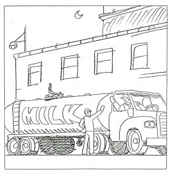
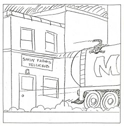
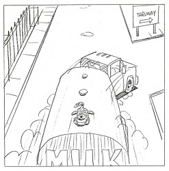
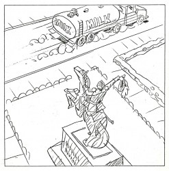
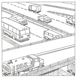
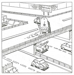
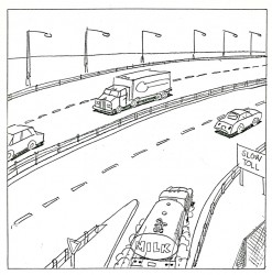
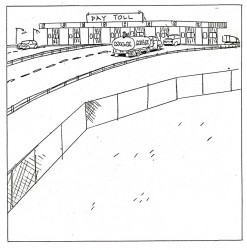
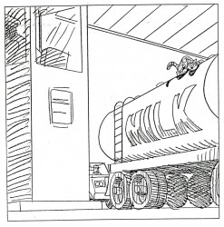
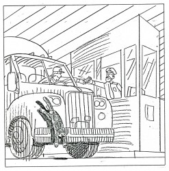
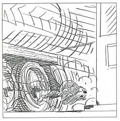
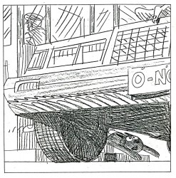
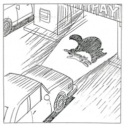
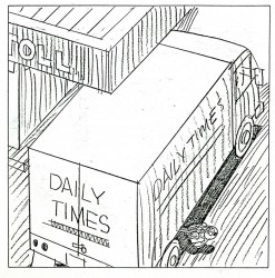
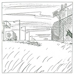
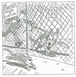
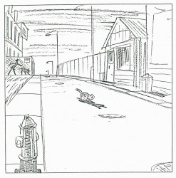
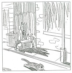
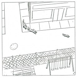
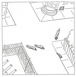
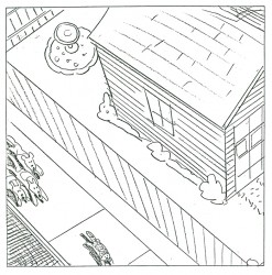
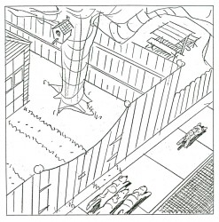
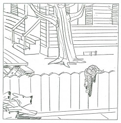
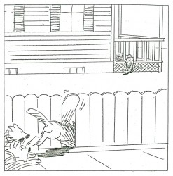
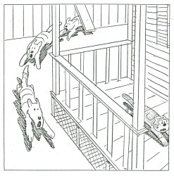
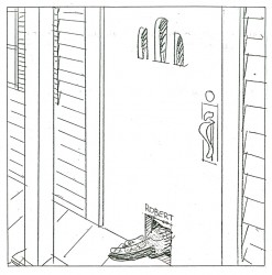
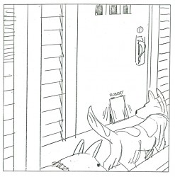
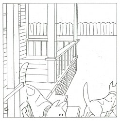
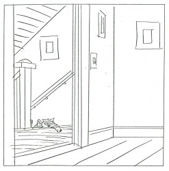
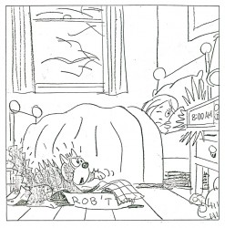
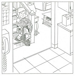
You’ll see immediately how original this book is:
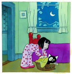 3
3(Click any image to enlarge.)
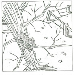 28
28 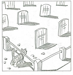 29
29
And just to put everything in proper perspective, here’s a letter they received from Houghton Mifflin rejecting the book. He was Rowland B. Wilson, for god’s sake!
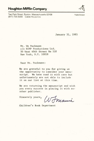
Bill Peckmann added this background info: “The rejection slip from
Houghton Mifflen really hurt the most because our thinking at the time
was that since they were publishing Bill Peet’s books (my all time
favorites), we thought they would understand the concept of “Robert”
better than anyone else. Go figure”

on 31 May 2013 at 9:13 am 1.Mark Mayerson said …
Fabulous layouts.
on 31 May 2013 at 11:32 am 2.Bruce Canwell said …
Now THIS is a treasure! Fabulous, fabulous stuff!
on 31 May 2013 at 2:18 pm 3.Stephen Macquignon said …
Wonderful story telling
on 31 May 2013 at 3:39 pm 4.Suzanne Wilson said …
It’s wonderful to see this presented in double page spreads that bring out the continuity. The backgrounds extending across the pages give a seamless transition from one escapade to the next. (A real page-turner!)
I think Rowland said the color concept was to transition gradually into darkness, as you can see by the color frames, and bring up the light to morning when the cat goes to sleep.
Bill Peckmann did a large amount of work on the layouts. It was a disappointment that the book wasn’t picked up. A friend of mine once overheard her toddler saying to their cat, “Now if you go to sleep, the night goes by real fastâ€, so I suspect little kids have a curiosity as to what the pets are up to in the wee hours and would enjoy this book. Another critic said it was “too longâ€!
Thanks for the Robert “Reduxâ€. (The name “Sneakers†was also considered.)
on 31 May 2013 at 3:45 pm 5.the Gee said …
So pages 4 and 5 were also facing pages?
And page 88 would be on the inside left page?
It is a wonderful story. So it is a shame they never got a bite from a publisher.
I would have loved to see the color choices Wilson went with. Obviously, the story took place at night and there is that tone relayed from the three pieces of finished art. I’d love to see how he made the warmer/hotter colors work in pages.
As usual with Wilson’s art, there’s probably loads which could be said about how great it works. But the story itself that Mr. Peckmann and he did reads really, really well. Words can be over-rated.
Thanks for sharing.
Questions though: what would you call the split splash format like he used? Some sort of diptich?
Was the intention for there to be full bleeds for each page or a gap between pages, in the spine?
I’m gonna have to play with that page layout, on a smaller scale. Just to mix up something Iâ€m working on.
on 01 Jun 2013 at 10:03 am 6.Bill said …
The Gee, You are correct about pages 4, 5, and 88.
On 4 and 5, we were setting the scene, the camera was locked in, so to speak. Then with pages 6 and 7, when the nocturnal adventure began, we started “panning the camera” throughout the book until the next to the last page. That last page 88, was a left facing, “iris out”, end page.
I would say Rowland would have agreed with you on the split splash format being called a diptych. One of the reasons we went with the panel format, not using bleeds, is we wouldn’t have to worry about miss matched art when it came to the printed gutters. The other reason was that we both loved the continuity panel format of comic strips and storyboards so much, which at that time didn’t pop up too often in kid’s books.
Without a doubt, Rowland’s coloring would have been masterful, sad to say, that part of the rough draft is sorely missed! Also, Rowland was living in Westport CT at time we worked on the book and we took a lot of reference/scrap photos of the nearby New England area, with Rowlie’s touch, the completed story would have been beautifully grounded in time and place.
on 01 Jun 2013 at 1:51 pm 7.the Gee said …
“iris outâ€
Nice! Until you mentioned it, that didn’t look at it that way but it makes great sense.
And, I do like the notion of the panel format, with gutters, without bleeds.
Oh, I forgot to mention this before: Page 23 using the window decorations as a mask for Robert is a great choice. That’s actually where some of the strengths of the diptich work great. It allows for a setup and then the gag.
The scenes with the cat on the milk tanker truck: how many bits have been done like that since in animation and live action? Maybe this isn’t the first but the way you two set the motion allowed for a flow that works for my eyes. I am guessing it would allow for something that would work well for younger eyes, too.
Sounds:
Page 5 with the owl, the second panel with the pipe organ and the final panel with the ZZZzzzzzz…are the only ones where you guys visually denoted sound. But, there are plenty of other panels where there is obvious loud noises. The fire engine, the dogs, the playground are “noiselessâ€. Where there plans on representing the sounds with words (I forget what the right word for that is; it is probably some Don Martin coined word).
Don’t get me wrong, noiseless works well, especially if a child were reading the book with a parent who could ask them what X would sound like….Not that sound was probably paramount to the story, mind you. It is just there in the pages. From a story standpoint (prose or picture stories) I think tickling as many senses by being evocative helps fleshes out things further; if done right it makes it more immersive. I guess if done wrong it would be clumsy or cluttered.
on 09 Jun 2013 at 5:29 pm 8.Joakim Gunnarsson said …
This is so good.
My guess as to why this was rejected is the lack of narrative. For an editor not used to the storyboard form of storytelling it might be a case of not “understanding” it.
You have to find the right person at the right company to get gems as this published. It needs an editor who believes in it and “gets it”. Too bad it didn’t happen.
on 09 Jun 2013 at 5:31 pm 9.Joakim Gunnarsson said …
Hmm… Having english as a second language makes it hard to find the right words sometime. But with “narrative” I meant “lack of words”. Just to make that clear.