Animation &Disney &Frame Grabs &repeated posts 28 May 2013 05:38 am
Whoopee
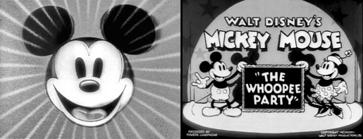
 - Before there was video tape (which means before there were dvds), there was only 16mm film that you could project in your own home. I had (and still have) a nice collection of decaying movies and used to show these often. One of the regulars to show and watch and laugh at was the great Mickey short, The Whoopee Party. Everyone loved this short, no matter how many times we watched it. It’s a great film!
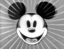
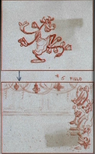
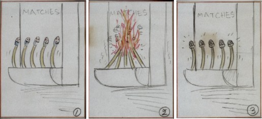
This encouraged me to watch it again on the B&W Mickey dvd I have. So I couldn’t help but jump for joy over the story sketches they include in the extras. Why not post them? So here they are – sketches from the limited storyboard they produced. I’ve also interspersed frame grabs from the film so you can compare images.

________________________(Click any image to enlarge.)

____________(Click any image to enlarge.)
 13
13
 1
1

 2
2
 3
3
 4
4
 5
5

 6
6
 7
7
 8
8 9
9
 10
10
 11
11
 12
12

 14
14
 15
15
 16
16
 17
17


on 28 May 2013 at 9:29 am 1.Luke said …
WHOOPEE!!!!!!!
on 28 May 2013 at 11:36 am 2.Mark Mayerson said …
I really miss the vitality of the early 1930s cartoons. The drawing and animation are hardly sophisticated, but the energy more than makes up for it.
I’d gladly sacrifice some of the slickness of modern animation for some of that vitality.
on 28 May 2013 at 11:44 am 3.Roberto Severino said …
I love the storyboard drawings! Rubbery, but also very fun and lively to look at. I’m pretty sure there’s a way to make a cartoon look just as lively and have it appeal to the Twitter/Instagram Millennial generation. I understand Mr. Mayerson’s sentiment though, but I think modern cartoonists need to focus on keeping the standards high while being able to move forward. Also getting inspired by older films like this and making entertaining the audience with real characters and good drawing a primary priority, IMHO. Forward vision combined with a respect for the old.
on 28 May 2013 at 11:44 am 4.Roberto Severino said …
I wish more adult animation would experiment more with incorporating funny, lively drawing. It would really enhance the dialog on a lot of those kinds of shows, BTW.
on 28 May 2013 at 2:21 pm 5.Nat said …
There is really some great kinetic energy in this short. Rubber hose may be scoffed at for being ‘primitive’ or bygone, but this is a great example of how it can be used in an appealing, creative way.
on 28 May 2013 at 5:57 pm 6.Stephen Worth said …
Lots of great Les Clark animation in this short.
on 28 May 2013 at 10:42 pm 7.Jim Atherton said …
I get a great deal of inspiration looking through these great concepts from a bygone era. I echo others’ sentiments in here about wanting to see some sort of resurgence of this energy, and if that means sacrificing the slick modern style, I’m all for it. There’s so much experimentation in these early shorts, I just love them.