Illustration 07 Sep 2006 07:42 am
2001 New Yorker Covers
 – I’m a bit in love with and a bit angry at John Mavroudis & Owen Smith‘s New Yorker cover(s) for Monday, September 11th.
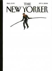
There are two covers: Philippe Petit walks against a white BG. No tightrope, no World Trade Center. Nothing. This white one is the real cover.
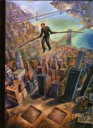
That overlays pg. 3 of the magazine – the painted version. Philippe Petit walks on air with a lot of buildings below him and the residue of 2006′s marker where the Twin Towers stood. No tightrope, no World Trade Center, a cityscape from the air.
It’s a great idea. Philippe Petit walking on nothing – the buildings are gone. There’s a bit of shock factor there. It strikes hard, especially for New Yorkers who lived through the tightrope walk and then experienced the collapse of the buildings.
Now, of course, I’ve done a film version of Mordicai Gerstein’s book, The Man Who Walked Between The Towers. And I have a real attachment to that book and the art from it. We used it to shape a film I’m proud to have made.
Seeing these covers, after getting over my first surprise at the jolt of the political picture it painted,  I wondered if the artists had seen the book or the film. I had to believe they had. It’s a good idea, but it looks so much like Mordicai’s work.
Yet, it is such a good idea – how mad can you get!
I think Art Spiegelman‘s cover back in September 2001 was much stronger.
It was the one piece of art that I’d seen which really captured the mood of the city. At first, it looked like an all black cover, but looking long enough, you slowly realized the twin towers were there – black on black. It was stunning.
The feeling could never be captured on a computer. (Go here to see an online version using blue & black inks. It doesn’t work.) You had to have the hard copy in your hands with the ink almost blending into the reflection of the black cover.
It was so appropriate. The emotions at the time were raw; the subject was sensitive; the cover had to have the jolt and the sensitivity. Spiegelman captured it exactly. It was the feeling we all were having. He expressed it and drew us into his fold. A perfect political cartoon. He had something to say; said it, and gave us a flag to salute.
This year’s cover is appropriate for 2006, but I have to wonder if Mordicai Gerstein’s book didn’t influence them.
(By the way, there’s a good conversation in the online edition with some of the New Yorker’s political editors including Seymour M. Hersh, Jon Lee Anderson, and George Packer discussing the aftermath of the event.)
Hendrik Hertzberg also has an excellent commentary in this issue on the event and its residue and exploitation.
- Speaking of exploitation, I have to get a tad political. On Sunday and Monday, ABC-TV will broadcast a two part program entitled The Path to 9/11. This program was created by right-wing conservative writers and relies on the old GOP playbook of using terrorism to scare Americans. It is out-and-out exploitation of an important event, and ABC has become their mouthpiece. I’d encourage anyone out there to voice against it and preserve the 9/11 event as a non-political event. Go here to sign a petition to Robert Iger, the head of Disney which controls ABC.

on 09 Sep 2006 at 2:01 am 1.John Mavroudis said …
Hey Michael…
First of all… nice site… there’s some excellent work on here…
Second… I don’t take issue with your comments in general… just wanted you to know that the Gerstein book actually did not influence me. I was working on ideas to submit for a New Yorker 9/11 anniversary cover and did a google search for WTC… I saw a pic of Philippe Petit and remembered the story… It was only after I knew what I wanted to do, that I did an image search to try to get the right angle… that search had some images from the Gerstein book… (if you’re interested in the process, I went through it on my website… http://www.zenpop.com )
…and that Spiegelman / Mouly cover for 9/11 is one of the greatest ever.
Cheers!
-John Mavroudis
on 09 Sep 2006 at 8:30 am 2.Michael said …
Thank you for your comments. I was, as I’ve already said, jolted by your cover. It’s a brilliant idea. The surprise came when I saw the second interior cover.
This is the second time the New Yorker has had more to say about the event than any other publication, and both were done with illustrations.
When I saw the image for the first time, Bob Blechman walked into my studio. He was taken with it just as strongly as I was.
on 12 Sep 2006 at 6:13 am 3.John Mavroudis said …
Thanks again for the kind words, Michael!
I just wanted to say (again) how fantastic this site is! I’ve bookmarked it and plan on returning often…
Also… I FINALLY saw the clip from your Philippe Petit film… WOW! (I definitely have to check that out…. simply beautiful… film festivals, here I come!)
Cheers!
-John M.
on 20 Aug 2008 at 1:47 pm 4.Madison Perry said …
I love your site! I have a question about this post. Will you please email me at your convenience. Thank you in advance.