Models &Puppet Animation &repeated posts 02 May 2013 04:26 am
The Hand and Fingerprints
As you can tell, from some of my recent postings, I have always had a love affair with puppet animation. There’s something extraordinary about that medium that has drawn me in. I’ve always demanded a tactile approach to animation, including all of the 2D work I’ve done.
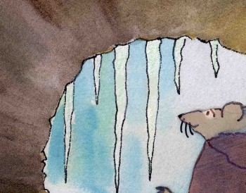 I remember seeing Lady & The Tramp in 1955, on its first release (I was nine.) It was then that I consciously noted that one of the backgrounds in the “Bella Notte” sequence (I can now see that it was an Eyvind Earle BG) had texture in its paper. The board it was painted on came through the animation photography and reached out to me. The human hand became evident in the film.
Perhaps, this was what I loved so much about animation in the first place. Humans did it, and it was self-evident. Being reminded of it, in the subtlest ways – usually unintentional, added to my joy.
Perhaps this is what brought me to John Hubley’s films. Those films were so obviously painted: characters and BG were both used by the photographer to combine for us, and the unintentional was often caught on screen. (I immediately loved those highlighted rings double-exposed around the characters in Moonbird, the brush strokes of The Hole, the transparency of the characters’ paper in Of Stars and Men.) It added to the experience.
In a sense, I was brought out of the film but held in it and given the opportunity to love it even more.
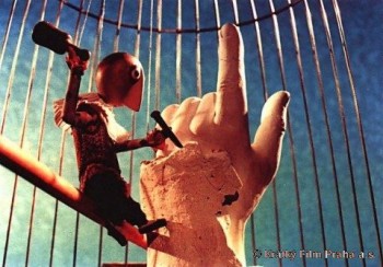 I’ve had this same sense with the best 3D animation. Though I was always there viewing it, I was also caught up in the emotions of the film. Trnka’s masterful film, The Hand, had my understanding those tears and sweat on the little potter were moistened ink that had been his painted eyes. But the anguish I felt the first time I saw the film and that effect has never left me. The perfections of the Human Hand in that film forced the imperfections of the puppet potter to be revealed until it destroyed him.
Perhaps this is also what keeps me from embracing cgi animation. Despite the faked textures of the computer, it’s so obvious that it is not real. At least not when the characters are cartoons.
A very small example of what I’m trying to communicate stands out for me in Cars. The paint job of newer cars has a flecking/speckling of glitter within the paint. In the right light, the main character, Lightning McQueen, had this paint job. Everytime I saw it, I was distracted and pulled out of the film. Like the real paint on a real car, that flecking was embedded within the paint, itself. It didn’t feel like the byproduct of a human hand; it felt like a computer trick.
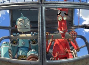 I am no more capable of coloring the computer skin of that computer hand than I am of painting a real car. It isn’t tactile for me, it’s just distracting.
It’s just something I never feel I can reach out and touch. This is something that has been overcome, for me, in a couple of films. The Incredibles gets very close often. Moments of Robots, such excellent design for the medium. Some of Toy Story.
(Click on any image to enlarge and enjoy the textures.)
Of course, I recognize that this is my problem. However, I recognize it’s a problem that other people probably have and wonder if there isn’t a solution. In The Iron Giant, the Giant is animated by a computer. I was told that the animation had to be rigged to be animated on “two’s” so that it wouldn’t separate from the rest of the hand-drawn animation. Oddly, it felt totally acceptable to me; I saw no problem and accepted that robot. There has to be, in there, a way to resolve it – I’m just thinking here and don’t expect anyone to try to follow what I’m saying. Perhaps if “human” problems, technical problems, were added to the animation. . . No this is even too stupid for me.
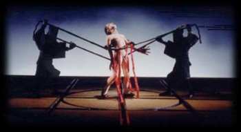 Barry Purves has made a number of absolutely beautiful films and has created in his own studio some masterfully realized pieces. His work has a discriminating taste, graceful and controlled movement with superb acting, and an intelligence that is rarely found in animation today.
He was nominated for the Academy Award for his film Screenplay, a virtuoso work which follows the rules of Kabuki theater and presents a double-layered story of a man watching and revealing a story from his past which eventually rips through the past and tears at the present. It’s a work of animated puppetry, displayed as theater and a stunning film that should have won its Oscar.
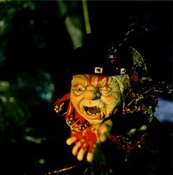 Rigoletto presents the opera in a condensed version that has been reduced for television. It’s a packed half-hour which places you into the full opera and allows you to follow it without any confusion. It has a majesty in its sweeping and dynamic camera moves which whisk you along in the luscious music; they carry you along through the depths of the complex story. It’s a wonderful film that certainly grows richer with each viewing.
Other works he’s done include a wonderful film about Gilbert & Sullivan: The Very Models gives us the pair as seen through the eyes of D’Oyle Carte. A rich and entertaining diary into the making of this film can be found on AWN and a short clip of the film is available there as well.
As a matter of fact, I found his diary there so entertaining, I’ve also followed the diary he keeps on his own website.
You can get a small glimpse of Barry Purves‘ craft by viewing the clip reel at Acme Filmworks. But you’re left without the full heft of his work until you’ve seen the complete storytelling ability he presents in the whole films.

on 02 May 2013 at 6:34 am 1.Nat said …
Indeed, the human touch is what drew me to loving animation in the first place. It is fascinating that artwork and simple drawings can be brought to life with the flip of a piece of paper or the manipulation of a still image or object.
CGI is harder for me to warm up to as well, perhaps for some of the same reasons. But also, many larger studios tend not to experiment with the medium that much. Outside of the Pixar influenced look and ‘Photorealism’, how many other prominent styles are there? I would also love to see more original storylines besides comedies and funny animals. (Not that there is anything wrong with that, but the medium needs more variety.)
on 02 May 2013 at 9:23 am 2.Luke said …
I agree with “the human touch” element, far more so than the “individual artist thumbprint” mumbo jumbo some folks yammer about ( not that it’s not fun to know who did what–so long as it never becomes obvious or more important than the story being told). Have to disagree about The Incredibles–although I like the film, I find the set design , lighting, and textures to be obvious, simplistic, and rather amateurish. It was continually distracting and cried for attention to the detriment of the story. Films like “Ratatouille” and “Finding Nemo, ” not without their own flaws, succeed far better in their ability of design complimenting story, without trying to be “too realistic”
on 02 May 2013 at 8:57 pm 3.Shane (Fighting Seraph) said …
While there is a fair share of CG animation that I do like; what Thad said to Michael Barrier about 3D CG animation not having a sense of humanity and individuality rings true. His statement sums up how I feel towards the use of post-processing programs used for 2D animation.
on 03 May 2013 at 12:25 pm 4.Teodor Ajduk said …
In my opinion, even last 2d animation projects /both feature and short/ became inhuman.
They waste time correcting the line, imitating wrong shadows and much worse-resort unlikable design.
Recently I enjoyed only in ”Toys in the attic” precisely because he has that “human” look of production.
on 29 Jul 2013 at 12:50 pm 5.Car Respray London said …
You are in truth beautiful webmaster. The web site running pace is actually amazing. This almost seems that you’ll be accomplishing every exclusive key. Additionally, The actual belongings tend to be mona lisa. you’ve done an incredible action in this particular theme!