commercial animation &Errol Le Cain &Illustration &Independent Animation &repeated posts &Richard Williams &Rowland B. Wilson &Tissa David 10 Apr 2013 05:55 am
Dick’s Christmas
Richard Williams, when he had his own studio, was known for doing everything in a LARGE way. All of the commercials, title sequences, shorts were all done with a large, elaborate vision.
The Charge of the Light Brigade was a collection of 19th century graphics that are completely wrong, stylistically, for animating. All those cross-hatched lines. God bless the artists that pulled that off. The same was true for The Christmas Carol.
If the rendering style wasn’t impossibly difficult, then the animation was complex. Think of any of the scenes from Dick’s dream-feature, The Thief and the Cobbler. The many scenes where backgrounds were animated, with those backgrounds complete with complicated floor patterns or an entire city to be animated. Raggedy Ann was covered in polka dots and Andy was clothed in plaids. Both of the characters had twine for hair with every strand delineated. The commercial for Jovan featured a picture-perfect imitation of a Frank Frazetta illustration. Even the mountain on the background had to be animated and rendered.
Well, when it came to Christmas cards, Richard Williams was the same. Enormous and beautiful cards were printed and signed by anyone who knew the recipient of the card. You were lucky being on the receiving line for these stunning cards. Tissa David once gave me a number of these cards. I held onto my copies of the cards until my space was flooded and the cards were damaged. I thought I’d post a few.
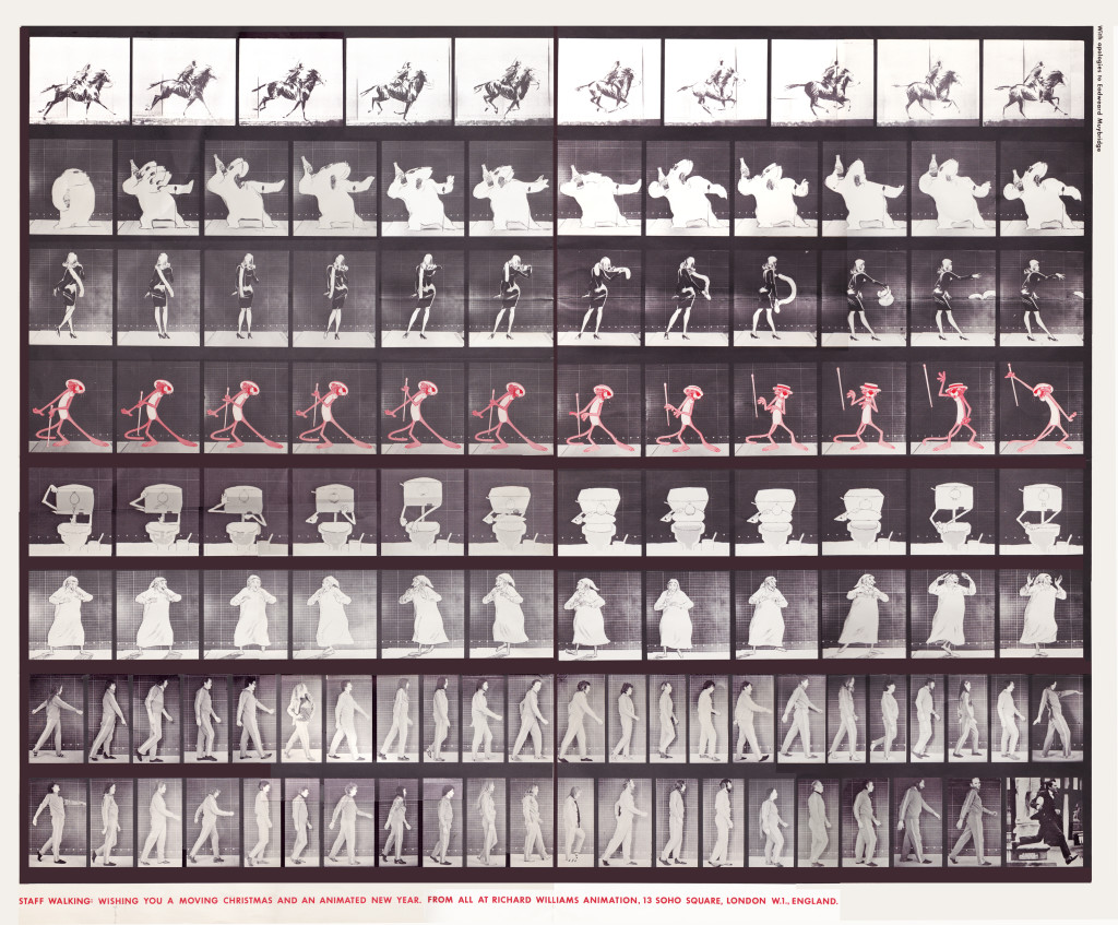
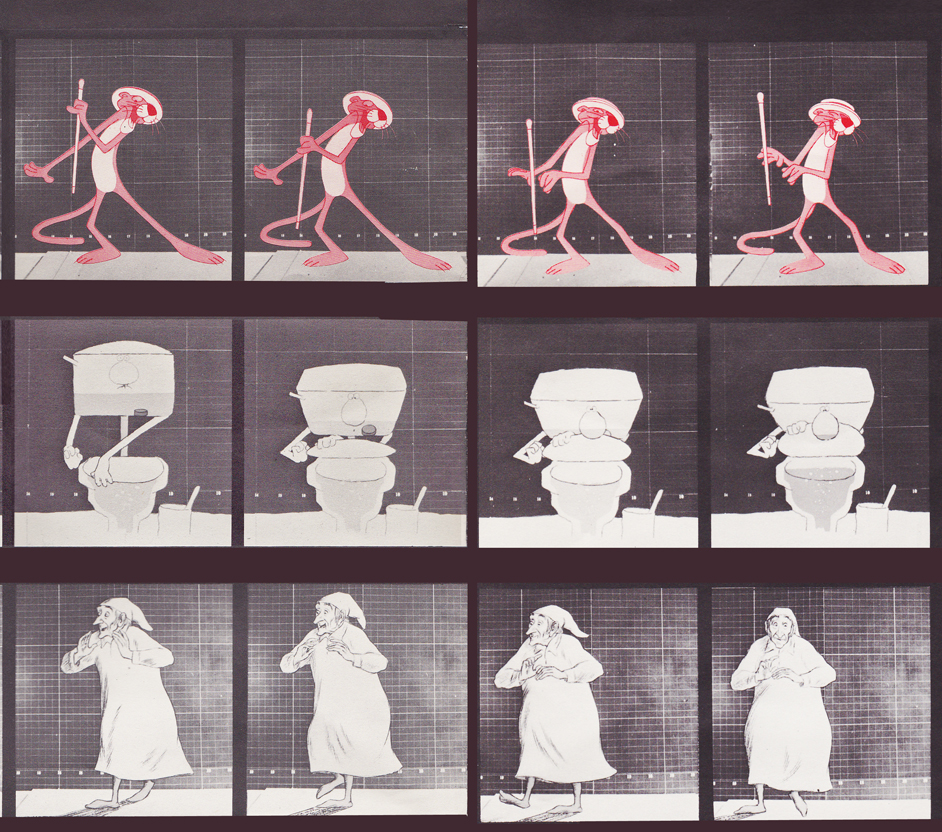
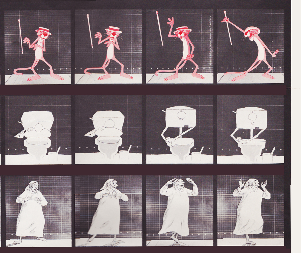
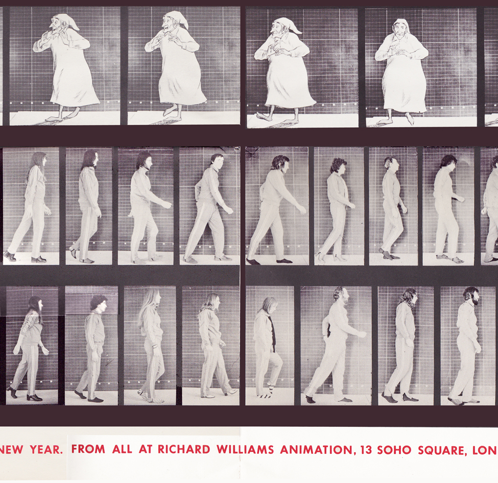
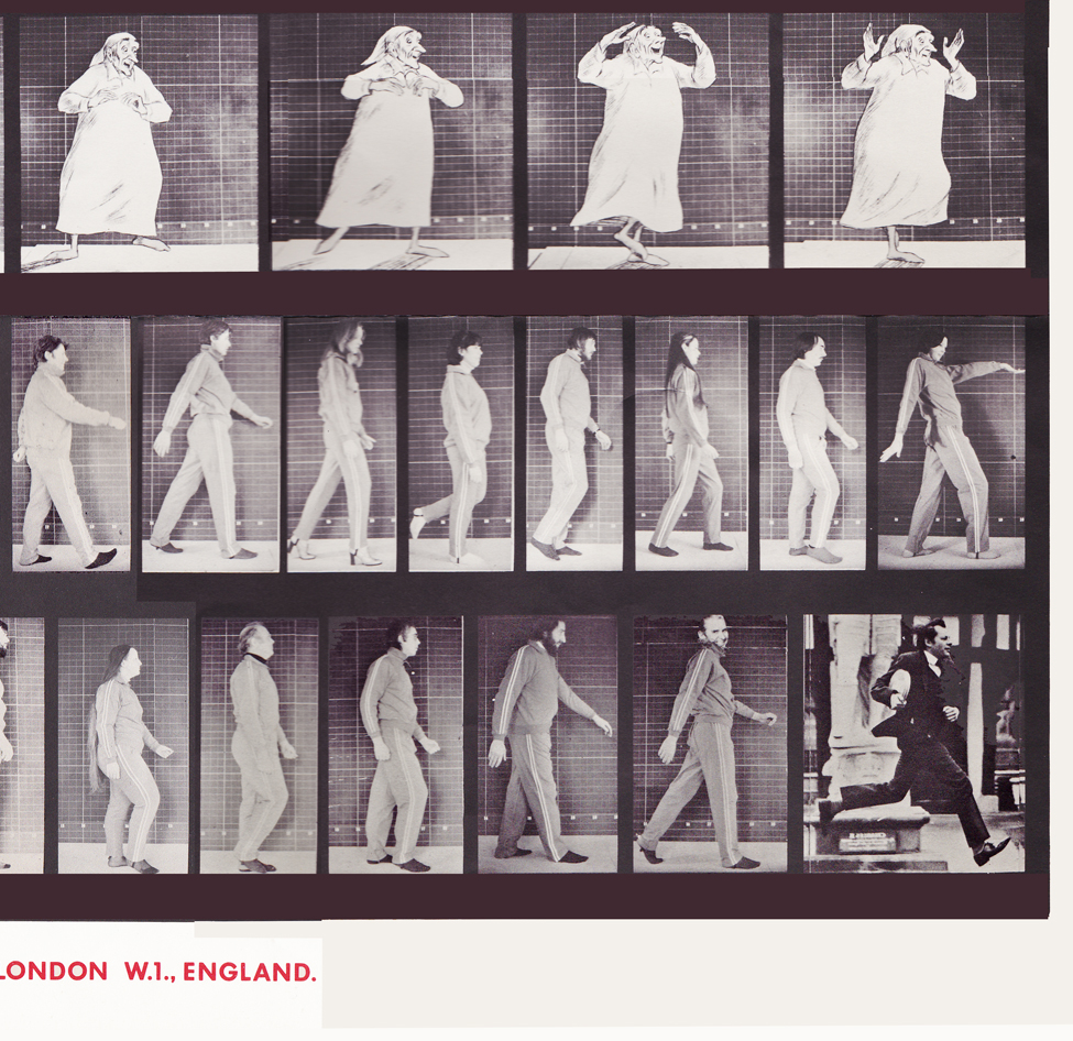
With card #1, a take-off of Muybridge with frame grabs from several of the better Williams commercial spots from that year, capped off by a number of key staff personnel positioned to continue the Muybridge motif.
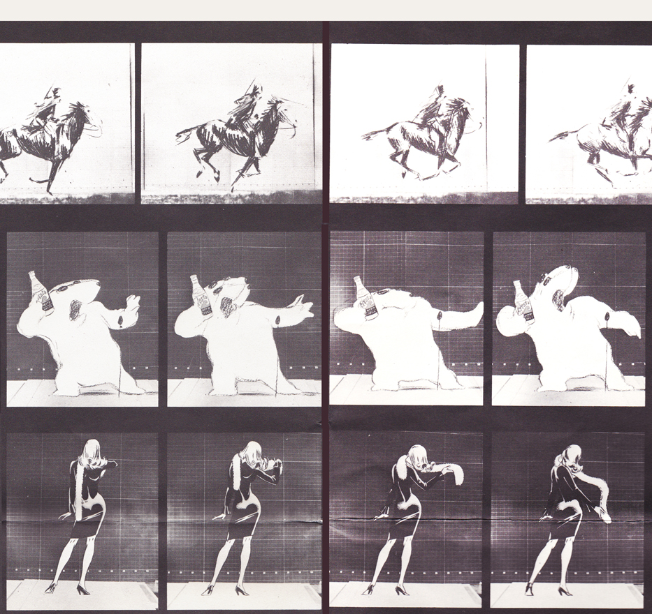
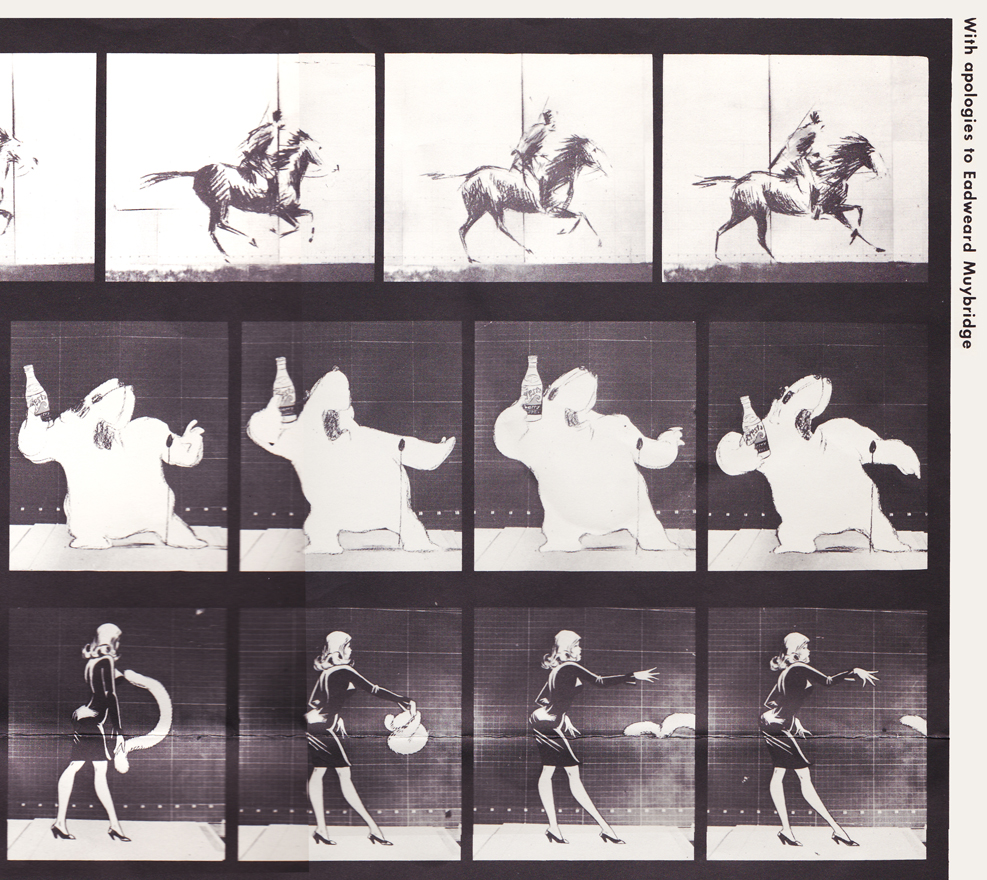
(Here, I first post the entire card, followed by a break up of the card into sections
so you can more ably see the details.)
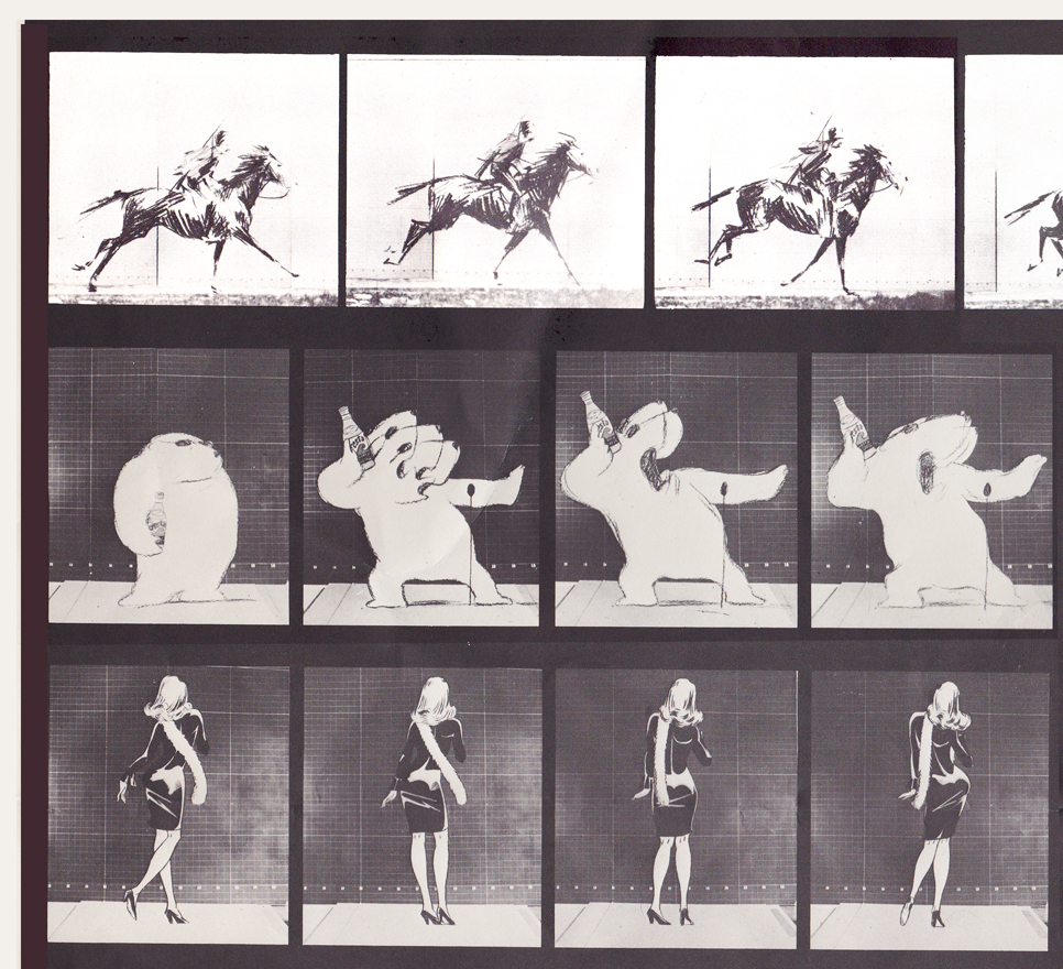
Top rows left side / Row 1: Pushkin Vodka ad
Row 2: Cresta Bear ad / Row 3. Tic Tac ad
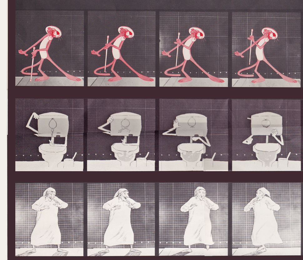
Middle rows left side / top row: Pink Panther titles
Middle row: Bloo toilet cleanser ad / Bot row: The Christmas Carol
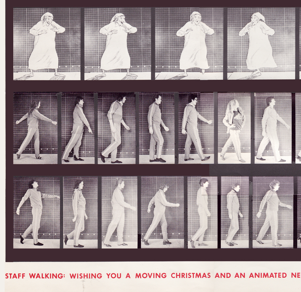
Bottom rows left side / top row: The Christmas Carol (repeated)
Middle row: staff / bottom row: more staff
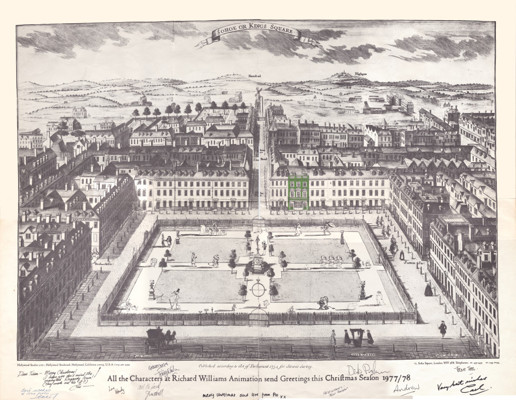
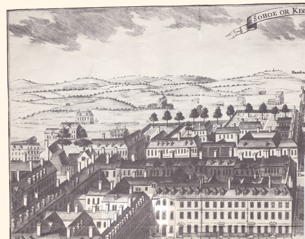
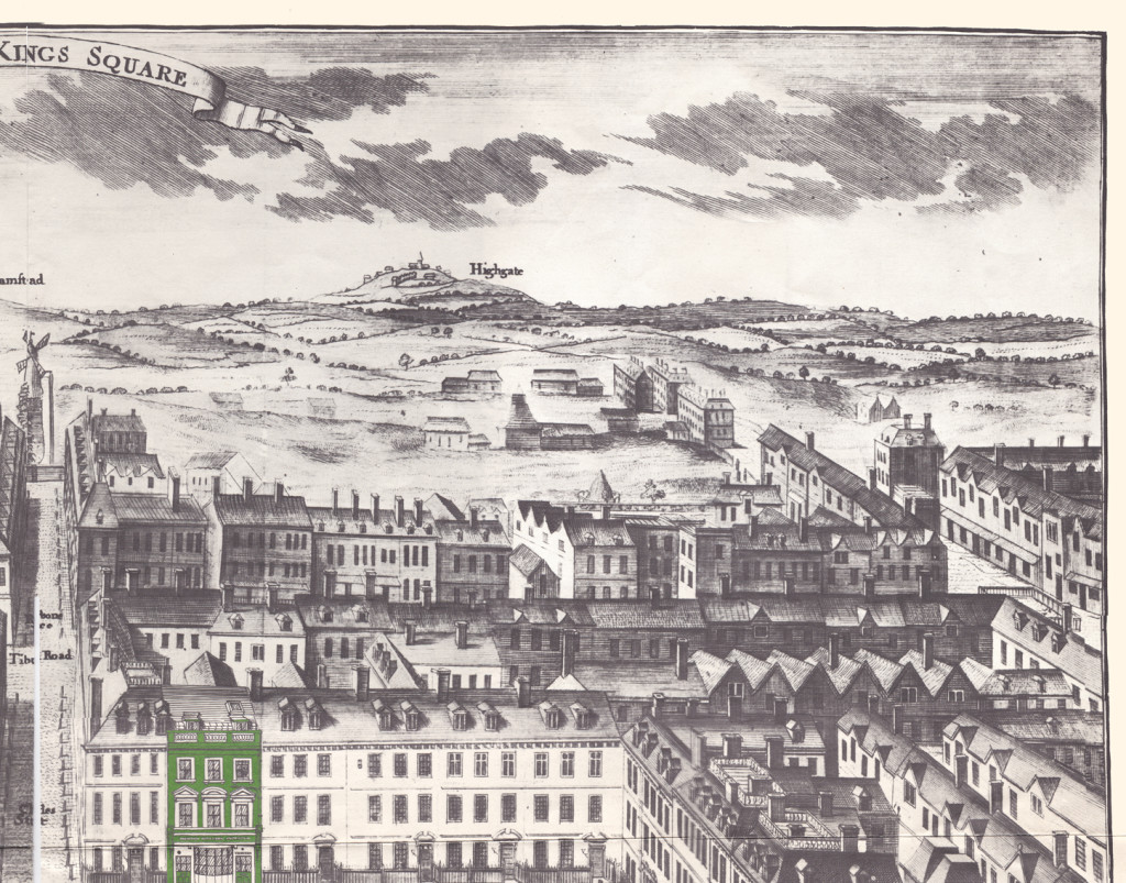
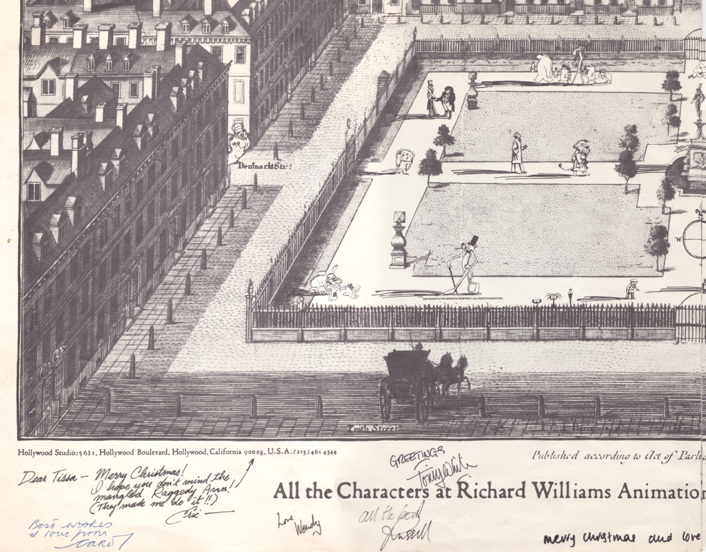
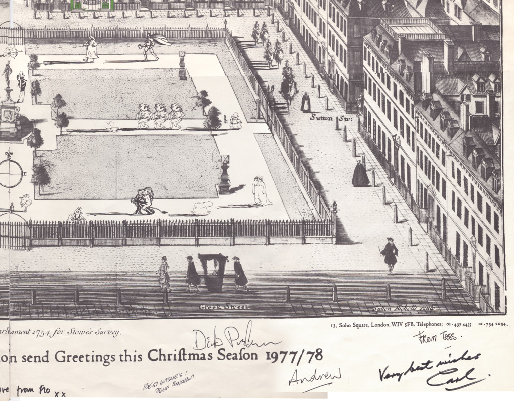
With card #2 we see Soho Square. The green front door
marks the location of Dick’s studio at 13 Soho Square.
(As with the first card, I posted the entire Christmas card,
followed by a sectional divide so you can enjoy the details.)
This is a folding card.
It comes folded so that you see the far left of the card
revealing part of the far right.
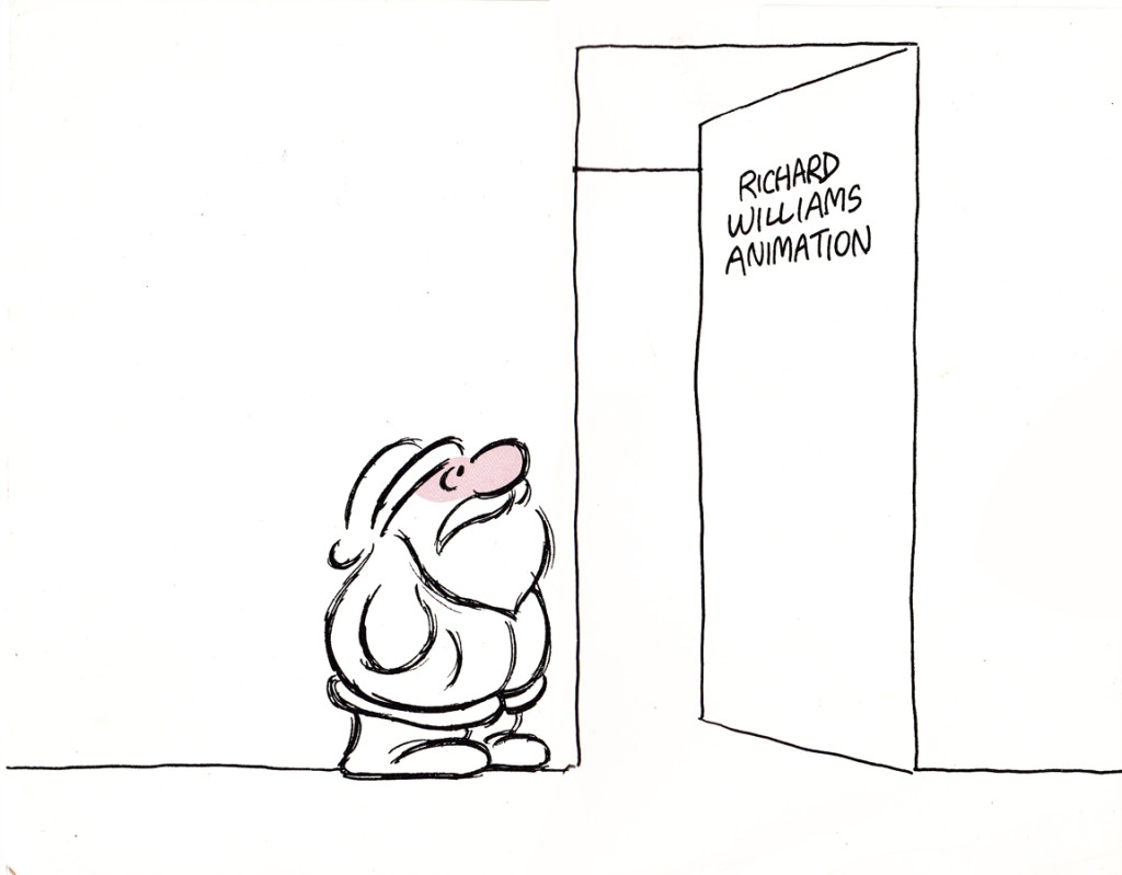
The card comes folded like this.
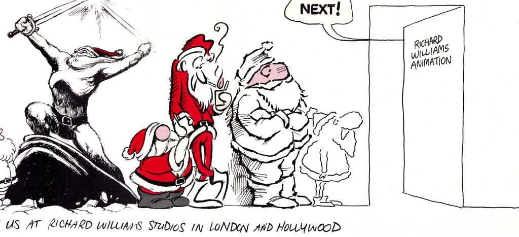
The left side (Santa up to doorway) is on the left side of the card.
The right side, on bottom, reveals the empty office.

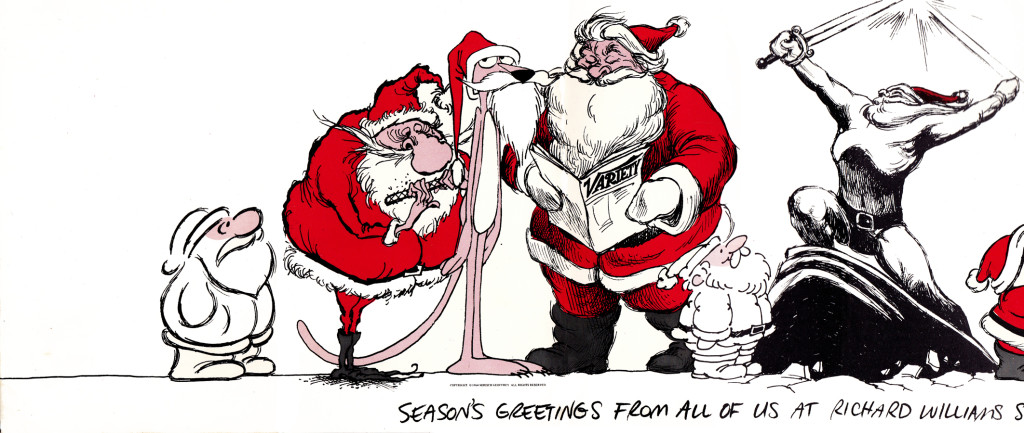
It unfolds to reveal this long line of Santas.
Each Santa is in the style of the many illustrators’ styles
of those who designed ads for the studio in the prior year.
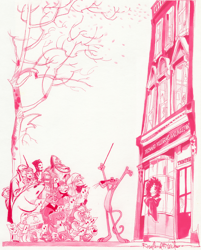
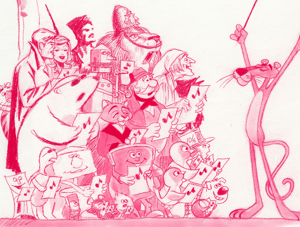
Suzanne Wilson sent in a Pink Panther Chistmas card; it was drawn by her late husband Rowland Wilson:
Below is a close up of that same card.
Here’s another full card.
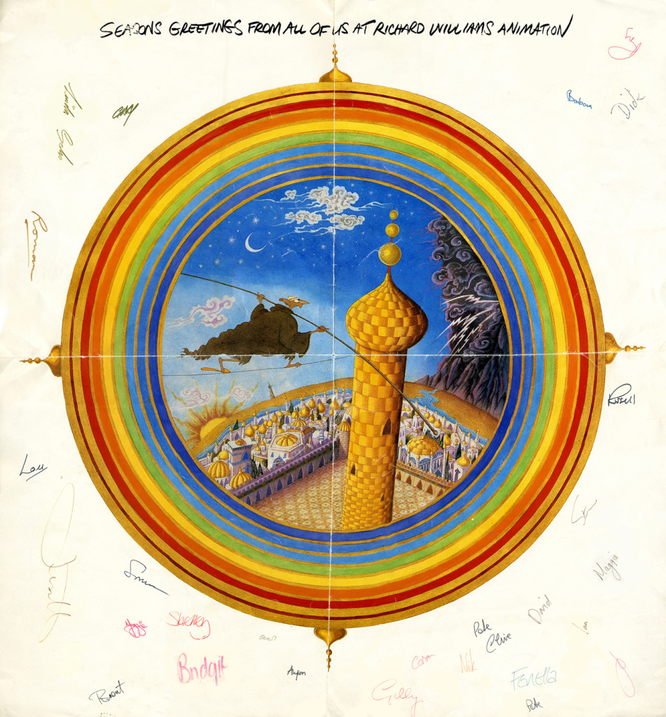
This one is designed after the McGuffin of Dick’s feature,
three golden balls over the city.
from The Thief and the Cobbler.

on 10 Apr 2013 at 1:49 pm 1.the Gee said …
“Each Santa is in the style of the many illustrators’ styles
of those who designed ads for the studio in the prior year.â€
The Blechmann one stands out. But, is it possible to figure out the rest? I could see Tom Wilson’s design in one. Is that Gerald Scarfe in another?
Or have I got three strikeouts so far?
on 10 Apr 2013 at 4:17 pm 2.Suzanne Wilson said …
These cards are not only beautiful and meticulous but are artifacts of
Animation-History-in-The-Making!
Richard Williams also created a die-cut zoetrope one year!
Long Live Ephemera!
Thank you for Christmas In…April! (Just when we really need it!)
on 10 Apr 2013 at 6:24 pm 3.Nat said …
Despite his mixed success, Richard Williams is truly admirable. His attention to detail is astounding and he really helped preserve some of the artistic skill nearly lost during the ‘TV era’ of animation.
on 11 Apr 2013 at 1:50 am 4.Michael said …
I’m sure Blechman wasn’t involved. That’s a knock-off Blechman-like style you see that many studios did. Unfortunately, it’s not drawn well-enough to really look like a Blechman drawing. (I’m talking about the Santa closest to the door.) I’m not sure of Tom Wilson, though you’re probably right since Santa appeared in the Ziggy show, but I am sure of a Ronald Searle Santa (the second in line). I don’t know for sure that Searle designed a spot for Dick but I would guess he did. It’s certainly his style.
on 11 Apr 2013 at 4:57 am 5.Peter Hale said …
The Brigands in ‘The Thief and the Cobbler’ were styled after Searle – it may be a reference to one of them.
There is a German TV wine commercial featuring Searle’s cats, made in 1979. It was almost certainly made by Dick Williams.
on 11 Apr 2013 at 8:21 am 6.Bill said …
Suzanne and Michael, thanks for including Rowland’s card, that Studio front is bang on and beautiful!
on 11 Apr 2013 at 1:33 pm 7.Suzanne Wilson said …
Notice that all the animators are busy at work inside the studio–they didn’t have time to look out the window!
on 11 Apr 2013 at 1:53 pm 8.the Gee said …
Searle! Of course. I’m not sure why I always forget his name when I see his work, or work done like his style. Perhaps I should figure out a mnemonic to avoid that screw up.
I figure that like the awesome update showing Rowland Wilson’s Christmas card the characters in the Many Santas card were drawn by one person emulating others’ styles. I probably didn’t make that clear.