Art Art &Commentary 23 Mar 2013 04:23 am
Gawking
I can’t think of many artists who have supporters as solid as is Richard O’Connor toward the brilliant artist, Fred Mogubgub. Certainly Fred deserved and deserves the attention and support and pleased I am to see it given.
Richard will exhibit some of Fred’s bits of genius in the studio of Ace and Son. This coming Thursday, March 28th at Ace & Son. 7pm. RSVP@aceandson.com
How to Animate the Fleischer Way
Ignacio Carlos Ochoa recently placed this video on his blog. He said he wasn’t familiar with it. I saw the video about a year ago and thought it really nicely done. I’m not sure why I didn’t share it back then, but Ignacio’s comments make me feel like I should post it now, as he has already done. (By the way, his is a good blog and always worth a visit. Keep it in your eyesight; I put it on my sidebar.)
Crood Reviews
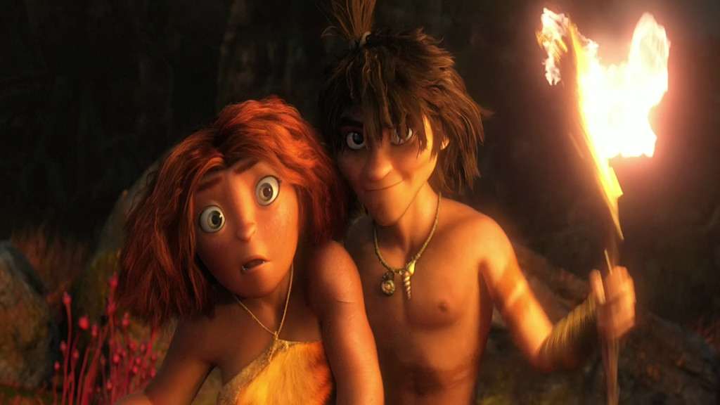
I guess Dreamworks’ The Crood opened on Friday, yesterday. The reviews felt so after-the-fact that I almost didn’t notice it in the NYTimes. The reviewer Neil Genzlinger wrote that “The Croods” is “. . . colorful and has an appealing central character and — who knows? — might even give the little ones something more challenging to think about than its tired main plot.”
Not the sort of review one might hope for. It contines that “. . . the movie is at its most interesting and amusing when riffing on how cavemen might have reacted to new experiences and ideas, like fire and shoes.”
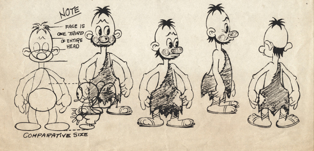 Flintstones . . . meet the Flintstones . . .
How many remember the Fleischer series called Stone Age? 12 shorts that couldn’t keep the Fleischer brothers together.
Great ideas just keep living on. I was a bit surprised a while back when Iwent to a party for How to Train Your Dragon; Chris Sanders said he’d be going on to The Croods, which was having a bit of trouble getting started. I thought his talent will probably not be best exploited there. But I don’t know. I can’t review the movie until I see it; that will be on Tuesday – that I see it. I’ll try to say something shortly thereafter. The film has to be better than Rise of the Guardians – talk about wasted material. I truly hope The Croods will be the bright spot of my coming Tuesday.
The NYTimes has a slide show about the design of the film. A violently colored watercolor toward the end of the slide show piqued my interest.
The review in the NY Daily News: “There’s a peculiar violence in the comedy in this CG-animated family film, similar to watching a loud, slapstick football game played by extraordinarily ugly plastic figures.”
“The film is best when speculating on the origins of human nature. Why, for instance, do we keep pets or love watching the horizon? When it gets past the Stone Age humor, this weird film manages to find some gentle revelations.”
The NY Post writes: Nothing Prehysterical Here – 1 star – “I’d like to take back all those times I said Nicolas Cage was one of the most annoying actors on film. It turns out he’s equally terrible when he’s only on the soundtrack.
And yet Cage is the least of the problems with “The Croods” . . .
63% from Rotten Tomatoes. That’s not too good. But then Oz the Great and Powerful got a 61% and has been the blockbuster these last two weeks.
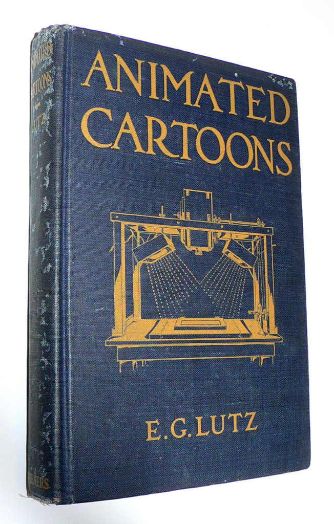 J.J. Sedelmaier has posted everything you want to know about the E.G. Lutz book, Animated Cartoons: How They Are Made (including a scan of the entire book).
The article, actually, is called How Walt Disney Used His Library Card, which is a more appropriate article, because it shows us other books that Disney probably checked out of his local library when growing up in Kansas City.
With some material borrowed from Mike Barrier‘s book, The Animated Man, we get a good picture of the young Mr. Disney staking out the world of the animated cartoon in the early thirties.
A New Face for an Old Effect
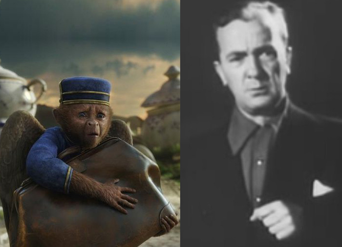
Finley, the flying monkey – Billy Bletcher with natural colored lips
Recently while reading Post Magazine in an article about the Effx for the new Wizard of Oz movie, Oz the Great and Powerful, I stumbled upon something interesting. Actually, it was only interesting because that same day I’d read a small piece in Mike Barrier‘s Hollywood Cartoons, and I found an interesting juxtaposition of the one story to the other.
According to Barrier’s book, back in 1934 Disney had chosen a Silly Symphony to direct, The Golden Touch. It would be the last animated film he’d take credit for directing. Disney had the two best animators of the day, Norm Ferguson and Freddie Moore scheduled to do all the animation in the film. A lot of time was given to every stage of this movie. When it came time to record Billy Bletcher as King Midas, they painted his lips white and filmed him so that Ferguson could use his lips in animating the character. The animation took a particularly long time and didn’t go well. Disney, himself, called the film “a tremendous flop.”
They didn’t paint his lips white, but they did photograph Walt Disney acting as the voice of Mickey Mouse when he did the track for “The Pointer.” The stills were used by Frank Thomas for the one big dialogue scene in the short, and Frank spoke several times, when I knew him, of this tactic.
Jump almost 80 years to shooting the monkey sidekick of the Wizard, James Franco, as he travels down the yellow brick road, seeking to become the Wizard of Oz. The two of them have a long conversation. The film’s visual effects supervisor Scott Stokdyk talks about the flying monkey partner of James Franco‘s wizard.
“Finley is the monkey who becomes Oz’s companion on the journey. He’s played by Zach Braff. The modern way for doing a CG character is to have them on-set, interacting actor to actor, and then paint out the stand-in actor and replace him with CG. We tried to do that whenever we could. But our CG Finley was three-feet-tall and had wings, could fly around, and was very active. So we couldn’t put Zach’s face where the monkey’s was.”
“We came up with this thing called ‘puppet cam.’ We had a puppet with a rod, and a monitor and camera on the end of it. We had Zach in the same booth that Joey was in, and he was interacting. We set up a virtual video conference, but it was executed through a monitor on a stick on-set. James had an ear rig, and he could talk to Zach, but was looking at a video monitor on a stick, put in the place of where the monkey’s head would be. And in the monitor he’d see Zach’s head in the booth. It gave us a proxy for having Zack on-set with his head in the right place.â€
All the time that has passed and not much has changed. They don’t paint Zach Braff’s lips white, but they do paste his video image onto a cardboard puppet on set. It all amounts to the same thing; it just costs a lot more money.
As a matter of fact I also think about the cardboard cutouts that James Baskett dealt with when shooting the live action sequences for Song of the South. It sounds very similar to what they did on the new movie.
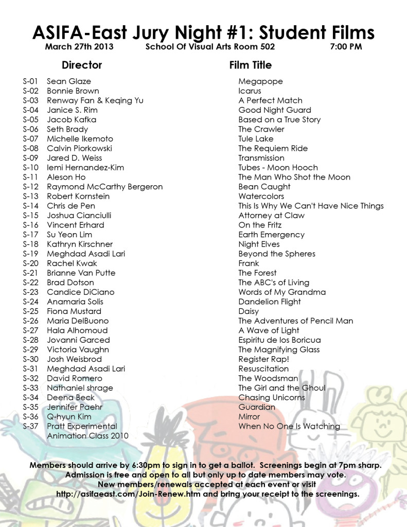
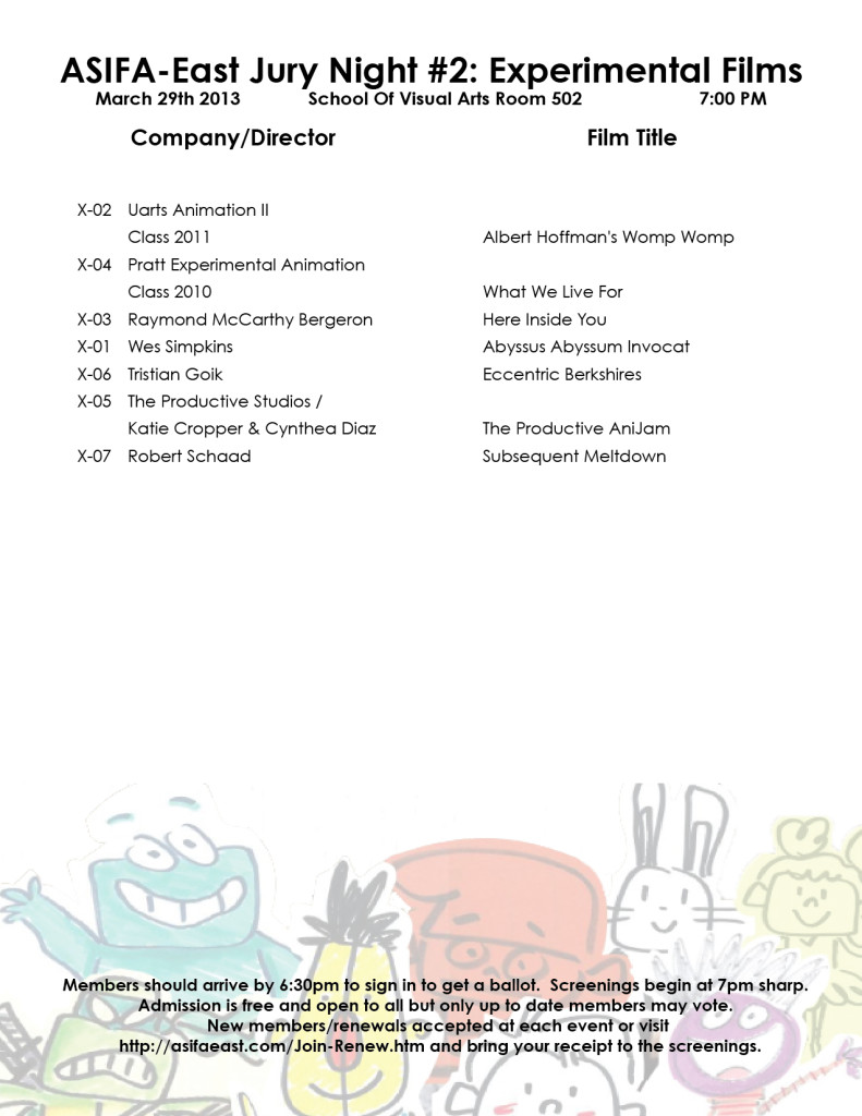
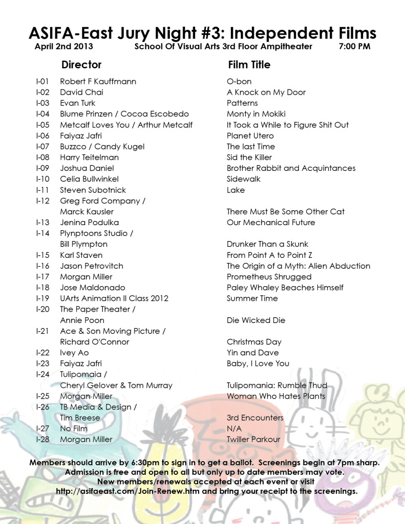
ASIFA East Festival Judging Screenings
This week several nights will be devoted to judging the entries for the ASIFA East Festival. Remember that all members of ASIFA East are eligible to vote for the awards from the films to be screened. Get out the vote.
There will be four screenings:
1. Wed., March 27th – 7pm – Student films
2. Thurs., Mar 28th – 7pm – Commissioned Films
3. Fri., March 29th – 7pm – Experimental Films
4. Tues., April 2nd – 7pm – Independent Films
These are the films competing:
 1
1 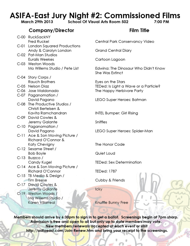 2
2
(click on any page to enlarge for legibility.)
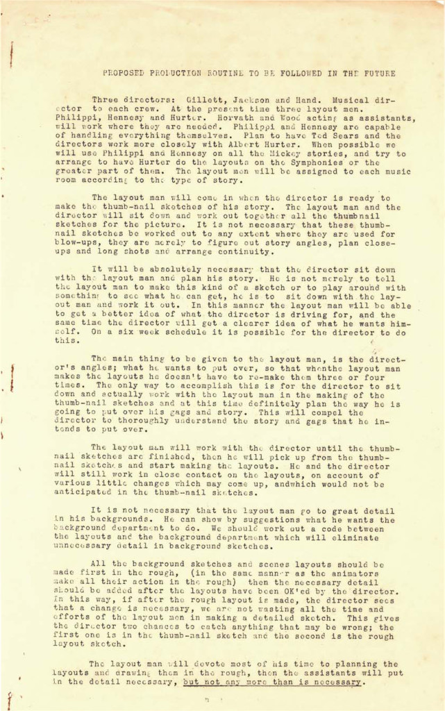
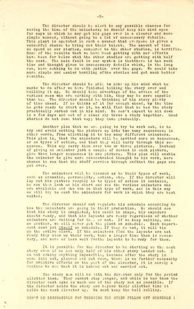
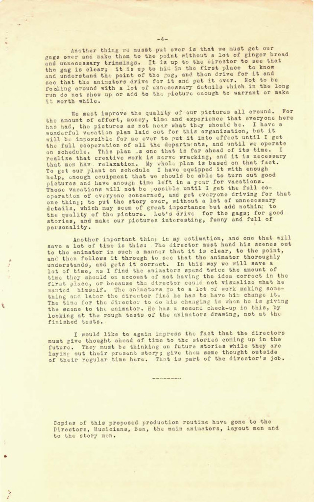
As an extra added attraction today, here’s a paper that was distributed at the Disney studio in early 1934, which outlines how their productions will move forward through the studio. They’re merely trying to set up some kind of organization, and they start by telling everyone how it will operate.
This document came from someone who would like to remain anonymous, but we thank him, just the same.
 1
1 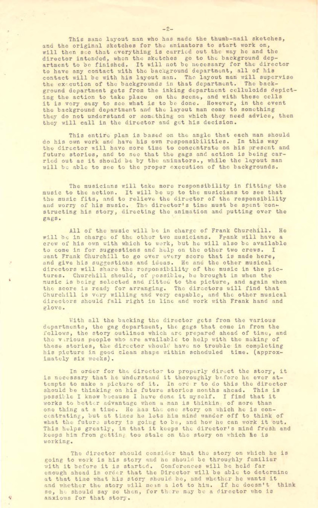 2
2


on 23 Mar 2013 at 2:29 pm 1.Scott said …
Crooks is worse than awful–it’s bland. DiMicco’s direction is what one might expect from someone who wrote crap like Quest for Camelot, Space Chimps, and Racing Stripes. He’s not a “writer,”. He’s a “typer.” And he’s certainly not a “director.” The characters are TYPES, rather than true CHARACTERS–moved along by the external forces of plot rather than by internal choices of character. What little plot exists is constantly papered over with distractions like chase scenes and LOTS of loud noise and bombastic music. The animation is more of the lame old same we’ve come to expect from CG of late. But to be fair, I don’t blame the animators. Their skill is evident–and I’m quite sure, given strong material and strong direction, they’d feel challenged and rise to the occasion. Sanders’ contribution appears to have been in the disperate “designs” of the characters. The humans are oddly bland, with facial features just off enough to be not as expressive as you ‘d need to want–as an audience-to get close ore care for them. The odd creatures beyond the cave are gag driven–which renders them as not much to further the story other than as asides. There are so many weird prehistoric creatures they could have caricatured to build a more believable world, that the choice to make them all up makes the film more cartoonish (in a bad way) than it’s spent time setting up. The shift in tone is abrupt and silly. The story was not served well by the weak, uninspired designs.
This film is a prime example of what drives me nuts about most CG features: just because you CAN do anything your imagination comes up with doesn’t mean you should try and cram it all into one story. Sometimes, less is more–and restraint is a good thing. Ultimately, that , along with the thin story and characters-is this film’s Achilles heel.
The two directors would do well to read the wonderful document you’ve posted today on processes from the Disney Studio. EVERY director should!
on 23 Mar 2013 at 10:03 pm 2.Ignacio Ochoa said …
Hi Mike. I posted recently on my blog a video about how Popeye cartoons was made. I never has saw this video before. Maybe you knowed about the existence of this tape. I think that this is fantastic. Thanks.
on 24 Mar 2013 at 3:36 am 3.Michael said …
Hi,Ignacio.
I think I did write about this about a year ago. I remember it appearing on Cartoon Brew. It’s a very good film. I followed your lead and posted it, myself, on this blog. I also gave you credit and added your great blog to the my sidebar. I should have done that a while ago. Thanks for your great dedication to animation.
on 24 Mar 2013 at 11:46 pm 4.Nat said …
Yeah, you pretty much summed up what I thought about The Croods. It’s just so ‘safe’ and predictable. It’s not a terrible movie, but it lacks originality. Also, it’s such as shame that Sanders original character designs for the movie translated rather poorly into CGI. The cave men characters are just not appealing to look at all.
on 13 Apr 2013 at 5:14 am 5.Andrew said …
IMHO it was pretty good . Quite funny and colorfull . Better than i expected when i watched the trailer first. More funny and entertaining than Ice Age franchise.