Action Analysis &Animation &Fleischer &Frame Grabs 26 Mar 2013 05:45 am
Grim – Distortions Smears, Abstractions & Emotions – 3
- In 1930, the animation in the Fleischer studio (as evidenced by Michael Barrier in his great book, Hollywood Cartoons) was pretty much controlled by the timing department. They supported a very even sense of timing and would expose everyone’s animation in the house meter. This virtually destroyed the timing within the studio. Their idea was that every drawing had to overlap the drawing before and after. It was done to such an extreme that it caused the even timing throughout their films.
There was at least one animator free of the timing department. Grim Natwick was the key guy in the studio, at the time. His animation was built, back then, on a distortion, a freedom of expression, that very much resembled what Bill Nolan was doing in Hollywood. The difference was that Natwick could draw, so his artwork was planned, designed to look that way. It wasn’t just a matter of straight ahead animation causing distortion. It allowed distortion with scenes going back to square one every so often to hold off the appearance of distortion. The inbetweens distorted and, in a way, smeared always to come back to a nice, tight pose of an extreme.
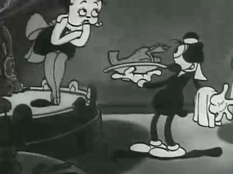
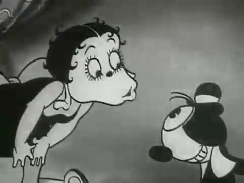
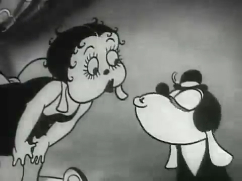
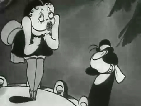
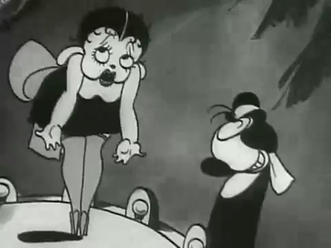
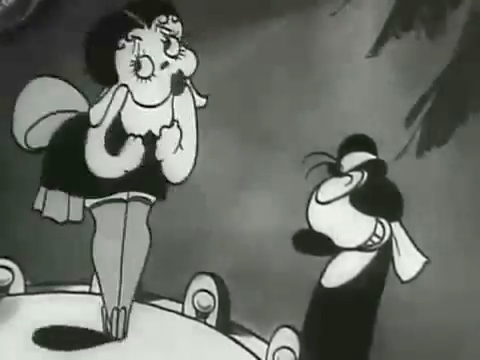
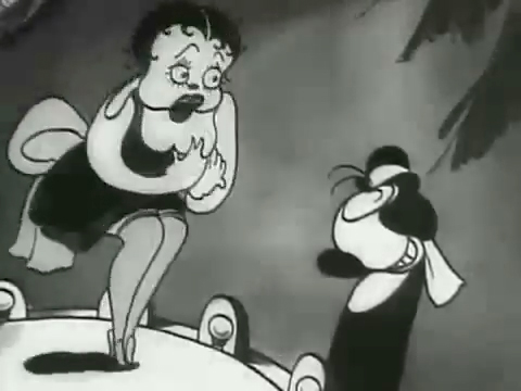
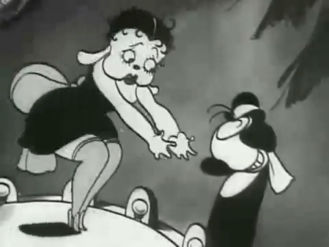
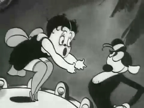
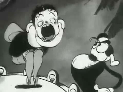
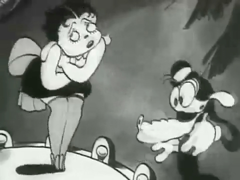
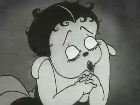
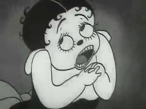
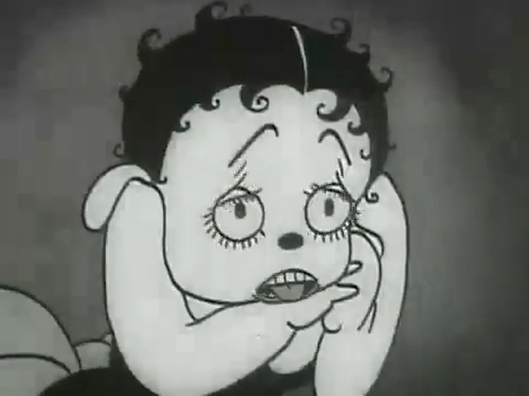
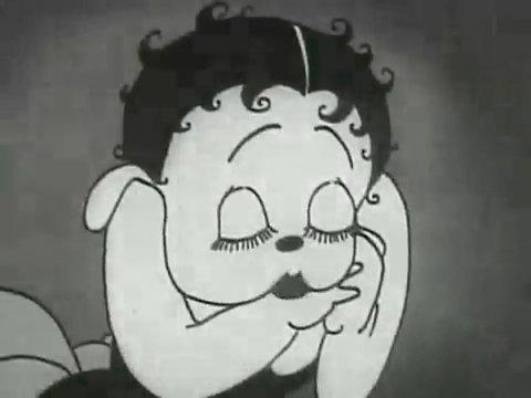
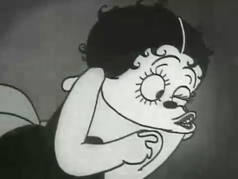
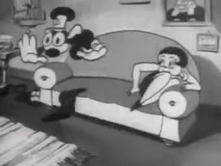
The film “Dizzy Dishes” is the perfect example of this style. This was actually the first Betty Boop cartoon, and Betty, a plump dog sings broadly. She really goes wild as she sings a song on top of a table à la Marlene Dietrich!. Here are some frame grabs from a couple of connected scenes to give you an idea of what was going on.
 1
1
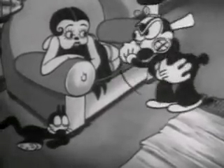
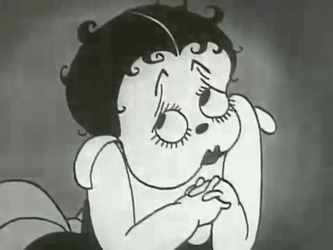
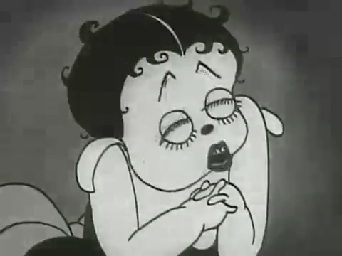
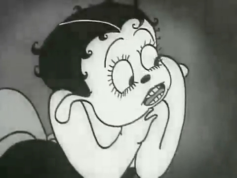
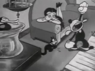
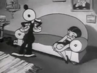
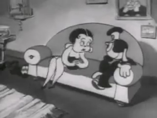
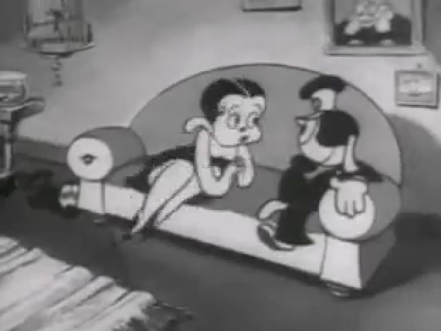
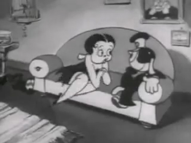
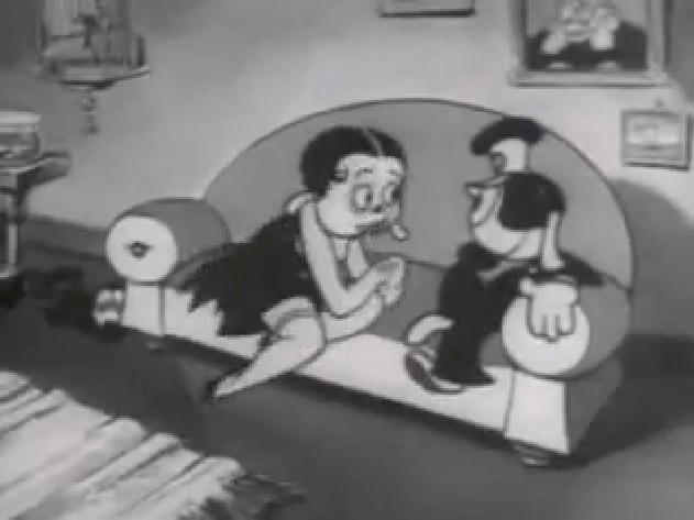
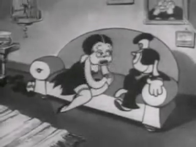
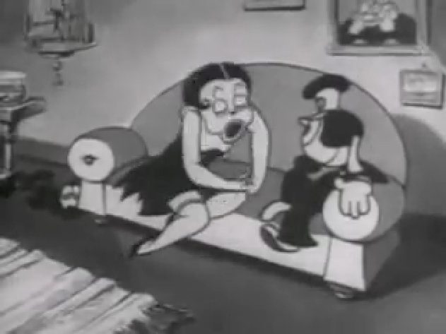
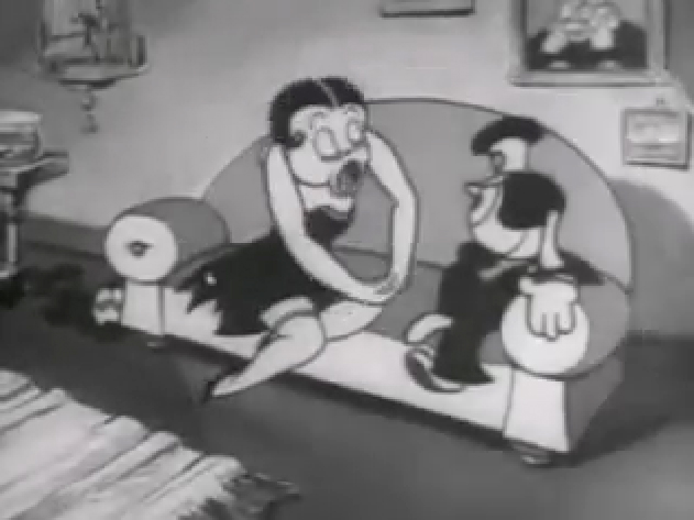
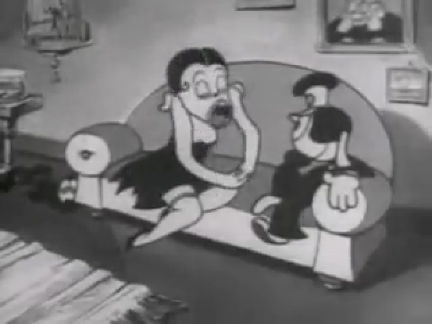
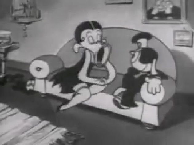
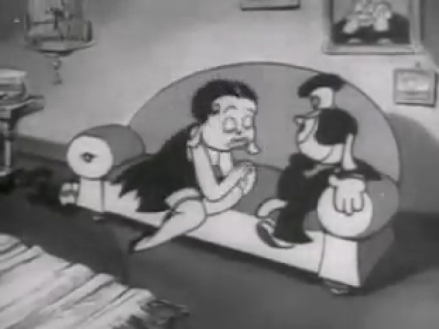
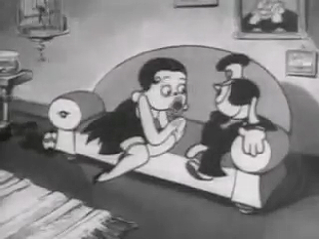
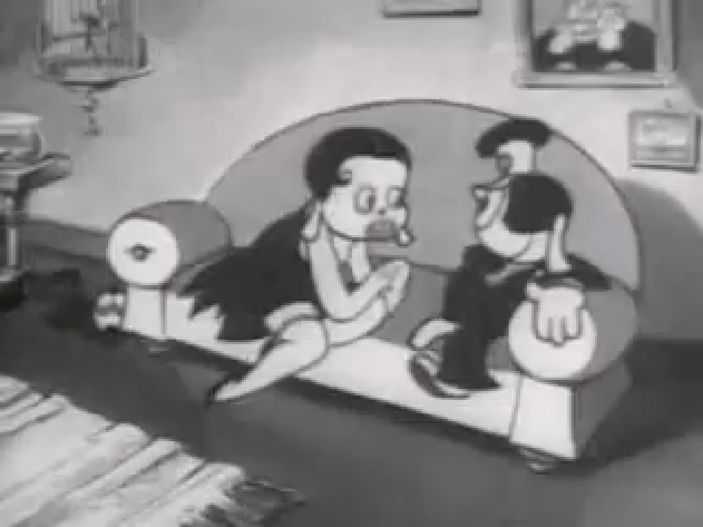
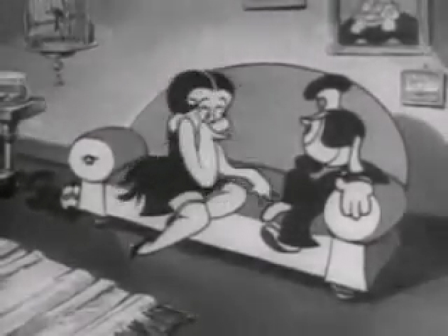
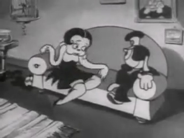
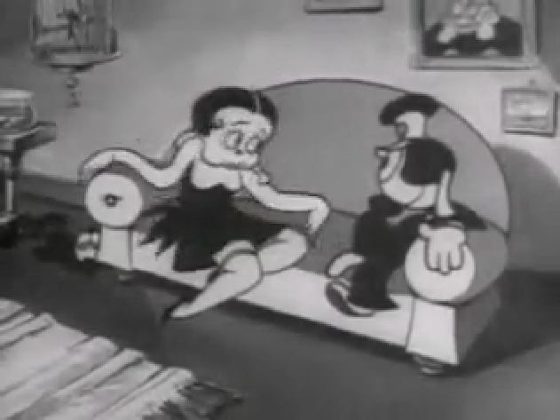
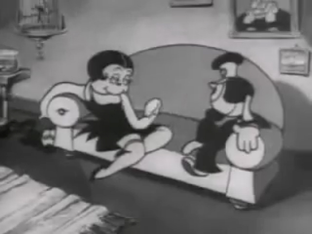
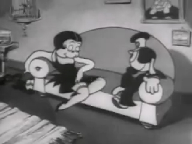
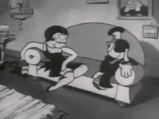
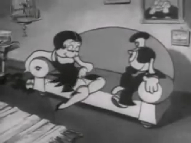
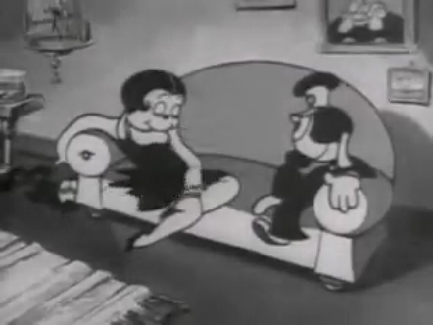
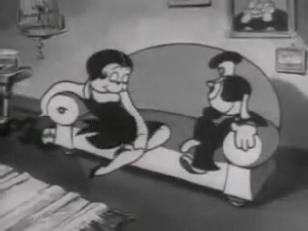
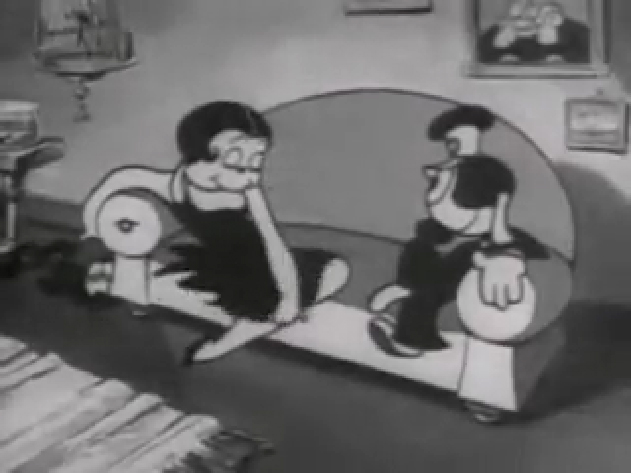
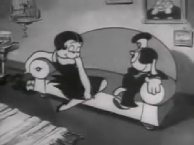
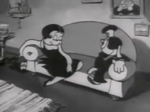
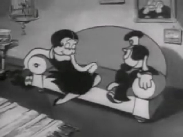
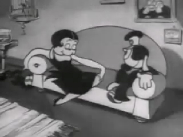
If you jump ahead to Fleischer’s “Barnacle Bill”, also from 1930, you’ll find this wild scene where Betty is seducing Bill, you’ll see all sorts of distortion in the inbetweens which Grim has maneuvered for Betty’s movements on the couch. Note how well posed his extreme positions are drawn despite the distorted inbetweens, when she is moving.
 1
1
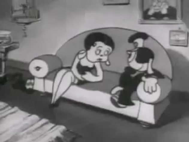
Look at the beautiful drawings (above) of this character in some of these extremes from this film. The character of Betty isn’t moving whereas Bimbo – I mean Barnacle Bill is all over the place. Yet your eyes are on Betty in that held position.
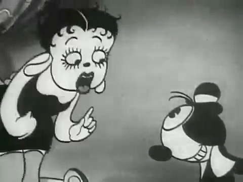
Now, let’s look at what the inbetweens are doing as Betty gets from one pose to the next. It’s really funny. Grim has found a way to create a sympathetic, adult and female character, yet he keeps her funny with the surface of the animation.
 1
1
At times in the animation, Betty’s hand may turn into a claw, but that might be that Grim delivered a rough which was poorly cleaned up by an assistant. Or perhaps the inker just inked from a rougher drawing, perhaps a Grim “clean up” if there ever were such a thing. He worked ROUGH. In fact, that distorted claw of a hand doesn’t matter. It’s the extremes that counted for Grim, and he was experimenting with this animation to see if that really were true.
I’ve remembered over many years an interview with Dick Huemer,* who worked alongside Grim on some of these films. Huemer gets credit for inventing the inbetweener to use in the animation process. It allowed him to turn out more animation and not worry about the many drawings that would paste the scenes together. In that interview, Huemer said that it didn’t really matter what the inbetweens looked like. You could draw a “brick” and it would still work. They actually may have believed this, at that time. Grim is using the inbetweens to get somewhere else in putting the scenes together.
(Tomorrow, I’ll post, again, a scene Grim did for Raggedy Ann with Dick Williams’ clean ups alongside so you can see the variance.)
* In Recollections of Richard Huemer interviewed by Joe Adamson, [1968 and 1969] Huemer said:
- And i decided that I would save all that work of inbetweening by just having a bunch of lines or smudges, just scrabble, from, position to position, When something moved fast. To prove it, I had an alarm clock flying through the air, and right in the middle of the action I put a brick. And vhen they ran the finished
film you didn’t see the brickl It proved that you didn’t really see what was in the middle. But I overdid it.






on 26 Mar 2013 at 4:52 pm 1.Kevin Hogan said …
If Fleischer’s rigid timing had any positive effects, it was making animation such as Natwick’s feel even more distorted than it already was.
I simultaneously love and feel put off by the Fleischer cartoons of this early period. Natwick is a major reason why. The cartoons have a strange mixture of unyielding structure (through rigid timing) and improvization (in certain animation and the surreal humor) that make them feel off-kilter. I find myself laughing ackwardly at the cartoons, and often times I am not sure if I liked it or hated it.
Fleischer toons (at least the early ones) are kind of like horror films- They make you uncomfortable, but you like the surprise and the outlandishness.