commercial animation &Frame Grabs &repeated posts &Richard Williams &Title sequences 19 Mar 2013 04:58 am
A Funny Thing Happened – again
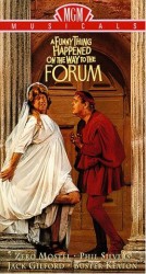 - Today marks the 80th birthday of RIchard Williams. To celebrate, I’ve chosen to post these images from the credit sequence of A Funny Thing Happened On The Way To The Forum. My first introduction to Richard Williams and his work came by way of a BBC documentary from 1965, The Creative Person: Richard Williams. It aired on WNDT’s ch 13 in New York (PBS before PBS existed.) Within the sequence there is once scene of a girl smelling a flower. (The Annette Andre credit.) I remember this as part of that doc, and Richard said that at times you should slow down the animation of a character if you want it to seem more real. There’s a dissolve animation going on here.
This is a great theatrical show and a mediocre movie. Despite the great cast, the brilliant people working behind the scenes (from Tony Walton‘s sets and costumes to Nicholas Roeg‘s extraordinary photography; from the incredible song score by Stephen Sondheim to Ken Thorne‘s excellent incidental music), somehow it all doesn’t really work.
However, animation enthusiasts would be primarily interested in the animated credit sequence by Richard Williams‘ fine animation. This was a sequence that brought Williams out of the cartoon world and into the more serious fold. Suddenly, his studio grew up.
Since we didn’t get to see his brilliant ads in the US, we had to seek out his title work. Credit sequences for future films such as The Charge of the Light Brigade, The Pink Panther sequels and What’s New Pussycat easily demonstrated how he really lifted his studio into the big time.
I’ve made frame grabs of the sequence from my recording, and thought I’d post them for your amusement. Sorry that the copy I have isn’t the most pristine and that the frames available are a bit soft. But I guess the idea comes across.
______________________________________(Images enlarge slightly by clicking them.)

The sequence starts at the end of the film. Buster Keaton runs on a circular treadmill, and dissolves to an animated version of himself.

He grows in the frames as some large-sized flies enter from the left.

Cut out to see a small Buster disappearing. The camera whips across to a picture of fruit. The flies zip over there and eat the picture. (This image of fruit was very dark on screen.)
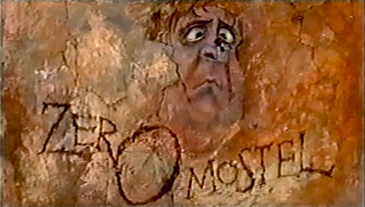
A fly lands on the nose of a CU caricature of Zero Mostel. His eyes cross watching the fly.
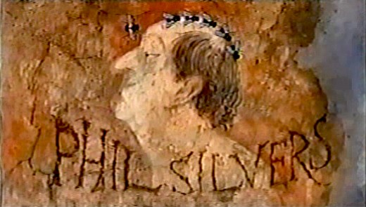
Flies land on Phil Silvers’ bald head and march across.

Buster runs across a painted frieze on the way to a series of inlayed boxes.
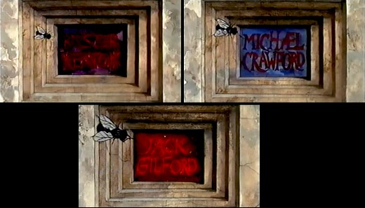
Zip to the second box credits Michael Crawford. Pan to the third box which features Jack Gilford’s name.
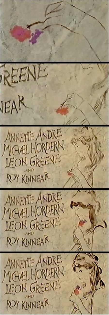
Dick talked with me about this scene in the film. He felt that to create realistic
characters in animation one had to slow everything down. He did it with dissolves.
It’s a technique he came back to often, quite noticeably in The Charge of
the Light Brigade.
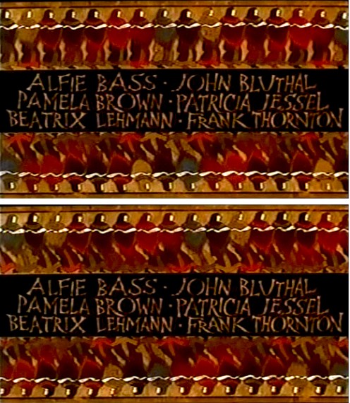
Errol LeCain’s art seems to be featured in this elaborate scene. The entire group – top
and (upside down) bottom – dance.
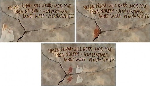
An animated version of Zero Mostel chases a female through and across a painted wall moving into and across the cracks.

The cornucopia of fruit starts in full color but goes to B&W before it’s done, in honor of the great cinematographer.
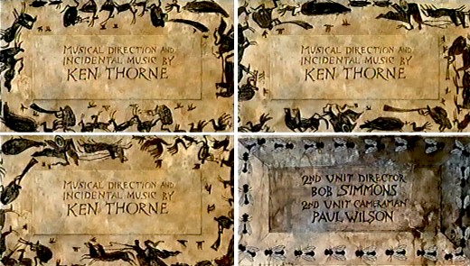
A very large cast of shilhouettes runs around this credit for Ken Thorne. There is no cycle here. This is a Dick Williams piece, so they’re all fresh drawings. They turn into flies for the next credit.

A Roman version of an Escher wall painting animates, confusing the fly trying to walk across.
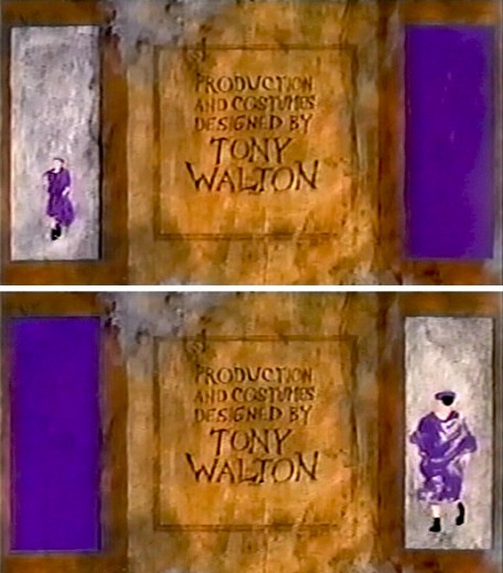
The animated Buster Keaton runs toward us on one side
and away from us on the other side.
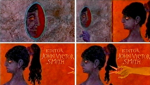
For the editor’s credit, a female looks at herself in a mirror. A hand comes in and clips off her pony-tail.
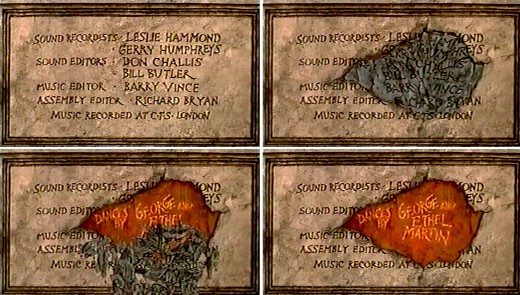
A slew of credits rots in one spot. This falls off revealing the choreographers’ names.
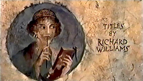
I’m always fascinated by the credit the designer gives himself. No sign of anyone else
who worked on this sequence. Titles have changed since then.
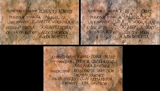
This is the first time I remember seeing letters from the type of one card falling down to match letters from the next card.
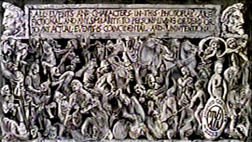
This card, the least significant one, comes back several times.
Of course it’s overanimated though it looks like a cycle.

The camera moves in on a fly crossing a checker board.
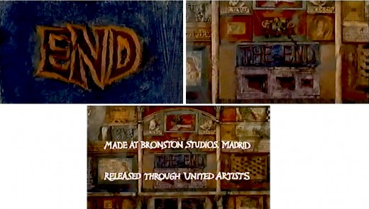
Truck out from “End” past “The End” to reveal several more boxes.
Happy Birthday, Richard. Thanks for all the wonderful gifts you gave animation, not the least being the obvious: a new respect for a medium that was dying when you stepped up to the plate. You restored its dignity at least once.



on 19 Mar 2013 at 9:31 am 1.John said …
I thought it was interesting that United Artists opted to put Williams’ animation for “Fourm” at the end of the movie, where most animated title sequences done were placed at the start of the picture, including, and most famously, with the Pink Panther series. I think that may have caused audiences of the day to overlook the sequence, because a lot of them were no doubt filing for the exits as the credits unwound (and in a day when people still expected the longer title credits to be at the start of the movie).
Williams got a ton of publicity for the titles when Blake Edwards and Peter Sellers revived the Pink Panther series in 1965, to the point you would never have known Friz Freleng did the original titles in 1963-64 (though that might have been the fault of some of the interviewers, including Pia Lindstrom, when she interviewed Williams on WCBS). But giving Ken Harris a special mention in the animation credits in “Return of the Pink Panther” was a nice touch by Richard.
on 19 Mar 2013 at 10:04 am 2.Luke said …
Best thing about the movie–which is a VERY FUNNY play.
I think it’s “cascading exposures” rather than “cross dissolves” on that shot. At first glance they might appear the same, but cascading exposures yields a a better, more subtle, controllable, and most importantly READABLE effect. Dick used them a lot.
on 19 Mar 2013 at 11:17 am 3.Kevin Hogan said …
I have always felt that Richard William’s best work is his commerical work- His technical precision made for work that was not as free as the typical Hollywood Cartoon, but sophisticated in a way that gave validity to a product/ title sequence/ abstract idea.
While I am not crazy about Who-Framed-Roger-Rabbit Williams, I very much enjoy the work shown here.
on 19 Mar 2013 at 1:23 pm 4.joel brinerhoff said …
YouTube has the sequence here:
https://www.youtube.com/watch?v=kNqptHlkjAA
on 19 Mar 2013 at 1:45 pm 5.Tom Minton said …
Putting an involved animated title sequence at the end of a live action feature was not a new idea in 1966. It had been done most famously at the end of “Around the World in 80 Days” by producer Mike Todd, showcasing Shamus Culhane’s sharply timed cartoon truncation of major plot points in 1956.
on 19 Mar 2013 at 8:42 pm 6.Nat said …
Animated openings for live action films always seemed cool. They really had their heyday back in the in the 1950s-60s. Only a few films that have come out ‘recently’ have had them like Kiss Kiss Bang Bang and Casino Royal.
on 20 Mar 2013 at 1:17 am 7.Michael said …
Actually, there have been quite a few that have animated openings. They vary from the Harry Potter films (particularly the closing credits) to films like Catch Me If You Can and Juno or Iron Man.