Commentary 18 Mar 2013 04:05 am
Smears, Distortions, Abstractions & Emotions – 1
It took a full twenty years for the industrialized animated cartoon to develop into anything approaching a professional, never mind artistic, level. Thanks specifically to Walt Disney‘s efforts, in the twenties and thirties, animation developed as a process with guidelines, rules and specifics designed to create the most consistency. To have those characters moving in anything resembling the elements of real life, it took a real education. And the development continued past the zenith of Snow White so that things grew faster and faster in leaps and bounds. Studios outside of Disney’s were slower on the uptake fighting the inevitable costs that this better animation required. Just as a Paul Terry held off on turning to sound or color, until he had no choice if he wanted to compete in the marketplace, so, too, did he not approve pencil tests to better the animation in his films. The second largest studio at the time, the Fleischer studio, likewise was slow to agree to the new developments. Whereas the Color Classics exploited color film, the successful series, Popeye and Betty Boop stayed B&W. Likewise Fleischer’s animators didn’t get to see pencil tests except on more important product.
However, once we hit the early forties, animators started doing their own variations on differing ways of introducing “quality” to the animation. The artists wanted to explore the “Art” and ways to get there.

A sample of John McGrew’s work on The Arist-o-cat
Maybe they didn’t think they were doing “Art”, but that’s what I’d say they were doing. And god bless the soul that gets in the way of an artist and his dream works.
Chuck Jones was always looking to better his product; so was Bob Clampett. They had different ways of going about it. Jones’ work with John McGrew meant that the filmmaking was pushed beyond the obvious and the artwork got unusual and daring. Check out the insane film cutting from 6:40 on in Conrad the Sailor. The artwork also turned more abstract in the layouts and backgrounds.
With Jones’ film, The Dover Boys, the animation was drafted to be daring as well. The animator, Bobe Cannon introduced smears. To pop a character from one extreme to another, accenting and parodying the 19th Century dramatic style Jones had sought. The character could move from one position to the next by smearing a couple of inbetween drawings and coming to a properly composed “hold.” It brought an unusual comedy bit to the scenes.

Frame by frame Cannon hurriedly smeared the artwork so that the character . . .

. . . could zip from one pose to another. This put the melodramatic action . . .

. . .blatantly into the action in a funny and purposeful way.
It also helped by accenting the peculiar track readings that Jones had caught from his actors. Immediately following The Dover Boys, the Jones team tuned out The Case of the Missing Hare. Smears abound as Bugs Bunny fights a magician against very stylized backgrounds. Cannon, Rudy Larriva and Ken Harris animated. No doubt Cannon’s smears were controlled a bit more as Chuck Jones experimented more with holds and freezes on his characters. John McGrew and Eugene Fleury designed them.
Cannon brought these “smears” into UPA with him, as an animator. He also started experimenting with the rule of “breaking of the joints” which meant that under no circumstances would an arm bend except at a wrist, elbow or shoulder. However, he allowed himself some distortion, flexibility to determine where the elbow was on the arm or how far the bend at the shoulder could be. Let’s just say he exaggerated. This was also an ideal form of animation for the limited animated practices at UPA. Grim Natwick had Nellie Bly corkscrew her arms around each other in Rooty Toot Toot. This was probably a direction Hubley called for in his quest for “modern art”. By this time, Cannon was already an Oscar winning director at UPA; Gerald McBoing Boing had won the previous year.
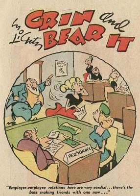 It was at the same time Cannon and Jones were developing these smear tactics for their drawings that Bob Clampett was talking with Rod Scribner. Scribner was an enormous fan of newspaper cartoonist, George Lichty. Scribner wanted to pull the designed looseness of Lichty into his animation and allow it to take control. Distortions would represent inner emotions, and Scribner was desperate to try it. Clampett agreed as long as he, as director, was calling the shots. He would tell Scribner when to “Lichty” something. They first tried it in “A Tale of Two Kitties” (the first Tweety & Sylvester cartoon.) They immediately took what they learned into “Coal Black and de Sebben Dwarfs.” Scribner used it wildly in relaying the emotional intensity of the characters. Now, they were not only distorting the characters on the inbetweens, they were visibly distorting the extremes as well. Not only were the characters’ surface emotions visible, but the internal emotions were allowed to run rampant.
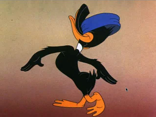
Rod Scribner had a different way of distorting.

The character would start off normally and distort by completely shifting . . .

. . . the masses of the character keeping the volume the same within . . .

. . . the body of the character who’d end up somewhat normal again.
The experiments between this animator and director were enormously successful, just as had been Jones’ experiments with Cannon and other animators under him. And these experiments continued to play into other films by both directors. The control was strong and personal and unique. Clampett and Jones were doing similar things for different reasons, however subtle.
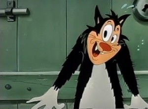 On the East Coast, the animator, Jim Tyer was doing something altogether different. His style was bursting at the seams of control; he had been drawing his distortions more and more forcefully as his directors grew weaker.
I’m sure, at Paramount, he was kept under control. Assistants altered his drawings in their “clean ups” trying to pull Popeye back onto the model sheet. A number of them actually complained to me about it.
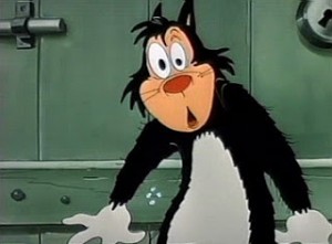 The kindest animator in the world, Johnny Gentilella had a dig as well, “He had difficulty keeping his character on model.” Once Tyer landed at Terrytoons, that was it. All was clear for his graphic distortions. The characters never appeared on model, never mind their ever having been “cleansed” in “clean-up.”
There was a difference with Jim Tyer, though. It would seem to have been more a graphic adjustment rather than an emotional one that Tyer was drawing.
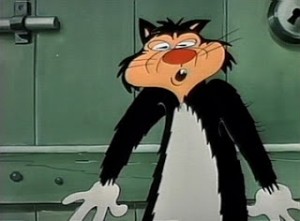 The characters were not trying to break out of their skins emotionally, as they did under Scribner’s pencil. Here they stood out from everything else and every other animator’s style. There was no attempt by the Terrytoon directors to emotionally cast these graphic outbursts. A Tyer scene, wild as it might flow in its distortions, would be allowed to flow into the work of some very tight animator, then come right back to Tyer. One would expect his scenes to, at least, be the action scenes; but no, they could have been very
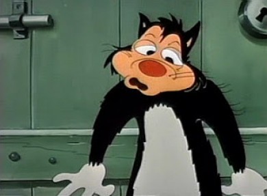 quietly building up to the wild actions of another animator who would try to rein in the stylization.
The Terrytoons cartoons were all over the map, and in many a case they were held hostage by Jim Tyer. As a kid I enjoyed these outbursts, and I looked forward to watching another Mighty Mouse or Terry Bears cartoon to see what that crazy animator did. The problem, of course, was that Tyer’s animation separated from the film as a whole and broke down
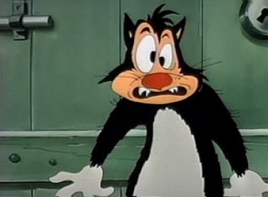 the entire short it came from. Mark Mayerson talked about this at length in his great piece, “Jim Tyer: The Animator Who Broke the Rules” (1990). As he points out, ” Tyer’s work is animation’s equivalent of a train wreck or a freak show. It’s not something you’d necessarily choose to look at, but once it’s caught your eye it’s hard to look away.”
This was unlike the work of Cannon or Scribner. All three are funny and to differing degrees. They,
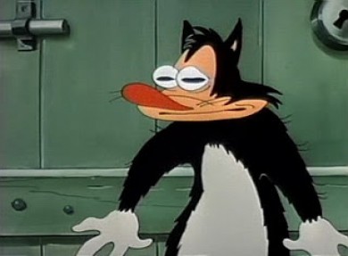 all three, have different levels of depth. However, whereas Cannon worked his style with one key director and Scribner did the same, Tyer worked against his directors – at least, one would guess that was the case. I can’t imagine a Connie Rasinski even talking about the style except to chastise Tyer, possibly to his face. I’m sure things got easier for Tyer after UPA and their “wild” stylization made his work more acceptable and possibly even more comprehensible for these directors like Rasinski,
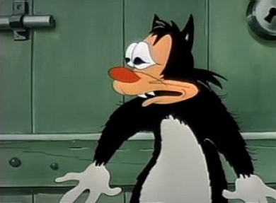 Eddie Donnelly or a Mannie Davis. Tyer seemed to have an autonomy over anything he was working on.I’m surprised, in a way, that he, himself, wasn’t more concerned about his work fitting more appropriately into the cartoon as a whole. It’s doubtful that he would have mentally dismissed the films he worked on – other than for his own animation.
Even Tyer’s still work shows signs of blowing up at any moment, as can be seen in this storyboard still or this comic strip. Paul Terry, himself, must have accepted, if not supported, this work. Tyer did it for so many years.
There was one other key animator who distorted his characters, but his was a greater example than any other. For a short time, he was producing some of the most important animation of is time. We’ll tackle him (again) in another post.Of course, I’m talking about Bill Tytla.

on 18 Mar 2013 at 4:35 am 1.Eddie Fitzgerald said …
Yikes! Mark Mayerson said that about Jim Tyer, one of the funniest animators in the history of the medium? Well, that was way back in 1990. One hopes that Mark has since repented.
on 18 Mar 2013 at 9:10 am 2.Michael said …
He was funny, but he takes over every short he works on. You sit waiting for more from the crazy cartoonist. The story and everything else on screen gets short shrift. Of course, this is a good thing when you’re watching a Terrytoon.
on 18 Mar 2013 at 2:45 pm 3.Kevin Hogan said …
Excellect blog Michael. I’m glad that you looked at other studios other than WB as well.
Maybe this is my perspective and not really true- it seems to me that smear drawings/ abstract backgrounds, etc. were more of an artform to Chuck Jones, as he was trying to get a specific vision across. It seems that Bob Clampett was less controlled in his approach, and was experimenting more out of curiosity than a precise vision- Ie. Chuck was composing an orchestral score while Bob was was a jazz improvisor.
Do you think this may be true to say?
on 18 Mar 2013 at 3:40 pm 4.Michael said …
I definitely agree with you, Kevin, about the different approaches between Jones and Clampett. Jones was very much more a thinker and a purposeful artist than was Clampett. However, I have no doubt that Scribner was the art behind those scenes. I think he worked it all out via whatever looseness connection he found in those George Lichty sketches. It’s wonderful when you know about the inspiration behind a style, as we do with the Lichty/Scribner connection. I don’t know where Bobe Cannon figured out his version of the smears, but he undoubtedly worked hard at developing it, and then I think he allowed his emotions to take over scenes. Jones, no doubt, gave him words and possibly even a couple of sketches, but it was Cannon who came up with this version of the smears.
I think in some odd way it goes back to Bill Nolan’s animation in 1929-130. Nolan worked so fast and so sloppy that the characters were pure distortions of what they were supposed to be. I hope in the next part of this discussion to go into that a little more. In the end, for me, it really comes down to what Bill Tytla was doing, and that’s where I’m heading.
on 18 Mar 2013 at 3:49 pm 5.Eric Noble said …
It’s so fascinating to read about these things. This helps me understand more about the artform and the people who created it. It gives a new lens through which to look at the work done by each person.
It also makes me sad that such wild distortion is lost nowadays, especially with the rise of computer animation, Flash, and the like. As a student in a gaming program, I’ve seen how literal computer animation can be. There’s squash and stretch, but no distortion to show emotion. There’s no room for the smears of Cannon, or the wildness of Scribner and Tyer. It’s all, as Mark Kausler put it, “digital puppeteering”.
on 18 Mar 2013 at 4:21 pm 6.Thad Komorowski said …
So many interesting thoughts….
“Experimental” doesn’t really describe any of the Warner directors (except maybe Jones in a few instances) or any Golden Age animation because “experimental film” by definition means “prone to failure.” Those guys were all ball busters and knew very well what they wanted to reach the screen. If Clampett seems less controlled, it’s because he created that atmosphere in his unit precisely because he envisioned the kind of animation he’d be getting from McKimson, Scribner, Gould, et. al. Different approaches to direction, but it’s ultimately all about control to lead to a specific vision, which is why the Warner cartoons are all routinely great and still commanding our attention.
I don’t think UPA had any effect on Terrytoons at all until Gene Deitch came in. Can anyone honestly say 1950 Jim Tyer is any different than 1954 Jim Tyer? Generally speaking, we all should cut the studio some slack. The cartoons only got two weeks in every department (so Tyer got away with his work because he was fast and on-budget, regardless of what the others thought of him), so if they’re bad, they’re not bad by choice.
I’ve always loved the comparison Jim Davis (the late Fleischer/Warners animator, not the Garfield hack) made. ‘”Uninhibited’ would certainly cover both men, but in terms of action, Rod was wilder still. Tyer’s was never insane, but some of the stuff Rod did looked to be the work of a guy who was disturbed.” Tyer’s work was clearly the product of a wild party animal having as much fun as he possibly could in often brutal circumstances – it’s all an act. If Scribner’s work seems more emotionally engaged, it’s because he more or less was the character he was animating.
Thanks, Michael, for regularly supplying a great dialogue.
on 18 Mar 2013 at 5:23 pm 7.John said …
Tyer’s animation at Paramount really depended on who was overseeing his head animator work. If you look at the stuff he did under Seymour Kneitel it’s far more reserved that what everyone came to expect from him. But if you look at his work under Izzy Sparber and Dan Gordon, that’s really where the all-out insanity of Tyer’s Terrytoons animation was born.
Neither Gordon nor Sparber put a leash on Tyer, and as head animator, he had the luxury of assigning himself the scenes that best fit his style of animation; usually the fight climaxes in the Popeyes, but not always — he opted to give himself the Averyesque sexual reaction scenes in “W’ere On Our Way to Rio”.
Bill Tytla’s arrival at Famous and his two Popeye collaborations with Tyer as head animator interesting; in the first cartoon, the head animator is definitely controlling things, while in the second, Tytla has adopted Kneitel’s style and Tyer’s animation is almost completely muffled (the fact that “Rocket To Mars” could possibly be the most polished-looking Famous Popeye ever and have Jim Tyer as its head animator shows how much this was Bill Tytla’s cartoon). In that sense, I suppose we should be glad Rasinski, Donnelly and Davis either went the Gordon/Sparber route either out of choice or out of the fact that nobody at Terrytoons cared enough to want their cartoons to look as polished as possible.
on 18 Mar 2013 at 6:09 pm 8.Kevin Hogan said …
I agree with you, Thad, on the difference between Tyler and Rod. I will say, however, that Rod’s work visually is energetic, while Tyler’s work can look kind of creepy. For example, just look at the examples above!
Perhaps the “creepiness” in Jim Tyler’s work stems out of the lack of ambition from the other animators around him. I find it kind of unsettling to see a generic character (ie. the typical Terrytoon character) suddenly having these bursts of distortion. While Scribner’s work stands out in the Clampett toons, the rest of the animators seem to at least try to match his energy (with Clampett’s hand guiding, no doubt).
… Thanks for your remarks, Michael.
on 18 Mar 2013 at 10:28 pm 9.Stephen Worth said …
The animators at Terrytoons complained because Tyer’s scenes stood out from the rest, but the problem wasn’t Tyer. The problem was that Tyer wasn’t animating the whole picture. When he takes sequences, they are masterfully paced and build to a devastating finish. No one else at Terrytoons could keep up with him. No one else even tried.
Clampett showed how animators as diametrically different as McKimson and Gould could be used for their strengths… and in the same picture. Had Terrytoons a directing staff as good as Clampett, Tyer would have been properly used within the context of the films they were making.
on 18 Mar 2013 at 10:40 pm 10.Stephen Worth said …
I don’t see any “creepiness” in Tyer’s work. I see pure unmitigated love of movement, not all that far from Norman McLaren or the best of John Hubley. It’s a purity of motion. If it brings out feelings of creepiness in you, that is because you, not Tyer. I can guarantee you it was not the intent behind what he was creating. He was expressing joy.
on 18 Mar 2013 at 11:19 pm 11.the Gee said …
I agree with Stephen, sort of.
While the individual drawings may seem odd and, to some people’s eyes, creepy, it is just part of the moment. It isn’t something you or I are expected to see and dwell upon. But, if you look where the action starts and ends, it just works for what Tyer was going for.
In a way, he’s just emphasizing design elements to allow for smooth actions that just “look right†when everything is in motion. That’s what the point of most of the smears are…I hope that isn’t just my opinion either.
The payoff obviously makes everything look funnier. For all the reasons why everyone else already mentioned, it works. Though, I’m sure that’s limited to the three artists that are focused on here and the intent of Tytla is to make everything look the way he wanted it to look.
on 18 Mar 2013 at 11:26 pm 12.the Gee said …
On Cannon’s influences, I can’t help but think of Lyonel Feininger and Jack Cole.
The timing would be right for them to have made their marks prior to The Dover Boys being made.
The way that they, respectively, as a comic strip artist and as a comic book artist, distorted forms was probably just as known as Lichty’s work. Though, from my understanding, didn’t Lichty know animators, too?
I found some examples of work from around that period but I couldn’t find a ton of decent Cole images from 1941 or earlier. However, I did find a good selection to see how he distorted the figure and depicted action, motion.
With Lyonel Feininger, his distortion wasn’t seeming about conveying the sense of motion that I could find. However, the thing that reminds me of his work when I see the smears from the Dover Boys is that the figures and forms are distorted and sometimes that seems to be done to help the eye move across the page in reading his comic strip.
I have links but the filter gets clogged up when I try to post links, delaying my posts. Let me know if you want to see what I found. I found a few visual examples.
on 19 Mar 2013 at 11:06 am 13.Kevin Hogan said …
I agree with you Stephen- the work Tyer did almost exists in a vacuum at Terrytoons with its energy and pure joy. Don’t get me wrong- it is exciting to see. I simply felt that it is also strange to see generic characters suddenly have such dynamic movement for a short burst of time. As with a woman, mystery and chaos is both uncomfortable and magnetizing simultaneously.
I liken the feeling I get when watching Tyer’s work to the feeling I get watching early Fleischer stuff. Watching a chair or some object suddenly come to life out of nowhere and then morph suddenly back to lifelessness is both quirky/ interesting and somewhat discomforting. Many a time as a child I saw a Fleischer cartoon and then had a nightmare that evening- and then watched more cartoons the next day!
on 19 Mar 2013 at 3:09 pm 14.Ray K. said …
This is a great post.
It can’t be stressed enough, so it’s good that it is here, that, fun as it may seem (especially for new animators) to mess around with — distortion for its own sake is not interesting. Tyer’s distortion is.
Tyer’s animation defies, almost refuses, description. Tyer strikes me as animation’s answer to William S. Burroughs. His subversive twists on the form, and the forms within the form, feel only authentic and seem to spring almost straight from the libido. Their logic is sensed more than explained; their balance comes from the pulses and counter-pulses of energy so that, reckless as any one drawing looks, balance through time and ultimately satisfies our instinct to wrestle some order or design from these outbursts.
As with Burroughs, there’s integrity to the wild ride — and we can find meaning if we stick around long enough to bother. But just letting it have its way with us is strangely satisfying in itself.
on 19 Mar 2013 at 4:33 pm 15.DB said …
Oh man, I completely revere “Drafty Daffy” – you can pause this film at any spot and there is a hilarious drawing. The distortions of Daffy rushing around are phenomenal and just on this basis alone I put Rod Scribner on a pedestal.
IMO Clampett often fell into some annoyingly cutesy/coy tendencies but in this film these are kept to a minimum and so its a thing of beauty.
I admire the art in Dover Boys but there is just something I find borderline insufferable about Jones at his most “Chuck-Jones-est’. A nice thing about “Duck Amuck” is in spirit it seems almost Clampett-like.
I am slowly growing to some sort of appreciation of Jim Tyer. To be honest, my initial impressions of his stuff have not been ‘oh, those distortions are really funny’ – its more just been that “oh, that is some really incompetent animation’. I’m wondering if people could offer some specific cartoons where they think his philosophy of animation best fits the material.
on 19 Mar 2013 at 7:12 pm 16.Michael said …
ou picked a great one! “Drafty Daffy” is one of my favorites too. I thik Daffy is my favorite of the WB characters, and that’s my favorite Daffy.
on 19 Mar 2013 at 7:13 pm 17.Michael said …
Jim Tyer and William S. Burroughs! I met Burroughs a couple of times; I wish I’d met Tyer. H probably had a greater influence pn my poetry than Burroughs did.
on 20 Mar 2013 at 8:44 pm 18.Stephen Worth said …
It’s easy to think of Tyer’s motions as random… Until you try to animate like him. Then you realize that he’s deftly juggling aspects of 3D/2D, relative shapes and different sizes of shapes and lines of action that change radically in short spaces of time. Yet all of it works and creates a bubbling joy on the screen. The only thing I can compare it to is Begone Dull Care and Hen Hop.