Bill Peckmann &Books &Illustration 21 Mar 2013 04:12 am
Baumgarten’s Toddy
Bill Peckmann forwarded another beautiful book by Fritz Baumgarten. Here’s Bill’s note:
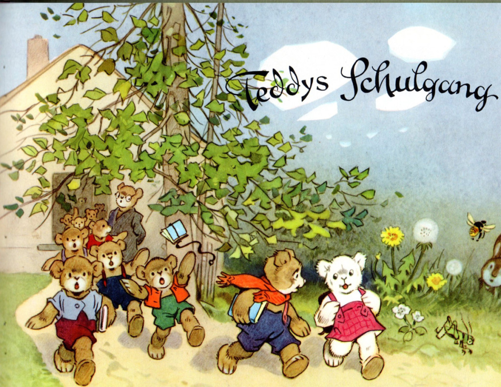
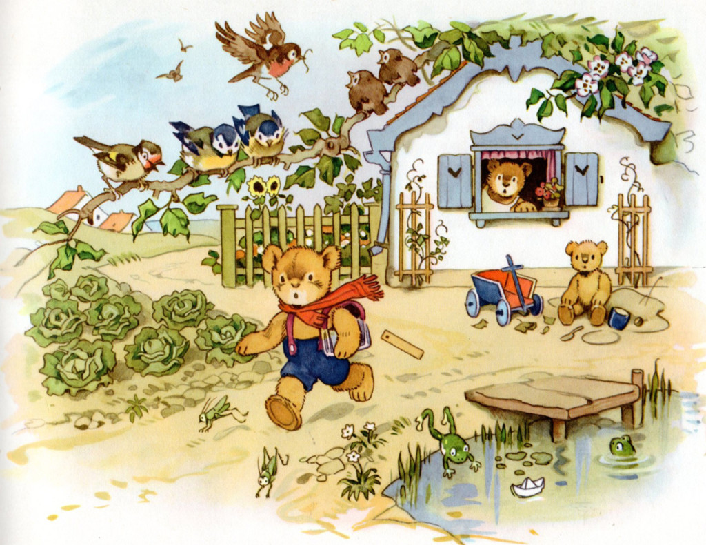
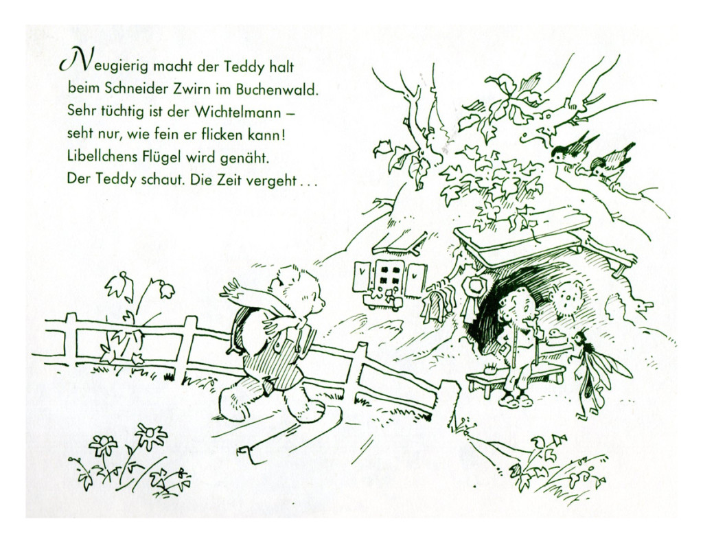
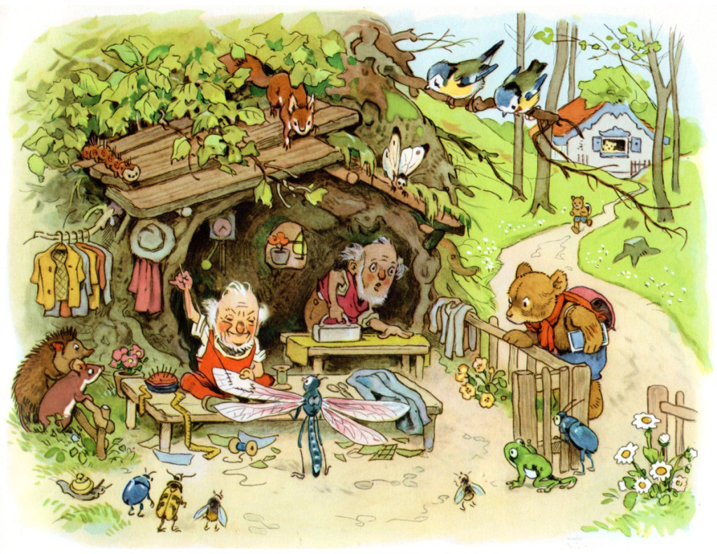
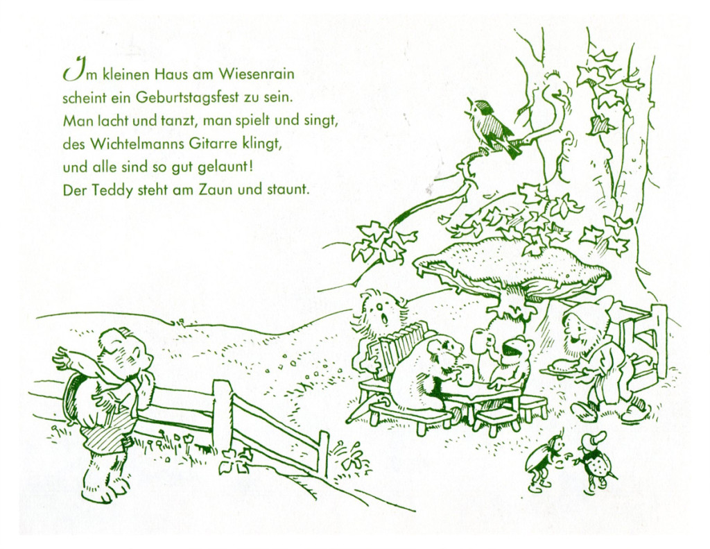
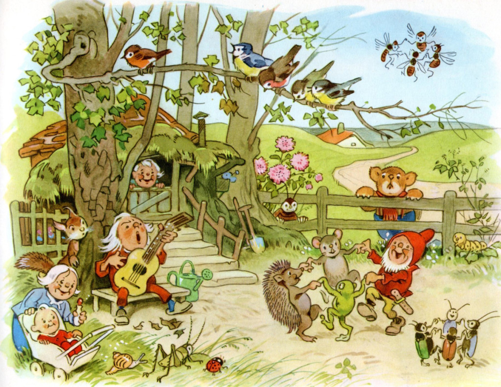
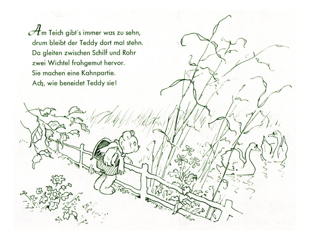
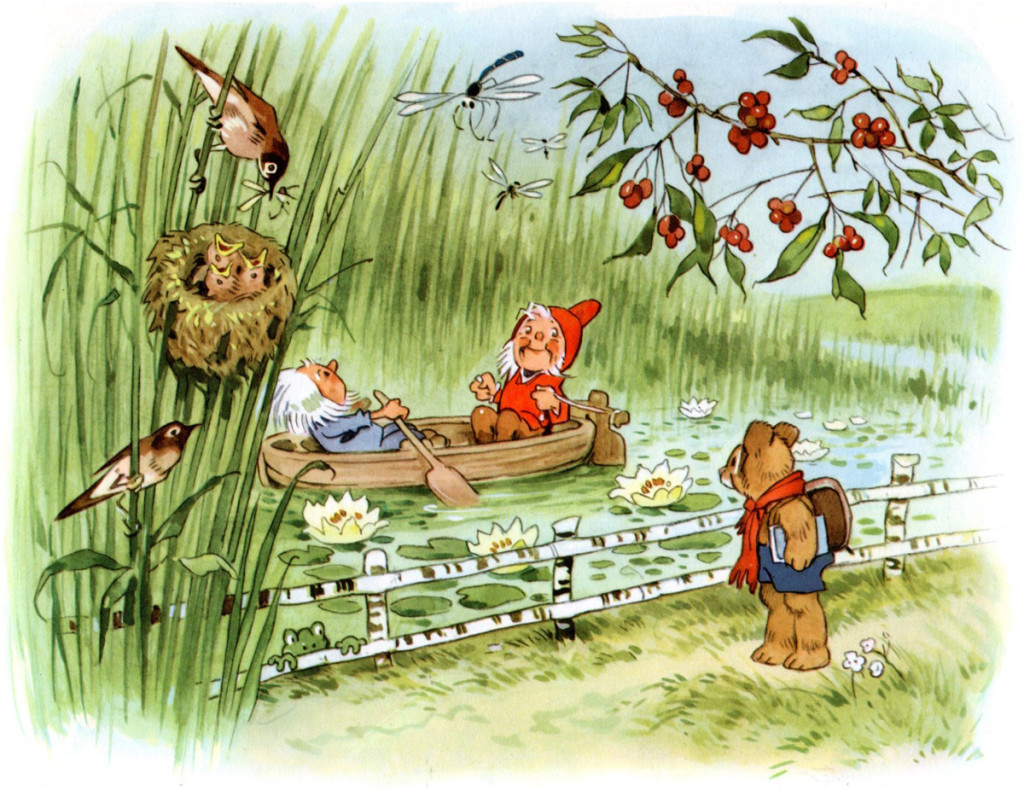
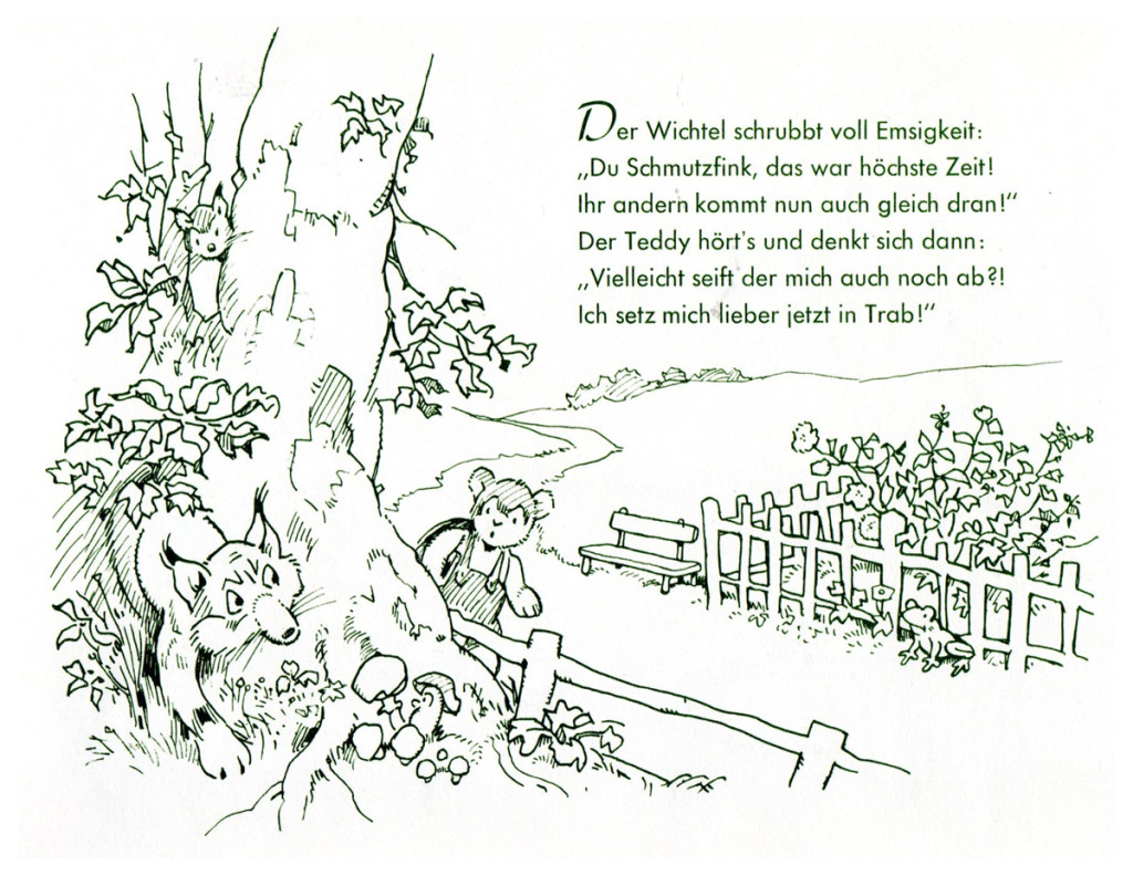
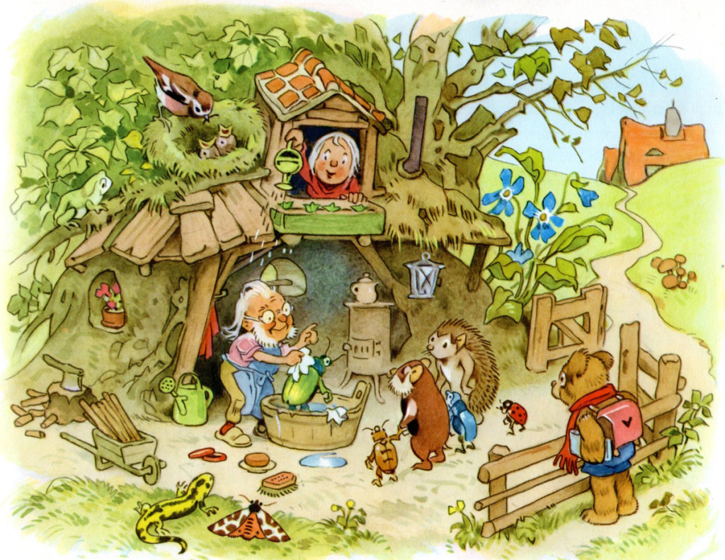
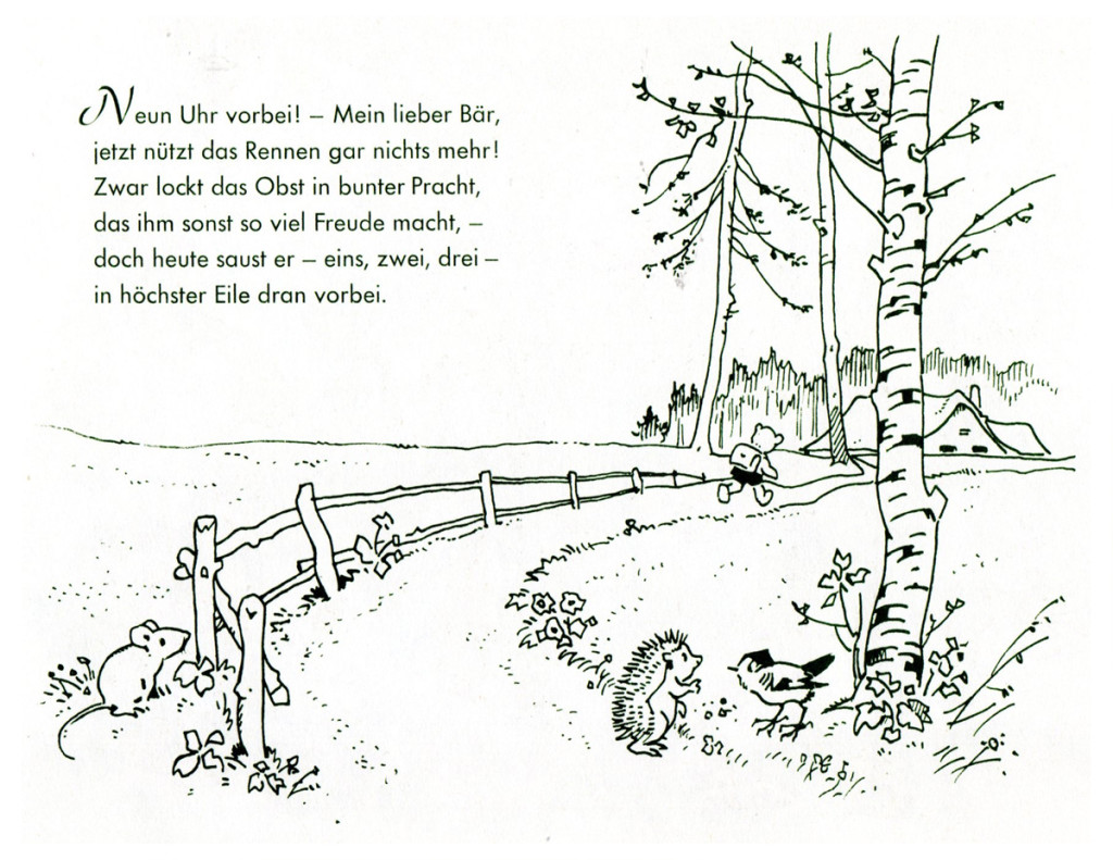
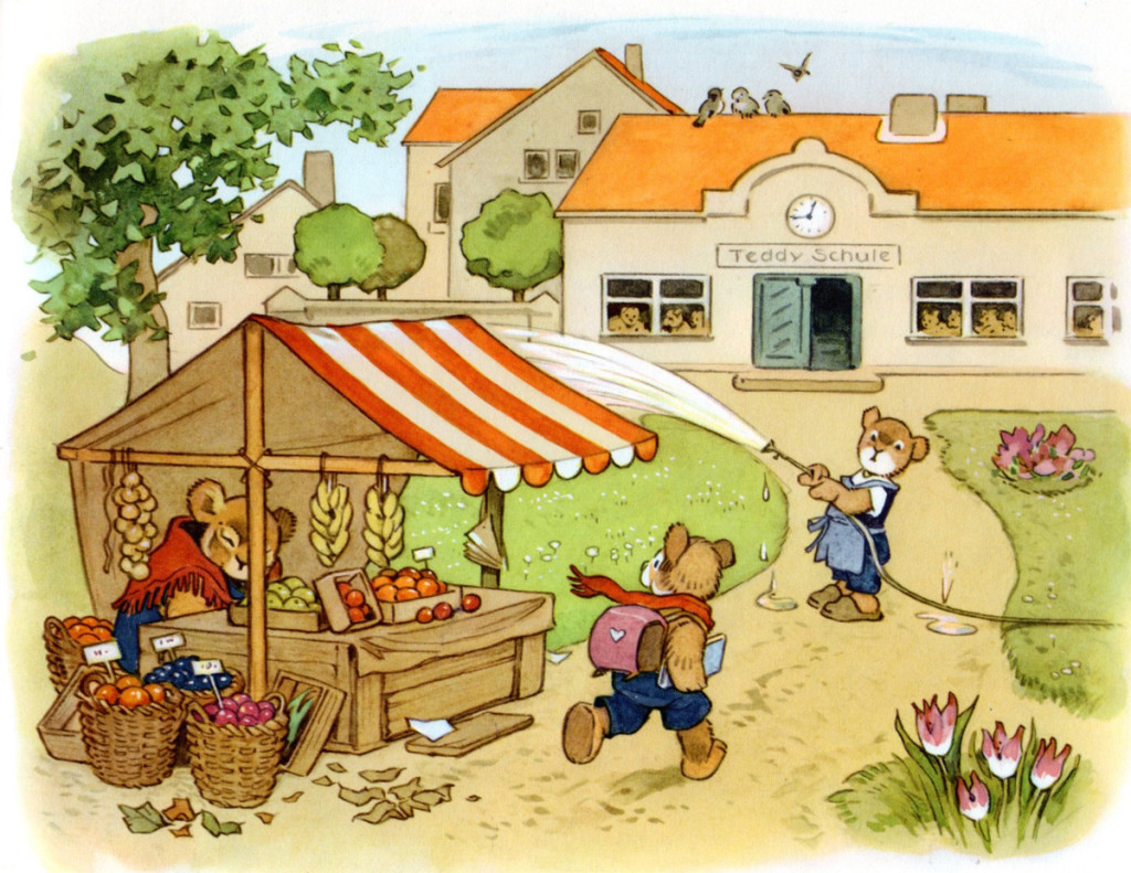
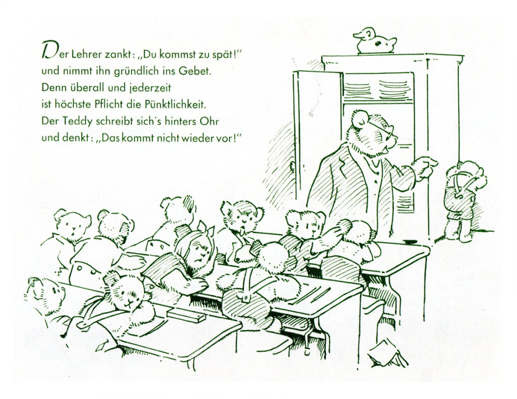
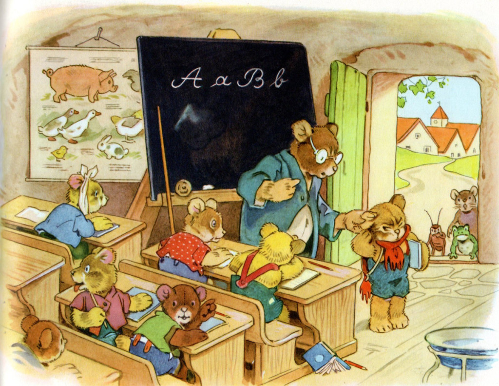
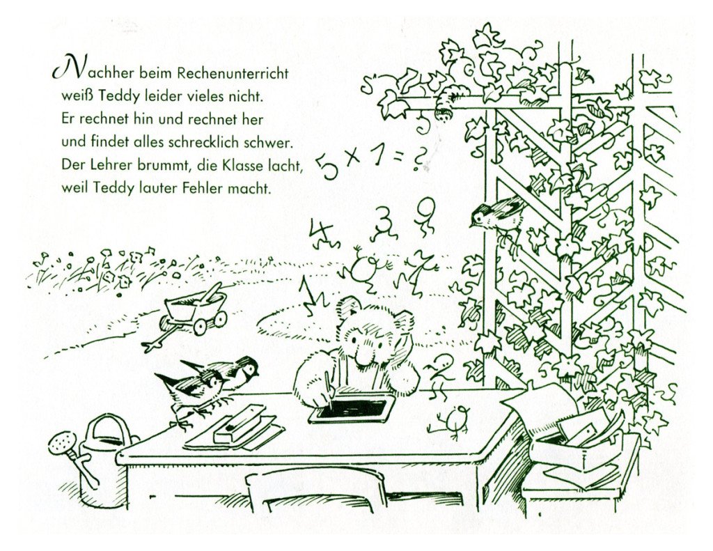
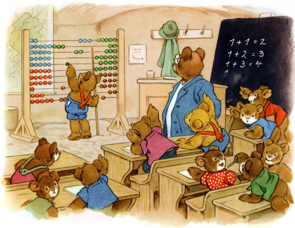
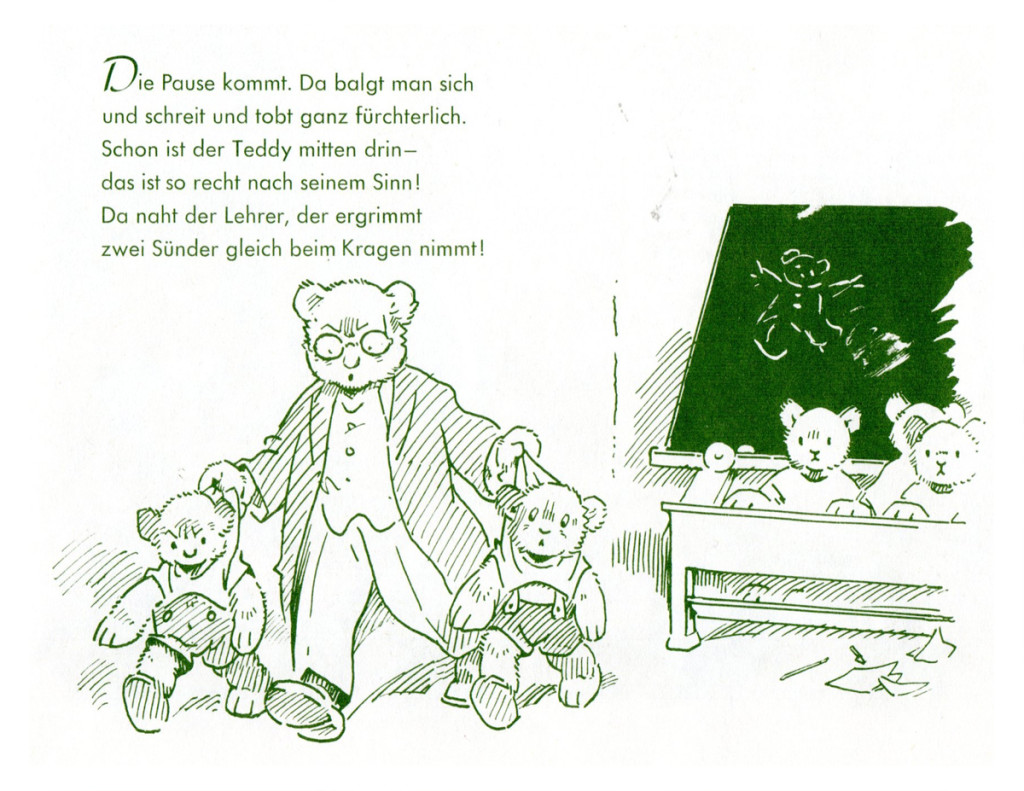
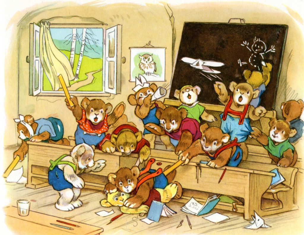
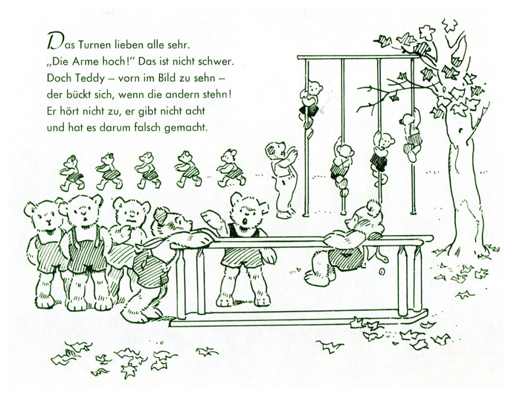
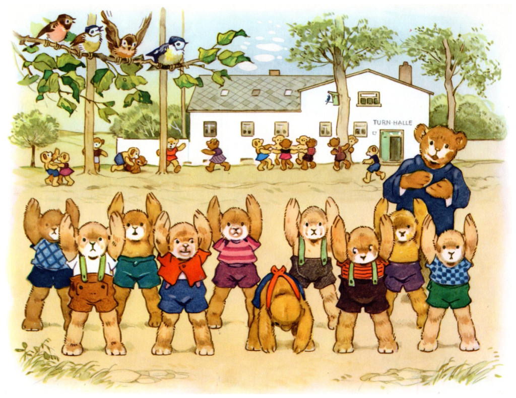
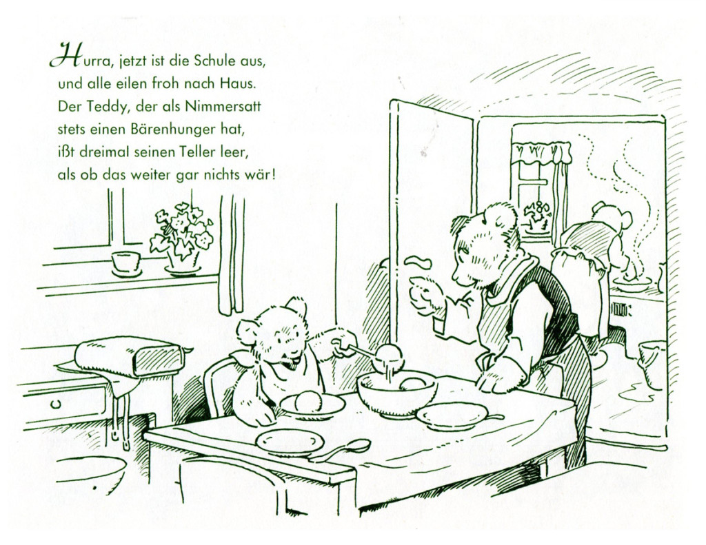
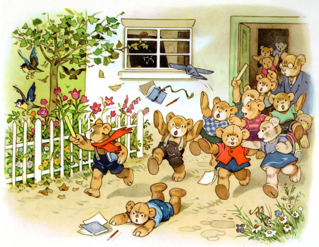
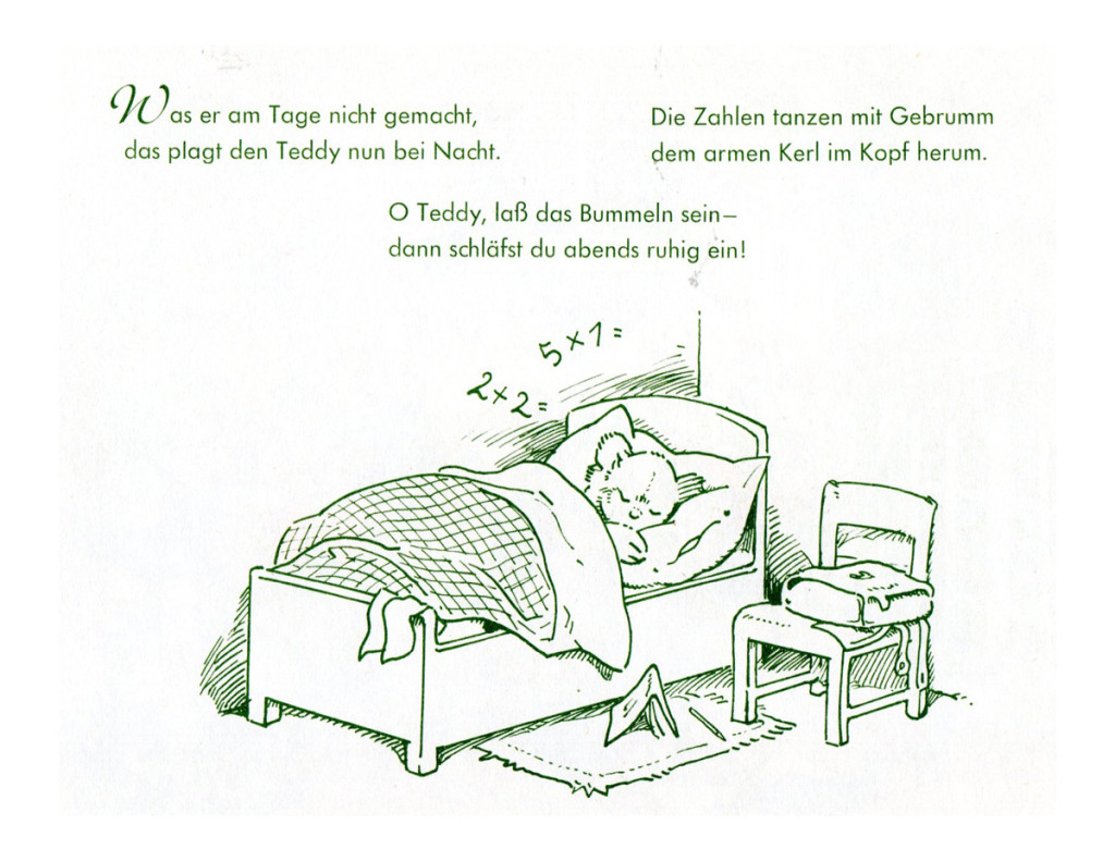
- “Teddy’s School Walk”. As Always, Baumgarten’s wonderful detailing is never over done and leaves you wanting more of it!
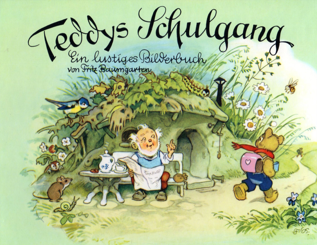
Book’s cover

on 22 Mar 2013 at 12:53 am 1.Mark Kausler said …
Baumgarten’s style is very colorful and seems reminiscent of early 20th century design. There is a Columbia cartoon, “The Foolish Bunny” which has classroom interiors that look a lot like Baumgarten’s. The Schlesinger cartoons “I Haven’t Got A Hat”, “The Country Boy” and “My Green Fedora” all have classroom interiors that look like Baumgarten’s as well. Very friendly stuff to look at!
on 22 Mar 2013 at 7:07 am 2.peter hale said …
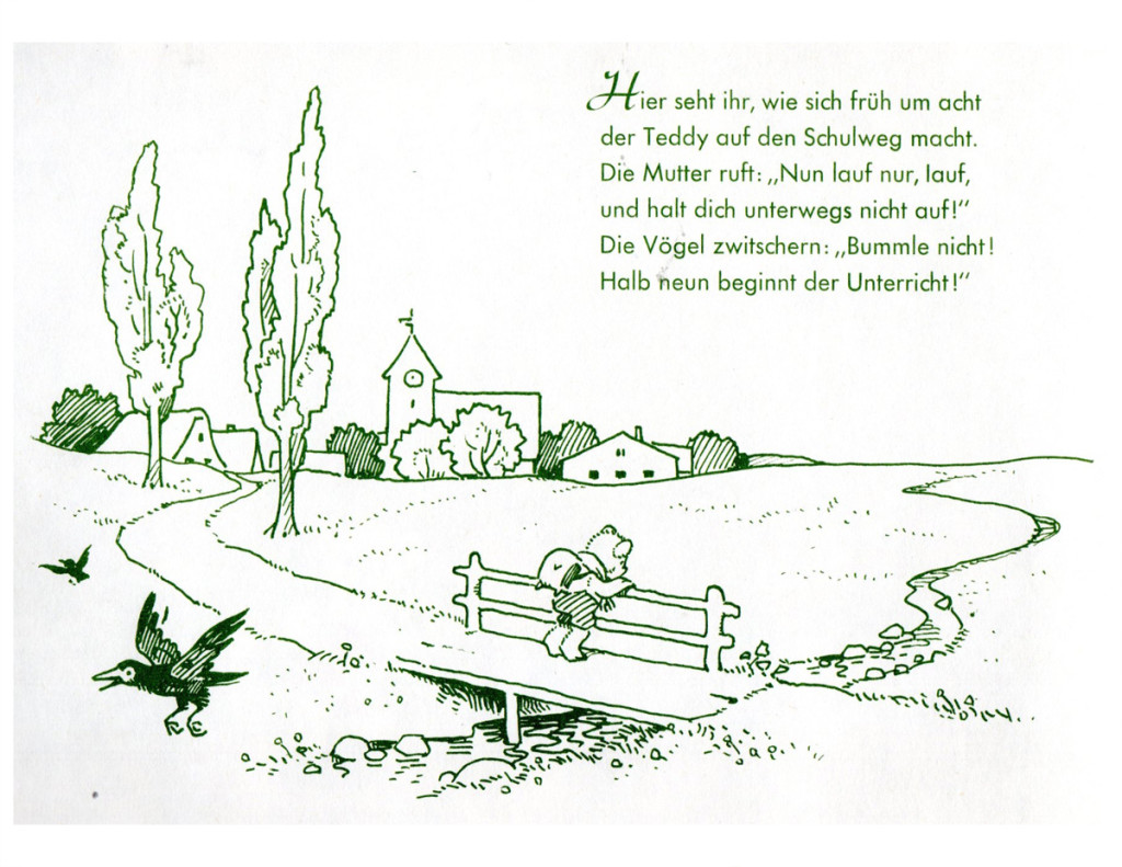
I really enjoy seeing these Baumgarten books. I like the way the line drawings seem to be designed to complement the coloured pictures – I assume they form double page spreads, with the line drawing on the left and the colour on the right. The line drawings seem to lead the eye over to main picture – often (not so much in this book, though) they appear as almost a continuation of the scene. Is this the actual effect in the books, do you know?
on 22 Mar 2013 at 7:16 am 3.Michael said …
Yes, Peter, you’ve captured the look of the books. The soft delicate, inked line drawings lead to the delicate watercolors. The art looks very much like early animation (1932-33) at Disney. The Albert Hurter school of imagination.
Mark, I’m surprised no one has animated Baumgarten or even more surprised that he’d never worked within animation. He was the boss of these books, and expect he probably was afraid to lose some of the control – the art was so delicate.
on 22 Mar 2013 at 4:13 pm 4.Stephen Macquignon said …
They always bring a smile to my face