Animation Artifacts &commercial animation &Layout & Design 10 Jan 2013 06:25 am
Emily Tipp Rerun
- Originally, after Vince Cafarelli had died, I was shown the boxes and portfolios full of artwork that Vince had very briefly and casually discussed with me for years. What I thought were a couple of drawings, ended up being a lot of brilliant work beautifully contained by Vinnie and his partner Candy Kugel, over the many ears they had their studio. It was work – meaning drawings, sketches, layouts and animation – that Vinnie had held on to and in some cases preserved because he knew it was valuable (not financially, but historically).
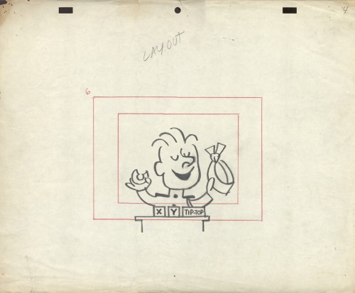
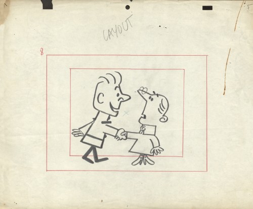
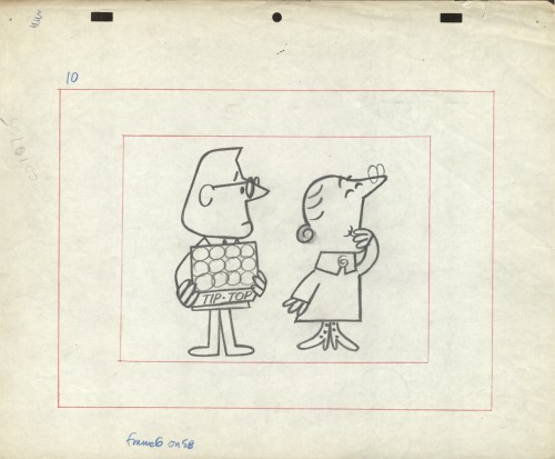
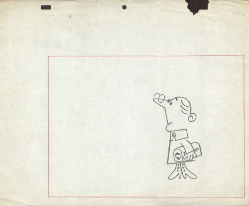
In the not-too-distant past (6/27/12 and 10/24/12), I posted material about an Emily Tipp commercial for Tip Top Bread. This spot, like all of those of the series, was well designed and animated and stood out among other spots on TV. It was commercial cartoon animation at its best during the 60s. Margaret Hamilton, memorably, the Wicked Witch of the West from The Wizard of Oz, provided the voice for Emily!
The problem for me was the disorganization. So little of it was labelled or attached to any others that were gathered in those boxes. So I started digging in and organizing while at the same time pulling art for display on this blog. What happened was pretty much what I expected. Some things got mislabeled and other items were separated from art which they should have been attached to. Here we have a prime example. Emily Tipp.
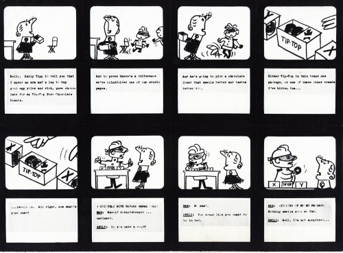
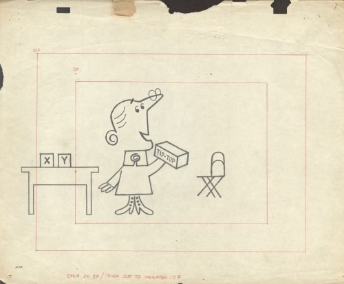
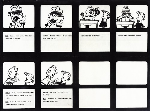
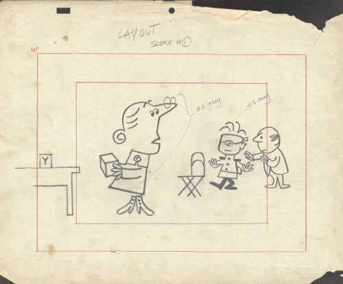
Gathered in one group/box were some of the layouts for this typical TipTop Bread spot. We’d already assembled some of the drawings that belonged together despite the fact that the were found in separate boxes representing different studios. It turns out that some work that was credited to Kim-Gifford Studio (the laouts below) actually were done by Elliot-Graham-Goulding.
So here, we have some story boards to connect with some layouts. Compare and contrast and enjoy.
 1
1
To see some of the Emily Tipp spots go here
at the Buzzco website.
 1
1

on 10 Jan 2013 at 8:23 am 1.Stephen Macquignon said …
love the line work
on 10 Jan 2013 at 8:36 am 2.Marcos said …
Hey, this animation was done using the top pegs just like we did in Sao Paulo (Brazil) back in the 80′s. Great design! I guess it would work perfectly with the cutout animation style everybody is using these days.
Thanks for posting it!
on 12 Apr 2013 at 11:42 am 3.BOB TRIVERO said …
Hi I was wondering if you know where i can find the Emily Tipp commercial that features the bad ventriliquest. This was my favorite. thanks