Bill Peckmann &Books &Illustration 14 Dec 2012 07:39 am
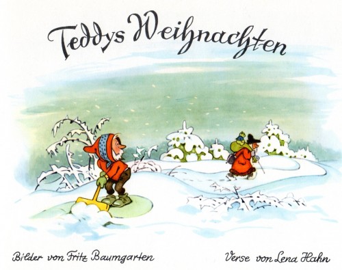
Teddy’s Weihnachten
 - There are times when I wish I had a political blog so that I could vent some of the political venom that builds up in my little world.
Fortunately, my first love is animation, and I maintain steadfastly an animation and cartooning blog. And believe me, one blog’s enough.
Given that, I’m proud to present this post.
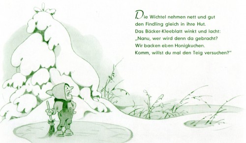
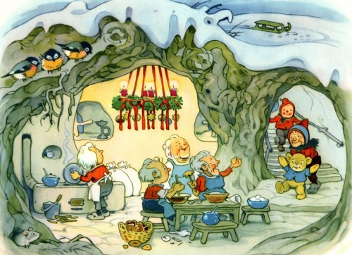
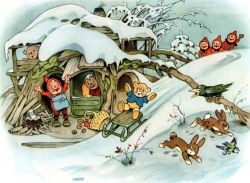
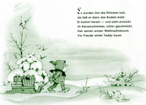
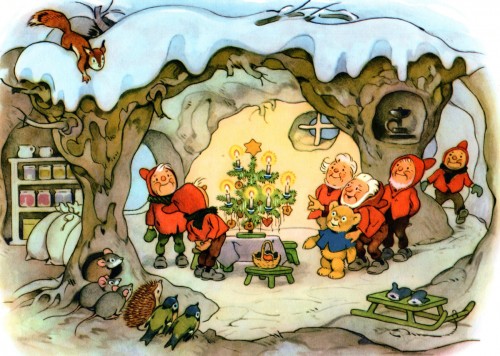
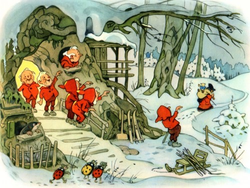
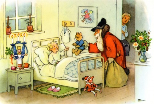
- We’ve already met Fritz Baumgarten‘s characters Teddy and we’ve seen his version of Santa. In this sweet little book, Teddy gets to meet Santa. It’s another wonderful Christmas book done in the very round style of Mr. Baumgarten. That coupled with his delicate and limited color palette.
Teddy’s Weihnachten.
This book comes from Bill Peckmann. Many thanks to him. His one short comment is:
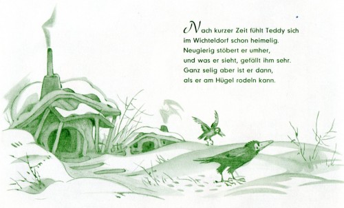
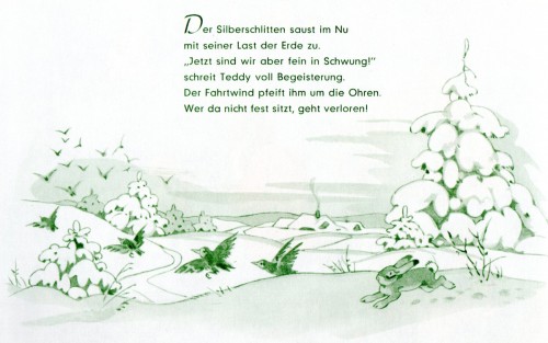
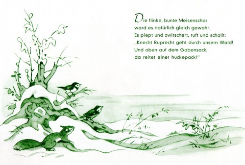
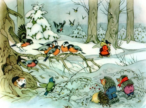
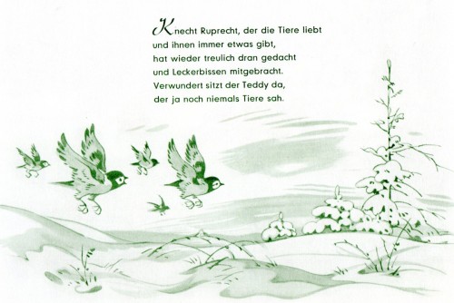
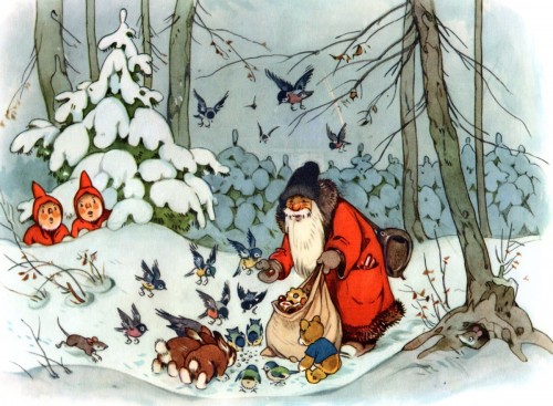
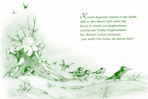
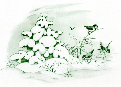
- Here is our second German Christmas card (book) from Fritz Baumgarten. (Man, can he do birds, or what!)
I hope you enjoy it.
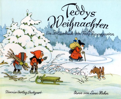
Book’s cover
 6
6
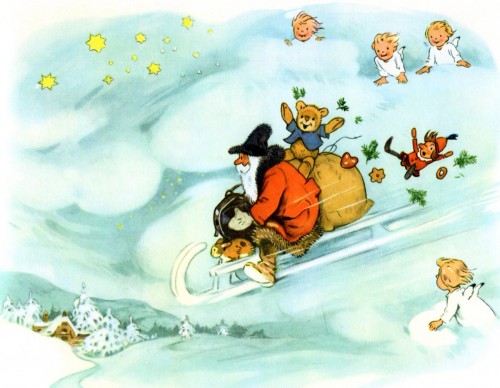
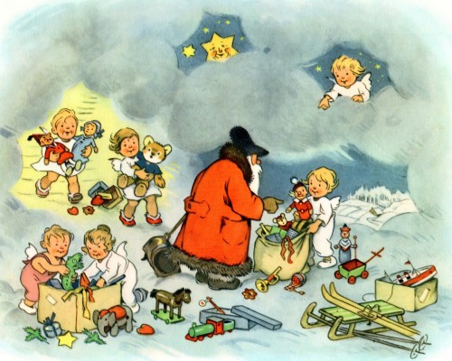
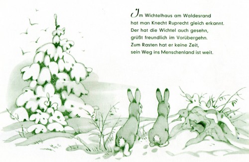
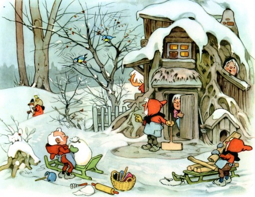
You’ve got to love this picture !
 17
17
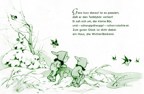
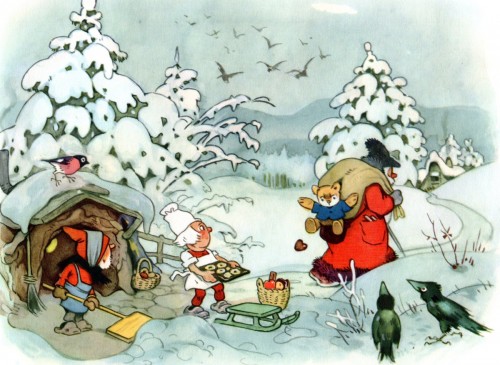
Beautiful poses on those birds.
The End
.
And a last note comment with an additional page from Bill Peckmann:
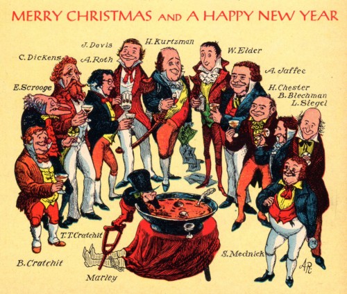
“In keeping with the Spirits (hic!) of Christmas past, a peek of a future post…”

on 14 Dec 2012 at 4:40 pm 1.the Gee said …
The guy put the AW in some.
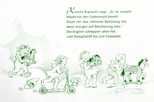
I don’t know if I mentioned it before, if I did then excuse the redundancy, but his choice of depicting tiny people and animals reminds me of how Richard Scarry depicted tiny beings.
The best way I can describe it is somehow they are not only cute but their proportions are perfect for how their surroundings are depicted. Obviously, it isn’t like Tom Thumb or Thumbillina or any derivatives of that stuff. The characters fit together in their space. Their space isn’t normal-sized or too big and that makes it a bit surreal but moreso than anything the visuals are that much more appealing.
That also makes the choice of what to and what not to anthropomorphize that much more interesting, to me. The rabbits are the “right size†but the birds are “too bigâ€. Somehow both are still appealing and still belong in that world. That’s nice.
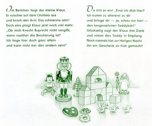
Plus, I am a sucker for monochromatic green. Get’s me every time. I’d probably forgive crappily drawn, sloppily inkwashed work if it were reproduced in green ink.
on 14 Dec 2012 at 7:02 pm 2.Oswald said …
Thanks for posting these, I especially like the colors in pictures 20 and 22.
The book’s title however is correctly spelled: “Teddys Weihnachten” (the z-like ornament attached to the letter h is just that, an ornament).
on 14 Dec 2012 at 7:20 pm 3.Michael said …
Thanks, Oswald, for correcting my German reading. I tried to use some Russian on the decorative design. Doesn’t quite work the same.