Daily post 01 Nov 2012 11:20 am
Here Comes the Sun
I have a problem. The hurricane, Sandy I mean, left me without electricity or heat. Fortunately, I have hot water and a gas oven. However, I don’t have access to a computer or the internet. Friends have been posting material I’d prepared, and those are running downhill quickly (material prepared, I mean, not friends.) I’ve decided that I’d post this today, and it would have to hold until I get electricity back. Maybe by the weekend, please Mr. Mayor.
So I leave you with Our Mr. Sun, hoping he comes to warm us all, soon. It shouldn’t be more than a couple of days. If I get to another computer, I’ll add something more. Best, Michael
 - Back in the 50′s the film director, Frank Capra, produced, directed and wrote four specials for TV which were sponsored by Bell. Our Mr. Sun (1956), Hemo the Magnificent (1957), Unchained Goddess (1958) and The Strange Case of the Cosmic Rays (1957) were devoted to explaining basic science to family home audiences. Capra was educated as an engineer, so he had a lifelong interest in science and he initiated these prorams.
Capra also had a long time interest in animation. He was responsible for securing a distribution contract for Disney with Columbia back in the early 30′s. Animation became a large part of these four programs, and Capra found different animation houses to do them. UPA, Disney, Shamus Culhane‘s studio and WB all were involved.
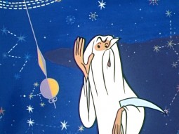
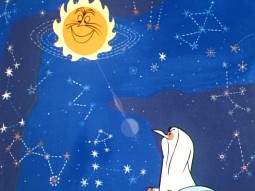
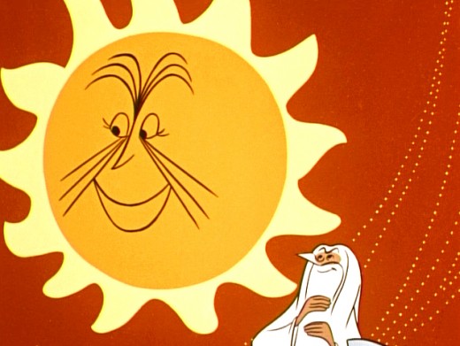
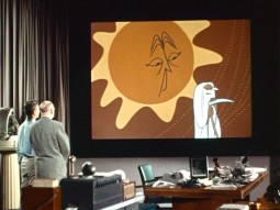
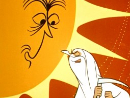
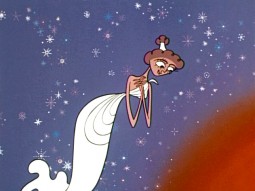
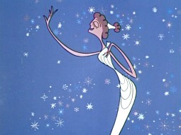
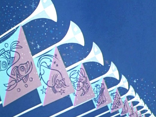
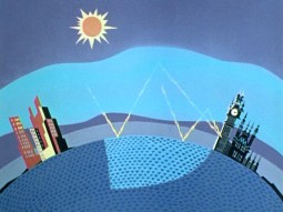
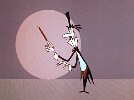
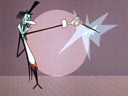
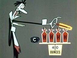
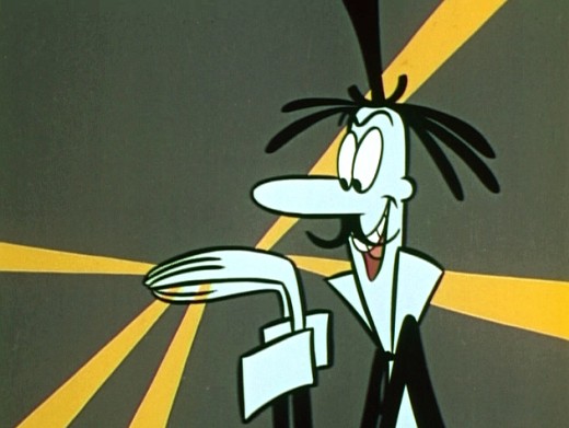
UPA did the artwork for Our Mr. Sun, the first of these programs. (You can watch it here.) I have a copy of the script marked up by Grim Natwick, so I know he animated on it out of the NY studio of UPA.
The shows play a bit like Ward Kimball‘s “Tomorrowland” episodes of the Disneyland television show. Perhaps these are a bit less joke oriented. The animation is just as limited and design oriented. This format has forever affected many who grew up watching them. Check out the new Pixar 2D piece, You’re The Rat, currently on YouTube (it’ll probably be removed soon.) There’s an obvious link.
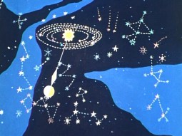
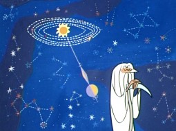
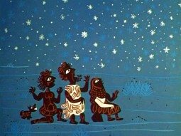
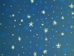
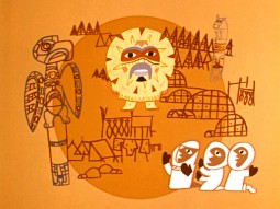
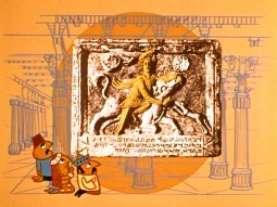
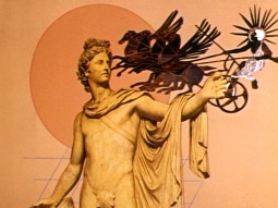
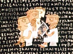
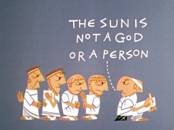
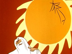
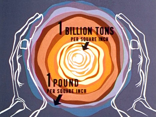
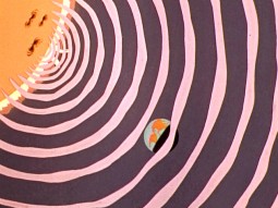
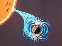
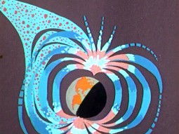
Here are some frame grabs from this first show of the Bell Science Series: Our Mr. Sun.
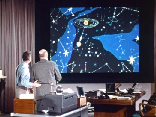
(Cllick any image to enlarge.)

on 01 Nov 2012 at 4:32 pm 1.the Gee said …
Things will hopefully become easier for most people affected by that weather system. It can’t be easy to need to adapt when you and others are without some basic things. Take care, do what you can.
This post on Our Mr. Sun is interesting. I’ve heard of it but I don’t believe I had seen anything from it until now. It is always interesting to see how concepts were explained to people using animation, limited or full enough. It reminds me to revisit some of those educational/industrial shorts. Just to remind myself of what they innovated and the hows and whys of the choices the made for the subjects.
Last thing…
I had hoped someone would have mentioned this in the earlier post on Crumb’s “Genesis†but no one did so I will.
That is pretty awesome to see Noah’s sons depicted as the Three Stooges, Moe, Larry and Shemp!
It reminds me of the movies the group did (which had a different third Stooge whose name I always confuse or that I spell incorrectly.).
The panel was good for a laugh.
on 01 Nov 2012 at 4:43 pm 2.the Gee said …
Oh yeah.
The art that Crumb did (and which I suppose he is doing now) is a wonder to behold. Tight as a tick and his figures really have a statuesque look going on. It is evolutionary for him, considering his art style.
I’ve been thinking a lot about two starting points for designing a cartoon look. Starting from a very realistic, representative point (like many caricaturists seem to do, for example) or starting from a very cartoonish point where the shorthand informs certain choices in how things look (not a great example but UPAs design or the “Cartoon Modern†look(s)? would be one way, but, Ben Washam as opposed to Beatrix Potter would work as a better example. If that makes sense).
When Crumb began doing biographical comics, on old blues and jazz musicians, his art became more reserved and reverential. The way he did his hatching became much more dense but it wasn’t sloppy or unnecessary, like excessive noodling to black out the white of the page. The deliberative choices became more obvious. I’m sure the short way is to say, his art matured, aged quite well.
Obviously, in what you have shown of “Genesis†it doesn’t seem like he’s going for easy gags and is somewhat respectful in terms of storytelling. But, the art is just a pleasure to see.
hope this makes sense. it has been a long week and I’m juggling a lot.