Bill Peckmann &Comic Art &Disney 06 Nov 2012 06:42 am
Dick Moores anew
- I’ve written about Dick Moores several times on this blog. He is one of my favorite comic strip artists. I knew him growing up with Gasoline Alley, which was about my favorite newspaper comic strip. Moores had taken over for Frank King, and the strip became something different and unique in his hands. There’s a roundness and a beautiful open quality to his character drawings. I find the style very appealing, and I also liked the stories. It took a while to learn that he’d also done a number of the Mickey Mouse comic books, which I also loved – (but not as much as those Gasoline Alley strips despite how great I think the Mickey comics are.)
- Here’s the 2010 post on Gasoline Alley: Dick Moores – 1
Here’s the post on the Mickey comic books: Dick Moores – 2
Bill Peckmann sent some scans to make up a good post about Moores and his work. Here’s Bill, writing about the post:
- Here’s a little triptych tribute we could give to master cartoonist Dick Moores. With tongue planted firmly in cheek, I would like to call it “The good, the bad and the ugly.”
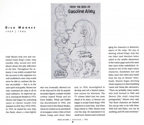
Here’s the good: Dick Moores’ self caricature and capsule bio from R.C.Harvey’s terrific 1998 book, “A Gallery of Rouges: Cartoonists’ Self Caricatures”.
-
Here’s the bad: As in really bad, which in “today’s jargon” means exceptional, out of sight good!
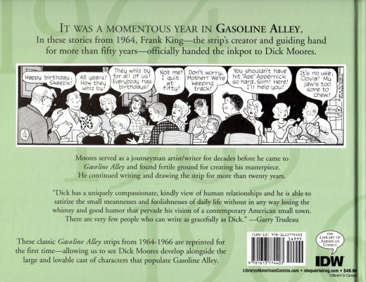
It’s the new release of Library of American Comics’ “Gasoline Alley, by Frank King and Dick Moores, it’s the collected daily strips from 1964 to 1966. This vol. 1 is a dream come true for all Dick Moores fans. Done with the same scholarly quality as all of their long list of great books, LOAC’s “Gasoline Alley” does not disappoint in any way. Their front of the book bio of Moores, is illustrated with a lot of his, not easy to find, pre GA art!
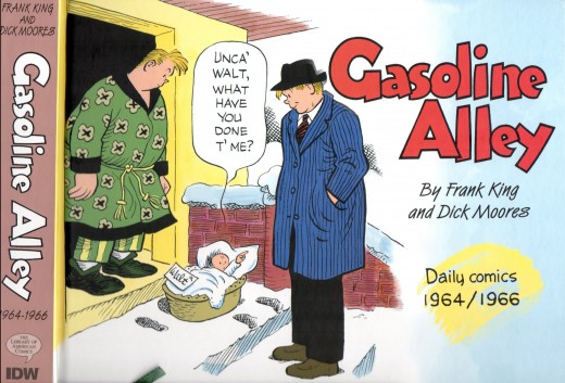
The front cover
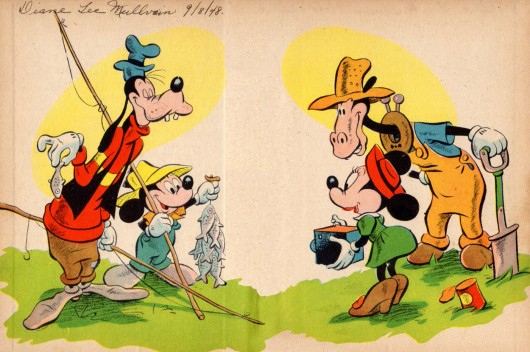
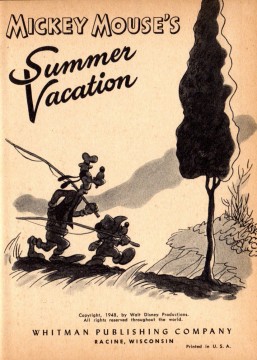
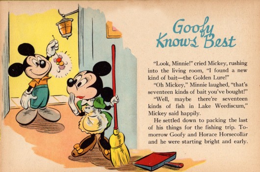
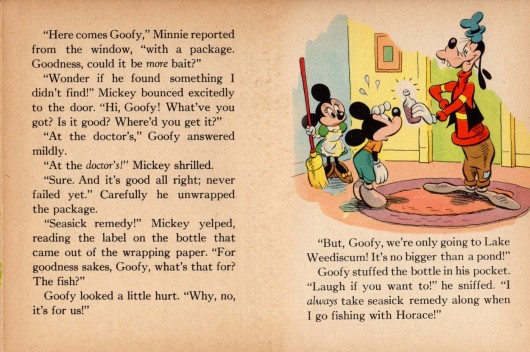
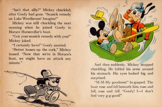
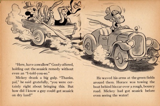
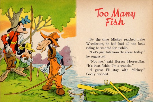
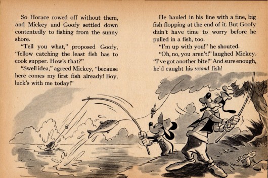
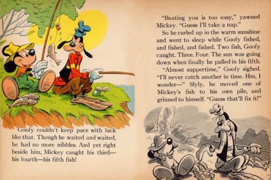
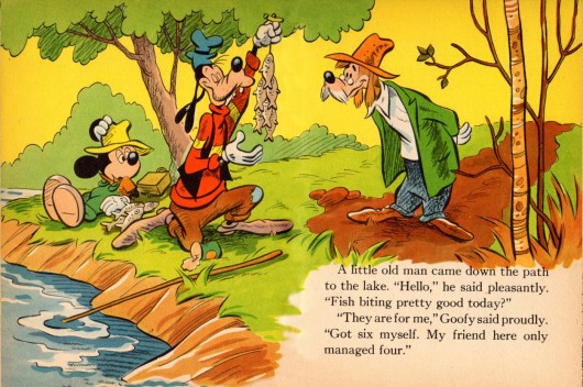
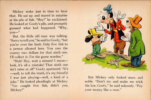
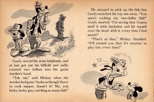
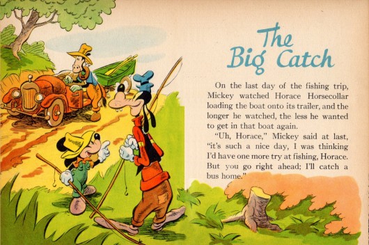
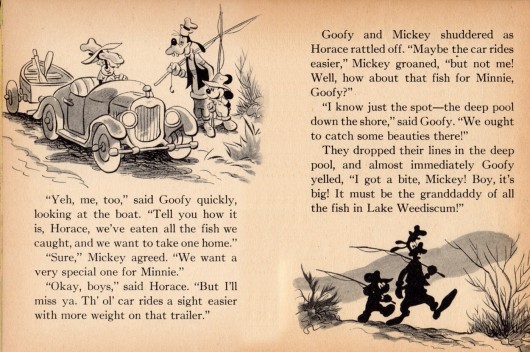
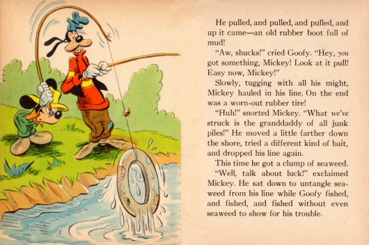
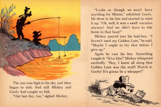
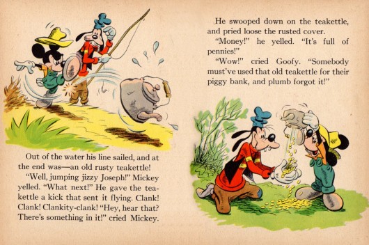
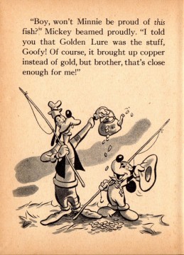
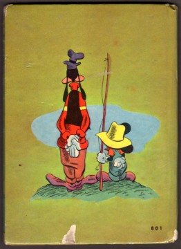
- The ugly: This is meant and said in only the most positive way. Here we have a 1948 Mickey Mouse children’s book that was illustrated by Dick Moores during his sixteen year tenure at Disney’s comic book and comic strip department. His style in the book might not be as “slick” as the great Disney print guys of the day, but Moores brought a wonderful, heartfelt “folk artist” quality to this book that he always gave to all of his endevours.
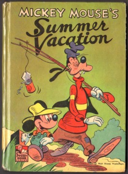
The front cover

on 11 Nov 2012 at 6:00 am 1.Peter Hale said …
I really like the Disney illustrations. They manage to be utterly true to the characters while eschewing the Studio style for a more individual look. They’re just done with such assurance!