Commentary 15 Sep 2012 05:45 am
Commentarium
This was a really busy week as far as seeing movies went. The first three were Special Oscar preview screenings.
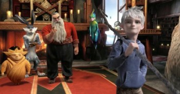 - Sunday night there was a screening of Dreamworks’ Rise of the Guardians. This was a rough cut; it had a lot of unfinished scenes. many were missisng proper lighting, the score was a temp track (a 101 strings big budget adventure-music type played LOUD and LOUTISH.) When I learned that the brilliant Alexandre Desplat was doing the music, I realized that I’d only seen 2/3 of the film. Desplat might actually be able to save this loud, annoying and tedious film. By the way, someone tell them that people don’t smile that much – visually, I mean – actually, aurally too (whenever there’s a hole in the track, they stab it with someone laughing), and females can do something other than pose cute. There isn’t one real female character in this film.
I met the director, Peter Ramsey, Jeff Katzenberg,the brilliant writer, David Lindsay-Abaire, who was wasted on this one. I met the producer, Christina Steinberg, and William Joyce, who fathered the whole thing. The film reminded me a lot of the Shrek films, stylistically, I mean. It wasn’t pretty.
Jude Law is brilliant and Alec Baldwin can do anything – including a Russian Santa Claus. Who knows maybe when they add the real and final score, when they finish coloring the scenes and when they put it all together properly it’ll be great. I seriously doubt that’ll happen, and it’ll be hard to sit through again. I do want to hear the new score, though. I like that composer and want to see how he scores this mess of a movie.
Monday night there was a screening of On the Road, the filmed version of the Jack Kerouac book. Directed by Walter Salles who did Motorcycle Diaries, this film doesn’t have the same drive as his last. The poster is a closeup of Viggo Mortenson, who in his two minutes in the film, brings it to life for a short bit. There are a lot of stars who make short appearances. I wish the lead actor had been someone with more screen presence. There weren’t too many people on the screen that you really cared about, and that certainly included Kristin Stewart who can’t act very well.
The tiny Disney theater was packed with celebrities (I sat next to Dianne Wiest) who all made it to the afterparty at Le Cirque. That was fun.
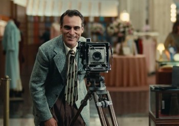 Tuesday brought The Master in 70mm to the Ziegfield Theater – one of NY’s largest and best. Lots of stars in the theater. I sat next to David Straithairn.
This was THE film of the year, so far. Joaquin Phooenix has a damn good chance of winning an Oscar. He was great. The film was eccentric and felt slow even though I never felt the need to check out my watch. Why don’t we get films like this in animation? Johnny Greenwood‘s (Radiohead) score is out of this world. The first really big film of the year. Although the film is about vague and elusive ideas, so much is left for the viewer to determine, the film has stuck in my head for the past five days replaying many of the scenes. I look forward to seeing it again at the Academy screening on Sept. 24th.
The film got an excellent review from AO Scott at the NYTimes.
Also excellent notices from the NYPost and the Daily News. But the best review I’ve read was Karina Longworth‘s review in The Village Voice. She responded to some of my thoughts on the film. An excellent piece of criticism.
Thursday I saw Arbitrage. Richard Gere, Susan Sarandon, and Tim Roth in a film about a corrupt hedge fund manager who accidentally kills his French paramour in a car crash. Can he get out of the financial predicament he’s in to save the company? Can he hide his involvement in his girlfriend’s death? A pot boiler that kept me interested, though the film is really about nothing. Richard Gere was good but no competition for Joaquin Phoenix or Phillip Seymour Hoffman in The Master.
Friday night I saw a new play that starred Jake Gyllenhaal and BrÃan F. O’Byrne. Called If There Is I Haven’t Found It Yet, (what a bad, unmemorable title) there were excellent performances from all four actors, but the play was a ghost of a show. Something about bullying an overweight high school girl in England. Mix that with something about global warming and have a set with a glass tank of water in the front of the stage. The furniture which is piled in a junk heap center stage is there for the actors to pick and choose the pieces they want to do the scenes with. Then they throw it into the tank of water at the end of the scene All scenes end with this violent action. When the girl tries to kill herself in the bathtub, water overflows leaving, on purpose, at least a couple of inches of water on the set. The actors play the last ten minutes ankle deep in water. (At one point, I actually wondered if the tank were going to overflow and water would come into the audience. I was sitting in the fifth row.) I think this is supposed to be a metaphor of some kind for the mess global warming is doing to the world which is a metaphor for the mess the world is making of families.
The play was not good. The actors were. They all play with Brit accents and all do well at it. I thought of waiting for Jake Gyllenhaal at the end of the show to say hi after Man Who Walked Between the Towers. However, there must have been a hundred people crowding the front of the theater to get a look at the star. I got outta there.
This afternoon, Saturday, I’m going to see Francine at MoMA. Melissa Leo‘s new film is being released by MoMA for the first week. The reviews haven’t been good.
- There’s a wonderful and extensive interview with Richard Williams on the blog One Huge Eye. The interview was conducted by Alex Amelines, the creÂator of oneÂhugeÂeye. He’s also the founder and direcÂtor at the LonÂdon based StuÂdio Tinto. Other interviews on the site include those with: David Sproxton, Eric Walls, Jeff Pratt and Nick Cross. (It’s obviously a Brit site.)
Inking for the Best of ‘em
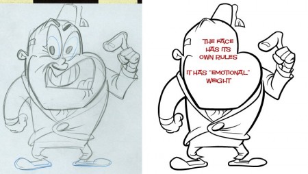
- John Kricfalusi has a tutorial, on his site, in how to properly ink his style. This, in many ways, is a lesson in how to ink (period). There are minor things that you would not do for every style — such as inking the entire externalline of the character in a heavier weight. This is purely a style preference. However, control of the thick and thin line as well as control of details is astute. Inking is such an enormous part of the animation process that it’s amazing to see how few pay proper attention to it. There have been many a film that have been badly hurt because of poor inking. I’ve seen beautiful inking on many a Peanuts special, but I’d also seen one that had a very poor, wavering inking rendering that episode almost unwatchable – for me. (The general public probably didn’t notice it.) If those lines are not right, it can damage the animation and takes the heart out of controlled assisting.
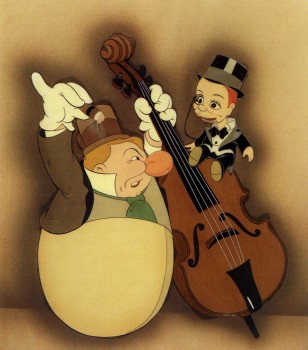 Yet, the opposite is true as well. An exhibit at the NY Public Library at 42nd Street in 1998 was one of the best I’ve ever seen. It was a program of “Celebrity Caricature” mostly from the 20′s & 30′s. In among the magazine art was a small section on animated caricature. Drawings by Tee Hee and Joe Grant were on display with a couple of cel set-ups. The ink lines were stunning. They were drawn with delicate thick and thin lines done with crow-quill in multiple colors. Just as the models would be marked up for the different cel colors, it had markings for the ink line colors, as well. The Charlie McCarthy & W.C. Fields in the image to the right represents some of the beautiful caricatures from “Mother Goose Goes Hollywood”.
Terrytoons New Camera
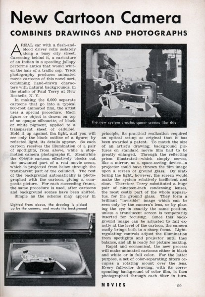
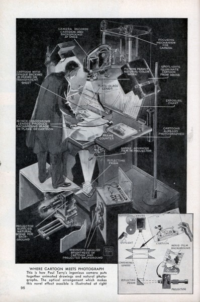
After a piece about inking, how could we avoid an article about a brand new animation camera. The Terry cartoons introduced a new camera in 1939 which allowed them to film live action, projected one frame at a time, from beneath the platen. Thus you could easily combine live action and animation at the camera phase, thus avoiding any opticals.
Here’s an article from Modern Mechanix.
 1
1
Dumbo’s Done
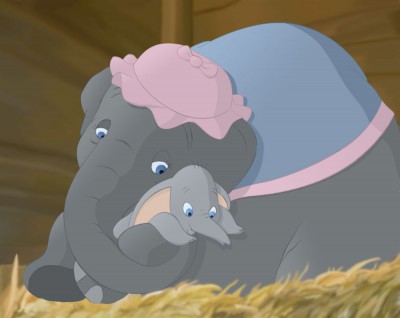
William Benzon has completed his lengthy article about Dumbo on his site, the New Savannah. He’s put all of these posts together into one big read. You can read it in PDF format by going here. Quite a work of scholarship by Mr.Benzon.

on 15 Sep 2012 at 11:05 am 1.Tom Minton said …
Amazing that the frugal Paul Terry actually spent more than a little money on such a camera in 1939, which Terrytoons may not have used all that much for what was later called “aerial image” animation photography. This piece of equipment predates John Oxberry’s double column 35mm stand by many years, which also boasted rear-projection capabilities. Two of the smartest elements of Terry’s camera are the ground glass and those twin rheostats, enabling razor sharp focus and precise light balance. All of this complicated, heavy hardware is utterly obsolete in the digital age, when kids can easily matte Flash cartoons over live action with a few strokes of their keyboards.
on 15 Sep 2012 at 2:47 pm 2.slowtiger said …
In 1992, the Braunschweig University of Art (HBK) in Germany still had a working ensemble with this technique, and I used it for some experimental title work. I wonder if they still have it, must ask a professor from there. Ha, I wonder if they even do real film anymore!
on 15 Sep 2012 at 5:23 pm 3.Scott said …
Couldn’t have agreed more with your assessment of that Rise of the Guardian cartoon. So juvenile, loud, and obnoxious. But it was also just so ugly to look at, and dark to the point of HARD to UNDERSTAND. Why must DW continue to make cartoons with no discernable audience?
on 15 Sep 2012 at 5:26 pm 4.Scott said …
Oh yeah–regarding Leonardo Decaprio as Jack Frost–I haven’t heard a less charismatic voice for an animated character since Brad Pitt in that horrible Sinbad cartoon.
on 15 Sep 2012 at 6:22 pm 5.The Gee said …
With “The Master†did you go in with any preconceptions about the movie based on what little you may have know beforehand?
I ask because I have a minor concern that like a book you’ve read knowing what this movie was possibly about might lead to looking for things.
Sometimes that can be alright. Sometimes the adaptation is so good you forget to piece together puzzles using knowledge of source material and you just let the adaptation–or, in this case the original work– pull you along.
Just curious.
on 15 Sep 2012 at 9:49 pm 6.Scott said …
I saw “The Master” a few weeks ago. It is fabulous. The acting all around is just great, especially Amy Adams.
Without a doubt, it is a screed against all cults and religions who prey upon the weak minded individuals searching for something in life to care about when they don’t like themselves very much. The analogies, as plotted by the film, are derived from the cult of scientology. As dramatized, it’s truly the characters that bring it to life, even if the landmarks hadn’t been scientology. It could have easily been about the mormon church, the catholic church, and even closer, the southern baptist convention.
It’s Anderson’s second best film after “There Will Be Blood.” Can’t wait to see it again.
on 16 Sep 2012 at 12:59 pm 7.bill burg said …
Wow, so much great stuff to read! Thank you, Michael!!
on 17 Sep 2012 at 1:22 am 8.Michael said …
Scott, Leonardo DeCaprio does not perform in Rise of the Guardians. Jack Frost is erformed by an actor named Chris Pine. He was Capt Kirk in the reworked and updated Star Trek film in 2009. his vice is non existent. Not bad not good not a character.
on 17 Sep 2012 at 11:38 pm 9.Scott said …
Yes–you are correct. My bad. I had it stuck in my head, as he was announced as the jack frost character voice with much fanfare a year or so ago.
Like Leo, Pine is a fine actor, but a lousy voice for a cartoon.
on 18 Sep 2012 at 12:34 am 10.James Nethery said …
I’m a big William Joyce fan but “Guardians” doesn’t interest me that much. To me, the whole “holiday mascots band together to fight evil” seems really hokey… but maybe the books were better.
Since I like to keep up with the big animated movies, and I know a few people who worked on it (one of my teachers from Animation Mentor, who is a fantastic animator, worked on it), I’ll probably end up seeing a matinee. But I’m not expecting that much out of it.
Also, has anyone noticed that in most of the animated adaptions of Joyce’s work that his style is either severely toned-down or just ignored completely? Blue Sky’s next movie “Epic” (again with the one-word title…) is supposedly based on Joyce’s “Leaf Men” book… but the Joyce influence on the designs is totally non-existant from what I can see. It looks pretty run-of-the-mill style wise (but who knows… maybe the movie will be great on it’s own!).
It’s funny, because Blue Sky also did “Robots” which was very faithful to Joyce’s style. Times have changed I guess.
on 18 Sep 2012 at 3:59 am 11.Michael said …
I very much like William Joyce‘s illustrations. I haven’t seen anything he’s done in animation that I liked. I include the short that won the Oscar this year. I assume Joyce had the most power over the style of that film, but it looked like any other ordinary cg film to me. Robots had a nice look and might have been a good film except for the poor script.
This film looked like it was done by a team of “art directors”. and I use that term loosely. The art was unattractive in every way. It really looked like the dregs of Shrek to me.