Animation &Animation Artifacts &Chuck Jones &Frame Grabs &Layout & Design &repeated posts 06 Aug 2012 06:38 am
Conrad – again
I repeat this post for good reason. This is one of the prime films John McGrew planned for Chuck Jones, and the work is just dazzling. However, to our eyes it hardly looks unusual. Many of the tricks here were done for the first time, and others are so seamlessly done that we hardly notice them. It just looks like another War cartoon from WB. It ain’t.
It’s special.
 - Regulars to my blog know that I’m a big fan of the work of John McGrew. He was a designer/Layout Artist working in Chuck Jones’ crew at Warner Bros. in the late Thirties/early Forties. His work was daring beyond compare, and, I think, with support from Jones, he changed the look of modern animation backgrounds.
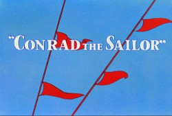
He designed the seminal film The Dover Boys as well as amazing pieces like Aristo-Cat, Inki and the Lion and Conrad the Sailor.
In an interview conducted by Greg Ford and RIchard Thompson, Chuck Jones was asked about McGrew’s style: 
- Q: What about John McGrew’s style and approach, as compared with Noble’s?
A: John McGrew didn’t really have a style; he was experimenting all the time. Maurice does have a style. John McGrew, you might say, was more of an intellectual. You could be intellectual, and get away with it— but if you’re solely intellectual as a director, you weren’t going to get away with it. The result was, however, that he goosed me into thinking that it might be worthwhile to try some different things with backgrounds and so forth. And later on, I would find this kind of thing very useful, in that often it would make your gag work, and sometimes you wouldn’t even know why. Like that little abstract background at the end of Duck Amuck, with the sharply angled lines going off.
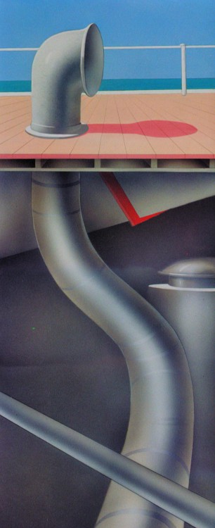
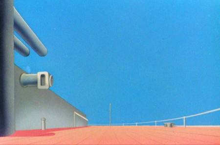
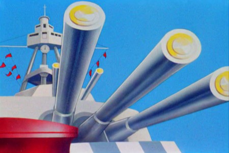
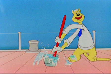
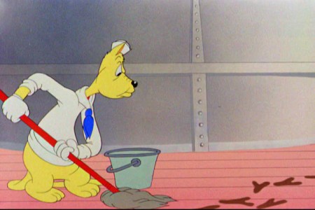
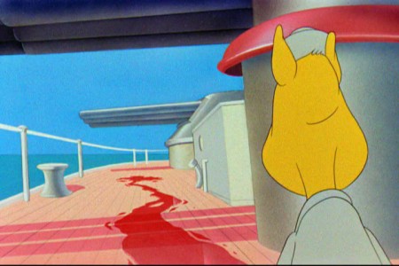
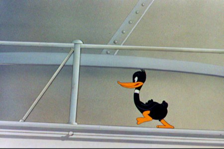
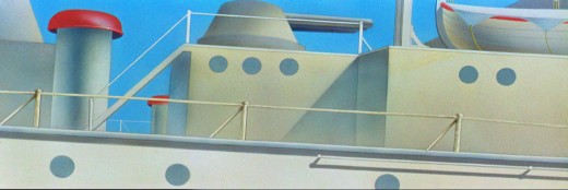
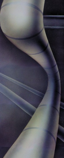
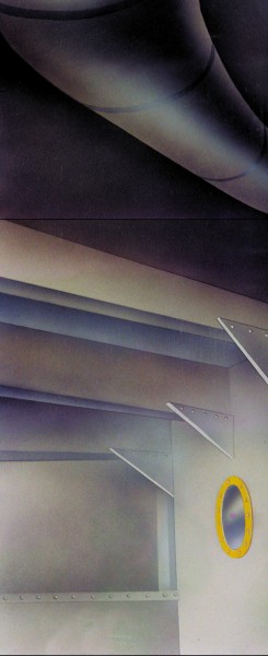
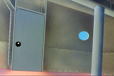
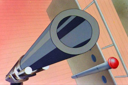
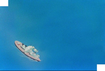
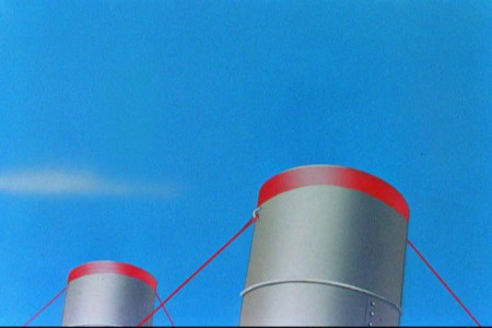
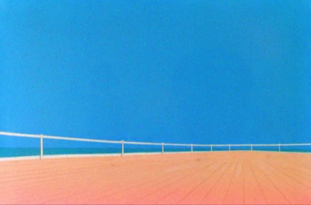
Today I’d like to feature some frame grabs from Conrad the Sailor. Where I could, I separated the characters from the backgrounds to just feature the Bgs. My guess is that the Bgs were painted by Paul Julian, but they were planned by McGrew.
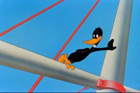
The one scene I don’t illustrate is the most original in the film. Daffy is shot into the air with a bullet. (illus #18) The camera does a 360° turn to head back to the ship. The Bgs don’t hold up on their own. Lots of blue sky and wisps of cloud. It works in motion.
Of this short & McGrew, Jones says:
- . . . we used a lot of overlapping graphics on that particular cartoon so that one scene would have the same graphic shape as an earlier scene, even though it would be a different object: first we’d show a gun pointing up in the air, then in the next shot, there’d be a cloud in exactly the same shape. It gave a certain stability which we used in many of the cartoons after that. John McGrew was the artist responsible for that sort of thing. Conrad was also the one where we used the first complete 360° turn, when the characters went up through the air.
For more information read Mike Barrier’s excellent interview with John McGrew.
 1
1(Click any image to enlarge.)
The following BG pan can be seen in full to the left. I’ve broken it into three parts for a closer look.

 12a
12a .
.
———-(Continue scrolling down.)
.
.
.
.
.
.
.
.
.
.
 13
13
 15
15
A bicycle pan that keeps moving to the left.
 16
16
Continue moving right to left.
And here’s the cartoon.
Pay attention to the Layout in the sky from 6’25″ to the end.
It’s amazing.




on 06 Aug 2012 at 7:44 am 1.Steven Hartley said …
Ben Washam’s first screen credit.
on 07 Aug 2012 at 2:11 am 2.Liim Lsan said …
Only Ken Harris could animate 45 feet of a character doing nothing cut singing and mopping while on a listing ship, and make it WORK. I stand in awe of the talent that went into a weak script.
You ever notice that the cartoon repeats motifs of three? Three guns, three sailors times three, three empty spaces in the pipe pan…
You’d know better than I would – the shot of Daffy walking along the mast singing the chorus of ‘Shovin’ right off’ – zzat Bobe Cannon or Rudy Larriva? Still can’t tell that one.
on 07 Aug 2012 at 4:44 am 3.Michael said …
My inclination is to say that it’s Bobe Cannon. all those frames of double exposed arms or hands. Just another way to add swipes as frames for movement. And only Chuck Jones would let an animator get away with this on low budget shorts. Interesting experimentation. The roundness, the openness of Daffy. If it isn’t Bobe Cannon it sure feels like a great imitation. But I’m horrible at this identifying animators’ work. I just love Cannon’s stuff.
on 15 Aug 2012 at 2:15 pm 4.Russell H said …
What’s also notable about the backgrounds of the ship is that, while stylized and simplified, they are still a remarkably accurate depiction of a US Navy battleship of the era. Despite the low budget, it looks as though someone probably took the time and expense to get detailed photos of real battleships to use as models.