Animation &Animation Artifacts &Hubley &repeated posts 30 Jul 2012 04:55 am
Tissa’s Glad Gladys – revisited
-Tissa David animated a lot of the Electric Company pieces for John Hubley. Hubley would design and write the spots, and he would get some real pros to do the tracks. In the case of this film, I believe it was the jazz legend, Billy Taylor, who wrote the music and did so for a number of Hubley’s Electric Co. films.
I’d like to post John Hubley’s LO drawings and follow it up with a few of Tissa’s animation drawings. John would usually do the loosest of layout drawings – usually in the presence of the animator as part of a discussion – and then hand it off to this person he trusted. Of course, the more he trusted the animator, the less he had to do in the LO.
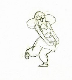
In the case of this spot, Tissa received the following drawing. (That’s right ONE drawing.)
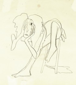
(If you click any the image, you’ll
reveal the full sized animation drawing.)
Enlarge the image, and you’ll notice tape marks and pin holes where Tissa attached it to her wall.
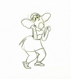
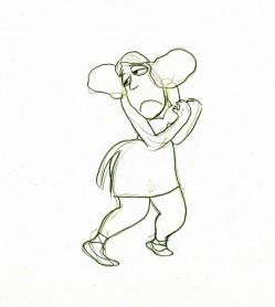
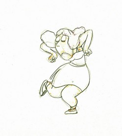
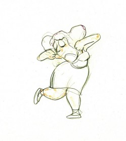
Here’s a short sequence of drawings done by Tissa. The missing mouths are on a separate level. This piece is built on reuse done artfully.
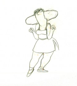 48
48 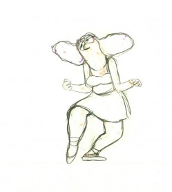 49
49
Here’s how the drawings looked when they were colored. They were colored on heavier paper. Sharpie outlines and marker coloring. The white background was all they used for the final. The animation carried the piece.
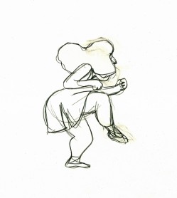 73
73 73
73Finally, here’s a copy of the film found on YouTube:
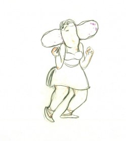
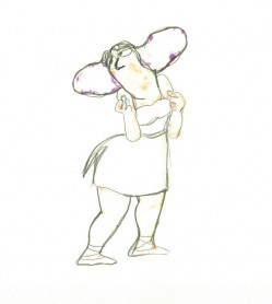
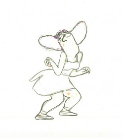
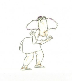
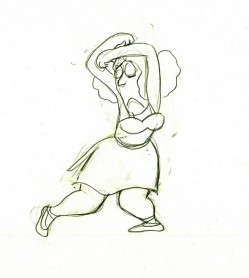
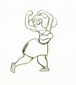
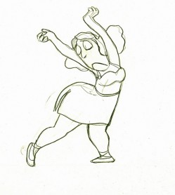
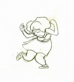

on 30 Jul 2012 at 7:14 am 1.Mark Mayerson said …
Some of those poses are fantastic.
on 30 Jul 2012 at 8:08 am 2.Pierre said …
The animation has so much vitality, and yet seems so simple. Thank you for sharing this really astounding piece of animation.
on 30 Jul 2012 at 2:25 pm 3.anik said …
Beautiful. She sure looks glad!
on 30 Jul 2012 at 10:17 pm 4.The Gee said …
I like how the change was done. It could have cut to a close up but it is totally more dynamic to have her pop up like that.
The way the contrast between her being sad and glad surprisingly works well. I would have thought that once she showed a hint of happiness, it would have stuck but she went back to the frown and sad eyes.
It’s cool.
on 31 Jul 2012 at 12:23 pm 5.allari said …
Wow! Simply marvelous! love how she moves those fun poses!