Animation Artifacts &Fleischer &Story & Storyboards 09 May 2012 06:00 am
Popeye Storyboard – part 1
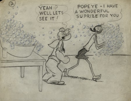
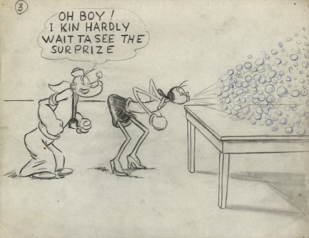
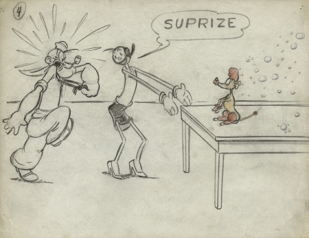
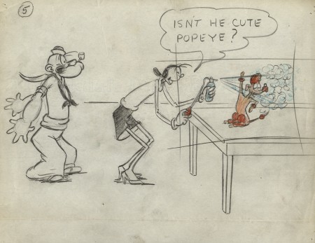
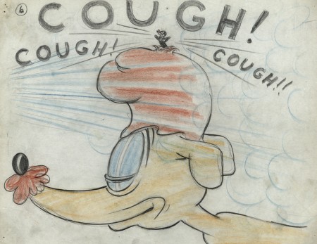
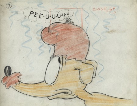
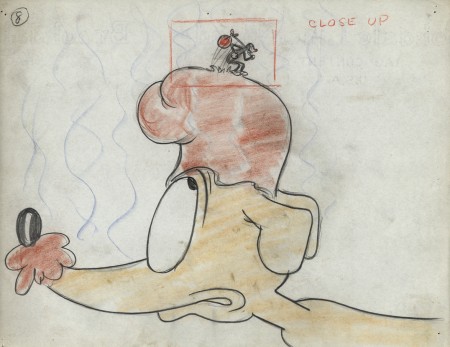
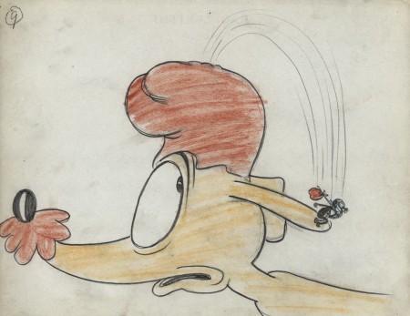
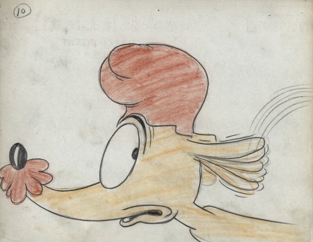
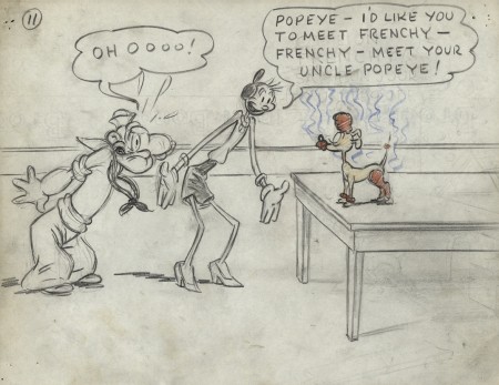
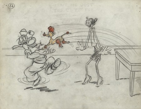
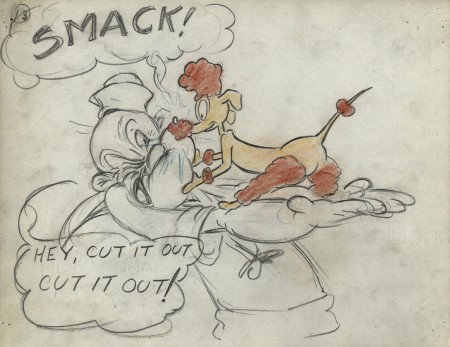
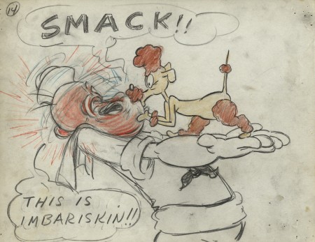
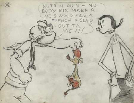
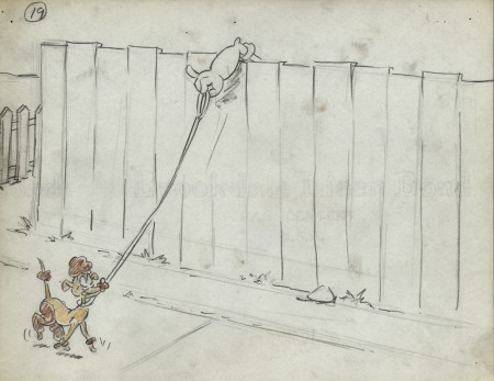
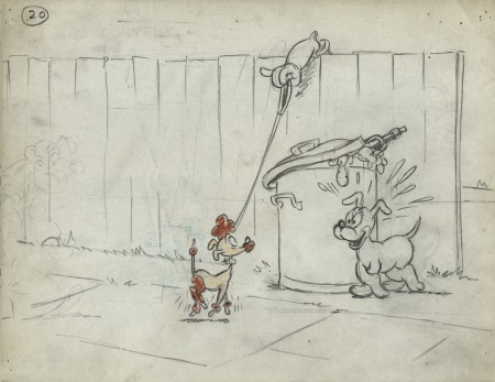
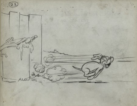
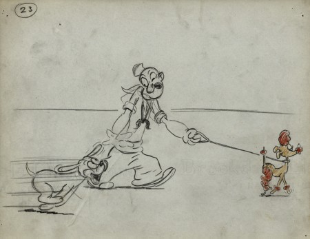
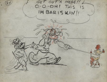
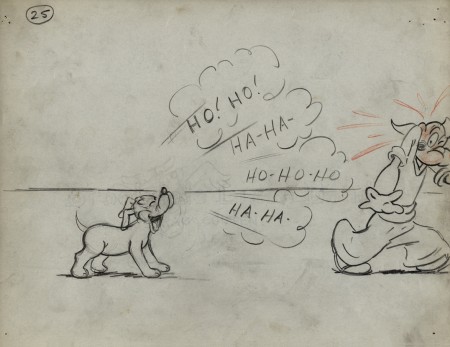
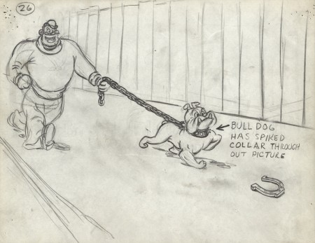
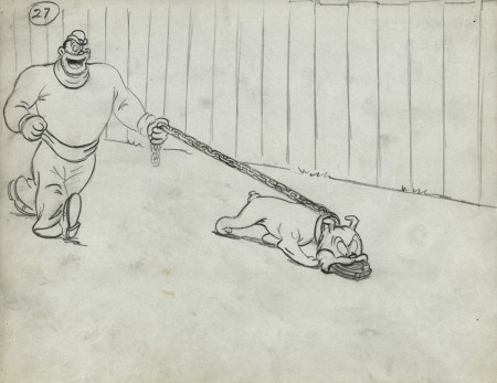
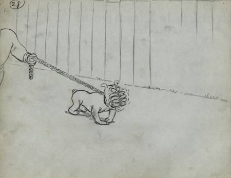
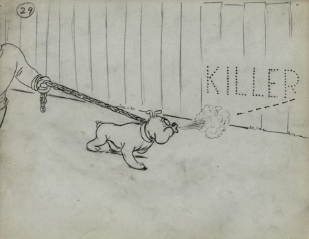
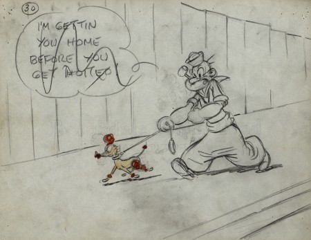
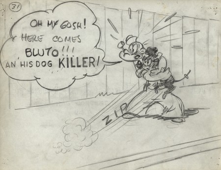
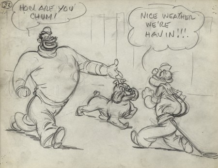
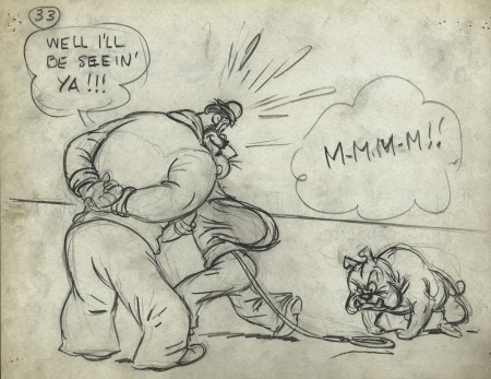
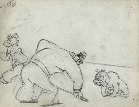
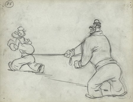
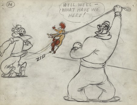
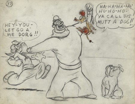
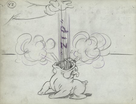
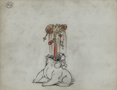
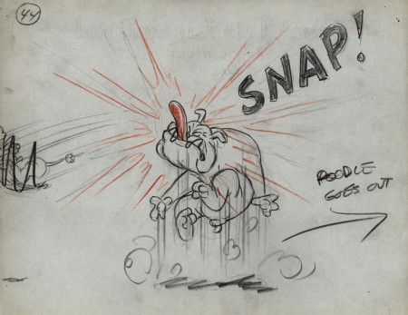
- Last week I introduced you to the late Vince Cafarelli‘s collection of animation artwork. This is a collection of artwork he had saved from the different studios he worked at. A solid part of the collection is this storyboard from the 1949 Popeye cartoon, “Barking Dogs Don’t Fite.”
The story and storyboard was done by Jack Mercer and Carl Meyer. I’m sure you recognize Jack Mercer’s name as the voice of Popeye, but he was also the voice of Swat the Fly in Hoppity Goes To Town. Carl Meyer voiced his partner, Smack the Mosquito. I love the drawing style of one of them (I don’t know who did which); it’s reminiscent of some early twenties comic strip art. The two artists draw Olive very differently. One draws a circle for a head; the other gives her a bubble cheek, and this is the one I favor. I also love his Popeye. It’s too bad the film looks so mediocre in its final incarnation. For some reason, they’ve given Popeye a powder blue uniform. I don’t think the Navy actually had such a uniform.
There are a lot of drawings to this, so I’m forced to break it into three parts.
I’ve also posted the YouTube version of the short at the end of this post.
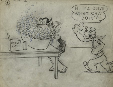 1
1
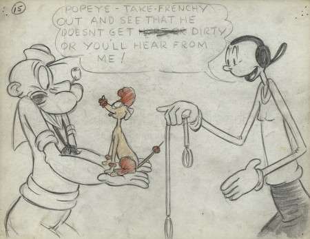 15
15
Olive gets breasts, at least, for one drawing.
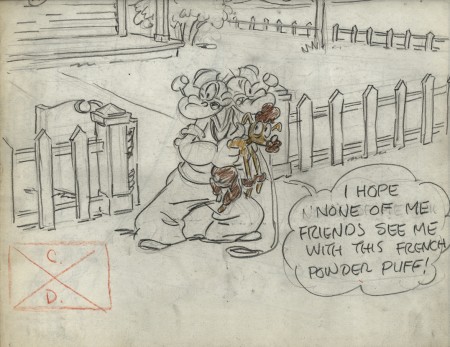 17
17
There is no number 18. 17 dissolves to 19.
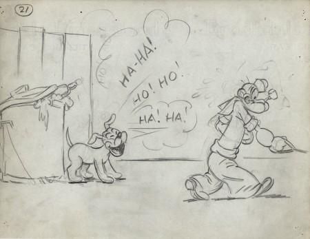 21
21
What an hilarious Popeye!
Right out of the Toonerville Trolley.
.
___________________________
.
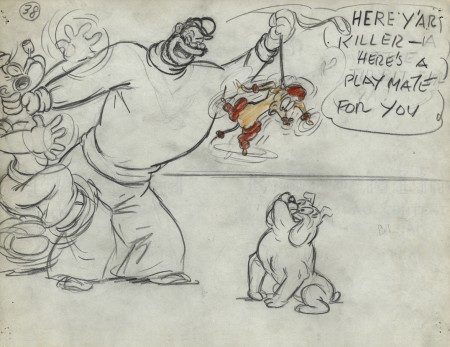
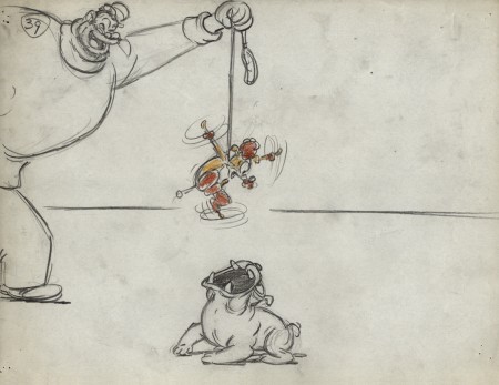
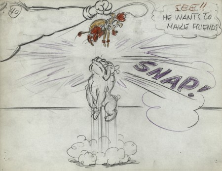
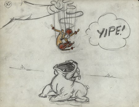

on 09 May 2012 at 8:59 am 1.J Lee said …
The cartoon was a remake of 1937′s “Protekt the Weakerist”, which featured some of the greatest examples of Jack Mercer’s ad lib mumblings. But by 1949, Famous had pretty much eliminated those, so this short doesn’t have the same light touch the original had. (Like Warners, Famous remade their B&W cartoons in color because those two studios produced more cartoons than the others, and it was a fast way to get a new one to market, since you couldn’t re-release B&W cartoons to theaters. But the Warners’ remakes, and the early Famous re-dos of the Fleischer Popeyes, tended to add enough new touches or fixed up any weak points in the originals so that the color versions were just as enjoyable. That’s not the case here). ’49 was the time period when Famous’ shorts started to really slip in quality, and “Fite” is just one example.
It’s interesting that on the storyboard, Olive also keeps her original Segar hairstyle, instead of the mid-40s remake Famous gave her. As for the uniform, for some reason the studio occasionally would deck Popeye out in the blue suit once the series went full color, beginning with the first color short in 1943. It just seems like more of an occasional change-of-pace decision than anything else.
on 09 May 2012 at 8:59 am 2.Thad said …
A great illustration of the main problem at Famous Studios: a lively board is almost always toned down as the cartoon goes down the studio pipeline. I’ll grant you that the finished cartoon isn’t very good, as it’s indeed a clumsily brutish remake of Protek the Weakerist. But I refuse to accept anything looks mediocre with John Gentilella doing so much of the animation!
on 09 May 2012 at 10:39 am 3.Doug said …
Michael – I didn’t realize that Jack Mercer drew as well as voiced Popeye. Would be fascinating for you to do a bit of an expose on him.
I’m on the verge of buying the recent Popeye dvd’s. I think my kids would love them and I really don’t know much about the Fleischer cartoons and I think I owe it to myself. Thanks for this!
on 09 May 2012 at 11:21 am 4.Stephen Worth said …
What’s the size on these drawings? They’re almost like layouts. I guess it was easier to go to finish like that since the cartoon was a remake and was basically already written. It’s interesting that they use the comic book style dial balloons. I wonder if that carried through to the composition of the shots- making wide open spaces for lettering that isn’t there any more.
on 09 May 2012 at 11:29 am 5.Stephen Worth said …
Yes they did. Looking at the video, there are scenes with huge blank spots over the characters’ heads.
on 09 May 2012 at 9:29 pm 6.Charles Brubaker said …
Yeah, alot of the Famous boards that I’ve seen have strip-style dialogue balloons.
Thanks for posting these. These production drawings are always a blast to see, even for dull cartoons.
on 10 May 2012 at 5:39 am 7.John V. said …
Anyone else Bluto looks like he’s in blackface in some of these drawings???
on 19 Mar 2019 at 8:18 am 8.Troy Fullwood said …
I knew Mercer wrote a lot on the 70s ALL NEW POPEYE HOUR, and he has a few story credits on the 60s TV Popeye shorts (there might be more, not all episodes list the story writers), but it’s interesting to see him working all the way back then.
on 03 Jun 2020 at 7:02 pm 9.Cammie Gemmell said …
I simply want to tell you that I’m newbie to weblog and actually loved this blog site. Very likely I’m want to bookmark your blog . You really come with outstanding articles. Kudos for sharing your blog site.