Animation &Animation Artifacts &Bill Peckmann &Disney &Illustration &Rowland B. Wilson 19 Apr 2012 07:18 am
Rowland Wilson Scrapbooks
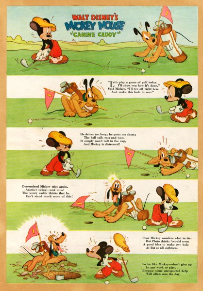
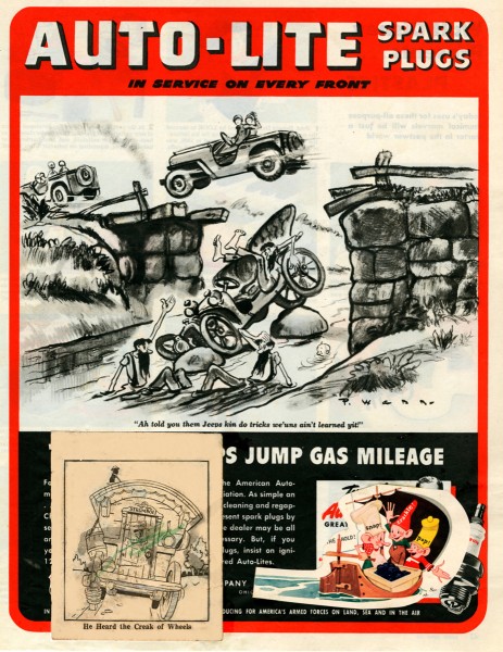
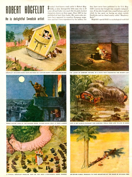
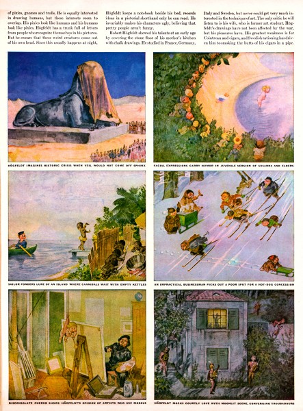
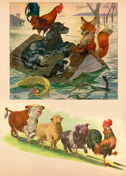
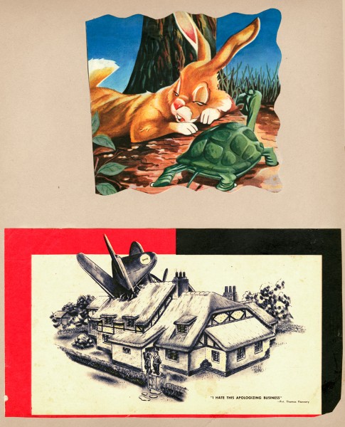
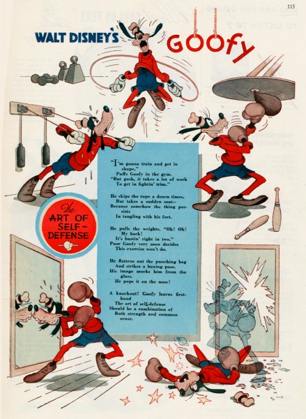
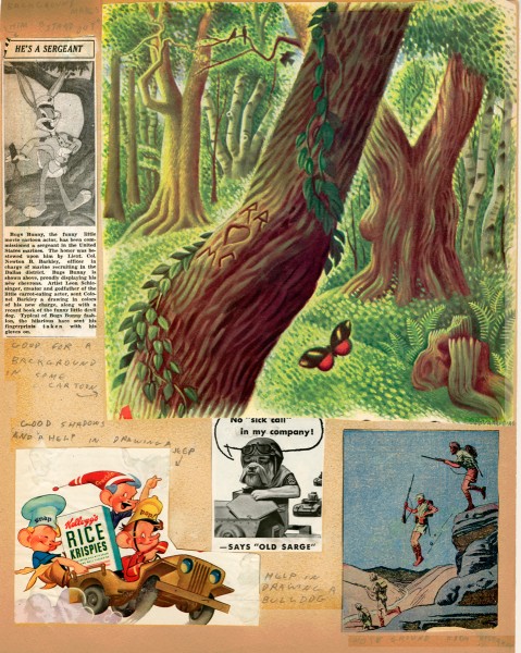
- Suzanne Wilson sent me some pages from the private scrapbook that Rowland B. Wilson kept for inspiration and reference. Seeing these pages, I was a bit surprised at what he collected. When I was a kid, I kept a scrapbook of everything – and I do mean everything – that was printed about animation. Remember, there were few books about animation back in the 60s; I had to hold onto everything available. I found looking at Rowland Wilson’s scrapbook not too different from my own, except that he kept material about the “Golden Years”. It gave me a smile.
Here are some of Suzanne’s comments:
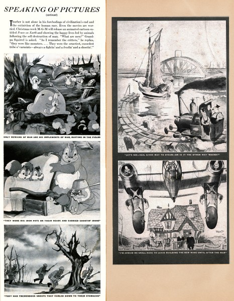
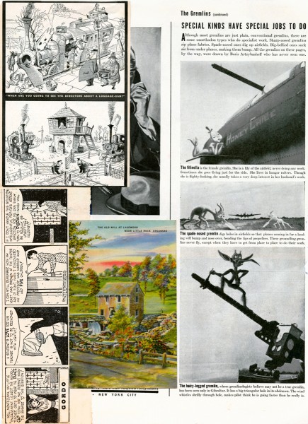
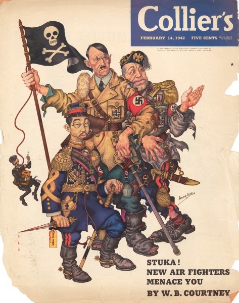
- Rowland B. Wilson, ever the contrarian, once said when speaking of deciding one’s future “Why should you expect an eight-year-old boy to decide what a grown man should do?†He may have been a bit older than that (dates of the periodicals suggest age 12 through 15) when he assembled scrapbooks of his favorite subjects and illustrations from Disney, Life, Collier’s and Look magazines and the Dallas newspapers, but one look shows the premonition of a later artistic sensibility. He zeroed in on what exactly appealed to him visually and subjectively and never deviated. The influences were taken to heart and incorporated into a personal recognizable style.
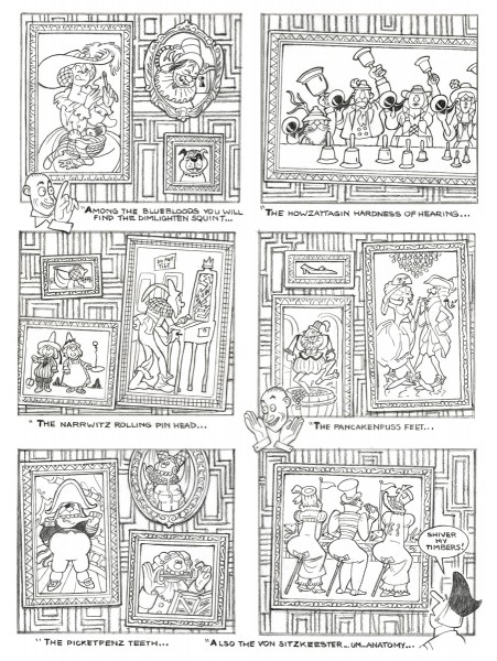
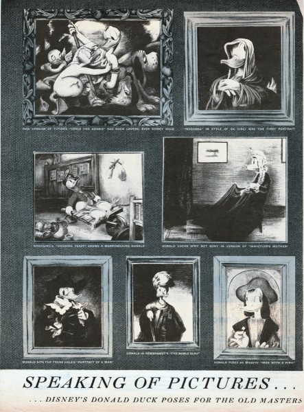
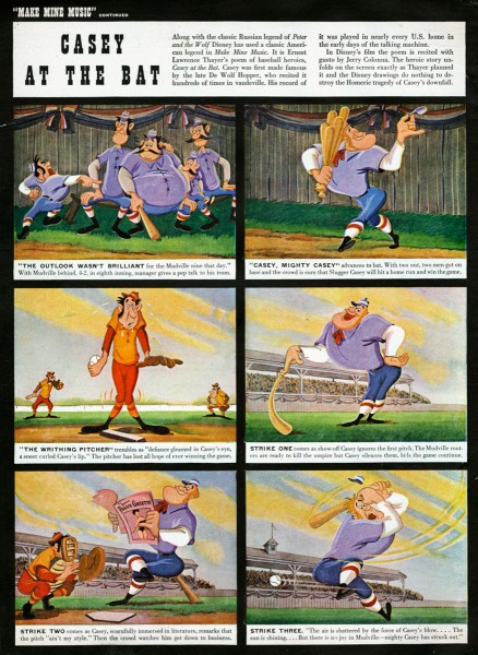
For example, “Speaking of Picturesâ€, a Disney spoof on the Old Masters (Image 15) clipped from Life Magazine in 1945 can be compared to The Sneezenfitz Gallery, drawn in 2005 for the cartoon novel “Cloak and Pistolâ€. One only has to look at “Casey at the Bat†(Image 16 to see a gestalt that was to emerge in the definitive baseball players in TV Guide. (See Rowland B. Wilson TV Guide Originals-1, posted February 16th.)
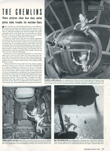
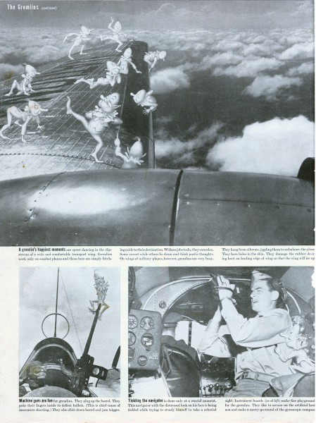
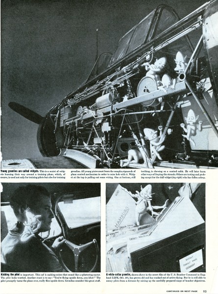
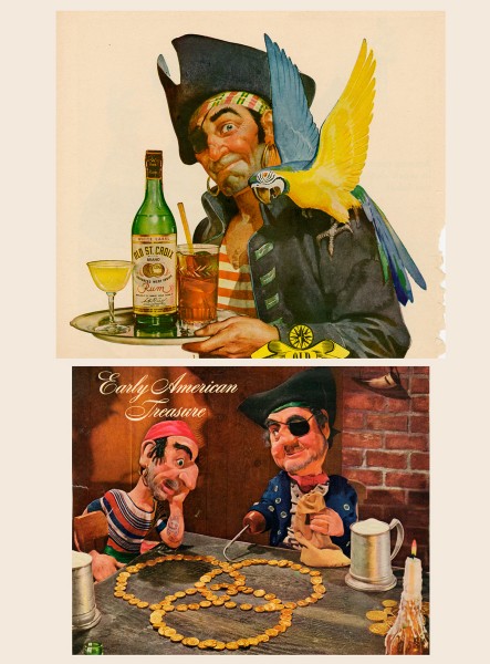
The clippings can also be seen as interesting ephemera. Those from wartime show aircraft insignia designed by Disney, aviation gremlins and advertising of the time.
Here are some comments from Bill Peckmann, who requested Suzanne send me the material:
- I have to admit it’s been over 35 years since I last laid eyes on them when Rowland brought them in to PK&A for show and tell. He had just returned from a trip to his hometown of Dallas, Texas and couldn’t wait to show us what he brought back with him. This was just about the time in the 70′s when Disney was starting to come back into the good graces of the art world again. (Think Lincoln Center.) I remembered there was Disney and other great stuff in there, but couldn’t quite remember exactly what. Seeing the collection now after all these years, it feels like I’m looking at a precursor to the SPLOG. One can see now what a terrific eye and good taste Rowland had as a young teenager, and it’s also neat to see that animation was in his blood at such an early age, he just got a little sidetracked with very successful advertising, cartooning and illustrating careers before he went back to the first love of his life, animation. Lucky us!
 1
1
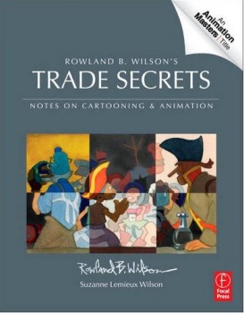 Suzanne Wilson is about to have a new book on the market: Rowland B. Wilson’s Trade Secrets: Notes for Cartooning and Animation.
It’s obvious that this book is directly related to this post. Rowland Wilson obviously kept journals in which he wrote about illustration and animation, and the information must certainly be very informative to students; some of these journals are published here. Presumably pages of the scrapbook may have made the book.
The book seems to offer quite a bit of attention to Mr. Wilson’s animation art, just as it does his brilliant illustration and cartooning. I look forward to getting my copy.

on 19 Apr 2012 at 9:25 am 1.Bill said …
That’s kind of neat to see Rowland’s young teenager notes on image 10, only wish there were more of those.
on 19 Apr 2012 at 10:06 am 2.Don Cox said …
He certainly had an eye for the good stuff.
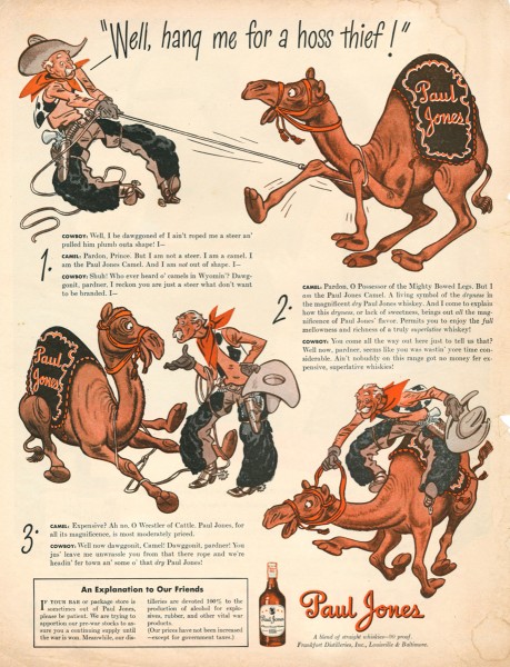
Anyone know who did the Paul Jones advert with the camel? The style looks familiar, but I can’t place it.
The forest “background” is an impressive piece of artwork, too.
on 19 Apr 2012 at 3:17 pm 3.The Gee said …
All this is great to see.
I did consider “Casey†when I saw those TV Guide baseball illustrations.
in image number 14:
you don’t see that too often in advertising art.
I’d rather see a picture of something like that than a glamour shot or a product shot. Fun stuff. But, it is for rum, so it is bound to be fun.
on 19 Apr 2012 at 3:21 pm 4.The Gee said …
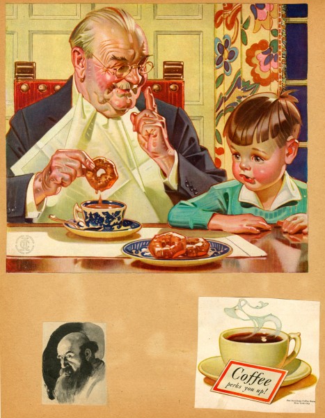
Also, I love how that generic (?) coffee ad is Stromboli – approved.
And, it reminds me that there were a lot of old, fat people in ads back then. I guess it was for a demographic or maybe presented as being aspirational.
(growing, old? wear your success)???
Other than that, the design of the child has a lot of Kewpie doll, artifice thing going on in it.
on 20 Apr 2012 at 5:25 pm 5.Bill said …
Don, thanks to eagle eye Leif Peng, the illustrator behind the Paul Jones ad is James Williamson, an artist with the same good, solid, humorous, easy going style that Al Dorne had.