Bill Peckmann &Books &Comic Art &Illustration &Rowland B. Wilson 09 Mar 2012 07:36 am
Rowland B. Wilson Playboys
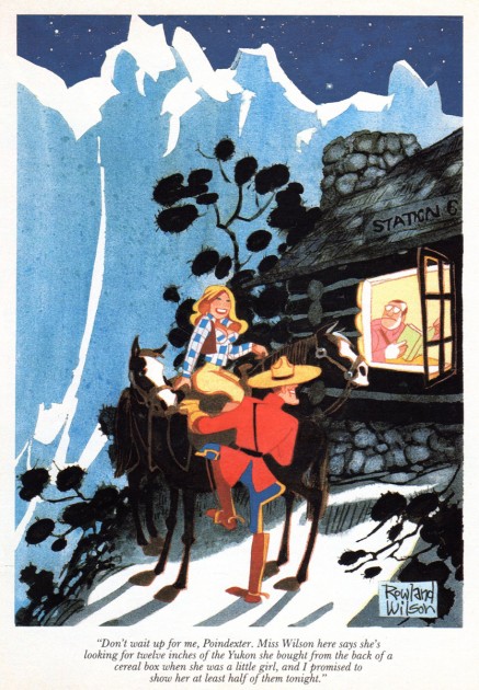
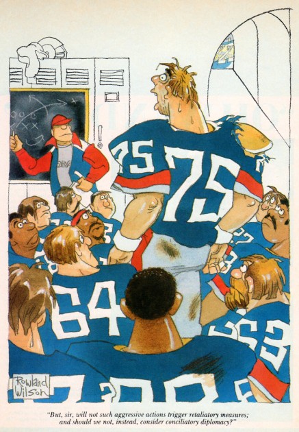
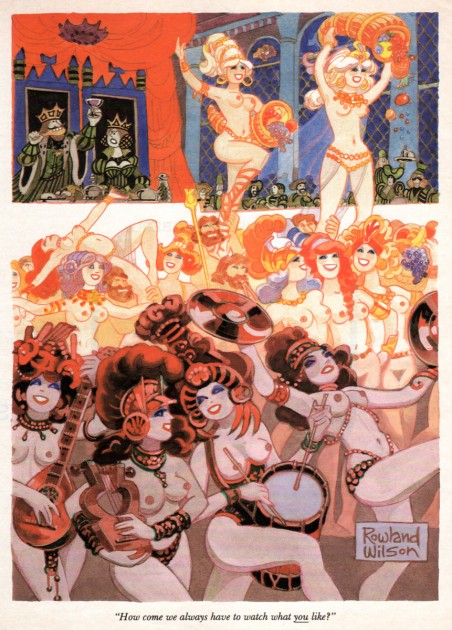
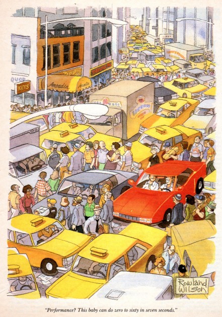
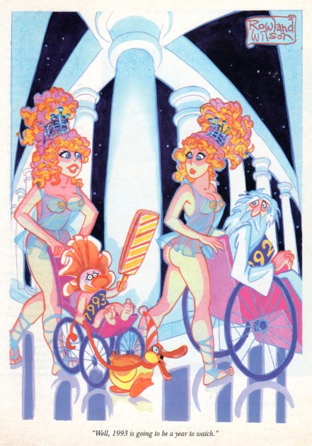
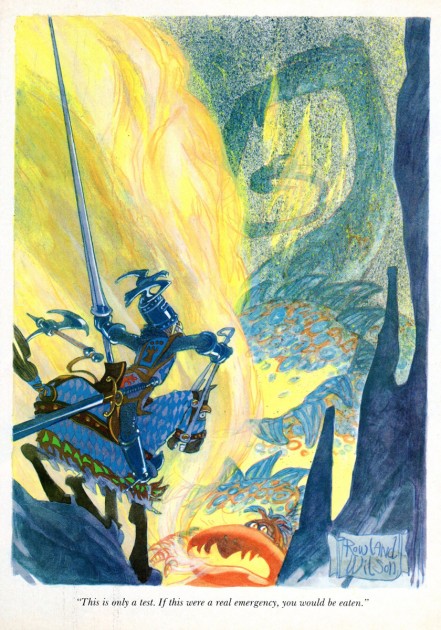
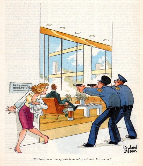
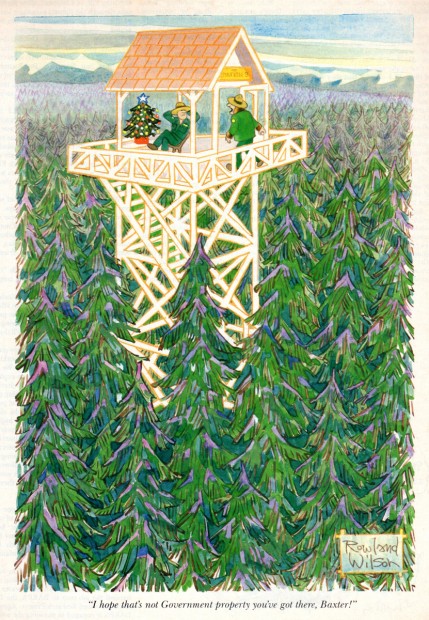
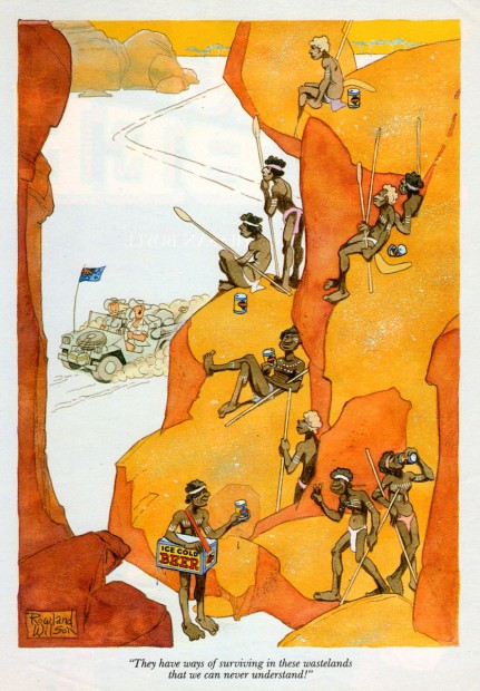
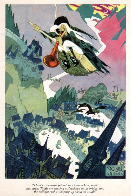
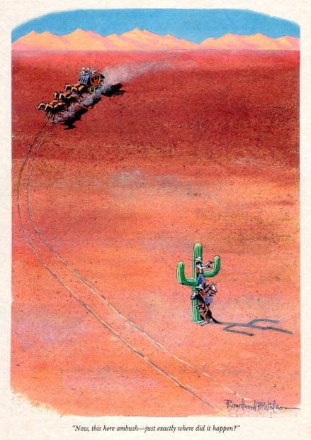
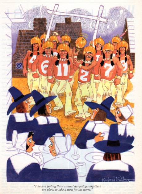
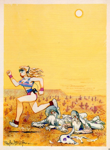
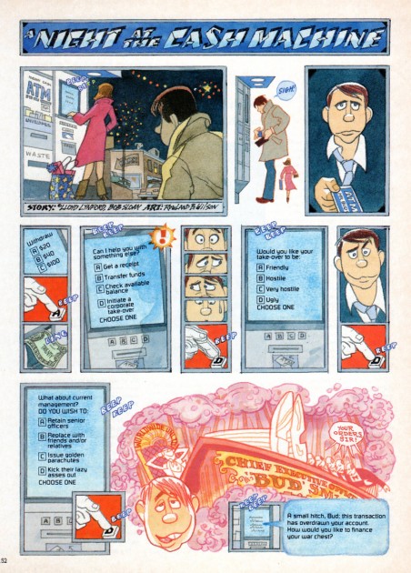
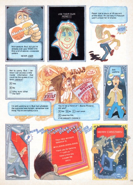
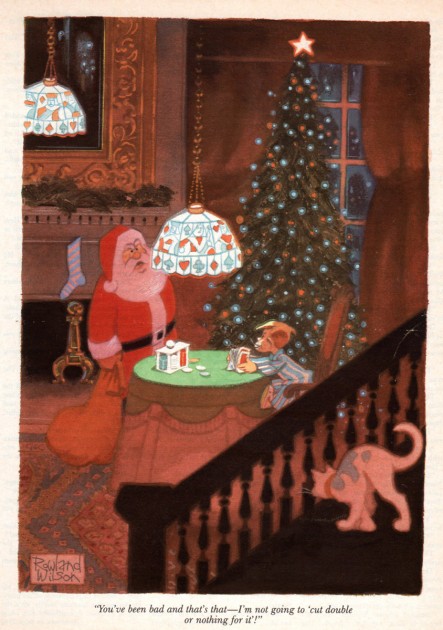
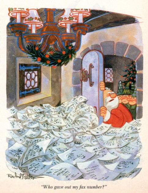
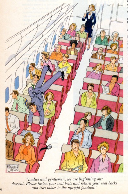
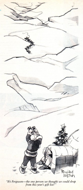
- Bill lPeckmann has sent a stash of beautiful cartoons by Rowland B. Wilson from the pages of Playboy Magazine.
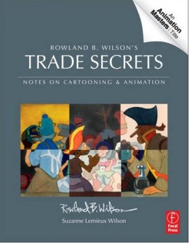 Before getting into this artwork, let me point to a brand new book on the market. Rowland B. Wilson’s Trade Secrets: Notes for Cartooning and Animation. This is a book that was put together by Suzanne Lemieux Wilson, and it looks to be as much about animation as about cartooning.
The book is available for pre-order from Amazon, and you should line up for a copy. You’ll remember that I posted lot of Mr. Wilson’s Disney and Bluth art for the animation art direction he did. I expect to repost a lot of that material again soon, perhaps when this book gets closer to hitting the market for real.
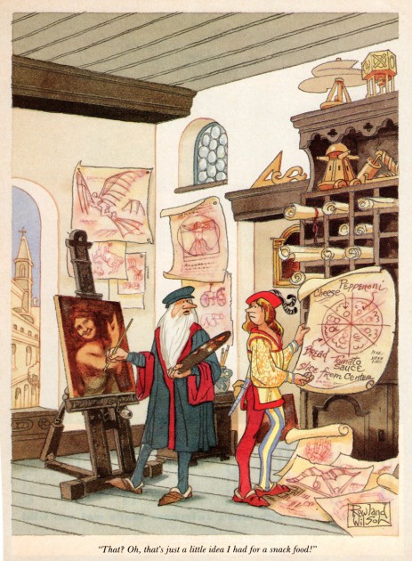
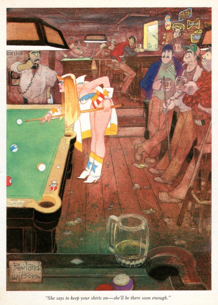
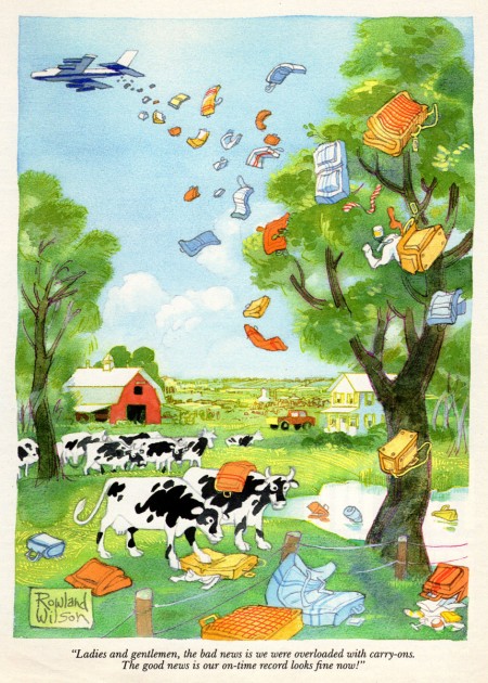
But, now we’re talking about Playboy. They did well by their artists and cartoonists; the printing was always first class and the amount of exposure was high. Rowland’s cartoons always jumped out at me as among the more sophisticated ideas, and the artwork was always top notch. I think you’ll enjoy these, and thank Bill for sharing his collection, yet again.
 1
1
You might check out some of these spot cartoons posted by Leif Peng.

on 10 Mar 2012 at 1:58 pm 1.The Gee said …
really great, varied layouts. very good use of foreground elements for framing scenes (hopefully those strengths are examined in that book)
Will Elder’s crowd scenes always freak me out. I’ve rarely had the gall or patience to deal with drawing dozens of unique people in a scene (unless the money is there for it–ah, great motivator…when the money is there for it)
The reason I bring that up is it seems like Wilson wouldn’t shy away from crowds when necessary. A lot of cartoonists, good and bad, will brush over spending the time to make individuals that are just “scene extras†but Wilson doesn’t seem like he would.
Number 12, with the Aborigines (?), the folks hanging out on the cliff, are a good example of spending a little extra time and putting thought into it. The dancing girls and the traffic jam are even better examples though.
Finally, and the first thing that caught my eye is the color. Brilliant stuff. Awesome use of colors to create/match the mood of each piece.
on 10 Mar 2012 at 6:55 pm 2.Eric Noble said …
I would love to see a collection of Rowland B. Wilson’s cartoons collected into a hardback volume. One can learn so much about staging, composition, color, and body language from them. They are a treasure trove of eye candy.
on 10 Mar 2012 at 11:19 pm 3.Bill said …
Gee, if you want to see “attention to detail”, enlarge and check out #13. No “faking it” going on in that little town!
on 11 Mar 2012 at 12:43 am 4.The Gee said …
Okay. I didn’t do that before. I was just taken in by the color scheme. It is predominantly cool colors, obviously, but he smartly used warm colors, too. And, white space. Somehow it wokrs really, really well. I can only guess it is mainly because of the layout and the inks that don’t let the eyes drift to where he didnt’ want them to drift.
While I’ve seen some of his work over the years, seeing these batched together is just impressive.
I can be a noodler so I appreciate details when I see them.
on 11 Mar 2012 at 6:50 pm 5.Suzanne Wilson said …
In response to The Gee (First comment): When I read comments like this I am so sorry that Rowland is not here to read them. He would have been pleased to see his attention to the classical standards of art recognized. He would love it that you appreciated the composition, color and mood but also took the time to examine the details.
Rowland documented a lot of his techniques so he “wouldn’t have to solve the same problem over and over againâ€. I tried to include as much of that as possible in the book. In order to shed light on his working process I also collected samples of preliminary art that survived. If you have been following this blog you already know that much of that was destroyed. (We have Bill Peckmann to thank for fielding some of the great New England Life and TV Guide sketches.)
I think Rowland kept interested in creating those “scene extras†by drawing caricatures of people he knew. A few folks might be surprised if they took as close a look as you did at the background characters!
Huge Thank You’s to Michael and Bill for getting this art onto the computer screen where it gains another dimension beyond the printed page.