Books &Disney &Illustration &repeated posts 12 Jan 2012 06:45 am
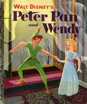
Eyvind Earle – Peter and Wendy
Back in 2007, I posted this piece on Eyvind Earle’s Peter Pan illustrations. I’ve combined the two parts and repost it here.
 – I’m an Eyvind Earle fan. I have been ever since getting my hands on Bob Thomas‘ original version of The Art of Animation (1959), which promoted Sleeping Beauty and its artwork, and then going up to Radio City Music Hall to see the first theatrical run of the film.
After the Disney film, I saw Earle’s Nativity film on the Tennessee Ernie Ford show and Paul Bunyan and other Disney shorts of the period made me more of a fan.
I got to meet the man thanks to Michael Barrier. We had one of the craziest interviews ever when we drove upstate to his house and sat in a somewhat darkening room as the afternoon dimmed and Earle continued to quietly answer the questions.
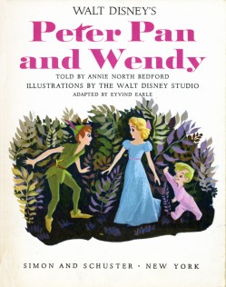
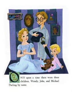
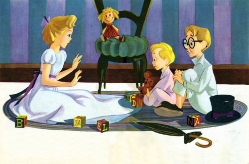
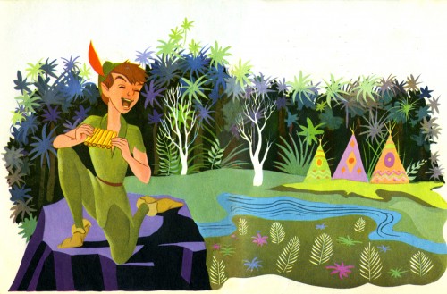
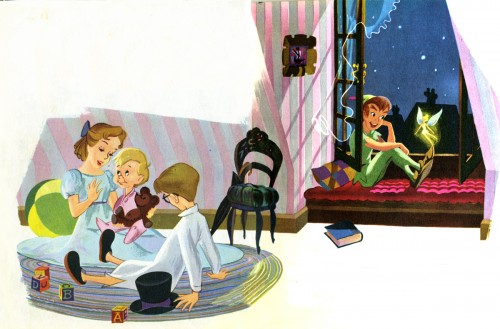
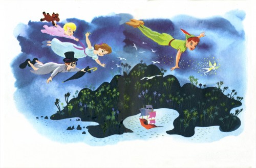
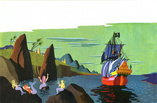
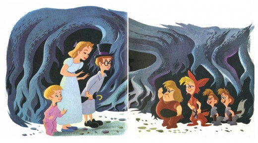
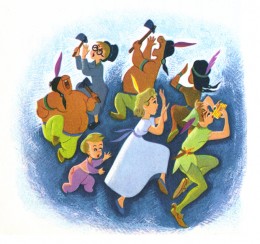
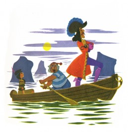
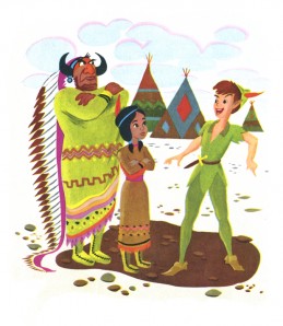
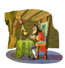
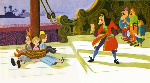
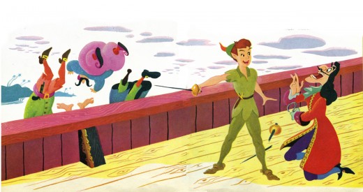
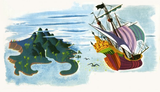
I loved that day, but I loved Earle’s work even more. After posting Retta Scott‘s Golden Book of Cinderella, I realized that I had this book, Peter and Wendy, which is Earle’s odd adaptation of Peter Pan. He’s obviously in love with Cinemascope in that most of the book’s illustrations are two-page spreads. Sort of wide screen proportions. This is unusual for a Little Golden Book.
The images look a bit like the backgrounds in Paul Bunyan, and the characters are not quite on model with the film. The printing, as with most of these books, is pretty dull. You know a lot has been lost in the transfer.
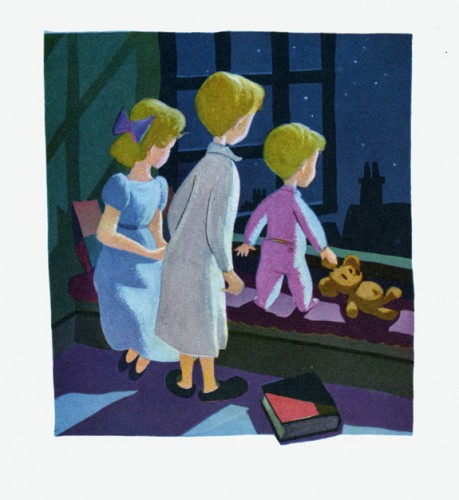
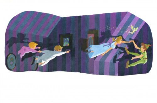
This last illustration is my favorite.

on 12 Jan 2012 at 12:25 pm 1.Andy Menter said …
This post was awesome in 2007, and it’s awesome now!
on 13 Jan 2012 at 1:59 am 2.Ed said …
Wow so ugly illustration, how the guy can hide the characters faces??!!, look at Wendy, her body is almost frontal and the head 3/4 back, how can she turn the head like that, is she an owl?, really bad solution for the illustration, anyway nothing insteresting, all drawings were taken from the film but badly traced.
on 13 Jan 2012 at 7:21 am 3.Michael said …
Ed, one person’s “ugly” is another person’s beauty. I posted the illustrations because I think they’re beautiful. Eyvind Earle is one of the principal designers in the Disney studio legacy (covering most of the ’5os), and his personal style and graphic abilities are truly an inspiration to me. Sorry you don’t see what I do.
on 13 Jan 2012 at 3:44 pm 4.The Gee said …
“a really bad solutionâ€
Oh critics of cartoon art, you are so harsh. Either it is dismissible or too much is made of it. And how can the maker of such art be spared from criticism? It is just impossible to win. Oh well…..
Suffice it to say, the last painting has some nice touches to it: The shadows, obviously. How the youngest is the most visibly awestruck. How Wendy is placid as she is shown sitting properly.
I suppose I’m too forgiving but I like Earle’s illustrations. He was one of a handful of wonderful artists who could paint cartoon characters without always relying upon lines and knew how to convey warmth and coolness, and, boy, is that some smart composition he did in his illustrations.
on 18 Jan 2012 at 8:04 pm 5.Ward said …
I love Eyvind’s work, too, Michael. And I find it interesting to see his work on the Peter Pan Little Golden Book – especially his two-page spreads. However, I would have to say that it wasn’t all that rare for a Little Golden Book to have multiple two-page spreads. Mary Blair’s “I Can Fly” is practically all two-page spreads – of course, it’s part of the story. In order to show off both the animal and the girl imitating the animal the layout had to go across both pages. Going through a few of my favorite LGB titles, I would have to say that the average is usually about 5-6 two-page spreads. And I noticed that the ones that have more were illustrated by current (at the time) or former animation artists, like JP Miller, Aurelius Battaglia, Mel Crawford, etc. Interesting!
Thanks for posting Earle’s work! Always love to see his stuff.
on 08 Jul 2012 at 7:54 am 6.Slavica said …
I have come across to your page by accident,by looking for Eyvind Earle writings,and i am glad i did;illustrations are wonderful,it seems to me like characters move and talk,they are so vivid and impressive.
I write on my blog and last story i decorated with his two artworks:Purple Sunrise and Purple Sunset.
Thank you
on 19 Aug 2014 at 6:00 am 7.Peter (Yes really Peter) said …
Just came across this website! This is an awesome site. I love Eyvind! I know no one will believe this but my wife’s name is Wendy and she does have a St. Bernard. I’ve been a graphic designer for about 20 years and I’m getting back into illustration. Earle was really a genius. Even the animator’s had a hard time with him because his drawing upstaged their animation. Regarding “ed’s” comments above….its quite a shame how someone can be so rude and ignorant at the same time. Earle made an incredible impact upon animation, inspired artists (Hildebrandt Brothers, designers, artists) etc. You can’t even go into Disney world without being surrounded by his impact.
Anyhow, to complain about Eyvind’s anatomy or his drawing style is petty. And to state “nothing insteresting, all drawings were taken from the film but badly traced.” Disney was inspired by Evind … not the other way around.
Finally, I think this is a great site. It inspires me to start illustrating again.
Sincerely,
Peter