Commentary 04 Oct 2011 06:39 am
Hubley/Blair
- Two shows are about to take place; one in New York (Monday October 10th An Academy Salute to John Hubley), another in Los Angeles (Thursday October 20th, Mary Blair’s World of Color; A Centennial Tribute). I wish I could attend bothh of them; I’m happy to be in NY to attend the John Hubley program (and be a small part of it.)
Interesting that these two shows appear in the same month at two different AMPAS stations. Yet, the two artists couldn’t be more diametrically opposed in their work. One was more of an illustrator, albeit a brilliant illustrator, and the other was more a fine artist.
.
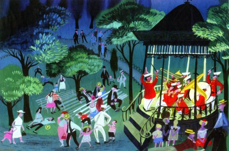
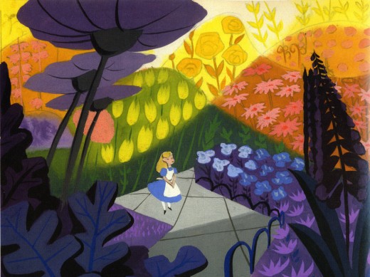
Everything about Blair’s work, from The Little Golden Books to the designs for the Disney features of the early 50′s to the overall design for It’s a Small World in Disneyland, are all glorious testaments to a first rate, gifted illustrator of the highest caliber. She radically changed her style on the trip to South America with the Disney group, and she brought these brilliant color mixes back with her to the work she did at Disney. The colors were almost there for the sake of the colors, alone. The work developed and grew more sophisticated with all that she did, and her color schemes became more radical as she designed for the Disney features.
.
.
The grand statement of the art . . . well, there was no grand statement. It was done to further the films or the projects, and had no message. It was beautiful production art, but it was not really “Art.”
.
.
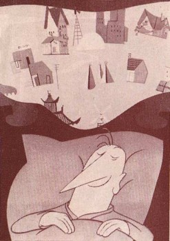 Hubley’s work sought to create art, and the style and growth continued upward through his years. The work at Disney’s studio started as gifted illustration (Snow White), then turned to a looser feel with oils (Pinocchio) and watercolor (Bambi). As he moved to UPA, the art followed Steinberg and Picasso closer to the world of abstraction. Ultimately, with Adventures of an * and films that followed (done by and for himself and his wife Faith) the Abstract Expressionists ruled, and Hubley’s art went far into that direction and stayed there through most of his films.
.
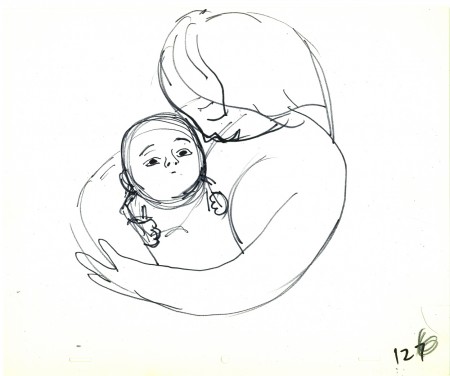
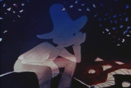
Tender Game, which followed Adventures of, was a variation that seemed to emulate some of the work of Baziotes. Moonbird was where Hubley came into his own and created a very rich style that was all his own. Variations on it came with The Hat, The Hole and Of Stars and Men. A new direction came with Windy Day. By the time we reached Cockaboody, a softness settled into that very same style and watercolor backgrounds dominated. There was throughout all this work a beautiful development where one phase grew out of another which had grown out of another.
.
And there was a grand statement: all art, abstract or realistic was an abstraction and it touched all of our lives regardless of our thoughts about it. Picasso could be dismissed by those not in the know, but eventually the masses would warm up to him and eventually take it for granted that this, too, was Art. Hubley helped make that world – this world – so. Acceptance and understanding was part of his oeuvre.
.
One wonders if Hubley had remained at Disney’s as long as Blair had whether any of his rich design style would have controlled the films as her work had. Of course, the answer is obvious. He never would have been able to remain at Disney’s studio. His penchant for the further development of the art – out of the 19th century illustration – would not have allowed him to sit still there. By leaving, he not only pushed his own work into a higher realm, but he pulled animation there with him.
.
.
In a sense, without his work, animation would still be stuck in the 19th Century graphics and would not have moved into the 21st Century. We can see evidence of this with all the cgi features being done today. Those little fabricated computerized puppets are wholly stuck in 19th Century art, yet 2D has moved on. We accept “Beavis & Butthead” or “Aqua Teen Hunger Force” (both badly drawn works that are most definitely 21st century graphics) because Hubley changed things. Not that John Hubley was the only one who wanted to do more, graphically, in animation, but others seem content with modernized cartooning. Chuck Jones, for example, who led the way in 1941 settled into a stylized cartooning in the 1950s. Hubley sought art – something different and deeper than was acceptable to others.
Picasso led to acceptance of Andy Warhol and Robert Rauschenberg; Hubley led to acceptance of “South Park” and Yurij Norshtein.
.
Pictures:
1. Mary Blair – personal painting
2. Mary Blair – Alice In Wonderland
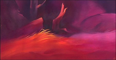
3. John Hubley – Bambi
4. John Hubley – Brotherhood of Man
5. John Hubley – Everbody Rides the Carousel
6. John Hubley – Moonbird

on 04 Oct 2011 at 9:14 am 1.Marc said …
Hubley was also but an illustrator–mimicking others progressive styluzations into the medium of animation. Love his cartoons, but there’s not one I could point to that I couldn’t identify–aside from the additional elements of time, sound, and motion–as based on other painting styles prevalent at the time or 30 years prior.
on 04 Oct 2011 at 10:22 am 2.Michael said …
Stylistically everything’s related. Picasso and Braque freely stole from one another while Matisse stole from Ethiopian art. Pollack stole from Picasso until he started splashing, and Steinberg also took from Picasso while Baziotes took from Rivera. It’s the nature of Art to steal and grow. Hubley was no different than any other artist. The point is that he had something to say whereas Mary Blair didn’t, and he brought the look of animation art into the 20th century Art whereas others stuck to cartooning.
on 04 Oct 2011 at 12:17 pm 3.Oscar Solis said …
Hubley has always fascinated me. Where is that point where a person decides to stop serving the needs of others and serve himself as an artist? Is it very early in their life or is it just where life takes them? Curious.
on 04 Oct 2011 at 2:40 pm 4.Stephen Worth said …
Most people credit Hubley with changing the way cartoons look. But that part of his work isn’t what I admire the most. To me, his most important attribute is the revolutionary way his cartoons *feel*.
Animation is basically at its most fundamental level a lie. That’s why the Germans call it “trickfilm”. Hubley took this disingenuous artform and imbued it with sincerity. Marky Maypo, Windy Day, Moonbird… All of these films are intensely genuine. When you watch them, there’s no way to look at them as characters in a play. It’s *life* being played out in front of you. In a medium as convoluted and complex as animation, that’s no small feat.
Hubley’s work at UPA is good, but perhaps with contemporary eyes it doesn’t stand out the way it probably did in the early 50s. But Hubley’s own films point to a direction for animation that still hasn’t become fully realized decades later.
Bakshi and Hubley are as far apart in personality and style as they could possibly be. But I see the same element in their best work. Maybe it comes from a common love for the openness and free improvisation of jazz. I don’t know. But they’re both masters at creating animated “riffs” that live and breathe.
on 04 Oct 2011 at 2:45 pm 5.Stephen Worth said …
Also, “sticking to cartooning” is a noble thing. The art of caricature and exaggeration goes back hundreds of years. One doesn’t have to give up cartooning to be an artist. To me, Hubley was a greater cartoonist in his own films than he was at the Hollywood studios, because he was more true to the art of caricature. He wasn’t creating characters, he was caricaturing life. That’s the mark of a true cartoonist.
on 07 Oct 2011 at 3:33 am 6.Eddie Fitzgerald said …
The Alice illustration you posted certainly was an example of color for the sake of color, and it’s not one of my favorite Blairs, but that’s not typical of her best work.
Usually she was pretty good at conveying good cheer and sensual delight, and a sense of reverence for nature and for the ingenuity of man. Surely these are qualities that are consistent with fine art.
It seems to me that there’s a point where illustration and fine art sometimes overlap, as they do with Fragonard and Lautrec.
Incidentally, it’s hard to convey sincere good cheer in an illustration. Very few illustrators can do it. That’s because pigment color is inherently melancholy. Most mixtures want to turn into grey or mud. It takes a first rate painter to express happiness in that medium.