Photos 25 Sep 2011 07:30 am
Signage Sunday Photo – recap
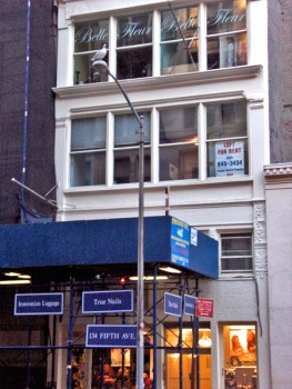 – Naturally, in a place like NY there’s an awful lot of signage about. The image to the left gives a good idea of the typical everywhere in this city. There are signs on the temporary construction, signs on the building, signs on the windows. Signs are everywhere and have become the ordinary part of the landscape. In fact, they’ve become part of the building, itself.
The signs that interest me usually are the ones that are actually painted on the buildings, themselves. I have to admit I’ve always been curious about these, and I’ve wondered how they actually do them.
Unlike the usual poster that’s printed onto strips that are pasted together on the billboard, these posters are actually painted in place on the brick walls. How, exactly, are these done? Realistic looking images are painted there. Paint by numbers? Perhaps I’ll do a little research and try to find out.
 __
__
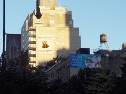
Of course, the City provides many blank canvases (open building walls) where ads can be placed. Several can be seen looking down any street. It’s actually not much different from the construction site image at the top of this post. A space is a space, and that space can be rented out. (The image on the right is a closeup of the one of the several signs on the left.)
 __
__
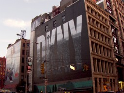
The fashion industry seems to have their own wealth of ads on buildings. These are photographically realistic, yet they’ve obviously been painted there somehow.
You can see the bricks under the coating of paint.

This Cartoon Network ad for “Boondocks” is painted right over a number of windows.
(You can see the lit window shining through it.) How do these folk see out? I assume
it must be some kind of special paint.
 __
__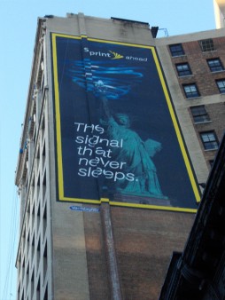
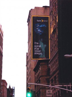
This ad for Sprint presents a new problem. When you look at the sign straight on, it looks fine. However, if you move a bit, you’ll see that the building/wall on which it’s painted has a shift in it. The sign had to have been designed to take in this change in level of the canvas. An interesting problem. (If you look closely at the Boondocks sign, you can see the same problem existed there.)
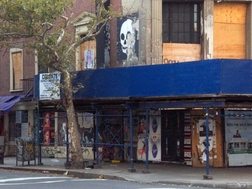
Here we have a melange of signage, not all of which are painted on walls. Does the skull represent a building under reconstruction?
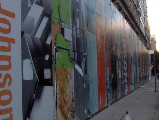
Of course, any construction site offers plenty of blank canvas.
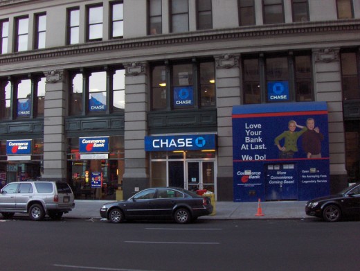
Naturally, I couldn’t pass up this image. The tiny Commerce Bank on the corner is overwhelmed by the Chase Bank next door and on the second floor. However Commerce seems to have painted its own add on the Chase construction-site doorway.

Finally, an image sent me by Steve Fisher, shows an odd and
funny juxtaposition of signs. It would make me a bit
nervous to have my pet cared for by this veterinarian.

on 26 Sep 2011 at 12:35 pm 1.S.C. Kershaw said …
Up There
A very short look at hand painted advertisement artists in NYC. Shows how this particular group gets their work done. Pretty interesting, very sentimental as it’s meant to be documenting these artists opinions on the demise of hand painted adverts.
on 26 Sep 2011 at 8:37 pm 2.D said …
Although I have not done sign painting, I have done some scenic painter on occasion….the classic way to do a large-scale artwork is via a grid…like a grid of 1 inch squares laid over a source drawing/painting you can hold on your hand is translated to a grid of (say) one foot squares on the surface to be painted.
It becomes a matter of being sure the lines in the large box match up like they do in the small one (nobody I’ve seen would try to do a large-scale drawing by eye).
In scenic painting the ‘under drawing’ is done in ink (these days, usually sharpies) that will bleed through initial layers of paint so you retain the source drawing for awhile. As classic signs are more about hard-edged letters on a background, worrying about ‘losing the drawing’ might not be such a big deal.