Commentary &Frame Grabs &Hubley 19 Sep 2011 07:23 am
Moonbird
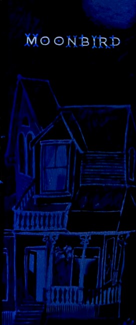
Opening title pan down- Moonbird
- In 1964, John and Faith Hubley‘s film, Of Stars and Men opened at the Beekman Theater in Manhattan. This was their first feature; it was accompanied by a number of their short films. I was in High School, and this is the first time I saw any of the Hubley films, and my life had changed at that screening.
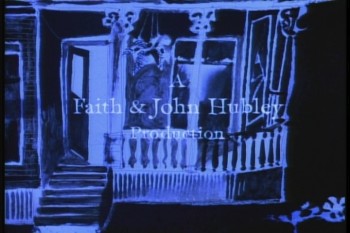 The flat colors of the Disney and Warner Bros cartoons were suddenly replaced with textures. It wasn’t only the backgrounds that had a texture; it was the characters as well. I’d already taught myself quite a bit about animation, but this was something new for me. I sat with saucer eyes watching every element and filmic device John Hubley came up with in creating these flms.
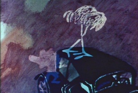
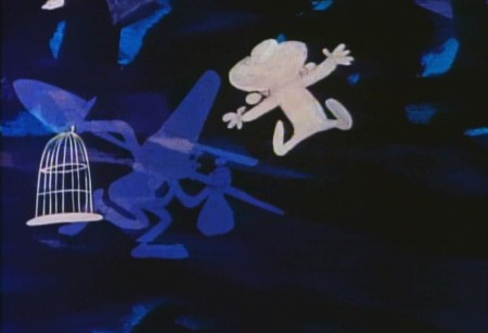
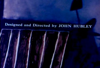 It was so clear that Hubley was using a system of double exposures, doubling the characters in at an exposure of about 60% so that the white paper would be somewhat translucent over the dark backgrounds. The rough pencil lines of the animators clearly delineated the characters in this technique, though they picked up some of color of the Bgs. Obviously, the white paper of the character had been painted black – up to the animator’s lines so that the extraneous parts of the paper was matted out. What a brilliant idea!
I explain this process in depth in this post from the past.
.
This enabled us, the audience, to see the rough lines of the animators and brought the same life the Xerox line had brought to 101 Dalmatians. It was thrilling for me.
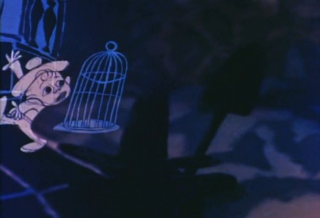
The sing-song muttering of a child introduces us to “Hampy”.
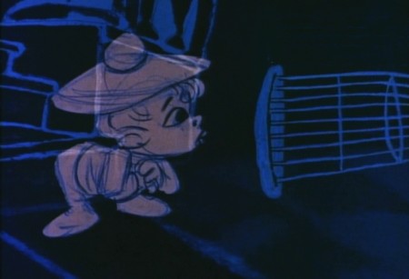
The rough lines of animator, Bobe Cannon, are a treat on the screen.

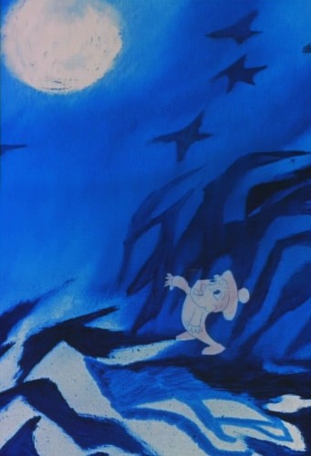
Every oil painting background beautiful, alive and modern.
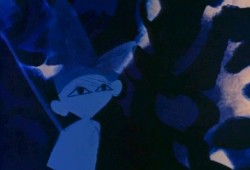
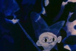
The other amazing thing was that the films used real dialogue.
It didn’t sound like a script. It was obviously, somehow, improvised.
It took me a while to learn how this was done
and what a wonderful way they had of doing it.
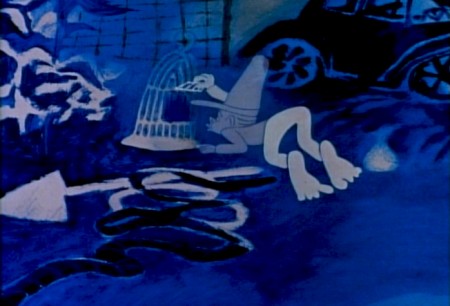
Moonbird was different from the other shorts of that period.
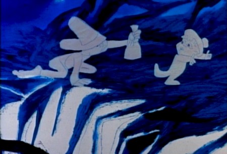
Its soundtrack was completely improvised by the
two boys of the Hubleys, Mark and Ray.
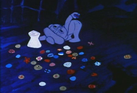
. . . but it also used NO music track.
This is very different for the Hubley films that had
such a devotion to the use of jazz on the soundtrack.
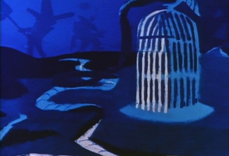
The film not only looked different for the time, 1959,
but it sounded different.

This film had clearly been the results of years of experimentation.
After all those brilliant UPA shorts, particularly Rooty Toot Toot.
The original Hubley produced shorts took a new, brilliant turn.
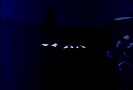
Adventures of an * moved animation forward
in its pursuit of 20th Century Art.
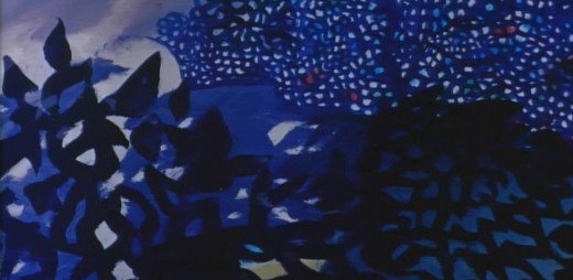
Picasso and Steinberg had been mimicked in the UPA films.
With Adventures of an * the Abstract Expressionists
came under the magnifying glass as John Hubley used
the New York school as his inspiration.
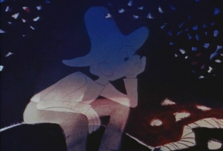
With Tender Game they moved that style into a more emotional
character animation, and by the time they did Moonbird, they
had settled into a very rich style that animation hadn’t noticed.
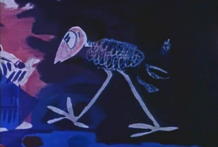
Two of animation’s finest animators delivered
the brilliant lyricism in this film.
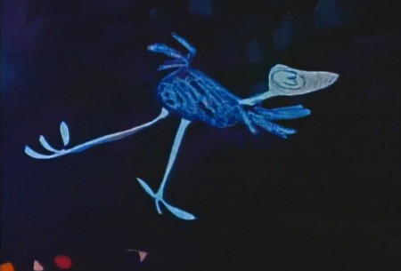
Bobe Cannon, for years, had delivered great animation.
His work with Chuck Jones had produced new and rich
experimental heights particularly in the 1942 short, The Dover Boys.
Hubley had stated that this film was an inspiration
in the move to 20th Century graphics in animation.
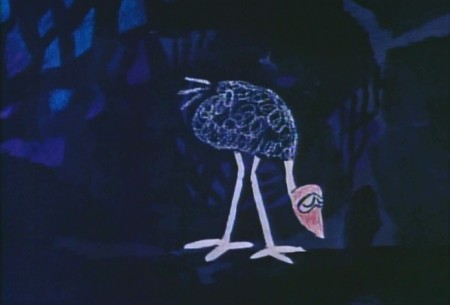
Cannon’s work with UPA, both directing and animating,
brought a new sense of poetry to the medium that finally
plays out in this film, Moonbird.
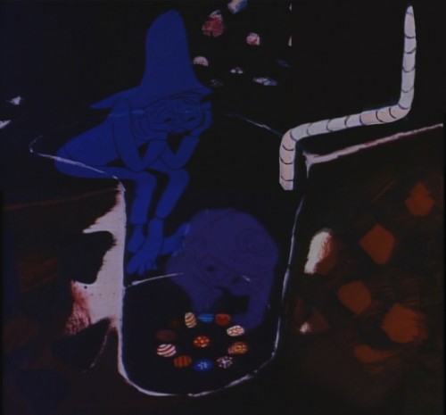
The young Ed Smith rose to great heights
while working for Hubley. His work on Tender Game
showed a natural warmth that spills over in this film.
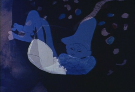
Animation, double exposures, oil painted Bgs,
improvised voices, no music all pushed this film
to the forefront of animation at the time.
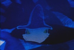
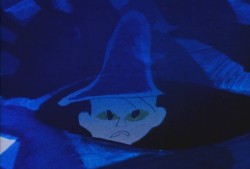
Despite the looseness of the style, it all blends
together as if it had been done by the one artist.
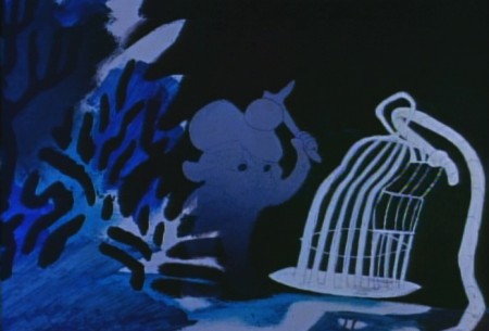
I love the soft airbrushed look Hubley was able
to pull off with much of this double-exposed artwork.
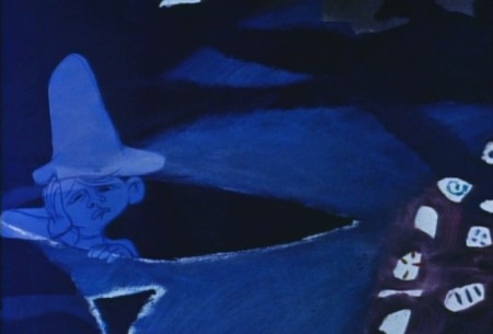
And yet the characters always remain front and center.
A tribute to the two animators and the directoral staging.
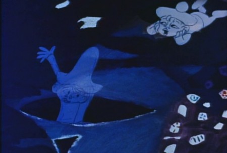
This delicate and lyrical film was followed by an anmiated
discussion of nuclear warfare and armament. The Hole
was twice the length and had a political point to make.
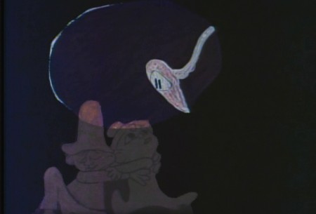
The characters’ colors change and fluctuate and sparkle
even as scenes progress, but this all becomes part of
the style which the Hubleys pursued for
the rest of their filmmaking life.
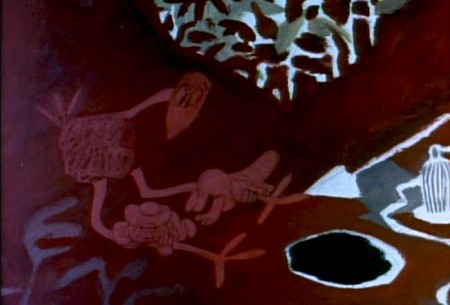
As in Moonbird, the voices in The Hole were improvised
. . . but this time by adults, Dizzy Gillespie and George Mathews.
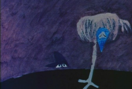
The Hubleys took their process of improvisation to a new level.
In the end, animation grew up, once upon a time.

The question is whether we’ve squandered that development
and have retrogressed to the 19th Century illustration styles
that Disney pursued. Recently, we seem to have had only
bad drawing or cgi puppets to choose from.
Time to step up, ladies and gentlemen.

on 19 Sep 2011 at 8:58 am 1.Rudy Agresta said …
One of my all-time favorites Michael. I also agree with your closing statements!
on 19 Sep 2011 at 9:31 am 2.richard o'connor said …
Great post.
It’s encouraging (well, may a little disheartening actually) that many students respond with the same saucer eyed amazement when confronted with this work for the first time.
I had first seen “Moonbird” on a 16mm reel without the opening credits truncated. The next day I was rhapsodizing about the scene with the kids in the ditch and the bird popping in and out above them. On the other of the line Ed Smith says, “Well, when I was animating that scene…”
Of course you can never tell when he’s BSing, but he went on discuss how he was a little unsure of the scene- or moreover, how he would have been unsure had it been anyone else but Hubley.
I’ve since gotten a copy with the opening credits.
on 19 Sep 2011 at 4:20 pm 3.Carla Veldman said …
Of all the films I watched through my schooling this one stood out the most; I love the loose, dreamlike quality and the improvised voice track. For the longest time since I couldn’t remember the title, so it’s nice to find this back again. Thanks for elaborating on it!
on 19 Sep 2011 at 4:29 pm 4.The Gee said …
“…we’ve squandered that development
and have retrogressed to the 19th Century illustration styles
that Disney pursued. Recently, we seem to have had only
bad drawing or cgi puppets to choose from.
Time to step up, ladies and gentlemen.â€
Surely there’s still shorts don’t fit that description of bad drawing or puppets, right?
And, are you getting at TV shows and features or the whole shebang, everything should get out of the ruts that are current trends?
on 19 Sep 2011 at 4:43 pm 5.Michael said …
Of course, there are exceptions out there, but far and away there is so much poor work being done that I have to start complaining and encouraging some of the young people to step up.
Artists like Gianluigi Toccafundo or even the young Dustin Grella certainly are artists. But these are far and few between. Too much of the work mirrors much of the poorly drawn Adult Swim stuff on Cartoon Network and has too little on its mind. Out of 43 films eligible for the Oscar last year, possibly two were worth watching. I just would like to see some artful intelligent work, and it’s gotten to be a rarity.
By the way, I include myself in there.
on 20 Sep 2011 at 1:02 am 6.The Gee said …
Is it presumptuous or is it preposterous for me to presume that you’re looking for for something that could be said to be rare in cartoons, more examples of films with souls?
To consider it after typing it and reading it: it might seem silly. After all, you are probably casting your line for a lot of Good Stuff.
But, the word soul would satisfy the need for more works which have well-tuned voices, persona(lity), some sort of spark that distinguishes it from the makes it more enjoyable and stand apart from every other example.
This is me bein’ hifalutin’, sure. But, it is kind of the anti-thetical approach to what is predominant, as I see it. I strongly believe that the attempt to make so many efforts into a Franchise is negative. It is a bad first step for too many things. And that is absurd considering things are serialize and episodic (TV and the Web, and with sequels, Features). Cartoons, of all sorts are being produced with commercial viability and longevity in mind. And, each production may not begin that way but may develop into that kind of project that a marketing department can love.
Silly notions on my part, I guess. I might be a fool for expressing them. It don’t matter none if I am.
I may very well be wrong or missing the point but it seems like the irony would be that one of the ways more idiosyncratic films and approaches and voices will develop is if there is one or more that achieves commercial success.
Jack Kirby. (That King of something or another.) :
Most people geekish enough probably know Jack Kirby was big on artists, especially younger ones, Being Innovative and not Being Imitative. The man was the King of something. Who’s to argue with the King?
on 20 Sep 2011 at 10:17 pm 7.Andreas Deja said …
I absolutely love this short.
One of the most beautiful things ever made!
on 22 Sep 2011 at 1:19 pm 8.Eric Noble said …
This is a great short. I love the art style and color. Perfect eye candy!
on 23 Sep 2011 at 8:45 pm 9.hans bacher said …
after I had seen that film as a student I knew what I wanted to do. I had no idea how, but at least i had a target.