Action Analysis &Animation &Books &Disney &repeated posts 10 Aug 2011 07:07 am
Tytla’s Willie – recap
Continuing with my recap of all things Tytla, here’s a post I did on Tytla’s work on The Brave Little Tailor.
- When I was a kid, I was never a big fan of the “Willie” character, the giant in Mickey & the Beanstalk. It seemed that every fourth or fifth Disneyland tv show would have this character in it (or else Donald and Chip & Dale). As I got older and grew a more educated eye for animation, I came to realize how well the character was drawn and animated.
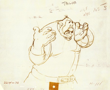
Willie first appeared in the classic Mickey short, The Brave Little Tailor, and he appeared fully formed. Bill Tytla was the animator, and he appeared to have fun doing it.
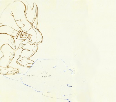
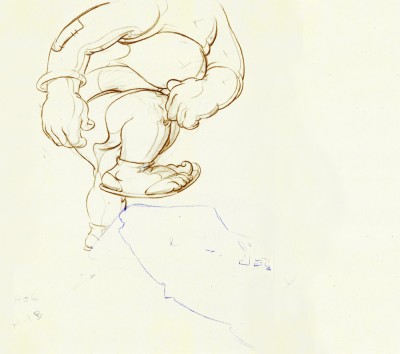
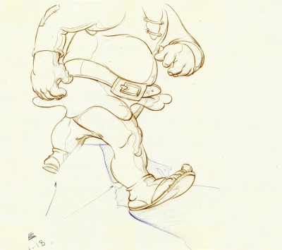
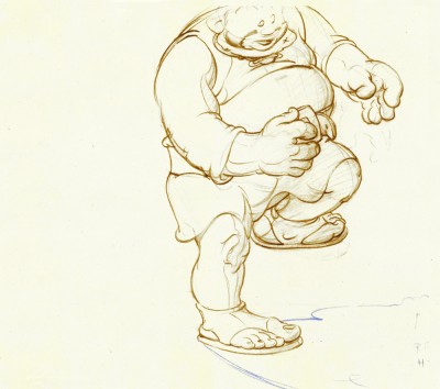
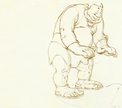
In John Canemaker‘s excellent book, Treasury of Disney Animation Art, there are some beautiful drawings worth looking at. Here they are:
 1
1(Click any image to enlarge.)
So let’s take a closer look at some of these drawings.
.
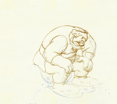
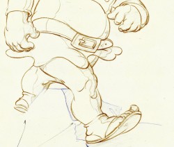
Drawing #3 features this weight shift. As the right foot hits the ground it pronates – twists ever so slightly inward. The hands do just the opposite. The left hand reaches in while the right hand holds back, completely at rest.
It’s a great drawing.
.
.
.
Drawing #4 shows Willie landing on that right foot, and his entire body tilts to the right. The hands twist completely to the left trying to maintain balance. The left foot up in the air is also twisting to the left before it lands twisting to the right.
.
.
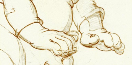
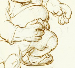
I love how drawing #5 features the two hands flattened out to
make his final stand before sitting down. It’s all about gaining balance.
.
.
.
.
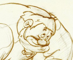
Just take a look at this beautiful head in drawing #6. He’s seated, his head has come forward and tilted forward. The distortion is so beautiful it almost doesn’t look distorted.
What a fabulous artist! This guy just did this naturally.
.
.
.
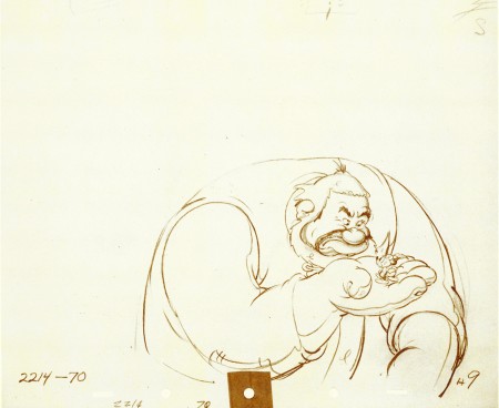
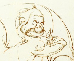
This scene begins with the seated giant eyeing the tiny Mickey Mouse in his hand. The characters are drawn beautifully almost at a rest waiting to get into the scene. The intensity of Willie’s glare is strong, and it’s obvous Mickey is in trouble.
.
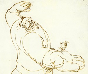 Here’s the drawing of the sequence.
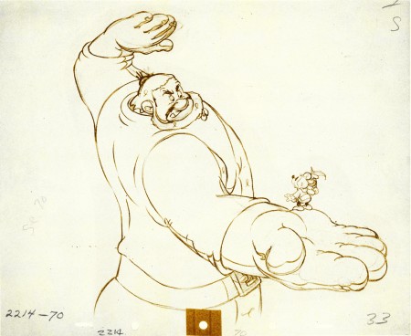
The major problem with drawing a giant is his proportion to all the other characters. The screen is more oblong and horizontalal than it is square. (Fortunately, when this film was done it was closer to a square but still not one.) Throughout the film, Tytla had to deal with a BIG Giant and little Mickey. The landscape is also small.
An obvious way of handling it – and one that would be done today, no doubt – would be to force perspective showing it from the ground up – most of the time. In the 30′s and 40′s they stuck to the traditional rule of film and editing, and they would NOT have done this.
Tytla plays with scale as the giant steps over a house and ultimately sits on it.
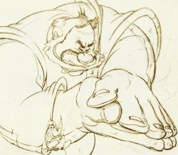
In this drawing, he does a brilliant drawing forcing the perspective with Mickey in the foreground and Willie’s left hand in the distance. The giant draws into this forceful perspective without calling attention to itself. Today it would be more exaggerated, but Tytla doesn’t want it to be noticed – just felt.
A real bit of art!
Here, Willie moves through that perspective of the last extreme, and he gets larger as he slams his hands to flatten Mickey. To exaggerate that flattening, Willie’s hands flatten for this key drawing. His head flattens as well in grimace.
The giant’s head will move in toward the hands to see the results, and the audience has a front row seat seeing Mickey escape up the giant’s sleeve. There’s a lot going on in this drawing.
.
.
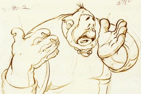
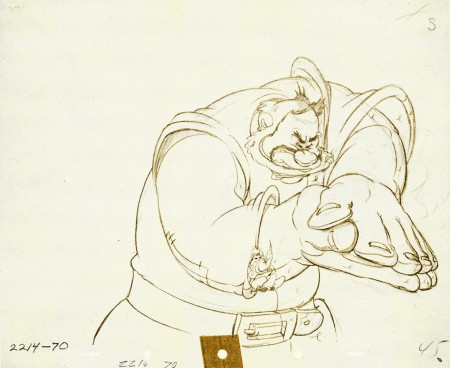
Finally, Willie tries to figure out what’s happened.
The drawing loses most of its distortion and comes to rest.
(Note that there’s still perspective distancing between the two hands.)
Mark Mayerson has done a mosaic breakdown of this cartoon and adds his excellent commentary.
Hans Perk on his site, A Film LA, has just posted the drafts to the earlier Disney short, Giantland. The draft for The Brave Little Tailor was posted a while back on this great site.

on 10 Aug 2011 at 9:19 am 1.John Celestri said …
I wish I could see and study Tytla’s first rough pass drawings & exposure sheets of this sequence. I have no doubt that they were 15 to 30 second fast scribbles that captured the pure forces moving through space and time (layout and number of frames on the exposure sheet).
on 10 Aug 2011 at 2:59 pm 2.Stephen Worth said …
There were several Jack and the Beanstalk themed Terry-Toons with giants. It’s likely that Tytla already had some experience thinking about scale and weight from working on those. Brilliant drawings!