Bill Peckmann &Comic Art &Disney 05 Aug 2011 06:54 am
More Walt Kelly Disney Covers
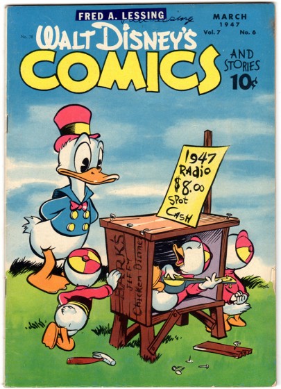
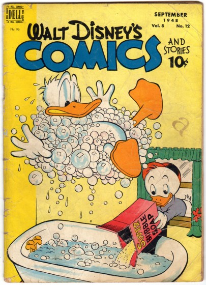
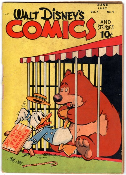
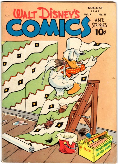
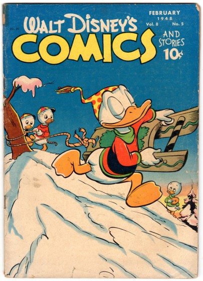
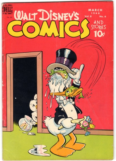
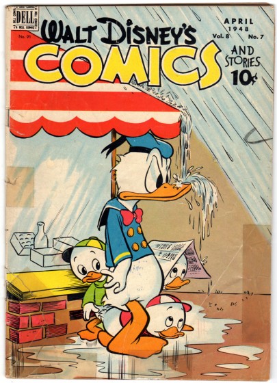
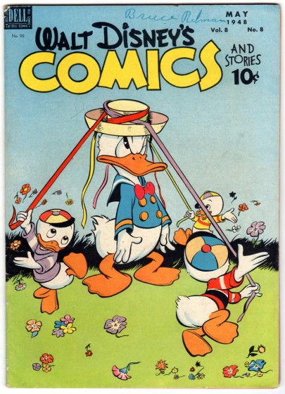
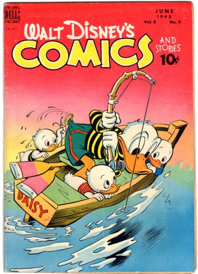
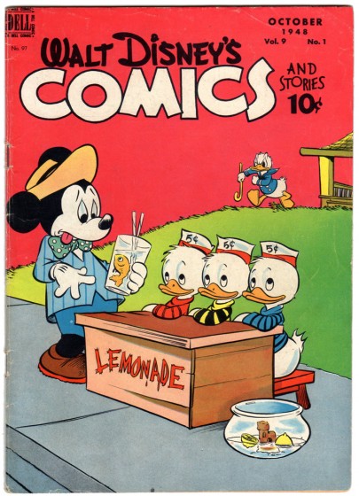
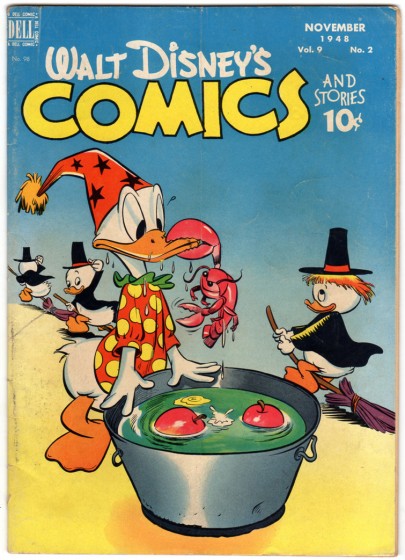
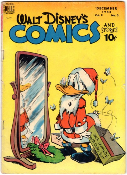
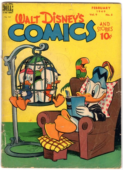
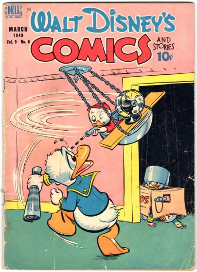
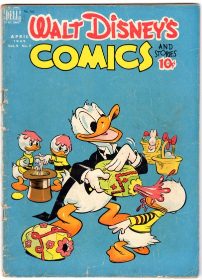
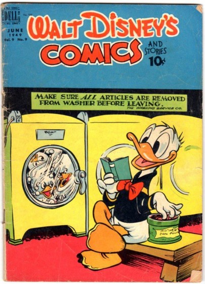
- Last week I posted a bunch of beautiful covers to Walt Disney Comics from the 40′w. For the most part they were done by Walt Kelly, and they were stunning. Here, thanks to another beautiful lode sent me by the inestimable Bill Peckmann, are some more of these wonderful covers by Kelly (except where noted). They are all gems. You can see the hint of Pogo starting to peek through in the non-Disney, secondary characters. Such clear composition and such clean design.
 1
1
 20
20
This is Carl Barks’ second cover that he did for “Comics and Stories”.
Many thanks, again, to Bill Peckmann for sharing his immense and invaluable collection.
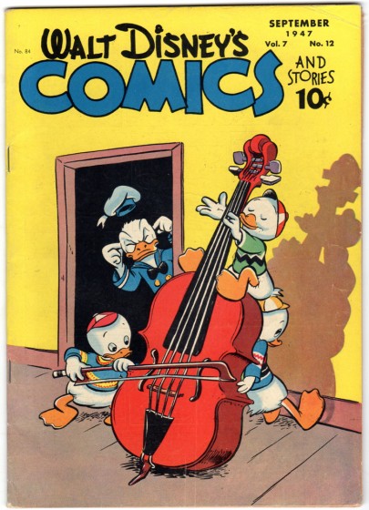
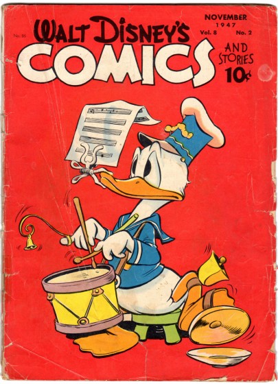
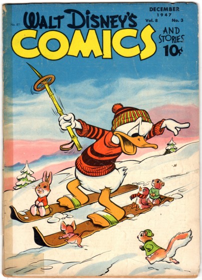
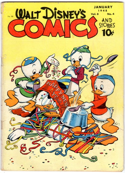

on 05 Aug 2011 at 11:53 am 1.Thad said …
I never tire of looking at Walt Kelly’s Comics & Stories covers. NEVER.
on 05 Aug 2011 at 12:16 pm 2.Milton Gray said …
Notice that on the March 1947 cover, Walt Kelly seems to have inserted Carl Barks’ name on the wooden box of chicken dinners — noteworthy considering that for a few years in the 1940s Carl ran a chicken ranch on the side to augment his income from drawing comic books, in case the comic book work didn’t pan out.
on 05 Aug 2011 at 12:27 pm 3.Oscar Solis said …
These are really great. Walt Kelly’s is just amazing.
on 05 Aug 2011 at 1:00 pm 4.Michael said …
Milt, interesting that it’s chicken dinners – for ducks!
How wierd can it get.
on 05 Aug 2011 at 4:55 pm 5.The Gee said …
I didn’t comment on the previous cover spotlight. At least I don’t recall if I did.
These Kelly covers are great stand alone one-panel gag cartoons. They work extremely well on their own. So, it is a joy for that reason, too.
As it goes, I haven’t read enough of these comics, the Barks ones or newer ones to know, but the nature of the nephews is kind of harsh. The pranks are close to malicious, and funny, but devious nonetheless. The earlier batch has more which make it seem like they are putting it to “Uncle Donald”–the duck with unknown, unseen siblings. (though perhaps the something similar could be said for Mickey Mouse and Popeye, too. Well, except for the duck part).
Thanks again for sharing these. The art is sweet. His sense of staging is remarkably good.
Though, on the Halloween cover, number 14, I’m not sure why the nephews are dressed like Irish Pilgrim Witches. But, at least there wasn’t a crab in the apple bobbing tub. (crab apple)
on 05 Aug 2011 at 10:15 pm 6.Blatz said …
I fail to see what’s so great about these. Kelly’s Donalds look mushy. The composition on all of the covers is just meh. Look at the first one: two of the ducklings have their backs to the audience. That’s a no-no in the theater and it doesn’t look so hot in a comic either. As for the humor, the gags are rather insipid IMO. That Easter one – what’s Donald squirting on his nephew – egg yolk? Yeesh. I realize that there are some people who worship Kelly – and rightfully so – for his Pogo work, but that doesn’t change the fact that his Disney work fell far short of Barks, and personal style has nothing to do with it. His art for Disney just lacks grace and ability. Too bad.
on 06 Aug 2011 at 12:08 am 7.The Gee said …
I like Kelly’s work quite a bit though I do have problems with some aspects of “Pogo.” I just don’t articulate them because few who care enough about comic/cartoon art and strips usually wouldn’t want to hear it. Surely, i’d come across as a young, brash cad….or sumptin’.
The covers…..
Mushy? I can’t speak to that. So I won’t.
As for the composition and the gags, in comics and strips there’s this thing that I consider “Working the Space” It is just good staging and leading the eye in the right way that best fits the panel. Yeah, it is composition by any other name. But, Not all panels are created equal. A comic book cover or splash page have similar dimensions, right? Not too dissimilar from a single panel gag cartoon (that isn’t “Love is…” or “Family Circus”). So, presenting something the way Kelly is doing it is a good use of that space. Obviously, he is rarely limiting himself withe a background. That affords him the option of keeping it simple and clean. I just think you are being too harsh.
As for the gags. Of course they aren’t high art hilarity. They are just good, clean gags. You can see the thought that went into the concept and how he translated the joke visually is just well done. The drawings could have been crappity crap crap but the staging and gags are well done. The jokes are well told. That, as was explained to me, is the most important thing. Always.
Lastly, I will refuse to turn my back to you, Dear Blatz. I doubt theater was A #1 for that cover. I just have three questions for you: You do see how the dramatic irony is presented, right? You do know something Donald does not, right?
It is well-done for the concept. Did the two ducklings really need to be turned towards us forcing us to see that Donald is is seeing not only the front of a fake and likely shoddily made radio but also the backs of two ducklings?
on 07 Aug 2011 at 12:56 am 8.Paul Penna said …
Well, more often than not, the covers of Dell funny animal comics were intended to be more in the nature of tableaux rather than still frames of ongoing action. But look at the stance of the nephew getting skooshed by the candy Easter egg, with its nice touch of his tail feathers themselves carrying through the force of the skoosh. It’s very Kelly.
on 08 Aug 2011 at 11:59 am 9.Ignatz said …
What jumped out at me was the zig-zag shirt on one of the nephews on the September 1947 issue (repeated on Donald’s fez on the February ’49 cover). I didn’t realize that the Charlie Brown shirt motif had predecessors!