Fleischer &Frame Grabs 01 Aug 2011 06:30 am
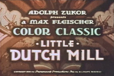
Fleischer’s 3D Multiplane – Little Dutch Mill
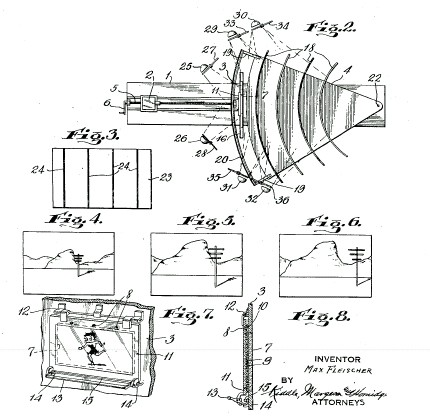
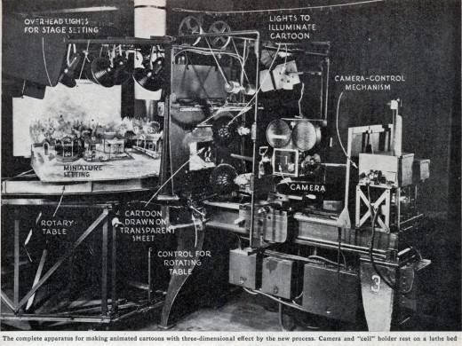
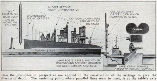
- We’ve been looking at the Disney multiplane camera, but let’s keep going back in time. The Fleischer studio had its own 3D setup, and it was very different from the Disney version. Little cartoon sets were constructed on a horizontal setup with the cels being placed in the foreground of the set. These sets could move east and west or in a circular motion. The 2D animated cels stood in front of the moving set and it gave the effect of a 3D world behind them. The end result was to show the 2D cels moving in front of a 3D set.
Here are some stills and artwork showing how the contraption worked.
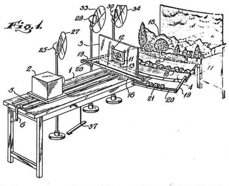
Images from the patent application for the Fleischer 3D multiplane camera.
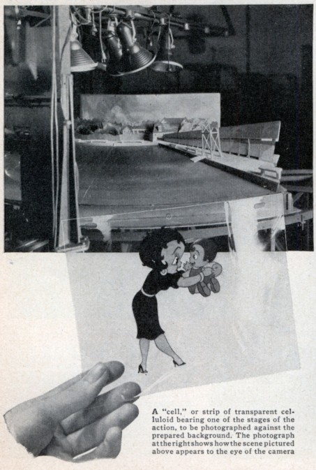
Images above from Modern Mechanix/November 1936
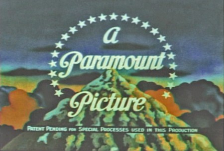
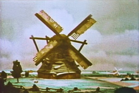
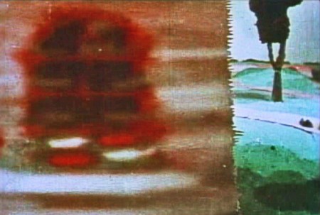
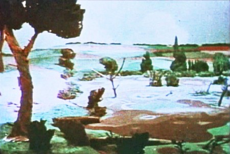
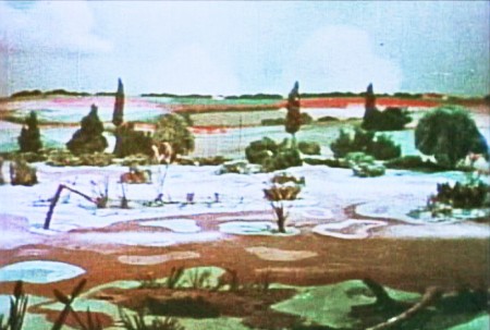
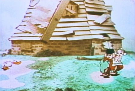
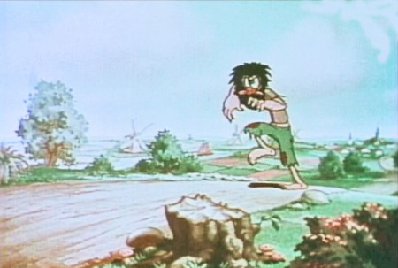
One of my favorite cartoons that really showed off this process, was a color cartoon called, The Little Dutch Mill. There was a lot of rotation of the characters running and skipping around the mill, which, of course, had the blades turning. It felt like the rotation was 360°, but that certainly couldn’t have been the case. But it was well planned to make it feel as though that were happening. Here are some grabs of scenes that employed the specialised camera.
 1
1Disney still had the rights to Technicolor, so the
Fleiscers used the 2-strip Cinecolor – orange & green.
 3
3
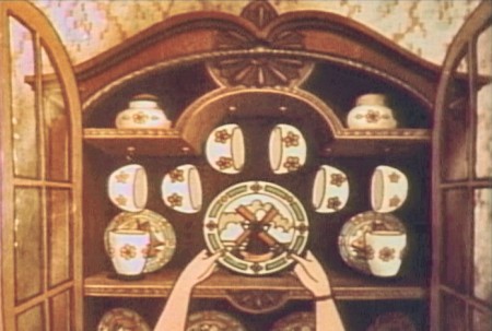
Here’s the first scene done as flat art.
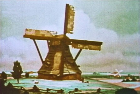 5
5
. . . which revolves as the kids enter the scene.
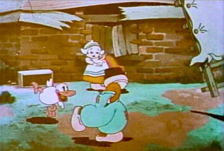 6
6
The closer shot of the kids looks flat, especially with that animated windmill blade.
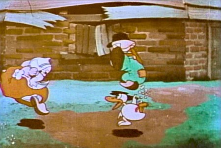 7
7
The mill isn’t revolving here.
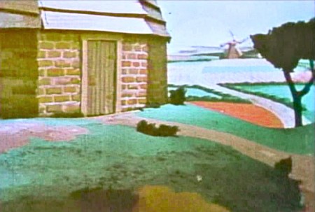 8
8
But the camera zip pans across to some 3D scenics.
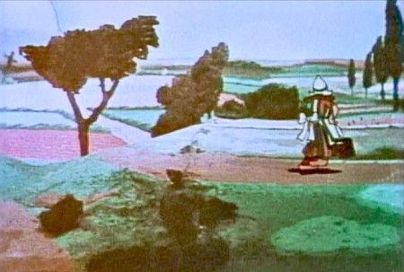 9
9
We follow a woman carrying water as she walks . . .
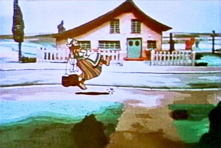 10
10
. . . into town. 3D movement on the BG.
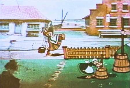 11
11
The woman, the picket fence level, and the
churning family have to match the BG movement.
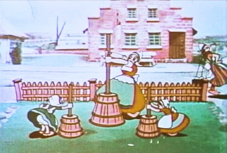 12
12
We stop on some kids & a woman churning butter.
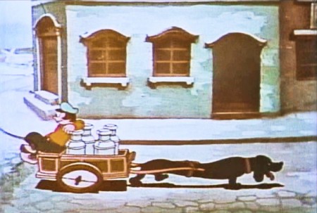 13
13
A dachsund leads a cart with a lazy guy.
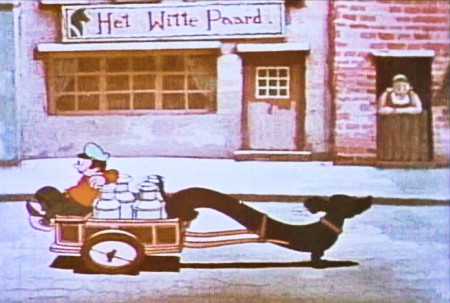 14
14
The town moves in 3D perspective.
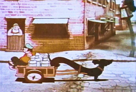 15
15
The dog & cart cycle is repetitive.
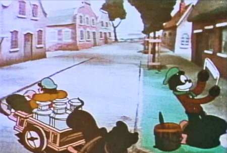 16
16
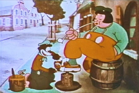
The cart turns toward the camera leading us toward . . .
 17
17
. . . a shoeshine boy carving away at the wooden shoe.
 19
19
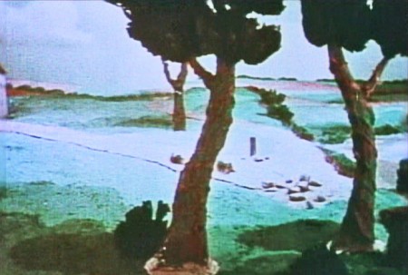
. . . to countryside that we seem to have seen before.
 22
22
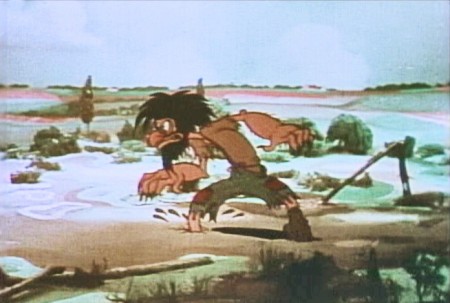
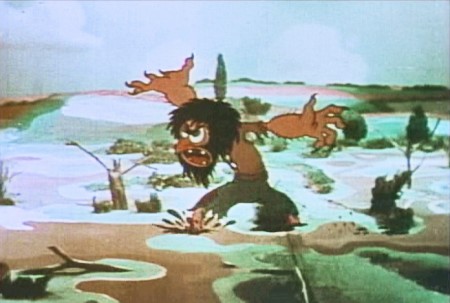
. . . the old miser/villain of the short.
 23
23
He rattles his nasty complaint.
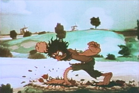 24
24
He steps on three tulip plants.
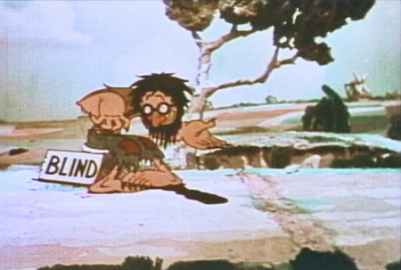 25
25
He stops to beg a coin from a fat guy with a pipe.
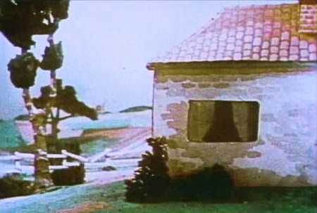 26
26
Another Zip pan to screen left.
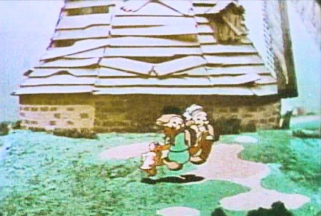 27
27
Back to the revolving mill. The kids are dancing with their duck.
There are a lot of other scenes that reuse the master BGs of the mill.
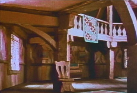
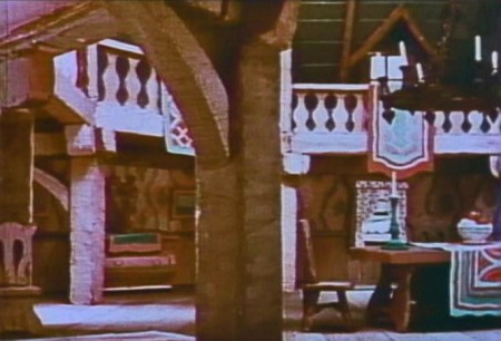
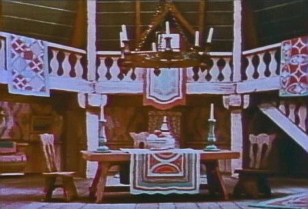
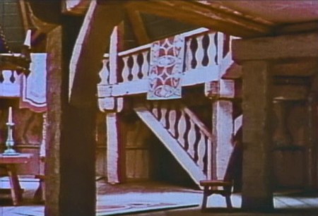
There’s only one other scene I want to feature which isn’t repeated frequently. Within the miser’s home, the town saves the day by cleaning things up. We get a pan across the place once the town has wiped everything down.
 1
1We get a simple pan across the mill interior.
 2
2
The pan shows off the 3D camera well. Everything is modeled and well constructed.
 3
3
There’s no animation in the scene, so the BG looks great.
 4
4
Most of the other interior shots of the mill are flat art,
so this scene is a stand-out.
Basically, other than a sweet story creatively told, there’s little more than the wonderful scenery moving. Oftentimes there’s not even animation or there are animated cycles moving in front of the panning BGs. The one regret is that the film hadn’t been done in
3-strip Technicolor.

on 01 Aug 2011 at 7:07 am 1.Nancy Beiman said …
It makes me wonder…since there was a clear rivalry between Disney and Fleischer’s at that time…did this film inspire THE OLD MILL the way (I feel) that the 20 minute Popeye shorts inspired THE SORCERER’S APPRENTICE?
It’s also too bad that this cartoon had to be made in 2-strip Technicolor.
How *did* they get the 360 degree rotations done? I’d swear they used them. If not, they had absolutely perfect hookups on their repeat pans.
on 01 Aug 2011 at 8:30 am 2.Don Cox said …
Do you have the number of the patent?
on 01 Aug 2011 at 9:42 am 3.Don Cox said …
OK, I found it.
US patent 2054414
on 01 Aug 2011 at 10:41 am 4.Mr. C. said …
“Disney still had the rights to Technicolor, so the
Fleiscers used the 2-strip Cinecolor – orange & green.”
No, this was Fleischers’ first 2-strip Technicolor film.
on 01 Aug 2011 at 11:15 am 5.Pierre said …
It seems to me that a full 360 degree rotation could be easily rigged. Consider this:
The image with Michael’s caption “How It Worked” shows a central pivot point on the left side of the illustration. A 360 degree rotation could be achieved if the mill model were built directly above the pivot point with a full 360 degree surrounding set built around it. As long as there was room in the studio to allow for it, the whole set could then be easily rotated a full 360 degrees behind the cel setup and camera to achieve the effect.
The film version of “Annie Get Your Gun” used a similar effect for a scene where Betty Hutton and Howard Keel are standing on the back platform of a moving train. I believe the scene might have been during the song “They Say It’s Wonderful. The moving landscape behind them was done exactly the same way as the Fleischer’s setup.
Sadly, I no longer have the book or else I would have posted some images.
on 01 Aug 2011 at 12:53 pm 6.David Nethery said …
There are some interesting 360 rotation and multiplane effects in the German film “Weather Beaten Melody” directed by Hans Fischerkoesen.
http://www.youtube.com/watch?v=3dKQLUqgB-0
Sometimes Fischerkoesen’s multiplane seems to be more like the Disney arrangement of shooting through multiple planes of glass, other times it seems some of the shots were done by animating over 3D models.
on 01 Aug 2011 at 1:24 pm 7.Michael said …
“Weather Beaten Melody†is an incredibly beautiful film, technically, David. The multiplane scenes do seem to be done in different ways. Perhaps I should do a number on that film as well.
on 01 Aug 2011 at 2:46 pm 8.Tsvika Oren said …
Any idea what type of wind mill was used as reference for “The Old Mill”? I’ve written the Disney archive, wind mills associations in Holland, UK and USA – none had an answer. I’m still curious. Thanks.
on 01 Aug 2011 at 3:20 pm 9.Michael said …
I have no idea. I just assumed it was an invention of the wacky Fleischer staff. It looks like any child’s idea of what a windmill looked like.
on 01 Aug 2011 at 6:14 pm 10.Nancy Beiman said …
Mike, I’d love to know more about Fischerkoesen’s Weatherbeaten Melody. that film never fails to raise gasps when I show it.
I believe they rotoscoped a puppet for some of the flying scenes…and the tracing is PERFECT; there is no boil.
on 01 Aug 2011 at 10:45 pm 11.Pierre said …
I’ve never seen “Weather Beaten Melody” before, nor any other films by this studio. I’ve checked out a few on YouTube and they are all quite remarkable. The multiplane effects in “Weather Beaten Melody” are really quite remarkable! Thank you David for pointing this film out!
on 01 Aug 2011 at 11:08 pm 12.Oscar Solis said …
I remember seeing this effect in a Popeye cartoon and being amazed by it. I love it’s use in the color Popeye cartoons. The thing that blew me away was how well those 3d backgrounds blended in. If they hadn’t moved I would never have realized they weren’t paintings. Even in this day of computer generated imagery, they still amaze.
Thanks for a fun post.
on 02 Aug 2011 at 12:26 pm 13.David Nethery said …
The color Popeyes are quite rightly renowned, but I like the use of the 3D sets in their black & white cartoons even more . One of the best (imo) of the black & white Fleischer 3D set shots occurs in “Little Swee’ Pea” when Popeye is taking Swee’ Pea to the zoo, from about the 1:42 mark – to – 2:23
http://www.youtube.com/watch?v=bxJQFrNg_-Q#t=1m43s
on 03 Aug 2011 at 9:44 am 14.Pierre said …
I’m in total agreement with Oscar’s comments. The magic of the miniature sets (and with the Disney multiplane setups as well) is not only their depth but that they work as 2D illustrations when they were static. The builders really tried to match the look of the static 2D illustrated backgrounds when constructing the 3D sets.
As someone who builds custom model buildings as a sideline, I would love to know how these 3D sets were constructed. Was each setup custom built? I would assume that after awhile that the Fleischer studio had a number of reusable elements to speed the creation of these sets. It would be fascinating to know if any of these pieces still exist in someone’s home someplace!
What’s especially impressive is the shear amount of detail. The cave of treasures in “Popeye and Sinbad” two-realer is especially impressive. It’s also interesting to note that these dimensional sets were not used (to the best of my knowledge since I’ve never seen them all) in the Fleischer Superman cartoons.
on 03 Aug 2011 at 1:56 pm 15.The Gee said …
It is such an odd cartoon.
In addition to the technical experiments, one thing this reminds me of is just how new immigrants to America and their culture could play a role in the types of stories for a cartoon short. It is there. Even if there were some storybook influences, too, centering the story around a Dutch community is definitely cool.
Something like this wouldn’t even be broached by a modern American studio, big or small. And, even if a similar story were made, it would probably wear its influences on its sleeve.
I have seen this cartoon at least a couple of times, but, this time around I thought of “Pygmalion”/”My Fair Lady.” I’m not totally familiar with either except that they are connected plays. But, the fact that the villagers decide to take on a threat by improving that characters life! is kind of mind-boggling considering other cartoons would have gone the Angry Mob Meets Frankenstein route and maybe the mill would be integral in the gags that would result from that conflict, which would have likely included a chase.
But, instead, the story played out the way it did. A redemption story. Weird.
—-
Oh Yeah. The Popeye short: They worked out a gag for the trucking scene. And, Swee’Pea falling out and climbing back in looks darn good.
—-
As for the 3D sets the studio used, I have long tried to share this one:
http://www.archive.org/details/Dancing_On_The_Moon_1935
Concepturally, it is kind of odd, in a Noah’s Ark/ocean cruise line sorta way.
But, it, like “The Dutch Mill” makes me wonder where the story came from.
The character animation isn’t Yowza! Maybe it is typical. Check out the walk of the Penguin Bride beginning @ 1:13. Notice her left foot.
Again, I don’t think many people these days would bother trying a story like this. Maybe in a TV show that has 2 x11 minute bits. But, it comes across as an odd showcase. And, it is based on a song so the story is lacking and the dialogue is almost nil.
Notice:
The design on the ship: did it influence Dr. Suess?
The cat making a cat’s cradle?
The length of time the 3D elements are on screen. As unexpectedly cool as it looks, was the last one worth it?
The cartoon has stop-motion along with the 3D sets and, if course, hand drawn animation. That combo is another reason that studio impresses the heck out of me. It was innovative. And, it is rare to innovation like that done now.
Anyhow, thanks for the post something about the studio.
on 03 Aug 2011 at 2:02 pm 16.The Gee said …
to see innovation like that done now…..
also, check out the Cab Calloway-esque shuffle the cat does. You can’t miss it, especially given the skatey-ness. It doesn’t matter that it should NOT happen as there is no grand attempt to approximate the physics of the moon. As such with the background, like Swee’Pea’s antics in the other cartoon, it looks darn good.
I wonder if re-use/tracing happened for that bit or if they used reference footage?
(as you can guess, I dig the cartoon. I dig the studio.)
on 25 Jun 2016 at 9:49 pm 17.David Chelsea said …
I would like to reproduce the magazine photograph of Fleischer’s tabletop set up for a book I’m writing on perspective. Can anyone tell me who has rights to this image?